You are using an out of date browser. It may not display this or other websites correctly.
You should upgrade or use an alternative browser.
You should upgrade or use an alternative browser.
slipSHOTS: GT5
- Thread starter SlipZtrEm
- 707 comments
- 77,957 views
- 4,387

- Lisboa
 Metal Gear Challenger: Snake eater? Lies, all lies
Awesome images, my favorites being the sideways i-miev and the second of the Volvo
- 2,538
- TheSwissLegend
Your efforts sure are paying off! What you did with the HDR on the Aston is just textbook if you ask me. Exactly what should be done using it.Swiss - Thanks Swiss, I've been making an effort to get cars in the right location; the colour and surrounding area seem to affect shots more than the specific model, really. Yep, a bit of HDR - they're 5-shot images, but I didn't want to go overboard, just bring out the sky and reflection details
Now for this update...Snake eater is just awesome, great theme there as with all the shots sets. Just awesome man. I love the drift angle of the mitsubishi too. YOur ideas as of late have been so creative. Keep this up!
- 627
- DjSkyline701, GTP_DjSkyline701
Lmao.. Haha, love the clever captions. Great photos by the way. My fave is the first Challenger pic and the drifting Mitsu, i had know idea it could. as the for the Challenger it looks so menacing power-sliding, and the Corvette is like "Oh Crap!"
- 108
Love the metal gear reference, generally had a laugh at that. How you go that Mitsubishi to drift so sideways is awesome! Great shots.
UnionStrike
(Banned)
- 1,186

- Toronto
- UnionStrike
- Onionstrike
Metal Gear challenge: Snake Eater 
Love that caption, pretty fun seasonal event too, that was.
and wow, that is one fairly hot looking i-mev. o__O
Love that caption, pretty fun seasonal event too, that was.
and wow, that is one fairly hot looking i-mev. o__O
- 33,155

- Hammerhead Garage
Do you take requests, slip? I'd love to see your work feature the McLaren MP4-12C at somewhere like Cape Ring South.
- 27,385

- Toronto
- NewAesthetic
- SlipZtrEm

(click on images for full-size)
_________________________
Update Info: And here are this week's (and next's) PMC and 2.0 prizes (in another subtle HDR shot). Three take inspiration from a certain rich family's rides, the fourth, the Matte White, based off another in real life. Presentation inspiration from the man with what might just get Album of the Year, as it seemed an easy choice with some of the first words on the album mentioning the car. All four have titanium exhausts and no mileage; the colours are unique since oddly enough, the Mattes are easiest for people to get; the red and turquoise are random-gift-only affairs. Enjoy!
Ghertel - Thanks, I try to grab that colour for the mkIV every GT. Now GT5 finally lets me spread the love
Rev - Staggered-quality tires; stock on the rear, much higher grip on the front! The C30's been a personal favourite too, so I loved having to use one, and the rims, while similar to the stock ones, look so much better. I feel like it's impossible to drive the Challenger and not end up roasting tires
RG - I know what you're saying; I've been trying to do more group shots, but so far it doesn't happen too often. And this update doesn't count! Funnily enough, these were all my second go's at the events too; I had forgot to save replays and had to go back in, despite already winning all the cash. Won't have that happen again!
Sems - Heh, the captions are half the fun! The second Challenger shot is my least favourite of the group (couldn't get a decent motion shot of the two cars), but I'm glad someone likes it!
Sprite - Two birds with one stone
. Thanks about the Aston, definitely one of my favourites so far, and at least in my opinion, one of my best as well.Ken - Hope this is satisfactory!
Franz - Thanks buddy! When can we expect an update from you?!
Luis - No, not lies
! My secondary save, I decided to go all out, made an all-black Challenger and maxed the power (but kept it on Sport tires and near-stock weight). Holy crap is that thing fast and fun! This Plum Crazy one enjoys a supercharger usually, but I had taken it off to make the event more of a challenge.Swiss - Thank you very much
 . GT5's blown the doors open for me, I have more ideas than I have time for, it seems!
DJSkyline - There's a name I remember! Yeah, drifting in anything is possible if you're determined enough
SVX - Thank you!
Photographer - It almost seemed too obvious!
Sej - You should, they're an even easier way of building credits than that other car I sent you
") .
.Union - Y'know, the i-Miev isn't that bad, sound aside. The colour did help, shame there's not a lot of good wheel choices (the split-4's look alright in motion due to their colour).
'Ludes - Actually, I probably can; I've had an MP4-12C in my garage since about a week into the game, but haven't taken it for any shots yet. Any particular colour choice? I've got it in that awesome Fire Black colour.
Magic Racer - Thanks for the kind words!
Last edited:
- 33,155
- Hammerhead Garage
Knock yourself out; she's a beautiful car. And Cape Ring is a stunning circuit. In fact, you could take photos of her anywhere on Cape Ring - just not in the Donut. I think it's the silliest thing Polyphony have ever included on a circuit. And that includes the bridge over nothing on Grand Valley (seriously, it's sandwiched between two tunnels and the short version of the circuit goes around the rocky outcrop; the sheer engineering challenge of blasting tunnels through two rock formations and then building an arch bridge over the divide makes this part of the circuit totally unfeasible).'Ludes - Actually, I probably can; I've had an MP4-12C in my garage since about a week into the game, but haven't taken it for any shots yet. Any particular colour choice? I've got it in that awesome Fire Black colour.
If you're going to do it up as an advert or some kind of magazine article, you could call it "CARTE BLANCHE".
- 4,387
- Lisboa
Seems like I have to win one of the competitions. I'm loving the preview by the way, nice position of text, really professional. Looks like a music album of some sorts.
I'm loving the preview by the way, nice position of text, really professional. Looks like a music album of some sorts.- 10,828

- Belgium
- bramturismo
Definitely not one of your best, but I do like the idea and concept behind it 👍
They look much better in place in the B&W background, but in the coloured version I find them to look a bit too much pasted in place. There's also a small blue glow on the two side cars which I assume you put there to give a reflection off the blue one onto the other two cars, but I think it would've looked better without the glow. But I do love your presentation style, as always! I have no idea where you keep finding all these good looking fonts. I go through many of them in Photoshop but they all look evenly bad!
On that, can I just say how wonderful that photomode location is modeled?
- 1,805

- Adelaide
- Revolution52
Kanye!
Presentation wise, you've nailed it, dead ringer for that style of presentation Mr West used. Lovely work.
That red looks quite nice on a Murcielago, there's something... forbidden about an Italian supercar which doesn't bear the prancing horse dressed in red.
Presentation wise, you've nailed it, dead ringer for that style of presentation Mr West used. Lovely work.
That red looks quite nice on a Murcielago, there's something... forbidden about an Italian supercar which doesn't bear the prancing horse dressed in red.
- 27,385
- Toronto
- NewAesthetic
- SlipZtrEm
I'm breaking my only-respond-during-updates semi-rule
Interludes - Yeah, not a fan of the donut either; it's fun when going around at full tilt in a fast car, but from a realism standpoint, it's utterly silly. Then again, so is the X1... I'll keep that in mind for the MP4, as I really have been meaning to shoot it, and it's a hoot to drive. Actually, I'm about due for another magazine article...
TVR - Thanks; I wasn't left with a lot of choices
Luis - As Rev mentioned, I definitely borrowed a page from Kanye. Wait, no... ripped him off, really. Though he uses a very slightly different font than I do, since it has a different "J", as one example. Here's a link of one example. A NSFW warning if you plan on clicking on any of the other GOODFriday selections...
SVX - That'd be Helvetica Compressed. I know, I know... real imaginative. It looks like West uses a variation of Akzidenz Grotesk, but I don't have a matching one.
Bram - Admittedly, the concept is stronger than the execution, here. It was mostly done to show off the cars for the prize aspect, and it took me quite a while to nail the right colour for the two non-mattes. Oddly enough, they looked more pasted in when I didn't have the slight blue reflecting off the side cars, which is why I added it. The angle doesn't leave a lot of shadow under them though, which probably is why they look the way they do. They really do deserve an urban location shoot to shine, so maybe I'll end up taking my own versions somewhere suitable. Like... London? I like the location, as it felt dramatic enough for them, but there's some ugly textures on the far side of the Abbey, especially on both side corridors...
Rev - Yay! Someone else recognized it. I love the simple design he's pulled with the GF collection, and the final album too, and Dark Fantasy just made this an easy decision. As for the red; you have no idea how many I went through trying to find the right shade. Seeing as how I'm in possession of over 1000 colours right now... you could say it took some time. Really worth it, and it does look fantastic in-game; the Murci seems to look good in nearly any colour, really. Alfas lay equal claim to red, though!
Interludes - Yeah, not a fan of the donut either; it's fun when going around at full tilt in a fast car, but from a realism standpoint, it's utterly silly. Then again, so is the X1... I'll keep that in mind for the MP4, as I really have been meaning to shoot it, and it's a hoot to drive. Actually, I'm about due for another magazine article...
TVR - Thanks; I wasn't left with a lot of choices
Luis - As Rev mentioned, I definitely borrowed a page from Kanye. Wait, no... ripped him off, really. Though he uses a very slightly different font than I do, since it has a different "J", as one example. Here's a link of one example. A NSFW warning if you plan on clicking on any of the other GOODFriday selections...
SVX - That'd be Helvetica Compressed. I know, I know... real imaginative
. It looks like West uses a variation of Akzidenz Grotesk, but I don't have a matching one.Bram - Admittedly, the concept is stronger than the execution, here. It was mostly done to show off the cars for the prize aspect, and it took me quite a while to nail the right colour for the two non-mattes. Oddly enough, they looked more pasted in when I didn't have the slight blue reflecting off the side cars, which is why I added it. The angle doesn't leave a lot of shadow under them though, which probably is why they look the way they do. They really do deserve an urban location shoot to shine, so maybe I'll end up taking my own versions somewhere suitable. Like... London? I like the location, as it felt dramatic enough for them, but there's some ugly textures on the far side of the Abbey, especially on both side corridors...
Rev - Yay! Someone else recognized it
. I love the simple design he's pulled with the GF collection, and the final album too, and Dark Fantasy just made this an easy decision. As for the red; you have no idea how many I went through trying to find the right shade. Seeing as how I'm in possession of over 1000 colours right now... you could say it took some time. Really worth it, and it does look fantastic in-game; the Murci seems to look good in nearly any colour, really. Alfas lay equal claim to red, though! - 2,381

- Midnight City
- RetroGiant
- TheRetroGiant
I applaud you for doing the multi car photomode shots man, I have yet to even attempt any. I don't know where I would even start.
") Good work!
Good work!franz
Premium
- 5,420
- Vancouver
- GTP_Franz
Can't wait to see your next magazine article. For the prize Murcies, they look awesome but the location doesn't show the colour too well.
I already have some photos sitting around for editing, but just need time and motivation to photoshop them. What really bothering me is choppy gradients I get for low light conditions.
I already have some photos sitting around for editing, but just need time and motivation to photoshop them. What really bothering me is choppy gradients I get for low light conditions.
- 7,811
- Leiria
- jpfctf
- jpfctf
What really bothering me is choppy gradients I get for low light conditions.
I hear ya.
That really takes the mood off a photo... 👎
- 27,385
- Toronto
- NewAesthetic
- SlipZtrEm


(click on images for full-size)
_________________________
Update Info: Well... have you? It's been a week since I updated: I've been working pretty endlessly on the next big thing, but I thought a fun little teaser of sorts could be put up. There's the magazine cover, again borrowing from the fine scribes at Evo Towers. Readers get two free prints with their subscription
. Both of those cars will be getting their own proper updates later this week, as will a mystery third car. The other features listed also might be hints. Enjoy!RG - Oof, they're a headache when you're moving the camera around, I'll tell you that much. Makes me yearn for the easier days of GT4
.Yui-san - Thanks sir, though I'd have to wonder why a magazine was testing four of the same car!
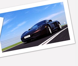
Diabolical - That's actually not the Volvo's stock white: it's Fiat's Bossa Nova White, as that was a purer white, and the car was originally going to be shot for the Snowy White competition theme, after I ran into the problem of the Evora's "Ice White" looking gray. I ended up sticking with the Evora anyways, though. The MP4-12C will be coming this week
Franz - Yep, like DM said, those gradients can really dampen enthusiasm when you're reviewing shots. But, you've worked your magic on countless shots before, I can't wait to see what you bring for us next 👍
Last edited:
- 1,805
- Adelaide
- Revolution52
Very cool! I'm thinking that a Magazine Cover photoshop comp theme is needed... soon.
Looks just like a bought one... and I'm intrigued by the idea of an 8C GTA.
The colour of that McLaren is fantastic too, I'm saddened by the fact that you can't get a paint chip of it.
Looks just like a bought one... and I'm intrigued by the idea of an 8C GTA.
The colour of that McLaren is fantastic too, I'm saddened by the fact that you can't get a paint chip of it.