CLOSED: POLL: CCCL Competition: Week 48 - WINNER: MusicalArtist

  • Thread starter Nato_777
  • 32 comments
  • 4,048 views

A Vent A Door

  • [url=http://www.flickr.com/photos/60616377@N02/6762961045/][img]http://farm8.staticflickr.com/7174/6

    Votes: 0 0.0%

  • Total voters
    118
  • Poll closed .
Status
Not open for further replies.

Nato_777

Moderately Super
Premium
8,187
New Zealand
Kaikoura, NZ
Nato777
CCCLW48Ban.jpg


Further explanation of the theme, as described by Boabdulrahman:

"I guess it's time for a car from the latest DLC to feature here. So, take your Aventador to the
Nurburgring and test this Bull!"


CAR: Lamborghini Aventador
LOCATION: Nurburgring (All versions/time/weather)


gtp_cccl_rules_02-2.jpg


Please, ensure you read and understand all requirements for this competition. Failure to follow
the rules may result in disqualification. If you have any questions, please, send me a Private Message.
This Thread has everything you need to know.

  • Be reminded that only the Judge's favourite 15 entries will get through to each poll.
  • Do not vote on your entry.
  • Do not try to sway the poll.
  • In the event of a tie, a 24 hour poll is created.
  • In the event of a second tie, Judge's vote is the deciding factor.
  • Please, view each image in it's full size, before voting.

 
Last edited:
Nice poll, However I have to ask if I can get some feedback since atleast one photo has some aweful jagged edges, one has some colour banding and one is just plain not focused right.

 
Nice poll, However I have to ask if I can get some feedback since atleast one photo has some aweful jagged edges, one has some colour banding and one is just plain not focused right.

http://i766.photobucket.com/albums/xx304/robbzy88/AV4Original.jpg
Honestly, I don't know.The only thing I don't like about your shot is that the yellow and red graffiti is distracting. I think you should have gone on to the poll.

Can I get some opinions or advice please? thank you
I think it's a bit too dark. I know what you were going for, but it could be a little lighter. I like this shot too though.

~Turtle
turtle.gif
 
Honestly, I don't know.The only thing I don't like about your shot is that the yellow and red graffiti is distracting. I think you should have gone on to the poll.


I think it's a bit too dark. I know what you were going for, but it could be a little lighter. I like this shot too though.

~Turtle
turtle.gif

Thanks mate 👍 I thought the graffiti complimented the car colour quite well always nice to get an honest opinion from someone as to what works and what doesn't.
 
This is my first time joining a photomode competition. Hope I can get some feedbacks on mine, so I can improve for the future entries :D

Untitled by DerekWong1019, on Flickr
 
Last edited:
Nice poll, However I have to ask if I can get some feedback since atleast one photo has some aweful jagged edges, one has some colour banding and one is just plain not focused right.


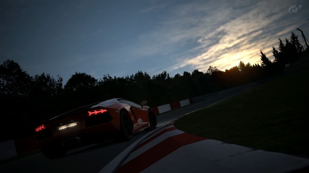
It was the last pic to not make the cut. I really liked the angle, and how the road is layed out. However, there is this soft feeling that I get from almost all of your edited pics. It is somehow annoying. The lighting wasn't the best. If you look at the car the lighting should be from the front of the car to the side. But, here it's only on the side so that really affected the whole shot. Other than that, the shot is great :)

6826929913_1c151f6323.jpg


Can I get some opinions or advice please? thank you

This is a 2.0 week, and your pic looks that it was untouched. However, the composition is good but the whole idea of the pic is somehow overused in these comps. Also, what bothered me here was the pixelated clouds which is not your fault. But, you could've avoided it by lowering the aperture so that the background becomes softer. Don't be afraid to edit your picture. Try one of the free programs provided like Paint.net and other great programs :)

This is my first time joining a photomode competition. Hope I can get some feedbacks on mine, so I can improve for the future entries :D

Untitled by DerekWong1019, on Flickr

Well, your shot is in the poll and I don't think you need any. You're on the right track. Looking forward for your future entries :)


Feedback ?

Well, it's overexposed. Try to lower the exposure next time. The angle here is not the best and it makes the car look wierd here. So, try to back up a bit with a more interesting angle and a lowered aperture for a good soft background so the focus becomes on the subject which is the car . Again, this is a 2.0 week. So, editing pics is a must.

feed my back?

Ok the angle here is good but the lighting....not the best. also, the car is a bit un-focused. what I would do is give the shot a bit motion, focus on the car, and lower the aperture. also, to get more lighting on the car, go to the other side of the car so that the lighting source (which here is the sun) becomes behind you. And again, this is a 2.0 week so editing is welcomed :)
 
I feel sad for the guy who recieved 0 votes. I found his photo quite interesting. I would've rather it be horizontally flat instead of horizatally angled, because the way the speed blurs the photo is quite incredible.
Also, it is a good use of basically what is an analogous color scheme.
 
I don't get why Gtuned has so few votes. It's the pic with the most "testy" atmosphere in it, since the theme was to test drive the lambo on the nurb. Also it's very realistic, with amazing lighting and toning. The only tiny downside is the sig IMO, but tastes differ ofcourse. :)
 
Pumped on making the poll with my last minute shot didn't expect to, though i have no votes haha. Pan mode 1 is an acquired taste..
 
Pumped on making the poll with my last minute shot didn't expect to, though i have no votes haha. Pan mode 1 is an acquired taste..

I liked it quite a bit, but, there were a few things that ruined it for me.
If the horizon line was parallel with the top and bottom borders of the photo, I think it would've looked a bit better. The car would then have to be centered possibly.
It actually, basically, used a real color scheme. An analogous color scheme is made of mainly colors that are next to each other on a color wheel. I think this is a really good example of that.
 
Status
Not open for further replies.
Back