2024 Formula 1 Constructors threadFormula 1 

  • Thread starter Jimlaad43
  • 793 comments
  • 82,046 views
Here's the official Tweet...


948d73fd-1d9a-4294-a6dc-a982ff6629e3.jpg
 
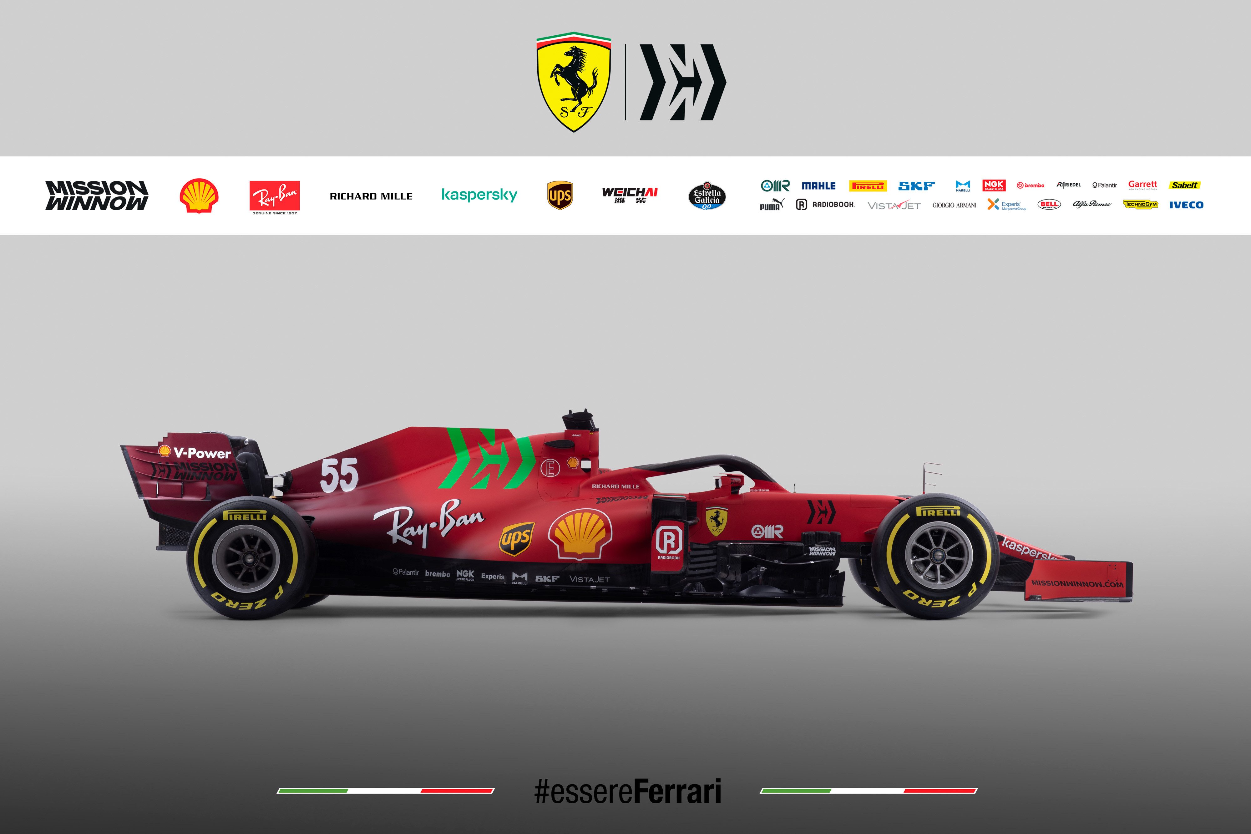
I’m noticing a suspiciously low amount of rich energy branding and a suspiciously high amount of festive spirit.
 
I’m noticing a suspiciously low amount of rich energy branding and a suspiciously high amount of festive spirit.

Storey is so busy ranting about masks and lockdowns he probably forgot he was supposed to announce his new F1 scam.
 
Ferrari has the easiest job on the grid when it comes to liveries. Just paint it red and add a few black sponsors. But like with most things, they Ferrari'd it and couldn't do that right.

This looks like one of those low-effort liveries you find in Forza or GTSport with stickers plastered everywhere with no rhyme or reason. It's in the running for worst livery of the year.
 
I can't find anything on Mission Winnow's website that would explain why their logo is suddenly radioactive, and environmentally-promoted stuff isn't usually that eye searing of a shade of green either. Only thing I can think of is it's an attempt at "guys we SWEAR it's not really low-key tobacco advertising, look it's not even the right color okay?"
 
I can't find anything on Mission Winnow's website that would explain why their logo is suddenly radioactive, and environmentally-promoted stuff isn't usually that eye searing of a shade of green either. Only thing I can think of is it's an attempt at "guys we SWEAR it's not really low-key tobacco advertising, look it's not even the right color okay?"
Maybe they're moving to weed? :lol:
 
Well, it's nice to see Ferrari do something (slightly) different. Too bad it's not the good kind of different. I think this season it'll be a good thing that Sainz doesn't get shown on TV...

Hopefully in countries where tobacco sponsorship is banned they do like they usually do and simply remove the MW logo, and not replace it with some other kind of green blob.
 
:lol:

What are they thinking with that giant green logo? Not a fan of the two tone red either, that must be the same red we seen from their special livery last year.

it would look better with black wings as well.

58y0jcdfo8m61.png
 
Last edited:
What are they thinking with that giant green logo? :lol:

According to Philip Morris (MW), green is symbolic of new possibilities, opportunity and horizons. Their tweet also directly alludes to the green screen technique, which allows one to replace what exists with something more exciting.

Current drivers take note.
 
Last edited:
Here's the official Tweet...


948d73fd-1d9a-4294-a6dc-a982ff6629e3.jpg

I don't understand... The sponsor was happy enough to use a grayscale version of their logo in the promotional material, and even weirder, in a different place on the same car at the same viewing angle, yet for some reason it was deemed necessary to put a slime-green version as the biggest logo on the car. The bright red car. So it doesn't seem like it was pressure from the sponsor to use a specific colour to comply with their brand guidelines. In fact, looking at the Mission Winnow website, they never use the MW logo in that green, it seems to always be either black or white. They do however use green throughout the website, but it doesn't even seem to be the same green. So basically, it really genuinely looks like someone in the design room made it green by their own free will, and no-one in the entire company did anything to stop him.

Baffled. Absolutely hideous Ferrari. :lol:
 
I think they should have made the darker red more prominent, and have it fade to the normal red further towards the middle of the car, rather than all the way at the back.
 
I actually don't mind the green MW decal, but I definitely mind that really abrupt transition from red to dark red. As a few others have pointed out, it just looks like there was an engine fire and they didn't bother re-painting it.
 
Well I guess it did get people talking a lot about the logo for that brand that I don’t know what it is. 💡
 
Well I guess it did get people talking a lot about the logo for that brand that I don’t know what it is. 💡
Which was probably the entire point, since the logo won’t even be on the car for the vast majority of races. That said, even without the bright green logo, it’s still not exactly a good looking livery.

Ferrari probably have the easiest job on the grid when it comes to designing a livery for their cars but they still manage to get it wrong more often than not.
 
Last edited:
According to Philip Morris (MW), green is symbolic of new possibilities, opportunity and horizons. Their tweet also directly alludes to the green screen technique, which allows one to replace what exists with something more exciting.

Current drivers take note.

When the hell did Phillip Morris hire Gwyneth Paltrow?
 
The reason for it being green seems to be working very well. It's all most people are talking about on the Ferrari.
 
Perhaps PM wants to "winnow" tobacco users by getting them onto marijuana?
 
Ah, right. It's a Greenscreen so when the car drives past FlyEmirates branding on track the top of the Ferrari temporarily looks like the proper Marlboro logo.
 
Back