- 341
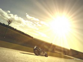
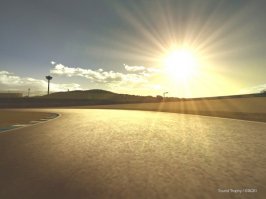
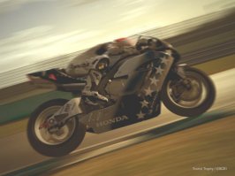
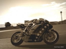
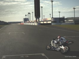
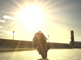
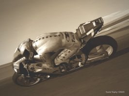
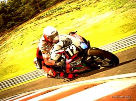
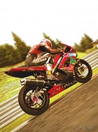
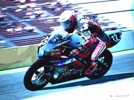
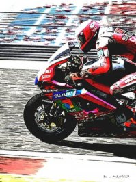
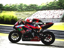
Here's my TT photo gallery. I hope you'd like it)))
Part 1. "Motegi: 8 hours of freedom"
Part 1. "Motegi: 8 hours of freedom"
Attachments
-
 1.jpg44.9 KB · Views: 20
 -
 2.jpg58.1 KB · Views: 18
 -
 3.jpg17.9 KB · Views: 12
 -
 4.jpg40.2 KB · Views: 13
 -
 5.jpg58.2 KB · Views: 18
 -
 10.jpg40.7 KB · Views: 14
 -
 9.jpg42.1 KB · Views: 14
 -
 8.jpg48.6 KB · Views: 21
 -
 7.jpg38.8 KB · Views: 15
 -
 6.jpg27.7 KB · Views: 14
 -
 15.jpg36.5 KB · Views: 15
 -
 14.jpg44.4 KB · Views: 18
 -
 13.jpg33.6 KB · Views: 12
 -
 12.jpg31.8 KB · Views: 15
 -
 11.jpg35.7 KB · Views: 14
 -
 16.jpg34 KB · Views: 16
 -
 17.jpg18.5 KB · Views: 15
 -
 18.jpg38.7 KB · Views: 15
 -
 19.jpg36.7 KB · Views: 12
 -
 24.jpg29.4 KB · Views: 16
 -
 23.jpg35.8 KB · Views: 14
 -
 22.jpg24.6 KB · Views: 13
 -
 21.jpg30.2 KB · Views: 16


")
