- 12,825
Ongoing PSC: REMEDIAL LOGO MAKING
This is an exercise in logo making and composition.
All logos will be primary text logos.
This is how we play:
I will provide you with random words for you to make logos with, I'll implement a bi- or tri-monthly voting system to decide seasonal and annual winners.
Try to keep all submissions under 400px by 400px.
EXAMPLE:
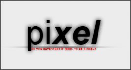
The word is Pixel.
The logo can be

5/20/2004, the word is Pixel.
5/21/2004, the word is Sventibold.
5/23/2004, Nova Zembla.
5/24/2004, new word is Blue Fois.
New word is Supernova.
This is an exercise in logo making and composition.
All logos will be primary text logos.
This is how we play:
I will provide you with random words for you to make logos with, I'll implement a bi- or tri-monthly voting system to decide seasonal and annual winners.
Try to keep all submissions under 400px by 400px.
EXAMPLE:
The word is Pixel.
The logo can be
5/20/2004, the word is Pixel.
5/21/2004, the word is Sventibold.
5/23/2004, Nova Zembla.
5/24/2004, new word is Blue Fois.
New word is Supernova.


")


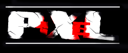
 Maybe its size doesn't help. A little better like this? Perhaps the background is drawing too much attention.