Cytoria
Premium
- 2,615

- France
- Cytoria
THIS FORTNIGHT'S THEMEThis week, you’ll have to pay a tribute to Polyphony’s imagination. Last winner @VulcanSpirit set this theme, let's hear what he has to say :
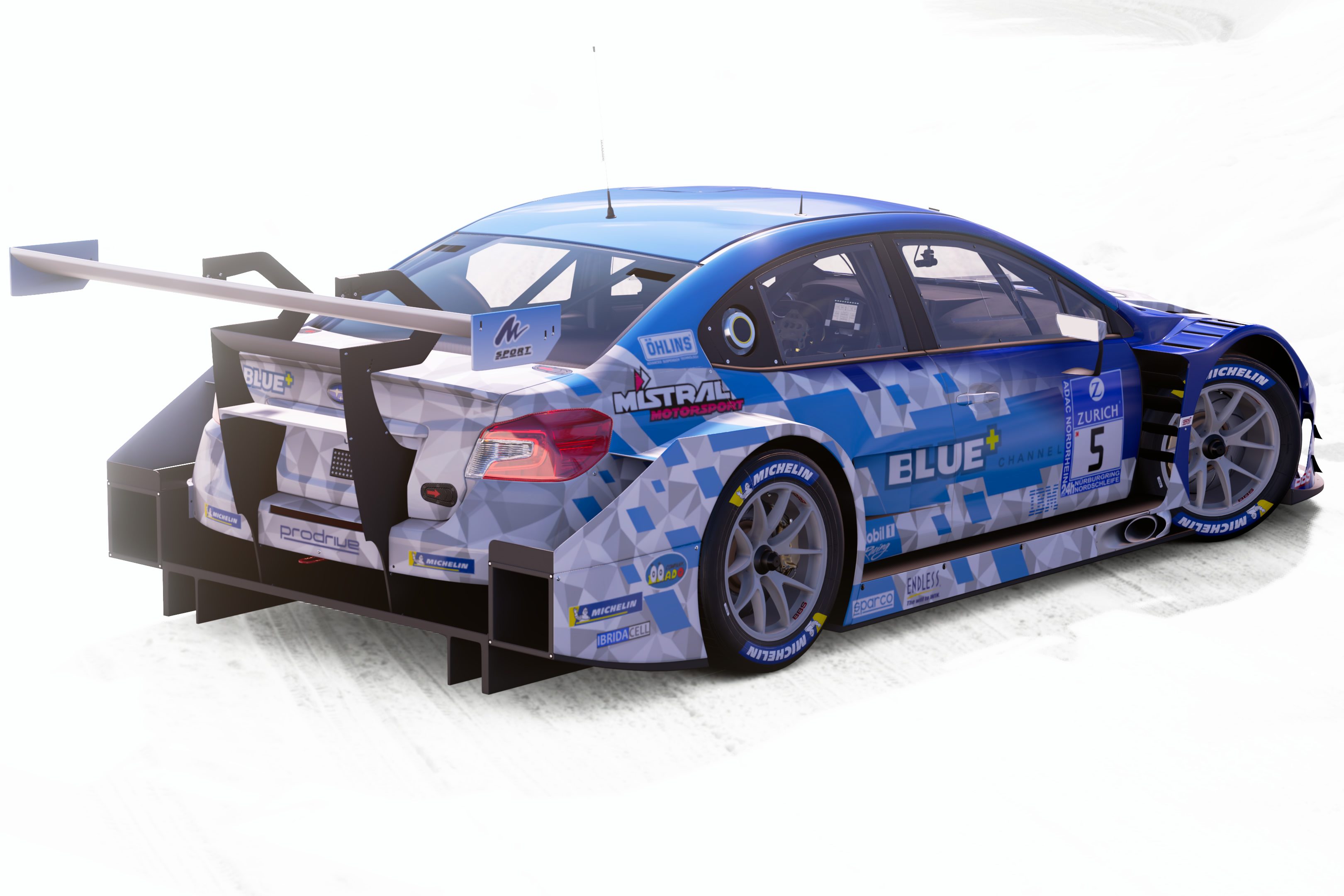
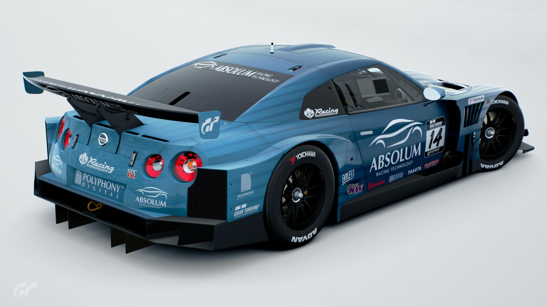
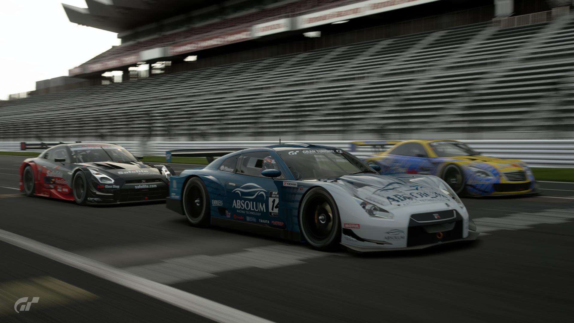
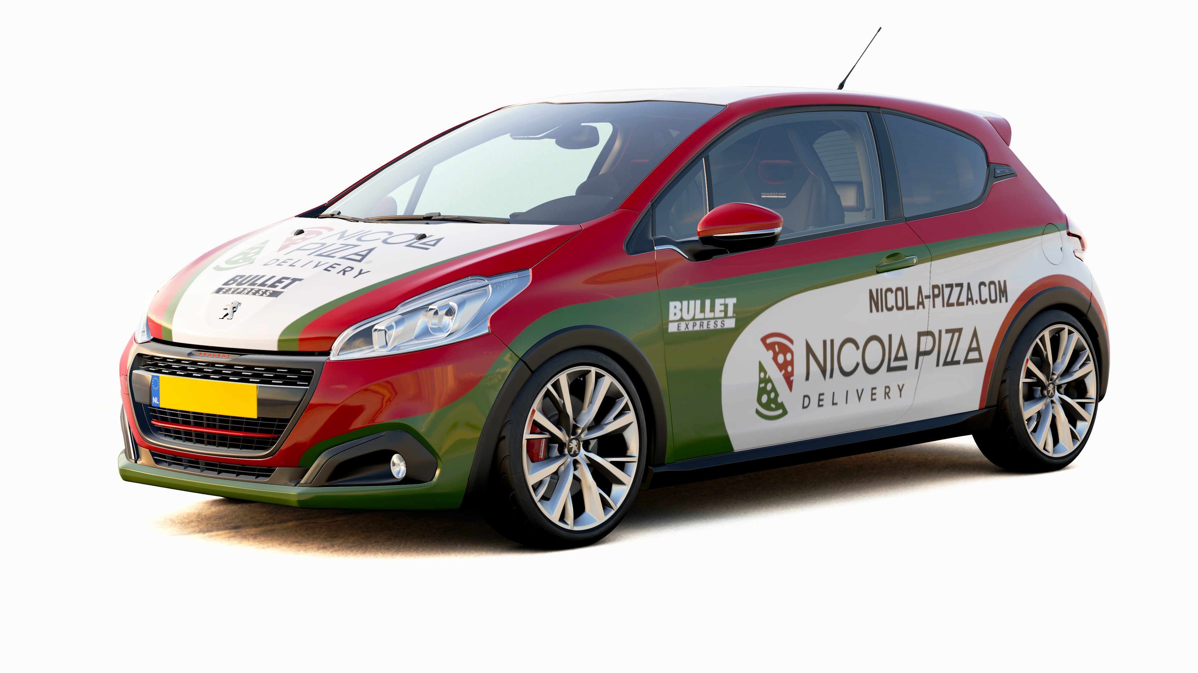
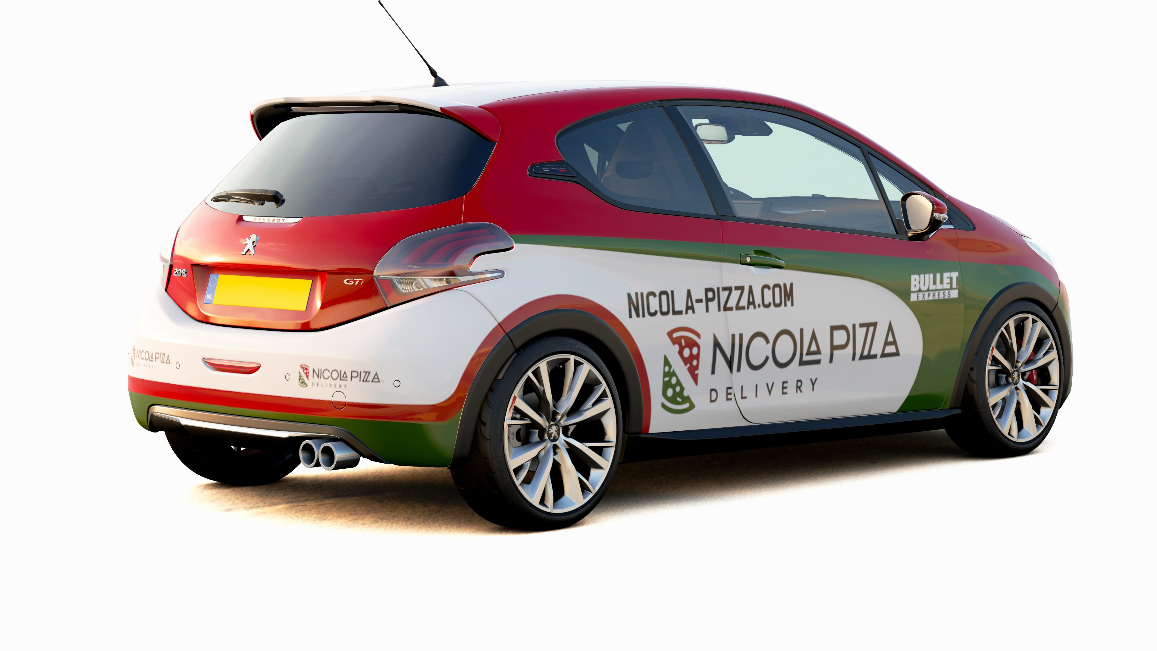
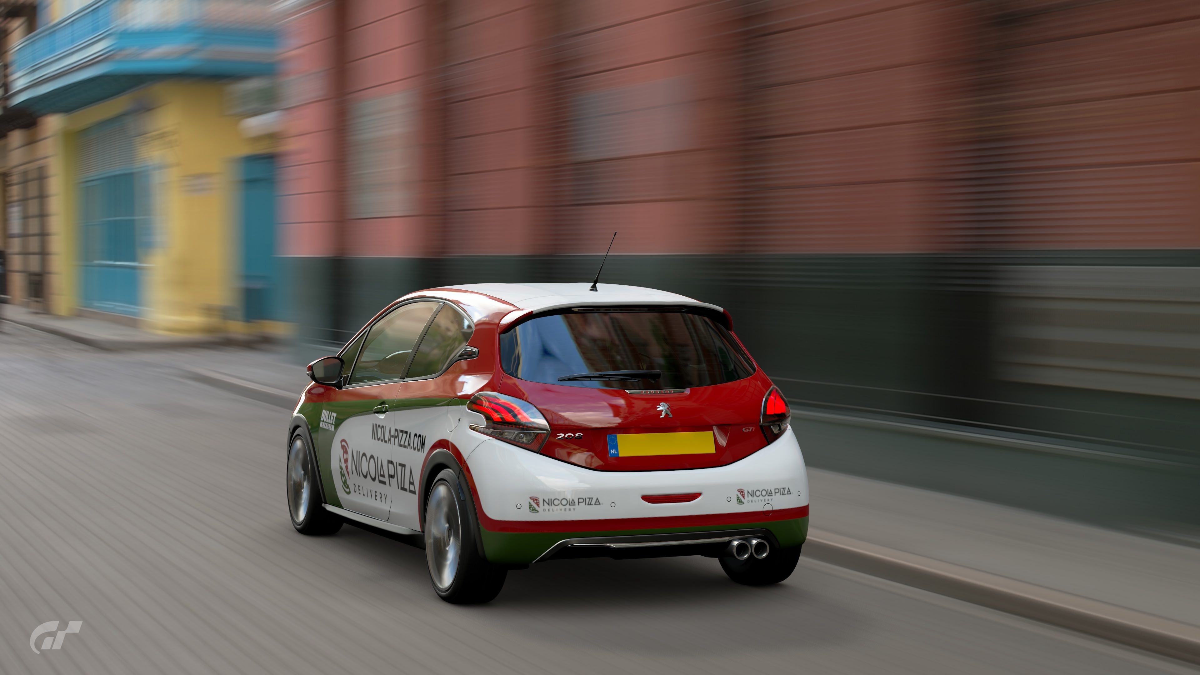
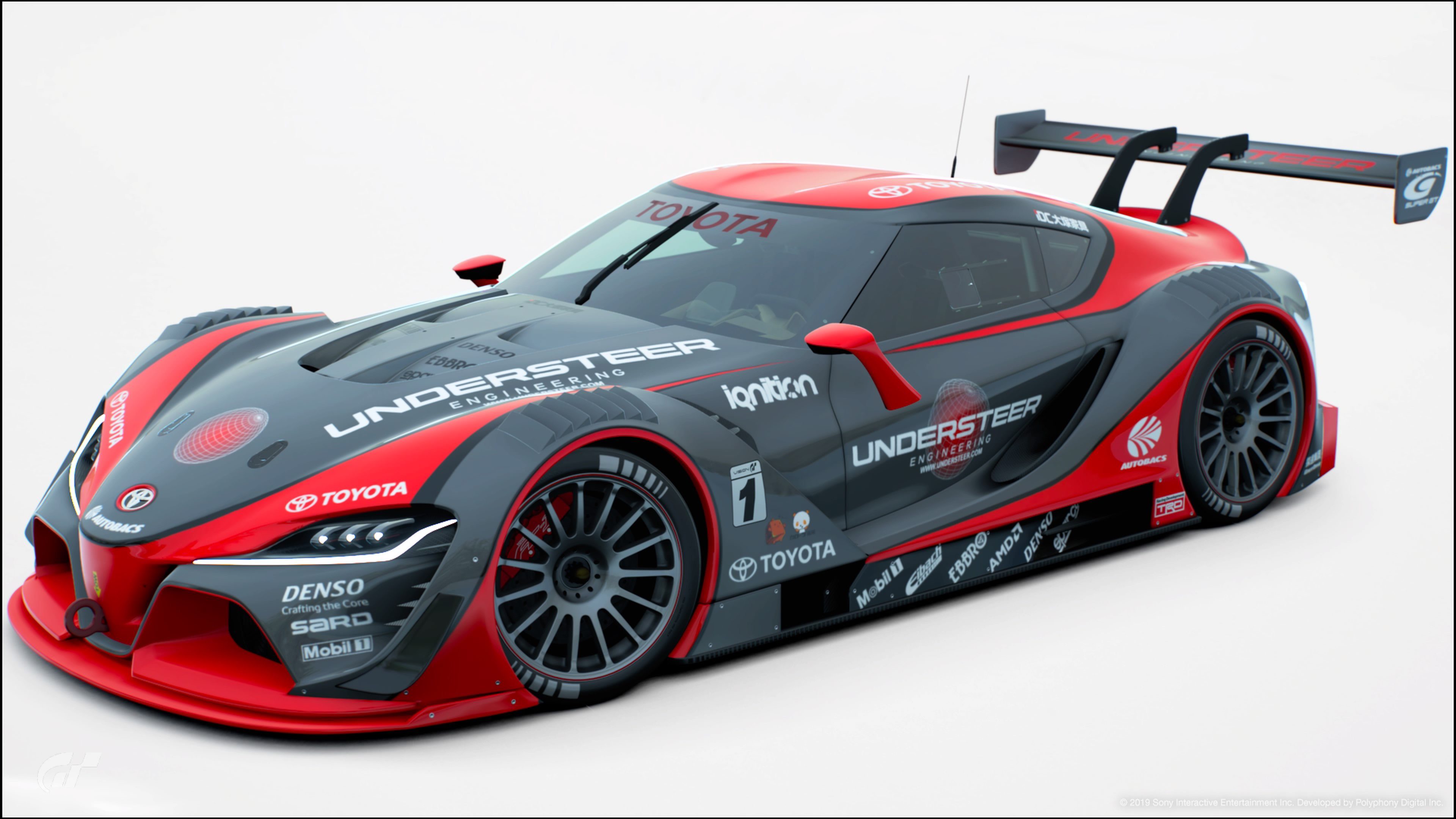
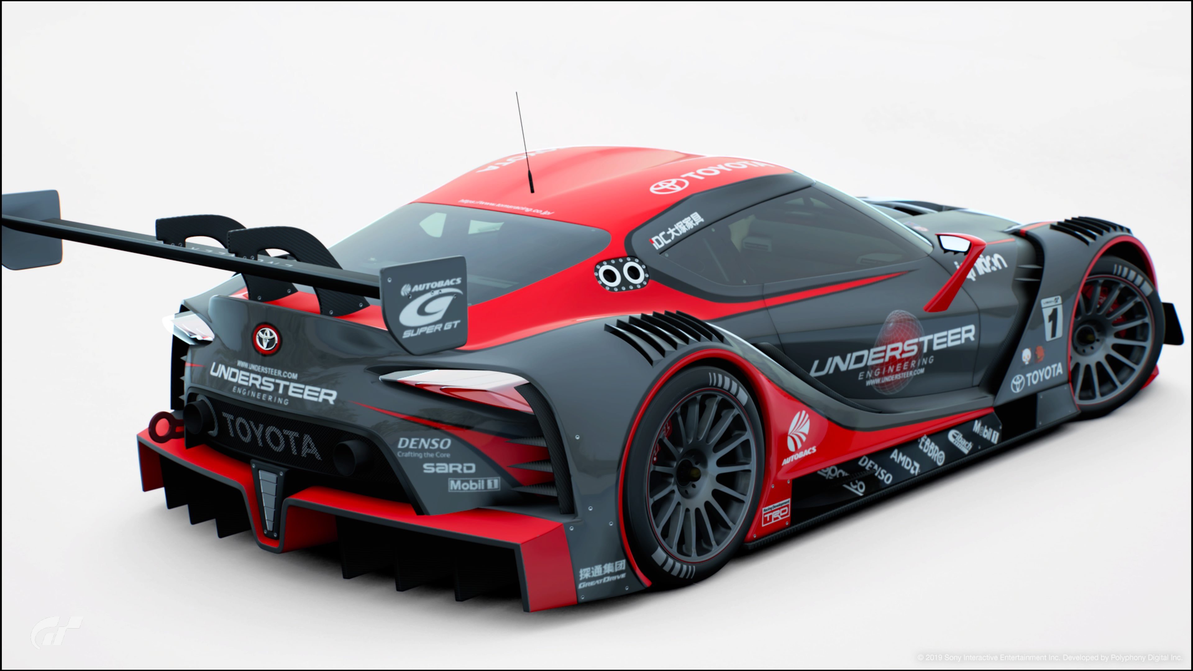
Anyone who has played GT Sport might have noticed that it has its own share of unique imaginary brands. When was the last time you ordered from Nicola Pizza Delivery, or booked a stay at Hotel Bellevue? Perhaps you might have heard of Mistral Motorsport, a fairly new but fast-growing racing team…
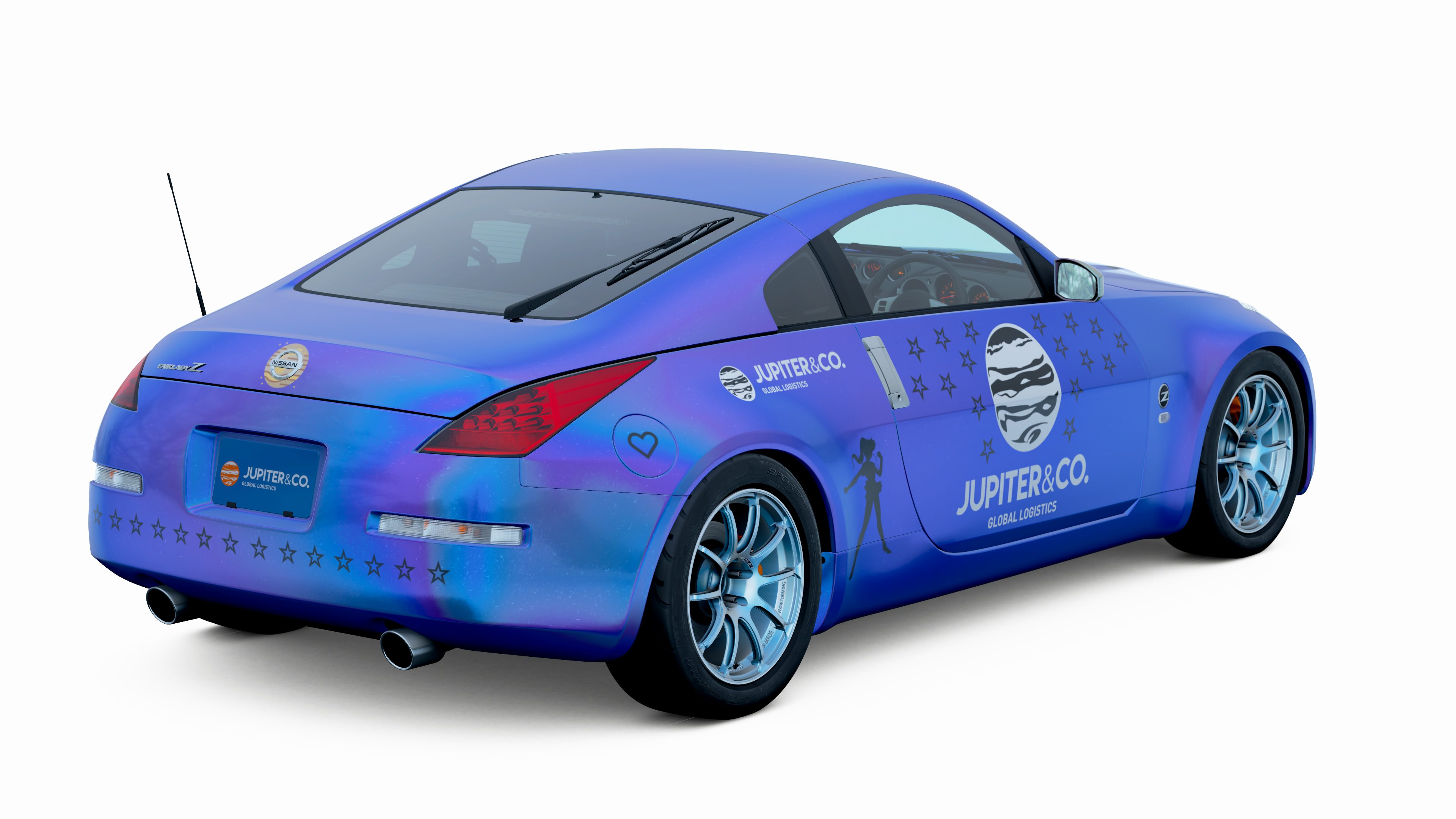
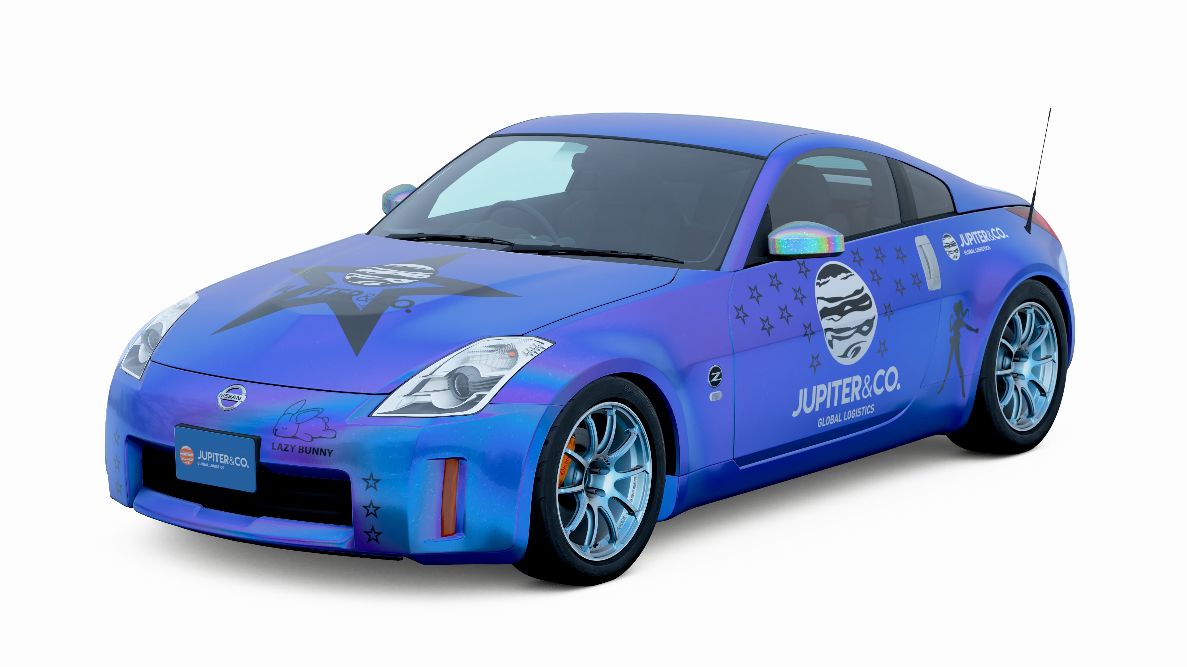
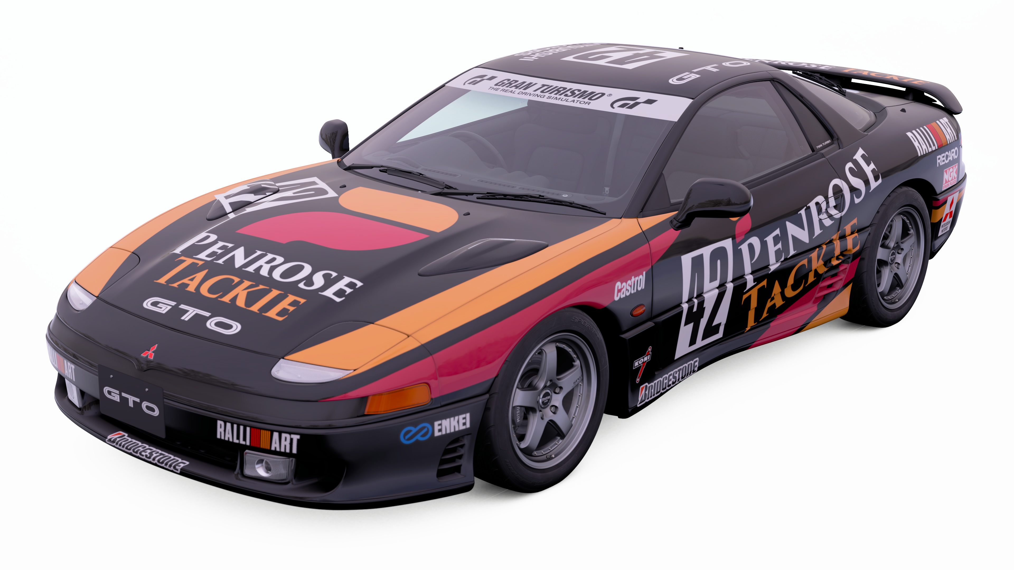
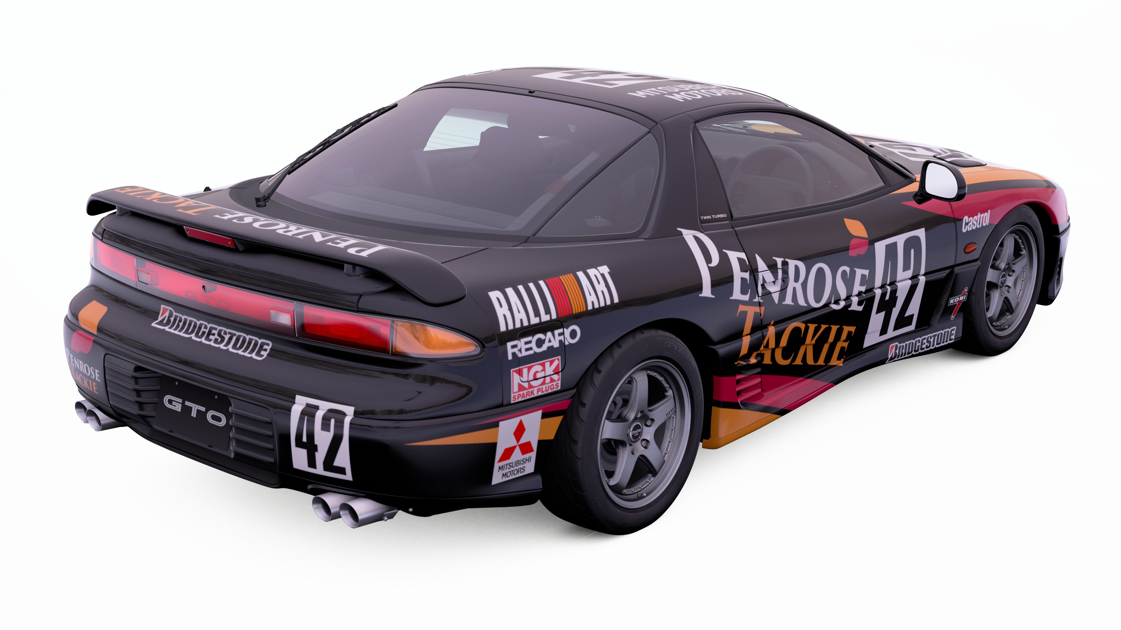
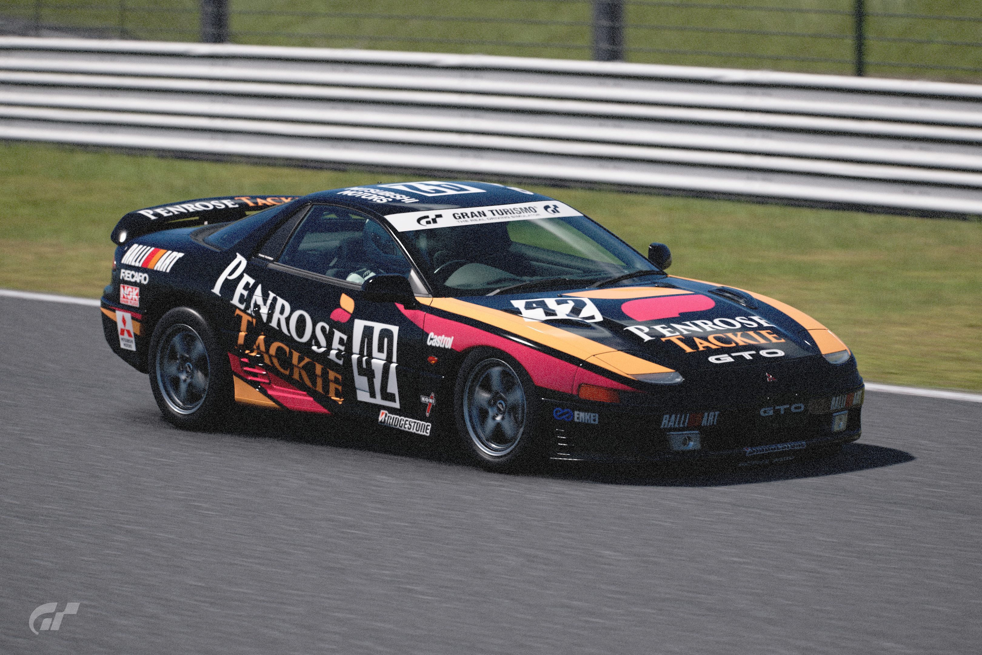
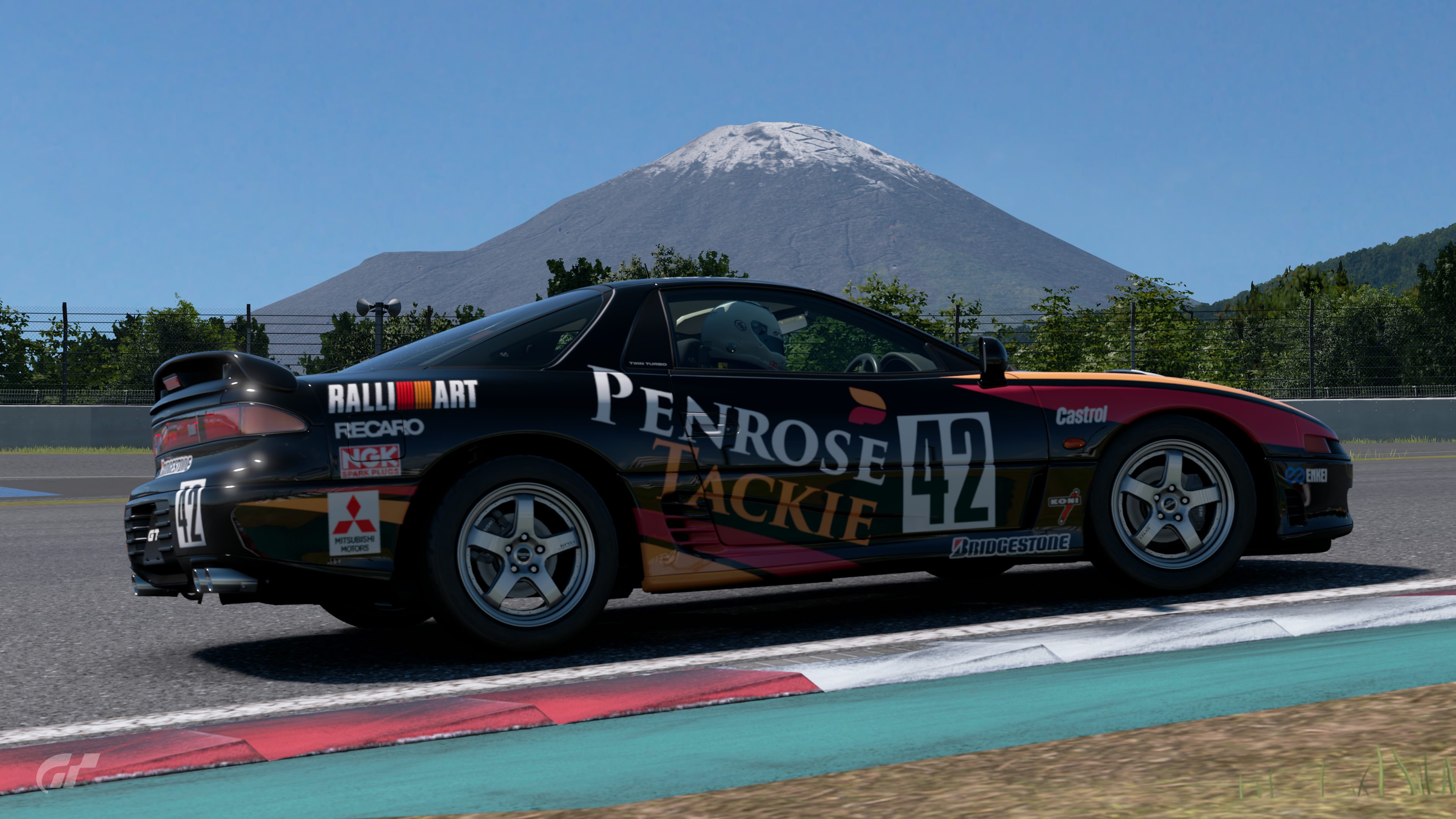
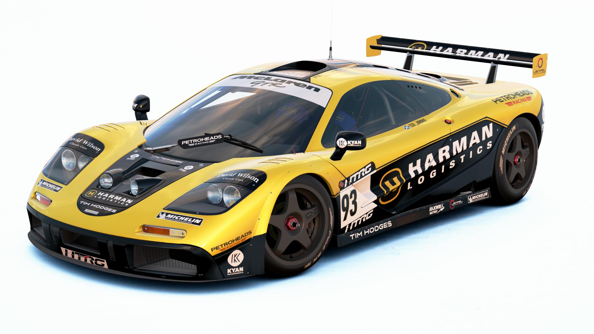
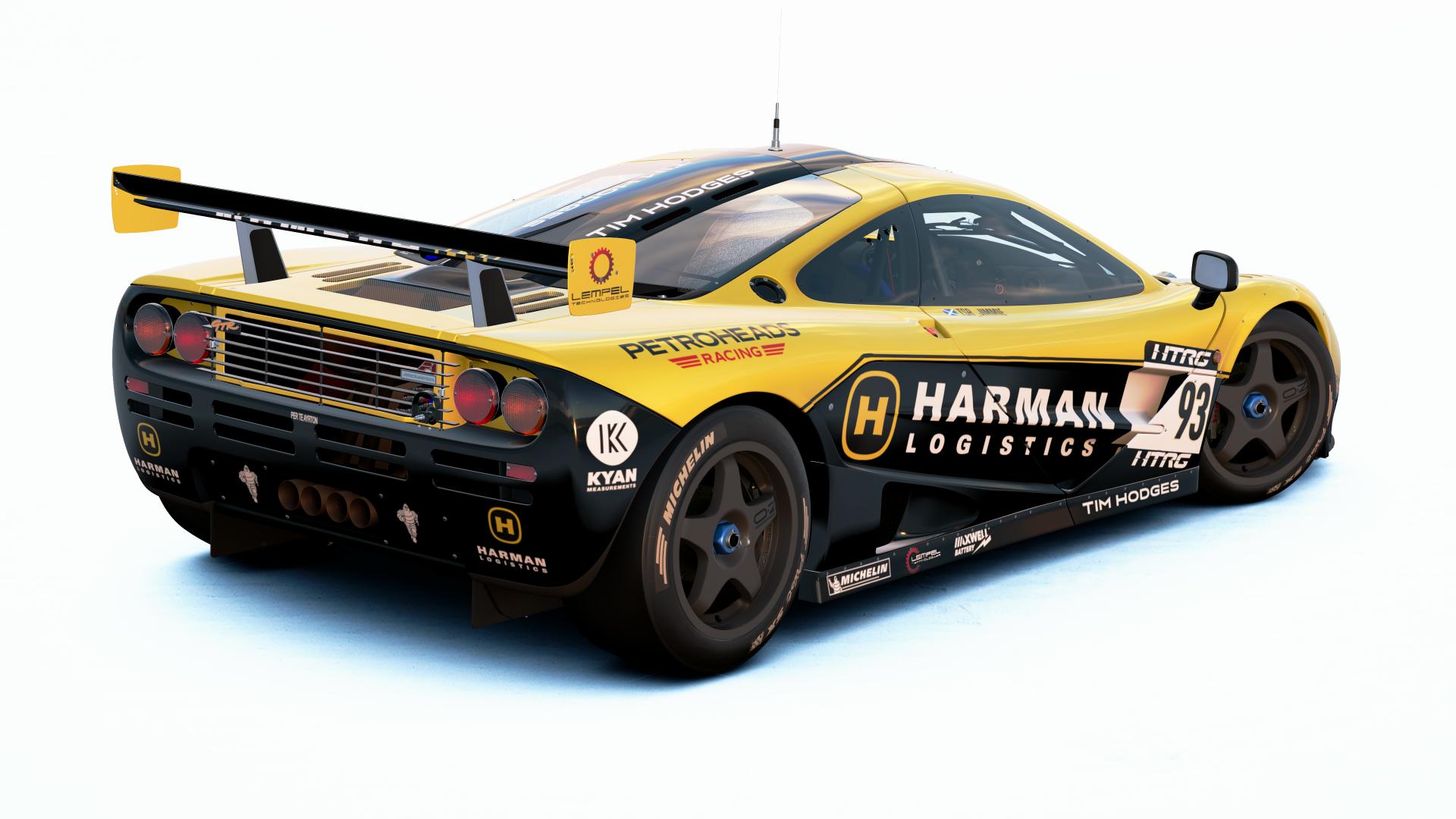
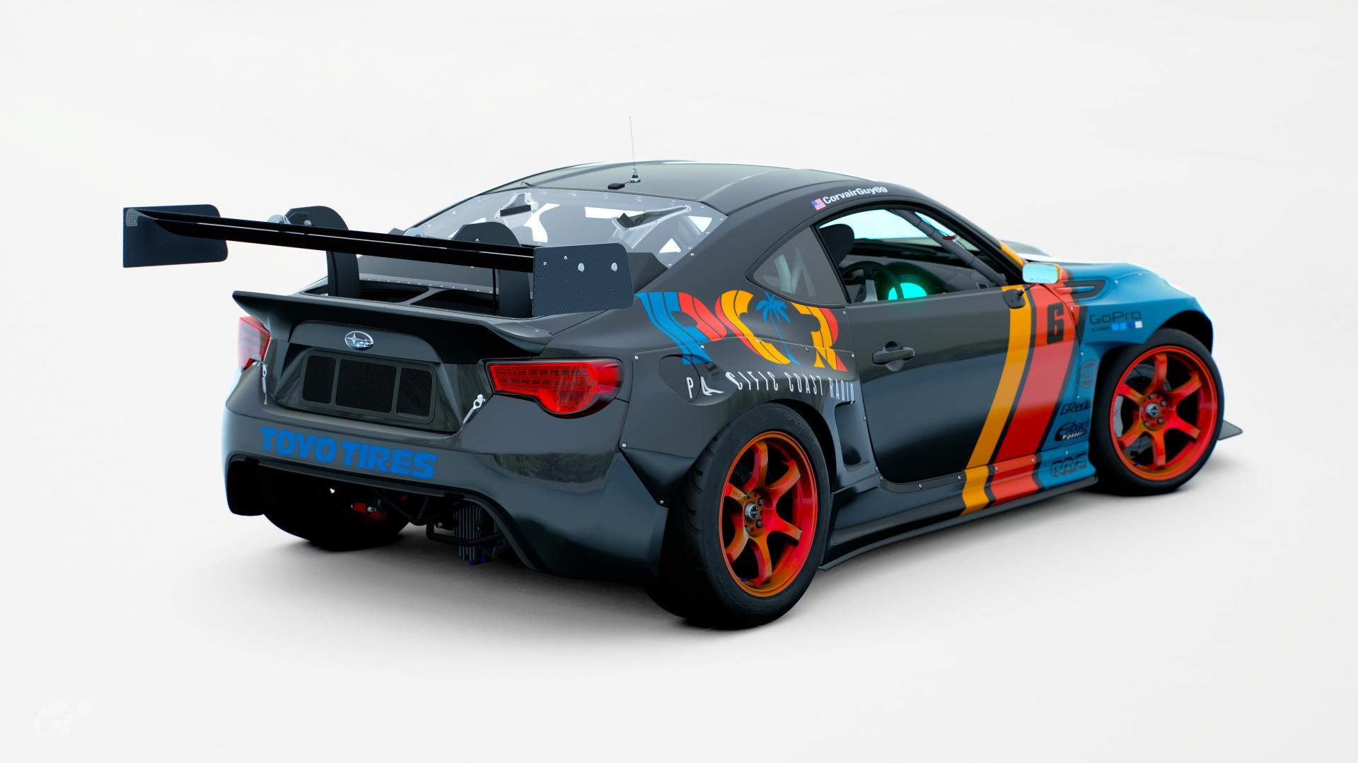
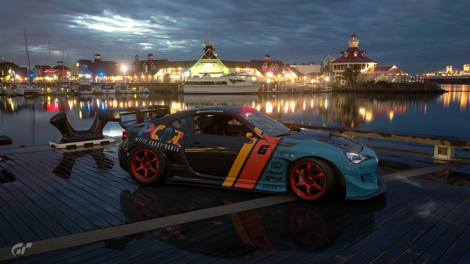
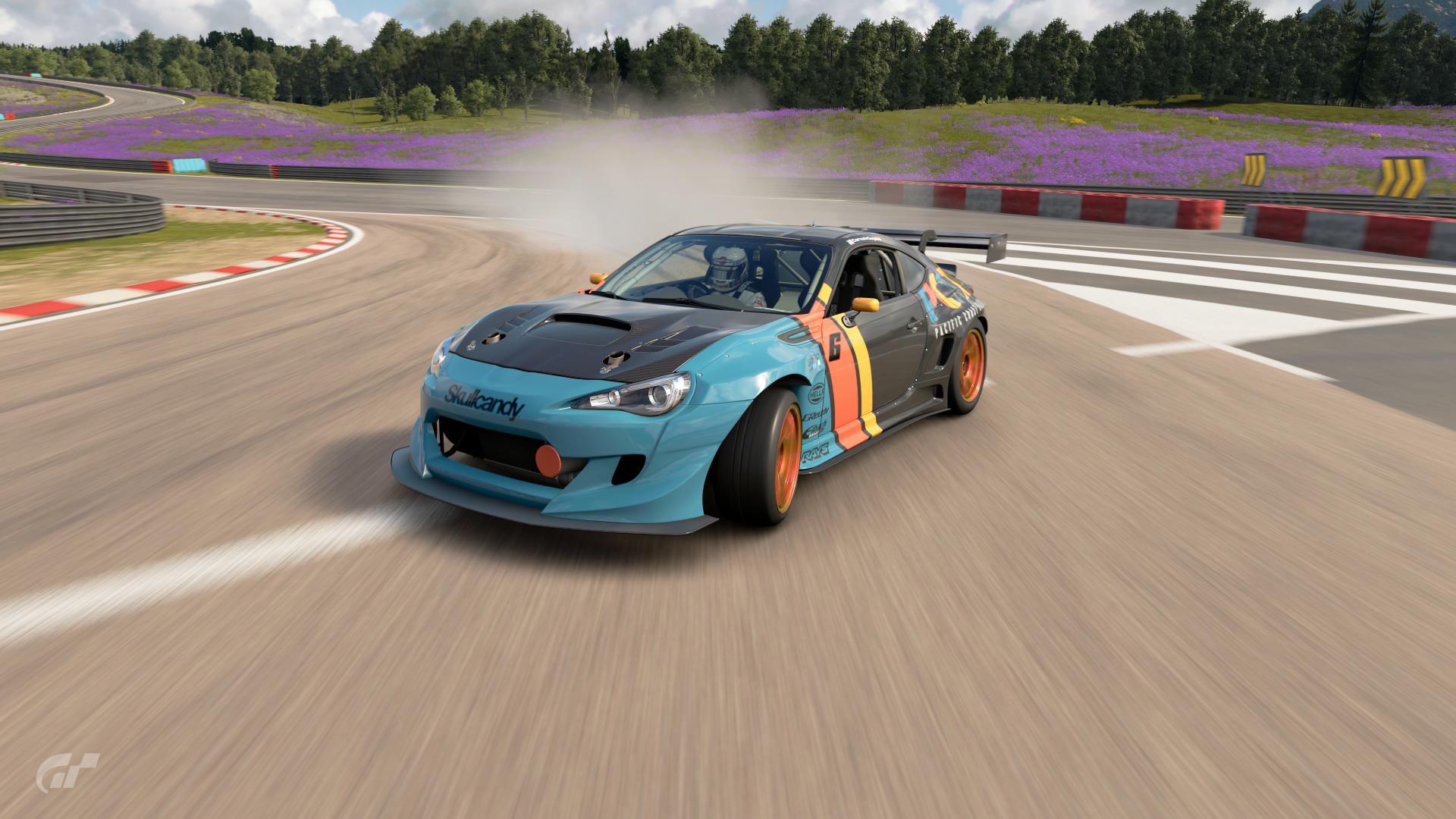
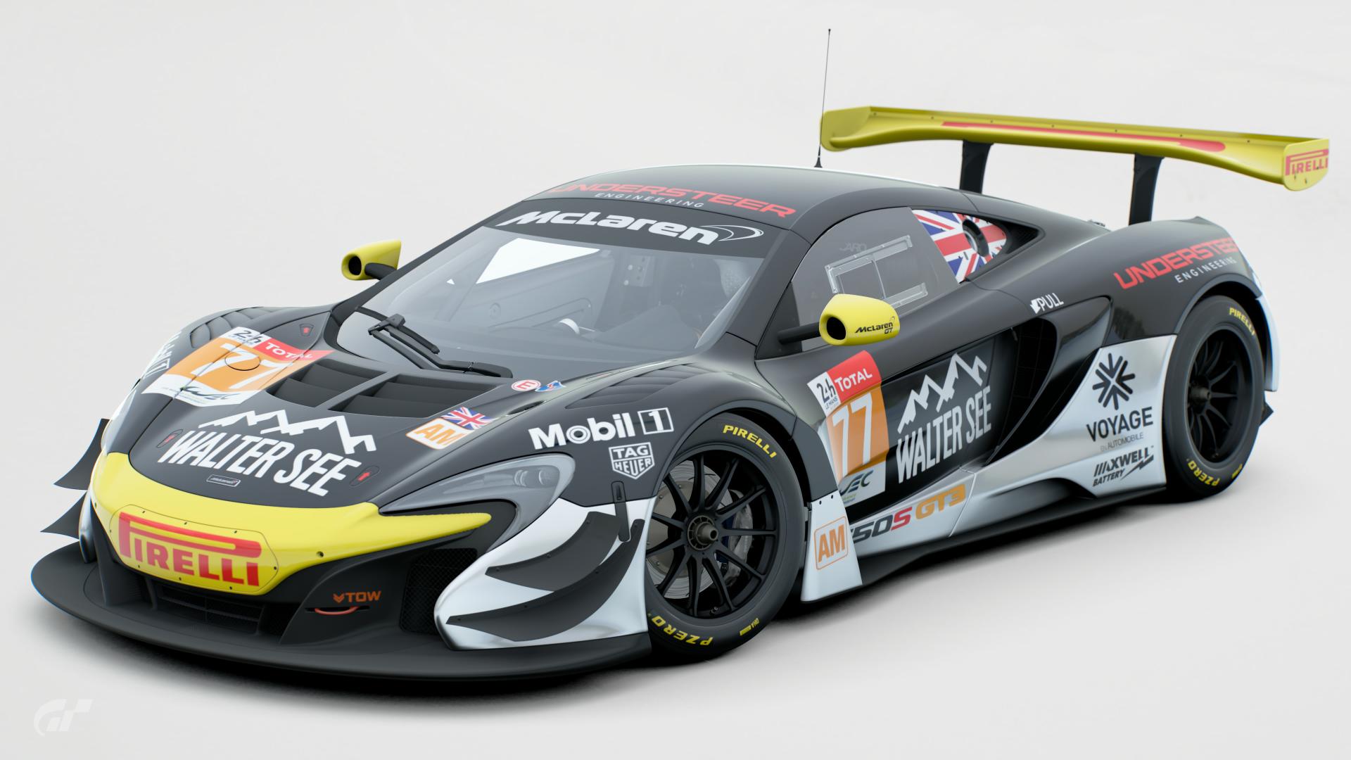
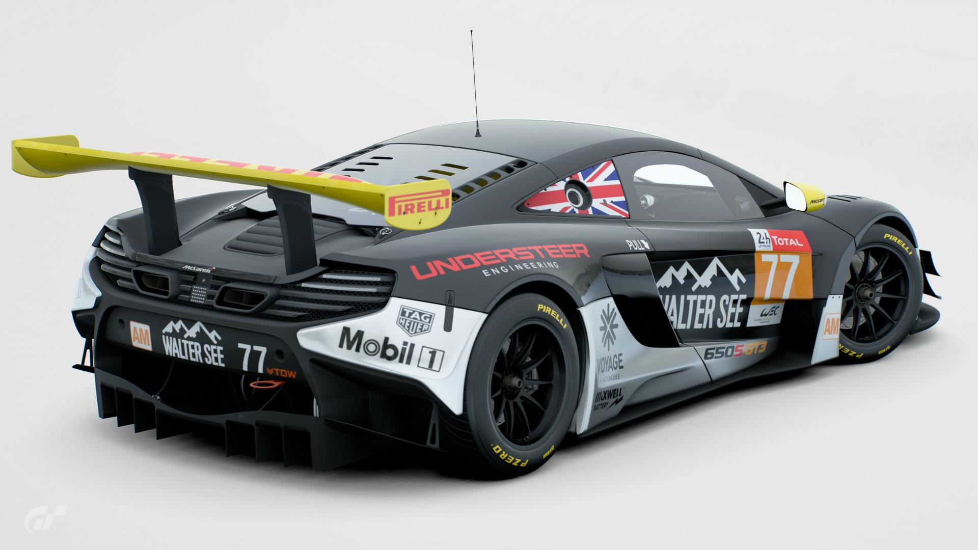
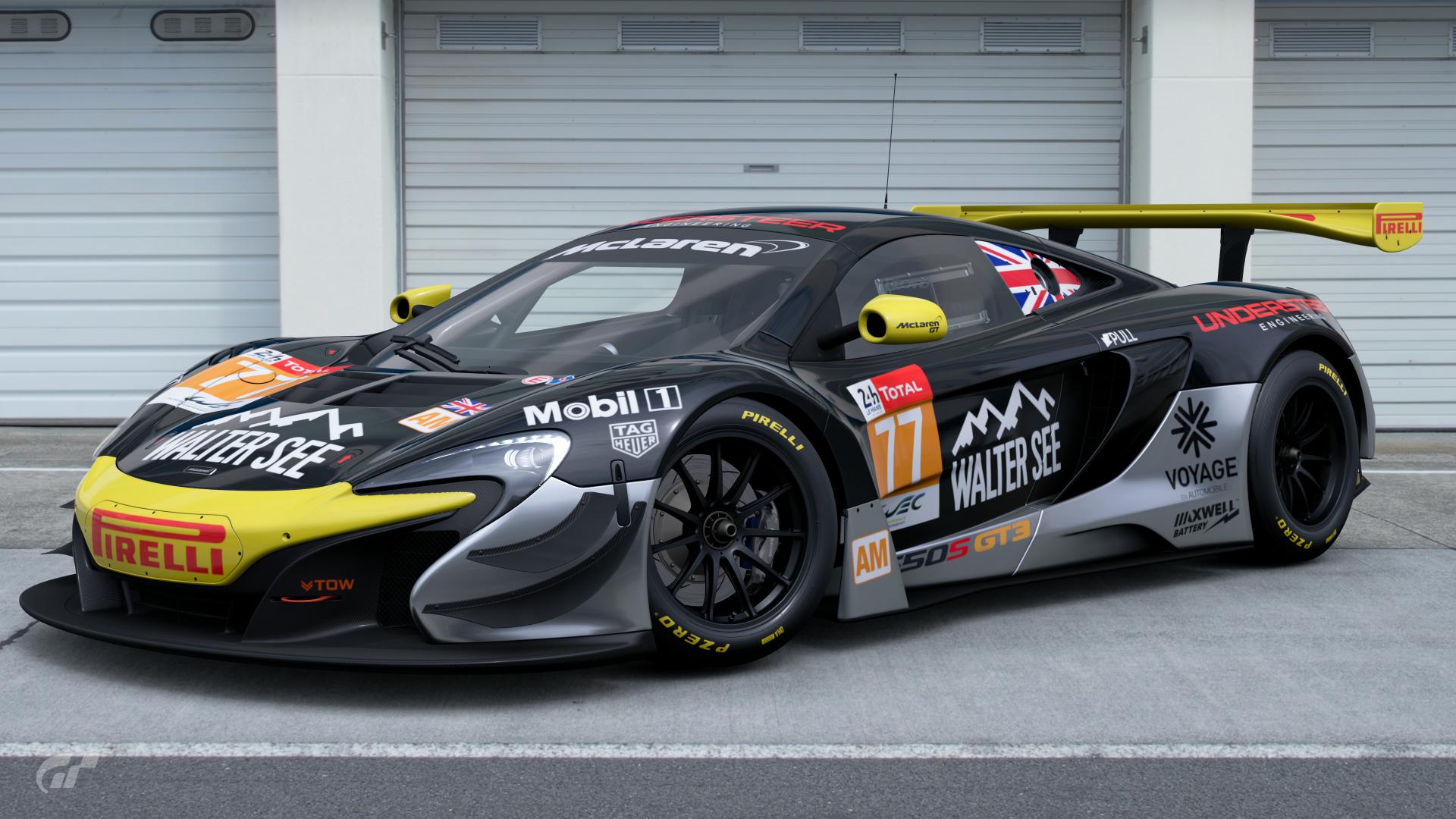
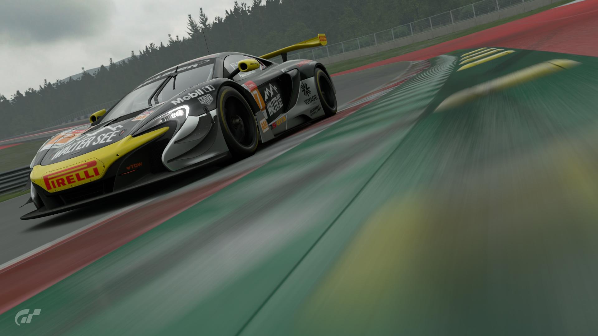
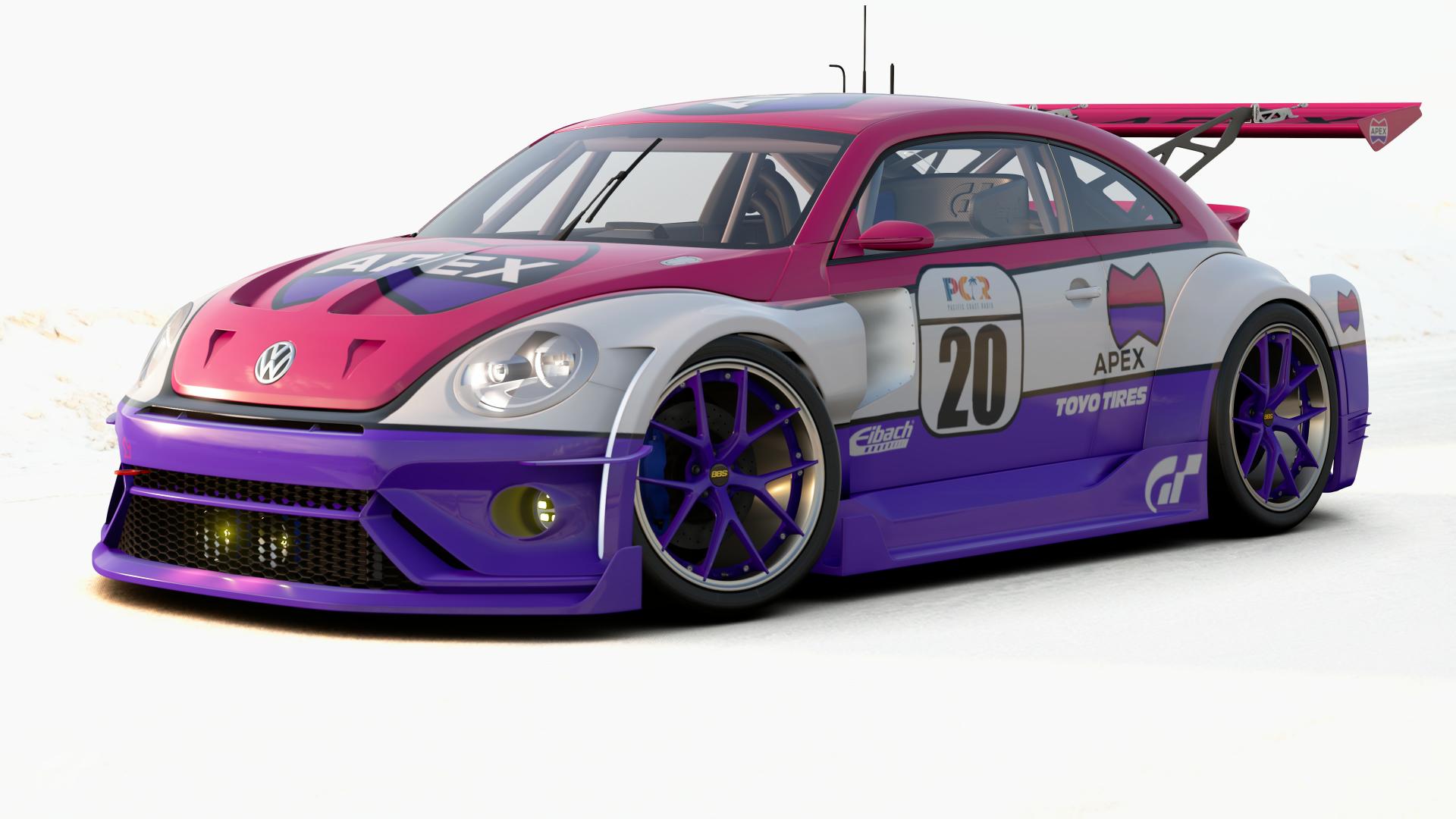
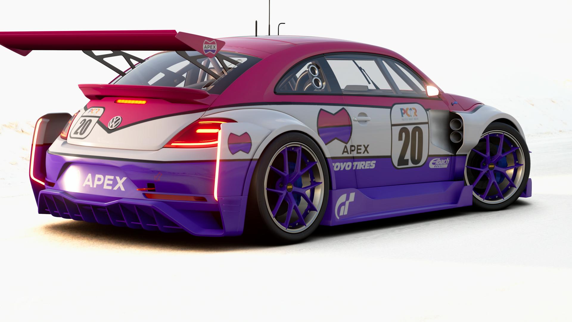
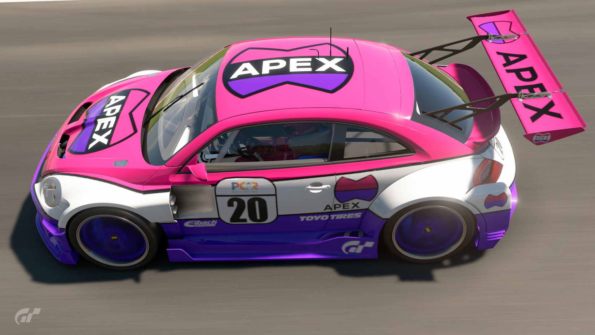
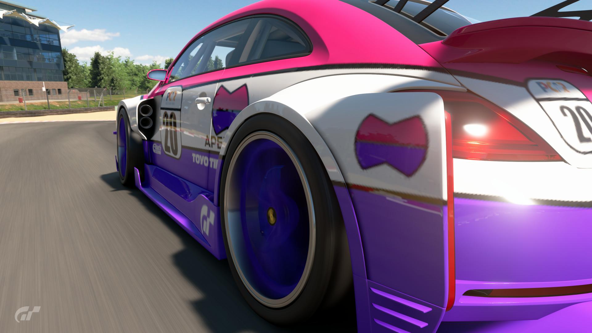
Your task is to create a custom livery based on one of the game’s fictional brands, found in the Fantasy Logos section of My Library. The brand you choose must be the primary sponsor, although other secondary or tertiary sponsors (including appropriate manufacturers) can be used as required.
Feel free to choose any paintable car you like. Anything from racing liveries to promotional wraps, or even something like a delivery vehicle or hire car, is welcome.
Good luck, and get creating!
CARS :
- No restrictions.
LIVERIES :
- As long as it’s safe for work, anything goes.
UNIQUE RESTRICTIONS :
- The Fantasy Logo/brand must be the “primary” sponsor.
- Secondary and tertiary sponsors (including manufacturers) allowed where appropriate.
- For racing liveries, Sport Mode compatibility is recommended, but not compulsory.
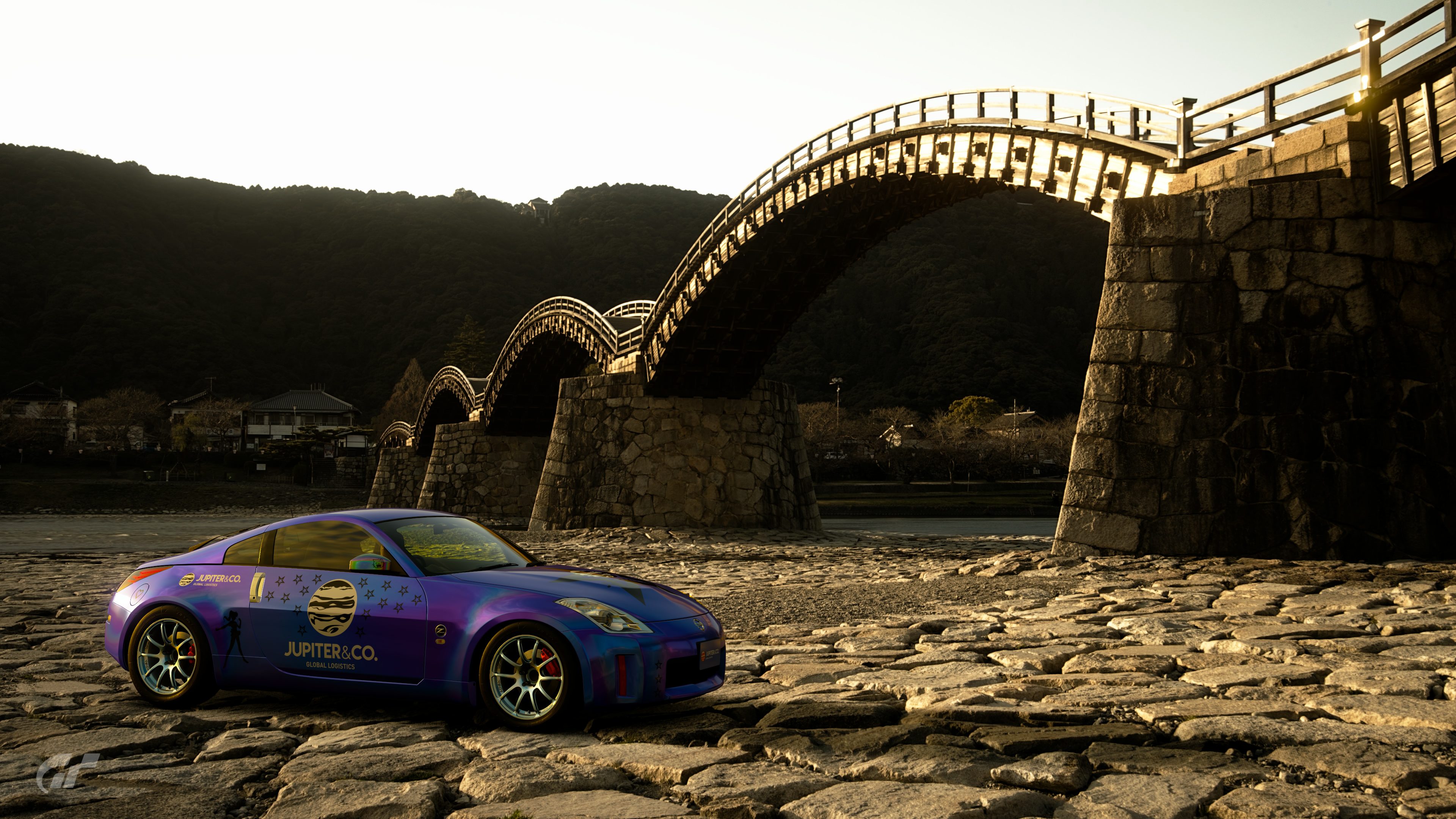
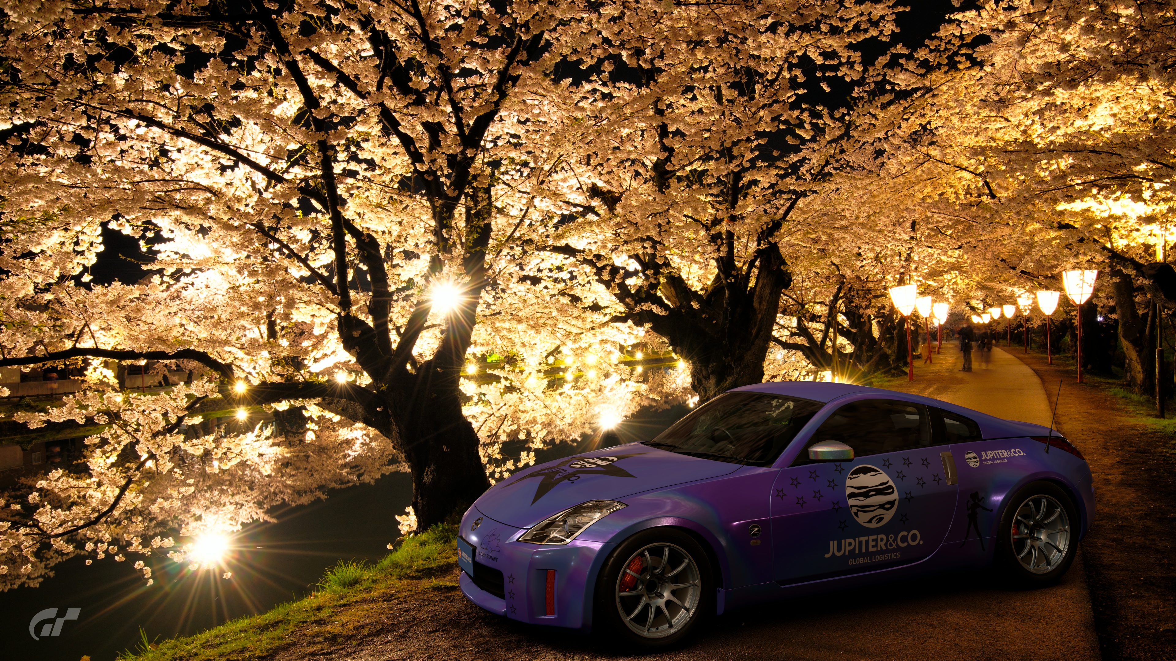
BONUS PICTURES SETTINGS :
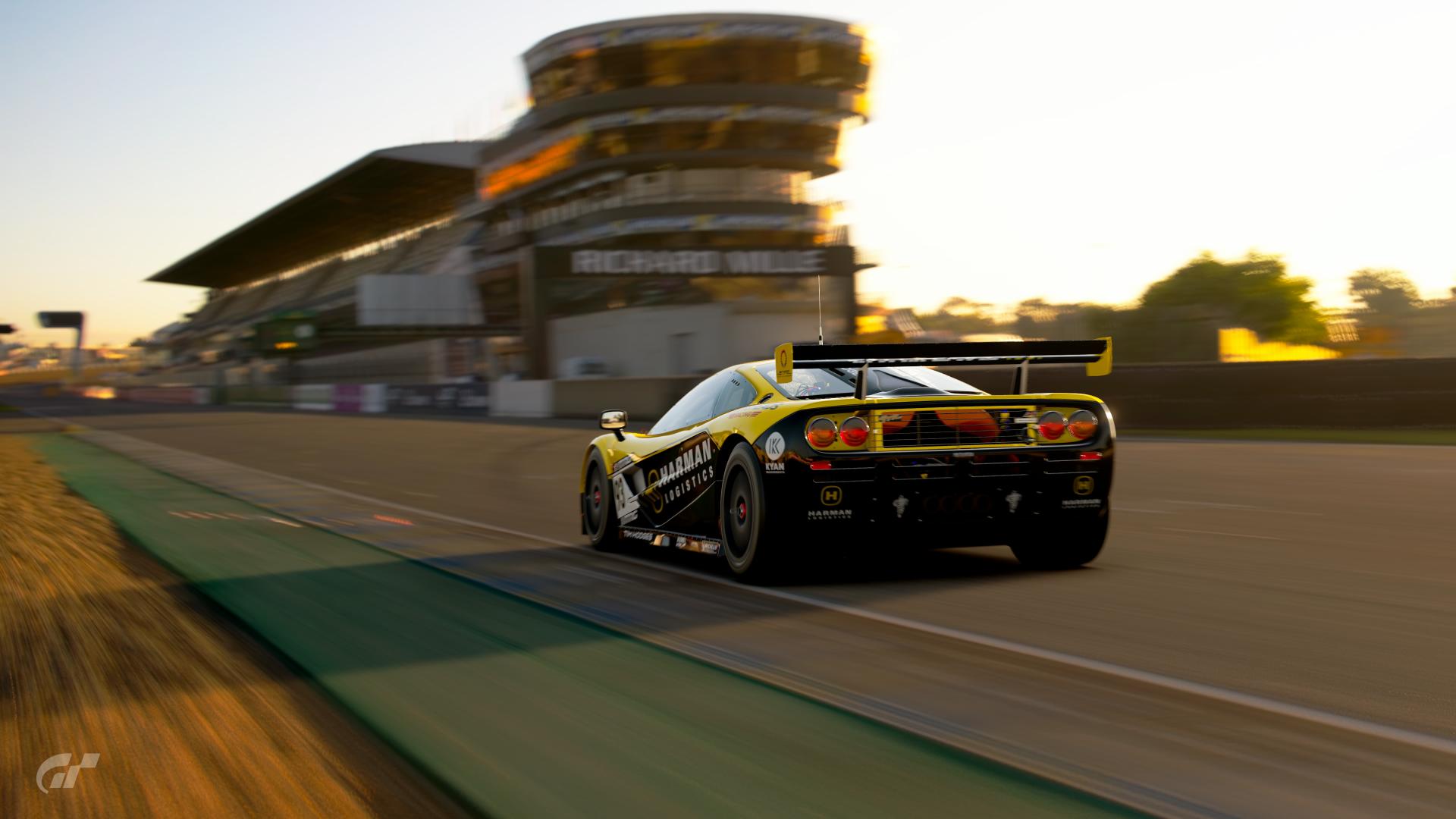
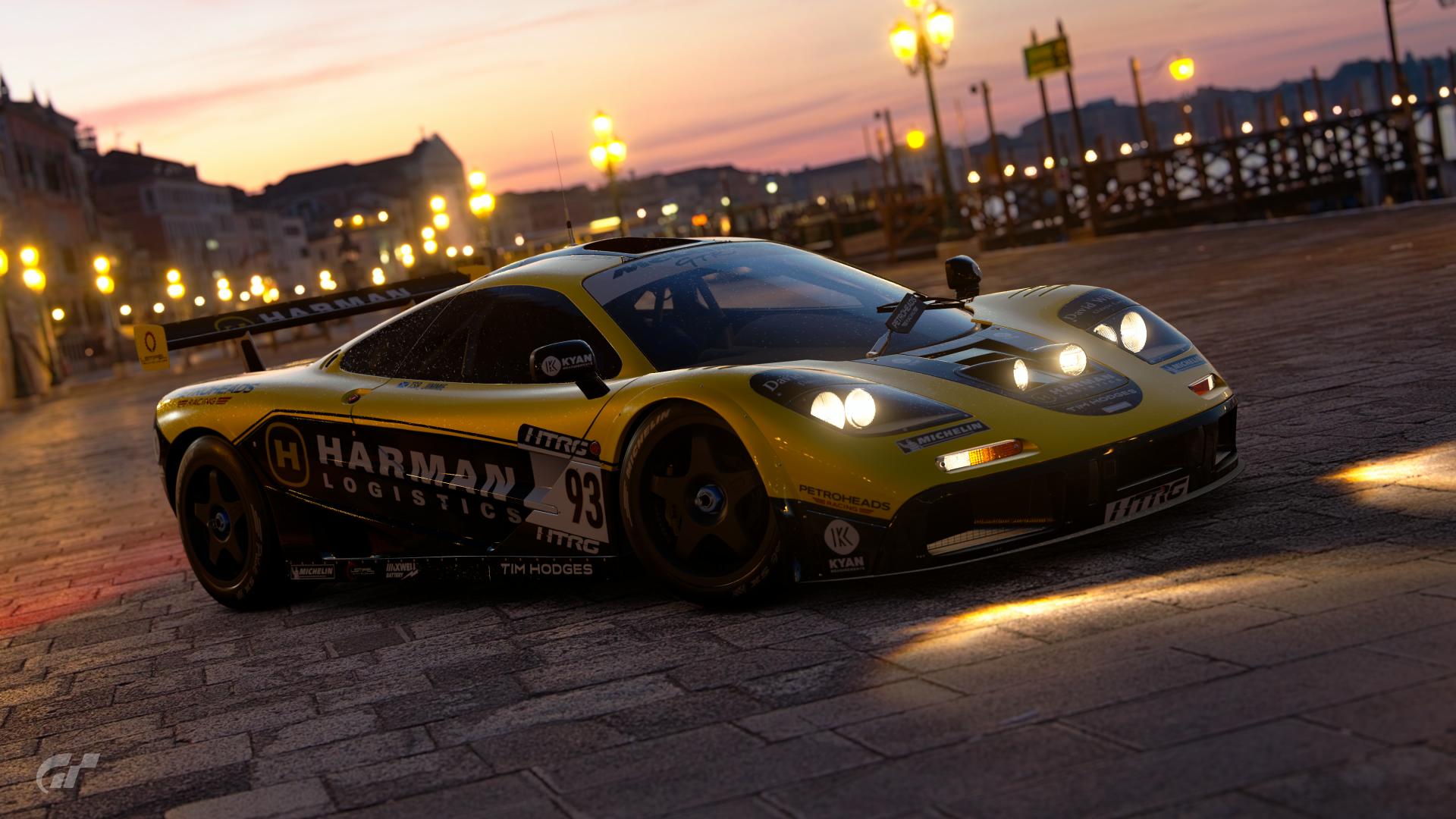
- Two bonus pictures.
USER MADE DECALS :
- No restrictions.
POLL : THE RULES
The poll will end on October 24, 2019 (23:00, CEST/GMT+2)
(5 days to vote, and this will leave a week for the winner to set up his theme.)
You can vote for 3 entries.
You can NOT vote for your own work.
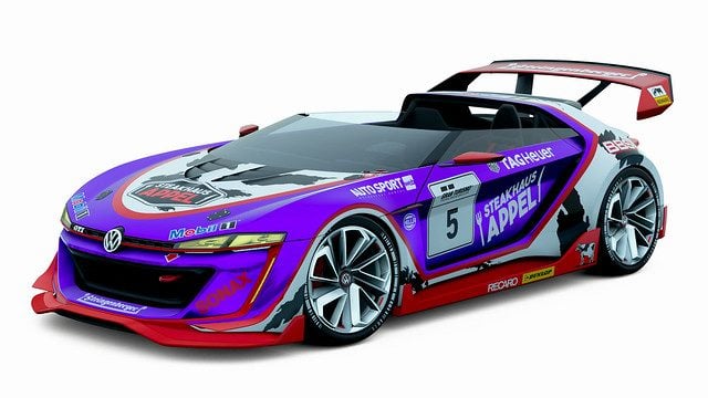
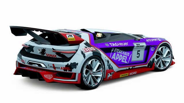
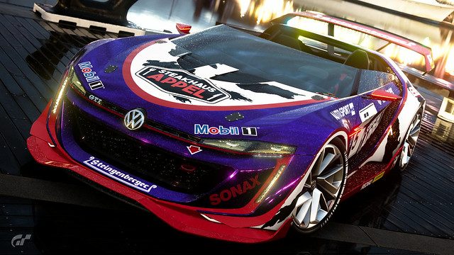
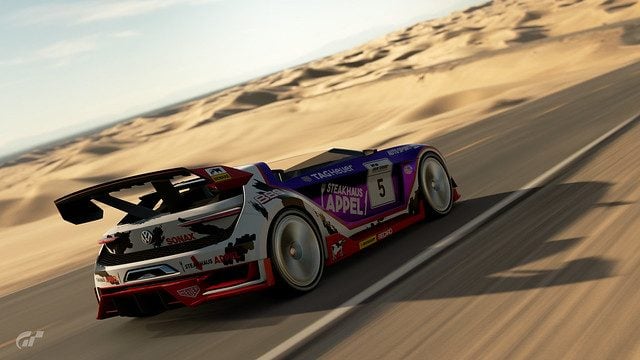
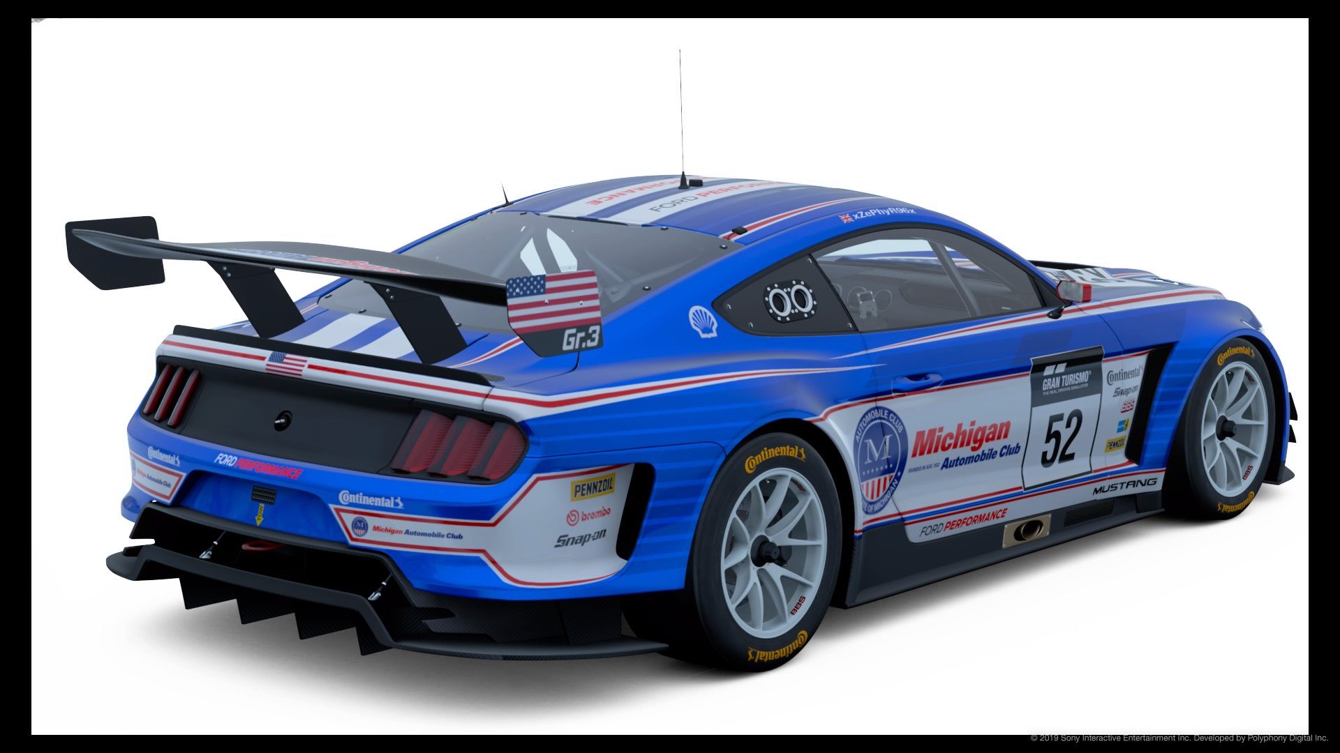
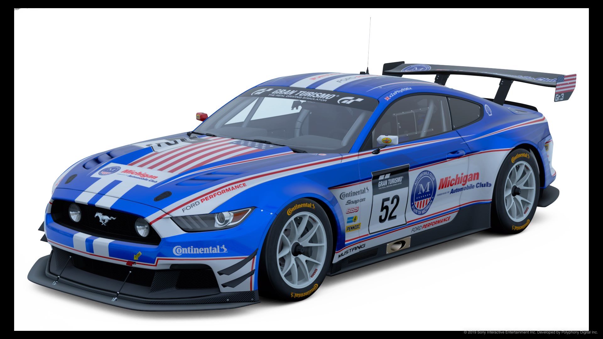
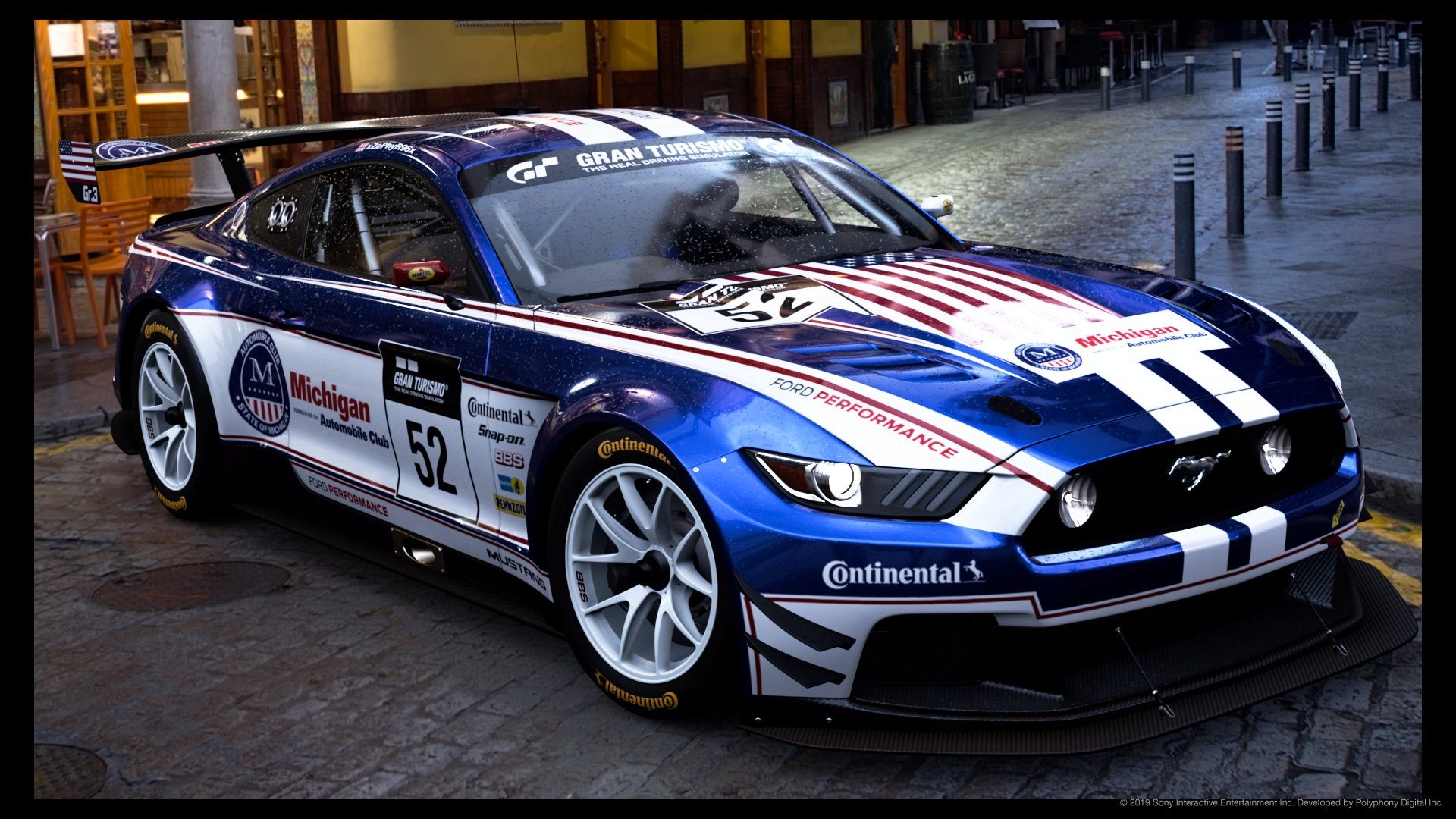
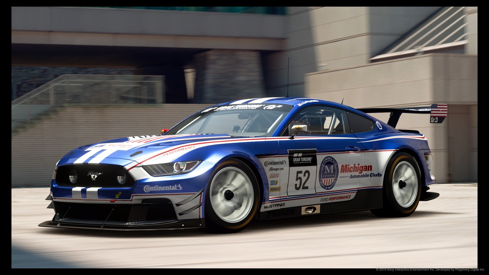
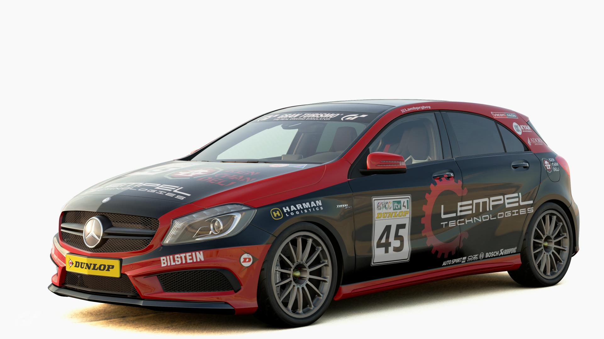
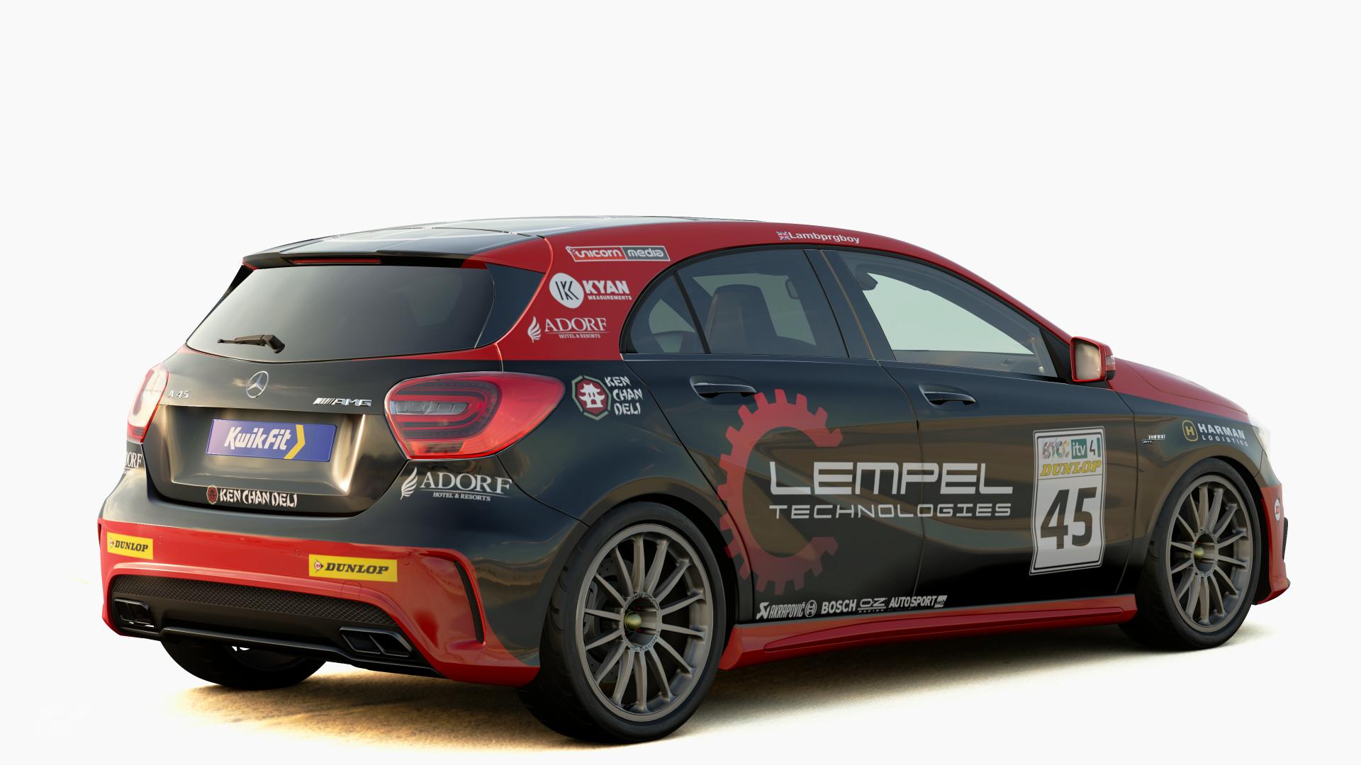
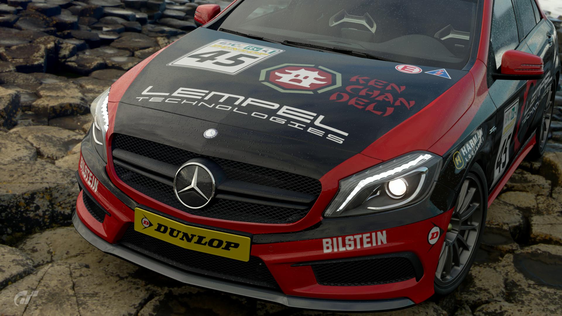
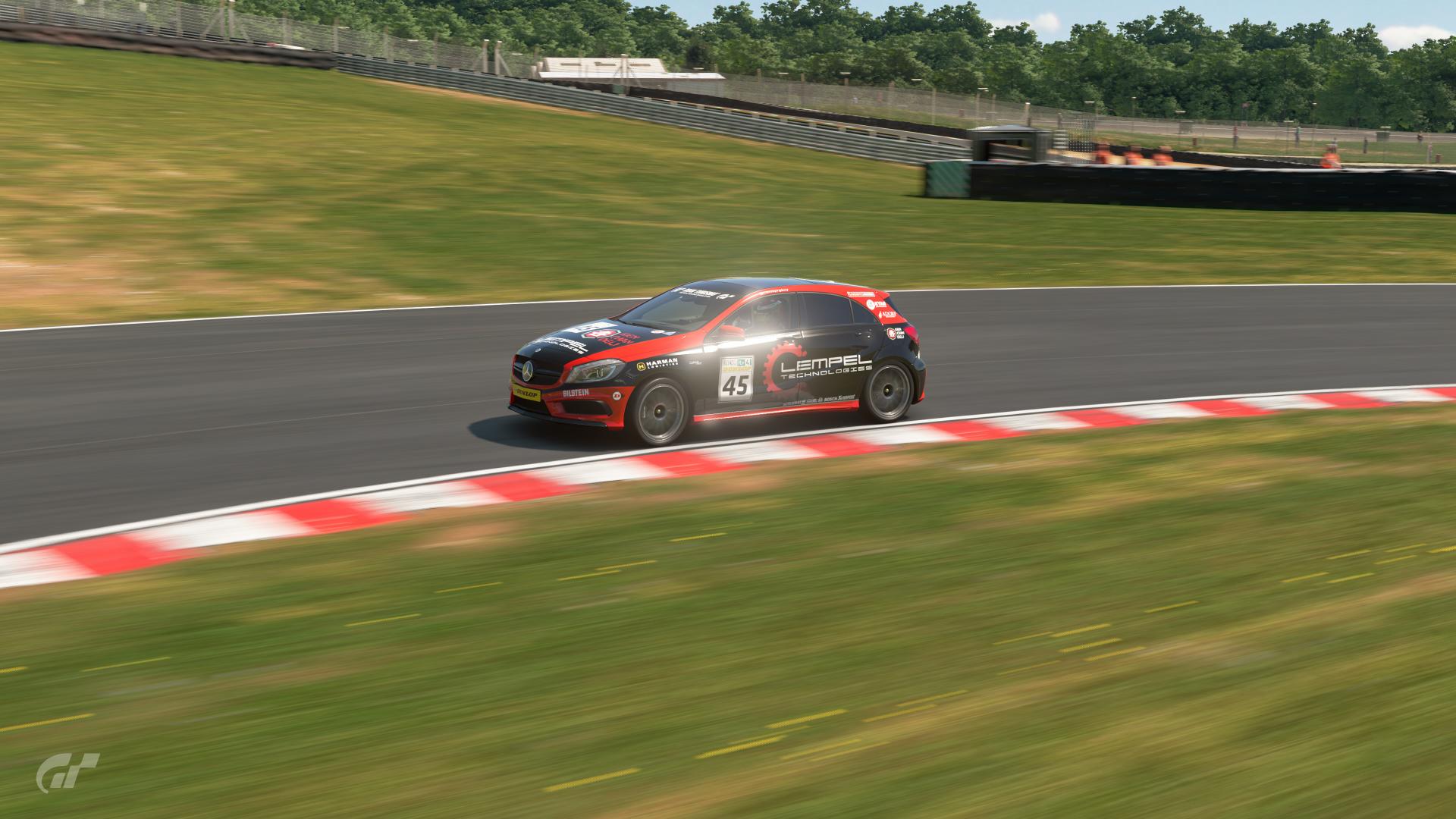
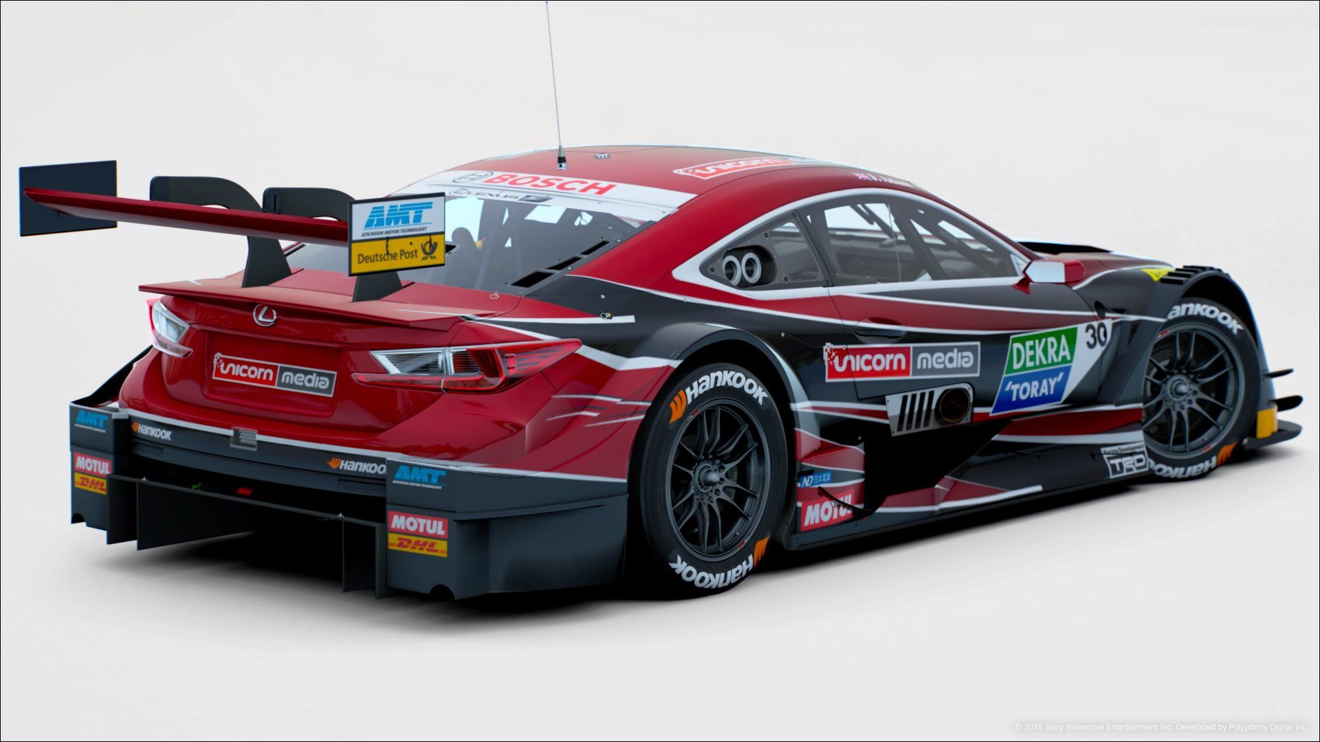
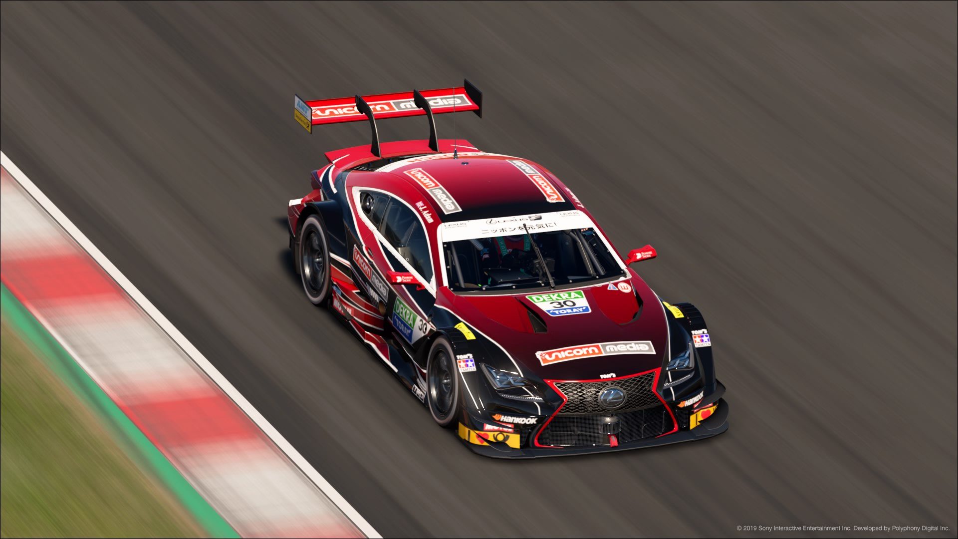
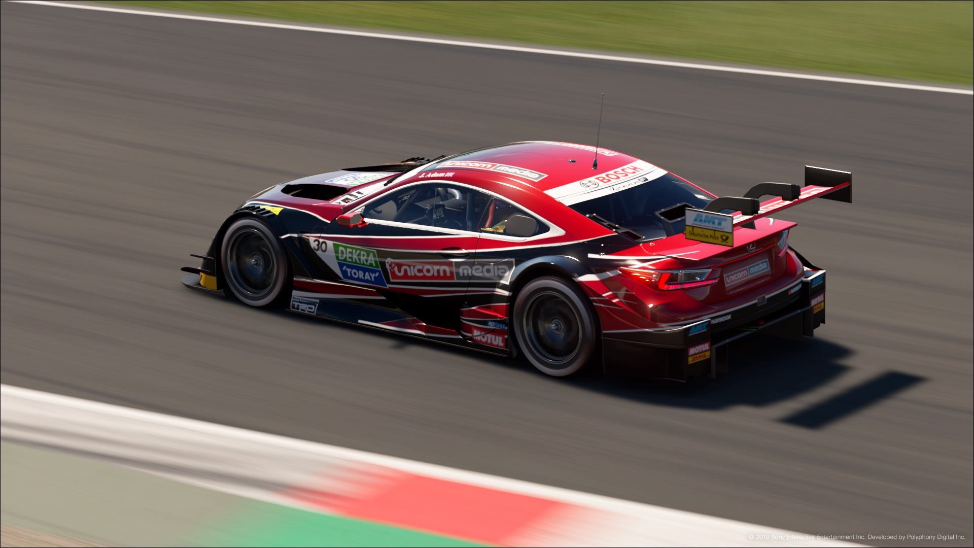
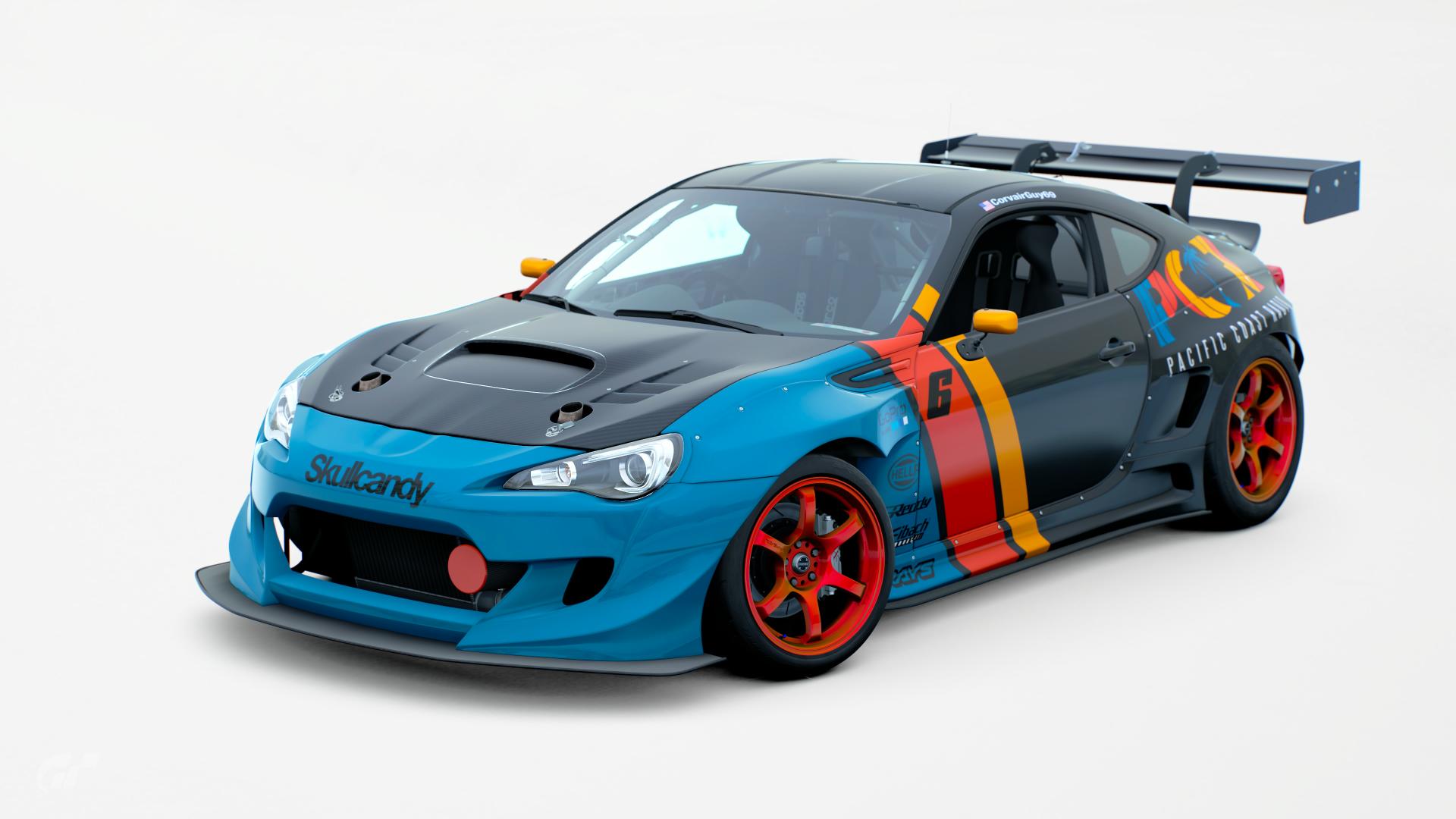
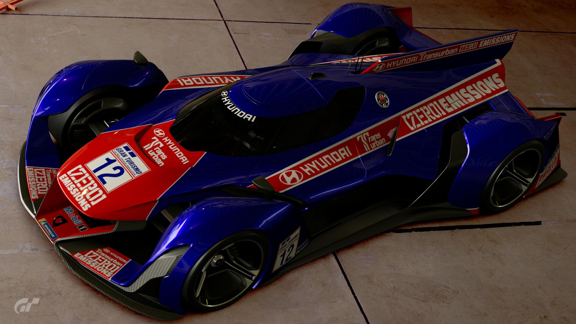
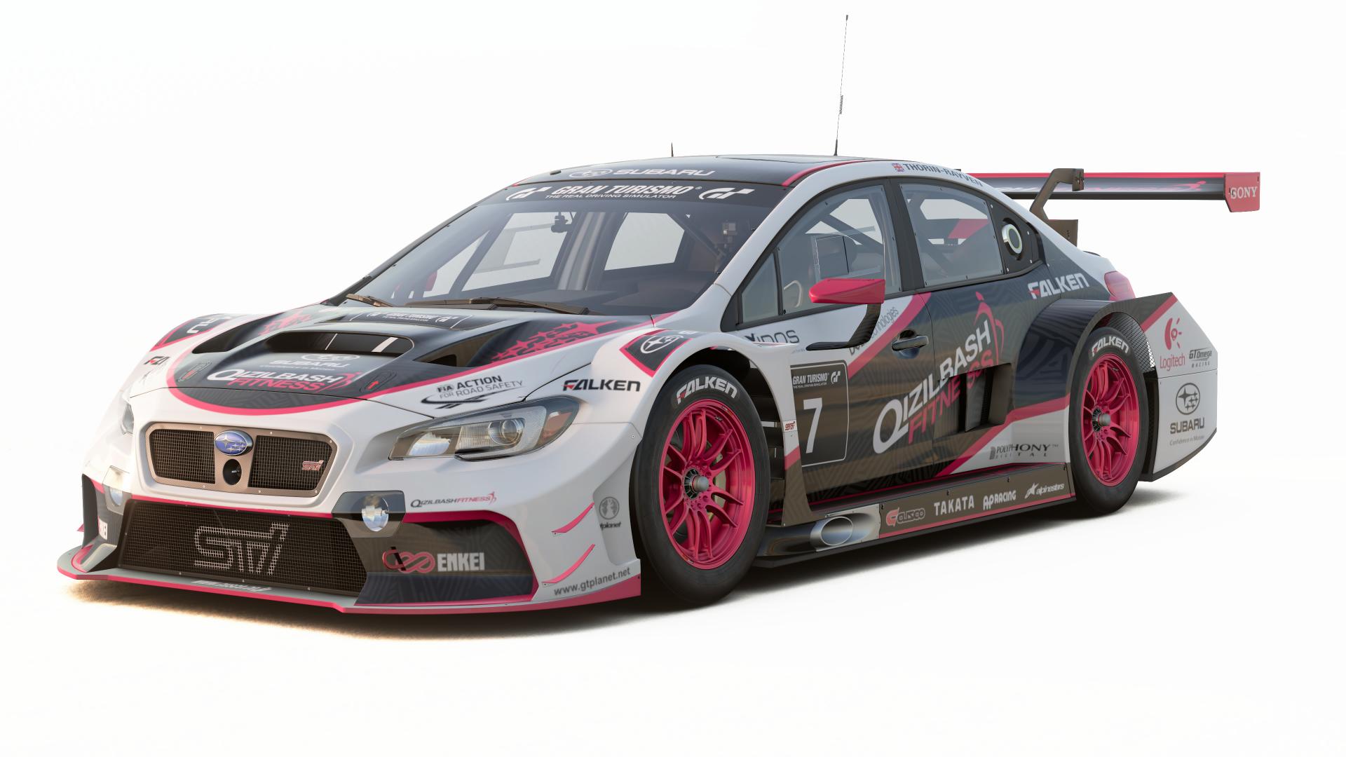
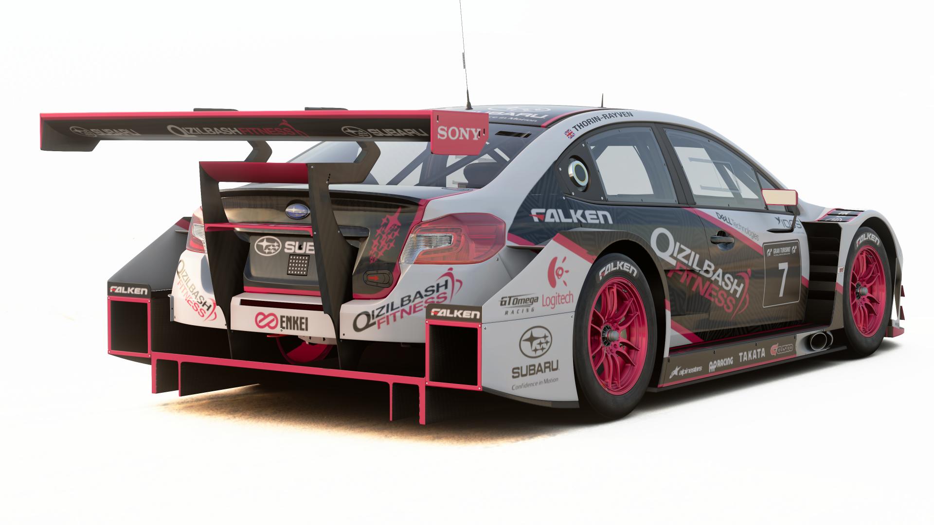
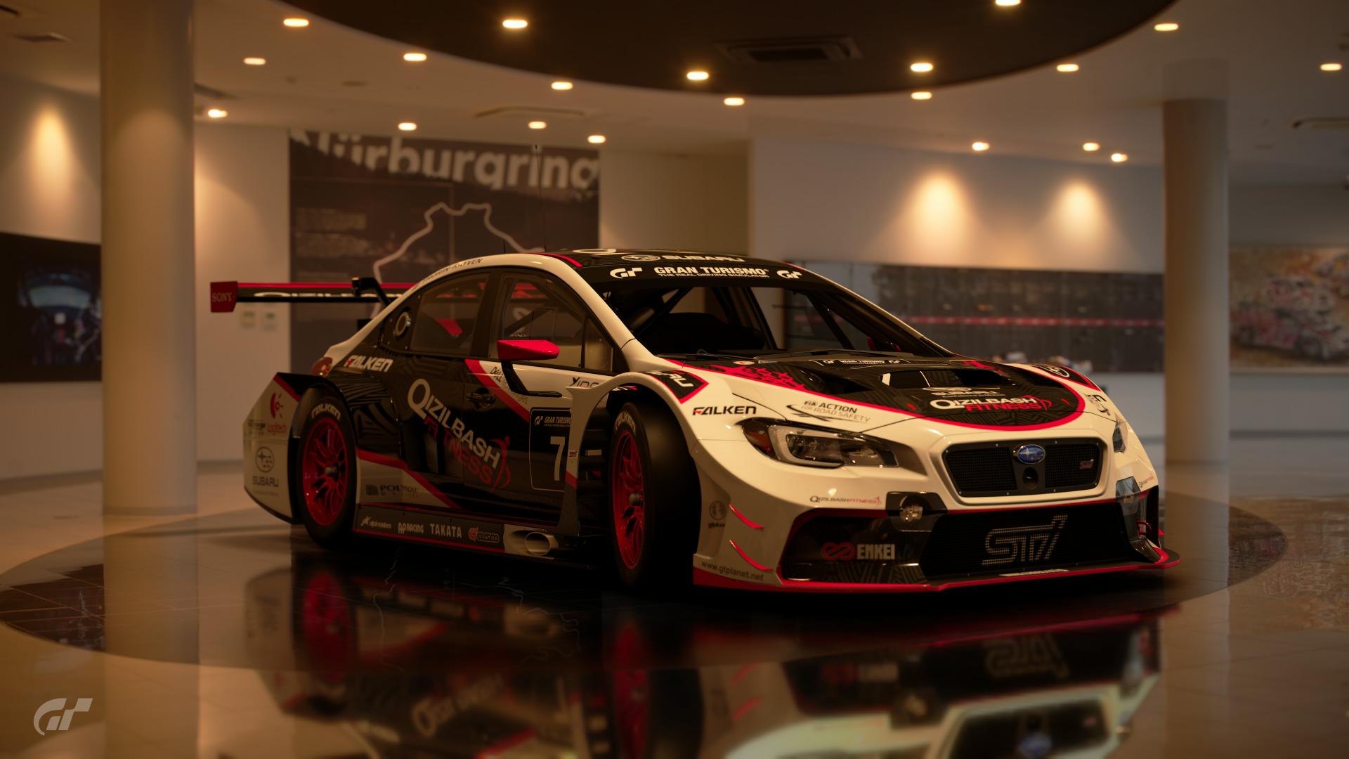
POLL : THE ENTRIES
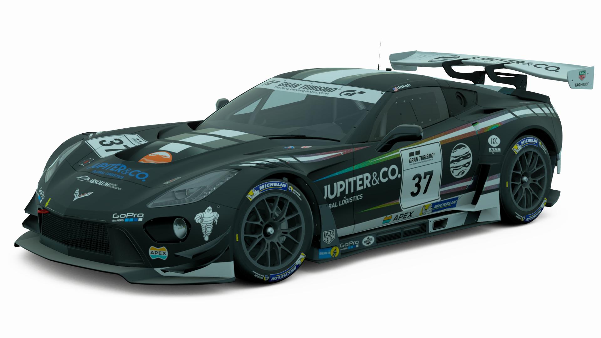
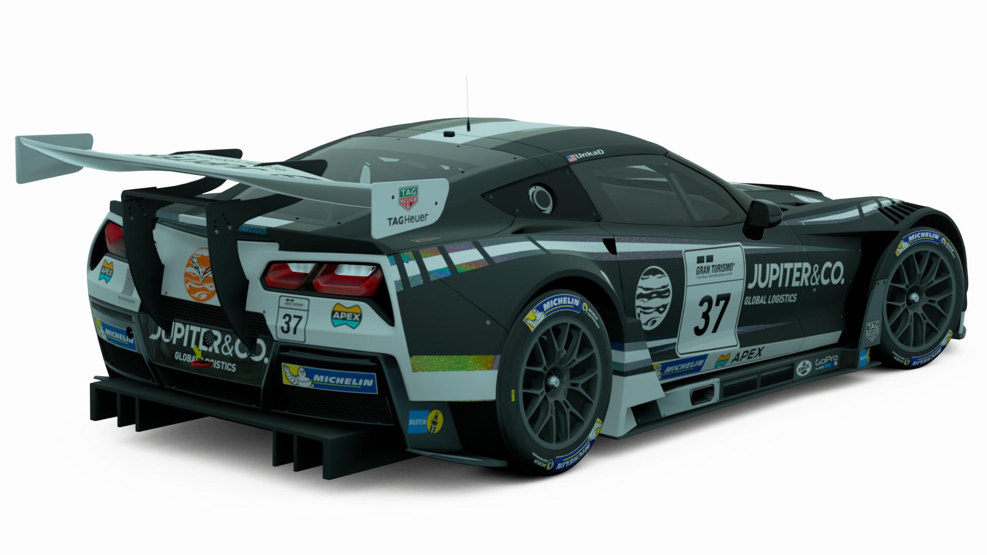
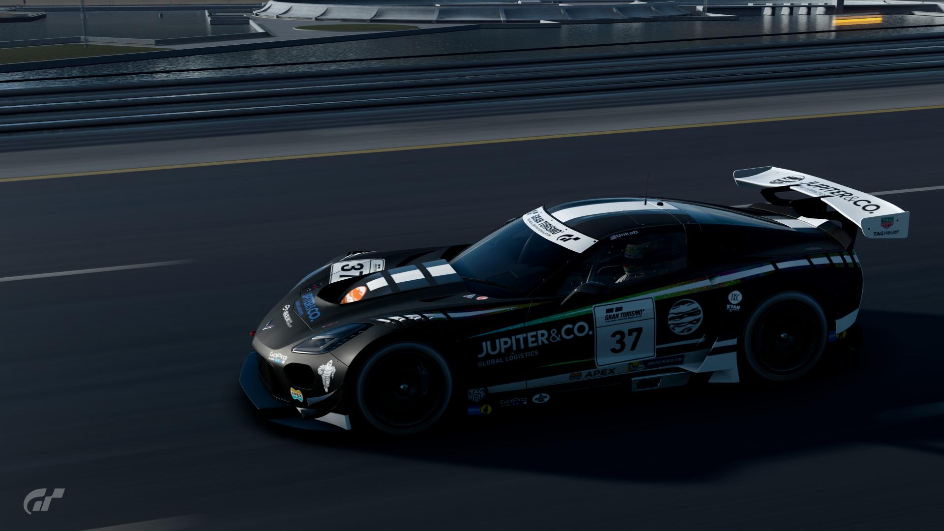
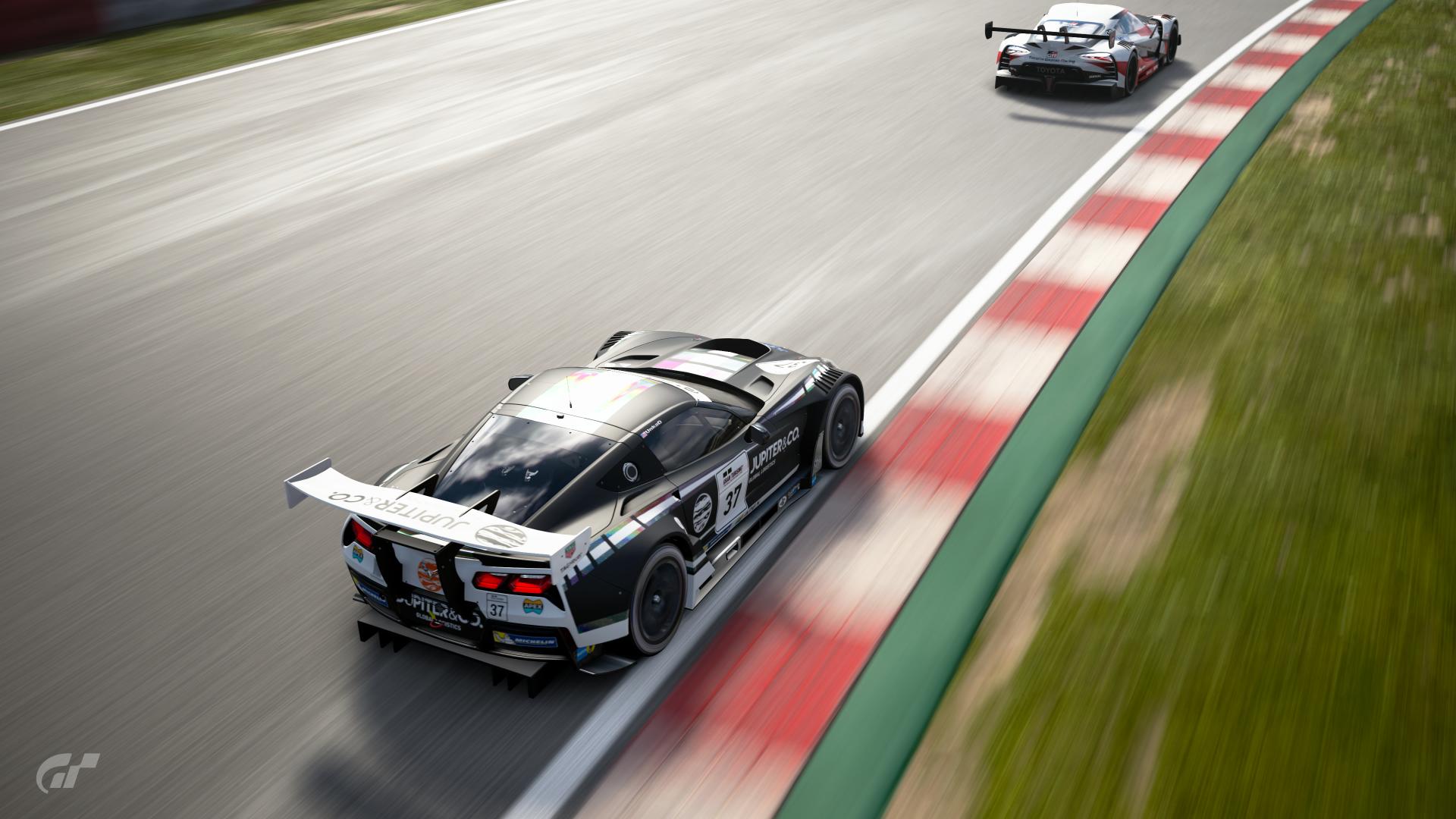
Poll Option #01
_____________________________________
Poll Option #02
 _____________________________________
Poll Option #03


 _____________________________________
Poll Option #04
_____________________________________
Poll Option #05
_____________________________________
Poll Option #06
 _____________________________________
Poll Option #07
 _____________________________________
Poll Option #08
_____________________________________
Poll Option #09
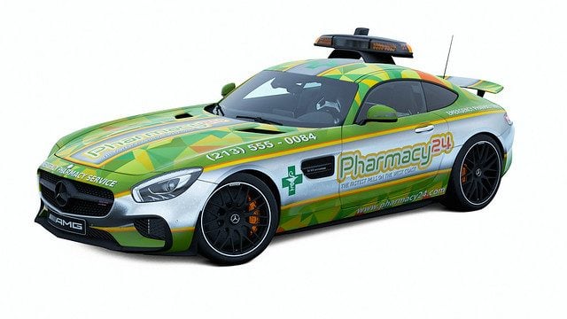
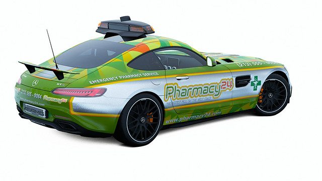
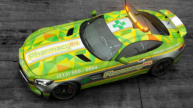
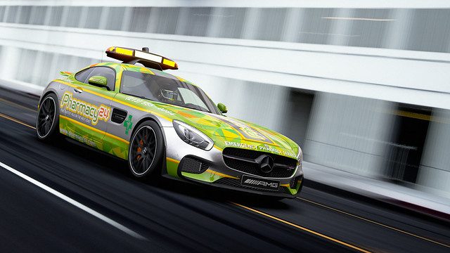
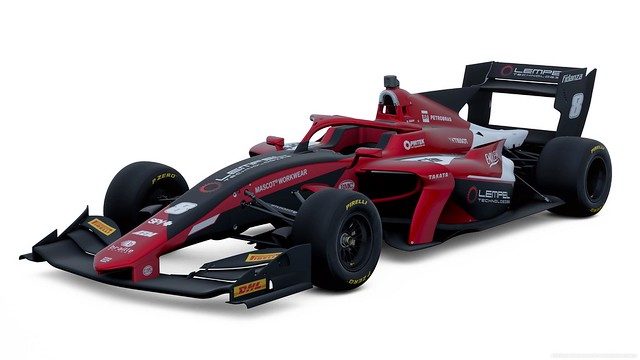
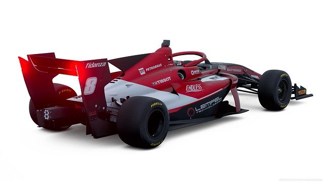
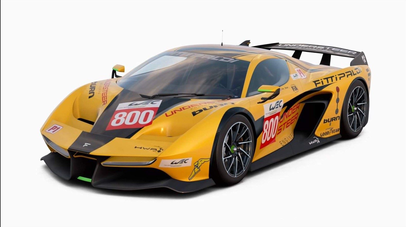
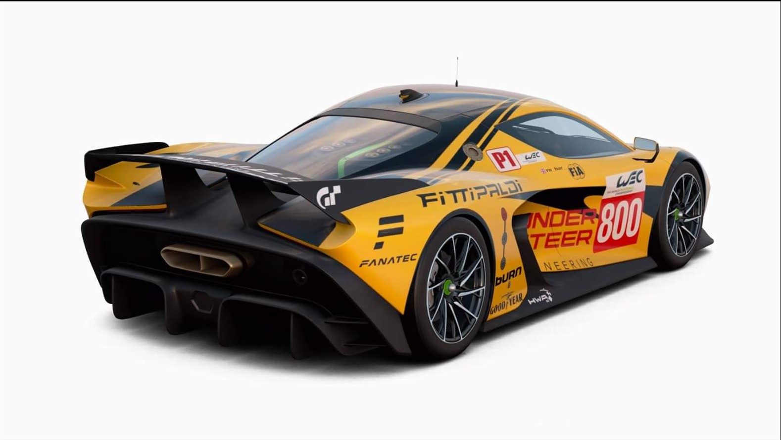
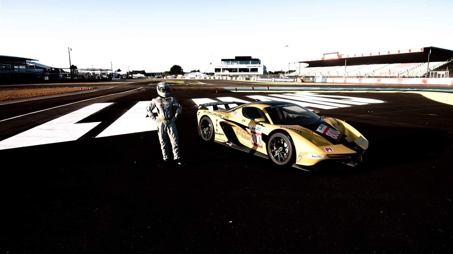
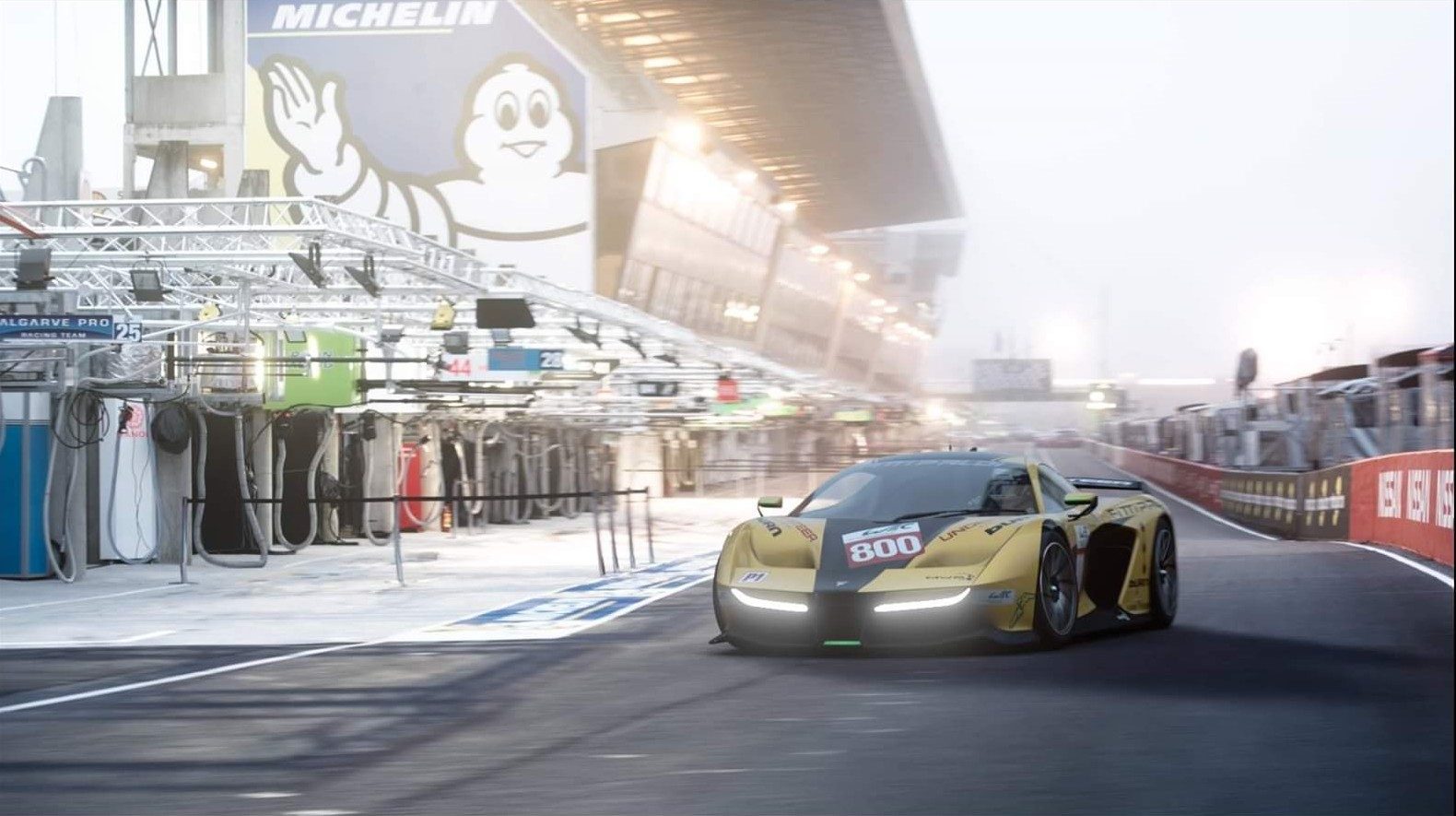
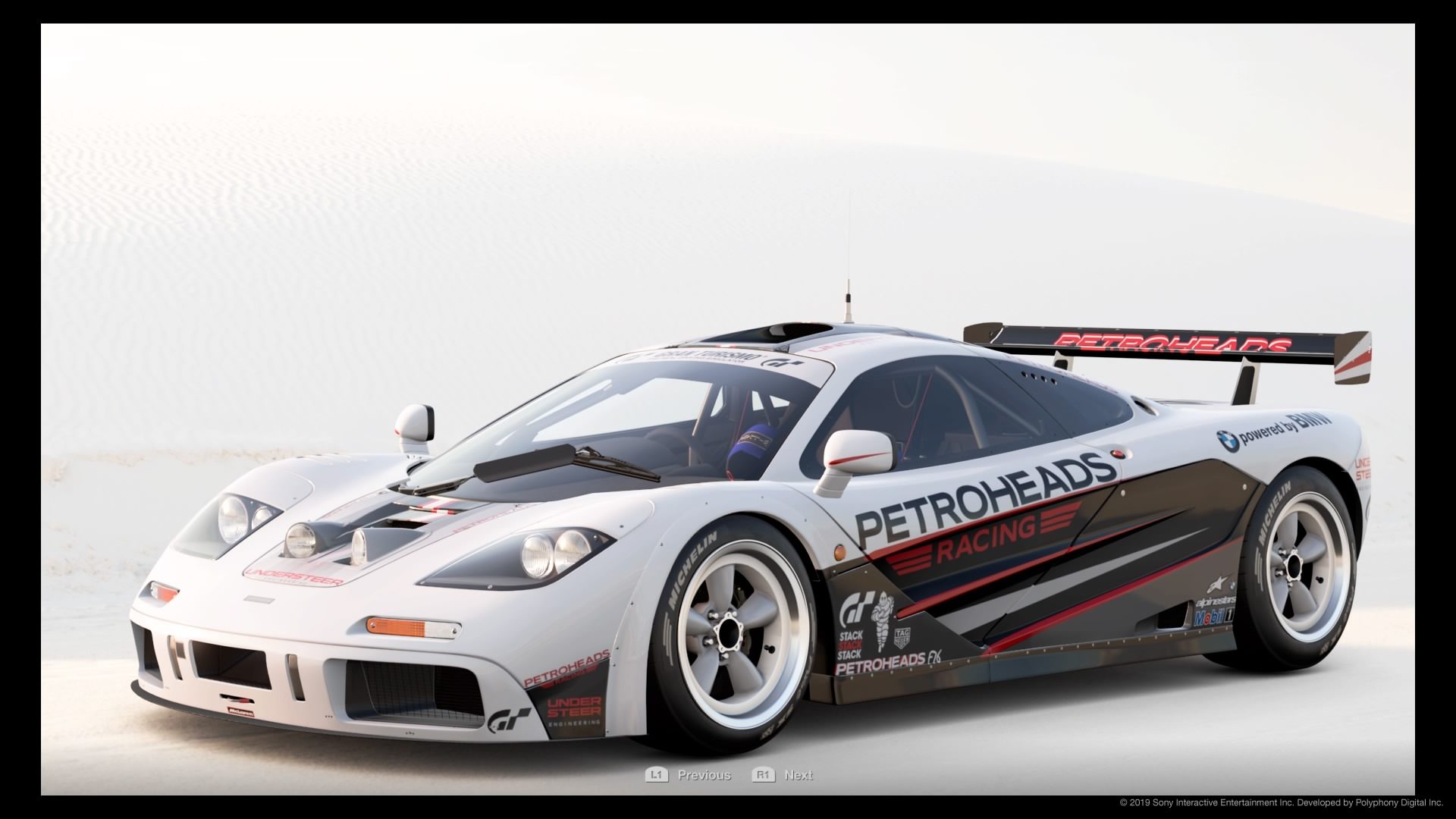
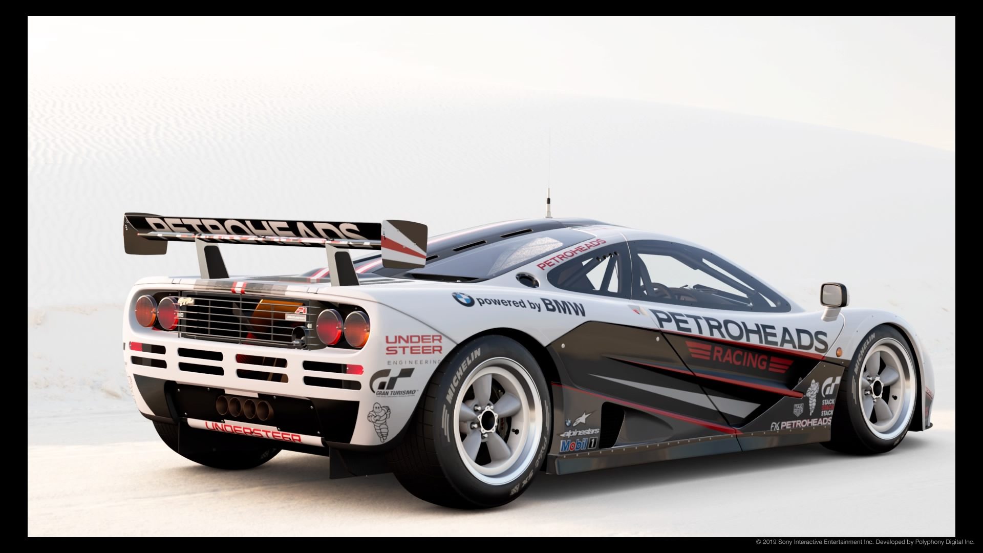
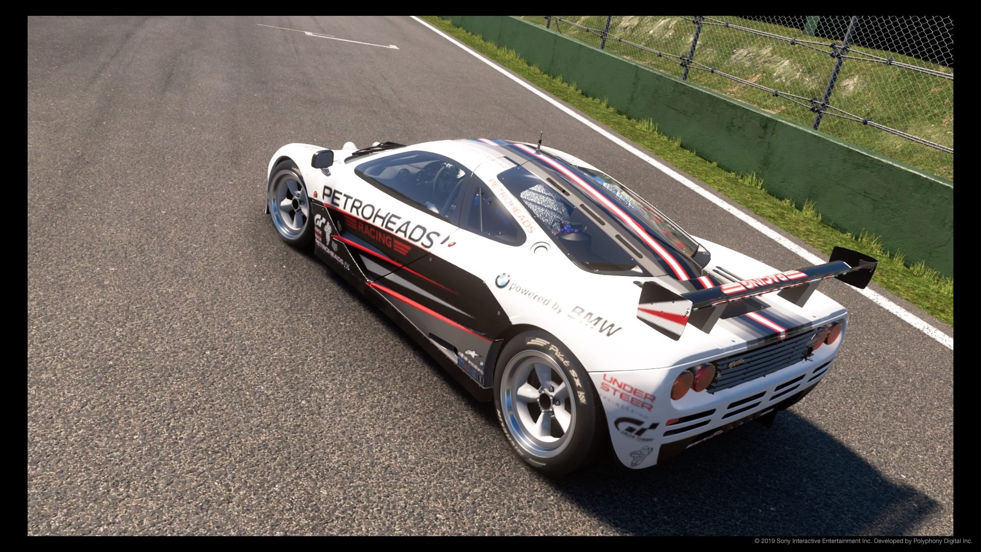
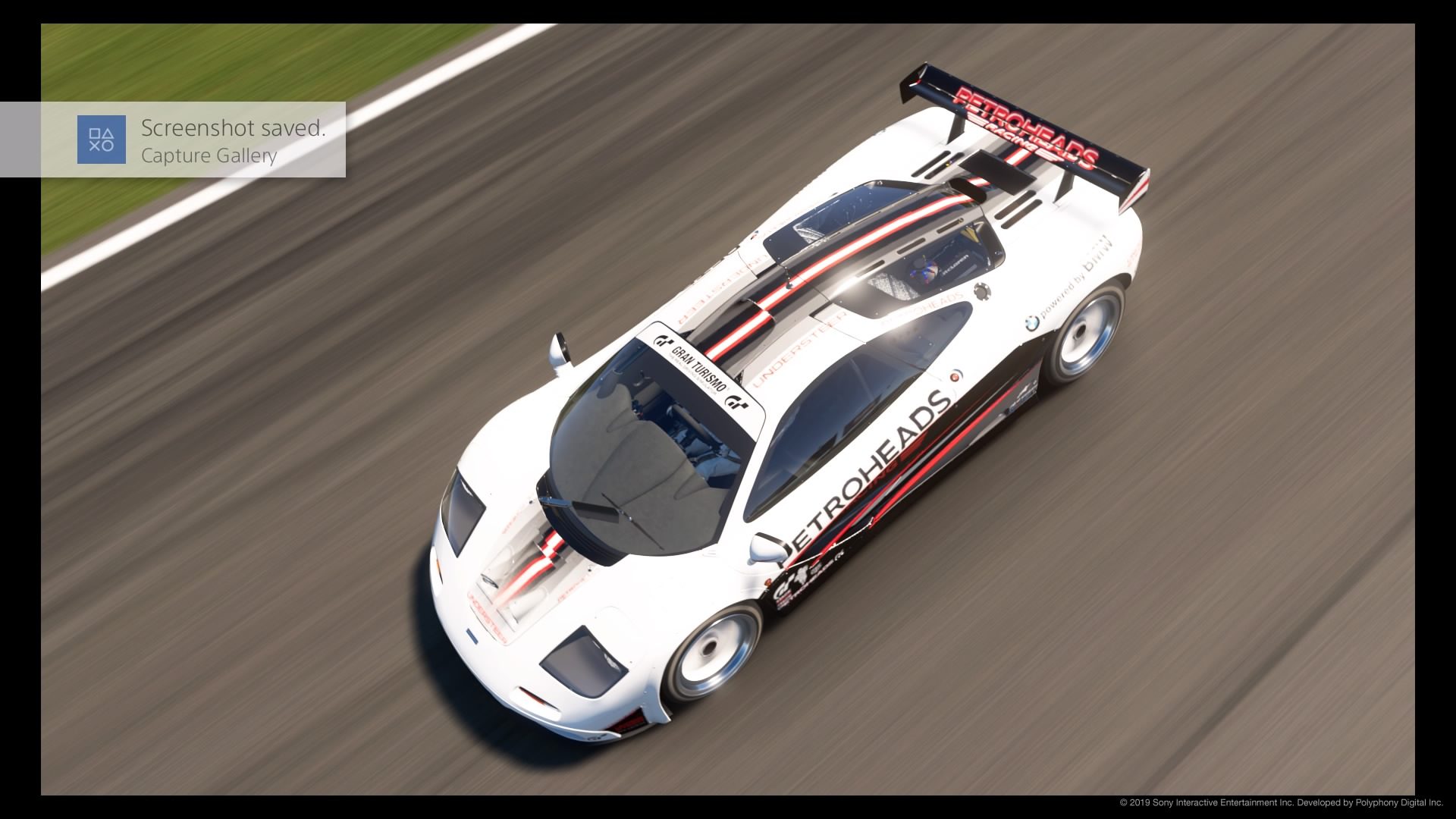
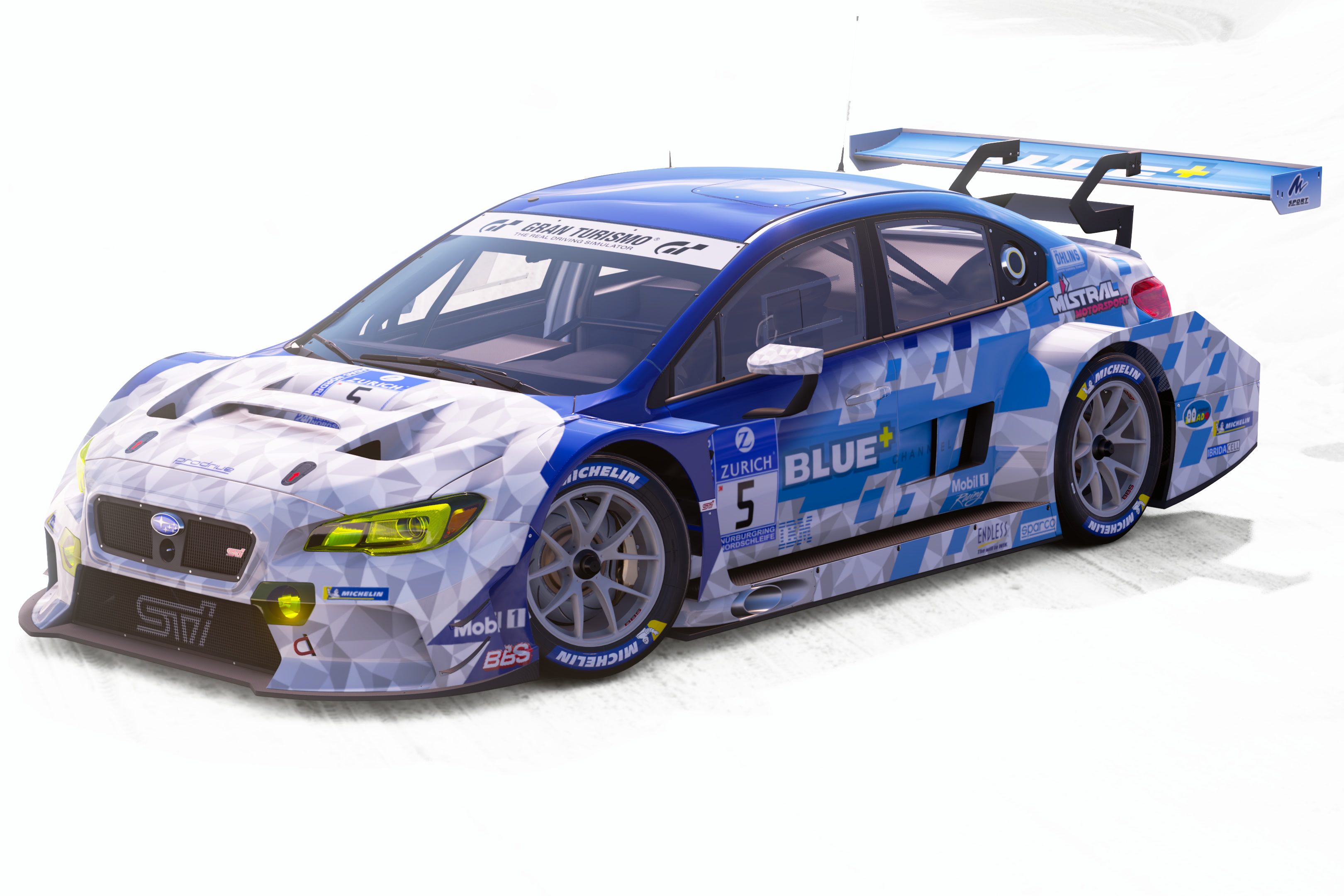
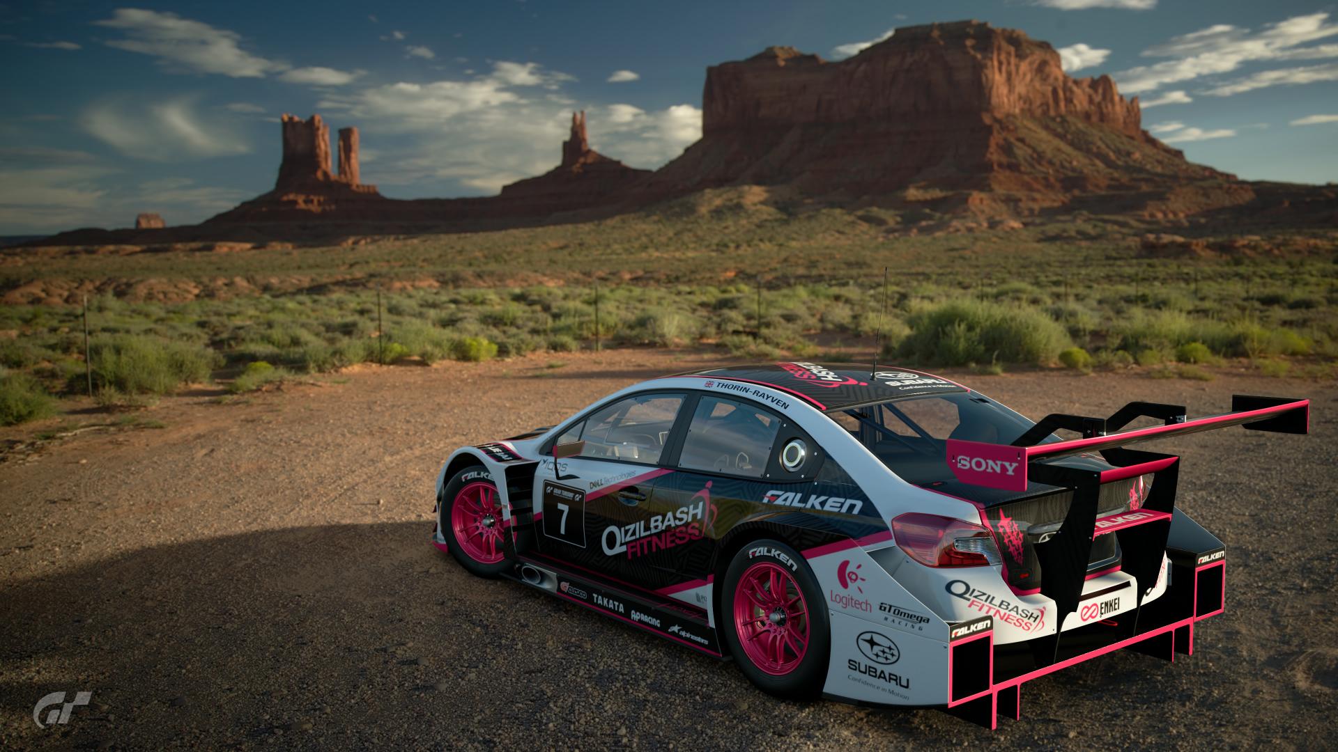
View media item 54110View media item 54111 _____________________________________
Poll Option #10
_____________________________________
Poll Option #11
_____________________________________
Poll Option #12
_____________________________________
Poll Option #13
_____________________________________
Poll Option #14
_____________________________________
Poll Option #15


 _____________________________________
Poll Option #16
_____________________________________
Poll Option #17

 _____________________________________
Poll Option #18
_____________________________________
Poll Option #19


 _____________________________________
Poll Option #20
_____________________________________
Poll Option #21
_____________________________________
Poll Option #22
_____________________________________
Poll Option #23
Poll Option #02
Poll Option #03
Poll Option #04
_____________________________________
Poll Option #05
_____________________________________
Poll Option #06
Poll Option #07
Poll Option #08
Poll Option #09
View media item 54110View media item 54111 _____________________________________
Poll Option #10
_____________________________________
Poll Option #11
_____________________________________
Poll Option #12
_____________________________________
Poll Option #13
_____________________________________
Poll Option #14
_____________________________________
Poll Option #15
Poll Option #16
_____________________________________
Poll Option #17
Poll Option #18
_____________________________________

Poll Option #19
Poll Option #20
_____________________________________
Poll Option #21
_____________________________________
Poll Option #22
_____________________________________

Poll Option #23
_____________________________________
Poll Option #24
_____________________________________
Poll Option #25
 _____________________________________
Poll Option #26
_____________________________________
Poll Option #27
_____________________________________
Poll Option #28


 _____________________________________
Poll Option #29
_____________________________________
Poll Option #30


Poll Option #24
_____________________________________
Poll Option #25
20191016193245
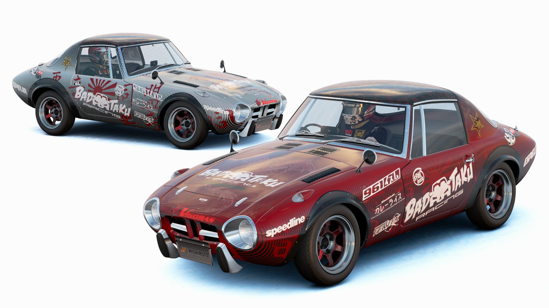
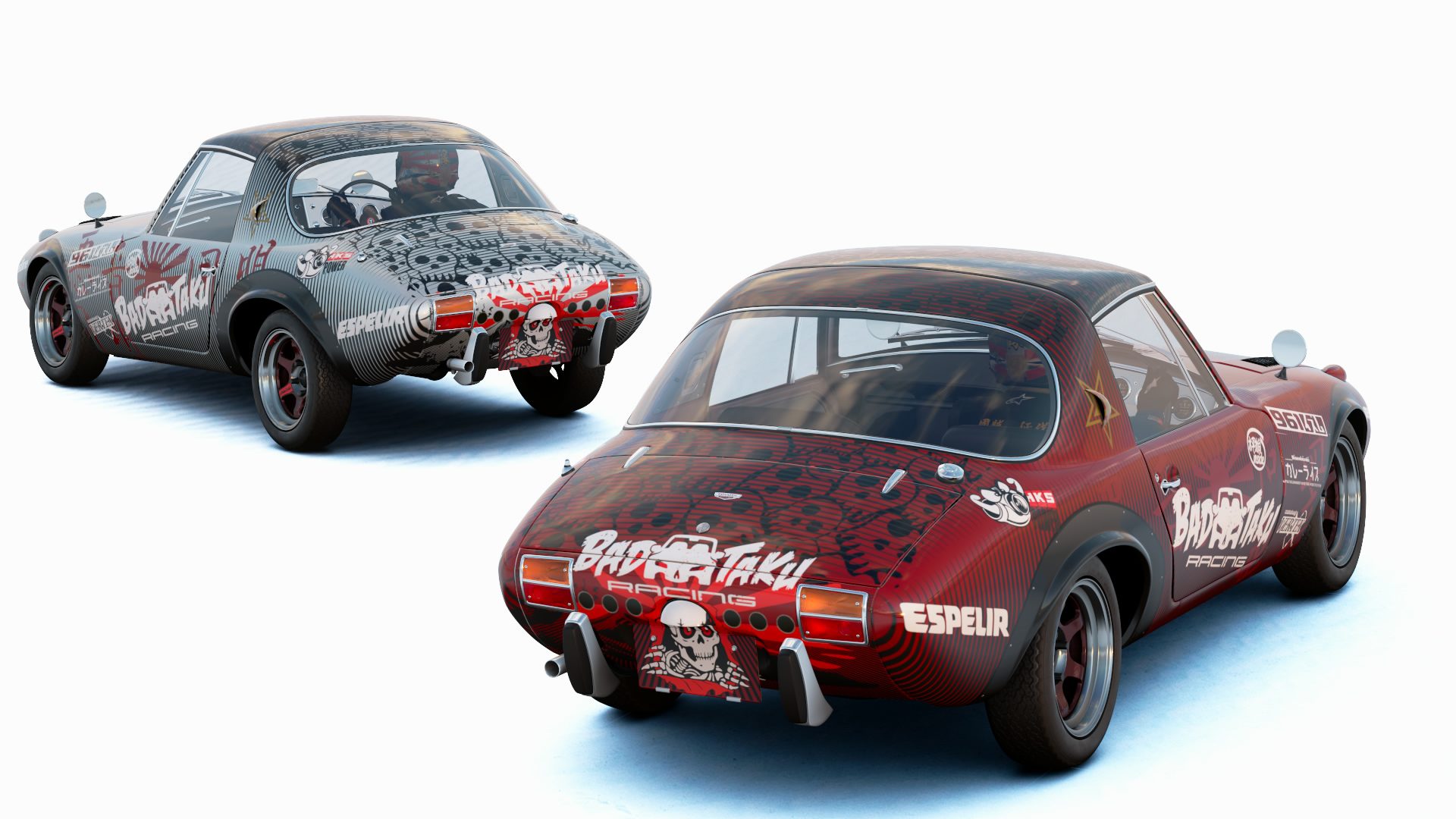
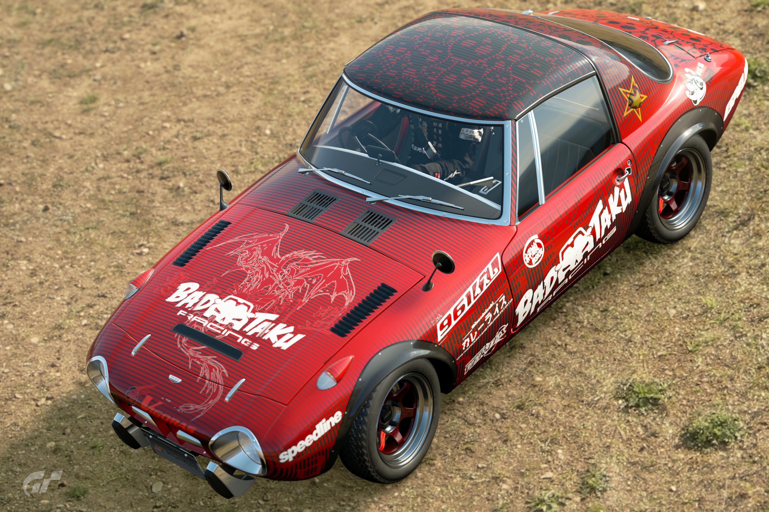
GT Sport Livery competition 40 - Bad Taku Toyota Sports 800 rear quarter (SouperK)
Poll Option #26
_____________________________________
Poll Option #27
_____________________________________
Poll Option #28
Poll Option #29
_____________________________________

Poll Option #30


 Stunning poll indeed!
 ). I've tried to be as fair and constructive as possible with any improvements or differences that could've been made (mainly from an design perspective), but some liveries I didn't pick simply because I didn't get what was meant to be achieved with some of them. These are my opinions and my perspective after all, not facts. I'm open to criticism myself if anyone else wants to do some.
")
") ).
). . It is something I would normally do to preserve my self-imposed 3 colour rule
  . But I felt the pink I ended up using was close enough that it didn't really need to be changed. If I had used larger decals, I probably would have to.
 I love that one really much!
 . Looks like we're in for a nailbiting finish!
 )
)