- 2,286

- Caerphilly, SW
- [-_-]MILO[-_-]
- RYAN-31
This thread has become a bit like...

True
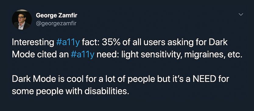
This day and age most Apps/Sites have dark modes primarily not for aesthetic preference but for health and physical comfort's sake. You would be surprised how much difference Dark Modes can make for people with sensitive eyes and/or vision problems. Especially on heavy text pages like GTP and other Forums.
") 👍
👍But yeah, I dont see the point in spamming the thread and being impatient about it (Even though i look forward to the option when it comes)

Last edited: