- 6,753

- Fürstentum Lippe
- GTP_Nuschel
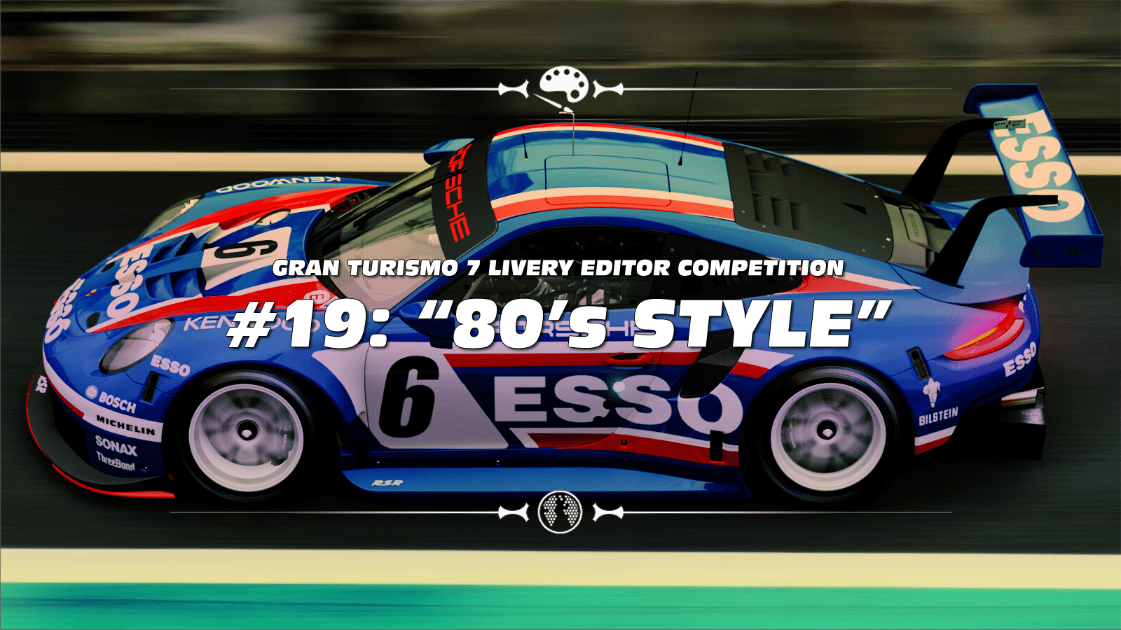
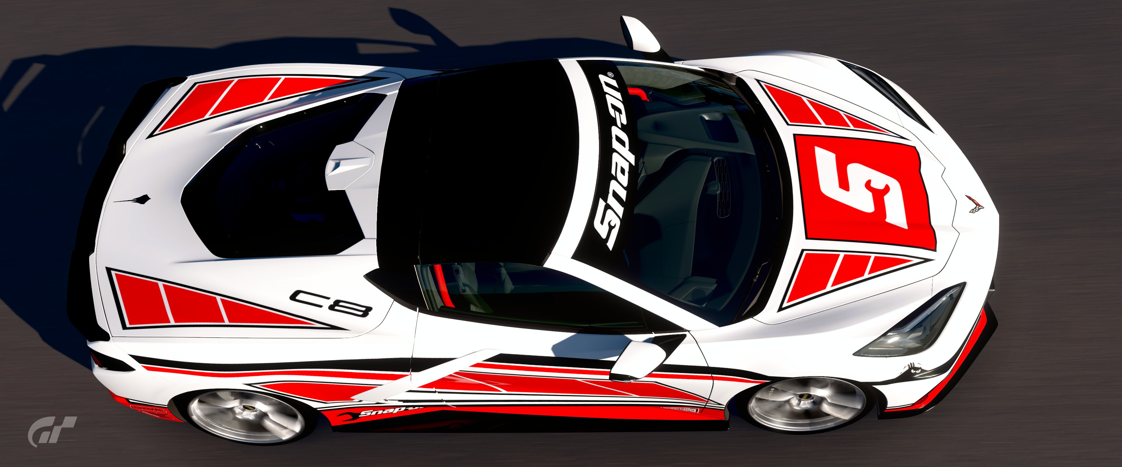
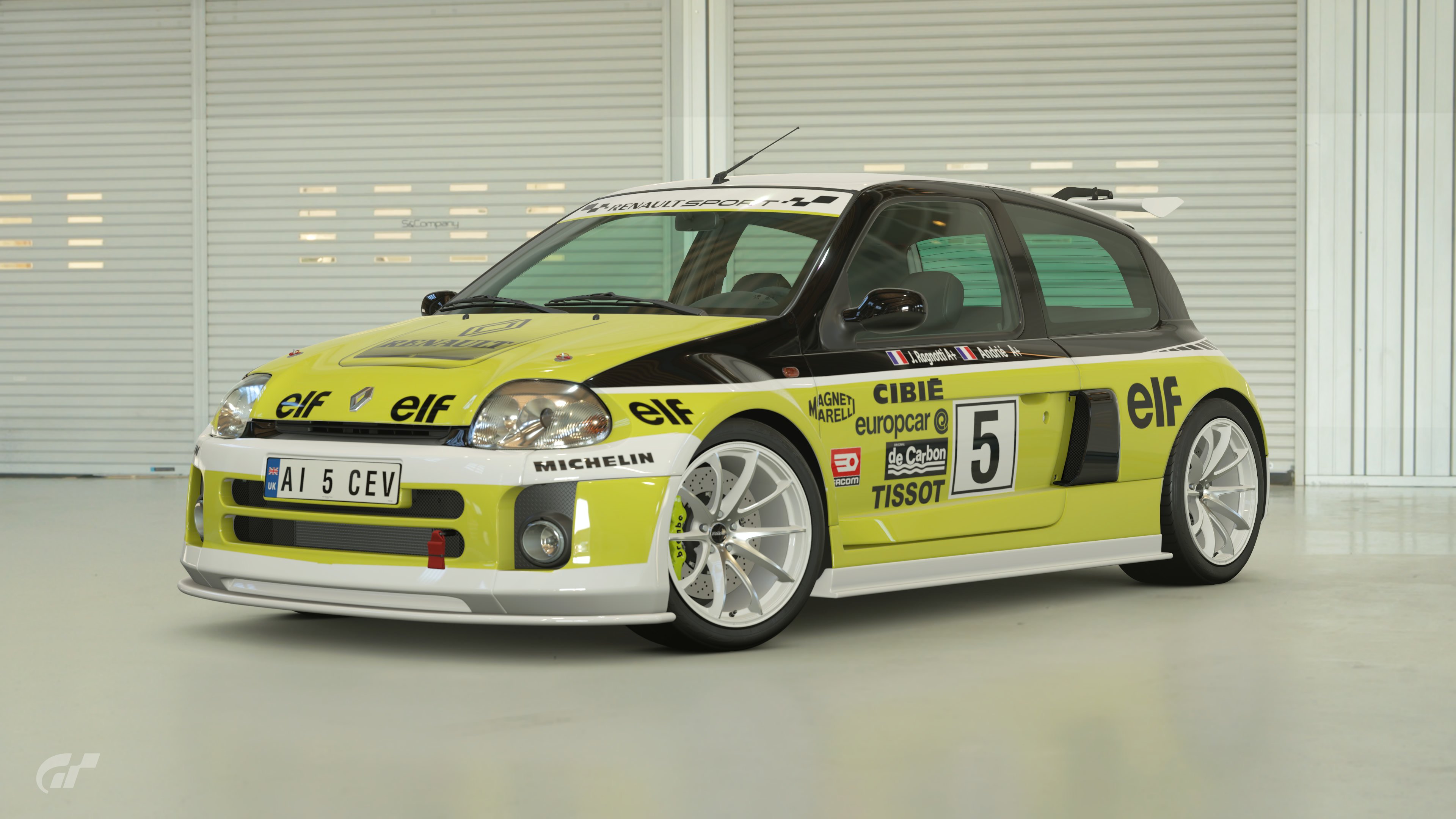
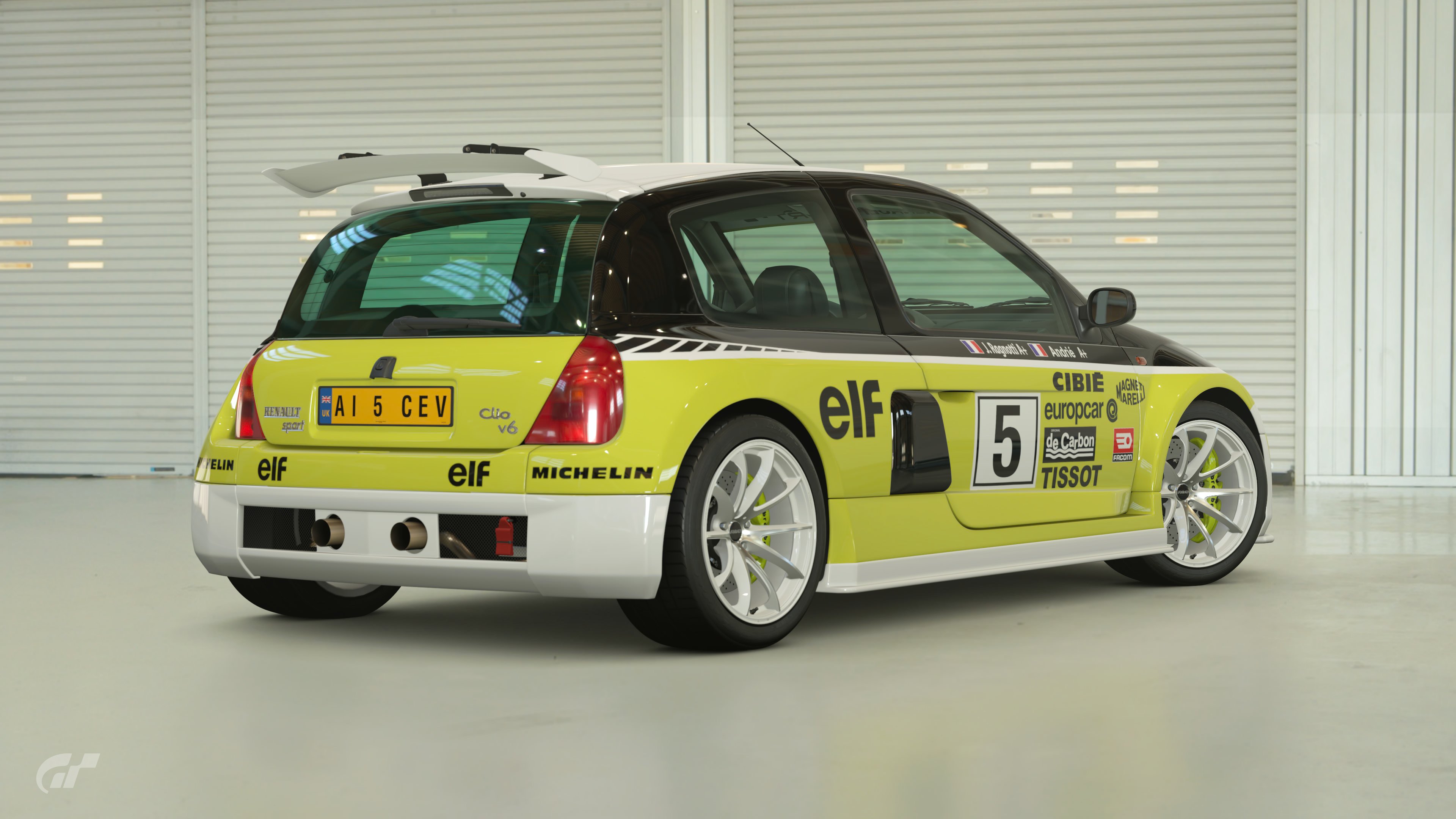
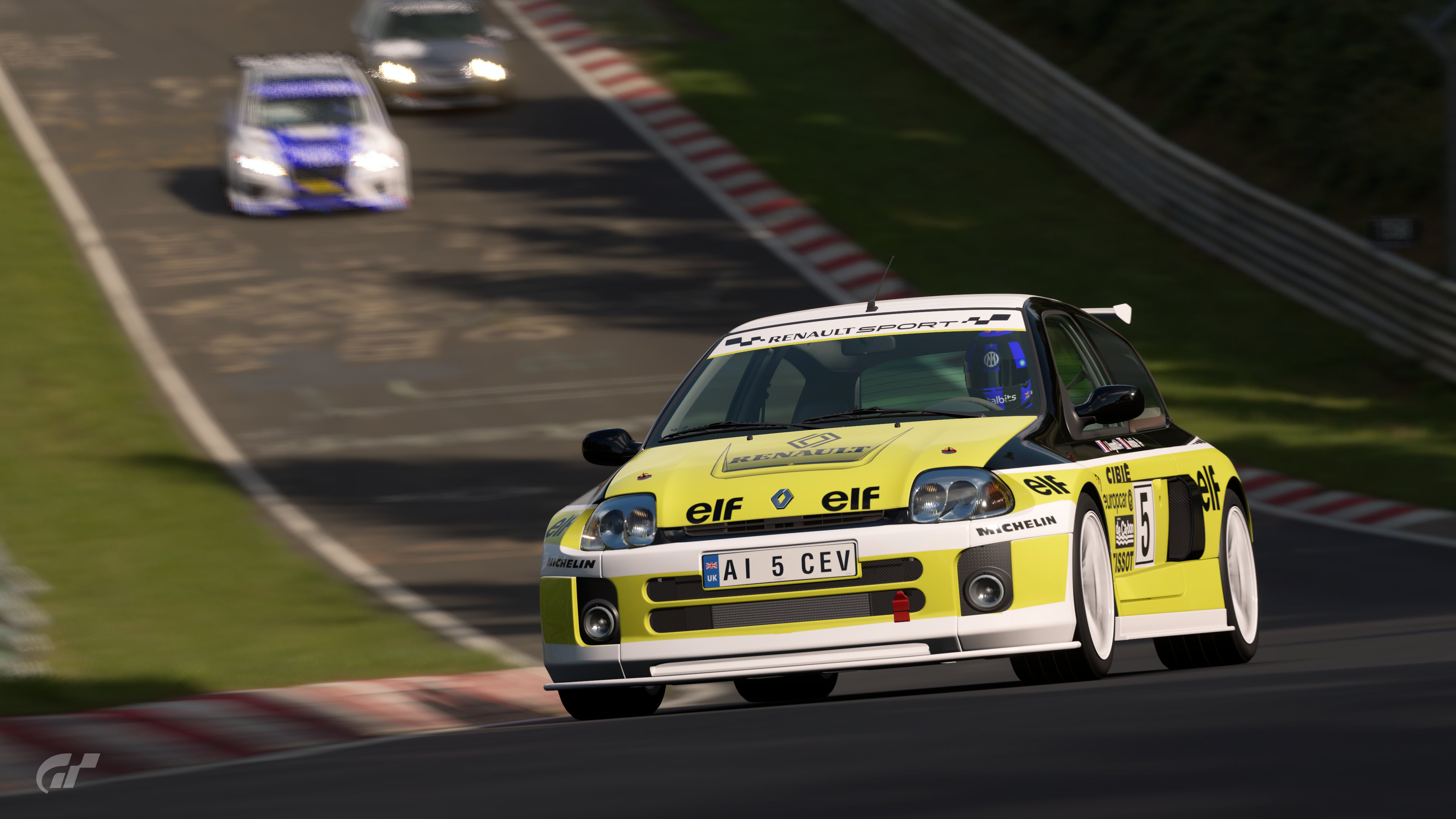
THIS MONTH'S THEME
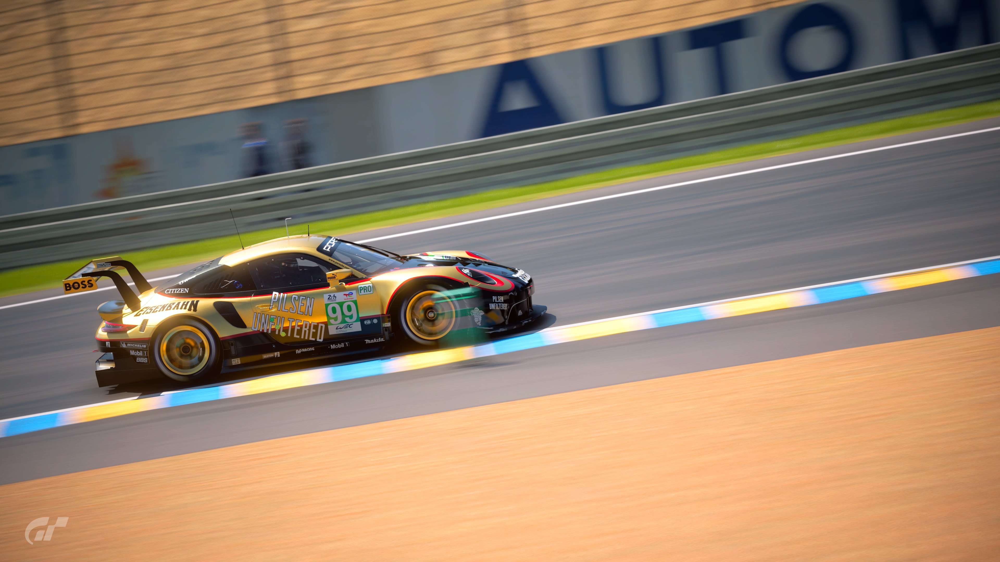
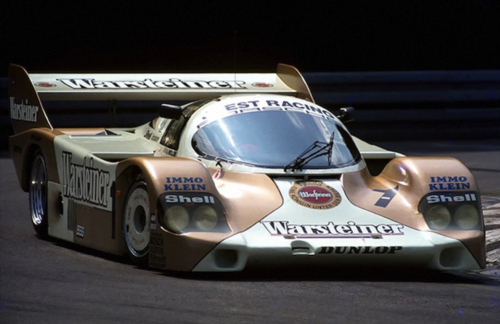
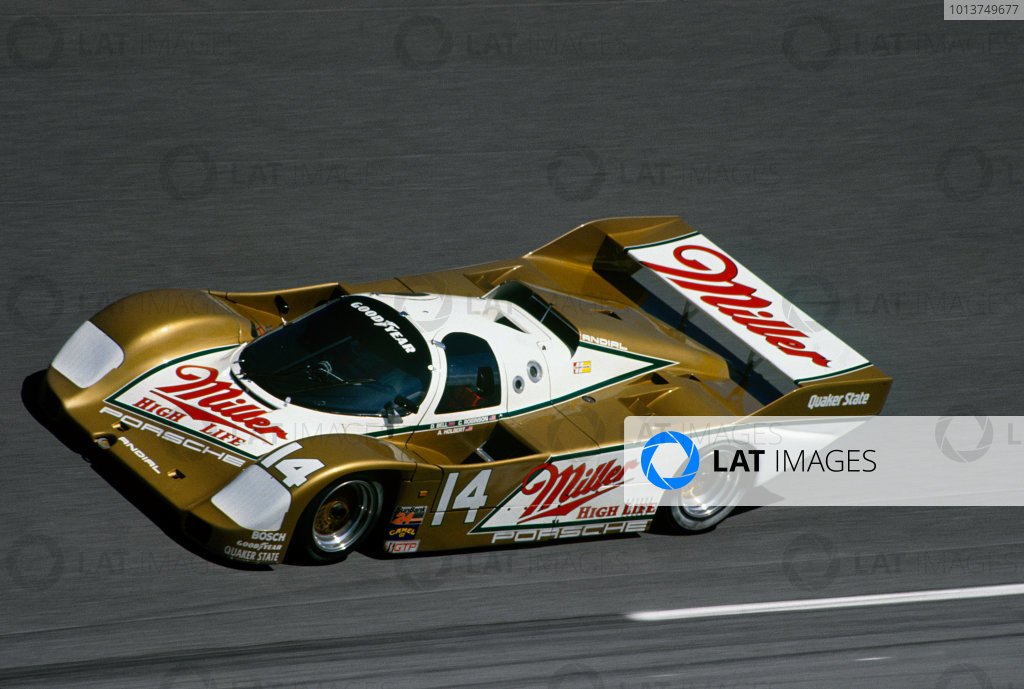
It's been a while but we're reheating another GTS LEC theme this time, previous LEC winner @Gingerale chose GTS LEC #16's theme for you. Let's recap what @D-Max had to say about this theme:
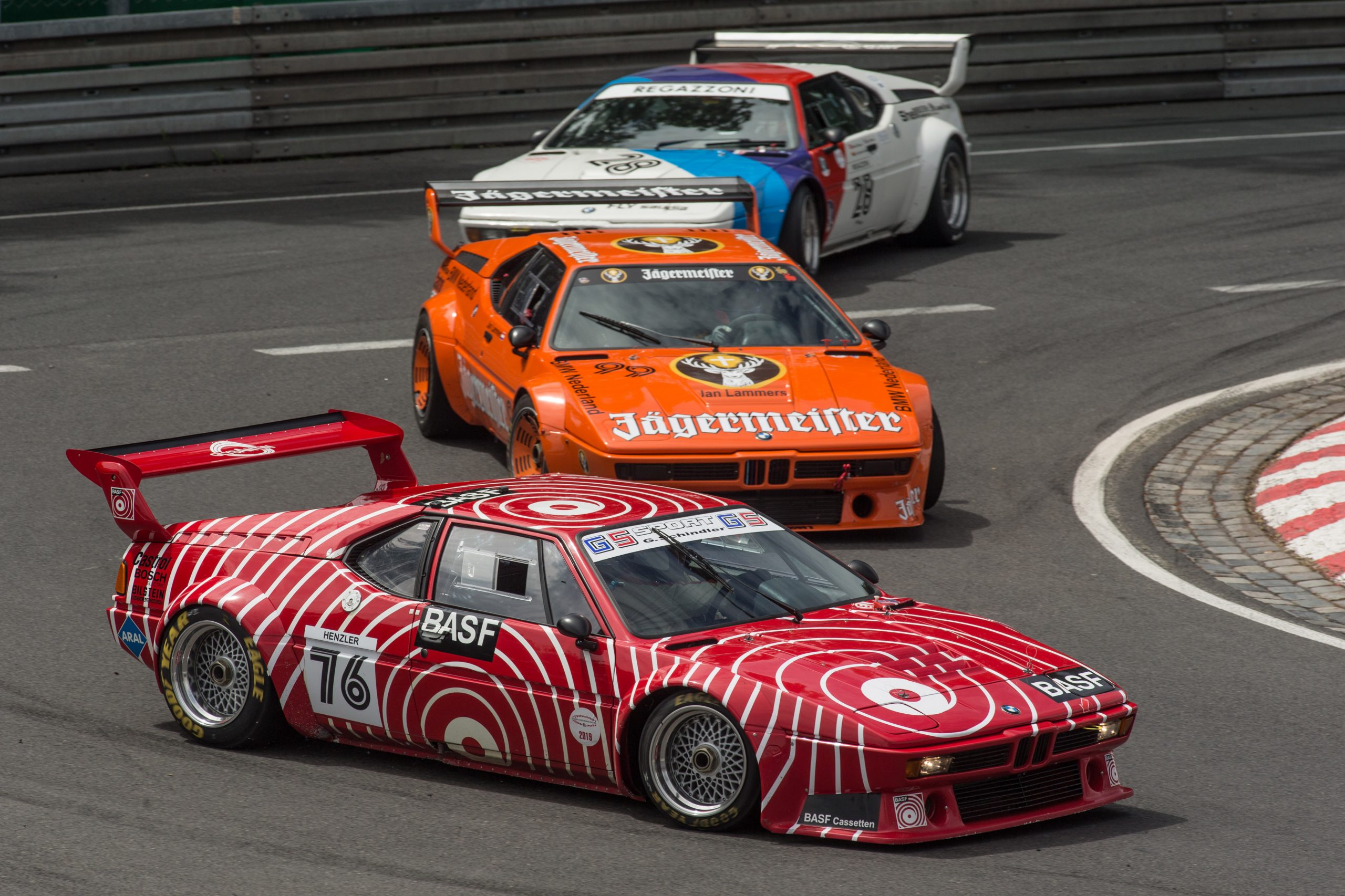
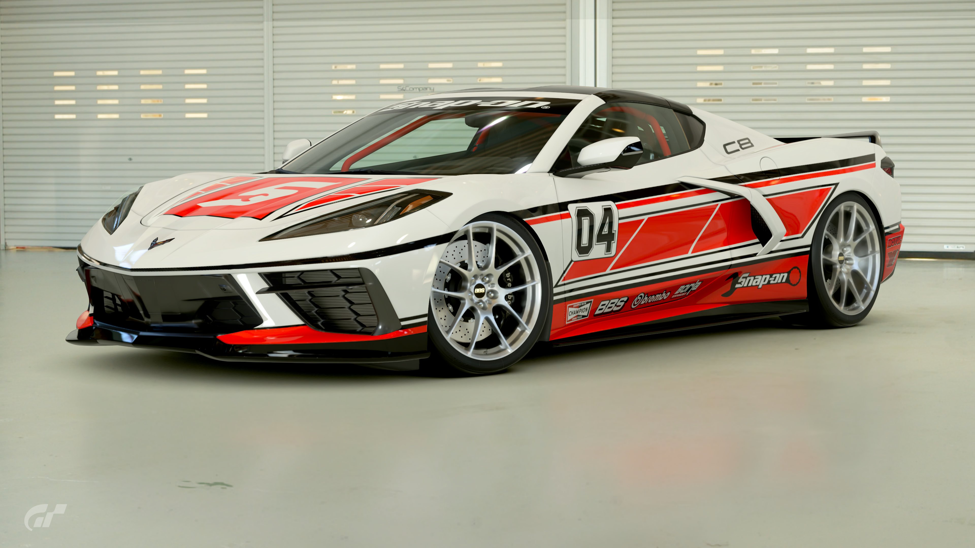
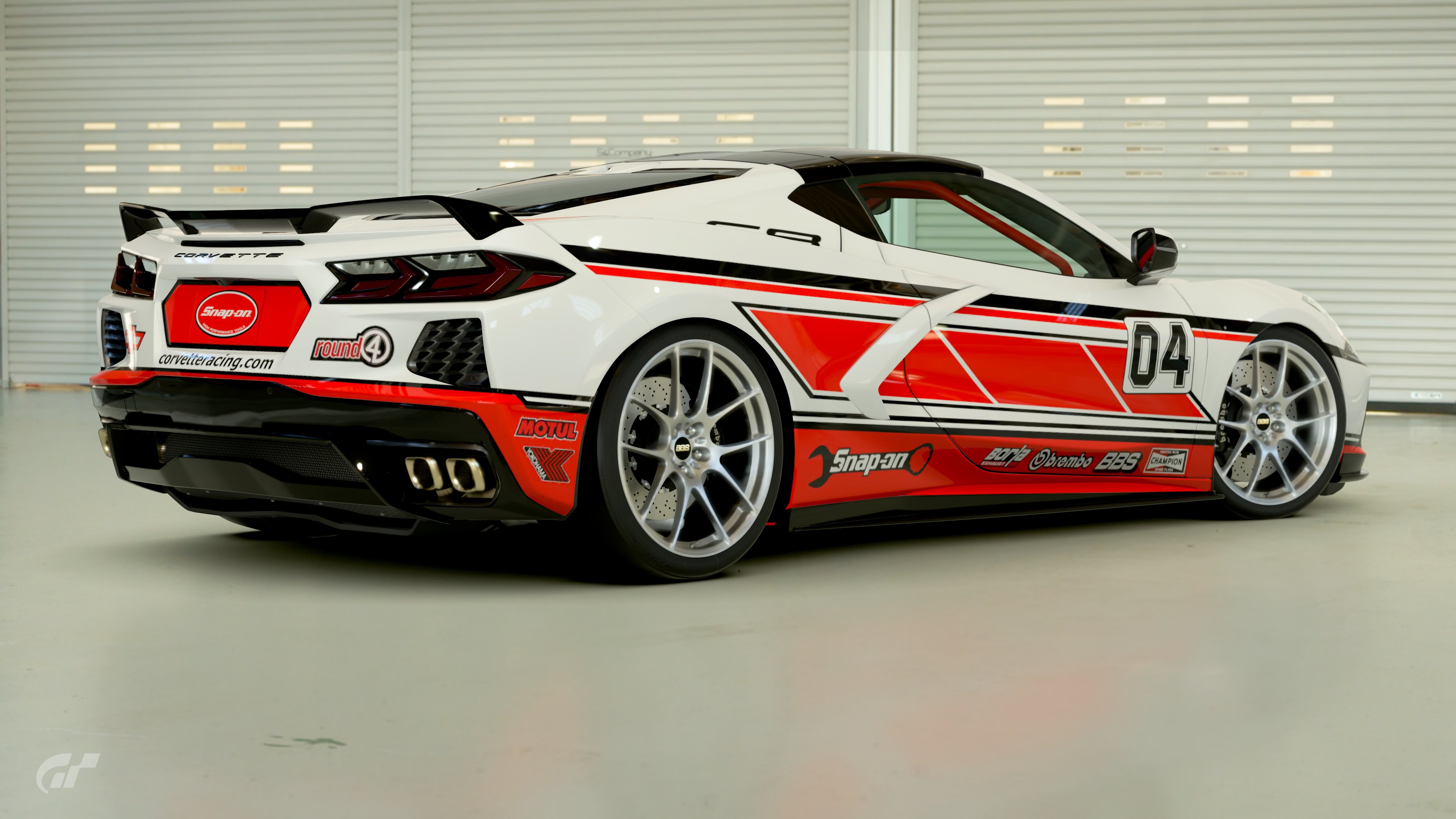
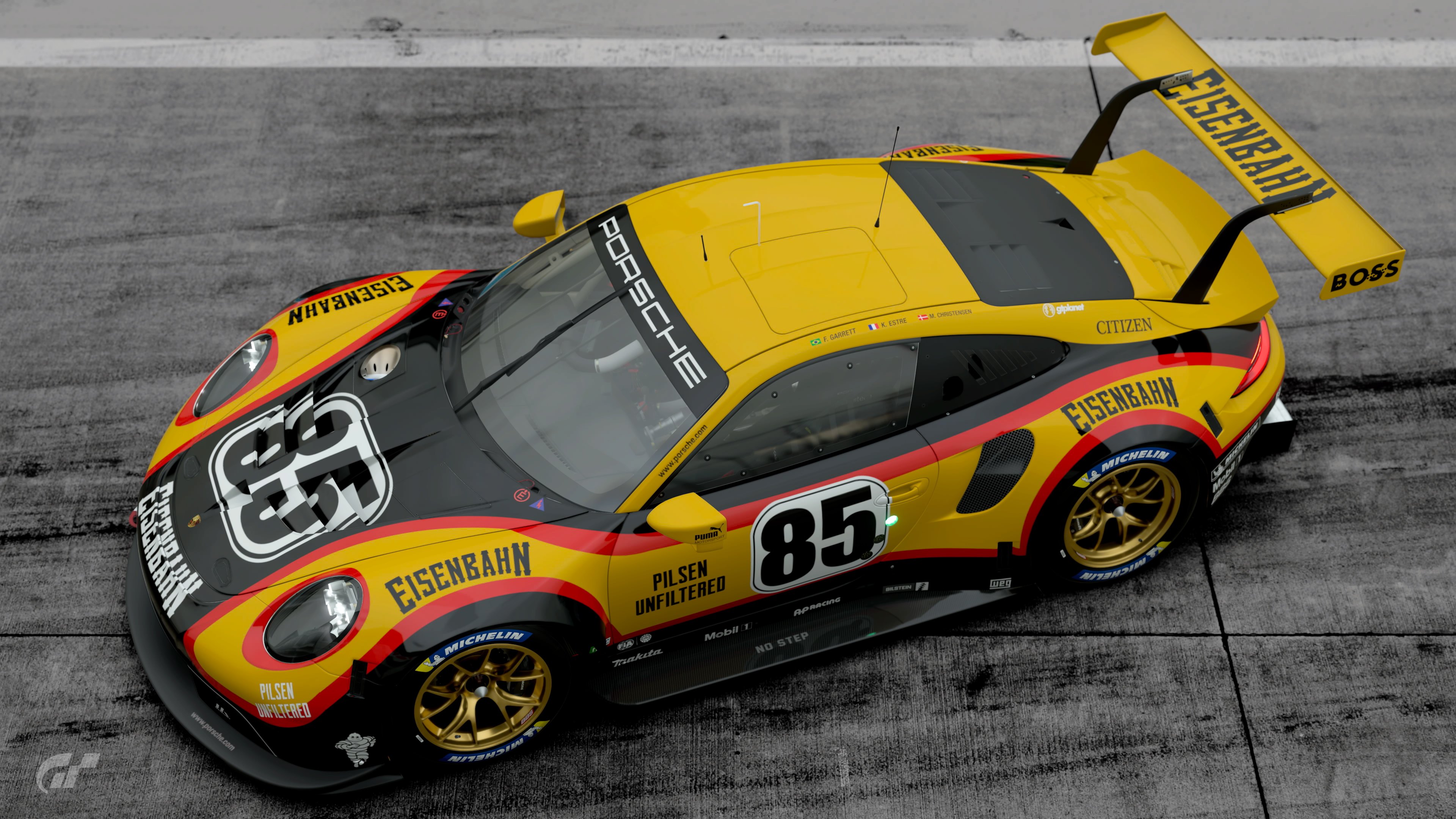
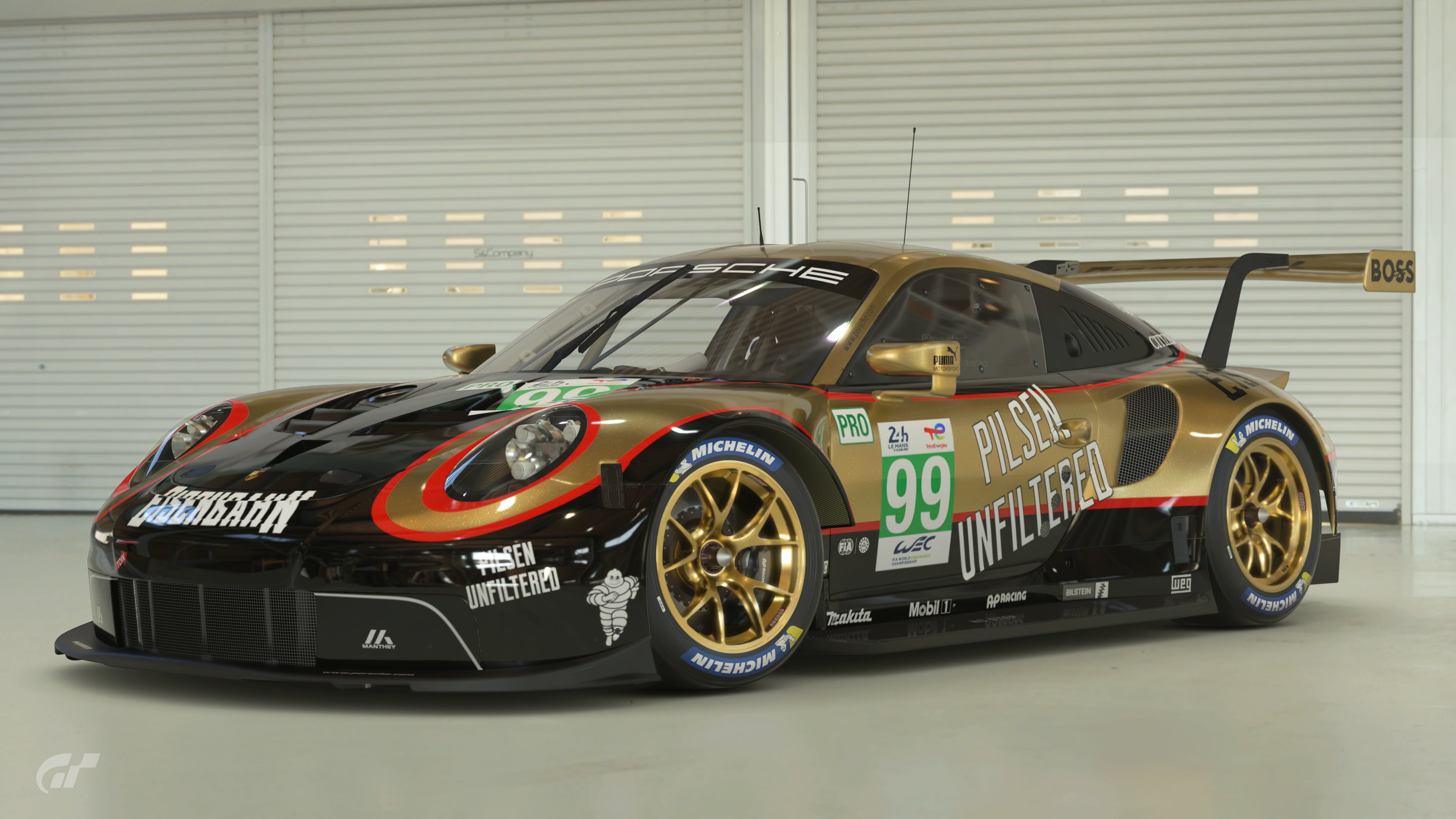
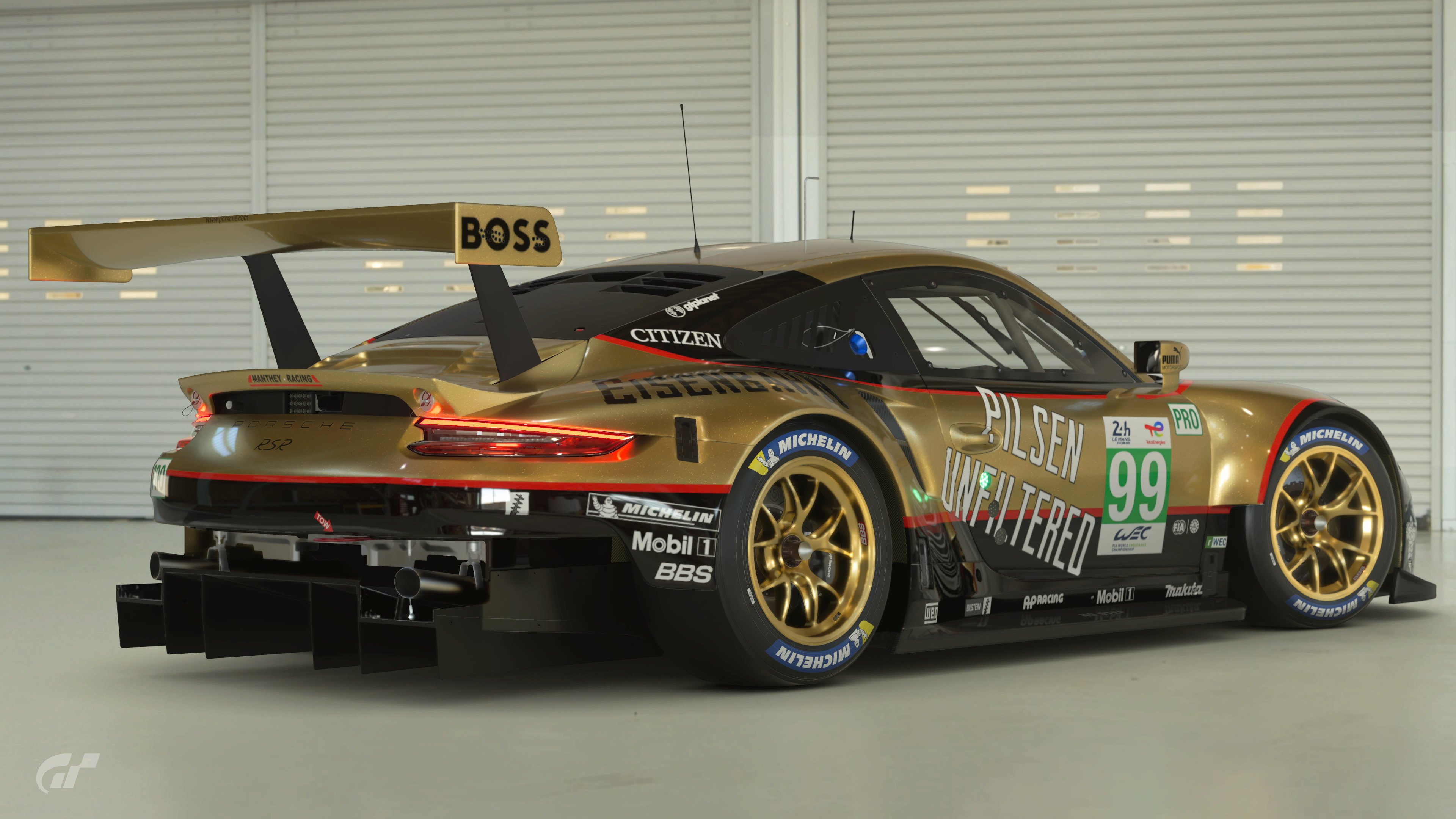
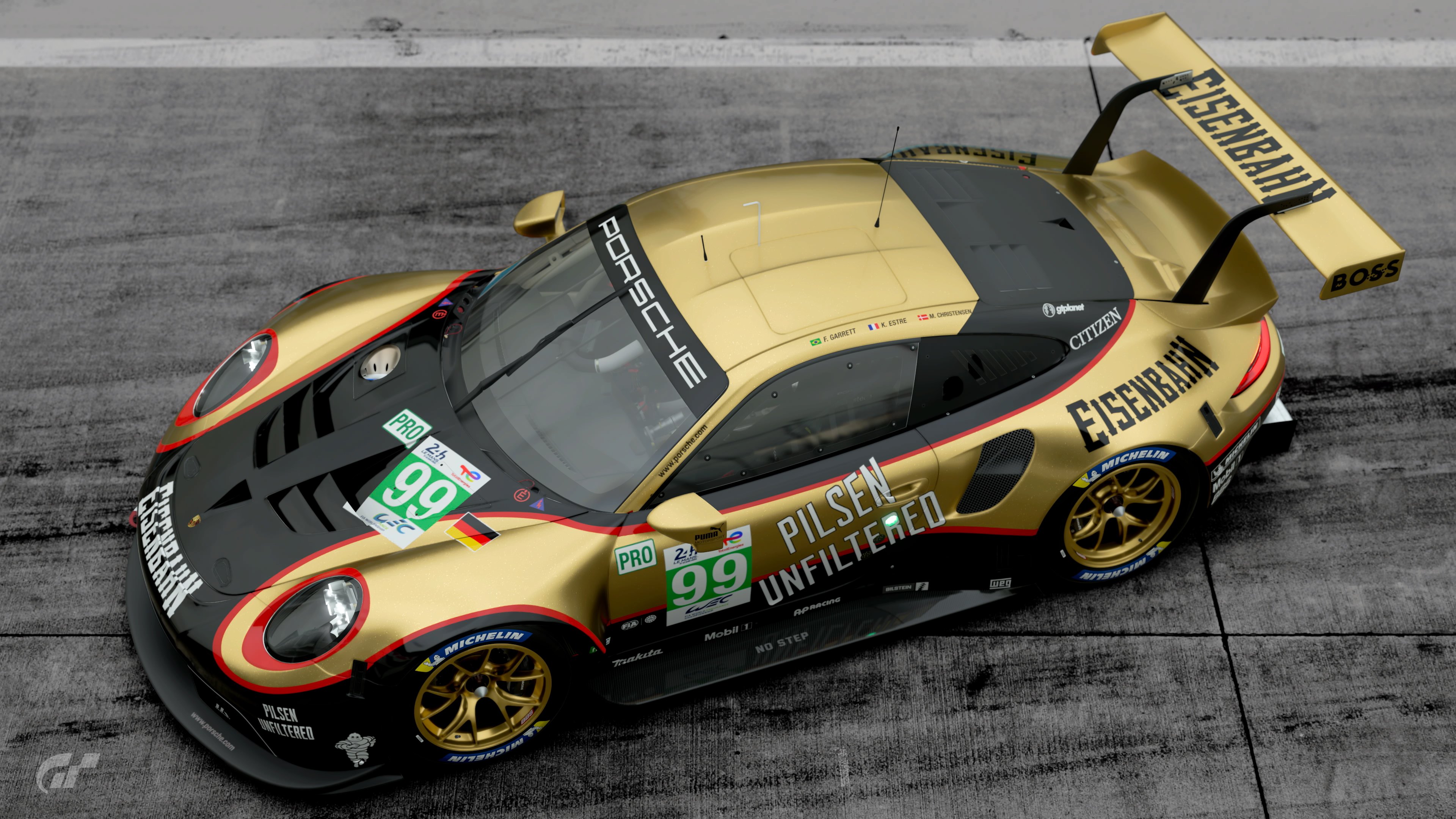
"80s' style. Design a car that takes its inspiration from 80s' liveries. But it's not that simple....
Keeping the liveries very much so 80s', I want cars to be from 2000 or newer. The big thing for me is limiting the crazy designs. 80s' cars had some very simplistic designs in terms of shapes yet still to this day are eye catching and mesmerizing. I don't want to see crazy curves or large scale images as that wasn't really a thing in the 80s'. I want to see the use of rectangles, squares and triangles. Strictly no replicas, though you can take inspiration and apply it. (if it is found to be too close to an original, you may be asked to edit your entry).
A quick note, bear in mind with 80s' car that title sponsors were very bold and in your face, so your livery should represent this."
CARS:
- 2000 or newer
- No VGTs (looking at you, @MatskiMonk)
BODY PARTS / WIDEBODY:
- Allowed
LIVERIES:
- Original designs only
UNIQUE RESTRICTIONS:
- Must use either classic or modern decals (not a mix)
- Must use a basic number board that would've made sense in the 1980s'
- Solid colours only (no metallic/chrom/fluo/matte)
- No massive amount of complex shapes or curves
BONUS PICTURE SETTINGS:
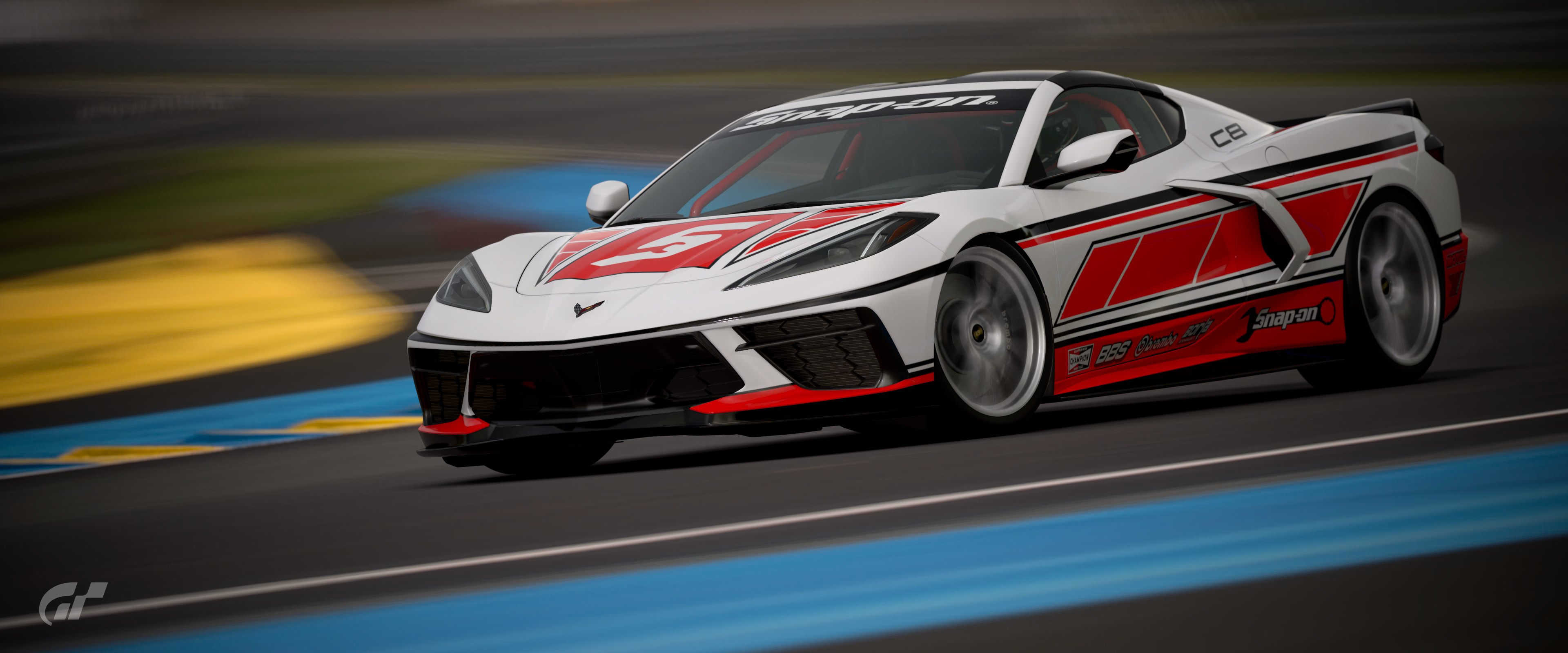
- Track shots in motion only
USER MADE DECALS:
- Allowed
GENERAL COMPETITION RULES
ENTRY SUBMISSION
- The only way you can take part is to be a member of the GTPlanet forums. If you haven't created your account yet, click here.
- Mark your FINAL ENTRY clearly, with red text.
- Unsure how to? Copy and paste the following:
[COLOR=red][B]FINAL ENTRY[/B][/COLOR] - One entry per user. It must be your own work, and never previously used in a competition.
- You may change your entry once. Do it clearly; edit out your previous entry, and either post the new one in a new reply, or in place of the original.
- Do not post "Honourable Mentions" or outtakes - just your Final Entry, that's all.
- Absolutely no entries which utilise edited/hacked file saves.
- Winner gets to choose the following month’s theme.
- Winners cannot enter their own theme!
- The organisers may ask for the original image/livery and it must be submitted if so.
- It's recommended to share the original livery online (in-game) to prove it’s your work.
ENTRY PRESENTATION
- All images shall have preview images which may not exceed 640 pixels in either direction (main and bonus pictures).
- You have to post two main pictures of your entry using the mandatory location and settings as shown in the quote below.
- You are allowed to post two bonus pictures in a spoiler (
[SPOILER]...[/SPOILER]) with free location and settings (unless the unique restrictions of the week’s theme specify something else). - You have to make one post with ONLY the set allowed number of pictures and the FINAL ENTRY (see above) mark. If you want to add precisions/background story/links, you are allowed to double-post under your entry, but please put all additional images in a spoiler. The best way to do it will be to "reply" to your own post.
- It is recommended you host your image either here on GTPlanet (via the Media section), or on Flickr
- Not sure how to submit your image? Here's a guide for both methods mentioned above.
- Do not attach your phots directly to your entry post.
- A preview image must be representative of the full-size image. Do not add effects to it.
- Please use a clickable-preview to full-size, not a separate text link for it; it makes poll creation much easier!
- No post-game editing of any entry image is allowed.
- Mark your entry with which platform you're on and which mode you're using, whether it’s taken on PS4 Base, PS4 Pro, PS5 Raytracing or PS5 Framerate.
MANDATORY PICTURES
- You have to post a front and a rear quarter view of your car:
- Mandatory Scape: S&Company East, Saitama, Japan (scape number 5)
- Focal Length: ~80mm ±5mm
- Aperture: f5.6 or f8.0
- Shutter Speed: 1/1 Second
- Exposure Correction: +0.5 to +1.0
- Do not use any Filters or Effects at all and only the camera setting above within the allowed limits; the pictures are supposed to be as equal as possible for all entries and not give anyone who is a bit more savvy with the Scapes Camera an advantage! Try to stay as close as possible to how the video shows the shot to be taken!
NOTE: if you have previously entered, just go to Scapes > My Library > click your previous entry > Open Scapes > change car to the new entry, refocus and snap a new photo. No need to reposition the camera/car unless its proportions are wildly different.
Please, ensure you read and understand all requirements for this competition. Failure to follow the rules may result in disqualification. If you have questions, start a convo with me, Matski or any other participant you feel comfortable reaching out to.
PLEASE NOTE: Repeat offenders will be disqualified. If your entry doesn’t match the rules you will be made aware of it at least once, so please keep an eye out for any notifications reaching your profile.
DEADLINE
February 28th, 2023 - 23:59 UTC
Last edited: