Gran Turismo 5 arts & concepts (heavy edit)

  • Thread starter Big Ron
  • 2,057 comments
  • 230,227 views

Metropolis...Into The Light

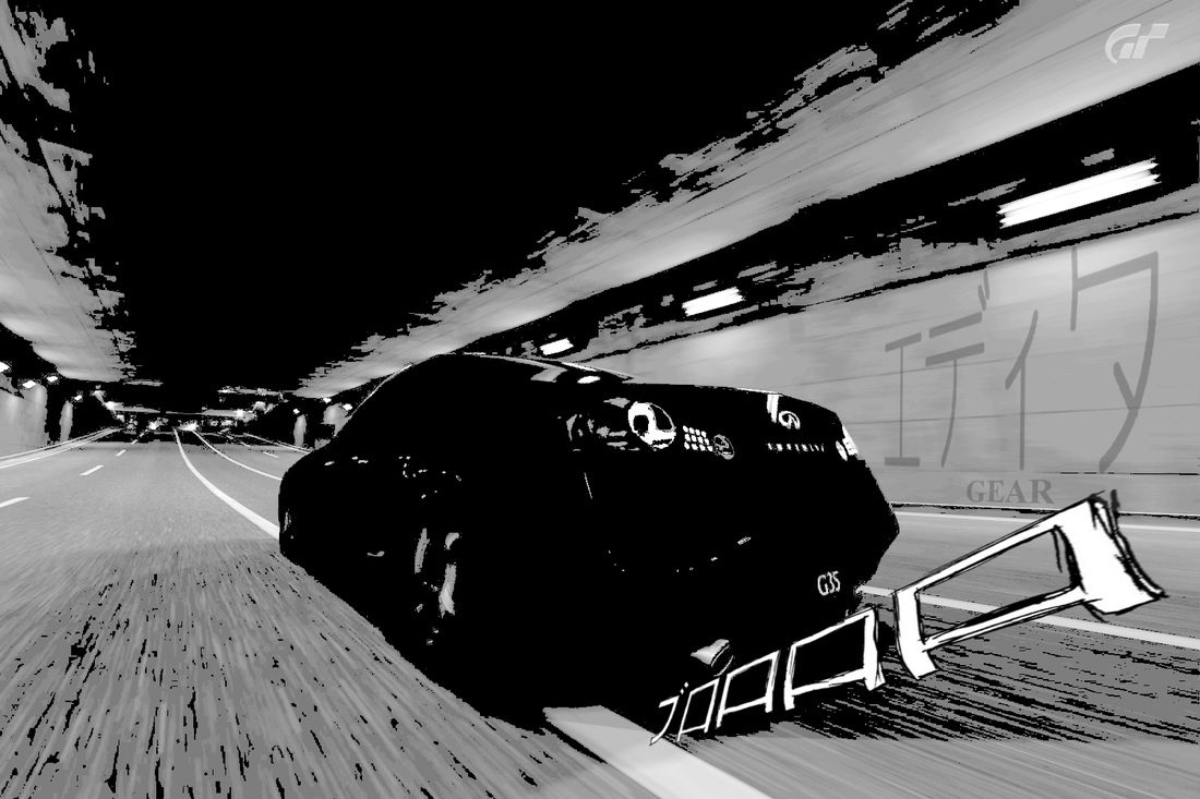
Decided to do a quick edit this time. I set myself a time limit of 20 minutes and this is the result...it took me 25 minutes! :yuck:

gotta love the combination of The Furai concept and SSRX!


----------------------------------------

The second part of my Metropolis set. The first part is here...

Metropolis...Somewhere In Time

 
Very good edit, ShaolinMasta. The leaves give the whole picture a realistic look, but also emphasize the depth of field. The saturation is spot on and everything looks clean, as well. 👍
 
any one else detect a slight hint of one-upping going on :)

some very awesome and creative edits coming out of you guys lately.

taking some inspiration from leeislee, I added some glare to the nbdesignz's lambo


Last edited:
Hmmm... I think the GTR would look better in black or a more dark color to pupup from the rest of the "smoggy" image. The light is a bit undefined due to the cloudy/smog environemt... but I think the position, perspective and proportions of the car are quite right. Maybe a bit more distance to the ground would look more realistic and If you could add some reflections in the car, then would look great for sure :D
 
Some more fantastic edits, NB!
But I think that default Photoshop flare might be detracting from it. :indiff:

EDIT: I accidentally one thousand.
 
Last edited:
Oppa Manga Style
The japanese symbol are vroom in English.

2589523_orig.jpg
 
I tend to agree with EG, it's pretty darn good mate. The balance of elements and simplistic typography work well. The textued background is also a nice touch and the colour harmonies blend very well also.

Bascially it's a nice piece. 👍
 
nice gtuned, but all I read in my head was:

"it didn't turn out that good but its art"

and it made me laugh

I came across this art in looking for Blade runner stuff, and thought a GT might look nice in it:


original background:

ewkn.deviantart.com/art/King-Tong-Street-YAO-209992823
 
GPR
I tend to agree with EG, it's pretty darn good mate. The balance of elements and simplistic typography work well. The textued background is also a nice touch and the colour harmonies blend very well also.

Bascially it's a nice piece. 👍
I couldn't have said it better myself. 👍

[...]


[...]
Great combination! The car fits very well into that environment. 👍
 
Back