- 3,159

- Livingston, Sco
- BkS-y0
- APX BkS
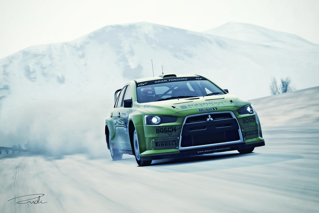
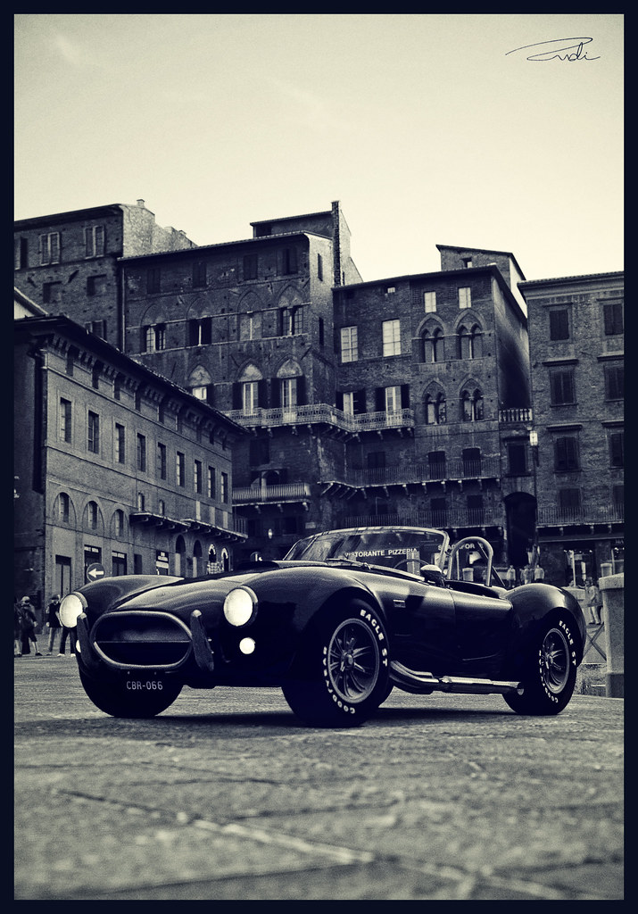
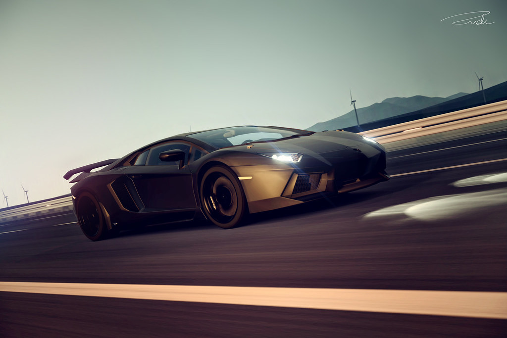
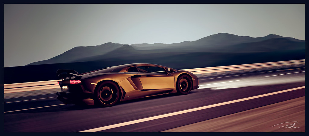
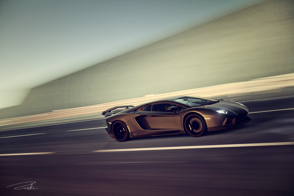
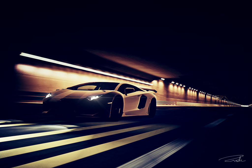
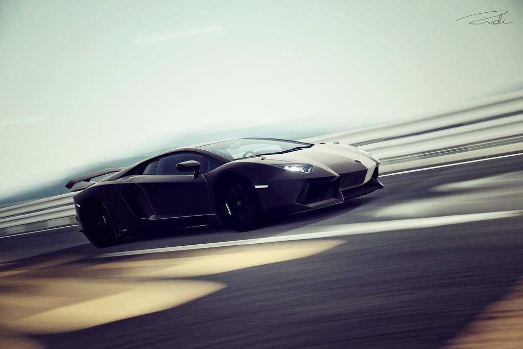
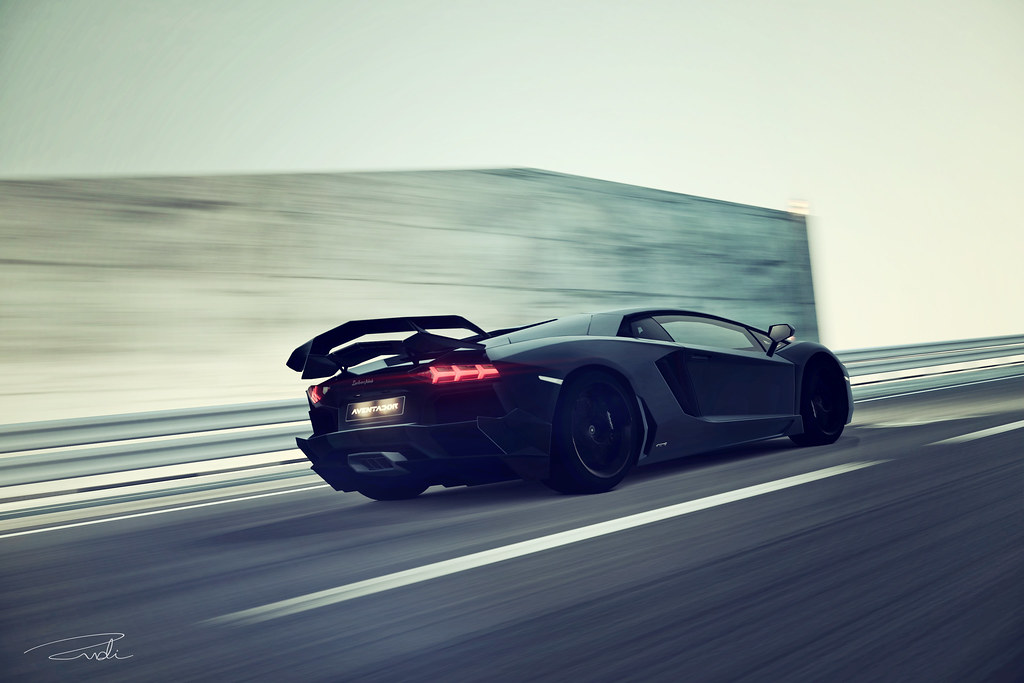
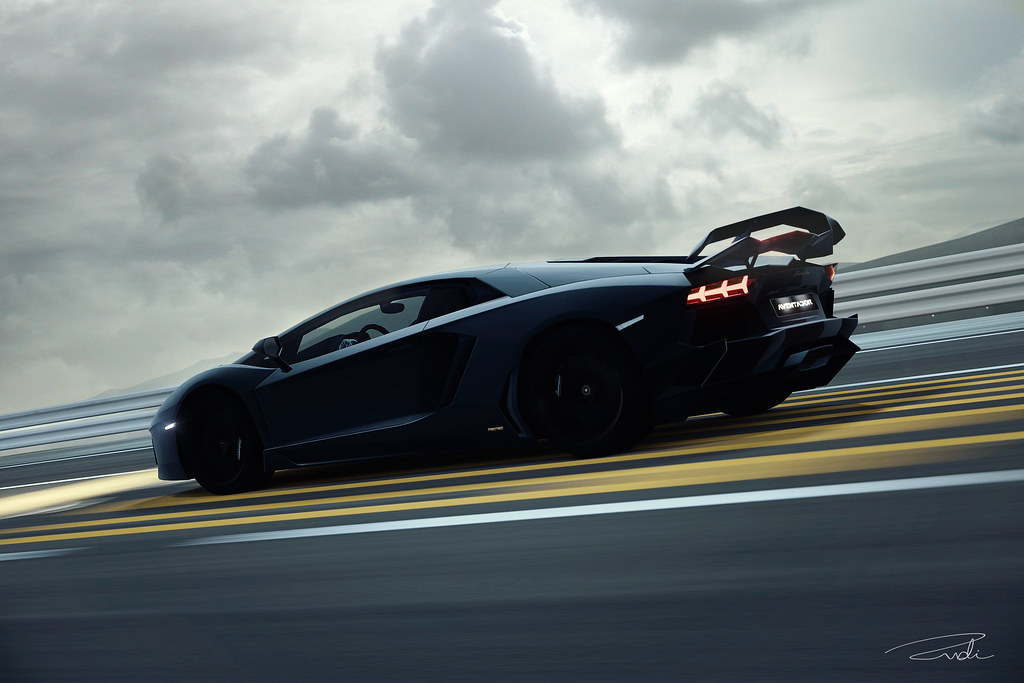
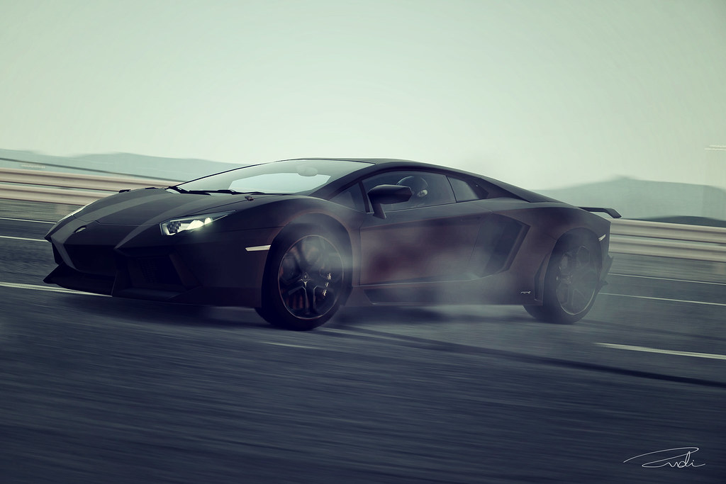
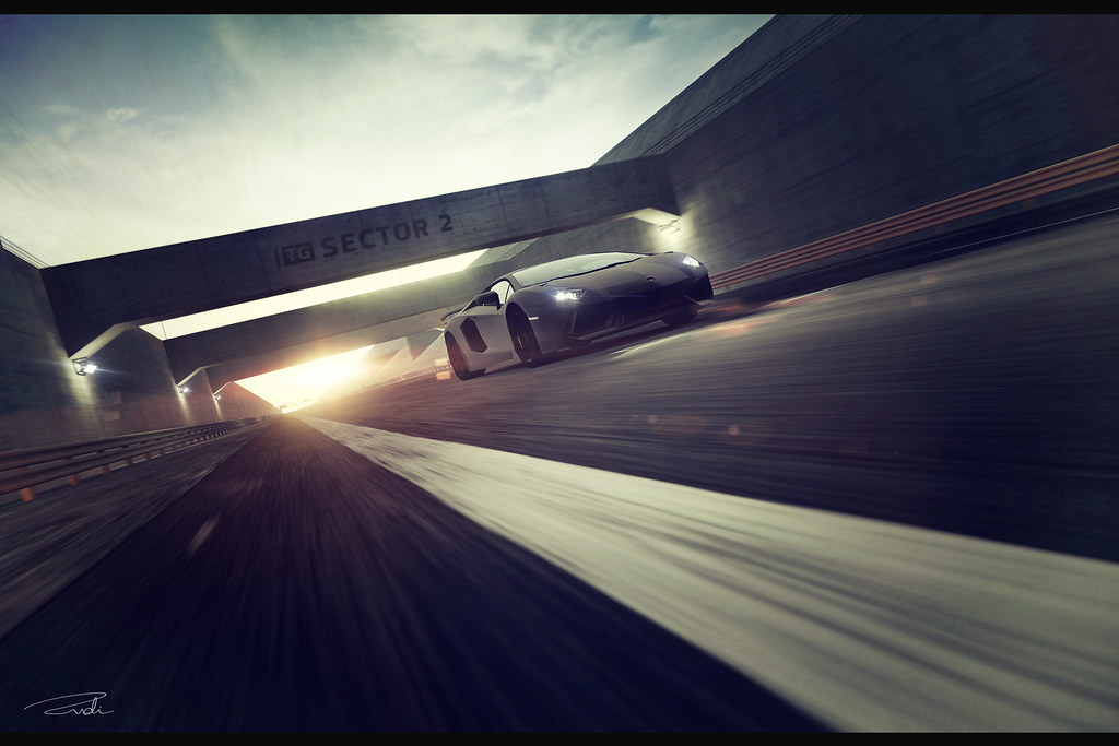
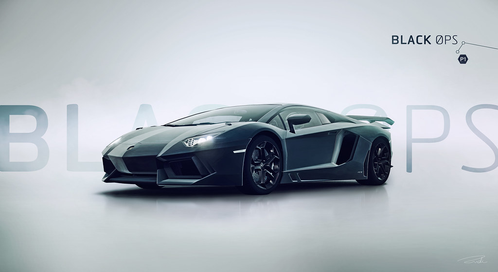
In my opinion, these look very well done. There are some "bleeding" issues of where you can see a feather from the car to the background, but overall, I like this. One or two are slightly over-sharpened (could just be my eyes though), but again, it's not really noticeable.
The weather edit is pretty funky as well. It's very minimal in terms of weather editing, but it's just right in my opinion.
Nice work! 👍
The weather edit is pretty funky as well. It's very minimal in terms of weather editing, but it's just right in my opinion.
Nice work! 👍

")

") 👍
👍