- 12,389

- Betelgeuse
- Beeblebrox_237
Hello there! I am Beeblebrox237, and you are reading my tutorial on using layers. Before you continue, consider that everything you see here is self-taught. If you have anything to add, I'd be happy to include it, and any criticism would be welcomed. I hope that you can learn something from it! 
So, I am going to attempt to teach you how to add a bit of artistic flair to a photo you've taken in GT5. Or anywhere, for that matter. Adding layers with gradients lets you adjust the colour balance of a part of a photo, rather than the whole thing. Lets look at a few examples of photos that have been edited with layers, first:
More artistic:

Here I've used a layer to warm up the flowers:

Here's a more subtle use:

Okay, now we've seen what can be done with them, lets get on with the tutorial. I use an online photo editor called pixlr, you can get to their editor here. As the tutorial progresses, I would recommend that you go into pixlr yourself and follow along. I would also encourage you to play around while following along, so that you can begin to find your own style and have a bit of fun. The tutorial may be able to be followed in other editing software, but I haven't tried it. Please tell me if it is compatible with GIMP, photoshop, lightroom, or any other programs you use.
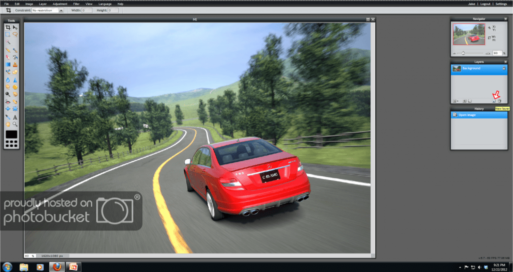
First, open up a photo. Any photo will do, but I recommend a lighter shot, and one that you want to make artistic, rather than realistic. Then, go over to the "layers" box on the right and click on the "new layer" icon.
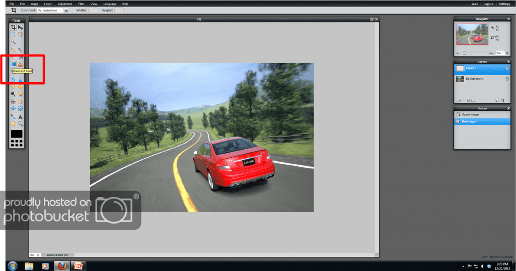
Once you have created a new layer, it will automatically be selected for editing. Whatever you do to this layer will be independent of the "background" photo, but will act as an overlay. You can select different layers to edit by clicking on them in the layers box.
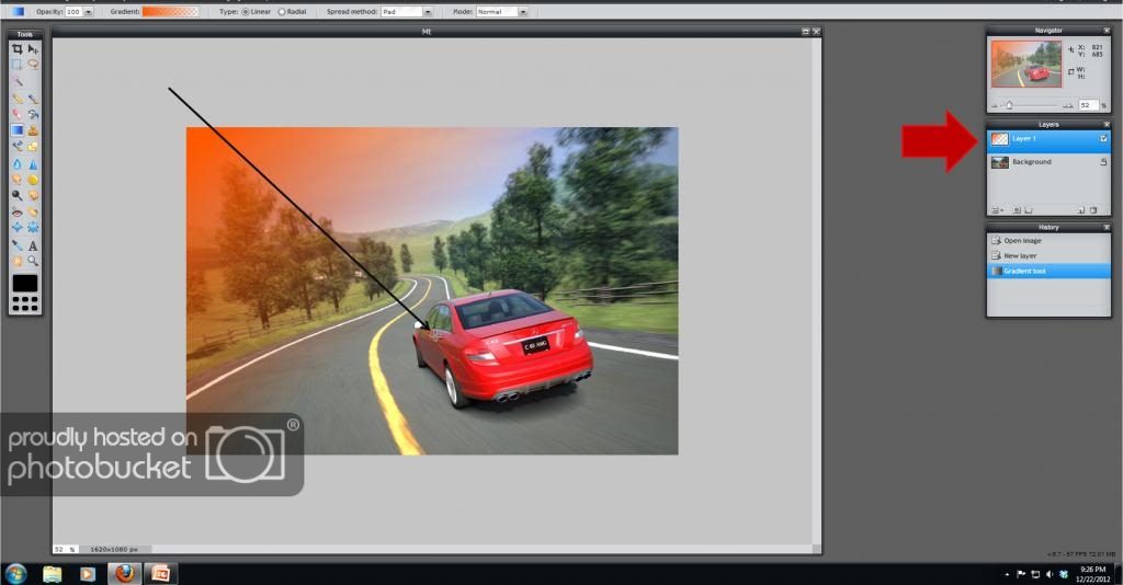
Now that the new layer has been selected, you will want to use the gradient tool to create the effect seen above. Below you can see where it is in the toolbox.
Now that you have selected this tool, you will see options appear at the top of the editing window. These options determine what the gradient you apply looks like.
Opacity: How much you can see through the gradient. Higher numbers mean the gradient is more opaque. As we will see later, there is another way to adjust this with the layer tools.
Gradient: This is what the gradient actually looks like. Below, the gradient submenu has been opened. For this tutorial we will be using the third option, black fading to grey chequerboard. [indicated by the cyan box below] The chequerboard indicates transparency. The two little boxes below the gradient display at the top of the submenu [indicated by the red arrows below] determine where the gradient starts and stops on the tool as you use it. If you select one of these and click on the box where it says colour, you can adjust the colour of the gradient. Be sure to do this for both, not just one.
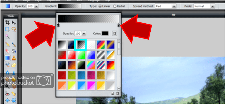
Type: This lets you select a radial or linear gradient. Radial will be useful for vignetting, linear more useful for artful effects. However, I encourage you to play around with this.
Spread method: I'm not entirely sure what this does, but it seems to work best when set to the default "pad."
Mode: This determines what effect it will have on the background. This,a s with opacity, can be changed in the layer settings.
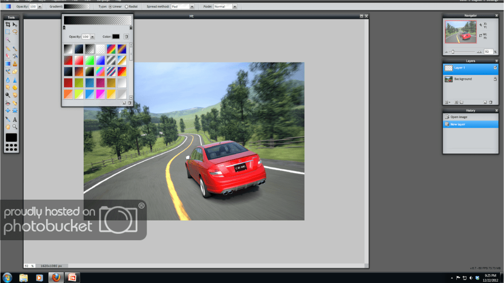
Okay, now that we've gone over the gradient tool, lets use it. Make sure it is selected, and that you have the colour that you want. Warm reds are nice to work with, as are cool blues. Make sure the new, empty layer is selected, and drag the cursor across the screen to create a gradient. You may need to undo what you just did, and do it again. Several times. It's rare to get the perfect result the first time. Note that what you now see is not the final product, so don't worry about making it subtle. If it covers up half of the background, that's okay.
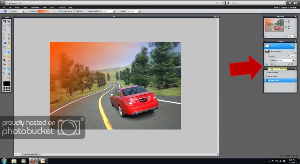
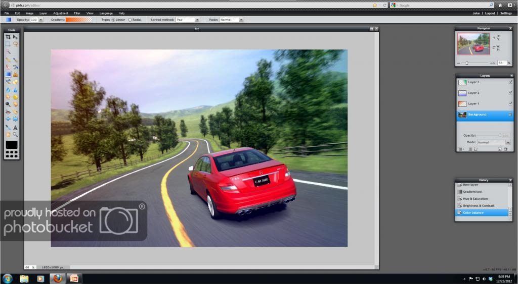
Once you have a nice ugly gradient in the middle of your photo, you need to make it look nice and interact more with the background. Go over to the layers box and click on "toggle layer settings." This icon is at the bottom left.
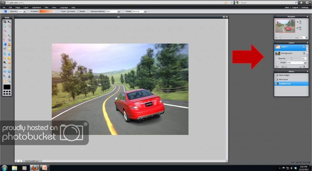
Now, adjust the opacity, usually I set it to between 5 and 30. Also, play around with the mode. There are quite a few, and I'm too lazy to describe them all, so try them all out now, with around 25% opacity, to see what they do.
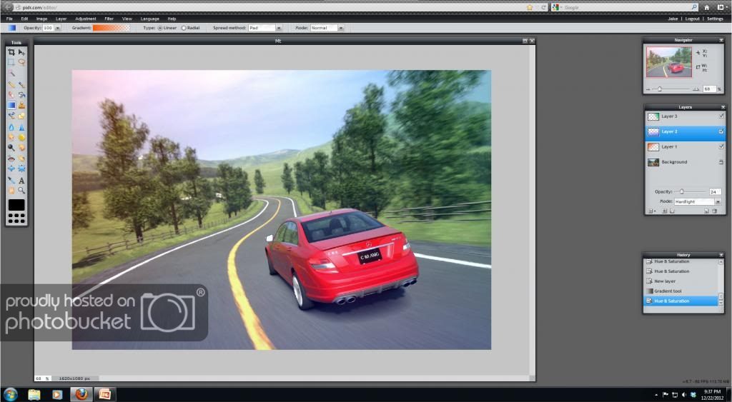
You can see that now there is a nice, reddish light in the top corner of the photo. Now, I've created two more layers and used blue and green gradients coming from the bottom and right, respectively.
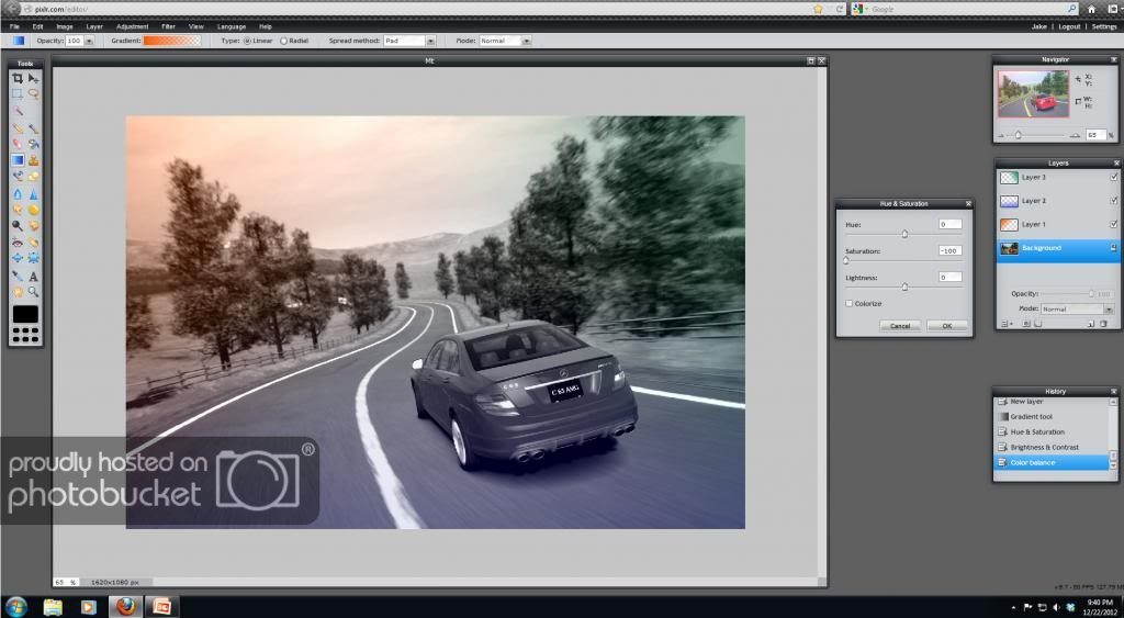
Now, select the background layer, and edit it like you would a normal photograph, until it looks good to you.
Notice that if I desaturate the background layer, you can see the effect of the other layers more clearly:
And that's pretty much it! As I said before, I encourage you to experiment with layers. The best way to find your own style is to discover it yourself.
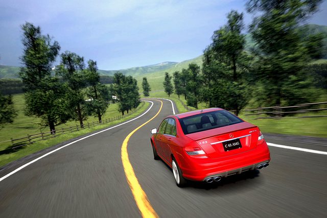
And here, for reference is the final product with and without layers.
With:

Without:
I hope this tutorial was helpful and not too convoluted. I would love to hear feedback on it. So goodbye for now, and happy holidays!
Part 2: community feedback/suggestions
This section will be where I put all of the useful and related comments from the community.
So, I am going to attempt to teach you how to add a bit of artistic flair to a photo you've taken in GT5. Or anywhere, for that matter. Adding layers with gradients lets you adjust the colour balance of a part of a photo, rather than the whole thing. Lets look at a few examples of photos that have been edited with layers, first:
More artistic:
Here I've used a layer to warm up the flowers:
Here's a more subtle use:
Okay, now we've seen what can be done with them, lets get on with the tutorial. I use an online photo editor called pixlr, you can get to their editor here. As the tutorial progresses, I would recommend that you go into pixlr yourself and follow along. I would also encourage you to play around while following along, so that you can begin to find your own style and have a bit of fun. The tutorial may be able to be followed in other editing software, but I haven't tried it. Please tell me if it is compatible with GIMP, photoshop, lightroom, or any other programs you use.
First, open up a photo. Any photo will do, but I recommend a lighter shot, and one that you want to make artistic, rather than realistic. Then, go over to the "layers" box on the right and click on the "new layer" icon.
Once you have created a new layer, it will automatically be selected for editing. Whatever you do to this layer will be independent of the "background" photo, but will act as an overlay. You can select different layers to edit by clicking on them in the layers box.
Now that the new layer has been selected, you will want to use the gradient tool to create the effect seen above. Below you can see where it is in the toolbox.
Now that you have selected this tool, you will see options appear at the top of the editing window. These options determine what the gradient you apply looks like.
Opacity: How much you can see through the gradient. Higher numbers mean the gradient is more opaque. As we will see later, there is another way to adjust this with the layer tools.
Gradient: This is what the gradient actually looks like. Below, the gradient submenu has been opened. For this tutorial we will be using the third option, black fading to grey chequerboard. [indicated by the cyan box below] The chequerboard indicates transparency. The two little boxes below the gradient display at the top of the submenu [indicated by the red arrows below] determine where the gradient starts and stops on the tool as you use it. If you select one of these and click on the box where it says colour, you can adjust the colour of the gradient. Be sure to do this for both, not just one.
Type: This lets you select a radial or linear gradient. Radial will be useful for vignetting, linear more useful for artful effects. However, I encourage you to play around with this.
Spread method: I'm not entirely sure what this does, but it seems to work best when set to the default "pad."
Mode: This determines what effect it will have on the background. This,a s with opacity, can be changed in the layer settings.
Okay, now that we've gone over the gradient tool, lets use it. Make sure it is selected, and that you have the colour that you want. Warm reds are nice to work with, as are cool blues. Make sure the new, empty layer is selected, and drag the cursor across the screen to create a gradient. You may need to undo what you just did, and do it again. Several times. It's rare to get the perfect result the first time. Note that what you now see is not the final product, so don't worry about making it subtle. If it covers up half of the background, that's okay.
Once you have a nice ugly gradient in the middle of your photo, you need to make it look nice and interact more with the background. Go over to the layers box and click on "toggle layer settings." This icon is at the bottom left.
Now, adjust the opacity, usually I set it to between 5 and 30. Also, play around with the mode. There are quite a few, and I'm too lazy to describe them all, so try them all out now, with around 25% opacity, to see what they do.
You can see that now there is a nice, reddish light in the top corner of the photo. Now, I've created two more layers and used blue and green gradients coming from the bottom and right, respectively.
Now, select the background layer, and edit it like you would a normal photograph, until it looks good to you.
Notice that if I desaturate the background layer, you can see the effect of the other layers more clearly:
And that's pretty much it! As I said before, I encourage you to experiment with layers. The best way to find your own style is to discover it yourself.
And here, for reference is the final product with and without layers.
With:
Without:
I hope this tutorial was helpful and not too convoluted. I would love to hear feedback on it. So goodbye for now, and happy holidays!
Part 2: community feedback/suggestions
This section will be where I put all of the useful and related comments from the community.
A good and simple use of layers to make an image more realistic is to duplicate it and set it to overlay or soft light (when it isn't too dark...if so, set it to screen or light)...and play with the opacity, gaussian blur between 2-3 and/or make it B&W.
Last edited:
") I only use PS to edit my images but I think this Tut will work fine in any edit program.
I only use PS to edit my images but I think this Tut will work fine in any edit program.