Zerox: Great sense of speed and use of panning. Only downer is that it’s a little empty and uninspiring in terms of shot location/composition. 7/10
Miklad: Good composition. Not a huge fan of the use of the warm filter here as it serves no real improvement to the image (only overexposes the rumble strip). I think with no filter and more realistic tones it would look a lot better. 6/10
Bmxmitch: Not bad, but I think the amount of wheel turn on the car makes it look awkward and unrealistic. The composition is also a little bland. 6/10
Aragam: Simple but effective. Good sense of speed and depth of field. Black and white works well too. 8/10
Youngun: Good to see something out of the ordinary, but in my opinion the whole composition doesn’t work too well. It’s an interesting shot that catches my eye immediately, but my eye trails off just as fast because there’s nothing in the photo to hold my attention (there is no well defined subject of the image). 3/10
Kaede: Really like the sense of speed and composition. Would have worked a little better if the car to the left were also in focus. 7/10
Wallbreaker: Looks great! Nice originality and well executed. It also looks pretty realistic! 8/10
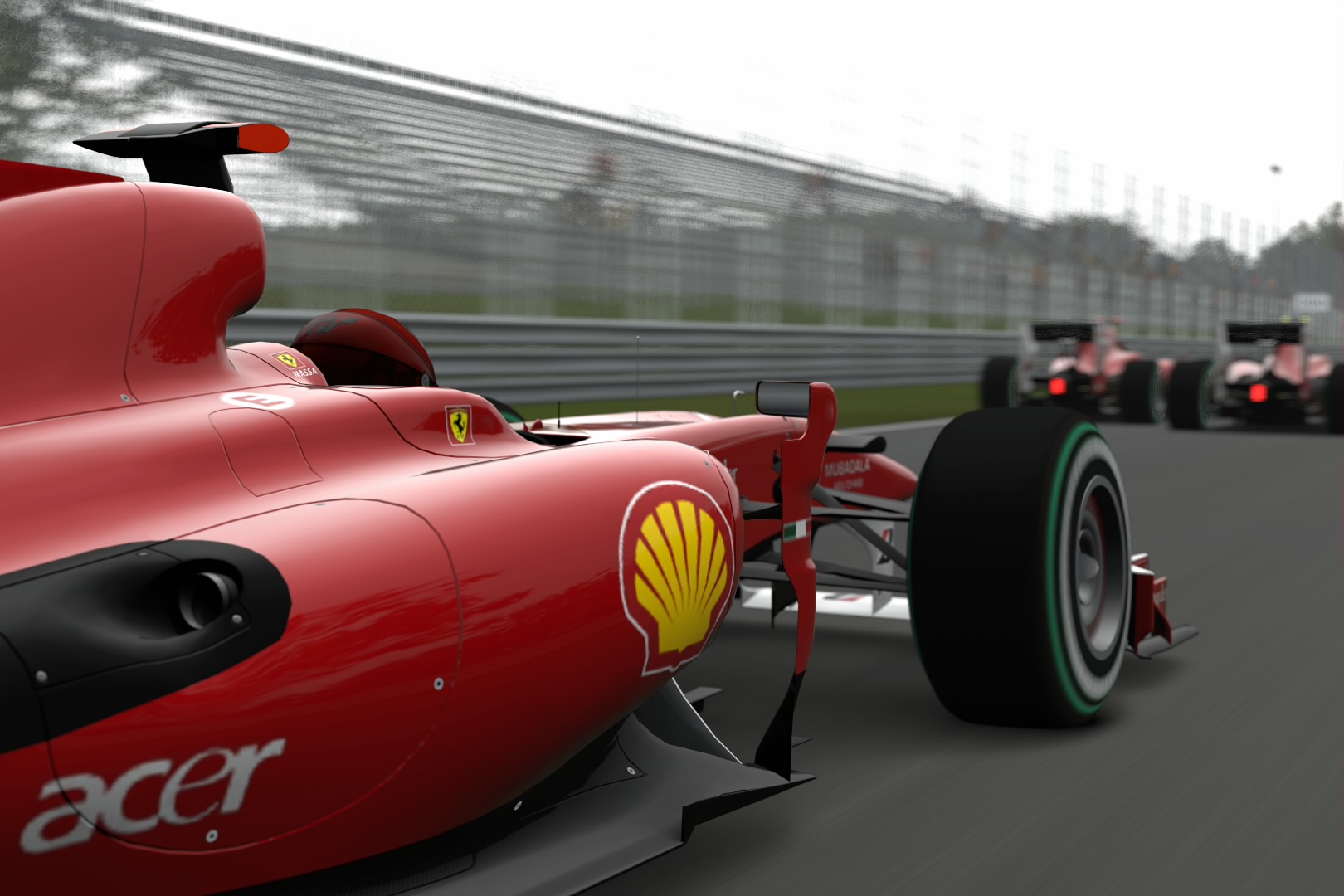
Benda18: A creative angle and composition. I just think that you’ve set the f-number too low…. I’d like to see he whole nose of the car in focus and not just the closest part of the front splitter. 6/10
Ferrari_458: A nice shot, but composition wise it didn’t really jump out and grab me. The direction of the lighting in the photo is also wrong. The rear end of the car should be illuminated if you’re taking a photo like this. 6/10
Bunchchristian: Not bad, but I feel the composition could be improved. There seems to be a too much space in front of the car that shows off nothing but an ugly wall. 6/10
Nfdids: Great composition but the lighting seems a little strange (not realistic looking). In this case it may have been wise to use a photo filter to disguise the odd lighting. 7/10
CCShaft: Quite nice. Good lighting, but nothing that special and creative. Could have used the shot location better in my opinion as it’s so iconic to the track. 7/10
Hgrf93: I really like this! Composition is good, and tones and lighting are realistic. Very good! 8/10
McZachenF138: Nice use of depth of field. My main point of criticism is the blurred artifacts at the lower parts of the image. They seem to be distracting, and detract from the image. 7/10
TVR&Ferrari_Fan: In this case I think the space to the right of the car works quite well – so I really like the composition. The whole image feels underexposed though and that’s my only real point of criticism 6/10. Changed Entry:. This shot is a bit better. Composition is unique and it looks rather realistic. 7/10
DarkR: Quite a nice shot. The tones and lighting look very realistic, however the water mist doesn’t. Without the water mist it would have been a superb shot. 7/10
F1_stig: I really like this shot. It’s super crisp and clean looking. Not too keen on all the brown/beige tones from the concrete. Perhaps a monochrome filter would have looked better. 7/10
Youtimestwo: A pretty nice shot. Perhaps a little bland composition wise. 6/10 Changed entry: Not quite as nice. The whole photo looks very cartoonish – almost like a PS2 game. 4/10
Tonystew42: A decent shot. Good composition, although I’m not sure the cross-processing filter works in its favour in this case. 7/10
Nissanfanatic: Composition wise it’s quite nice, but the photo itself is heavily overexposed (the sky in the background is completely white and so too are many of the highlights on the car). 5/10
Nato_777: Similar in many respects to Youngun’s shot, but slightly better in execution. Still, I’m having trouble keeping my eyes from wandering off the image as there is no well defined subject. 5/10. Second Entry: Much better. Looks like it could have been taken right from ceiling_fan’s shoot! It’s hard to split yours and his shots apart but there's something about the tones and lighting in his shot that does it for me more than yours. 7/10
Bazylfox: Good use of the environment, but sadly that’s about all that’s good in this photo. It seems a little underexposed, and I’m not sure whether the warm filter is suitable here. The angle of the camera is also a little boring and uninteresting. 4/10
Nt1138: A nice shot with a good composition although the lighting is a little odd (cars look cartoony) and the image is a marginally overexposed. I feel a little bit of tilt in the camera (slightly clockwise) could work really well here. 6/10
Zambuca: Love the composition and depth of field/bokeh. The vibrancy of the tones really grab your eye. A really nice shot! 8/10
Rekve: Not a bad shot. Even though I know the car has static hubcaps, I think it looks weird that it is obviously in motion, but the wheels look stationary. It kills the sense of speed in my opinion. As you stated yourself, the composition is also a little bland (doesn’t really feature anything special of the car or backdrop). 5/10
Mazda787: Looks lovely! Tones and lighting are good (looks fairly realistic), composition and sense of speed are superb. A perfect shot would have shown off more of the distinctive features of the Nurburgring. 8/10
Nicknamealguem: Pretty cool. It’s a very eye catching image and the composition is quite nice. I feel that there should be a distinctive subject in the image to capture the viewers attention (rather than the whole rear end of the car) as my eyes seem to wander around the image in search for one. Coupled with one of the artistic filters, this image could have been outstanding. 8/10
RED3MON: Nice composition, although I am struggling to pick out any detail in the car, due to the underexposure. I think the warm filter works quite well, the only other thing I’d suggest for improvement would be to have a little tilt to the shot. 7/10
ShadowPeter: The extreme monochrome filter works perfectly to white-out anything but the important details. As a result it accentuates the details that we should be able to see (the car and the racing line), turning it from a nice shot, to one that’s outstanding! I’d been waiting to hand out an illusive 10 and here it is. 10/10
PaperHats: Composition is interesting and certainly a bit different, but I can’t say that I’m a huge fan of it – perhaps it would be better if the f-number was a little lower so that the car right in front of the lens was blurred more. Also I’m not sure that the monochrome filter serves any favourable purpose in this case. 5/10
Honkydonky: Quite nice. Good sense of speed (other than the stationary hubcaps) and not bad composition. I feel the tones and lighting of the image aren’t hugely realistic – the colours seem overly saturated. 5/10
At1504: Really good composition. Perhaps the shot could have been taken a little more from the right of screen, so the line of F1 cars is more obvious. Tones and lighting aren’t that great (in comparison to the composition) so perhaps an artistic filter would work in the shot’s favour. 8/10.
Schwartz38: This shot has real potential and the idea behind it is nice. The composition looks confusing though and it’s difficult to pick out the pit crew in the background (they should play a key part in the image). Like most unedited pictures, the lighting isn’t great and the tones are a bit oversaturated and overexposed in some areas. 6/10
Mattmflok: Cool composition, I just feel that there’s a little too much camera tilt which is quite off putting. Perhaps an artistic filter would have worked well, but overall quite nice! 7/10
GTuned: I really liked your first shot before you changed your entry! This one isn’t quite as good (composition wise). One thing that this shot does do better is that it really jumps out at me, and despite the fact that the car looks super over exposed, removing most of its details, it’s still a great idea. 7/10
Ijkhk4: Similar to Wallbreakers shot, and almost as well executed. You’ve captured the sense of speed and essence of racing well. However, I think a shorter focal length would really benefit the shot by displaying more of the beautiful backdrop of Monaco (at the moment most of the shot is just of the track). 7/10
Ceiling_fan: Perfect, realistic tones and lighting. Perhaps a little “safe” looking composition wise, so it doesn’t quite have the wow factor of an audacious shot like ShadowPeter’s. I also feel that you could have picked a better location for the shot – something that would show off what is unique about Fuji Speedway (i.e. Mount Fuji). 8/10
SVX: Lovely composition – good portrait shot and the right amount of tilt. Really not much else to say, other than great work! 8/10
Raphaele: Pretty cool idea, although it would be pretty unusual for an F1 car to do a burnout from the grid

As a picture it doesn’t really seem attractive to my eye (too many straight lines in varying directions – the shadow line is an example). 5/10
Cphbullet: A nice shot! Composition is quite nice, although I feel a wider lens/resolution would have made it that much better (so that both of the cars on the right would be included in the photo). The lighting is a little lackluster, but overall an attractive photo. 7/10
CakeConjuror: Not bad. I’m unsure such a low f number suits the shot well – I think it’d look better if almost the whole rear end of the car was in focus rather than just the body part with the exhaust (I know that may have been the point of the shot, but in reality the exhaust is a pretty insignificant part of the car). 6/10
Crishan: Pretty nice composition. The blur on the car in the foreground is a bit distracting and perhaps the shot would be better if you’d actually focused on that car rather than the one in the background. Otherwise it’s nice. 7/10
BluckBoster: Not bad composition, just the camera isn’t perfectly in line with the car in focus, which is a bit off putting. Not sure if the warm filter works in favour of the shot either. 5/10
FishyJuice: A good shot and use of panning mode 1. I think it’d look better if the front of the nose was in focus rather than the middle part of the body, and also if the car took up more of the background (either by zooming in or getting closer to the car). 7/10 Changed Entry: Much better! Great composition and sense of speed. Really displays all about formula one! All that would improve this shot would be some trailing cars in the backdrop behind the leader. 9/10
przemekszulim: Not bad. Nothing really special composition wise (the blurred brown wall in the background isn’t super attractive) but the sense of speed and lighting is good. 6/10
GT HP Nut: Composition is great! Love the way it really portrays a battle for position. However the lighting is a little odd (few over-exposed areas). It would have worked better if it was shot from the other side of the cars so that the cars would be in direct sunlight (then there wouldn’t have been such a need to turn up the EV in order to see detail in the cars). 7/10
Jason_B: I really don’t like how the wide angled lens has distorted this picture so much and there’s a little too much tilt in my opinion. Overall the shot makes me dizzy (too much going on at once in the shot). 5/10
ThaSyn: Sweet composition. Love the how the shot has two halves. One thing I will say is that the car doesn’t seem to “pop-out” in this image – it’s not that noticible (perhaps because of the red advertising board to the right of the car.). Having the car on the left half of the shot may have been better. 8/10
Fido_le_muet: Another good shot. Composition wise it’s simple but attractive, but once again those static rims are distracting me! Lighting and tones are spot on though, and in all aspects it’s a good shot. 8/10
Lellep: Absolutely love it! Composition is sweet and lighting (especially the boom and glow) works a treat. Just about perfect to be honest. I will say that it doesn’t quite have the audacity of a shot like ShadowPeter’s, so I can’t award you the same perfect score. 9/10
Ollytickles: Looks spectacular. The vignetting works awesomely to showcase the car in this instance. I don’t feel that it portrays much about F1 (which is in part, the aim of the theme) but it is definitely a beautiful shot! 8/10
ENDURANCEGUY: The composition is good, but the warm filter ruins it for me. It serves no beneficial purpose to the image in my opinion and only seems to underexpose a fair portion of the car. 4/10
MillDrum: It’s a cool idea, but the smoke is far too strong. It completely engulfs the car, and as a result the picture isn’t attractive. 2/10
Pgani: Good stuff! Good sense of speed and lighting. Fairly simplistic composition (nothing that wows me) but it works! 7/10
Crooooooow: Looks quite nice. Another one of those cases where I think the filter doesn’t work in favour of the shot. 6/10
Stiggy: Quite nice! Composition is a little simplistic, but the tones and lighting are spot on. 7/10
Jonjwlee: Great tones and lighting. I really like the sense of speed too. I think the composition feels a little awkward (perhaps the shot is a bit too “fisheye” looking distorting the perspective too much. Overall it’s a great shot though! 8/10
I3zoz: Simple but effective. There’s nothing that really jumps out at me about the shot, like some of the others. 7/10
Boabdulrahman: A nice shot! The composition could be improved by zooming out slightly in my opinion. Doing this would show slightly more track behind the car and I think would make it look a little better. 7/10
Brad431: Not bad. Looks pretty realistic, but I’d like to see the car hugging the apex a little closed. There’s nothing really wrong with the shot, but there are just too many good shots in this competition for yours to stack up highly. 5/10
Rpanico: It’s a good idea, but I’m not sure whether the photograph works as a whole. For me there are too many areas in the shot seem underexposed. It’s artistic, but that’s not necessarily what I was looking for in this theme. 6/10
GranTurismo916: An interesting choice going for the static shot! In my opinion it’d have to be something super impressive for you to pull it off, and I’m afraid it isn’t quite that. I think you could have done something a little more interesting composition wise and I don’t think the warm filter works to improve the shot. 4/10


 )
)")


") Happy to be in poll with it and even getting some votes considering this was an absolutely random shot
Happy to be in poll with it and even getting some votes considering this was an absolutely random shot