My gif site is moving up in the world!

  • Thread starter Thread starter FusionS2000
  • 23 comments
  • 740 views
Messages
1,327
United States
in a box
well i'm sure you guys are sick of seeing my little Gif cars, but hey I just want to show you guys the new layout for it.
the only working links for now are the ones under ".:[Multimedia]:." the rest of the links dont work yet, becuase well I just finished the template and all the HTML for the first page this morning so tell me what you guys think, cause if this new layout sucks I'm not gonna do anymore to it.

.:[Custom Made Car Gif's Ver.2]:.
 
011003-carpage.jpg


Other than that, nice work.
 
now that you mention it it is a little too jagged.:odd:

I might change it. If I get some time.
 
Fusion your last site was great i didnt think it could get much better but i was WRONG. Except non the links to the cars are working for me :(
 
You should find a place to put that Macro. Supra with the music you had on the old one that was PIMP
 
Awesome! Also, I love your "Burnt Rubber" videos! :D
 
under "information" it says "Geustbook" as noted in milefiles screen cap. and I dont like the clogged lines either. other than that it looks good.

Cano

perhaps putting one of the designs instead of the skyline? it looks too generic. and, please, DONT put music on the site. music on webpages SUCKS.
 
Try to keep it clean and slick, looks good so far and I like the Black/Grey color combo, looks good!! One suggestion would be, when you do get the links up to the mini gifs. under mazda you gotta make a 2nd generation MX-6, thats all i ask for ;)
 
MX-6, Ill see if I can make one, I got a new Idea for another template, its a blue scheme, its much more simple and there are no crazy ass lines, as for music, I probably wont only out of respect of the slow kids (56k'ers)

umm, anything else you guys can think of?:D
 
yeah its nice at first but like milefile said the lines are a little crazy.
 
GOD DAMN! I swear im sick of that damn site!

Ah, im kidding, nice site though!
 
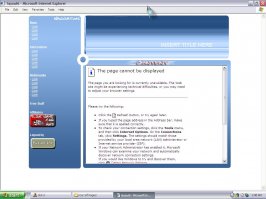
here is the other template I got, what do you think this or the black one?
 

Attachments

  • screen.jpg
    screen.jpg
    99.3 KB · Views: 59
I like the blue one better too, because its easier to find things. And looks more organized.
 
Back