- 2,149

- FL, USA, Earth, Sol, Local Bubble, Milky Way
- TeamACRZARacingo
- GyroxOpex
Note: this thread is for original logos ONLY. Please don't post replicas here. Thanks. 
Like creating logos? Share your creations here!
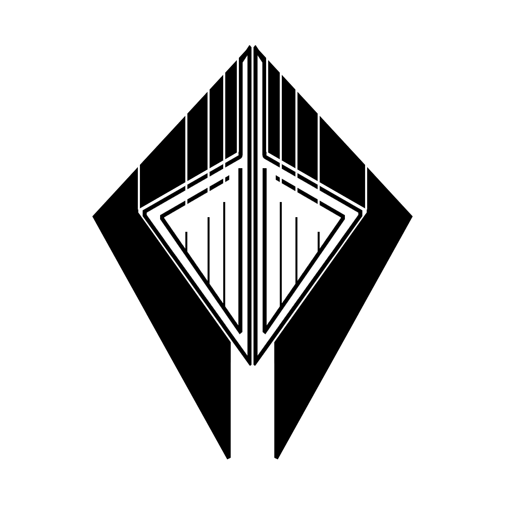
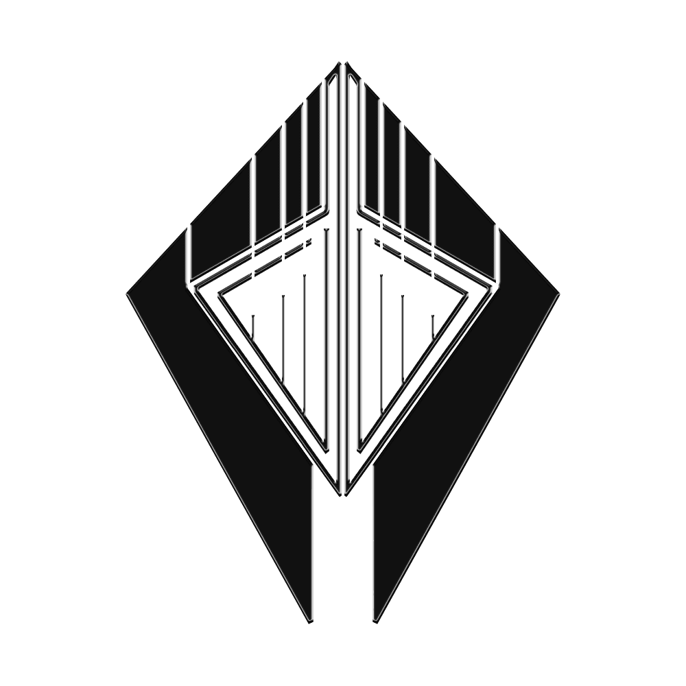
Here are a couple of mine to get things started. These are for my Typhoon Industries line of starships in the game Space Engineers. TI mainly makes small ships, ranging from space hypercars to heavy fighters. Typhoon ships are known for sleek, aggressive styling as well as the special emphasis placed on speed, light weight, handling, and when the time calls for it, overwhelming firepower. This emblem attempts to capture the spirit of TI, and I think it does it pretty well.
(Note that this is just a logoform; it's meant to be a reference for, say, a badge, and the lack of color in this version makes it easier to adapt to various incarnations of the TI wordmark.)
I really like this logo because there's a LOT of meaning behind it.
1) The overall shield-like shape of the logo represents honor and morality. In the universe I've created for my SE creations, TI prides itself on being a corporation with a soul; for instance, they won't sell any type of warship to any entities they deem evil or morally questionable.
2) The hard edges throughout the logo represent Typhoon's angular yet sleek design.
3) The shield's split bottom brings to mind Typhoon's signature design element, the Typhoon Twin Prong front end. This element originated on their first ship, the MRS-1 Multirole Fighter, as a way to protect the sniper gun, which was affixed to the front for better aiming. The Twin Prong front end has been carried forward in varying incarnations through all subsequent products.
4) The centerpiece of the badge, the arrow, is an homage to the company's origins as a fighter ship manufacturer.
5) The lines, when looked at vertically, make the arrow appear to be furiously striking down from the heavens, again going back to Typhoon's origins. However, if you look at the white lines at the top horizontally, they form a three-dimensional space progressing towards the center, representing eternal advancement and progress towards the future.

And now, here it is with the Typhoon Industries wordmark.

-----
But enough about me. This thread isn't just about my stuff; it's about your creations to, so let's see 'em!

Like creating logos? Share your creations here!
Here are a couple of mine to get things started. These are for my Typhoon Industries line of starships in the game Space Engineers. TI mainly makes small ships, ranging from space hypercars to heavy fighters. Typhoon ships are known for sleek, aggressive styling as well as the special emphasis placed on speed, light weight, handling, and when the time calls for it, overwhelming firepower. This emblem attempts to capture the spirit of TI, and I think it does it pretty well.
(Note that this is just a logoform; it's meant to be a reference for, say, a badge, and the lack of color in this version makes it easier to adapt to various incarnations of the TI wordmark.)
I really like this logo because there's a LOT of meaning behind it.
1) The overall shield-like shape of the logo represents honor and morality. In the universe I've created for my SE creations, TI prides itself on being a corporation with a soul; for instance, they won't sell any type of warship to any entities they deem evil or morally questionable.
2) The hard edges throughout the logo represent Typhoon's angular yet sleek design.
3) The shield's split bottom brings to mind Typhoon's signature design element, the Typhoon Twin Prong front end. This element originated on their first ship, the MRS-1 Multirole Fighter, as a way to protect the sniper gun, which was affixed to the front for better aiming. The Twin Prong front end has been carried forward in varying incarnations through all subsequent products.
4) The centerpiece of the badge, the arrow, is an homage to the company's origins as a fighter ship manufacturer.
5) The lines, when looked at vertically, make the arrow appear to be furiously striking down from the heavens, again going back to Typhoon's origins. However, if you look at the white lines at the top horizontally, they form a three-dimensional space progressing towards the center, representing eternal advancement and progress towards the future.
And now, here it is with the Typhoon Industries wordmark.
-----
But enough about me. This thread isn't just about my stuff; it's about your creations to, so let's see 'em!

Last edited:
