Worst Liveries Of All Time

  • Thread starter Liquid
  • 1,105 comments
  • 184,991 views
Striking is not the word I’d use. That is right up there with the pepto bismol force india/racing point liveries.
 
Alfa Romeo unveils a special livery for Spa:


Click at your own risk because it's quite bad.
I'd be more concerned with running Kick.com as a sponsor than the livery they've gone with. Not exactly a platform without questionable figures at its forefront or super-inflated, fake viewership.
 
I'd be more concerned with running Kick.com as a sponsor than the livery they've gone with. Not exactly a platform without questionable figures at its forefront or super-inflated, fake viewership.
Yeah I looked it up and... yikes, not a good look, both visually and literally.
 
Last edited:
00hondaearthdreams.jpg
looks like the wall paper of the worst arcade of all time
 
People might not like this opinion but for me, I don’t like the new AF Corse 296 GT3 livery.

I see what they’re trying to do, with the yellow stripes like on the 499P calling back to the 312PB of the 70s. But wow this just doesn’t work at all on a GT car.

The forward yellow stripe looks fine but the sort of weird half-stripe directly behind it just looks so out of place and amateurish in my opinion.

IMG_9796.jpeg


Also the yellow square on the front looks out of place and poorly integrated into the design as well.
 
If they accentuated yellow stripes to the shape of this car instead of another car, then it might look good.
 
When Tony Gilham drove the Geoff Steel Racing BMW towards the end of the 2011 British Touring Car Championship.
btcc11093001.jpg
6680659831_91f47a2696_b.jpg

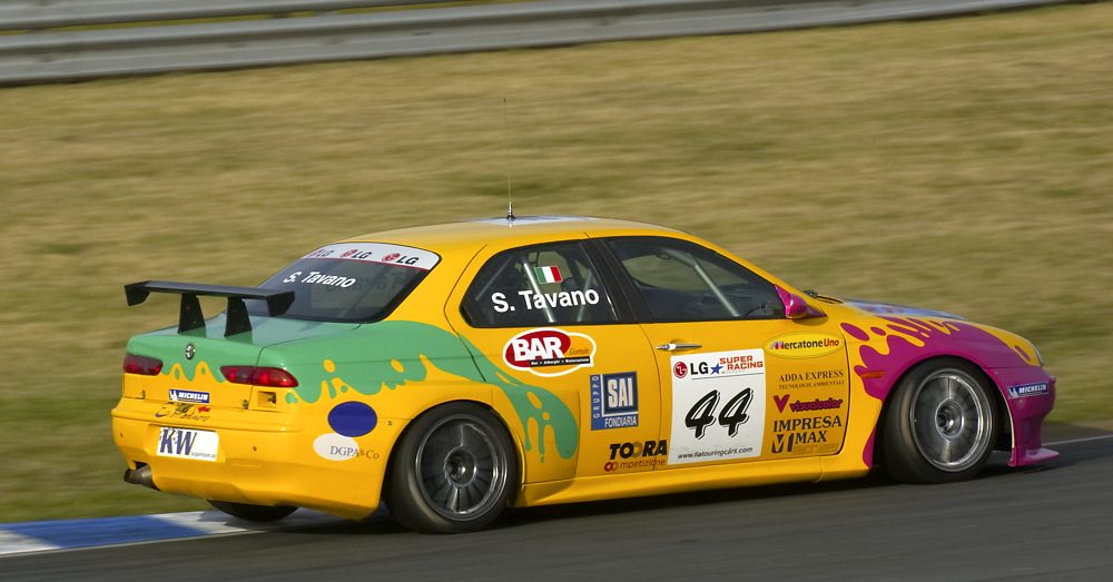
Doesn't matter which way round the pink and the green are arranged, it looks ugly as sin, period!
open-uri20121012-19714-1liyhlk.jpg

The livery he had when he drove for Triple 8 wasn't much better.
 
Last edited:
Back