- 5,812
- shmogt
Ferrari_458Preview Time
http://www.flickr.com/photos/ferrari458/6839328500/
I'm about to change my PMC Entry to a shot from this set, so it won't be a mystery for too long")
Haha yes the sheep are back!
Ferrari_458Preview Time
http://www.flickr.com/photos/ferrari458/6839328500/
I'm about to change my PMC Entry to a shot from this set, so it won't be a mystery for too long


I can't say I am a Ferrari fan now, or in 2007 even (though having watched my first F1 race at the age of 2 weeks, and going to my first live race at 3 years old, I used to be a huge Schumacher and Ferrari fan, still have a flag in my wardrobe
). 👍 I've only been to a few races in Sepang, because it's pretty near where I live and the tickets are cheap. Man, what I would give to go to Spa, just once in my life...  And here are the rest...


Number 9's my favorite!
I can't really explain it in words, but I like it alot

10.


 Feedback would be much appreciated
 Number 9's my favorite!
I can't really explain it in words, but I like it alot
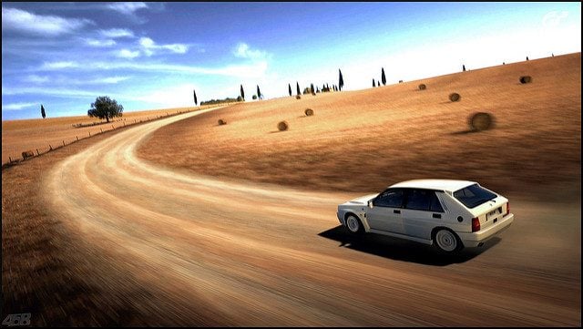
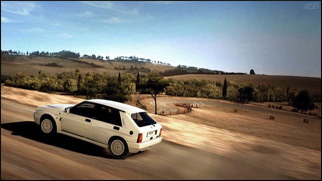
Lovely rally shots
well done 👍, love the 2nd & 4th shot the most
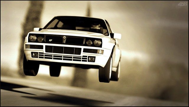
Loving the angles to bits!
X2!!
Great job 458!!
Great set. Well done. 👍
Thanks everyoneSweet set 👍
Thanks, that was the first time I'd experimented with them, and it definitely won't be the lastWow! Great set, especially the photos with the 'sepia' tones.
Oh dear, I was wrong.- 3rd & 9th are really something special, but OH MY GOD! That last shot. I'm speechless. I could look at it forever because it's beautiful! Oh and nice new watermark too!
Thanks both, I have to say #10 is by far my favourite from the set, and the one I spent the most time getting perfect when editing, so I'm glad it has gone down well
I KEEP CLICKING FAVORITE, BUT IT'S ONLY ADDING IT ONCE.
Mother of God that is beautiful.
Thanks JustinNice angles and editing! Including #10!
It's nice to see your new sig! Try to raise the opacity to full because, unlike your old sig (with the childish font), it's more stylish.
In the set above, I tried 100% opacity, do you like that better?Much appreciated ShaolinLovely shots !
#6 , 10 are my favorites 👍👍👍
Lovely Panning Mode 1 shots!
Awesome signature as well. 👍
Thanks, glad you like it better nowMuch better.
Phelps, 1-2-4-7...are my fave!
Thanks SVXLovely Panning Mode 1 shots!
Awesome signature as well. 👍
Cheers tazI was thinking the same, and my favorite's are 1, and 2 nice update 👍
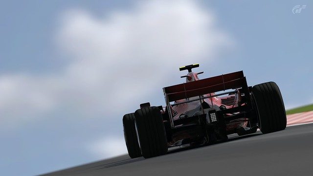
Thanks GT_R, your feedback is always very useful, and I'm glad to see that I'm improvingWow. You are improving with every update. Needless to say, that F1 set is outstanding.
Very colourful, good lighting, even better depth of field and to cap it all off, the angles make for a very, very interesting set in general.
Thanks BkSLove the panning mode 1 shot! 👍
Love every single shots
 It'll have to do until I get round to doing a meaningful set, which could be a couple of says, as FIFA Street seems to have taken over a bit at the moment Don't worry, I'll always be here
  OK, enough talking, here they are:


 Hope you enjoy this bit of randomness
 Well hopefully that bodes well for the competition thenThe PMC Entry is definetly my favorite of them all.
The others are good as well, but there's just something missing. This WOW - Effect, y'know?
Can't really explain what it is though.
Although I know what you mean, it isn't a special set really...Definitely very helpful, thanks a lot for the in depth comments GT-R 👍 The smooth colour transitions anre something I work quite hard on, because they add a whole new dimension to the photo I feel, and I always strive to make the car look as good as it can, so I'm happy that you feel that that has workedI like the smooth colour transitions (mainly perceptible in the sky). The colour(s) of that F1 car are not too saturated, which means that you get a nice balance between the light sky and the somewhat dark F1 car (the contrast here is fine). I also like the angle and depth of field because these two aspects play a major role when you want the object to stand out (crisp; clean) and/or want to emphasize its shape. Even though it is not directly noticeable, I would like to add that I like the blue/grey transfer from fore- to background.
Hope that this is of avail. 👍
Thanks TVR&FF, I must say I am fond of that myself, even if it isn't my favourite from the setMy favourite from the whole set, has to be this shot.
Thanks EvolvedsoulNumber six.. omnomnomnomnomnom
Fav'd
