- 12,949

- Cambridge
- Moglet85
- Moglet

Welcome to my guide to GT5’s Photomode! The aim of this guide is to share various tips and techniques to getting great looking photos and to editing well in Photoshop. To use this guide you will need to be familiar with Photomode and basic photography techniques, and will require a basic understanding of image editing software. I use Adobe Photoshop CS running on MacOS but there are plenty of options available out there.
If you are a complete newcomer to Photomode, then it will be worth your time reading gtsomething’s ‘Make the most of the GT5 Camera v2.0’ as this covers everything you need to start taking brilliant photos.
Guide Index
1. Composition
a. Vehicles in motion
b. Stationary Vehicles/Phototravel [Coming soon!]
c. Multi car photos [Coming soon!]
d. Tips and Tricks [Coming soon!]
b. Stationary Vehicles/Phototravel [Coming soon!]
c. Multi car photos [Coming soon!]
d. Tips and Tricks [Coming soon!]
2. Editing
a. Colour Balance
b. Lighting and Reflections [Coming soon!]
c. Tips and Tricks [Coming soon!]
b. Lighting and Reflections [Coming soon!]
c. Tips and Tricks [Coming soon!]
1. Composition
1.a – Vehicles in Motion
Capturing cars in motion is easy thanks to GT5’s excellent blur options. Composing your image effectively is a whole other ball game though, and for newcomers to photography there are a few pointers that can help change an image from a boring snapshot to a well composed piece of art.
First up you should think about your surroundings when moving the camera around, as the car isn’t the end of the photo. Getting the reflections on the car to look good is a great idea but you must also consider what this will do to the surroundings that you’re shooting in. When I shoot cars in motion I take a look at what’s around the image and think about the appearance they will have when blurred.
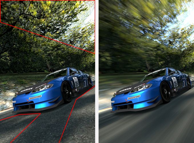
Here’s a good example of areas I spotted while setting up my demonstration photo. All of the sections highlighted in red contain interesting features that will show up as points of interest around the photo when blurred. The image next to it shows how those areas become eye catching and interesting without being too distracting.
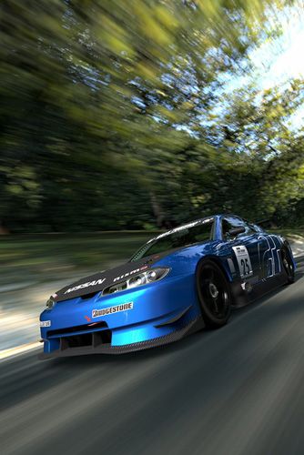
But it’s not only blurring that you should take into consideration. Sometimes the framing alone can be difficult to get right. Placing the car right on the edge of the frame is a definite no-no as it leads the viewer’s eye off the page and away from the photo which you definitely don’t want!
The example below shows the effect this has on a photo. The image on the left clearly has the rear part of the car clipped off, whilst the image on the right keeps it in full frame.

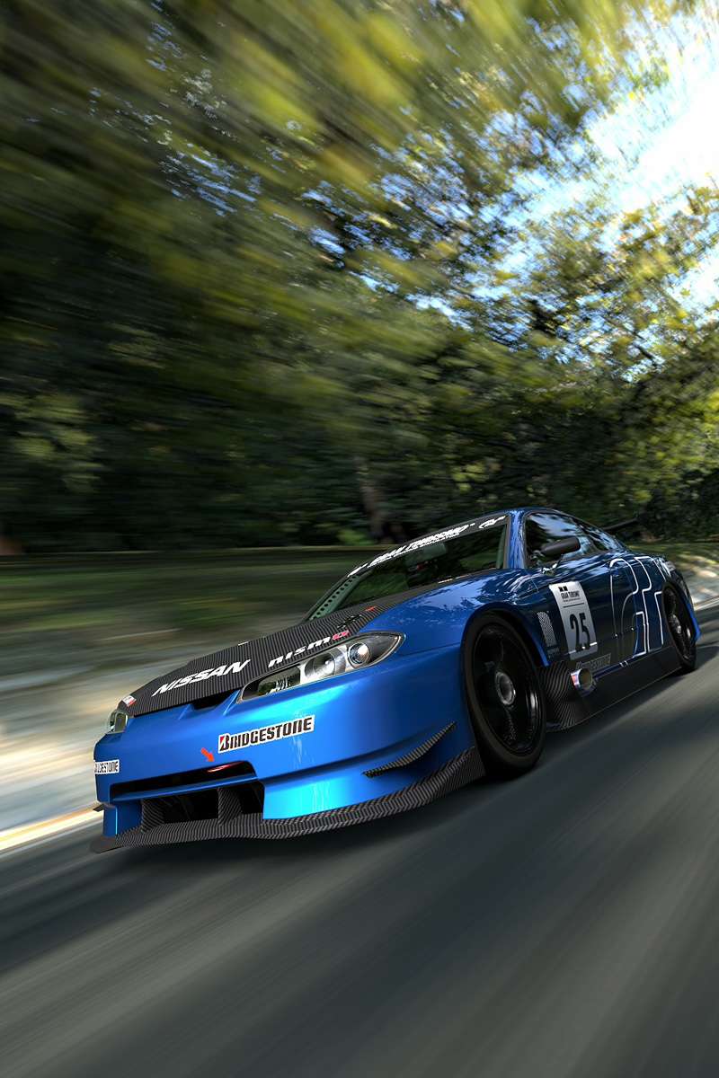
But I like to take things a step further and consider where the car is going to and coming from. It’s clearly supposed to indicate forwards motion, but the composition could reflect this better. This technique is simple, all you need to do is move the frame slightly so that the ‘blank’ section in front of the car is larger than that at the back. As seen below:
It’s only a tiny difference but it can have a huge effect upon the image and how the viewer’s eye sees your image.
--------------------------------------------------------------------------
2. Editing
1.a – Colour Balance
A lot of people ask me how I get my photos to look the way they do, often describing the tones I use as quite retro and faded. The key to this look is using the ‘Colour Balance’ adjustments effectively. For this section of the tutorial we will be using a sample image so you can try and get the same results as my finished image. The image can be downloaded by clicking the thumbnail below.
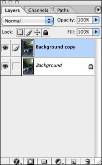
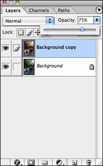
Now it’s time to get started! The first thing you should do before making any major adjustments is to duplicate the image so you have a backup of the original in case things go pear shaped! You can do this in 2 ways, by clicking on ‘Duplicate Layer’ from the ‘Layer’ menu or by dragging the base image to the ‘New Layer’ button in the Layers panel.

Once this is done you should be left with a Layer panel that looks like this:
Now you can start making adjustments!
The Colour Balance adjustments panel can be opened by clicking ‘Image’ followed by ‘Adjustments’ and then ‘Colour Balance’

This should open up a panel like the one below
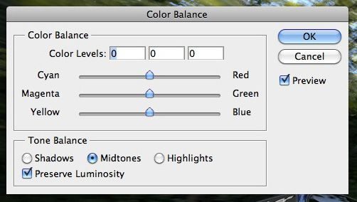
These are the adjustment bars for each level of brightness found in your photo. It’s fairly straightforward; you simply select your brightness level from ‘Shadows’, ‘Midtones’ or ‘Highlights’ and then slide the bars to adjust the colours in that area. Selecting Shadows and then sliding the top bar all the way to the left, for example, will make your shadows and dark areas appear Cyan in colour.
The ‘Preview’ option lets you see your image change as you make adjustments to it. It’s best to leave this ticked so you can see what’s happening as you slide the bars about.
‘Preserve Luminosity’ is a simple option that I often leave unticked as it can drastically alter the image. With this ticked ON, any adjustments you make to the image will also alter the brightness or darkness of that selected area to match the colour. With it turned OFF, you will simply being editing the colour of that area, not the brightness. Experiment with it both on and off to see which you prefer.
For now though, leave it unticked and enter the following settings on your sliders:
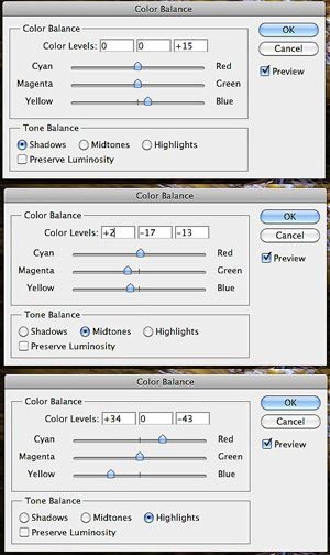
These settings will give you a nicely adjusted image that almost looks like the sun is setting on Trial Mountain:
This is a nice looking image, but I think it could do with a little more ‘pop’ from the brighter areas. So, undo your adjustments by clicking ‘Edit’ and then ‘Undo’ and you should go back to the original image. This time, open the Colour Balance sliders and make sure that Preserve Luminosity is ticked. Then, enter the following adjustments:
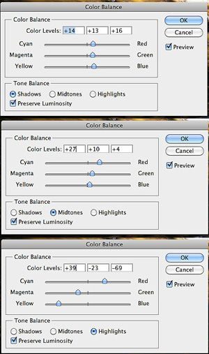
This will leave you with an image that’s similar to the first, but has more contrast to it and definitely leaps out of the page more than the last one! There’s one last thing that I always do before saving my image though, and that is to tone down the adjustments just a little. It means that you can preserve a little more of the original colour without losing the contrast and tones of the adjustments you’ve just made.
In your Layers panel, adjust the Opacity of the 2nd layer to around 75%.
It’s a subtle difference but it actually changes the mood of the image quite dramatically in my opinion!
This should leave you with the following image that you can now save (under a new file name!) for future use.
The easiest way to learn all about Colour Balancing is to play around with images using the sliders. Don’t be afraid to go wild, either. It can sometimes give very impressive and artistic results.
That’s all for this section, but stay tuned for further updates!
----------------------------------------------------
If you require any further help, don’t hesitate to reply to this thread and I’m sure someone will be along to help you soon enough!
Version history
11/5/11 - 2.a 'Colour Balance' added [v1.1]
5/5/11 - V1.0 thread started, 1.a 'Vehicles in Motion' added
Images resized, 2 pairs of images under 1.a merged, highlighted areas made clearer
Last edited:
")
 So resizing the images is definitely something that will happen with the next update.
")
 Can't wait for the next update!