Just found out that one of the albums in my collection has been nominated for a grammy for its packaging design and artwork. Easy to see why, its epic.
This band has gone through some very interesting transformations in this regard actually. They're quite a small band, and started even smaller. The artwork has pretty much evolved along with their sound, making for one of my favorite case studies in how artwork makes you think of an album.
Here was their first outfit: The Four Trees.
I
despise this artwork

. Just don't like anything about it. It feels to me like the creator had a cool idea in his head for a piece of art, but lacked the tools or skills to bring it to life in an appealing way. I like the concept, and hate the execution. It’s interesting, because I find almost the exact same feeling in this albums music. That is not because of the way its written, or played, but they way it
sounds. I like the ideas, but its one of the most poorly mastered pieces of work I've ever listened to, which is a definite shame because I think it would be a great album otherwise. It was, however, pretty successful in the genre, and regarded quite highly in the community, so it spawned a follow up:
Tertia.
This album is quite a lot heavier, and darker, which suits the artwork to a tee. However, I might say that this album has even worse production because of it. The heavier body of music just leads to what essentially sounds like listening to a live performance from the other end of a sewage pipe. Like, you can almost feel how awesome it
would be, however, it just sucks from where you are. I do think I prefer the actual music though, again, both of these albums would be great with a bit more work in the mastering. I once again find that the artwork for this album sums up that feeling in my mind perfectly. Dark, dingy, mush. Literally reminds me of sewage. Once again, great ideas, poor execution. But everyone liked it despite this, probably at least partially because its a small band in a small genre so no-one expects instant expert execution. So, the band continued, and clearly by this point had hired some new eyes and ears.
Waking Season:
And at that, they pull a 180. Almost completely gone is the grunge of the previous album, replaced by relatively odd sounding samples and synthesizer work layered with enticing build-ups and pay-offs, giving it a progressive rock sound. And whats more, the mastering! It sounds
good! Definitely not perfect, but a big improvement. Luckily, this album was how I got into this band. I remember quite vividly about 6 or so years ago, visiting my older brother who had this album on vinyl, and just seeing the album art on display. It has since become one of my favorite album artworks, and up there as far as music goes as well. It continues the theme of artwork matching album; its an abstract, minimalist and calming illustration, which goes hand in hand with the music. The majority of the heavy, almost metal-like qualities of the previous album has been replaced by positively beautiful, elegant and often abstract melodies. Even the closer, which is certainly the heaviest song on the album, is more dark than angry. Its quite an unusual album, and a very different sound than their previous outings. I believe their band went through quite a few changes in between Tertia and Waking season, none more than the production team apparently. This album was their biggest success yet, and I fully understand why. If anyone here has an interest in rock-based instrumental music, I can do nothing but recommend giving it a listen. The follow up on the other hand...
Dust and Disquiet:

Is perfect. Comfortably sits in my top 5 albums of all time. I describe this album as pure emotion. It starts off with one of the most harrowingly beautiful tracks I've ever heard, which I have probably listened to about 100 times and the sting hasn't worn off. It doesn't even consist of much; It is unusually short for the genre at just over 3 minutes, doesn't have a single drum hit throughout the song, and consists of mostly a synthesizer lead instrument and a mixture of brass and electric guitar as the support, which makes for a very unique sound. It is then followed by the second perfect track which takes the melody of the first song, and uses it to paint a much darker, richer and longer story, all whilst feeling like a continuation of the first song due to its sampling of its melody. It is epic, and ends with just my favorite big musical sting of all time. Even the lead out is perfect. The rest of the album continues this theme of deep, dark melancholy with the occasional
loud thrown in. I hits the spot. I have the album art to thank for my discovery, as it just showed up one day in my suggested albums on spotify. It says almost nothing concrete, yet I saw it once and immediately started listening to the album before I even knew it was created by the same people as Waking Season. it sums up the album perfectly, once again it tells me exactly what I'm going to listen to, and the music reinforces the artwork with track. When I listen to the music, I see black and white feathers, just as I see the respective artworks when I hear all their previous works.
So now we are up to their latest work, On Circles, the album that was nominated for a Grammy for its packaging and design. The music, once again, suits the artwork perfectly. I feel warmth and intrigue when I listen, just as I do when I look at the artwork. All of the art is actually heavily processed photography by one of the band members, and it just looks (and feels, having been printed on lovely, textured card with embossed lettering) awesome. Definitely the nicest physical album in my, admittedly small, collection. It would also probably be my pick for album of the year 2020, it just sounds great. The mastering and production also took another step forward from Dust, which is almost a shame as going back, Dust just doesn't sound as rich as it could. Still a pretty well mixed album, but On Circles is a step up.
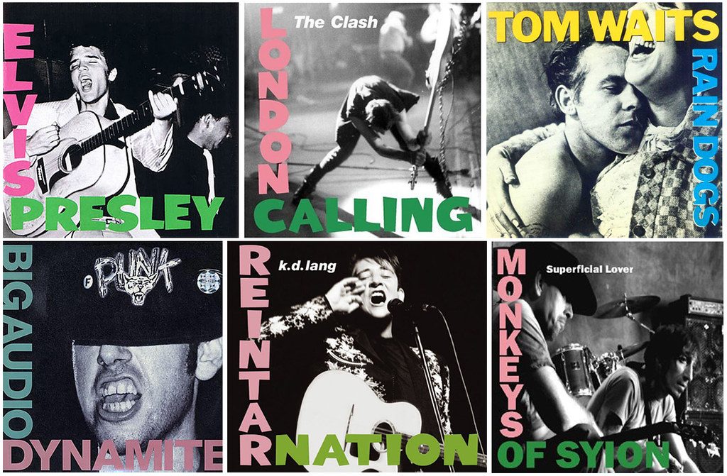
So that was a long winded post. I ended up writing a lot more about the music than I originally wanted to, but I couldn't help myself. This is in part because my point of all this rambling was to say what an awesome thing it is when the artwork for an album does more than just provide a visual incitement for people in their spotify suggestions; the best artists can make artwork that actually enhances the music, almost like a catalyst in an otherwise stable solution, and gives a starting point to base your perception of the music upon. Either that, or none of this makes any sense to anyone else, which is very possible, in which case, they're still pretty album covers.

")
")