Which ones do you distinguish and why.
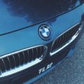
I'll come out and say the Germans win cause they have meaningfull and instantly reckognizable badges. Merc's has the theme of "air, land and sea", BMW the propeller, Audi the olympian strength, Opel to a lesser degree the bolt, VW obviously their initialism. And Porsche, although I have no idea what it represents, looks really nice.
Japanese badges I personally find mostly bland, save for Mazda, and from America I choose the Cadillac's badge as aesthitically most pleasing followed closely by the Corvette's. Ford goes well with its image IMO, Chrysller is ok, Chevrolet I find a little bit bulky.
Coming to Europe again, I'd say Ferrari, Alfa Romeo and Jaguar I find most beautiful. Also the Bugatti is simple yet stylish and effective. French are meh except for Peugeot which is ok, British look similar with all the wings. The most blant ones have to be Seat and the old Fiat logo, new one is ok.
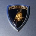
Finally my favorite of them all. And of the mall. It is hands down Lamborghini's bull. Color combination is a win with gold and black and its aggresiveness goes supremely well with the company's image and prestige.
Fewhh... I did't expect I would analyse as much but oh well. Your turn!
I'll come out and say the Germans win cause they have meaningfull and instantly reckognizable badges. Merc's has the theme of "air, land and sea", BMW the propeller, Audi the olympian strength, Opel to a lesser degree the bolt, VW obviously their initialism. And Porsche, although I have no idea what it represents, looks really nice.
Japanese badges I personally find mostly bland, save for Mazda, and from America I choose the Cadillac's badge as aesthitically most pleasing followed closely by the Corvette's. Ford goes well with its image IMO, Chrysller is ok, Chevrolet I find a little bit bulky.
Coming to Europe again, I'd say Ferrari, Alfa Romeo and Jaguar I find most beautiful. Also the Bugatti is simple yet stylish and effective. French are meh except for Peugeot which is ok, British look similar with all the wings. The most blant ones have to be Seat and the old Fiat logo, new one is ok.
Finally my favorite of them all. And of the mall. It is hands down Lamborghini's bull. Color combination is a win with gold and black and its aggresiveness goes supremely well with the company's image and prestige.
Fewhh... I did't expect I would analyse as much but oh well. Your turn!