CLOSED: 2.0 Advanced Competition: Week 28

  • Thread starter Thread starter SlipZtrEm
  • 154 comments
  • 10,216 views
Status
Not open for further replies.
FINAL ENTRY


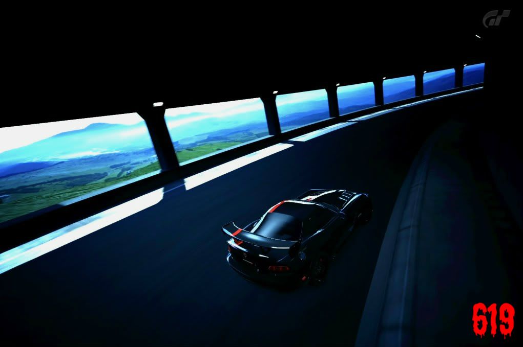
Not my best shot but it will have to do.
Also please tell me what you think of my sig.​

About your sig... To be totally honest, I think it's horrible. For one it's like a zombie font. Two, it's bright red and gaudy. Three, it's way too big. If I were you I would just completely remove it all together and not use a signature. I personally do not like signatures on these entries and images. It takes away from the shot. I think they always look better when there is nothing there to distract the viewer and nothing there to cover up the shot.

But that's just my opinion!
 
I'll agree with 440 that it's not one I like much either, Ashes. I feel a good signature is simple and doesn't really detract from a shot, just reminds people who took it. What's also weird for me, personally, is that you still have the GT watermark in addition to a signature. "619" on its own I approve of - three numbers to be your own little trademark on all images. I'd just suggest making it a bit more subtle :). I'm usually pretty bad with signatures, which is why I just ripped off PD's idea and did the same thing as the watermark! :lol:

It's even more interesting, to me anyways, when a user has a signature look - 440's gradient-mapped GT4 images for example, or his high-speed blurs - something that can be picked out regardless of signatures. I could always tell a Franz image, too...
 
Also please tell me what you think of my sig.

I'm not quite as anti signature as others apparently (seeing as how mine is really long), but I do think the 619 is a little big in this one. I'm not wild about the dripping blood look either, but it would definitely work better for me if it was quite a bit smaller. A signature needs to compliment the shot. I'll change up the font on mine and try to match the theme and colors to the photo.
 
FINAL ENTRY
Replacing my earlier one


Pushing my Cappuccino Racer through the Eiger Tunnel.​
 
EDIT: Now linked to full size.

-------

Final Entry


Last edited:
My entry is not currently linked to the full size (just the Flickr page), if I can work out how to do it properly I'll change it as and when.

Final Entry


This post will help you, but here: [ IMG ]previewimageurl [ /IMG ] you put the adress without the final "_b", like this: "http://farm3.static.flickr.com/2703/5742093443_ed876d6365.jpg"

EDIT: now you have the link working, It was too late
 
Final Entry.

"Skyline on the Highway"


Clickit, click it, click it? Click it..!

I suspect that this way of linking is better. :sly:
 
Last edited:
Final Entry.

"Skyline on the Highway"


Clickit, click it, click it? Click it..!

I suspect that this way of linking is better. :sly:
Yes, why don't all flickr people do this?
 
May as well have a go :) Final entry

GrandValleySpeedway_8-1.jpg


full screen

http://i1192.photobucket.com/albums/aa333/gt5nismo33/Tuscan Speed 6 RM/GrandValleySpeedway_8.jpg
 
Last edited:
Final Entry

^Click for larger image^
 
FINAL ENTRY


Interesting that the curved tunnel at Trail Mountain will let you photograph both entrances at the same time.​
 
Ignore
 
Last edited:
^ Oh my god. Well, I'm not going to have a chance to beat that. :drool:
 
Final Entry


the reflections in this particular tunnel are so awesome. There are plenty of good options in this one. Almost took a similar shot to yours! Great work Rev.👍
 
final entry

Your original shot is too big, remove the _z from the first url in the link.

It should look like this:

 
Yes, why don't all flickr people do this?

Do what?


Here is mine... um, I dunno how to thumbnail, so I've just linked to the full size. Sorry =(

FINAL ENTRY
Cote d'Azur

Instead of having "Cote d'Azur", just add the
tag there (with the thumbnail size in the middle of the tag obviously)
 
Status
Not open for further replies.
Back