Okay, I'll try to give some feedback to what possibly could've been improved.

Awh, no poll for Zach this week.

Feedback please? But I would assume there isn't enough car in the picture.
I would have preferred a view closer to the car - zoomed in. And it is too dark. There are just the headlights to view. There's no major fault with since that's how it ends up exactly as you've done. But I just didn't get excited by it. I think you see the heavy bias to close-up shots in the poll.
Honestly, this is a great picture, the clouds look stunning. The problem for me, is that the car is too dark (although it makes the headlights show in a very nice way). I think I'd put it in the poll...
here's mine...any feedback? (aside from being a bit too dark...)
 20
20 by
RodsGT5, on Flickr
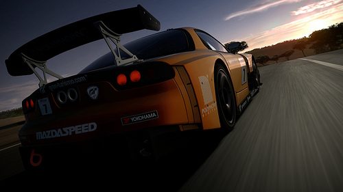
I think it is too dark as well, and the motion blur in the road is mostly lost due to how dark it is. I'd like to see a slightly different angle and a more zoomed in composition. But that's just nitpicking. A good entry, but I thought there were better entries.

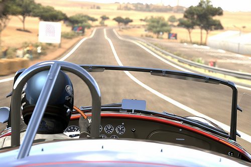
I can't believe neither of my entries made poll this week, especially this one seeing as theres 2 pictures that feature pretty much the same car at the same angle. But anyway... feedback?
Yeeah... The issue here lies in several things. The composition is off IMO, the POV is strange. The focus feels a bit strange, and the slightly low-grade quality of the upload due to your limitations. You need to feature the whole car, and I'd like to see a usage of panning mode 3 and 1/60 to get some nice motion blur.

mine didn't make it to the poll!
any feedback?

This is a really good image IMO, and a very good start for a first-time entry. It is a bit over-exposed and the whole idea with the image taken of the side isn't that interesting, but you made it look pretty good. Raise the camera, feature less green-ish road and more sky. And you've got a competent entry right there. Just keep trying, and you will make it.
Didn't make the poll either.. But I ain't even mad because awesome LFA

I would like feedback though.. Im guessing not enough road. AND the stupid bush thing on the left :C
You were among the last that got cut, the lens flare looked good and pretty much of the environment looked nice. Sadly, there were better entries. Just keep trying, you entries have a high quality.
I think it's pretty cool. Just the right amount of blur on the gas station.
Looking at my entry now, I think I picked the wrong car.

At least I got a fun track out of it.
That is the miniature filter, right? Firstly, get rid of that. And then... yeah. The car is a bit misplaced, it does just have decals on it so the premium thing is a bit lost. I'd swap it for an Alfa 156 and have a less centered composition on the vertical plane. Otherwise, a decent entry. Keep trying, you have potential.
At least I got a new wallpaper out of this.
Feedback?
The issues lies in... Where is Toscana? I see a beautiful image with a pretty nice composition. But I wanted to have a lower angle. Feature the whole rear and have a end result which would be some kind of mixture between your entry and GP HP Nut's. I simply don't see much of the environment. There isn't much of it in some entries that made it, but there's at least some.
C & C please?
Yes, the point of view on this one is really in my taste. It just feels a bit uninteresting. I would have preferred the whole car in the view, a more dynamic image simply. The DoF is really good, and fairly well-exposed, but the base image isn't IMO as interesting as the entries that made the poll. Sorry, but this week wasn't
the week.
feedback?

Miniature filter. Remove that, lower the exposure, and add a less centered composition and some motion blur and you might have made it.
Feedback welcomed...

Remove the partial colour filter. Great entry otherwise, especially with a first-time entry. There were just better entries. Keep trying. 👍
It is a bit like Boabdulrahman's entry. But without the yellow colour to contrast and darker. Lower the shutter speed and use a brighter body colour. There were better entries this week.
Can I get some feedback,please?
A little bit dark and slightly uninteresting in my opinion. Good entry actually, but again... I thought other entries were better.


")


")
 ), I'm simply stating my opinion.)

 (although the distortion is only noticeable when viewing in certain ways) eg it doesnt show up when i view the picture on my 32" tv but it does heavily on my iphone
