Commercial/Advertisement Photos

  • Thread starter RetroJohan
  • 720 comments
  • 105,502 views

RetroJohan

A.K.A GT_johan
Premium
2,080
Sweden
Sweden
RetroJohan
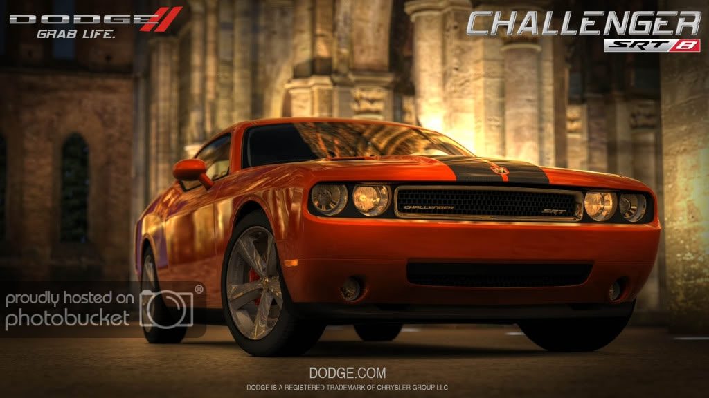
Here can you show your picture that look like it can fitting in a commercial.

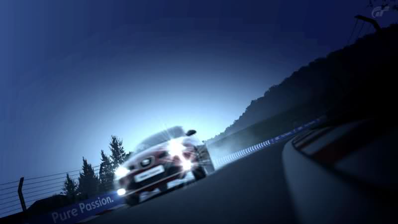
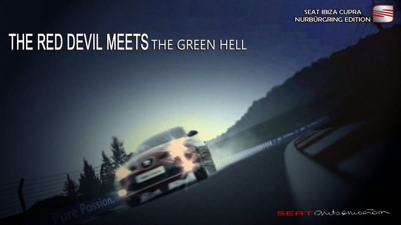
you can photoshop picture as well.
 
Lucerne-ChapelBridge_2.jpg


lfacool.jpg
 
SanGimignano-TownSquare_4.jpg


I don't have any photo editing software but somewhere on the picture the caption could say "Your chariot awaits you..." 👍
 
:drool: AWESOME! :) 
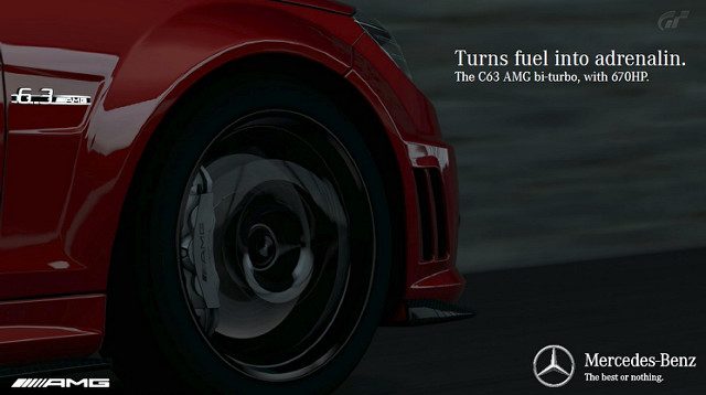
You should contact Mercedes! :D

Hehe, thanks! I wish I could get into the advertising world, god knows I trained long enough for it and got all the right qualifications. It's just an insanely hard industry to get into :(
 
Hehe, thanks! I wish I could get into the advertising world, god knows I trained long enough for it and got all the right qualifications. It's just an insanely hard industry to get into :(

Yeah, it really seems that you trained for it, the font choice, the alignment, trademark identity its all there. I work with advertising, but digital ones, instore digital signage, etc... here in Brazil... my hint is, start small, look for freelance jobs on small business near you, do free jobs for friends and family, that's how you build your portfolio, but I bet you already know that :)

Anyway, great work! :) I would just darken the "scenery" a little bit or maybe get a colder/blueish/greenish tone, that would fit Mercedes-Benz more. But its already great like that!
 
Rivals during Japan 80's decade, they're old cars but they still keep their charm.

1986 Mazda Savanna RX-7 FC GT-X since 2,362,198 Japanese Yens:


1986 Nissan Skyline HT Turbo 2K RS-X since 1,759,321 Japanese Yens:

 
Cool concept, but you need to increase your kerning within the word "Bahnstormer". And maybe decrease font size of "Force" text and decrease the leading as well.

I decreased the kerning on purpose :P

As for the 'Force' text, I don't really like any of it but I just threw it in there to fill the space a little. It was a 5 minute job with barely any thought put into it!
 
I decreased the kerning on purpose :P

As for the 'Force' text, I don't really like any of it but I just threw it in there to fill the space a little. It was a 5 minute job with barely any thought put into it!

Yep, from my point of view, increasing the kerning added some tension on the ad. And that's good because it catches up some attention.
 
Back