Evolving Gran Turismo's Art Direction

  • Thread starter dabz343
  • 4 comments
  • 1,342 views

dabz343

(Banned)
950
United States
United States
dabz343
One of the most under appreciated aspects of game design is the art direction. The graphical scheme, the menu system, info graphics, motion, camera angles, lighting, color palette are just some of the many elements that come together to give a game a certain personality.

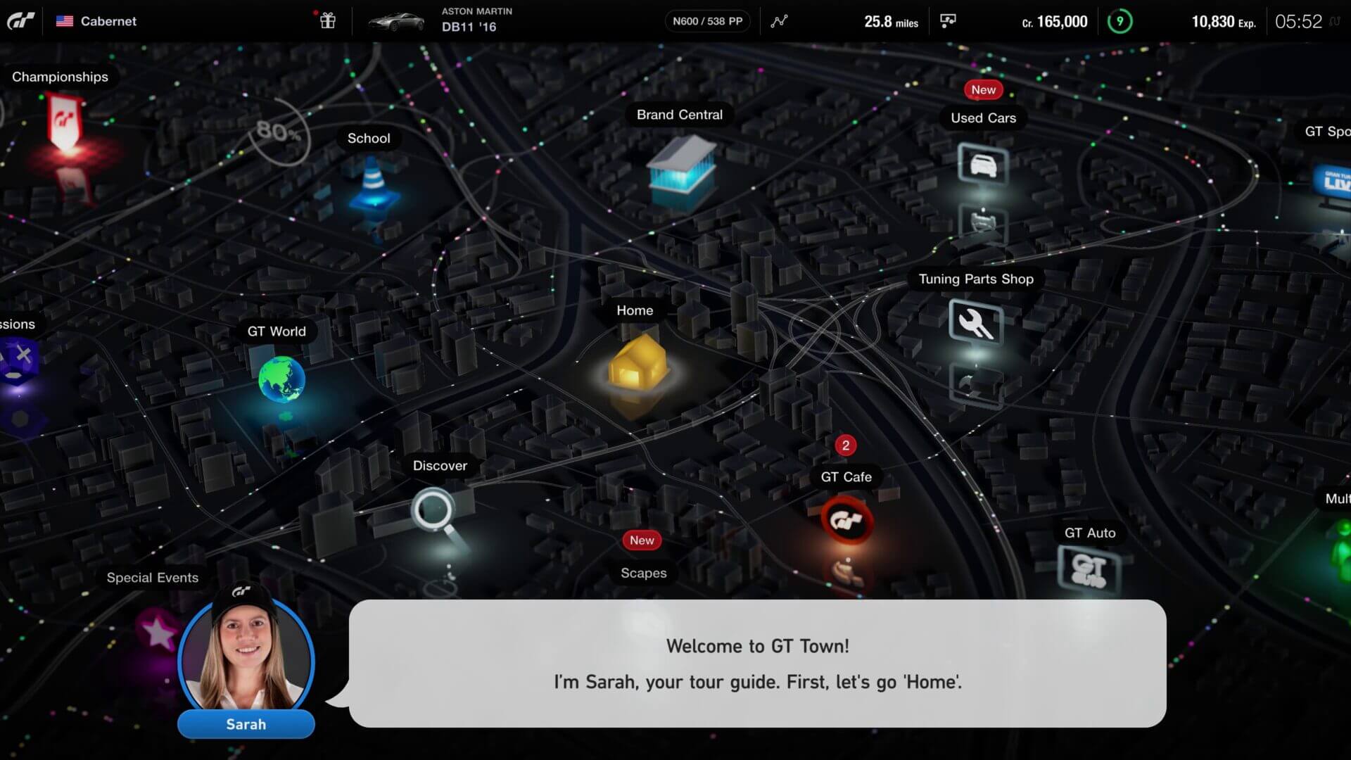
While GT7's art direction isn't bad, it's a familiar formula...Perhaps it's time for PD to be a bit more adventurous? Slightly more ahead of the curve?

This short clip oozes with personality and while some will find that it just doesn't translate to GT's heritage, it does represent how emotive a presentation of a car could be.

 
That was basically GT4's cover art. The white silhouette felt like it was celebrating the purity of the machine. GT4's menu was also the best ever seen in a GT game with very simple icons on a simple background, laid out like a map or a board game. People will say it was clunky to navigate but you got used to it. There was concept art for GT7's menu which was a dark city-like map which I much prefered over what they chose but that's because it was so similar to GT4 and I loved that style. This map also could've changed color like a day/night cycle minus the gaudiness of the mountain landscape we eventually got. It could've been dark like this at night, and white like GT4 during the day.

gran-turismo-7-ps5-screenshots-4k-26.jpg


But the bottom line is that the franchise has built an image, most notably the two strongest games in the series, GT2 and GT4, and it's a unique design. GT7 harkens back to that and although I personally don't like the art direction I think the game is better for it. Brand familiarity, especially with the nostalgia crowd. Even the cards for the events are throwbacks and carryovers and that familiarity is vital or else the game begins to lose its character.
 
Gives me the same feeling as NFS MW 2012 Boss Intros.


It's too abstract and outlandish for GT IMO. When I think of GT's menus 2 words come to mind: classy and elegant. The world map is nostalgic but personally I prefer GT5P/Sport main menu style more with dynamic backgrounds and showcasing the cars' beauty in various locations.
 
It is funny how the first Gran Turismo menus were like the Cool hustle and bustle of the city, with NYC-Philadelphia-Chicago-Detroit vibes and jazz tunes. Now, it’s a retirement resort.
The menu could be a bit more like the actual Concours d'elegance or even Goodwood.

Anyway, as Keef posted, that early map was indeed an evolution of the original city maps.

PD we’re going in the right direction as per the concept below. Maybe a background with all the constellations PD made such an effort to show off, during races.
Thing is, we should be able to spin the globe to select where we want to race.
1703921172042.jpeg
 
Art direction is about more than mere visual composition and style, though this is important. It can also direct the content and it's emotional characteristics so audiences 'feel' something.

 
Back