- 20,685
- TenEightyOne
- TenEightyOne
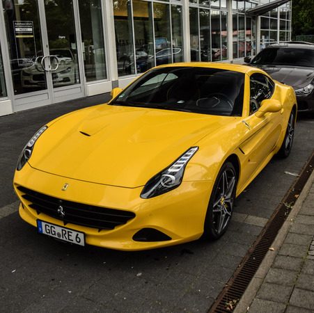
How much is it, this entry-level Ferrari? I have some cash to spend.
17500 Euro. With another zero
")
How much is it, this entry-level Ferrari? I have some cash to spend.
Yes, €17,500 is for the entry-level. The last zero is an option.17500 Euroo?
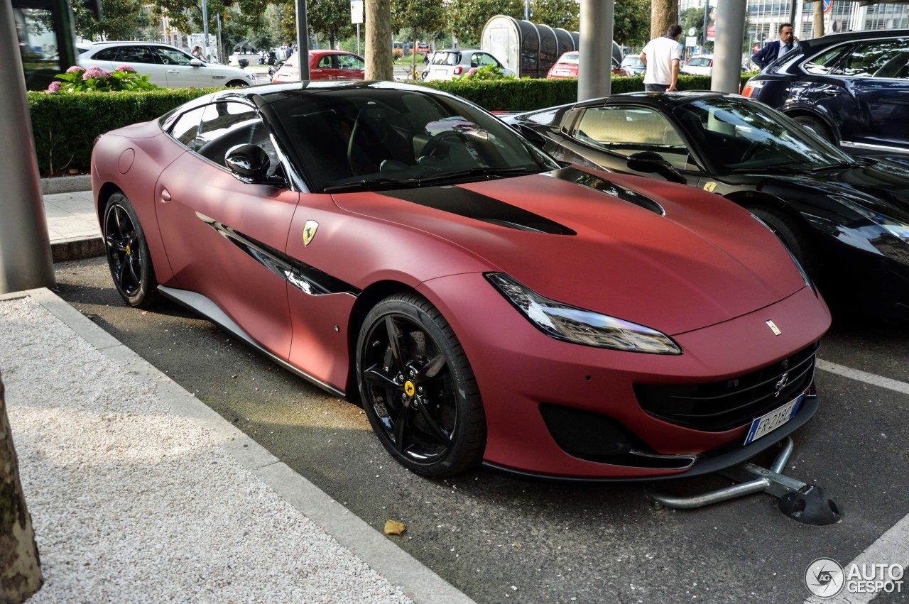
I wish.Am I the only one that sees it?
Yeah, the wheels are definitely five spokes.
I'm seeing more of this:
Racist!
Good design is good design, no matter the badge 👍Always been a fan of the big GT Ferrari's but this one is a fantastic looking car .
Gotta admit I'm guilty of liking the old pug coupe aswell . But only with the v6 . Of course .

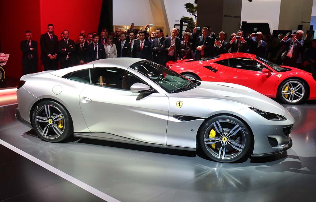
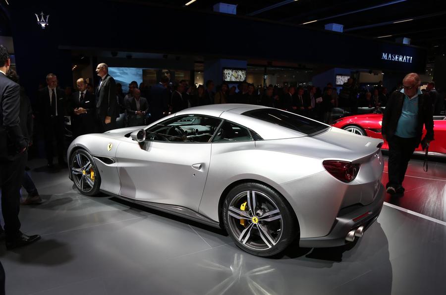
Just a few images of this car with the top up. Definitely looks best in this configuration, in my humble opinion.
You´re proving my unpopular opinion that red is not a good ferrari colour.
Not a problem if you have loads of money. Hence why i will be stuck driving around with these peasant rims.Those wheels are vile. They seem to ruin the flow of the bodywork, too.
They've done a good job making it look good with the top up or down. Although I, too, prefer it with the top on.