Gran Turismo 7's HUD design

  • Thread starter IXON009
  • 28 comments
  • 12,279 views

What kind of HUD would you prefer the most?


  • Total voters
    78
  • Poll closed .
129
Hungary
Budapest
IXON009

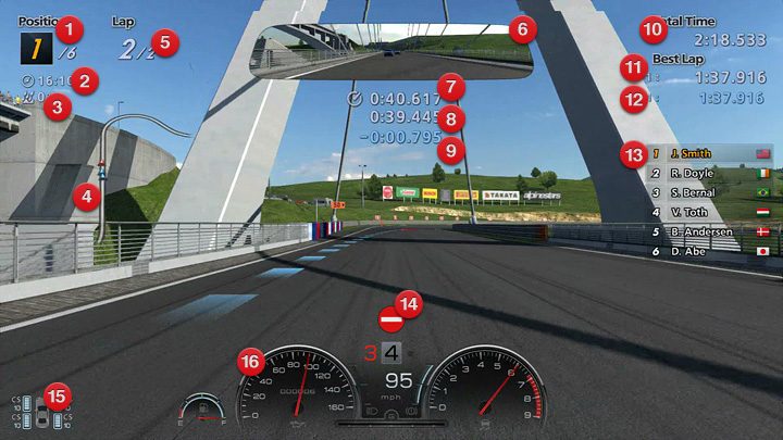
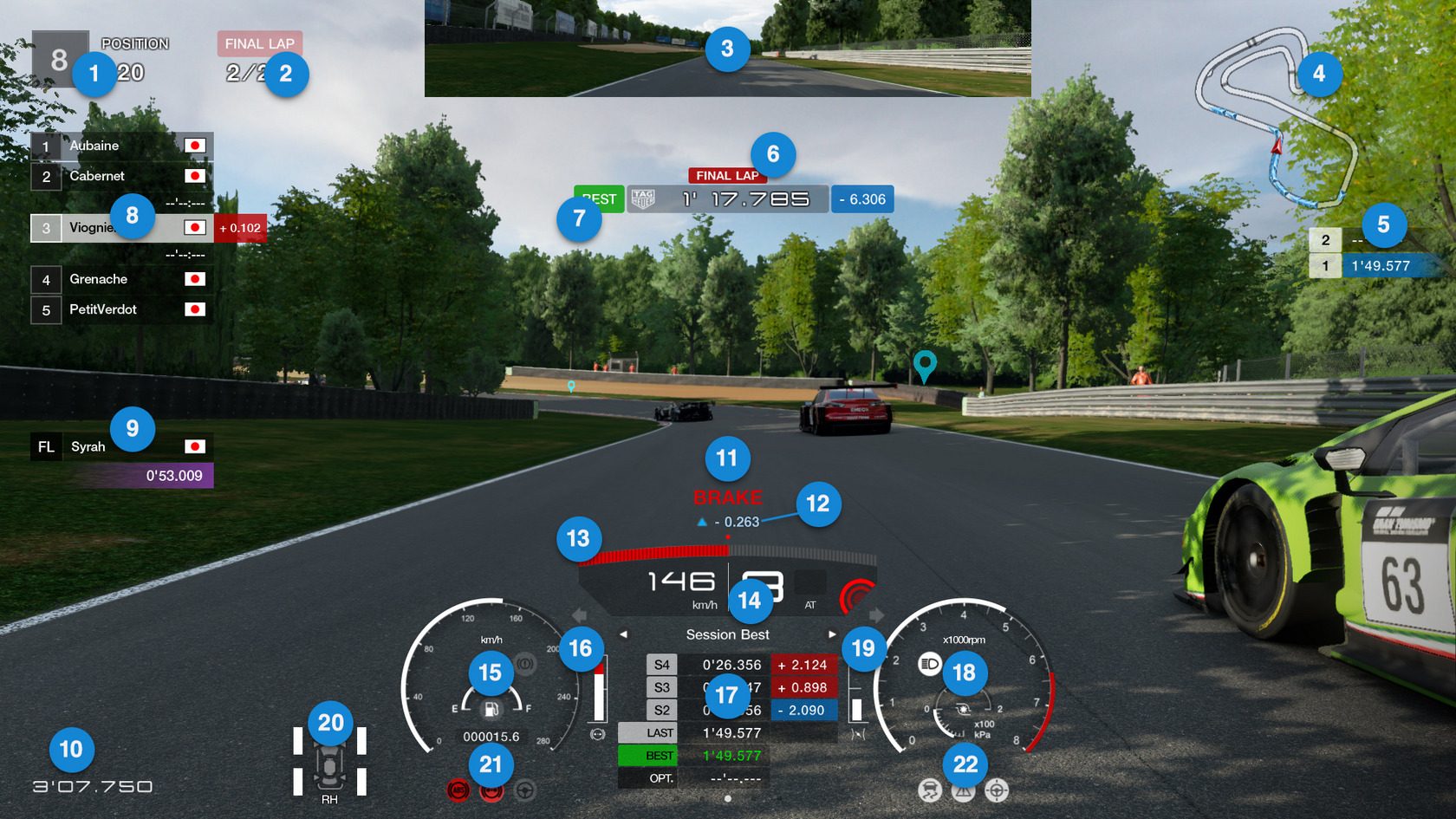
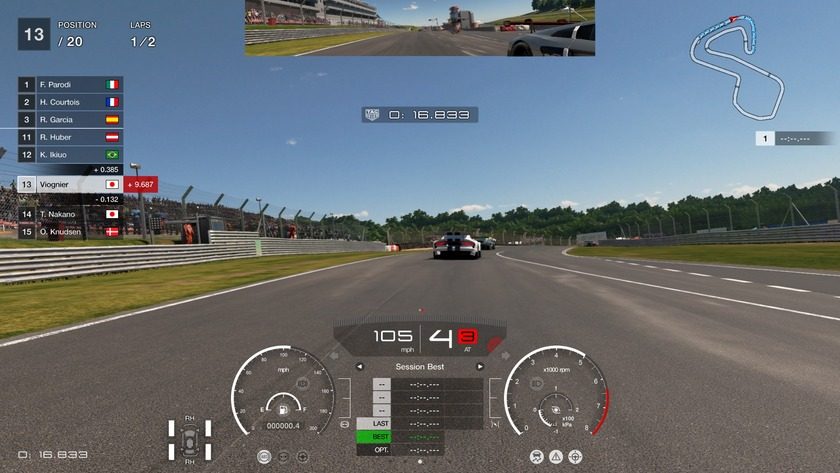
So I got in mind that after playing both games over the years I love the newer HUD (GTS's) more than the one we had in GT6, but I'm still missing some of the older one's part.

Personally I would like a mix. From the GT6 I would take the mirror on the top as it looked like a real mirror from an average car, and maybe get back that blue color for the notifications when you run your best lap time. From the GTS HUD I would take everything else. I liked the mini map you can choose as your second map next to the big one on the edge of your screen.

So here is my question, what do you guys think, how can PD still improve the current HUD to show us a better selection of information? I'm thinking about the choseable screens that you can change by pressing the arrows. Do you want to keep this method or are you looking for a new one? If yes, why? :)

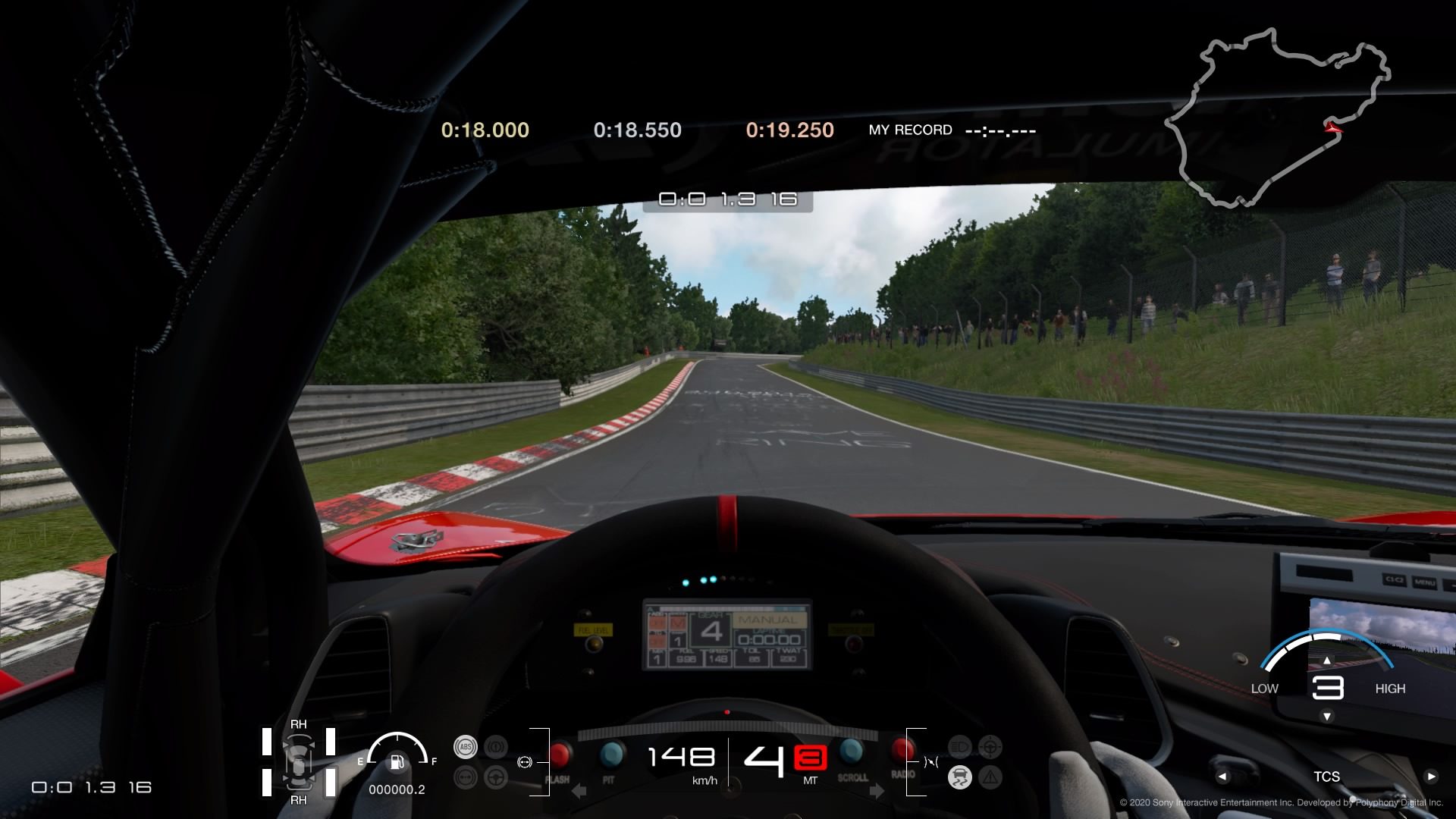
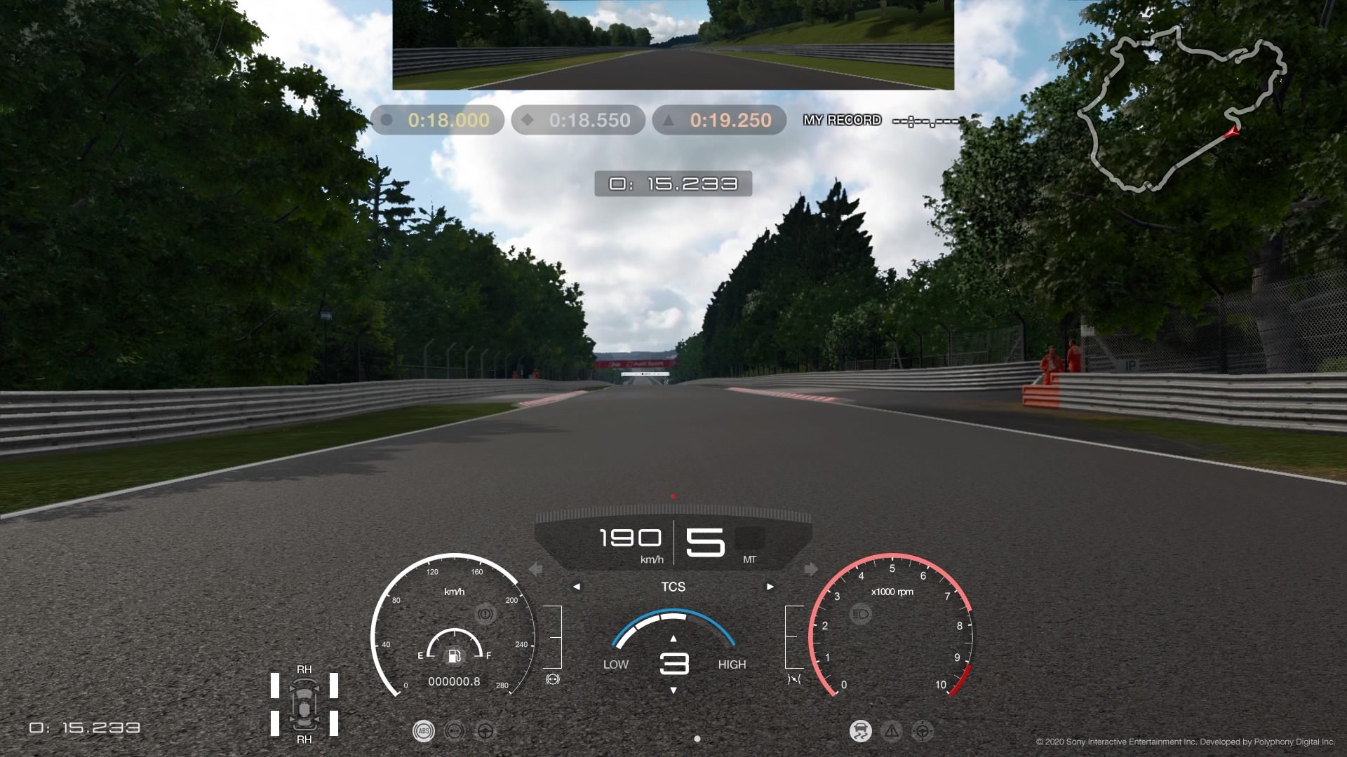
*The pics are from gran-turismo.com
 
Last edited:
HUD is far too busy! We need options, options and more options. I want to chose what is displayed and where.
A fully editable HUD would be the best in my opinion too, let's hope they finally make it real.
Newly designed, completely editable.
Fully editable customized and personalized HUD.
Kaz...please look at other games in regards to HUD. Just this one time, look at other games.
A fully customizable hud is what we need. Project Cars 2 does it best, PD should copy that game.


I totally agree, but...

CFD.jpg
 
I think GT Sport's HUD is great. The warning message needs to be less intrusive, but otherwise I can't think of anything obvious that needs improvement

Not even the fact that it's all or nothing?

We all have our preference for what information we want to have displayed and where, those are the option we deserve...at least in driving mode...

In the replay mode it could be standard location, but we also need more information to be displayed in replays, at least have options.

Race HUD works for me. Replays are crap though, they need a total overhaul.
 
Definitely need options. For non-tyre/fuel/damage races, the "car" should be NA. In addition, I use cockpit view the most. All I need is the MFD circle. Delete the redundant fuel gauge, TCS indicator(I know it's ON if there are bars in the TCS half circle), dlelete gear number as I can see it in the car's intrument panel.
When wear & damage are activated, I'd combine it all in a scrolling MFD. I'd assign a button to hide the display on the fly. Not "Pause" and then hide it.
EZQZElkU4AEgJVe


I don't use bumper cam, but again, if I did, with fuel/tyre wear/damage Off, just delete those indicators.

EZQZJtWU8AAlwuw
 
I use bumper cam. IMO the driver list, lap times and track map are just unnecessary clutter on screen during a race. I hate how I can't turn those off without losing the more useful info at the same time. I turn off almost everything in all other racing games. I would love to be able to move the tire info to the bottom left or right corner and make it larger as well so I can actually see when my tires are overheating.

i1XkIwBh3ZPlscc.jpg
 
Last edited:
GT Sport's HUD is the better one overall, but I do think that the Multi-Function Display (MFD) is out of the place if it's placed between the speedometer/tacometer, creating more confusion that it's not related to what infos the meters want to display. Though I prefer the Normal View's Driving Assistance Indicators compared to the other view ones, more organized and neat.

Aside, I want the HUD to display the speedometer/tachometer/fuel gauge/etc. in the actual shape the car has, like for example Shift 2.
 
I'd like the MFD to work like that 'action menu' or whatever it was called in the PS3 games, where you could open and close it with a button so it didn't clutter the HUD.

Other than that I think that the HUD should be made flatter so there isn't the lump of information and then nothing to the sides like we have in GTS.
 
They should offer a fully customisable, or at least have templates to choose from and maybe the option to turn elements off. If other games offer customisation, then I don't see why PD can do something similar, especially with more processing power available.

No doubt they will make changes, upset people, and still do something stupid like having things like fuel messages blocking most of the screen for a lap or two. :rolleyes: And then be so ignorant or pigheaded not to listen to users and either take many months to fix it, or not fix it at all. :banghead: :rolleyes:
 
Here's the HUD from the PS Showcase trailer...
Gran Turismo 7 Release Date Trailer 0-0 screenshot.png


Something must be going on with the MFD in this trailer, as some have pointed out.
 
Back