- 28,901

- Brooklyn, NY
- KR_Viper
- I Renown I
Hello, folks, first time doing an authentic tutorial around these parts and for the sake of keeping exactly to the point I'll assume you're familiar with level adjustments, sharpening, blur, noise, etc, etc. So I'm just going to jump straight to the action. This will be easy to follow and soon you'll be cranking out better pictures than you were before.
Okay, let's get started!
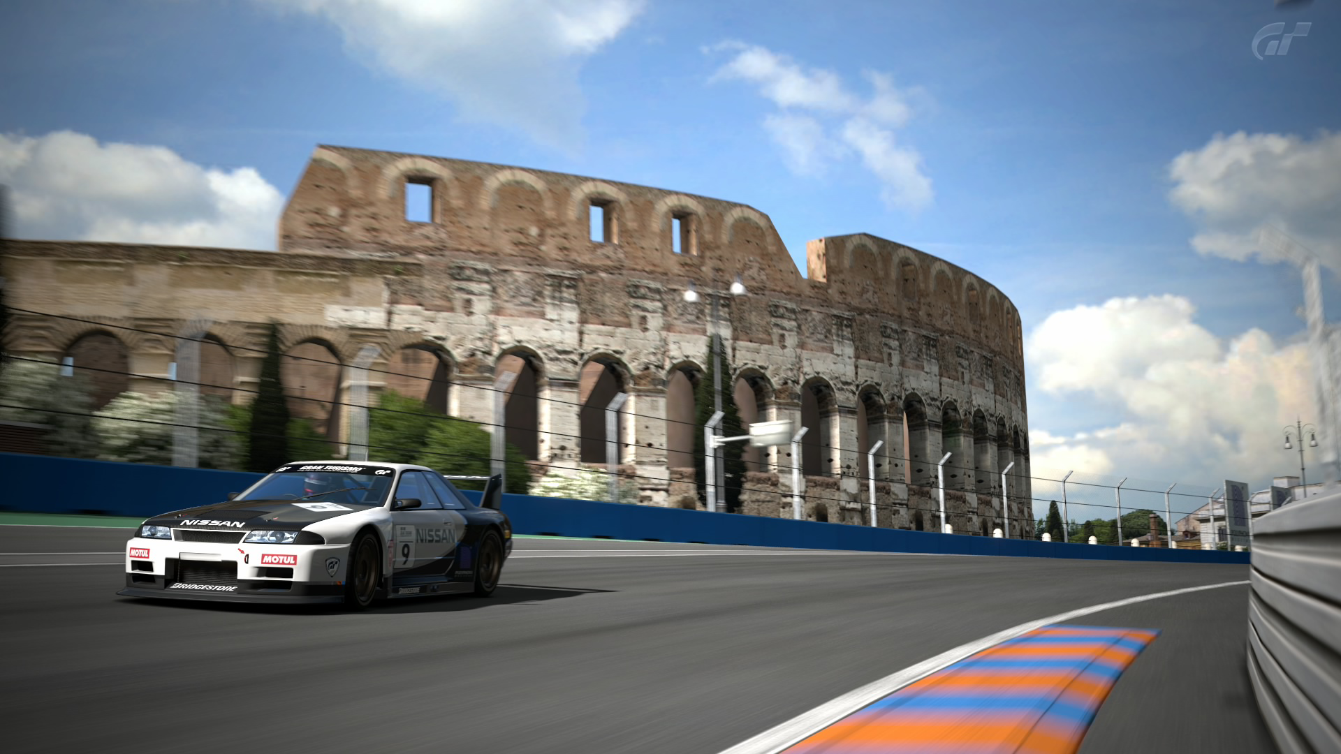
First off, we need a photo from GT5 - how else am I supposed to teach you anything? Mind manipulation? Sorry, don't have the stamina nor the patience for such an activity. Grab some popcorn, a piece of chocolate, a slice of pizza... whatever it is you munch on because I'm about to drop knowledge into your head, or heads, I don't know you... you could be Medusa for all I know.
...
....
.....
...Someone has stolen my flash drive - Flashy, Flashy... where art thou? Oh, there he is, hiding from me.
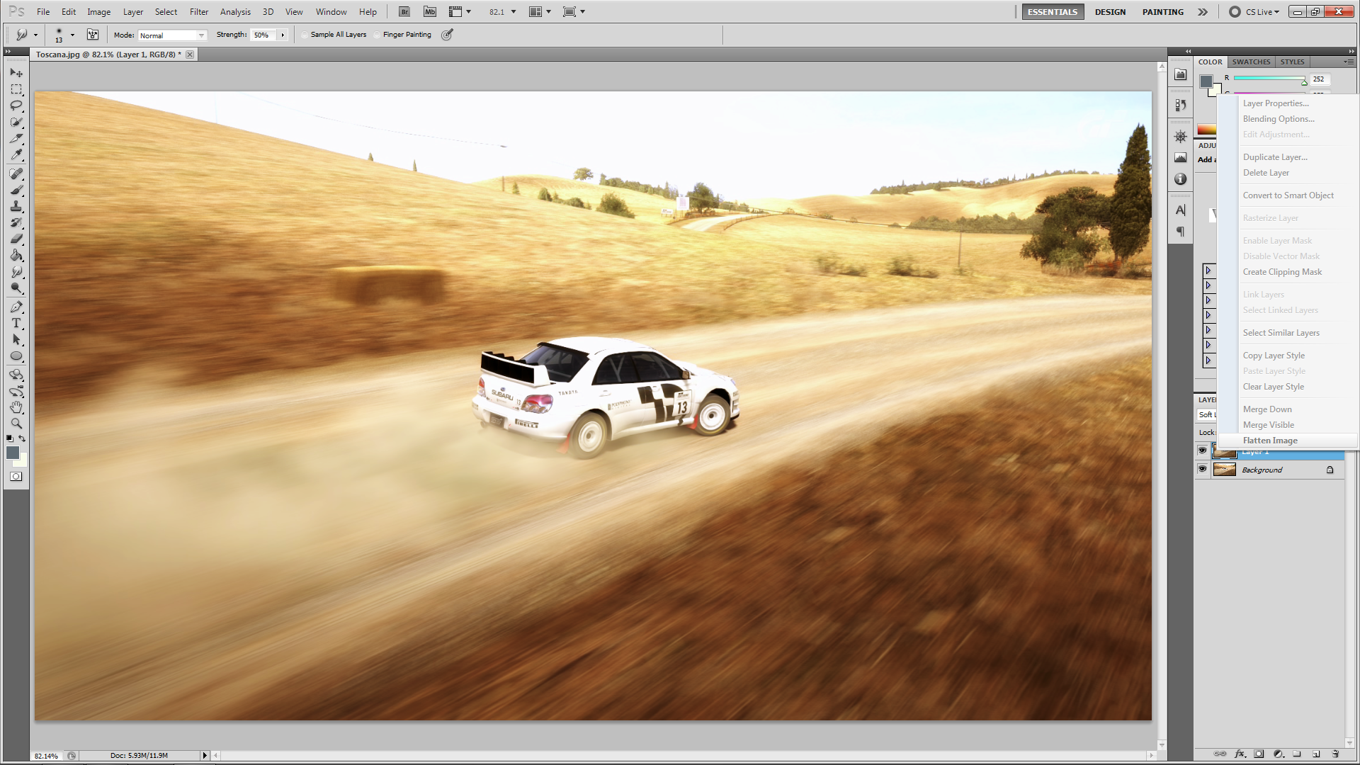
Now, what were we doing? Oh, right, the lab method. Let's load up a picture here:

(all images have a full-sized redirect. Just click the image and BOOM. Full-size.)
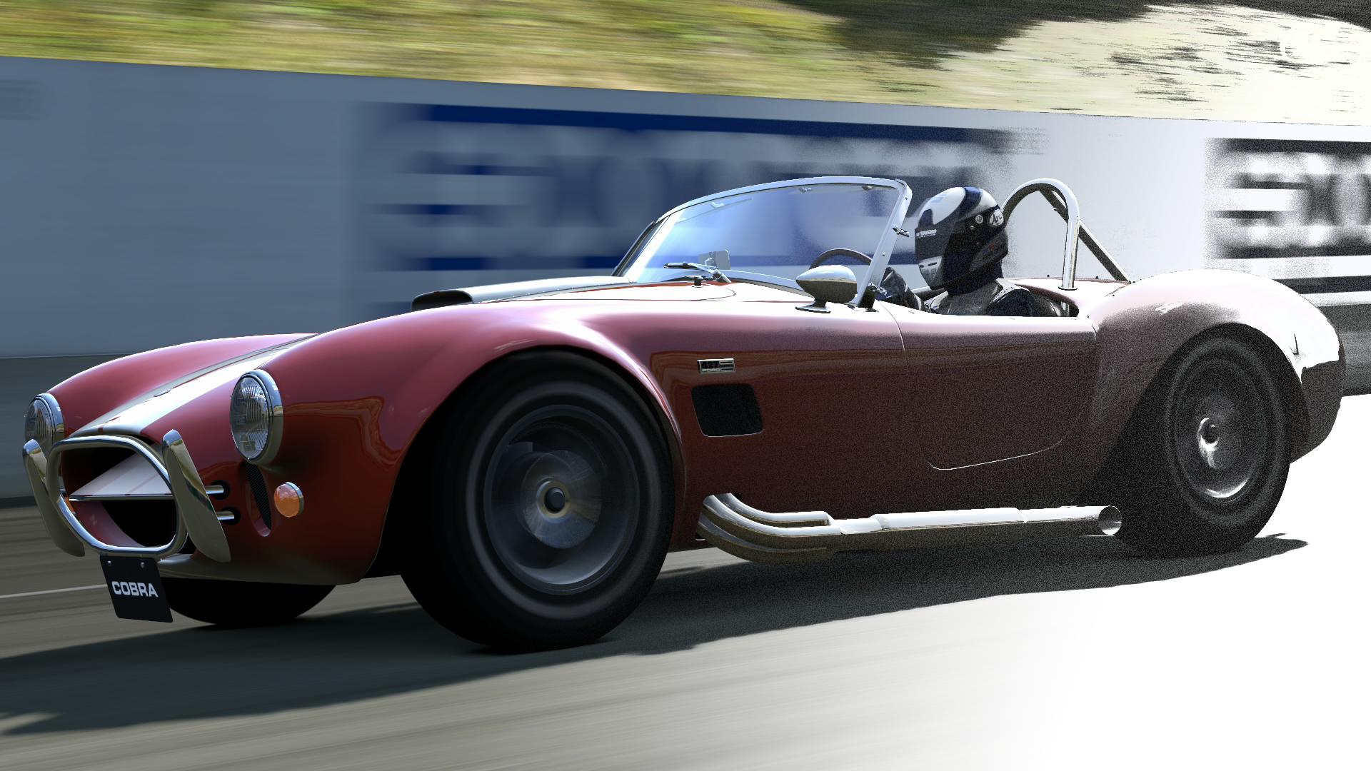
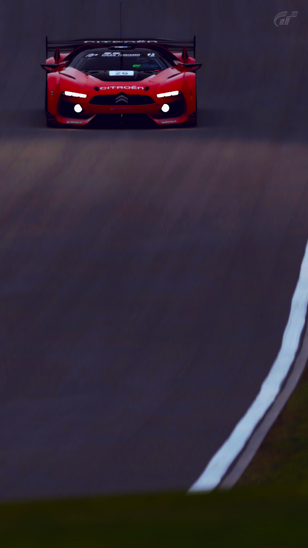
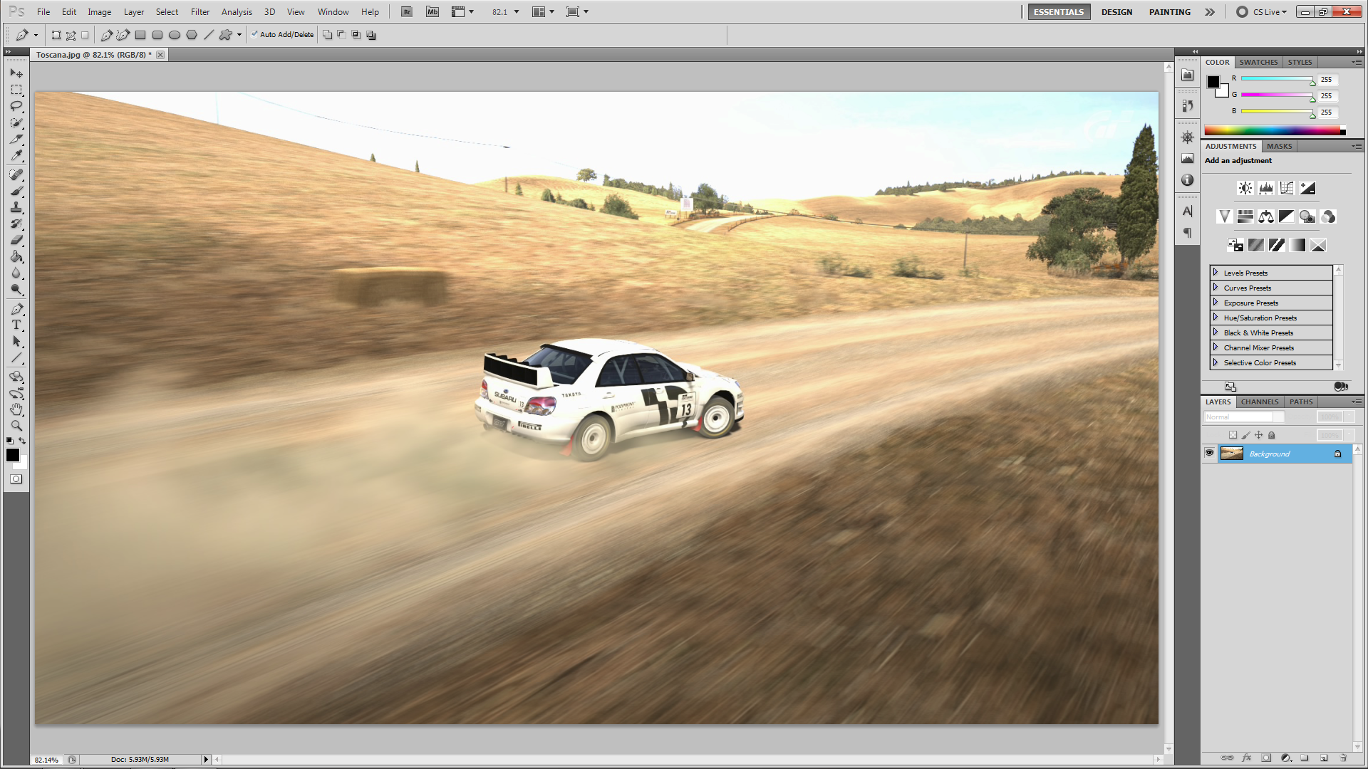
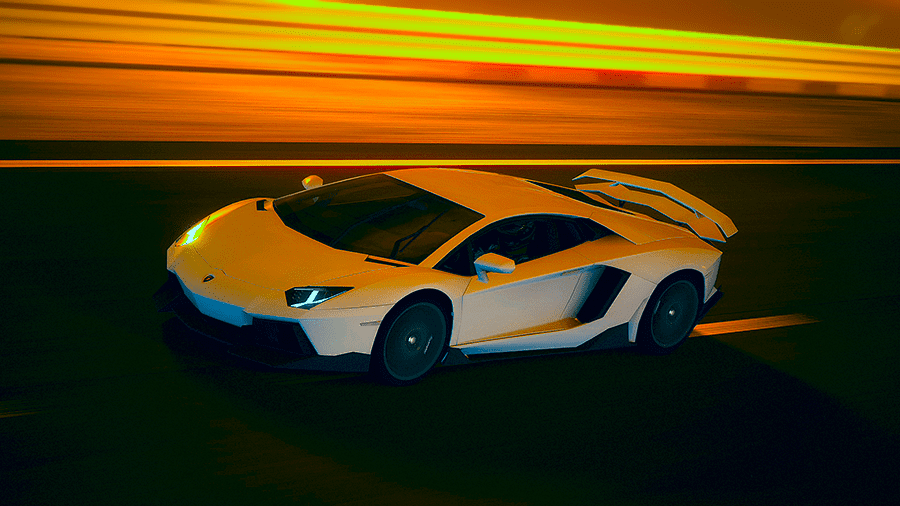
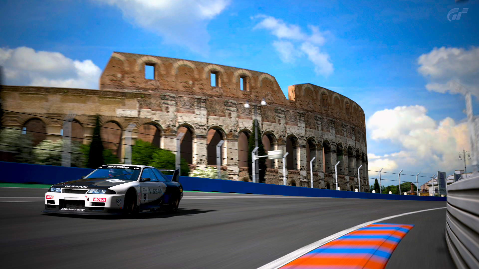
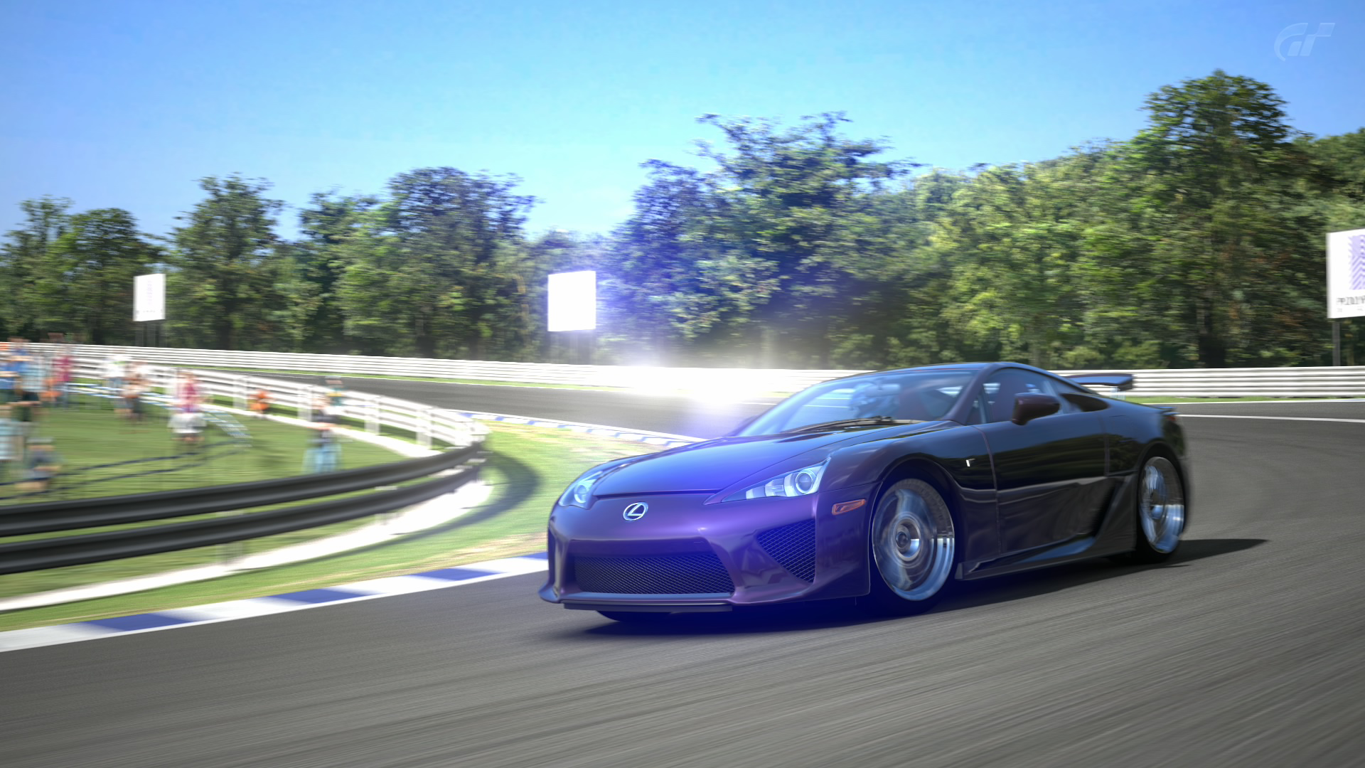
This will do just fine. The Aventador with SV-esque aero mods. Quite the looker, isn't it? Yes, yes it is. And if you haven't noticed already this is a Photoshop tutorial; whether or not you can do this in GIMP (or any other piece of free image editing software) is unbeknownst to me.
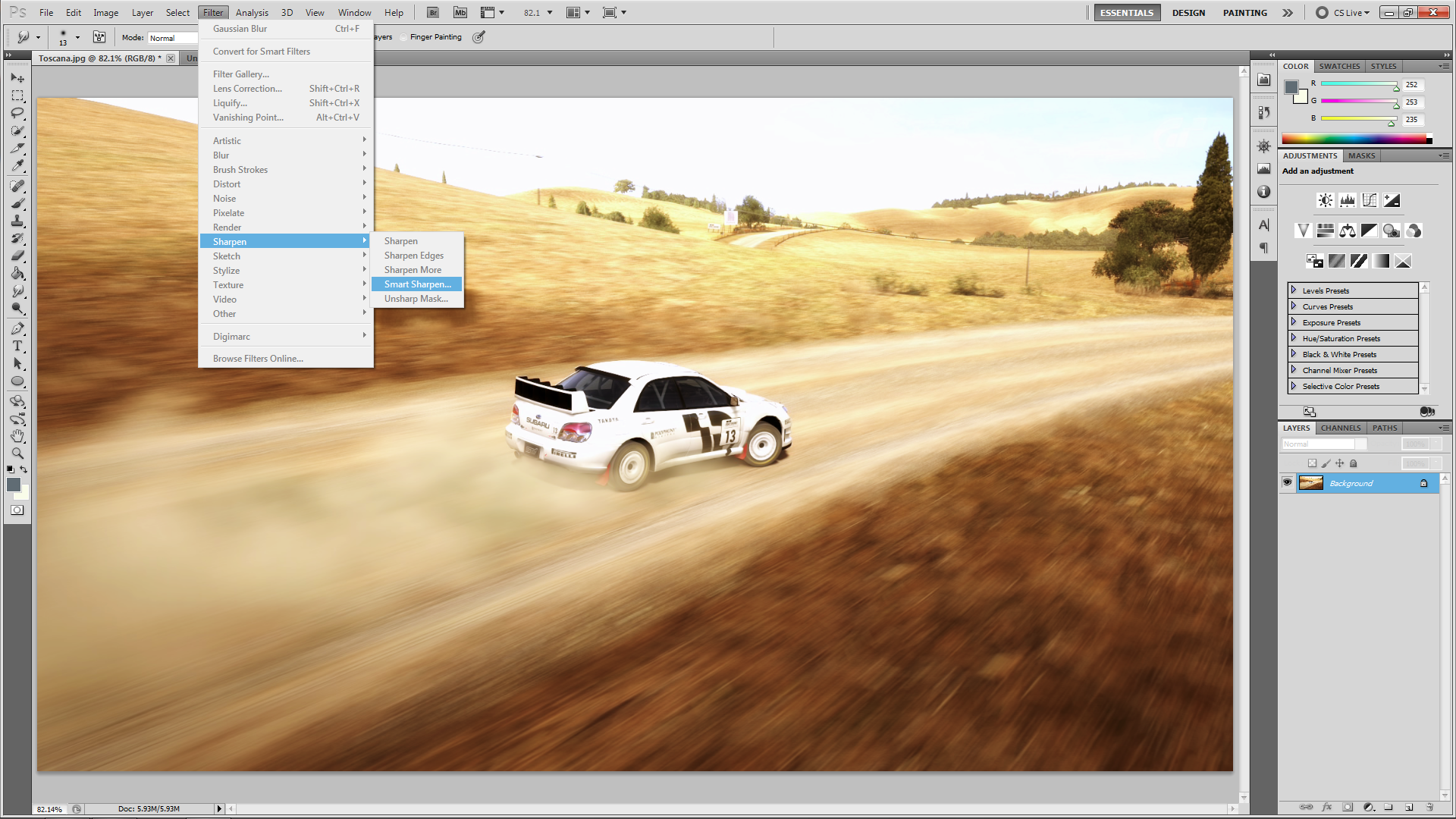
What you want to do now is go to Image > Mode > Lab Color. Just as you're shown in the picture:

See? I told you this would be easy.
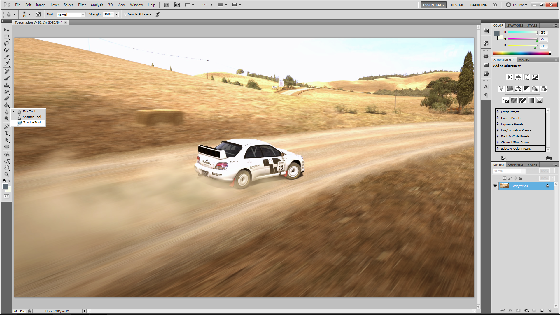
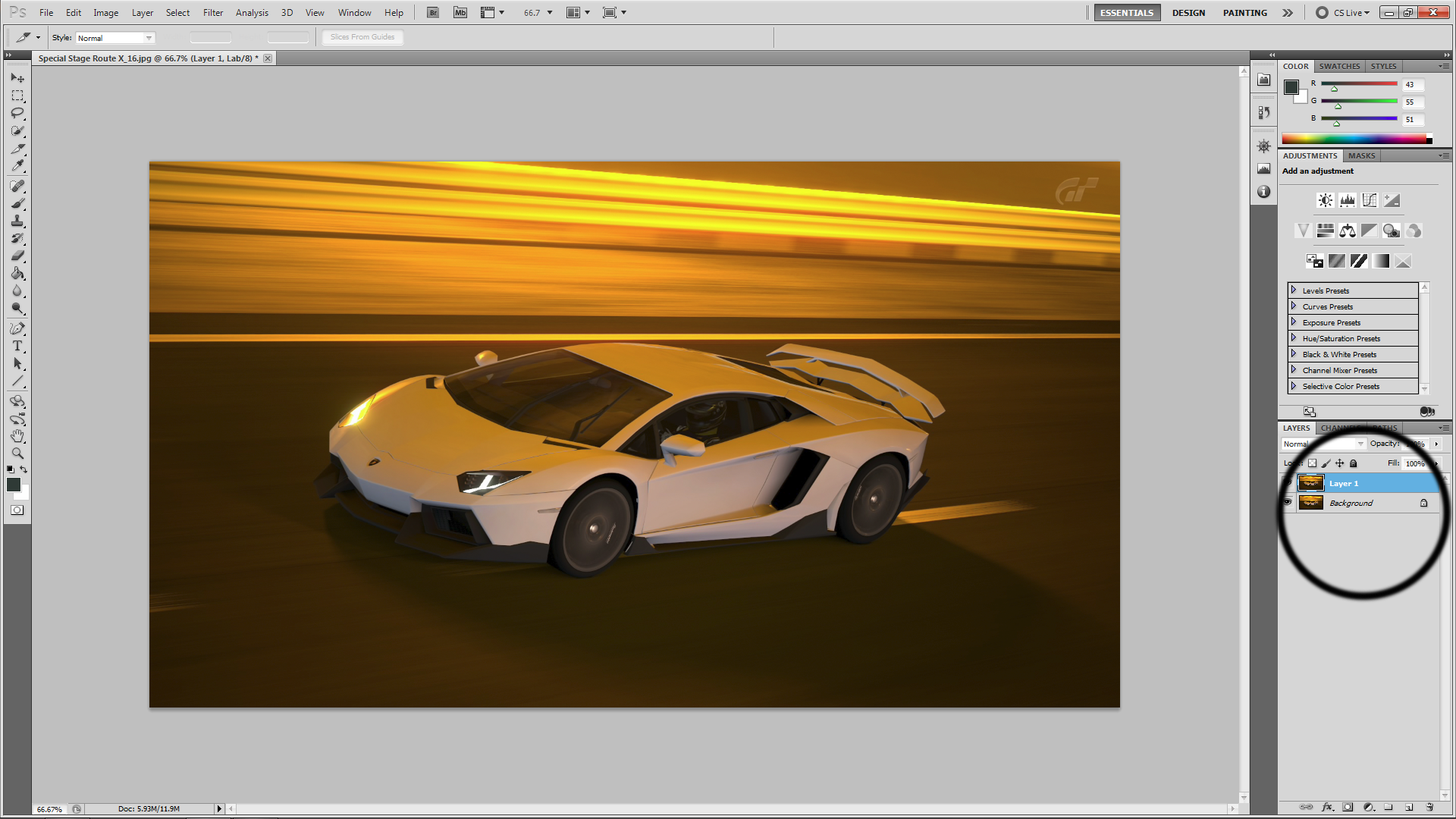
Once you've clicked it (you did click it, right?!) the image should 'blink'. Notice any difference? No? Good, you shouldn't. Not just yet. At this point hit "Ctrl+J" to duplicate the image layer, and you should now have the original "Background Layer" and the new "Layer 1". Leave Layer 1 selected as this will be our guinea pig.

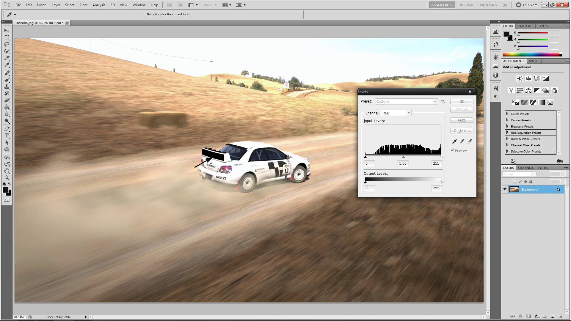
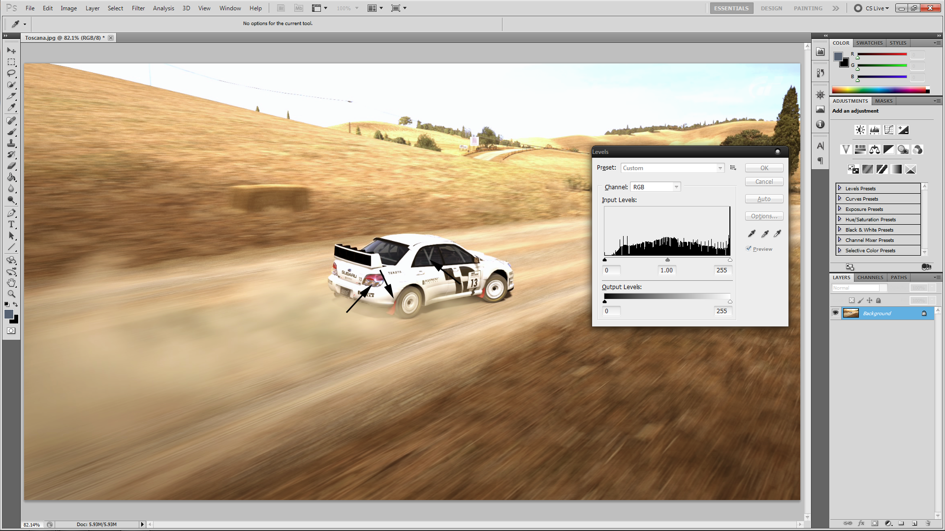
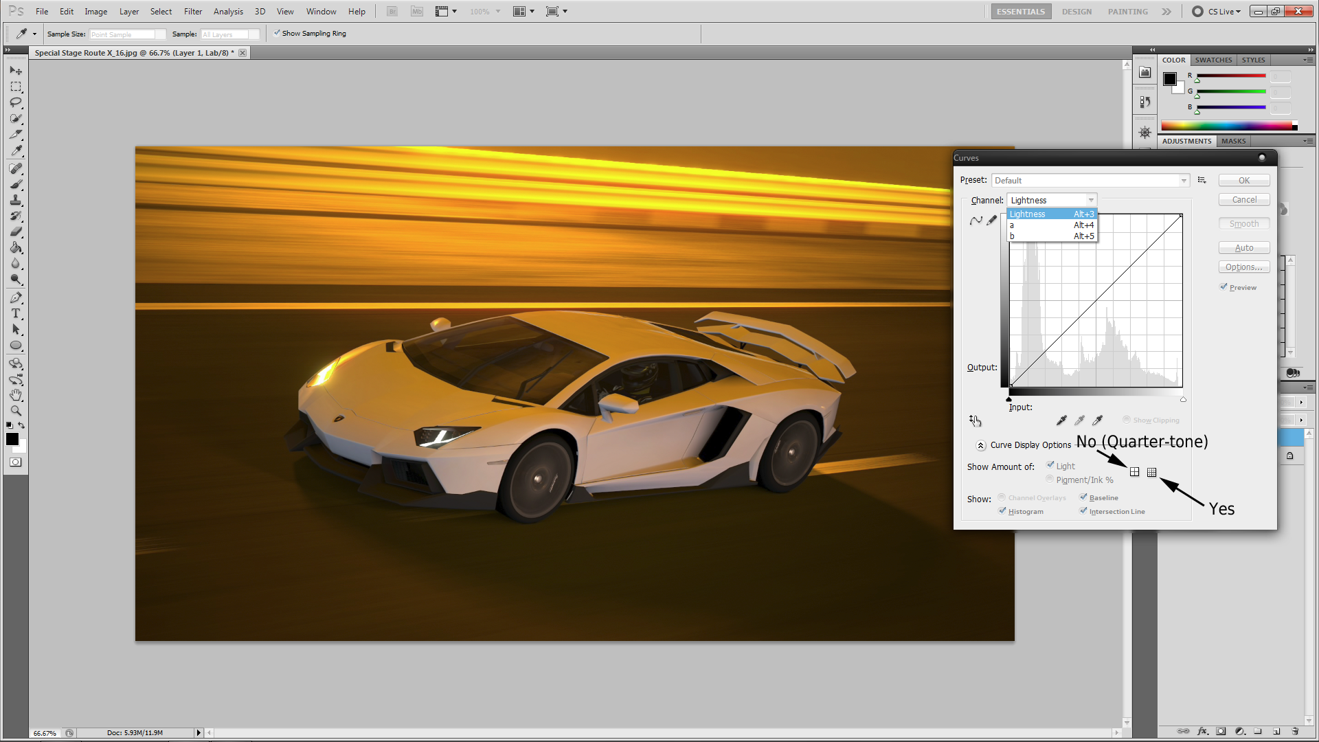
What you do now is hit "Ctrl+M" to bring up the coveted "Curves" window. Before going any further, make sure you have the histogram displaying it's grid in 10% increment adjustments and NOT quarter-tone. Look to the picture for the distinction.

You'll also notice the drop-down menu and the three adjustment parameters: Lightness (don't worry about this now, we'll come back to it later), a channel, and finally, the b channel. The latter two are what you want to focus on upfront as they'll directly control how much more colorfully vibrant your photo becomes.
---
If you're stuck, or scratching your head... now would be the time to re-read and get caught up. Any questions asked will require a $5 surcharge. Per question
---
Okay, let's get on to the nitty-gritty, shall we?
You'll notice that 45-degree angled line crossing through the middle of the histogram - that's where the adjustments will be made. Remember, only drag from the bottom (and top) of the line, not middle, or anywhere else. Top and bottom.
Say it with me: "Top and bottom". Good. Very good.

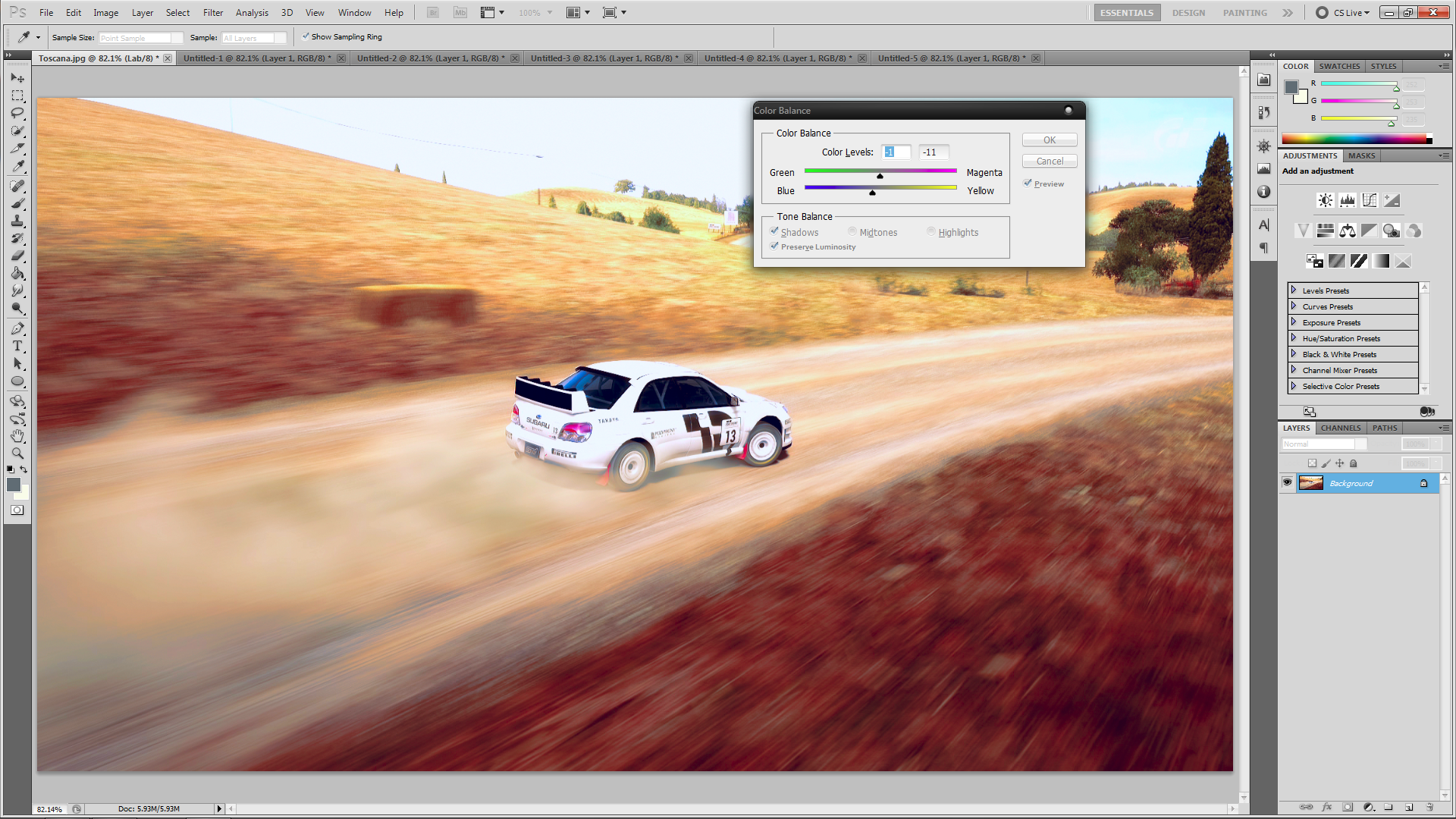
You want to drag one end 1-3 spaces, and what you do for one end you must do for the other. If you don't you'll end up with a weird (and possibly scary depending on how sensitive your eyes are) color tint, and no one wants that. As you can see, I adjusted the a channel slider 2 spaces on both ends of the line. Now, we move on to the b channel.

What you did for the a channel you can also do for b, but you don't have to. You can undercut it by 1 (1 space on both ends), or you can do 3 spaces on both ends, however, for the sake of keeping this easy to follow let's mirror what we did for the a channel - 2 spaces on both ends of the line.
And just as I promised, we're back to the Lightness channel. I won't bother to show any specific picture for this as it's easy enough to understand: the bottom edge of the line controls exposure, and the top lines controls gamma. You can fiddle with both to your heart's content but avoid extremes... otherwise it'll look as if you somehow got close enough, and took a picture of the sun, mid-explosion. Once you're done fiddling around don't forget to finalize the edits by hitting "OK"!
Now, there are two ways in which you can go about saving this image:
1. Revert it back to it's original RGB base by going back to Image > Mode, but this time you'll select RGB. You'll then be prompted about changing modes can affect the appearance and whether or not you want to flatten the image, don't flatten the image.
2. Leave it as, merge the two layers together, and then save it in your format of choice. I personally save my images in PNG-24. Sure, it's a bit hefty in size but I love my PNG's.
The second option is the more advanced of the two because it limits any further postproduction only to what Lab supports, so it's advised that you do any postproduction preparation beforehand if you go this route. The first option reverts the image back to it's RGB base and as such a little bit of the color vibrancy will be lost in translation. There will be times where the first option is absolutely necessary as the colors will, at times, be far too intense and you'll want some of that vibrancy gone.
That's it. You're done. Congratulations, you are now a Lv. 2 Photoshop Goblin.
-----
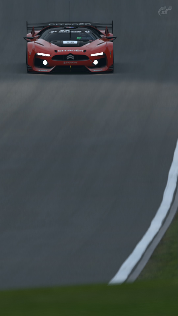
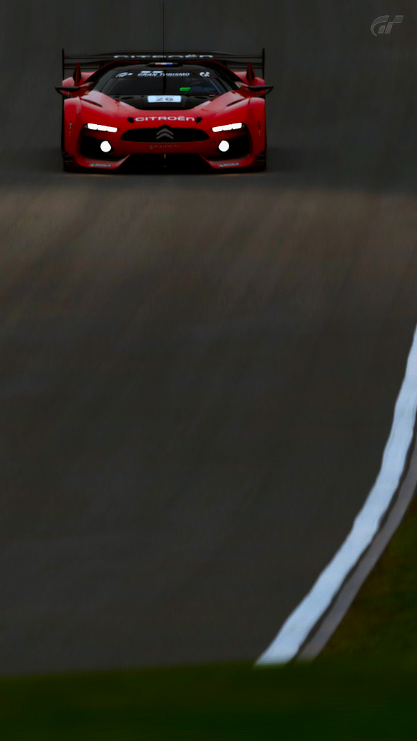
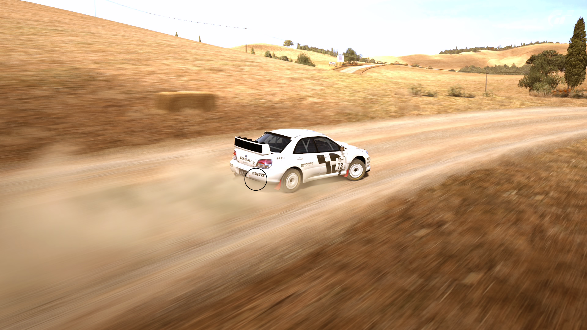
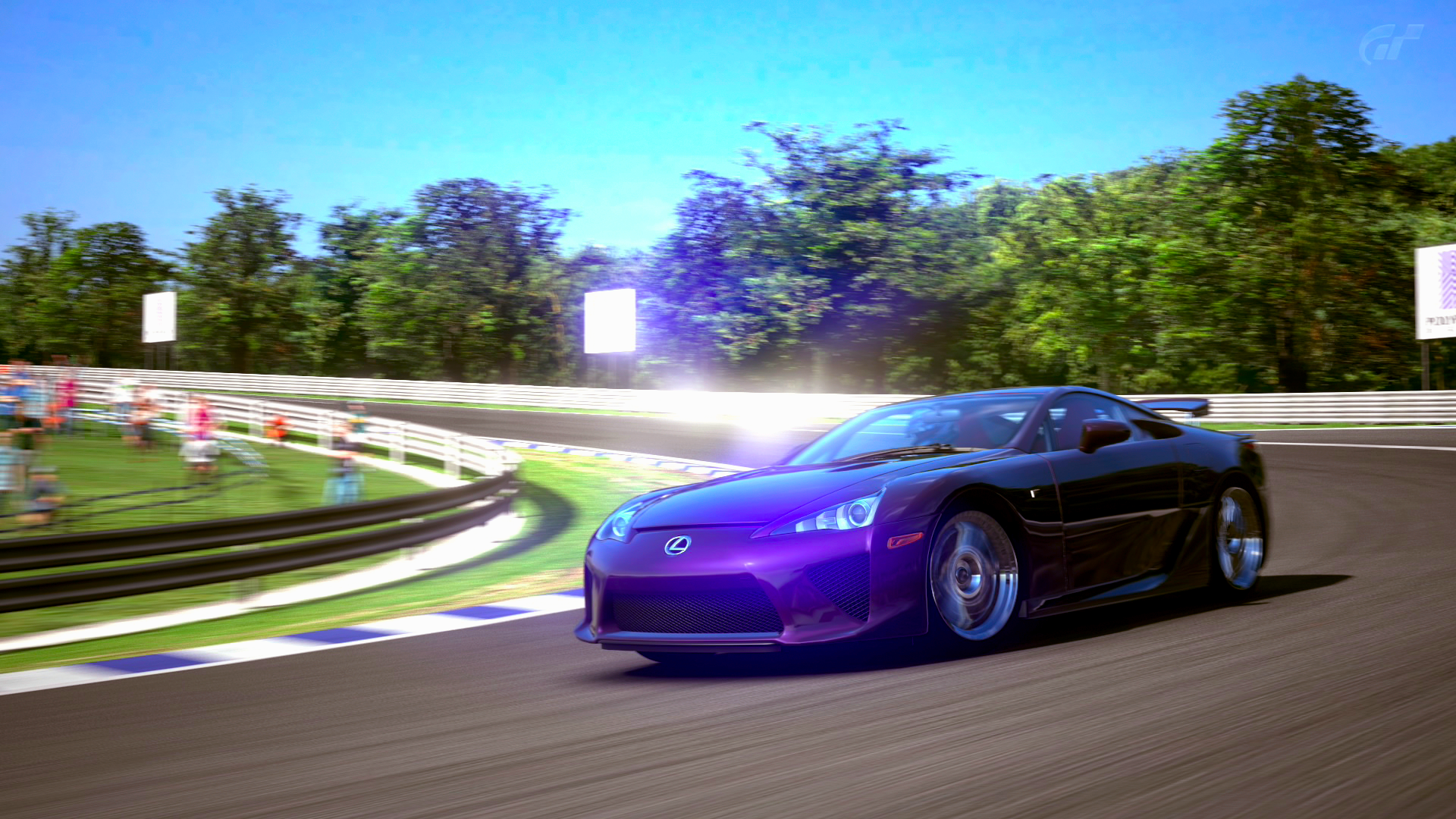
In closing, it needs to be pointed out that, like many other methods of advanced postproduction, the Lab method looks it's best when paired with other adjustments. Such as my own personal edit:
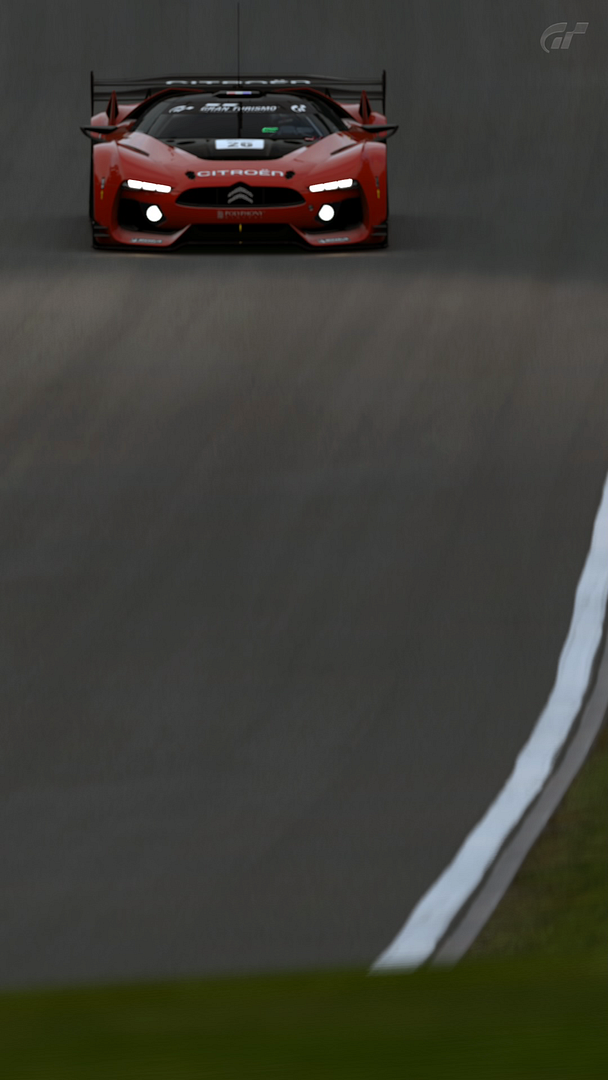
Depending on how well received this is, I'll teach you the whole nine yards of how I utilize the Lab method with a far better picture as well. This is too dark for my own liking. Oh yeah, don't mind that subtly-blurred GT logo, I forgot to edit it out the proper way before doing that.
Okay, let's get started!
First off, we need a photo from GT5 - how else am I supposed to teach you anything? Mind manipulation? Sorry, don't have the stamina nor the patience for such an activity. Grab some popcorn, a piece of chocolate, a slice of pizza... whatever it is you munch on because I'm about to drop knowledge into your head, or heads, I don't know you... you could be Medusa for all I know.
...
....
.....
...Someone has stolen my flash drive - Flashy, Flashy... where art thou? Oh, there he is, hiding from me.
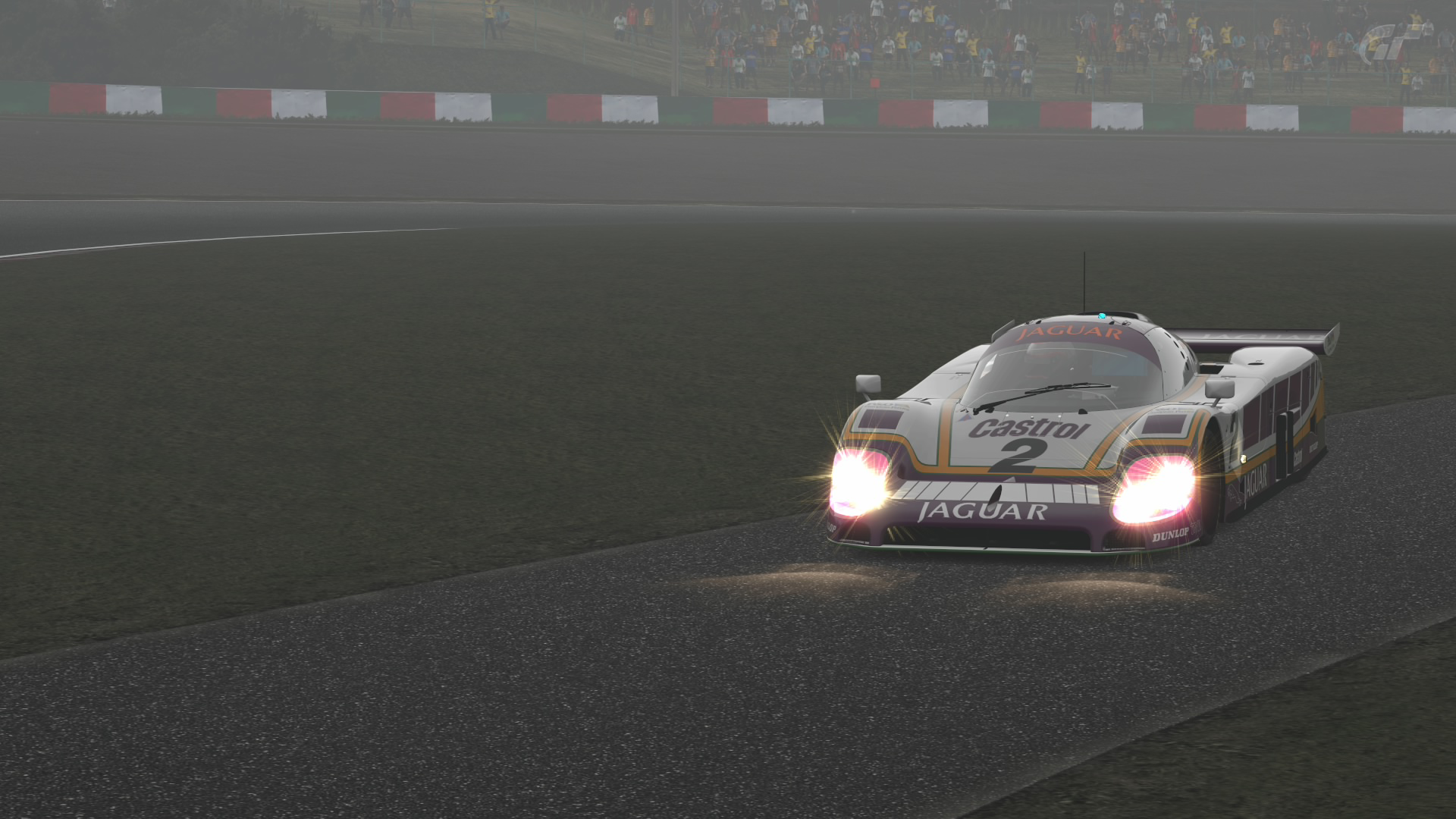
Now, what were we doing? Oh, right, the lab method. Let's load up a picture here:

(all images have a full-sized redirect. Just click the image and BOOM. Full-size.)
This will do just fine. The Aventador with SV-esque aero mods. Quite the looker, isn't it? Yes, yes it is. And if you haven't noticed already this is a Photoshop tutorial; whether or not you can do this in GIMP (or any other piece of free image editing software) is unbeknownst to me.
What you want to do now is go to Image > Mode > Lab Color. Just as you're shown in the picture:

See? I told you this would be easy.
Once you've clicked it (you did click it, right?!) the image should 'blink'. Notice any difference? No? Good, you shouldn't. Not just yet. At this point hit "Ctrl+J" to duplicate the image layer, and you should now have the original "Background Layer" and the new "Layer 1". Leave Layer 1 selected as this will be our guinea pig.
What you do now is hit "Ctrl+M" to bring up the coveted "Curves" window. Before going any further, make sure you have the histogram displaying it's grid in 10% increment adjustments and NOT quarter-tone. Look to the picture for the distinction.
You'll also notice the drop-down menu and the three adjustment parameters: Lightness (don't worry about this now, we'll come back to it later), a channel, and finally, the b channel. The latter two are what you want to focus on upfront as they'll directly control how much more colorfully vibrant your photo becomes.
---
If you're stuck, or scratching your head... now would be the time to re-read and get caught up. Any questions asked will require a $5 surcharge. Per question
---
Okay, let's get on to the nitty-gritty, shall we?
You'll notice that 45-degree angled line crossing through the middle of the histogram - that's where the adjustments will be made. Remember, only drag from the bottom (and top) of the line, not middle, or anywhere else. Top and bottom.
Say it with me: "Top and bottom". Good. Very good.

You want to drag one end 1-3 spaces, and what you do for one end you must do for the other. If you don't you'll end up with a weird (and possibly scary depending on how sensitive your eyes are) color tint, and no one wants that. As you can see, I adjusted the a channel slider 2 spaces on both ends of the line. Now, we move on to the b channel.

What you did for the a channel you can also do for b, but you don't have to. You can undercut it by 1 (1 space on both ends), or you can do 3 spaces on both ends, however, for the sake of keeping this easy to follow let's mirror what we did for the a channel - 2 spaces on both ends of the line.
And just as I promised, we're back to the Lightness channel. I won't bother to show any specific picture for this as it's easy enough to understand: the bottom edge of the line controls exposure, and the top lines controls gamma. You can fiddle with both to your heart's content but avoid extremes... otherwise it'll look as if you somehow got close enough, and took a picture of the sun, mid-explosion. Once you're done fiddling around don't forget to finalize the edits by hitting "OK"!
Now, there are two ways in which you can go about saving this image:
1. Revert it back to it's original RGB base by going back to Image > Mode, but this time you'll select RGB. You'll then be prompted about changing modes can affect the appearance and whether or not you want to flatten the image, don't flatten the image.
2. Leave it as, merge the two layers together, and then save it in your format of choice. I personally save my images in PNG-24. Sure, it's a bit hefty in size but I love my PNG's.
The second option is the more advanced of the two because it limits any further postproduction only to what Lab supports, so it's advised that you do any postproduction preparation beforehand if you go this route. The first option reverts the image back to it's RGB base and as such a little bit of the color vibrancy will be lost in translation. There will be times where the first option is absolutely necessary as the colors will, at times, be far too intense and you'll want some of that vibrancy gone.
That's it. You're done. Congratulations, you are now a Lv. 2 Photoshop Goblin.
-----
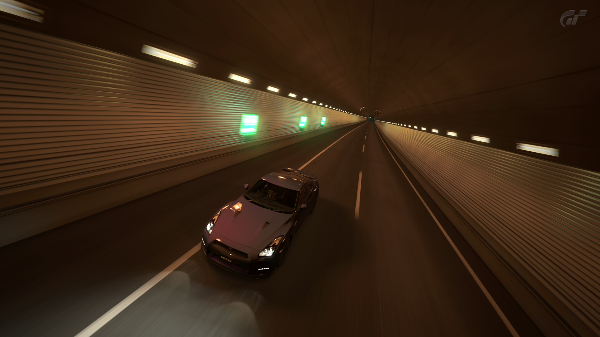
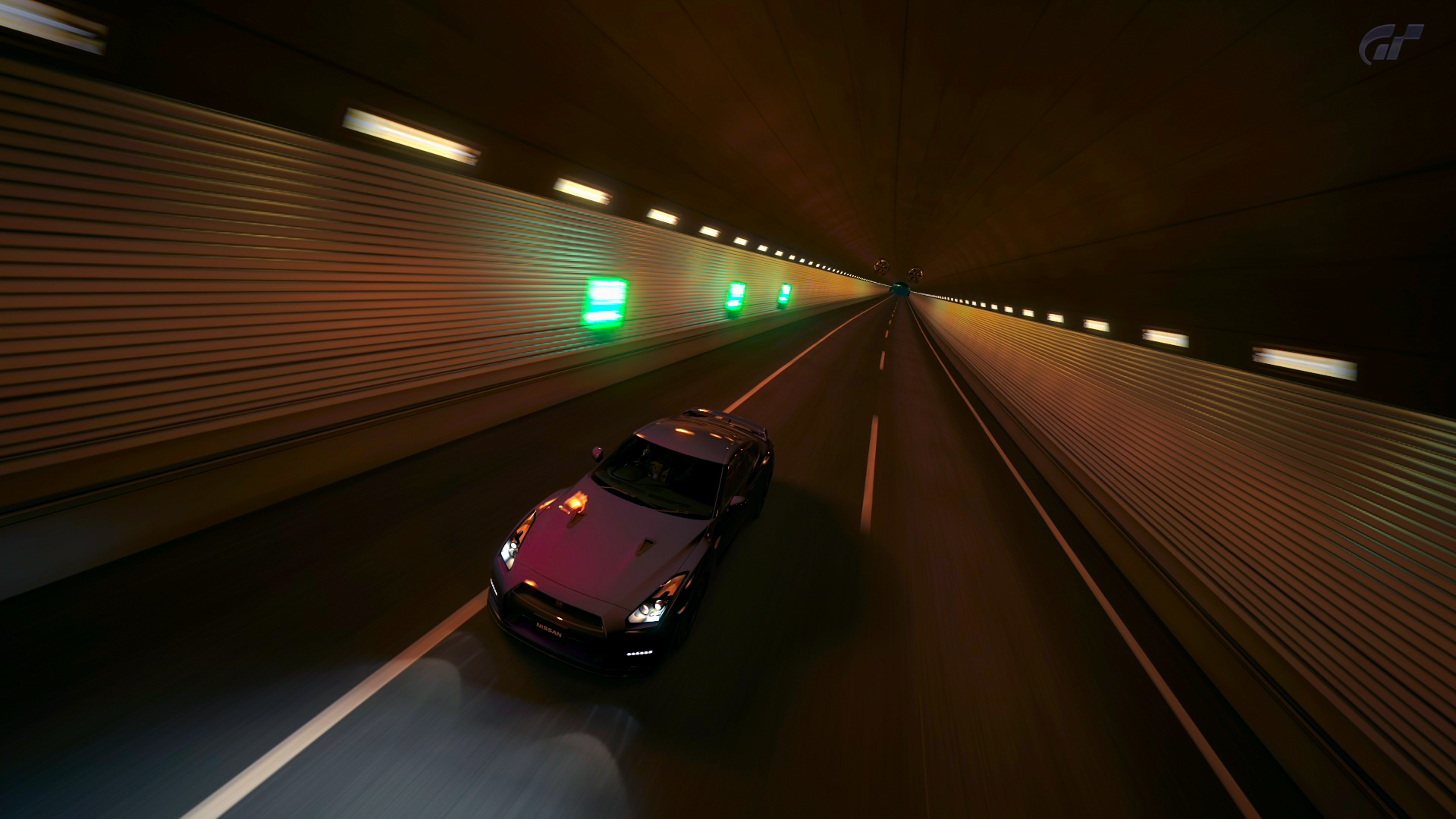
In closing, it needs to be pointed out that, like many other methods of advanced postproduction, the Lab method looks it's best when paired with other adjustments. Such as my own personal edit:
Depending on how well received this is, I'll teach you the whole nine yards of how I utilize the Lab method with a far better picture as well. This is too dark for my own liking. Oh yeah, don't mind that subtly-blurred GT logo, I forgot to edit it out the proper way before doing that.
Last edited:

")