- 3,615

- Liverpool
- leeislee
I feel in the sharing mood so i'm going to show you all how i created things like these...
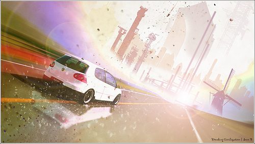
Metropolis...Somewhere In Time
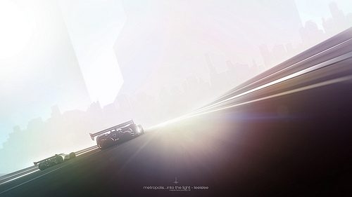
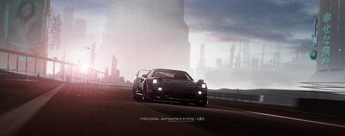
Metropolis...Into The Light
Not sure there will be any interest in this tutorial but since not many people create tutorials on here...here it is...
------------------------------
As some of you may know, i like a few things in my pictures, Beetles, Glowing Shiney Sunshine, Reflections and The Future (not in that order)
When i speed paint for my personal art work the process of creating good looking future worlds can take a while to get them looking good.
It was during my many times sat infront of Photoshop that i noticed that the hint of huge futuristic building in the distance can still conjure up the awe of the future. Infact, the very hint can also create a nice misty, distant look that i and many people prefer.
so, why spend days painting in every light, window and ambient element when some simple blocks and blending can do just as good a job and in a fraction of the time?
This tutorial assumes that the reader (you) has some knowledge of editing. I use Photoshop CS4 but i'm pretty sure that these techniques will work in GIMP (which is free by the way) with a bit of tinkering of course.
Nothing stopping you from reading this, getting abit of inspiration and sending your pictures into the future.
I hope you have a go at this stuff and let us all see what you can come up with......ok, Let's get going.
What i'm going to do is do a quick tutorial before moving on to a bigger picture.
------------------------------
Tutorial 1
----------Starting Image----------

I often use SSRX for my future shoots largely because of the light and the slight futuristic-ness to the scenery. Any car will work for this stuff but i tend to go for a more space age car to fit in with the concept but this tutorial will work with any track and car but you may need to mess around with the blending of the buildings more to get it to look good.
This shot will be turned into something a little bit better.
----------Step 1----------
Before you start drawing anything you can use my custom speed painting brushes to follow along with the tutorial or you can of course create your own buildings.
With the brushes downloaded or any brushes you'd rather use, i select a suitable building shaped brush. (or you could just draw a building freehand)
----------Step 2----------
I want my city to be in the distance, on the mountains so i need to select the correct colour. I choose the same colour as the mountains as shown by the red arrow.

A simple rule of creating landscapes is that things further away are less colourful, they're faint and have less detail, the opposite is true for things closer to you.
----------Step 3----------
Brush selected & colour selected i now draw in a few buildings.

----------Step 4----------
Now in order to match the buildings to the angle of the photo i move the buildings layer over to where i want it and rotate the image, in this case it is 21 degrees clockwise.
An easy way to match the angle is to place a building (on its layer) next to something that is vertical in your shot and rotate it to match. (it's easier if you remember the number of even write it down just in case)
Now i add a few smaller buildings and rotate them the same way.

----------Step 5----------
I now want more buildings across the background so i select the appropriate colour as i did earlier.

Again i draw in some buildings and a huge skyscraper.

I once again move the layer to where i want the buildings and rotate it to fit.
----------Step 6----------
Because that last step used a wide line of buildings, the colour has changed across the mountains and now the buildings don't match. I select the mountain colour i need...

I then CTRL and click on the layer of those buildings and with the layer selected, i pick a large, soft, round brush and just blob in a bit of colour at the end to match it up.

Looks a lot better now.
----------Step 7----------
The thought of 3 mile wide and 10 mile high buildings amazes me and of course, is a standard vision of the future. So in this next step, I create a new layer then on that layer i create some HUGE buildings using the same colours i had selected earlier. I then placed them on layers UNDER the first set of building layers because these big buildings are further away.

Actually, i arrange all the layers like that, anything i create that is nearer to the camera will be on layers above things that are further away.
Again, i move and rotate the layer to where i want it. I also added an extra bulding to fill the space of the right.

I lowered the opacity of that layer to 50% because i want these massive buildings to look further away.
----------Step 8----------
In order to increase the look of distance i want to make the bases of those huge buildings misty. I select the LAYER MASK option...

And you will see a little window appear on the layer. I select a large, soft edged, round brush, change my brush colour to black and blob in a bit of black at the base of the buildings. It should hide a bit of the buildings and make it look misty, like this...

----------Step 9----------
I want to darken the tops of the buildings nearer to the camera to add abit of contrast to the sky so i select the foreground building layer and create a new ADJUSTMENT LAYER

and you should not only see the adjustment layer, you should now make it to only adjust the layer you want. Move the layer ABOVE the buildings layer in the layer window the right click on the adjustment layer and select CREATE CLIPPING MASK and you should see a little arrow pointing to the layer it will effect.

Now in that adjustment layer window i lower the brightness to -10...

But oh no! it has ruined the blending of those buildings into the mountains. In order to fix that i want to hide the base of that adjustment layer.
It's easy, as before i select the little layer mask window on the adjustment layer and treat it like we did before when we misty-fied the huge buildings.
Select a large, soft, round brush. Select my brush colour as black and just draw out the bottoms of the buildings and you'll see it hides the darkening effect.

----------Step 10----------
Now all that i needed is to have a play with your usual levels, curves, shapening and whatever to finish you picture.

Done!
------------------------------
Tutorial 2
Now that was a simple version of the technique, it can of course be made to look a lot more epic, so this next tutorial will use the same techniques from above but to better effect.
You'll also notice that i use a few more editing techniques that i don't really touch on or show pictures as to how i done it but you can skip the bits you don't understand.
----------Starting Image----------
This is the image i'll be using for the tutorial (actually it's 5 pics merged together to create a massive picture)

As you can clearly see, it is a dreadfully bland shot which is intensional by the way. A shot full of clouds, trees and clutter will be harder to edit the future into it.
Yes, the bottom left corner is missing a chunk but i'll fix that later.
----------The Almighty Brushes----------
Now it's time to get comfy in your chair and think ahead (a few hundred years ahead helps!) because this is where the pic you've chosen will give you everything you need to start your buildings.
I assume you have the brushes loaded into Photoshop? If not then do it and we'll begin.
The first thing to do is select a distant colour from the background of your pic, (i've highlighted the colours i chose by the arrows) If the distant scenery changes colour across the miles then it will be neccessary to select the changing colours for the places you plan to build your buildings.
The two arrows are pointing to where i want to place the buildings and as you can see, the land masses are different colours.

----------Sim City----------
This is the part where you look at the tutorial and your photoshop window and think..."Really? it looks awful!". But, like they say, things need to look bad before they can look good.
With my colours selected i choose one of the building brushes i made, select an appropriate size and nervously plonk a few buildings (each on a seperate layer), remembering to pick the different colours from and for the hills the city will sit on.

It looks a mess and it IS a mess, but how many building sites have you seen that are neat and tidy? (i've put a black background on this bit so you can see what i done).
----------Planning & Matching The Lie Of The Land----------
This step requires the services of architects, civil engineers, town planners and people like that. I crudely arrange the building layers into a city formation before i move the things into place.
If your picture is perfectly straight then you'll find it easier to create your building but if like me you prefer silly angles then of course, your buildings need to match the angle of the picture. (90 degrees to the horizon obviously!).
In the case of my picture the buildings needed rotating 13.5 degrees anti-clockwise (it's easier if you remember the number of even write it down just in case)

💡
For my own sanity i placed all the buildings in a folder and just rotated the folder once!
----------Insane Buildings----------
Like i said earlier, The thought of 3 mile wide and 10 mile high buildings amazes me and of course, is a standard vision of the future. So in this next step, i creat some HUGE buildings using the same colours i had selected earlier. I then placed them on layers UNDER the first set of building layers because these big buildings are further away.

Actually, i arrange all the layers like that, anything i create that is nearer to the camera will be on layers above things that are further away.
----------Atmospheric Blending----------
Now it's time to actually push your building back into the distance and give your city some scale and mood.
A simple rule of creating landscapes is that things further away are less colourful, they're faint and have less detail, the opposite is true for things closer to you.
With that in mind you would be tempted to just lower the opacity of the layers but no...That comes later. First i made a new hue/saturation adjustment layer for each of the building layer and i lowered the brightness of each building a bit so you can see the top of the buildings.
You'll notice that this makes the base of the buildings darker too and ruins the blend into the land far in the distance.
I correct this by selecting each Hue/Saturation layer's Mask and with the gradient tool set to Black>Transparent i draw a line to fade out the Hue/Saturation layer at the bases of the buildings. (Again this can also be done using a soft black brush like before)

You may replicate this anyway you like, but this is the way i do it.
As you can see...I took the time to lower the opacity of the massive buildings in the distance because they'd be barely visable in the atmospheic distance.
----------Looking Better?----------

As you may notice, the bottoms of the building layers are very visable hanging over the road barriers etc so i spent a few seconds with the lasso tool and selected the ugly parts then deleted the bits i don't want.

Before i move on i used the clone tool to clone in the missing bottom left portion of the picture i missed off
----------Creating The Speed----------
I have a concept in mind which involves a pacey drive so, I hide all the building layers to leave the basic image i started with.
Obviously, i duplicate that layer so i can add some motion to the shot or as some of you may say, Ruin the shot!
I then used the PEN TOOL to cut around the car and copy it to new layer. That way i have the background layer, and the car seperate.
I want to ZOOM Blur the shot to add speed but this also blurs the car and leaves it looking messy. I take the time to CLONE out the cars edges. I don't go to the trouble of cloning out the car completely, justaround the outside edges.
I also use the liquify tool to push the edges of the car into the middle of the car itself when i want to save time, it's often a lot quicker but not always practical.

Like I said, I want to create a zoom blur effect that creates a sense of speed so I select my duplicated background layer then open up my Radial Blur filter and select ZOOM.
Now BEFORE you add any zoom blur to your shots you need to move the BLUR CENTER center cross to match the vanishing point of your photo As indicated by the arrow here...

This takes a little trial and error to get it right but be patient and you'll get it. If you place the center wrong it'll create a zoom blur that looks odd, just UNDO it and try again until you get it right.
I went for a blur amount of 70. The lower the number the less blur and the higher the number the 'faster' your shot will look.

With the car i cut out earlier on the layer above the Zoom blur layer it already looks good. This is where the preperation helps from before but you may need to clone out any of the blurred car bits that show through!
----------The Final Touches----------
This is what we have now, i brightened the image up abit using a Brightness/Contrast adjustment layer.

this next bit is optional
An old 21st century Hyper-Car in the future will at some point have been modernised and fitted with the latest technology so of course, i had to fit my Zonda with some future upgrades.
First, i got rid of the rear wing. Then on a new layer i selected a small soft edged brush and changed my colour to WHITE and drew in some LED lights and glowy things. I also wanted it to look like the wheels where all future-ish so i drew a few glowy circle tyre things!
I then opened the layers blending option window (right click on the layer and select Blending Options) and added a small light blue outer glow and light blue inner glow to it to make it more colourful.
----------So This Is The Future----------
The road lights at SSRX got all blured out when i added the zoom blur and i wanted them back. On a new layer I just used my lasso tool and drew in a couple of lines were the lights where then added a gausian blur to them.
Of course, i wanted a reflection in there so i added one using my usual technique which can be found HERE
It all looked a bit empty back in the distance so i then took an odd shaped brush and drew in a few distant flying vehicles using a pale blue colour

(you can see the full effect at the end of the tut)
A final play with the levels and curves and it is done. Easy!
----------Before & After----------

And this is the final piece with added head up display on the windscreen!
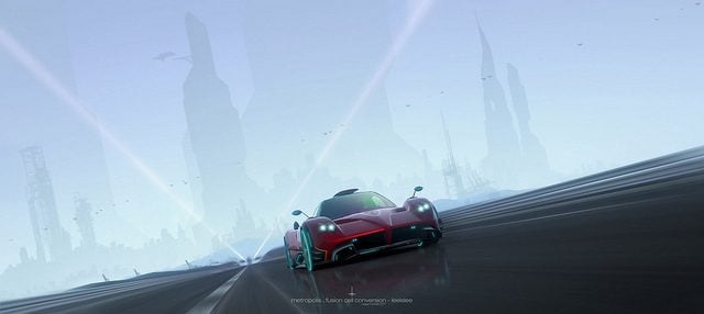
Metropolis...Fusion Cell Conversion
pagani zonda 2177
Feel free to download the PSD file i've attached below so you can have a look at the layout of the layers etc.
If you feel brave and have a go at this stuff, share it so we can all marvel at your work!
Have fun
👍
Metropolis...Somewhere In Time
Metropolis...Into The Light
Not sure there will be any interest in this tutorial but since not many people create tutorials on here...here it is...
------------------------------
As some of you may know, i like a few things in my pictures, Beetles, Glowing Shiney Sunshine, Reflections and The Future (not in that order)
When i speed paint for my personal art work the process of creating good looking future worlds can take a while to get them looking good.
It was during my many times sat infront of Photoshop that i noticed that the hint of huge futuristic building in the distance can still conjure up the awe of the future. Infact, the very hint can also create a nice misty, distant look that i and many people prefer.
so, why spend days painting in every light, window and ambient element when some simple blocks and blending can do just as good a job and in a fraction of the time?
This tutorial assumes that the reader (you) has some knowledge of editing. I use Photoshop CS4 but i'm pretty sure that these techniques will work in GIMP (which is free by the way) with a bit of tinkering of course.
Nothing stopping you from reading this, getting abit of inspiration and sending your pictures into the future.
I hope you have a go at this stuff and let us all see what you can come up with......ok, Let's get going.
What i'm going to do is do a quick tutorial before moving on to a bigger picture.
------------------------------
Tutorial 1
----------Starting Image----------
I often use SSRX for my future shoots largely because of the light and the slight futuristic-ness to the scenery. Any car will work for this stuff but i tend to go for a more space age car to fit in with the concept but this tutorial will work with any track and car but you may need to mess around with the blending of the buildings more to get it to look good.
This shot will be turned into something a little bit better.
----------Step 1----------
Before you start drawing anything you can use my custom speed painting brushes to follow along with the tutorial or you can of course create your own buildings.
With the brushes downloaded or any brushes you'd rather use, i select a suitable building shaped brush. (or you could just draw a building freehand)
----------Step 2----------
I want my city to be in the distance, on the mountains so i need to select the correct colour. I choose the same colour as the mountains as shown by the red arrow.
A simple rule of creating landscapes is that things further away are less colourful, they're faint and have less detail, the opposite is true for things closer to you.
----------Step 3----------
Brush selected & colour selected i now draw in a few buildings.
----------Step 4----------
Now in order to match the buildings to the angle of the photo i move the buildings layer over to where i want it and rotate the image, in this case it is 21 degrees clockwise.
An easy way to match the angle is to place a building (on its layer) next to something that is vertical in your shot and rotate it to match. (it's easier if you remember the number of even write it down just in case)
Now i add a few smaller buildings and rotate them the same way.
----------Step 5----------
I now want more buildings across the background so i select the appropriate colour as i did earlier.
Again i draw in some buildings and a huge skyscraper.
I once again move the layer to where i want the buildings and rotate it to fit.
----------Step 6----------
Because that last step used a wide line of buildings, the colour has changed across the mountains and now the buildings don't match. I select the mountain colour i need...
I then CTRL and click on the layer of those buildings and with the layer selected, i pick a large, soft, round brush and just blob in a bit of colour at the end to match it up.
Looks a lot better now.
----------Step 7----------
The thought of 3 mile wide and 10 mile high buildings amazes me and of course, is a standard vision of the future. So in this next step, I create a new layer then on that layer i create some HUGE buildings using the same colours i had selected earlier. I then placed them on layers UNDER the first set of building layers because these big buildings are further away.
Actually, i arrange all the layers like that, anything i create that is nearer to the camera will be on layers above things that are further away.
Again, i move and rotate the layer to where i want it. I also added an extra bulding to fill the space of the right.
I lowered the opacity of that layer to 50% because i want these massive buildings to look further away.
----------Step 8----------
In order to increase the look of distance i want to make the bases of those huge buildings misty. I select the LAYER MASK option...
And you will see a little window appear on the layer. I select a large, soft edged, round brush, change my brush colour to black and blob in a bit of black at the base of the buildings. It should hide a bit of the buildings and make it look misty, like this...
----------Step 9----------
I want to darken the tops of the buildings nearer to the camera to add abit of contrast to the sky so i select the foreground building layer and create a new ADJUSTMENT LAYER
and you should not only see the adjustment layer, you should now make it to only adjust the layer you want. Move the layer ABOVE the buildings layer in the layer window the right click on the adjustment layer and select CREATE CLIPPING MASK and you should see a little arrow pointing to the layer it will effect.
Now in that adjustment layer window i lower the brightness to -10...
But oh no! it has ruined the blending of those buildings into the mountains. In order to fix that i want to hide the base of that adjustment layer.
It's easy, as before i select the little layer mask window on the adjustment layer and treat it like we did before when we misty-fied the huge buildings.
Select a large, soft, round brush. Select my brush colour as black and just draw out the bottoms of the buildings and you'll see it hides the darkening effect.
----------Step 10----------
Now all that i needed is to have a play with your usual levels, curves, shapening and whatever to finish you picture.
Done!
------------------------------
Tutorial 2
Now that was a simple version of the technique, it can of course be made to look a lot more epic, so this next tutorial will use the same techniques from above but to better effect.
You'll also notice that i use a few more editing techniques that i don't really touch on or show pictures as to how i done it but you can skip the bits you don't understand.
----------Starting Image----------
This is the image i'll be using for the tutorial (actually it's 5 pics merged together to create a massive picture)
As you can clearly see, it is a dreadfully bland shot which is intensional by the way. A shot full of clouds, trees and clutter will be harder to edit the future into it.
Yes, the bottom left corner is missing a chunk but i'll fix that later.
----------The Almighty Brushes----------
Now it's time to get comfy in your chair and think ahead (a few hundred years ahead helps!) because this is where the pic you've chosen will give you everything you need to start your buildings.
I assume you have the brushes loaded into Photoshop? If not then do it and we'll begin.
The first thing to do is select a distant colour from the background of your pic, (i've highlighted the colours i chose by the arrows) If the distant scenery changes colour across the miles then it will be neccessary to select the changing colours for the places you plan to build your buildings.
The two arrows are pointing to where i want to place the buildings and as you can see, the land masses are different colours.
----------Sim City----------
This is the part where you look at the tutorial and your photoshop window and think..."Really? it looks awful!". But, like they say, things need to look bad before they can look good.
With my colours selected i choose one of the building brushes i made, select an appropriate size and nervously plonk a few buildings (each on a seperate layer), remembering to pick the different colours from and for the hills the city will sit on.
It looks a mess and it IS a mess, but how many building sites have you seen that are neat and tidy? (i've put a black background on this bit so you can see what i done).
----------Planning & Matching The Lie Of The Land----------
This step requires the services of architects, civil engineers, town planners and people like that. I crudely arrange the building layers into a city formation before i move the things into place.
If your picture is perfectly straight then you'll find it easier to create your building but if like me you prefer silly angles then of course, your buildings need to match the angle of the picture. (90 degrees to the horizon obviously!).
In the case of my picture the buildings needed rotating 13.5 degrees anti-clockwise (it's easier if you remember the number of even write it down just in case)
💡
For my own sanity i placed all the buildings in a folder and just rotated the folder once!
----------Insane Buildings----------
Like i said earlier, The thought of 3 mile wide and 10 mile high buildings amazes me and of course, is a standard vision of the future. So in this next step, i creat some HUGE buildings using the same colours i had selected earlier. I then placed them on layers UNDER the first set of building layers because these big buildings are further away.
Actually, i arrange all the layers like that, anything i create that is nearer to the camera will be on layers above things that are further away.
----------Atmospheric Blending----------
Now it's time to actually push your building back into the distance and give your city some scale and mood.
A simple rule of creating landscapes is that things further away are less colourful, they're faint and have less detail, the opposite is true for things closer to you.
With that in mind you would be tempted to just lower the opacity of the layers but no...That comes later. First i made a new hue/saturation adjustment layer for each of the building layer and i lowered the brightness of each building a bit so you can see the top of the buildings.
You'll notice that this makes the base of the buildings darker too and ruins the blend into the land far in the distance.
I correct this by selecting each Hue/Saturation layer's Mask and with the gradient tool set to Black>Transparent i draw a line to fade out the Hue/Saturation layer at the bases of the buildings. (Again this can also be done using a soft black brush like before)
You may replicate this anyway you like, but this is the way i do it.
As you can see...I took the time to lower the opacity of the massive buildings in the distance because they'd be barely visable in the atmospheic distance.
----------Looking Better?----------
As you may notice, the bottoms of the building layers are very visable hanging over the road barriers etc so i spent a few seconds with the lasso tool and selected the ugly parts then deleted the bits i don't want.
Before i move on i used the clone tool to clone in the missing bottom left portion of the picture i missed off
----------Creating The Speed----------
I have a concept in mind which involves a pacey drive so, I hide all the building layers to leave the basic image i started with.
Obviously, i duplicate that layer so i can add some motion to the shot or as some of you may say, Ruin the shot!
I then used the PEN TOOL to cut around the car and copy it to new layer. That way i have the background layer, and the car seperate.
I want to ZOOM Blur the shot to add speed but this also blurs the car and leaves it looking messy. I take the time to CLONE out the cars edges. I don't go to the trouble of cloning out the car completely, justaround the outside edges.
I also use the liquify tool to push the edges of the car into the middle of the car itself when i want to save time, it's often a lot quicker but not always practical.
Like I said, I want to create a zoom blur effect that creates a sense of speed so I select my duplicated background layer then open up my Radial Blur filter and select ZOOM.
Now BEFORE you add any zoom blur to your shots you need to move the BLUR CENTER center cross to match the vanishing point of your photo As indicated by the arrow here...
This takes a little trial and error to get it right but be patient and you'll get it. If you place the center wrong it'll create a zoom blur that looks odd, just UNDO it and try again until you get it right.
I went for a blur amount of 70. The lower the number the less blur and the higher the number the 'faster' your shot will look.
With the car i cut out earlier on the layer above the Zoom blur layer it already looks good. This is where the preperation helps from before but you may need to clone out any of the blurred car bits that show through!
----------The Final Touches----------
This is what we have now, i brightened the image up abit using a Brightness/Contrast adjustment layer.
this next bit is optional
An old 21st century Hyper-Car in the future will at some point have been modernised and fitted with the latest technology so of course, i had to fit my Zonda with some future upgrades.
First, i got rid of the rear wing. Then on a new layer i selected a small soft edged brush and changed my colour to WHITE and drew in some LED lights and glowy things. I also wanted it to look like the wheels where all future-ish so i drew a few glowy circle tyre things!
I then opened the layers blending option window (right click on the layer and select Blending Options) and added a small light blue outer glow and light blue inner glow to it to make it more colourful.
----------So This Is The Future----------
The road lights at SSRX got all blured out when i added the zoom blur and i wanted them back. On a new layer I just used my lasso tool and drew in a couple of lines were the lights where then added a gausian blur to them.
Of course, i wanted a reflection in there so i added one using my usual technique which can be found HERE
It all looked a bit empty back in the distance so i then took an odd shaped brush and drew in a few distant flying vehicles using a pale blue colour
(you can see the full effect at the end of the tut)
A final play with the levels and curves and it is done. Easy!
----------Before & After----------
And this is the final piece with added head up display on the windscreen!
Metropolis...Fusion Cell Conversion
pagani zonda 2177
Feel free to download the PSD file i've attached below so you can have a look at the layout of the layers etc.
If you feel brave and have a go at this stuff, share it so we can all marvel at your work!
Have fun
👍
Attachments
Last edited:
")

 great effort there mate
 ") Layers are awesome!
Layers are awesome!