Koutch_Pro not so pro liveries, but trying.....

  • Thread starter Koutch_Pro
  • 33 comments
  • 3,291 views
388
Netherlands
The Dutch flatlands
Hi guys / girls,

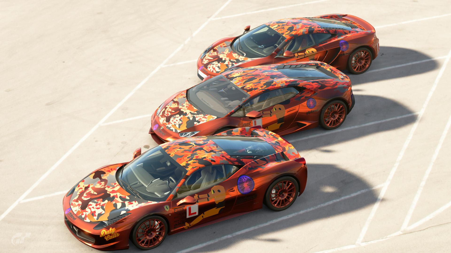
once ïve discovered the livery editor I do have to admit that I like this a lot. You can give you're imagination a spin or try to recreate as close to the real thing as you want / can.

So, here are a few of mine, thanks to Matski for providing the correct decals.

The first I did (and still do) are quite basic, but hey, we all have to start somewhere.
The most liveries I've done are "shaken out of the sleeve" (dutch phrase) for nation cup. The karts I wanted to as correct as possible. Looking forward on tips/hints/feedback.

Cheers !

The Alain Prost 1993 Bercy kart

4972567795779764244_0.jpg


And the Senna kart

4972563404712576020_0.jpg


There are still a few issues here, on the Prost kart the Speedy logo should be bigger but somehow it just doesn't work, same for the Senna logo upfront, that should be the S, Senna and driven to perfection underneeth it. Same thing with the back numberplates, can't get them to work for decals.

For both the karts i used a colorchanging paint for the wheels, closest to alu as i have got for now.
 
The nation cup cars.

Easy to spot that I am dutch :D.
The kart was the very first, slapped on competition orange and .... grey and some logo's and voila.
Used the stock posibilities plus some logo's because I had not discovered all the other options at that time..

5845765852127822860_0.jpg


6197029022369613320_0.jpg


next up the RX-7, basicly the same approach, but now with slogan's on subjects the Dutch are known for around the world, and a few dutch company logo's

Every side is different, that is what I liked most about this one. Might do something like this again, but then with another approach.

6052909438460789256_0.jpg


At this point I had never copied one side to another, just did not know it was possible :banghead::banghead::banghead::banghead:. That's another reason GTPlanet comes in handy... more seasoned members give out plenty of tips, and have some nice tutorials on the tube.

Next is the 3C, used patterns for the first time and learned to use the angle and depth when applying to spoilers/mirrors etc plus copy to the other side. This is my least favourite though.

8215155127421501968_23.jpg


Last but not least thusfar is the Porsche GT3, not quite finished, but it will get there.. Using more layer over layer etc and its improving a bit imho ;)

6269588002232632340_0.jpg


Whats next? The Tic Tac BMW M3 DTM on the group 4 BMW. It will not be perfect, but I hope its going to turn out better then what's uploaded sofar.
 
Guys, just putting this wip in here, sofar I am pretty happy how its turning out, but was wondering what you guys make of this.

Its the Tictac dtm car, correct grand prix, tnt and tauber logo by matski, rest all handy work (cut/past mostly)
I still need to do the tictac's on the roof and bootlit, and also some more on the back. But I am already up to 280/290 layers just for the sides and front. will it work when i would select Other, or just not and should I start over to stay under that magical number?

4909021529844483096_0.jpg

4900577280677381136_0.jpg

http://www.carmodel.com/autoart/89147/1-18/bmw/3-series-m3-e30-tic-tac-n-43-dtm-1991-berg/67572

This is a modelcar wich i used to make this. Its not a 100% replica, I hope it will pass the "first glance at 10ft. away test"
Anny tips/hints etc more then welcome!
 
I second what Cytoria suggests, one SVG with lots of white shapes in it would be fairly easy to achieve and would cut down on the number of layers a lot.

Other than that, I think it's a pretty good effort.
 
Try this file attached, it's 18 white tic tacs spaced evenly so it can be tiled. It's kind of somewhere between your M4, and a photo I have of the actual car.

Thank you very much ! It looks like I actually succeeded in opening it (didn't had an unzip thingy) and got it uploaded, what do you mean be being tiled?
 
Just that you can keep placing the decal on the car and if you're careful, it will just look like a consistent pattern.

aha, lightbulb moment there :lol:. The uploader signed it ready, but I can't see the svg annywhere, I did it about an hour ago, does it normally load up quick/aka, am I looking in the wrong spot? Looked in library, activityfeed and the livery editor in several maps.
 
Alex, yes I did extract the file and saved in in a folder on my laptop, from there used the uploader on gran-turismo. got the message both times that it was ready, and showed the svg file nice and tidy on screen. bit puzzled now :grumpy:
 
Alex, yes I did extract the file and saved in in a folder on my laptop, from there used the uploader on gran-turismo. got the message both times that it was ready, and showed the svg file nice and tidy on screen. bit puzzled now :grumpy:
Do you see the new file on your Library > Decals > User decals (the first icon with the bust). Even if the SVG is « bad », at least the game will show you an empty or messy vignette if the uploader said it’s ok.
 
Do you see the new file on your Library > Decals > User decals (the first icon with the bust). Even if the SVG is « bad », at least the game will show you an empty or messy vignette if the uploader said it’s ok.

Sorry, missed this one, will check that again. got the tictacs from matsi, going to work on it tonight.

edit; argh... yup, they showed up under personal decal... good to know it works!
 
Last edited:
Just finished 3 cars since I am on the reserve list for the "super handicapt" series also on this forum.

The lay out of the cars is the same, slight differences because I had to hurry up and panel size do differ.
Used 2 paint colors, the simple gradiant from zxr400kizz_2, the dummy and duty calls from eaboy77, the patterns for hood, roof and back sections are these ;

roof first layer ; https://www.gran-turismo.com/nl/gtsport/user/my-library/decal/decal/1288845/5846239669177548800
hood first layer ; https://www.gran-turismo.com/nl/gtsport/user/my-library/decal/decal/1288845/4764897479155024384
hood and roof second layer ; https://www.gran-turismo.com/nl/gtsport/user/my-library/decal/decal/1210219/5773620224764970008
hood and roof third layer; https://www.gran-turismo.com/nl/gtsport/user/my-library/decal/decal/2816571/5053699592696135696

gradient above the wheel arches and on the front ; https://www.gran-turismo.com/nl/gtsport/user/my-library/decal/decal/5027474/4972616118591062032

I like that effect witch it gives above the wheel arches

5053624897376388620_0.jpg

6061868272073048588_0.jpg
 
Last edited:
The Tic Tac family has got new additions in the meanwhile !

First up is the Tauber TicTac Fan Van with most of the stuff copied to the Samba van.

4836884760414420992_0.jpg


Offcourse I am triggered to do the classic Group C Porsche in the Tic Tac livery, whilst looking at some pictures I came across this wrapped tribute 911 ; http://skepple.net/weathered-tic-tac-porsche-gt3/ This find resulted in this ;

4765441799821983748_0.jpg


Haven't don the "battle scars" yet, but i do like it this way. If you guys spot some major wrongs, ore have some feedback, that is allways appriciated!.

Links to the livery's ;

TTFV : https://www.gran-turismo.com/nl/gts...arLivery/livery/3918491/1/7422569975876945416
Porsche ; https://www.gran-turismo.com/nl/gts...arLivery/livery/3918491/1/4756365264644243977
 
Hi @Koutch_Pro :cheers:. I don't do this much, but I did just go trough your own livery thread!. As you say your self, we all start from scratch and learn new things. It's great to see your progression in your work:tup::). Great livery's you make. But from my stand point of view, you have a thing with colour combinations I don't favor, or I personally keep away doing, from experience. Let me give you an example from one of your own livery's.
proxy-2.jpg

Here you gone with an Orange car paint, and then using a slightly lighter Orange for the Decals!. Nothing wrong by doing it, but because of the lighting engine PD are using, and have accomplished vs real life, you get colour induction. Colour induction is when two colors from the same family are used, they will fade together if real sun light are pointing on the subject. Like, if you have a sign with light Grey background, and the text on it are White, with real sun light pointing on the sign, the text will fade in to the grey and disappear, or be very hard to read. What there should be used on a light Grey background is Black. Two complimentary colours, can work together. Means, if you had gone with a 50% Grey colour for the small decals on that Orange paint, they would have stood out much better:). Also the thing you have on the hood, try to give it a 50% Grey outline, the same goes for DJ'S on the doors as well. Side note: If you have had different stripes of forms on your livery, that would have worked as you've done it, because a stripe, is just graphics, part of the overall colour scheme!. Hope it makes sense:cheers:.
Like also if you have different types of stripes or decal shapes on your livery, to make some of them stand out from the rest, or you want to highlight some of them, giving them a slight outline, or shadow effect, is very effective', to give contrast, so two colors don't fade into each other. So if you are using a light colour for the car, use a contrast darker colour for decals, or atleast some that should be readable. So on your livery shown, a dark Blue, a Dark Green, a dark Grey or black will work!:), and Vise Versa. Of course there are no limits, but what I have described is a very good learning tool, and a good thing to think about, and to have in back of your mind, when you combine different colors:).
My education required me to learn about colours, the hole colour palette, and how colours are working together.

Keep up your good work, and keep them coming:). Cheers. I'm from Denmark by the way:).
 
Hi @Koutch_Pro

Keep up your good work, and keep them coming:). Cheers. I'm from Denmark by the way:).

Hi, and thank you for going through this thread and actually giving some good founded advice! Appriciate it!

I did indeed not use anny outlines here on the "orange" cars, because I wanted the blend effect, so that someone should have to look more then once to see whats going on with the car. But agreed, you are very right about the color use. (comes to thinking about it, 25+ years ago I was teached something about color usage etc, but that faded... ) The thing on the hood is the dutch lion, this is widely used by our national teams on tournaments and on the olympics.

When I did this livery, I indeed see the colorblend at work on the rear wing, had a #hollandsecond and youtube logo refering to that viral thing from Arjan Lubach (very funny) and that dissapeared totally. (will do that again, but then with a cool matt grey outline)

Thanks a lot, and if you wish to spill more tips, you are more then welcome ! You're nation flag sort of gave away that you are from Norway ;).
 
Back