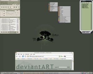
Let's see those desktops (rev 3.0)

  • Thread starter -Fred-
  • 329 comments
  • 11,568 views
Status
Not open for further replies.
Blake
And Jimmy, I'd told you heaps of time you need to change your res!
I knew you'd say that. But it's like Homer on the Simpsons, where Marge tells him to clean the car, but he only listens to Lenny when he finally does. That's what it is...:lol:

Nice background, Joel. Anyone know where to find some really nice desktops that don't include 400 pages of female-orientated pictures? I'd like something very cool-looking. :sly:
 
I finally decided to get an Icon theme and cursor theme. It looks pretty slick, now.
untitled12dt.jpg
 
Sage
Theme: Milk 2.5 by Max Rudberg
I can do that also, Sage :P
I have been using KDE since GNOME 2.5. I have returned to GNOME to find it much friendlier and more refined in 2.8. I think I shall be staying with GNOME/GTK2 for a while.
 
Sage
Why does Verdana look so poopy? :( (And it's an ugly font to begin with!)
That's not Verdana, it's Bitstream Vera Sans (free clone of Verdana; slightly closer packed). Except in the browser--that is Verdana, and you can talk to Jordan about that. Both are, in my opinion, some of the best fonts out there--very readable even at very small sizes.

And I got sick of that milk theme very quickly. It's too bright and does not have enough contrast. Now I am using Digital Harmony, which, I feel, is much cleaner and easier to view at a glance.

Something like this.
16258-2.jpg
 
I love Verdana, my favourite font by miles. It's very easy to read (even at tiny sizes) and looks very neat. 👍
 
I, too, am a fan or Veranda, but I'm using Bitstream Vera Sans, like Skip. It's very smooth. Bitstream size 10 is the same size as Arial 12 or times 12, If you wanted to know. I type all my papers for school in Bitstream 10.

EDIT: Blake- All I know is that I got this icon package from dA and it is called XP-MadB.
 
It's easier to read because the x-height is some 15% larger than most other fonts… which means that Verdana is literally bigger than most fonts at the same size. So if Verdana is "nicely readable" at 10 pts, it's more like looking at a font that's 11 or 12 pts… thus, it's not necessarily more readable at smaller sizes, but just happens to not be smaller.

I've just never been agreeable with Verdana's kerning, and some of the letter widths are grossly out of proportion. I still have to use it in web design though, because it's one of the few reliable fonts out there (the other two being Arial and Georgia, both of which I also have issues with).
 
Right now I'm just using solid red as my background. But you know what? It's 1600 x 1200 x THREE desktops.
 

Attachments

  • loudcam.jpg
    loudcam.jpg
    21.8 KB · Views: 32
Just a reminder, that if you look in the Thread entitled "For Those Who Use the Desktops Thread", you will see that it's now necessary to post either Attached Screenshots, Thumbnails, or pictures no larger than 400x400, just like Blake's post.
 
Jimmy Enslashay
Just a reminder, that if you look in the Thread entitled "For Those Who Use the Desktops Thread", you will see that it's now necessary to post either Attached Screenshots, Thumbnails, or pictures no larger than 400x400, just like Blake's post.
No it's not, not untill friday ;)
 
Why not just start a "Let's see those desktops (rev 4.0)"?
 
Status
Not open for further replies.
Back