GTPNewsWire
Bot
- 23,995

- GTPHQ
This is the discussion thread for a recent post on GTPlanet:
This article was published by Gary Slater (@AudiMan2011) on April 22nd, 2020 in the Gaming category.


New DLC available;Legal IssuesFaux-stencil lettering is so early 2000's, but I guess it's better than the faux-Apple superthin lettering that's been all the rage the last 5 years.
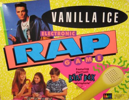
Frankly, I think it's about time for 1990's graphic design to make a comeback. That's the kind of imagery that demands you pay attention to it:
At least it doesn't look like it was made in photoshop, Sony.
I like it. 👍
The PS5 logo looks fine. Why would Sony change it up for no reason? They don’t need to worry about it. They don’t have the slightly confusing models to deal with like series x and one x and one s and series s, etc. It’s PS4 and PS5. The logo doesn’t need to be more than a 5 to replace the 4. Easy enough. I’ve never understood why some were expecting something radical there.You say this a lot but it still makes no sense what you're getting at.Who cares, they leaked the entire console before the logo anyway lmao
What on earth kind of management is happening over there...
In chronological order:
>They publically announce all the specs
>They publically state why people shouldn't ask for specs
>They then publically show the entire console in all its physical form
>And finally thely "teaser" the logo
What on earth is going on ahahaha
I'm a train enthusiast, and the only thing we argue about is branding. Ever.Only in the gaming fandom would arguments over a logo erupt, it's truly pathetic. Buy both then you don't have to make yourself look so pathetic.
Well that's boring. Graphic design sucks nowadays. People are so obsessed with being "clean" and "modern" that they leave out any form of flavor.
You say this a lot but it still makes no sense what you're getting at.
Indeed. Plus, this logo was made for the console model itself; the Series X. The Series S will have a different letter which is the "S". The console itself will just be "Xbox". Think of it as a trim for a car.Logo's matter otherwise there wouldn't be a whole graphic design industry tasked with coming up with them and being paid very well to do so. I think every generation should change it's logo, makes a statement. The Series X logo looks quite professional imo, very corporate in style.
I give it to Microsoft at least they did something different regardless of how it goes down. Sony took a mediocre font, have for some reason come to their own conclusion its iconic and slapped it on 2 and a half generations now.
Regardless of what the others say, the Series X logo does looks good, and screams different. Too bad Sony had to go with the same boring logo again. Although it suit the PS3 more than it does now, because it was made with it in mind at the time.)
Now THAT'S iconic!The original PS3 logo/font was this,
View attachment 914132
But the mid cycle logo change to the wavy one was at least fresh for the time and kept moving things forward. Now it kinda feels dated being 11 years old, especially as its not particularly amazing or iconic.


Now THAT'S iconic!
Why Sony has lost their creativity, or at least style, to make logos like that afterwards we'll never know. I guess they think fans won't care all that much, thus the current logo we got.
Ikr? It sucks it has to be that way. If can remember correctly, we used to have so many unique logos. Nowadays, I'm not even sure anymore. :/Yeah I also really like that one. It seems a lot of creativity has gone out of most things these days, everyone tends to play it safe.
")