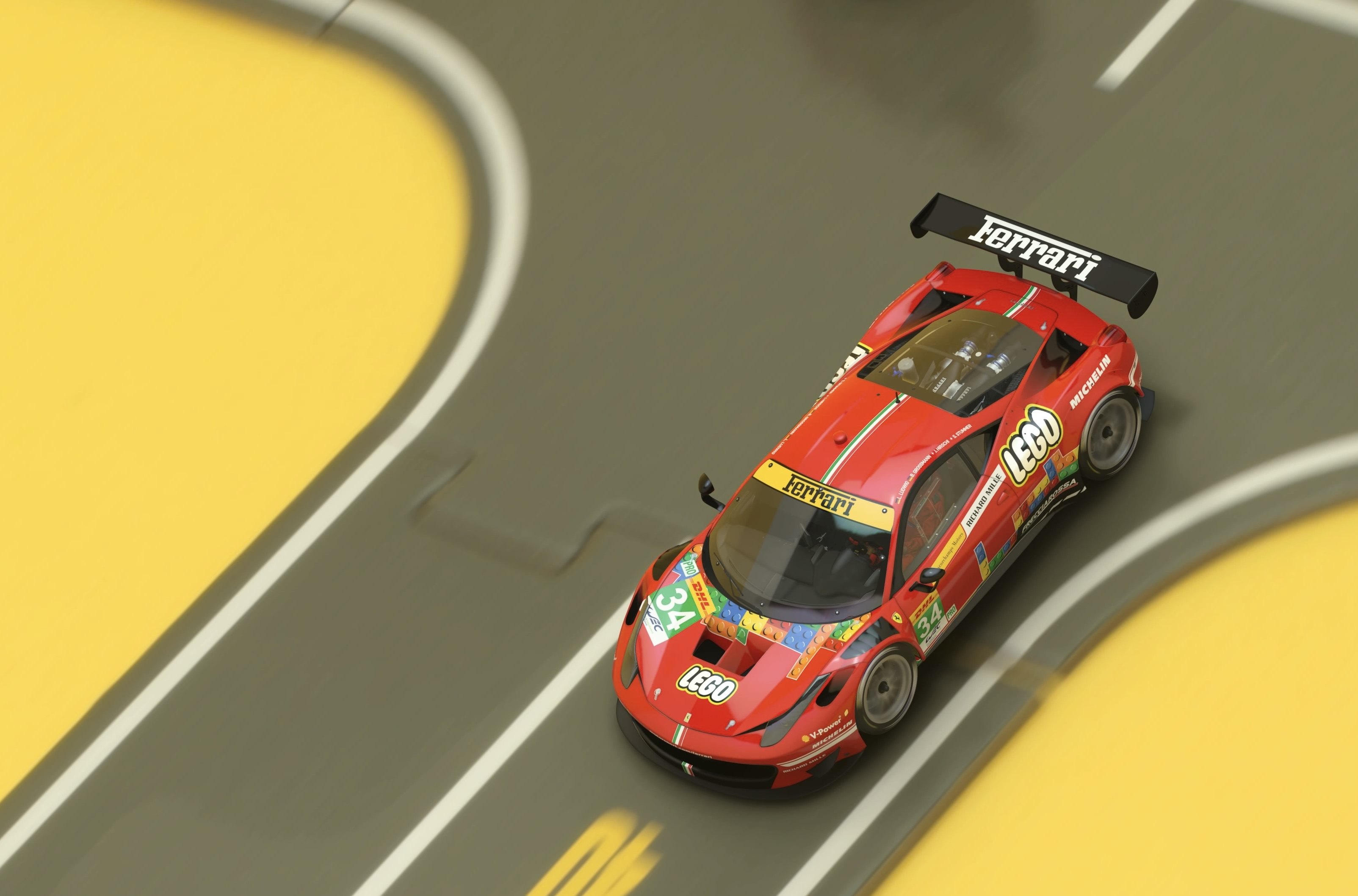
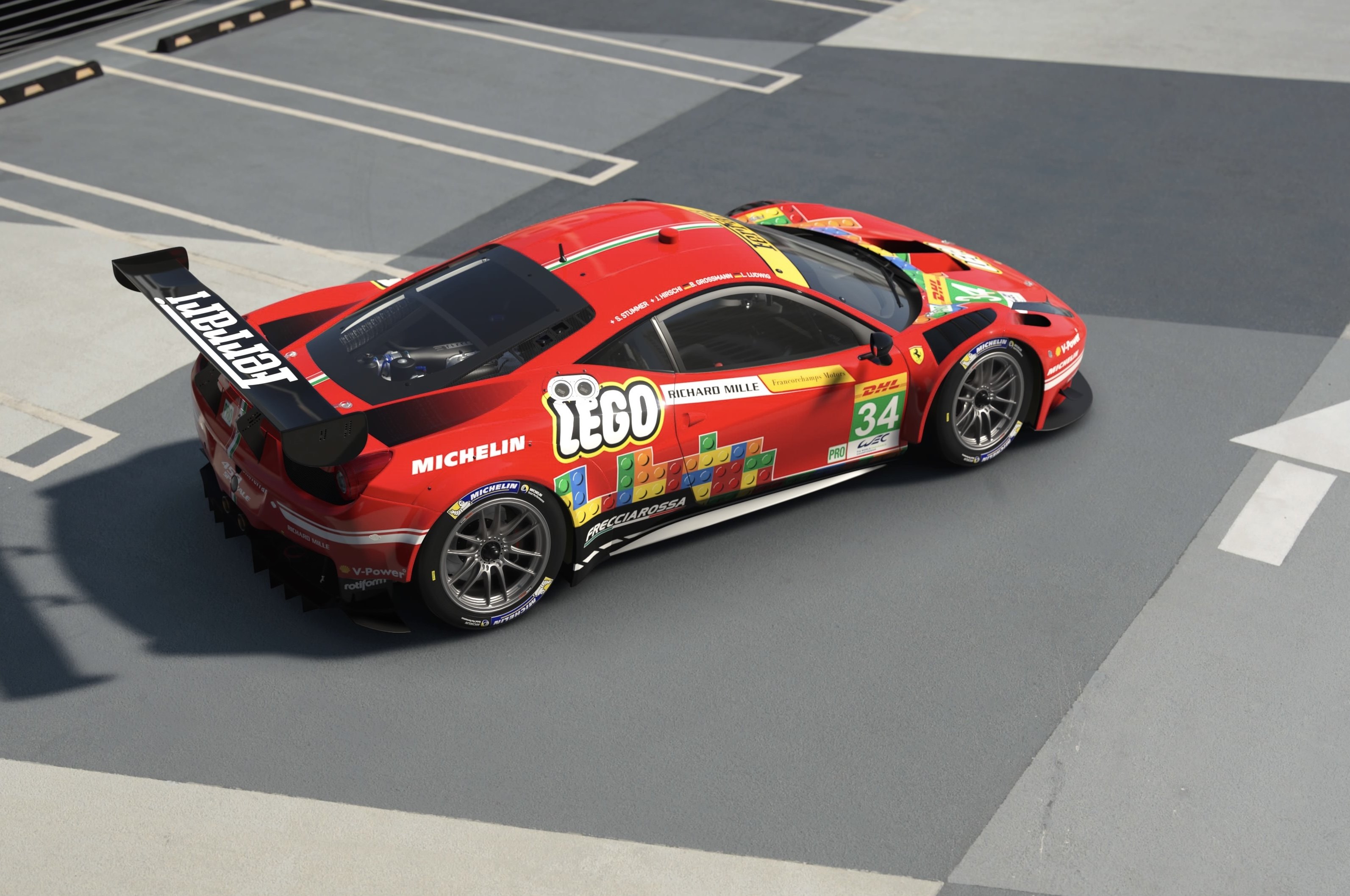
- 6,753

- Fürstentum Lippe
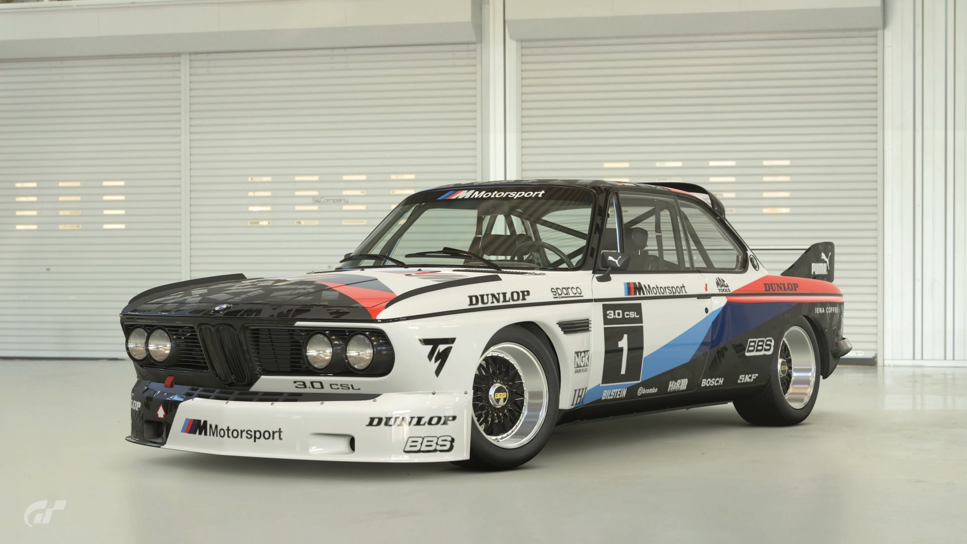
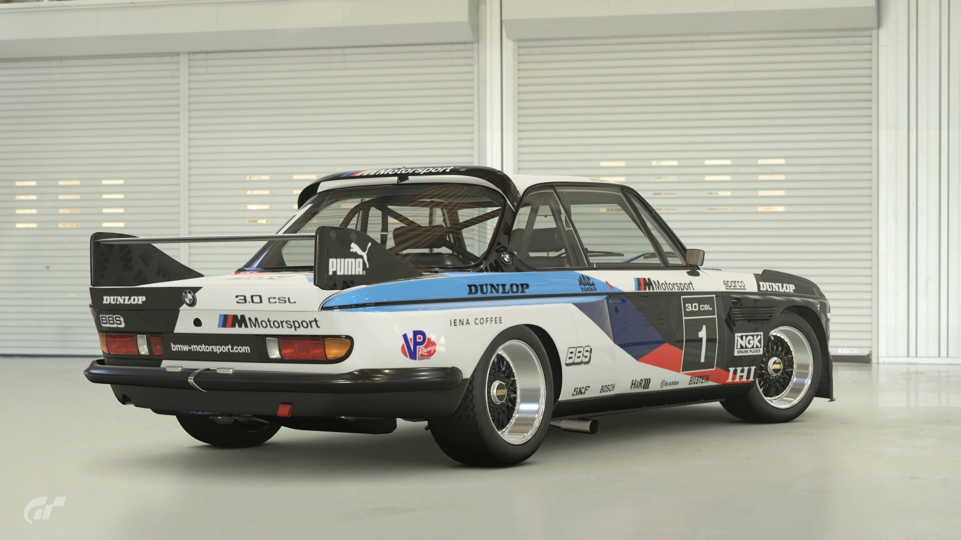
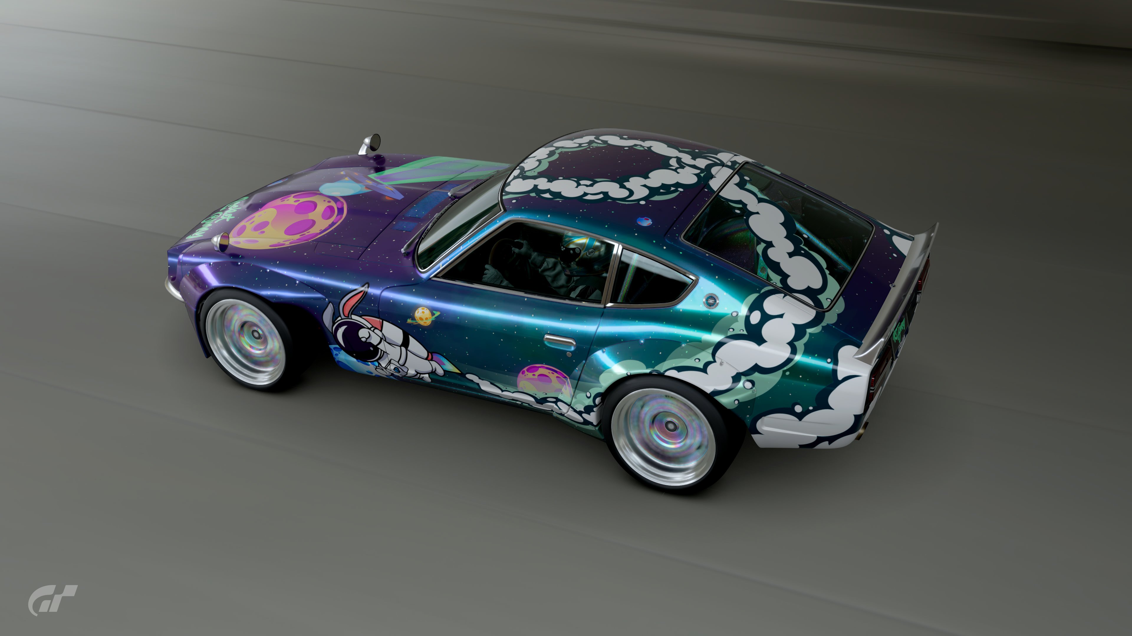
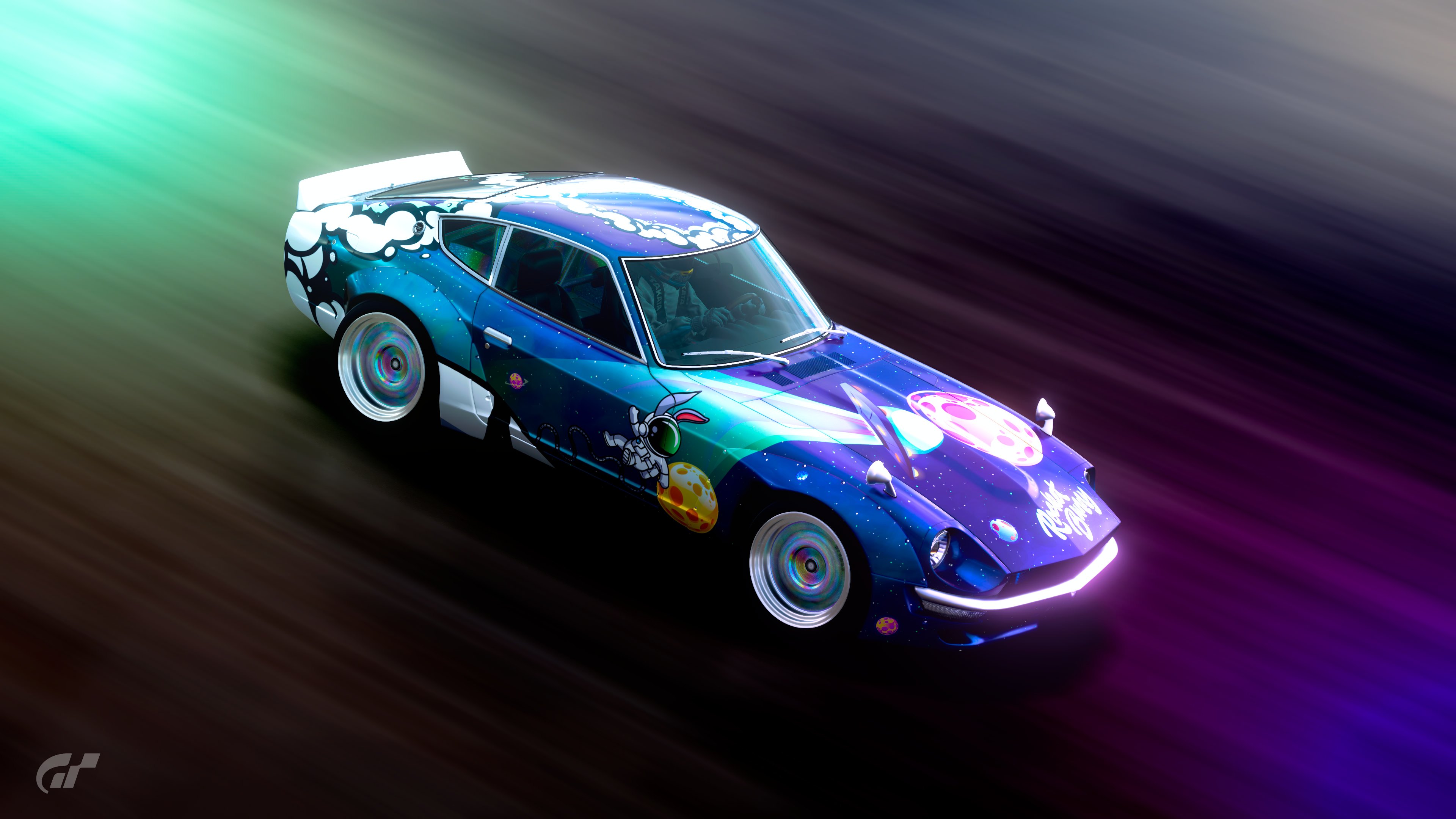
- GTP_Nuschel
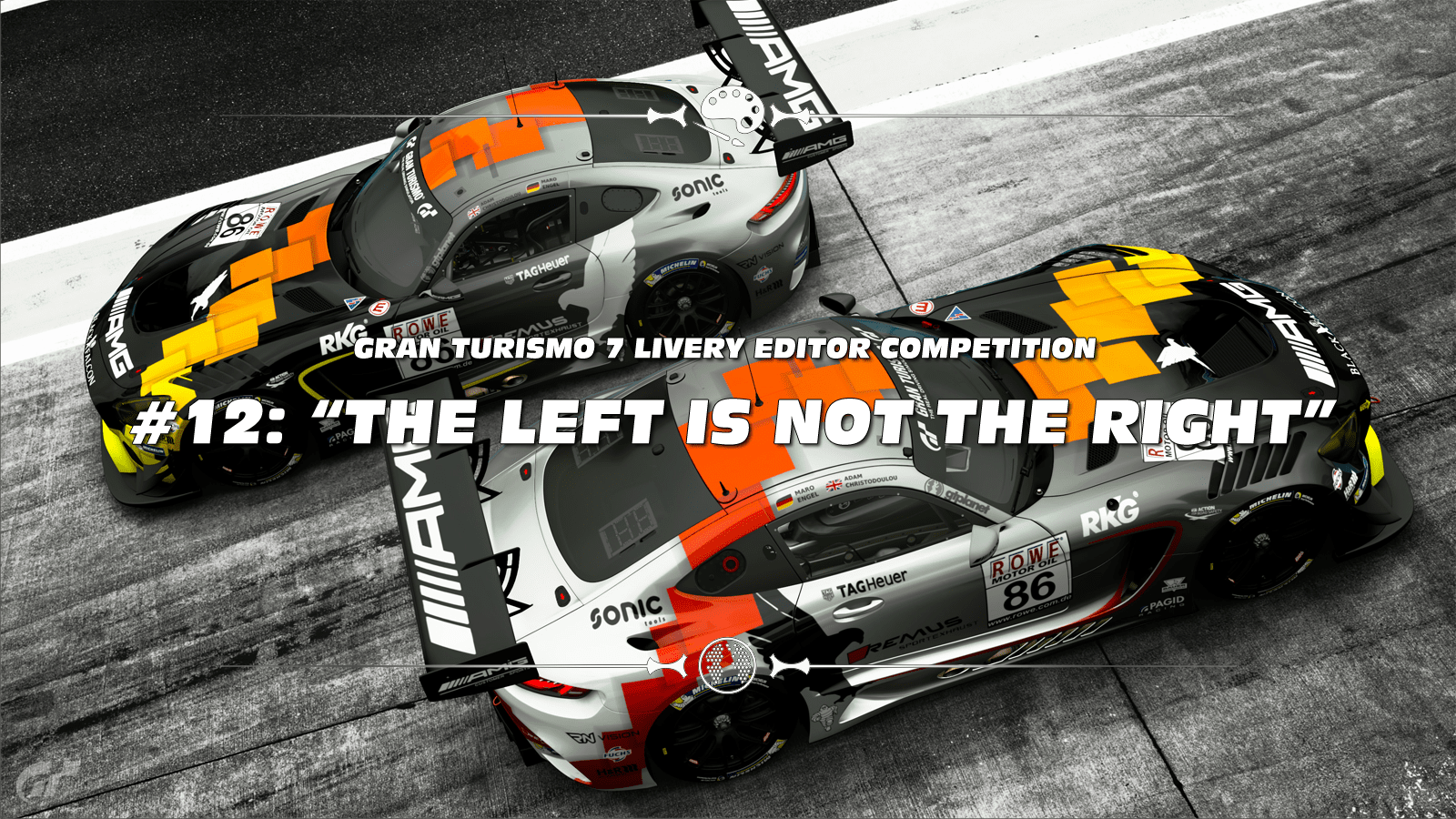
THIS MONTH'S THEME
Forget about that "Dupicate to other side" feature of the livery editor! Last winner @ziggedzag chose this theme which was originally proposed by @Noisy for GTS LEC #19. Let's recap what Noisy said about this theme:
"I want to challenge our designers and take them out of their comfort zone.
Design a livery that is asymmetrical, that is different in design on one side compared to the other.
The design should be noticeably different on the drivers' and passengers' side of the car with a transition on the top of the car. Asymmetric designs are quite uncommon in racing and it would be great to see what people can come up with. Good luck!"
CARS:
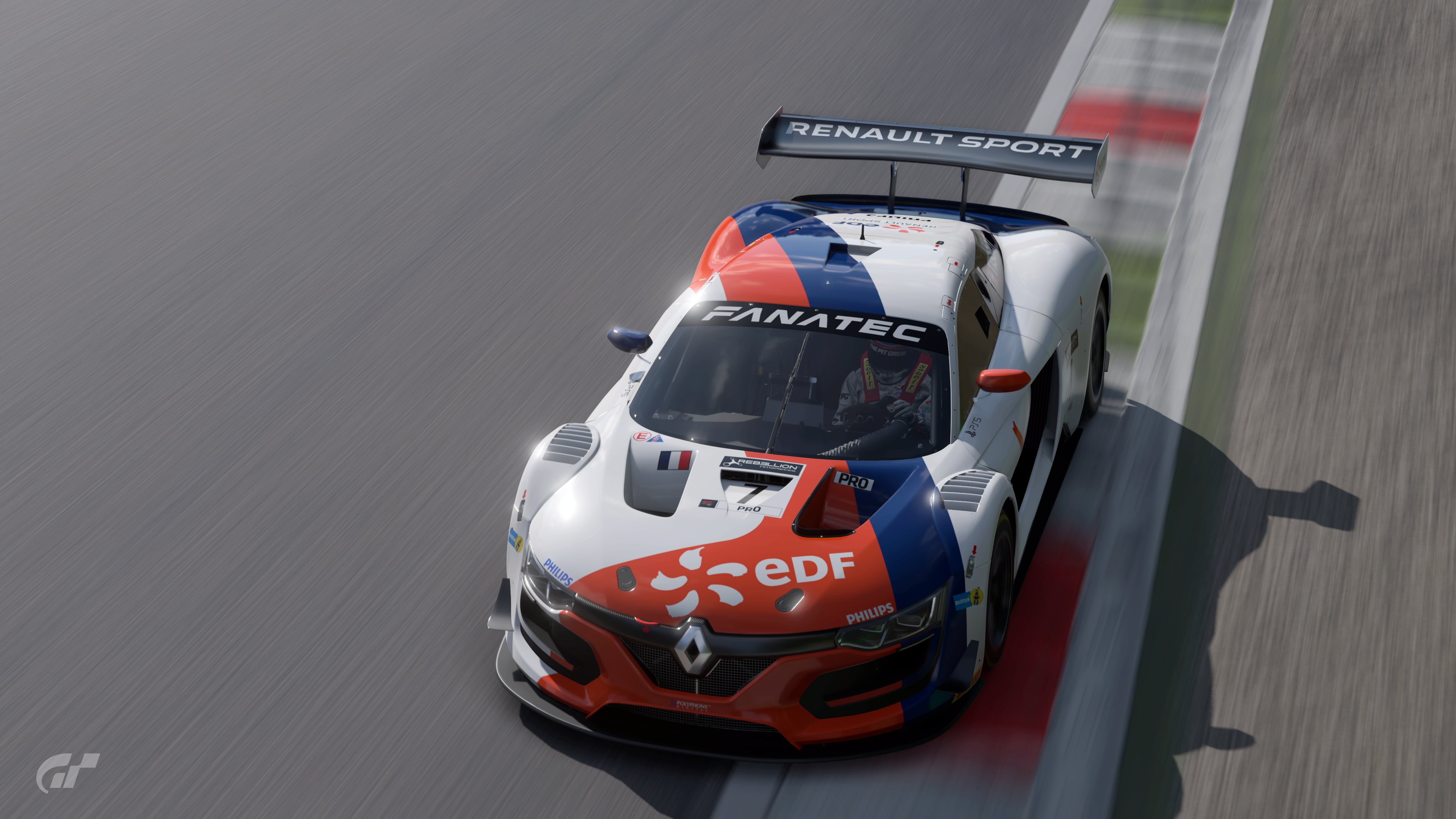
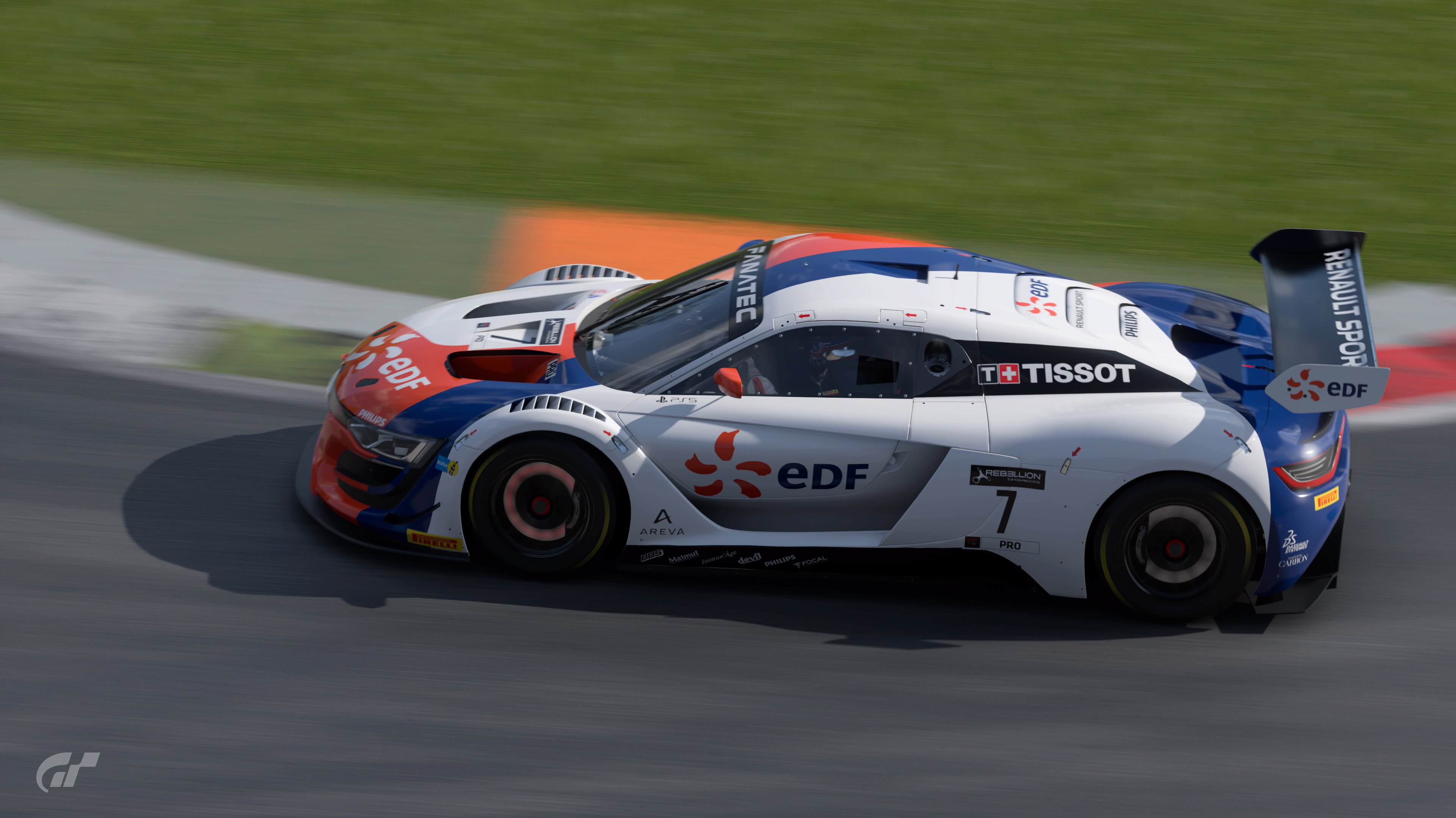
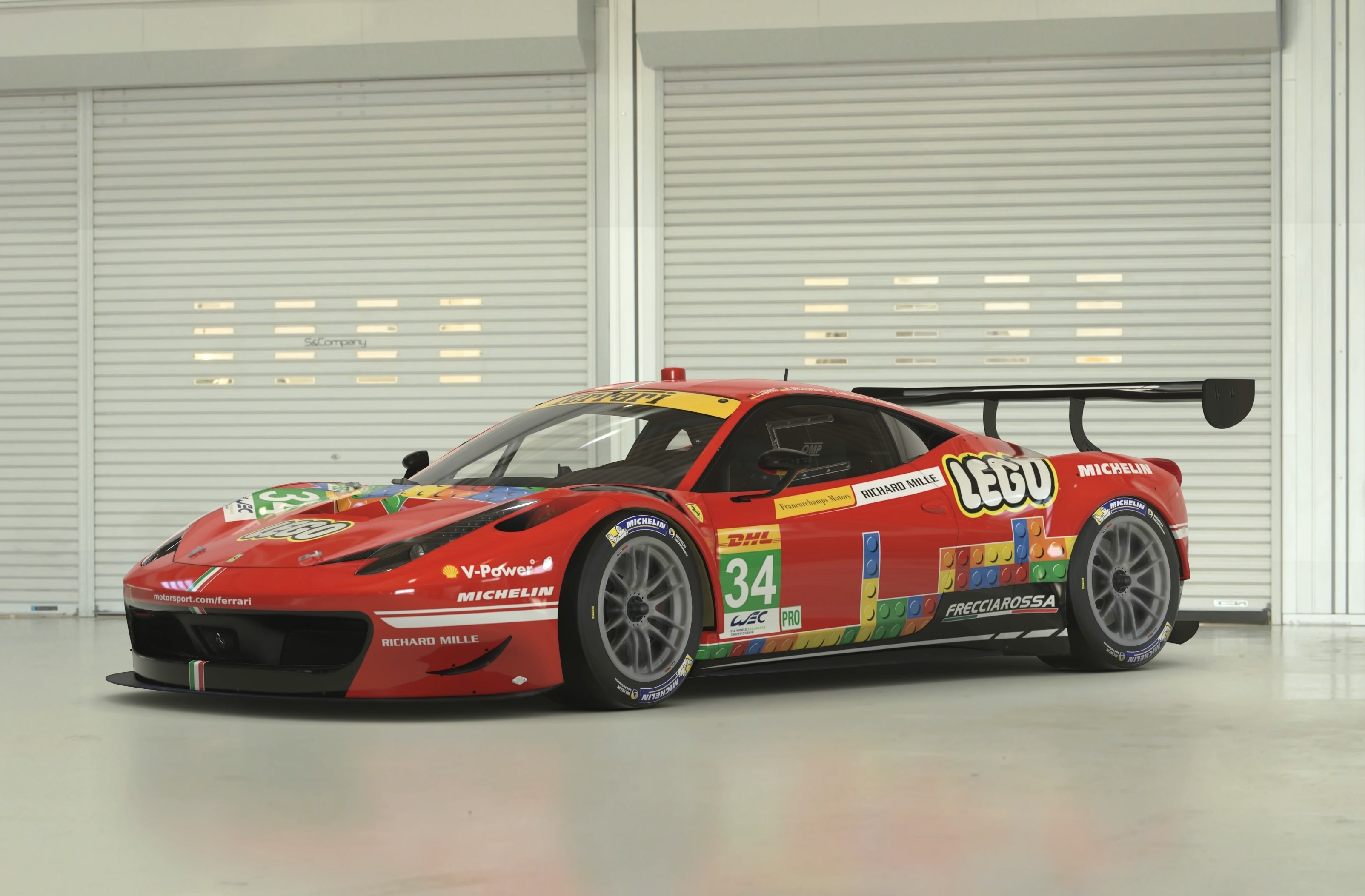
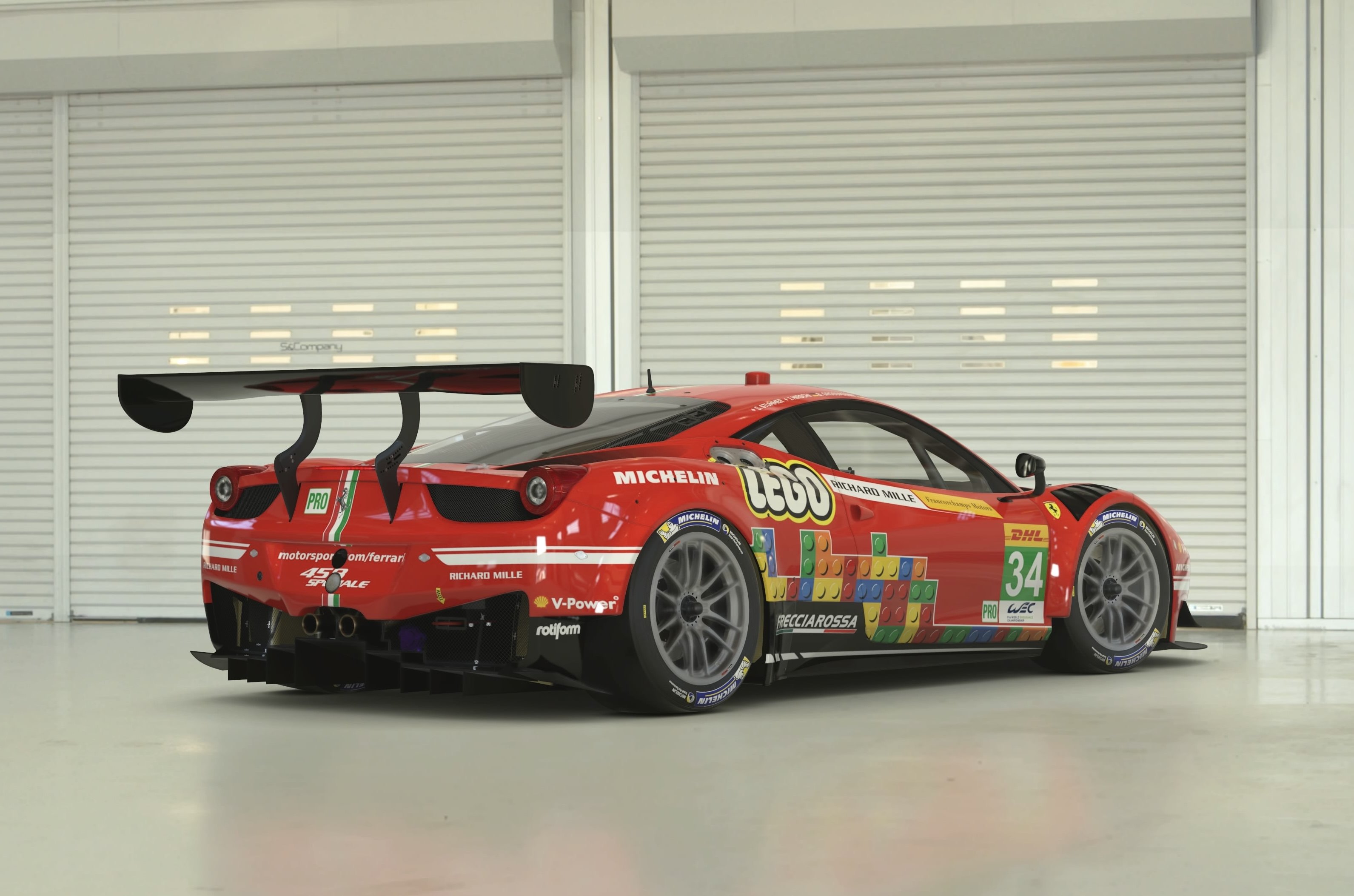
- Any
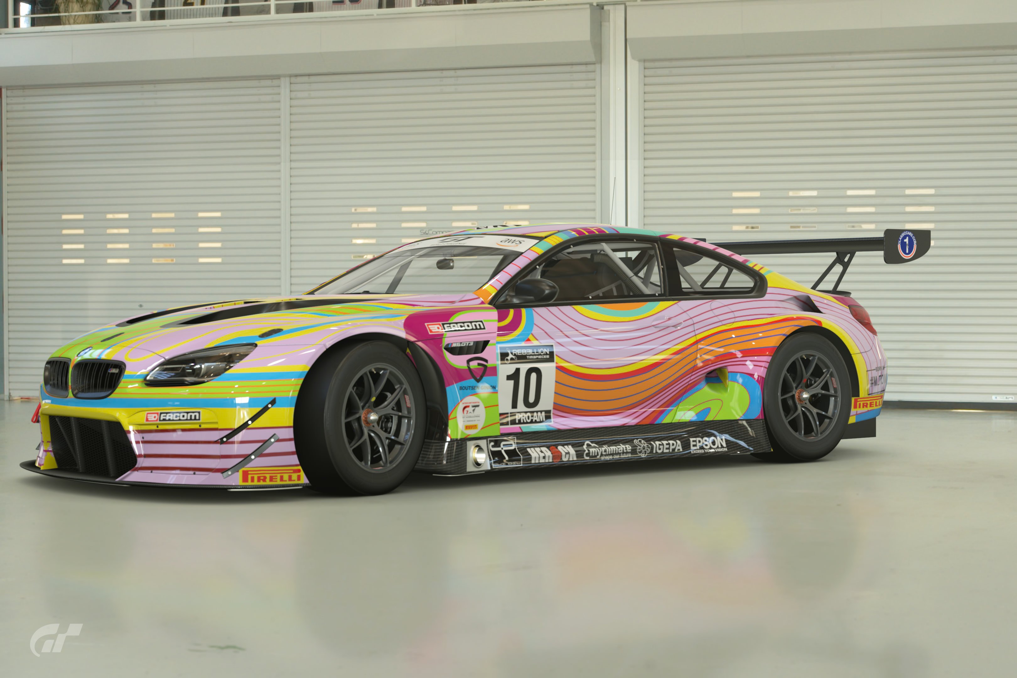
LIVERIES:
- Original or replica desgins
UNIQUE RESTRICTIONS:
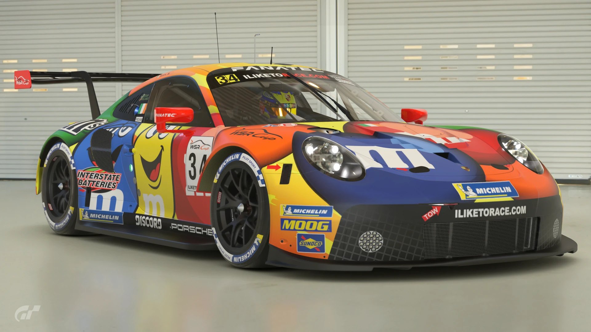
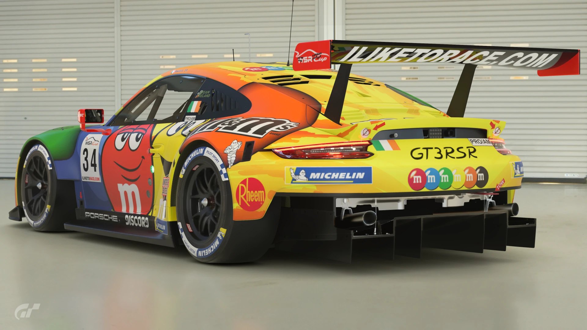
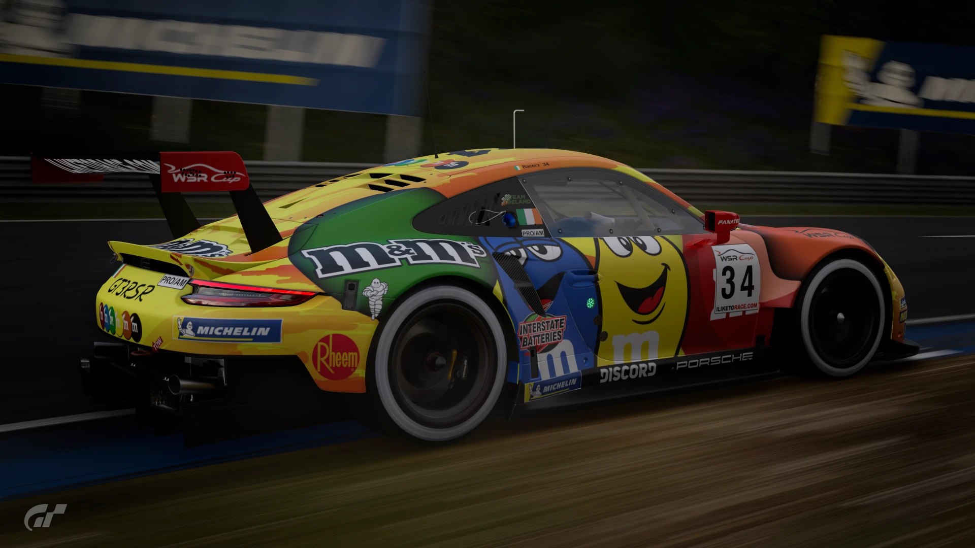
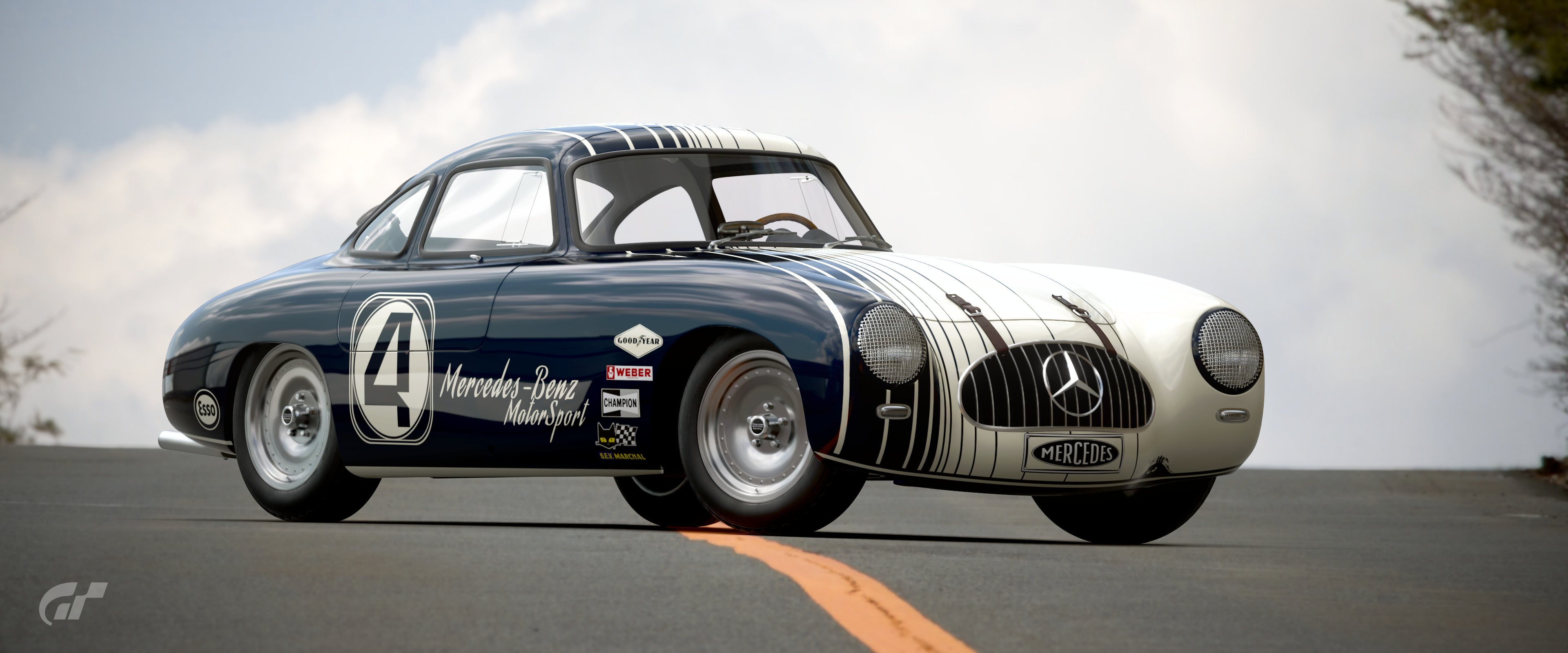
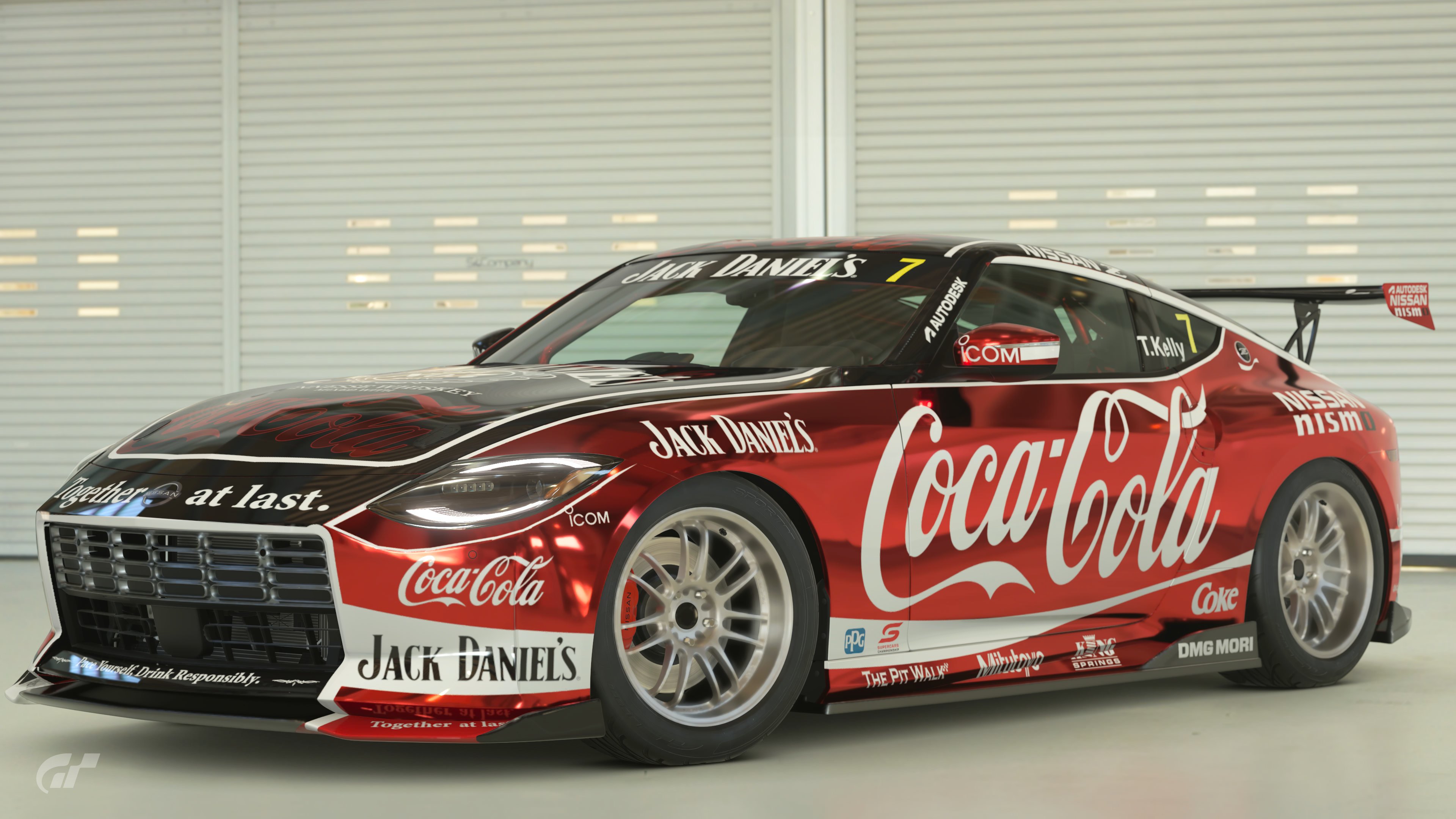
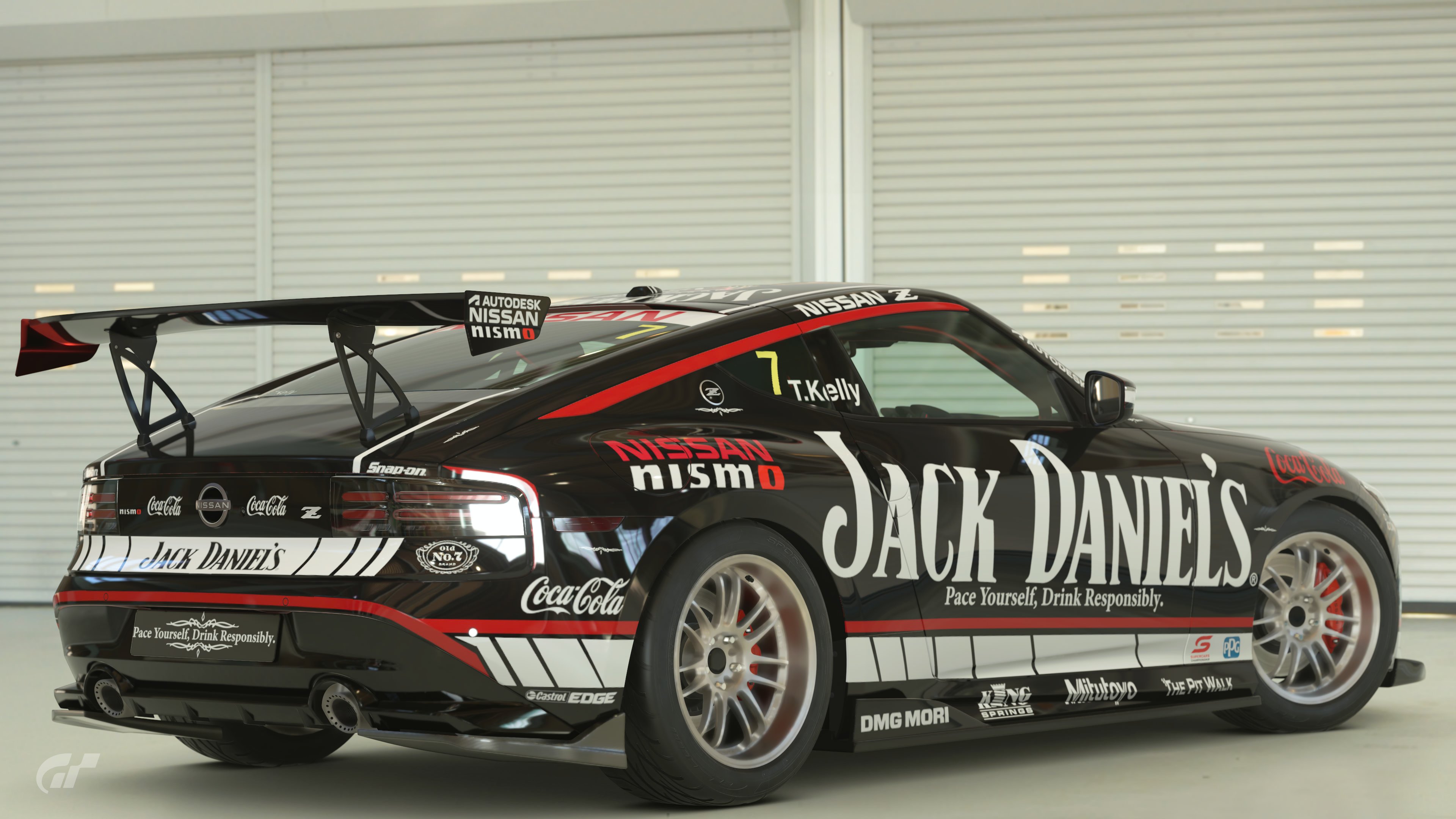
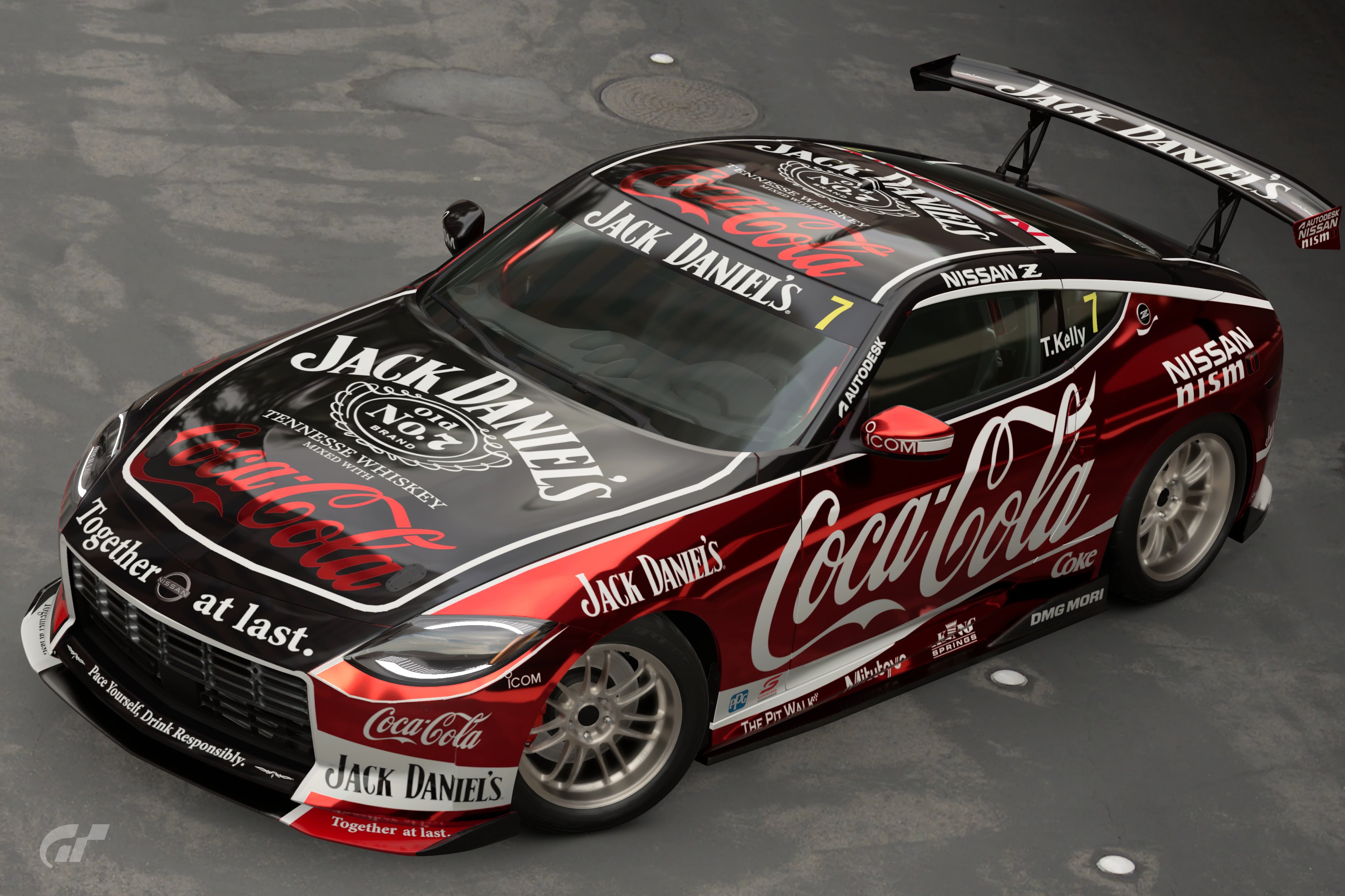
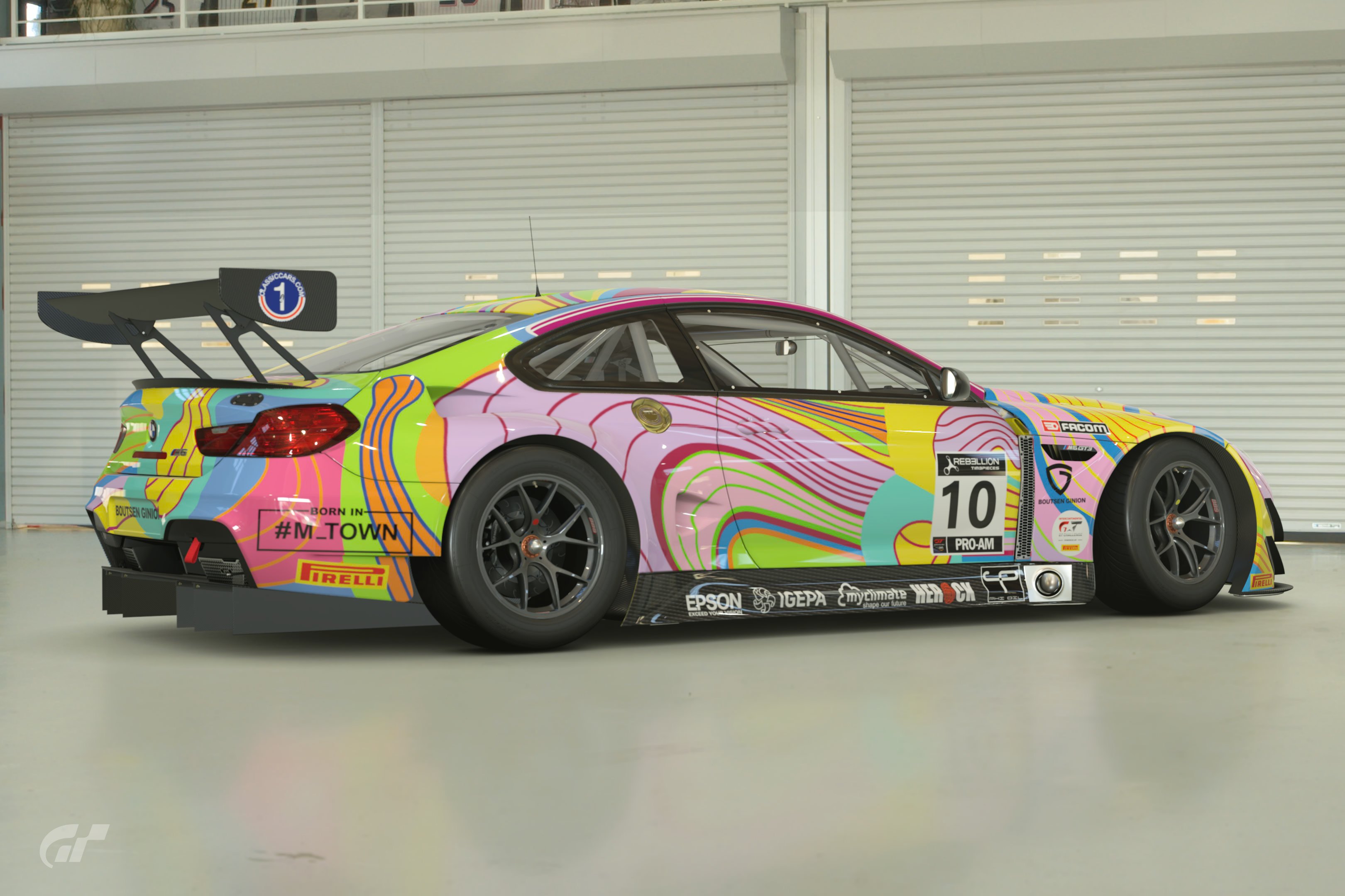
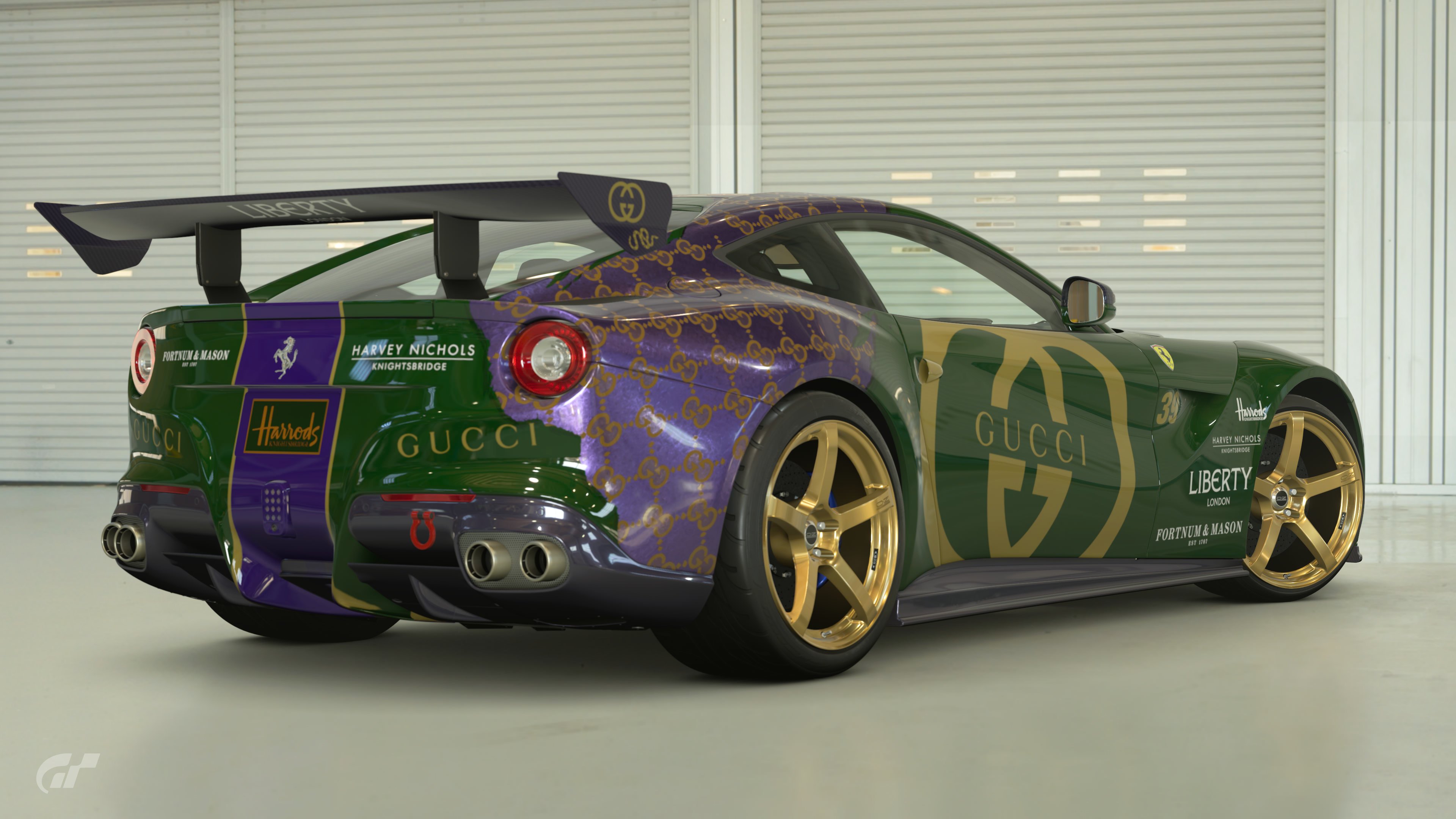
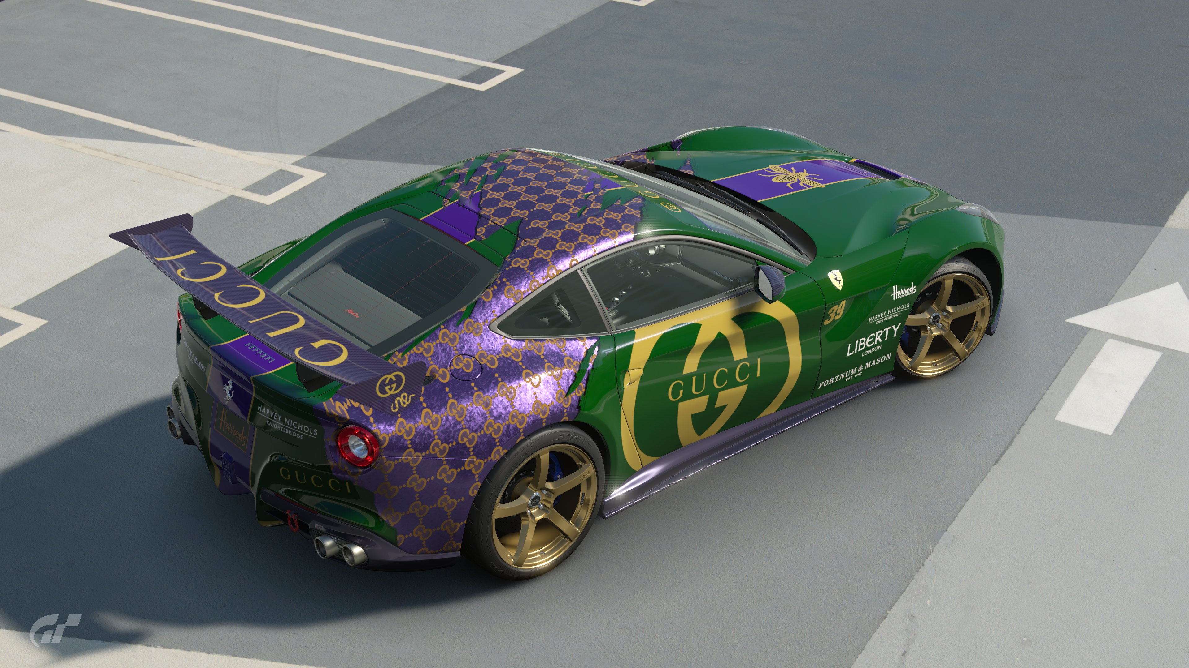
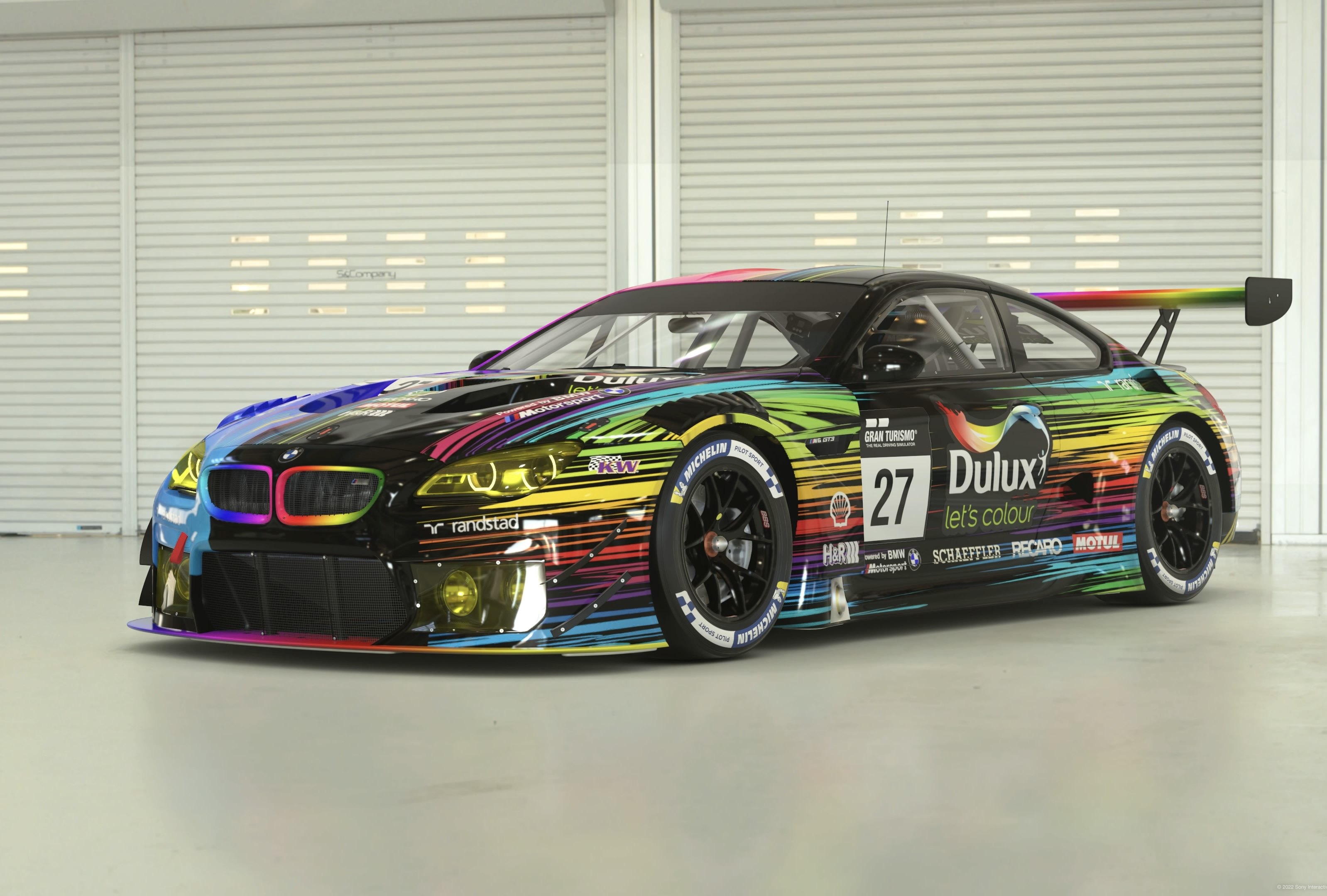
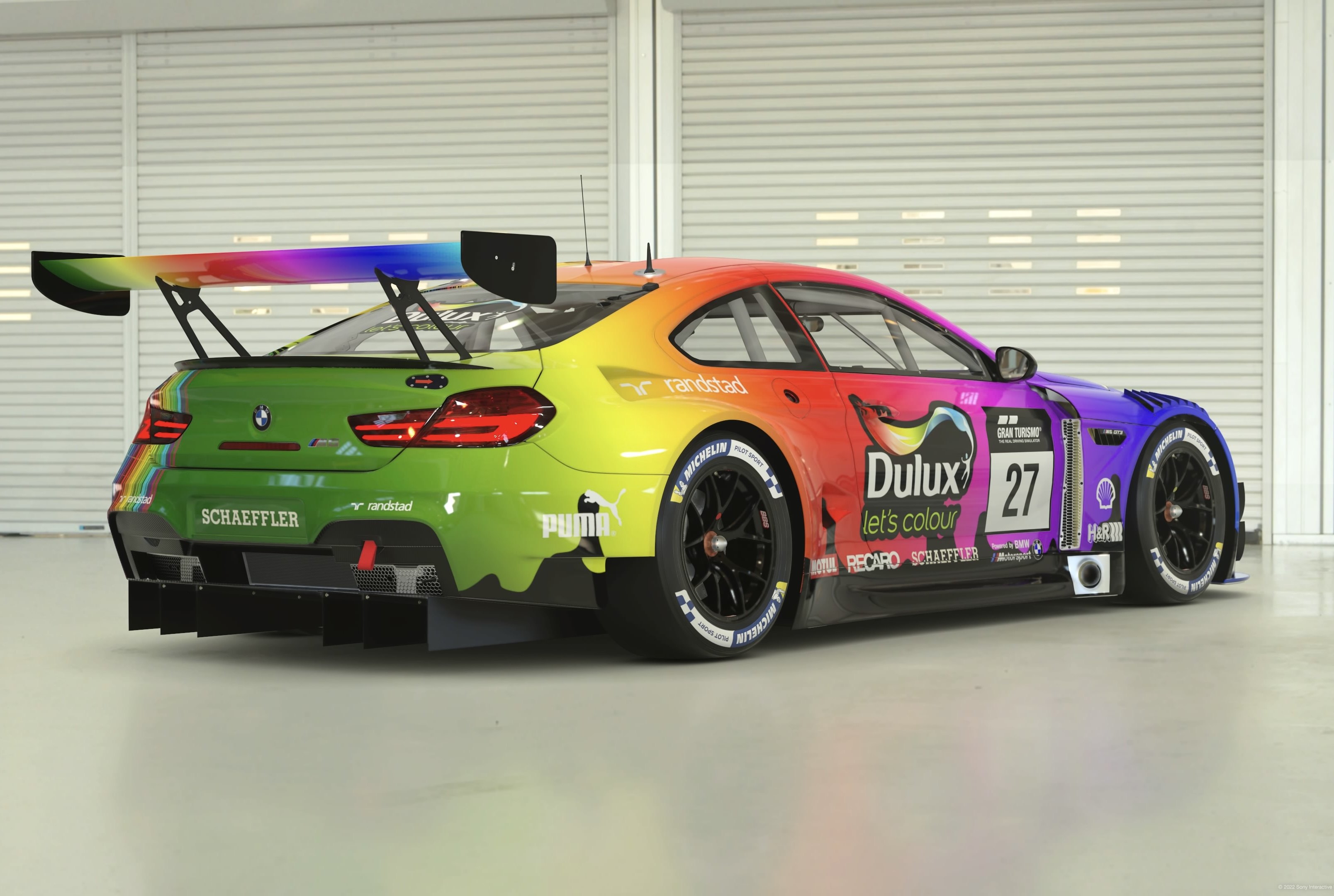
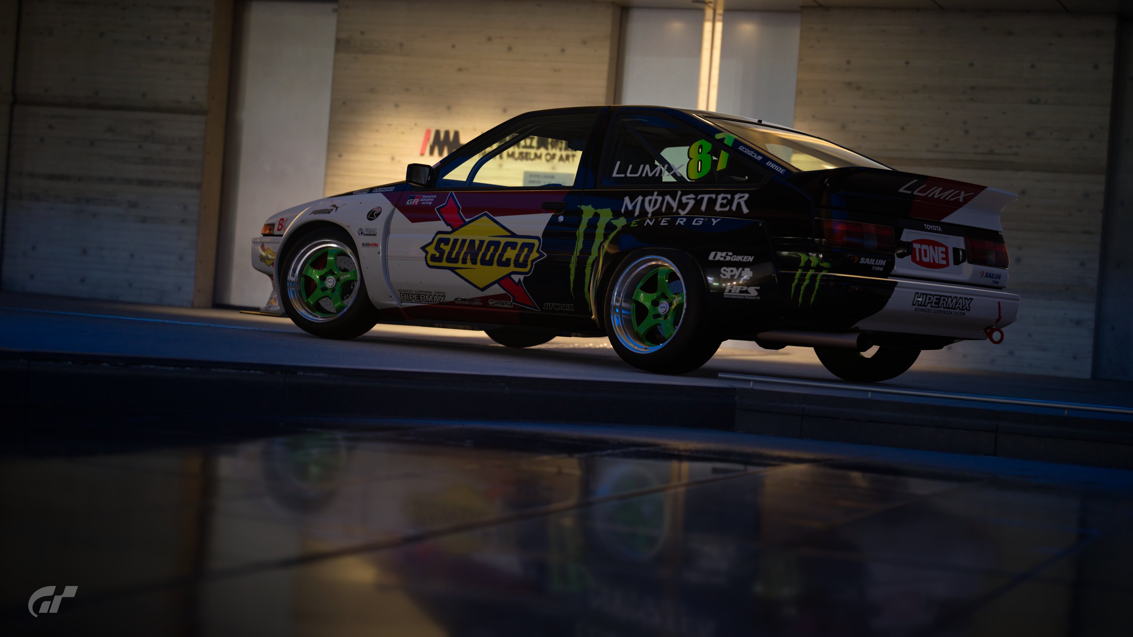
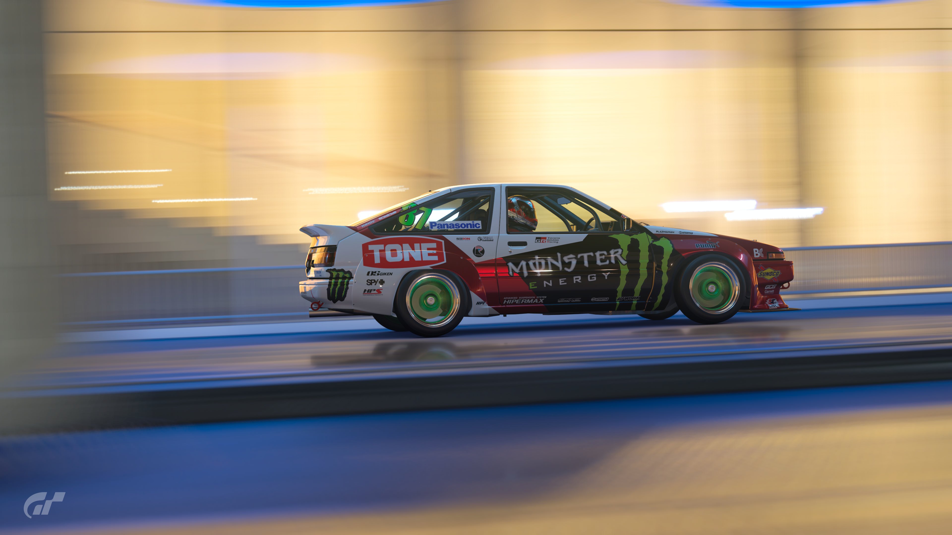
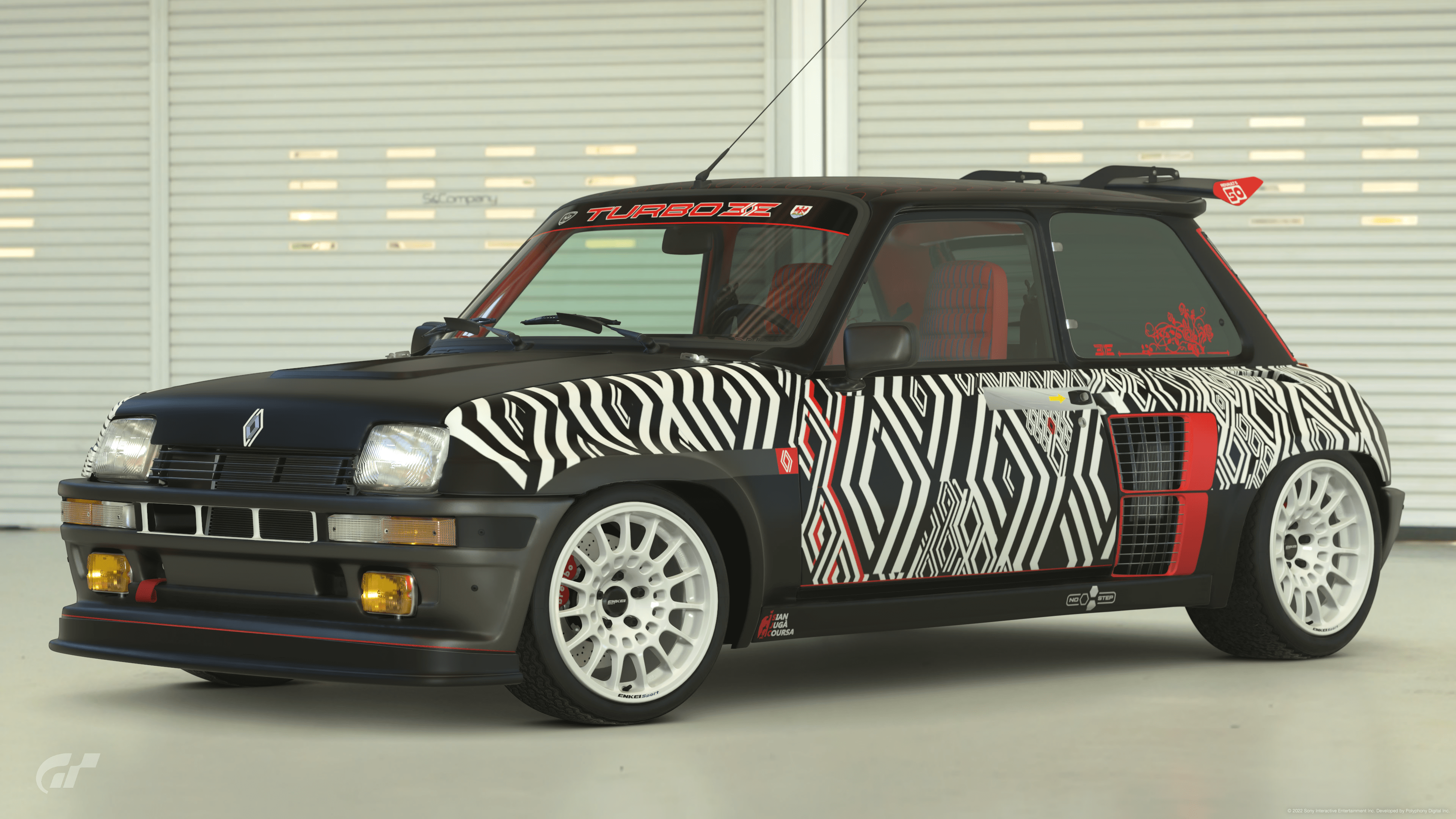
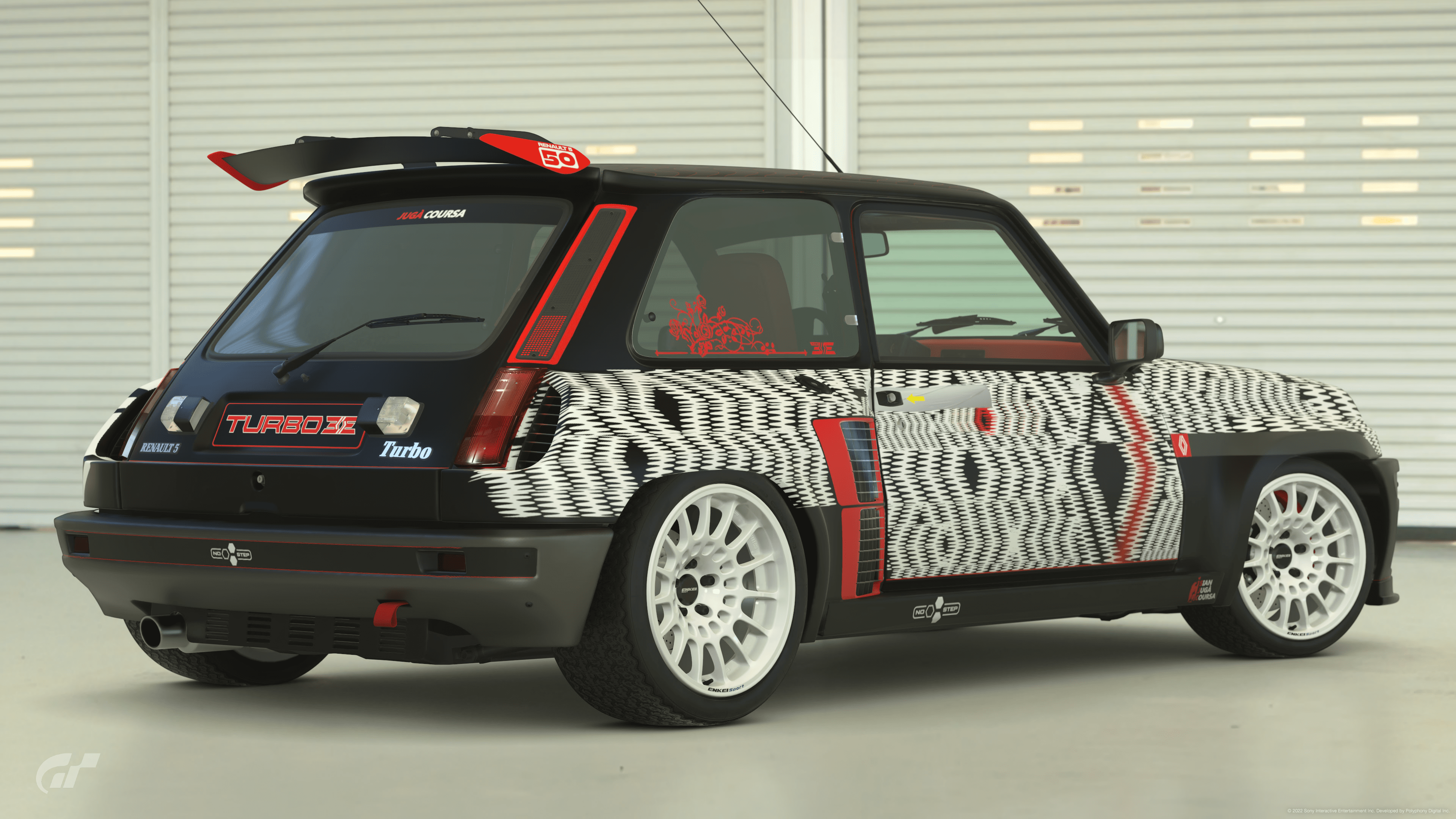
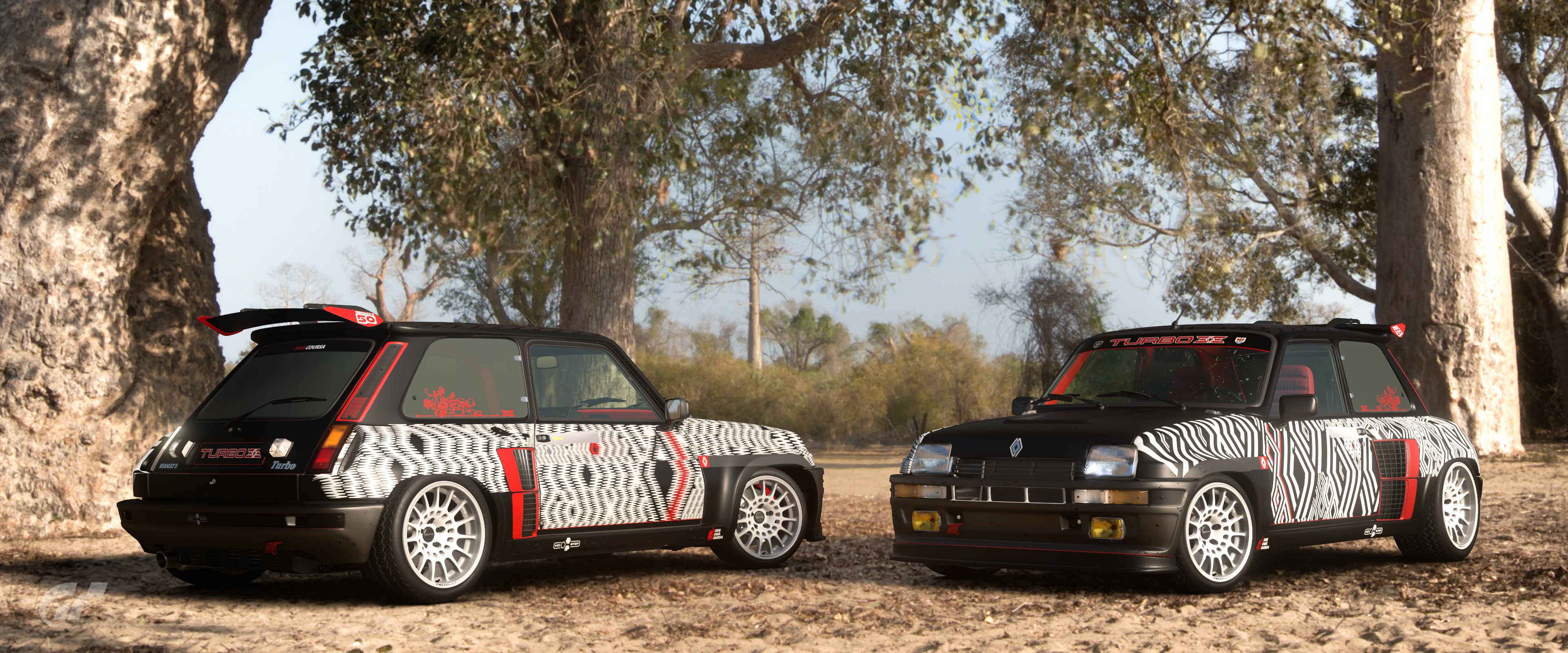
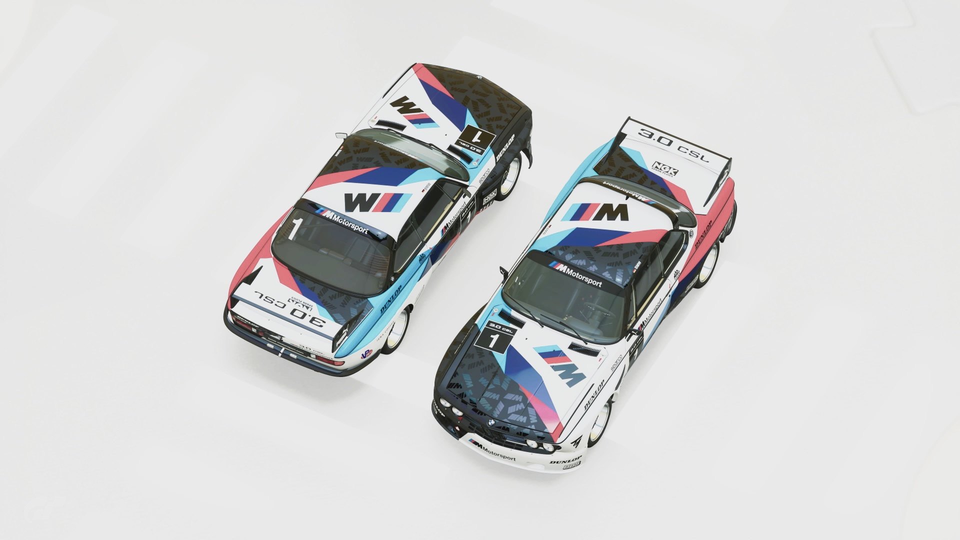
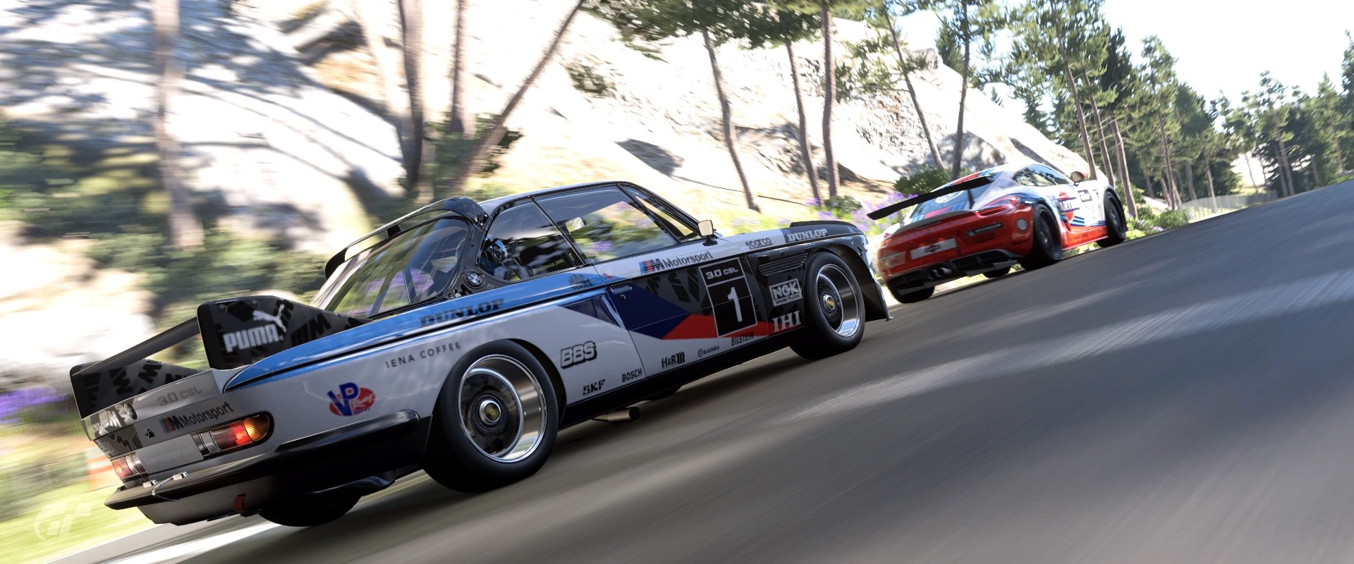
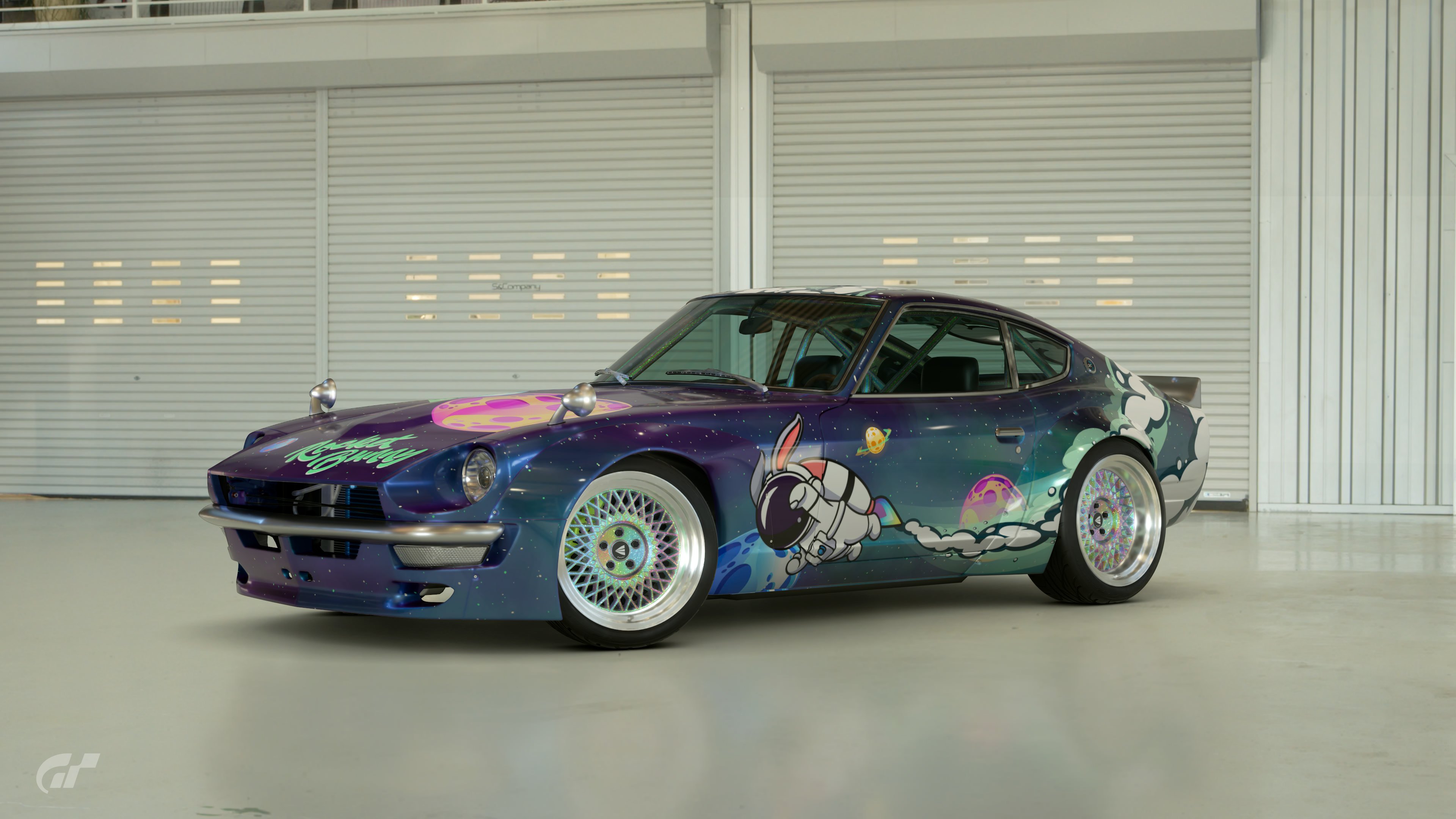
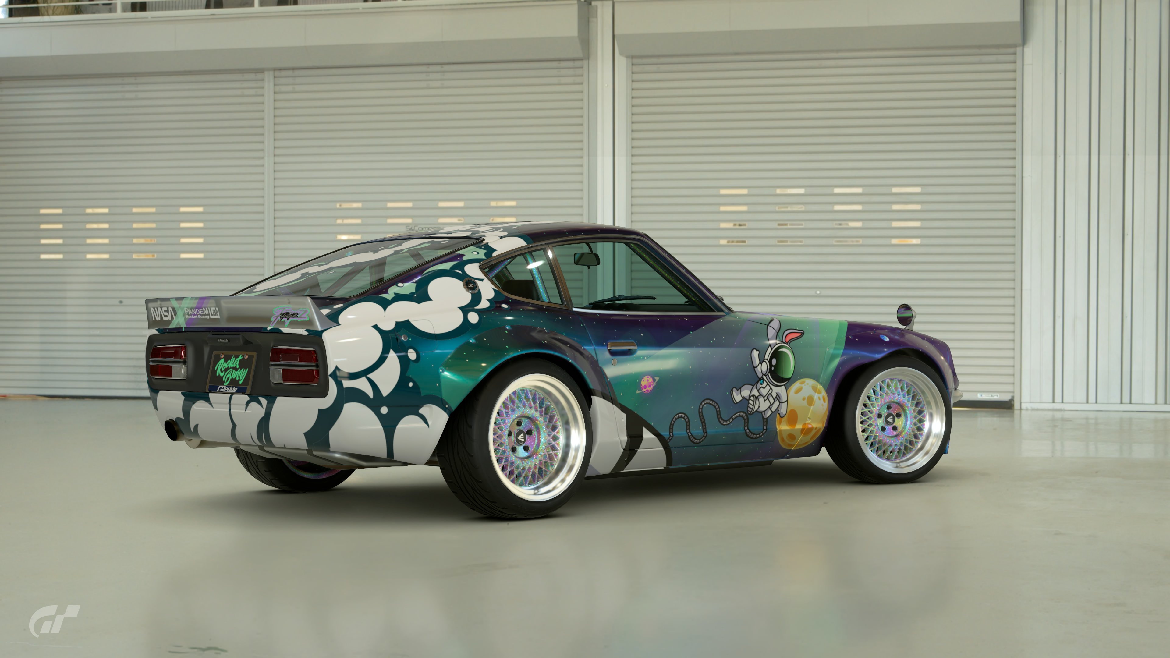
- Livery must be noticeably different in design on drivers and passenger side of the car.
- No simple colour swaps between sides (so no red text on white background in one side and white text on red background on the other).
- No split designs i.e. 1999 BAR F1 influenced designs.
- Sponsor logos and number plates can be symmetric.
POLL - THE RULES
The poll will end on November 21st, 2022 at 23:59 UTC.
This means you have one week to decide which entries to vote for. After the winner is decided, they will decide the next Livery Editor Competition’s theme from a random selection three themes that were suggested via the Theme Suggestion form.
Please note:
- You can vote for THREE - 3 - entries.
- You can NOT vote for your own work.
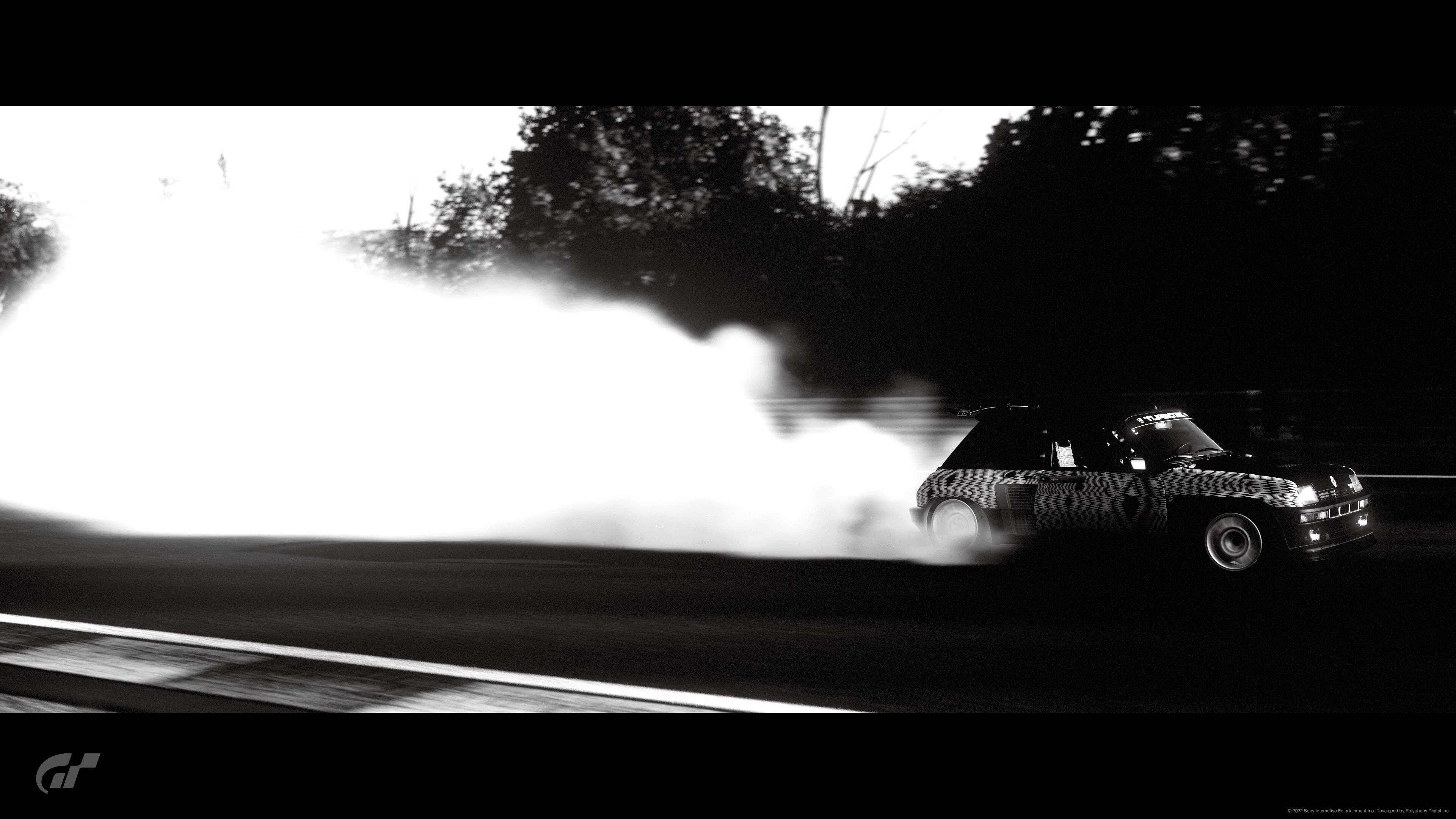
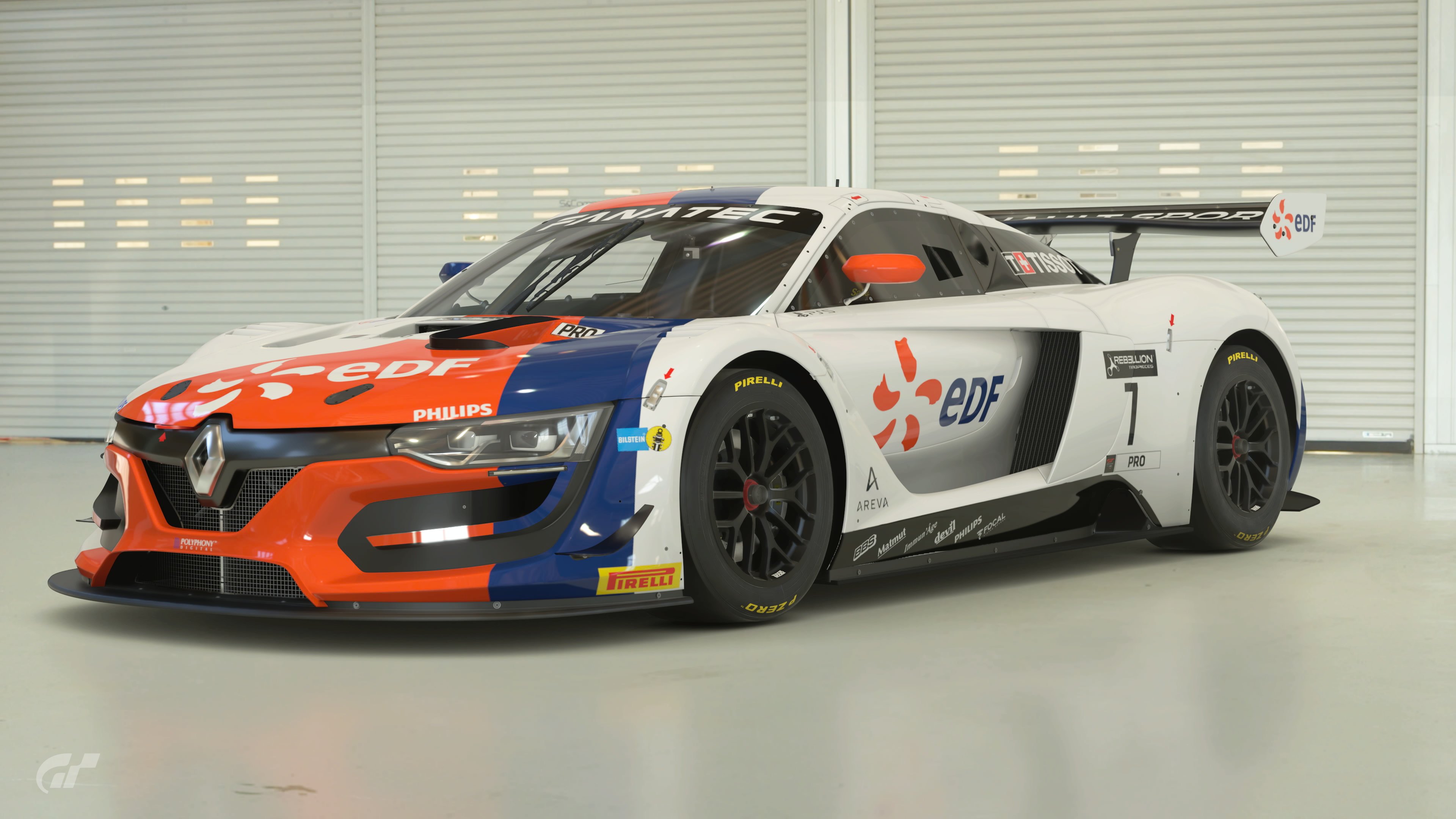
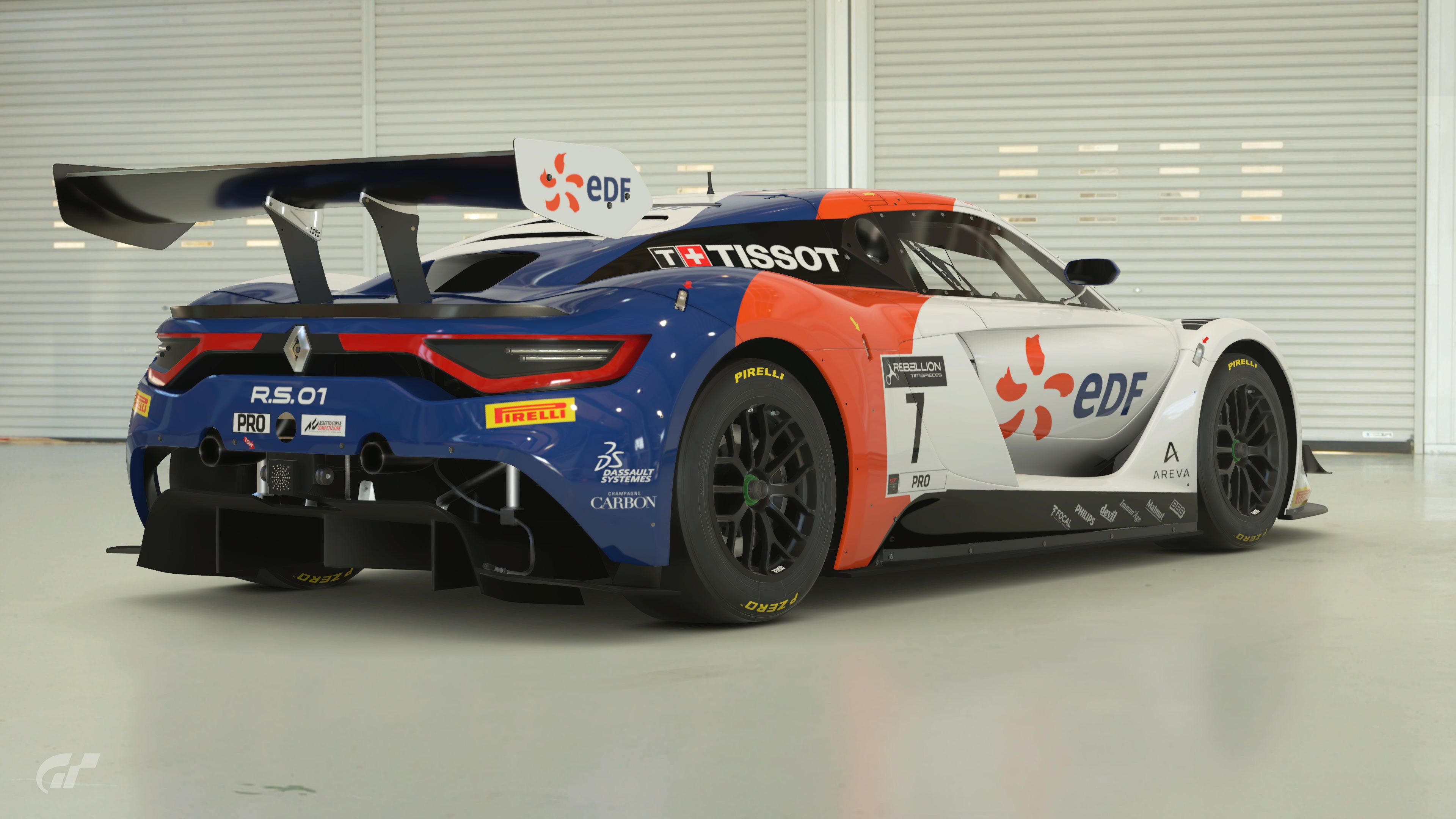
- Most, if not all entries have spoilers, they definitely show the liveries in the way the creator intended, be sure to view those as well.
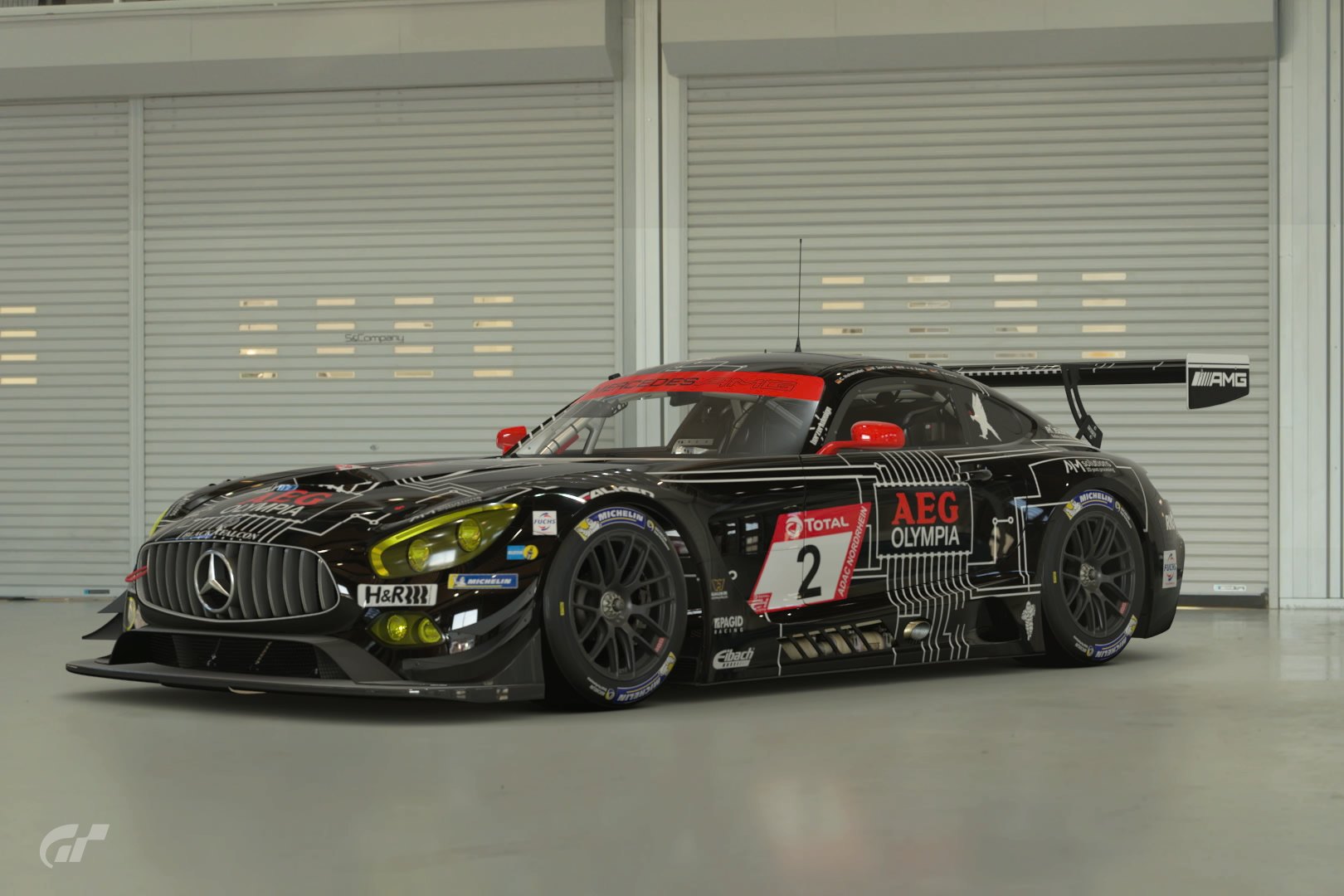
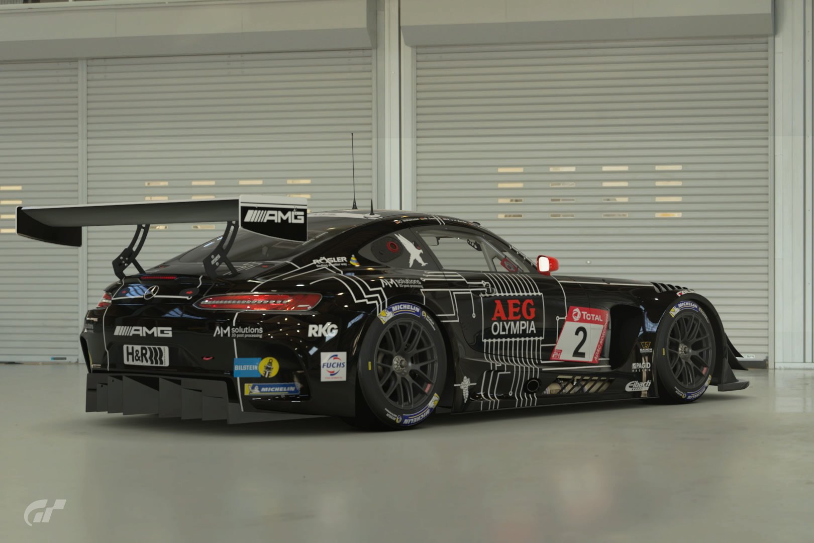
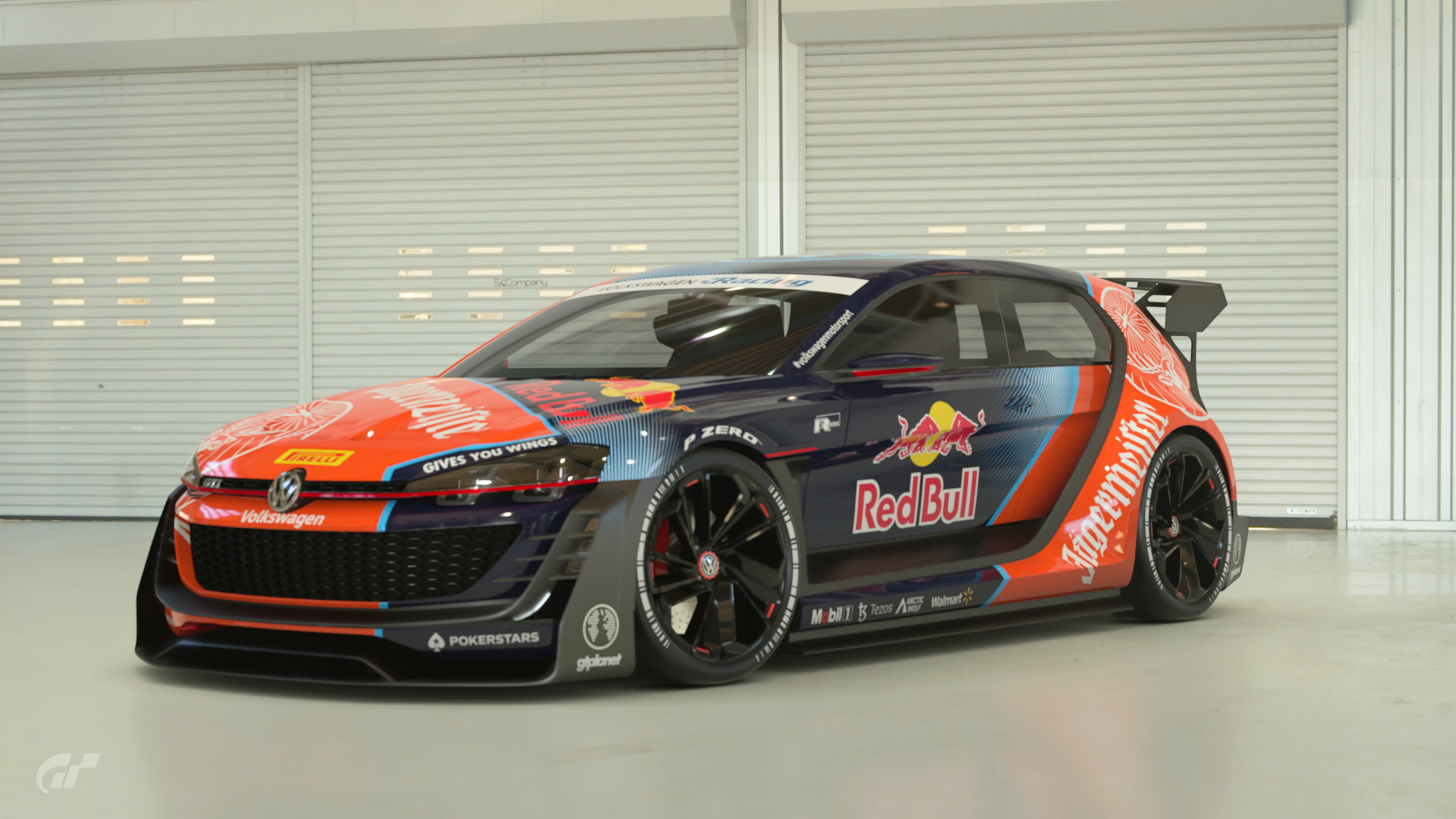
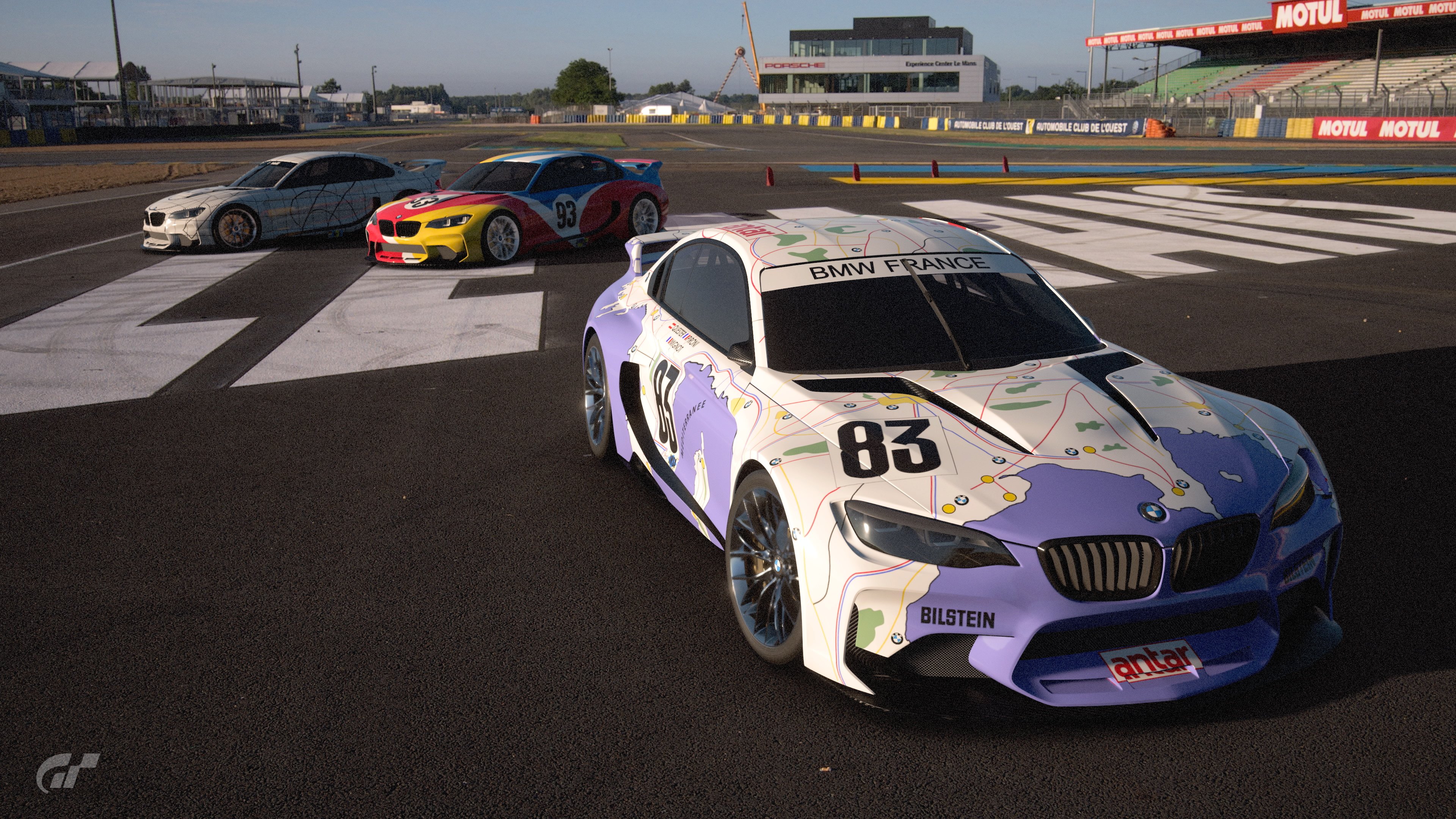
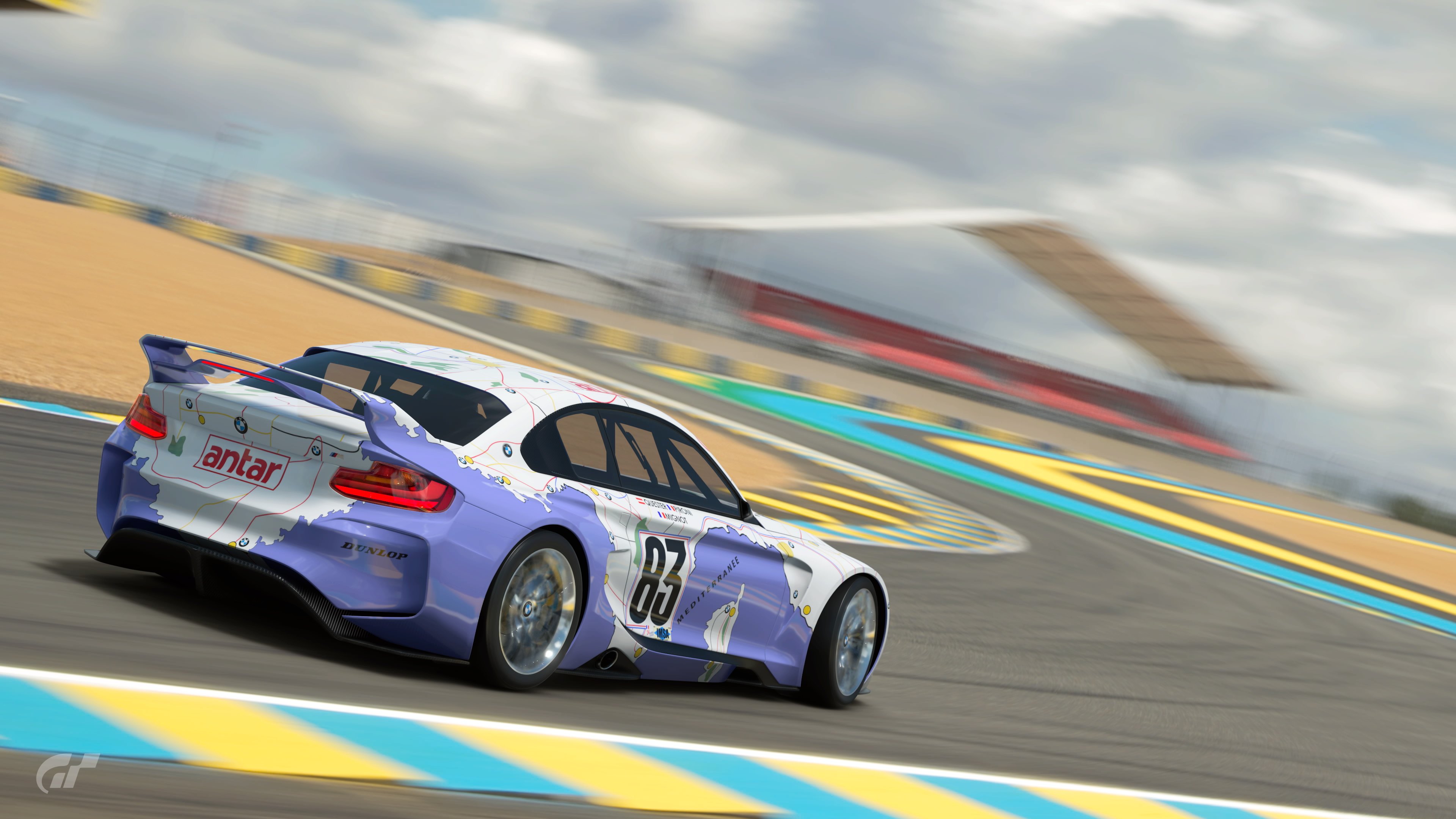
Without further ado, here are the entries:
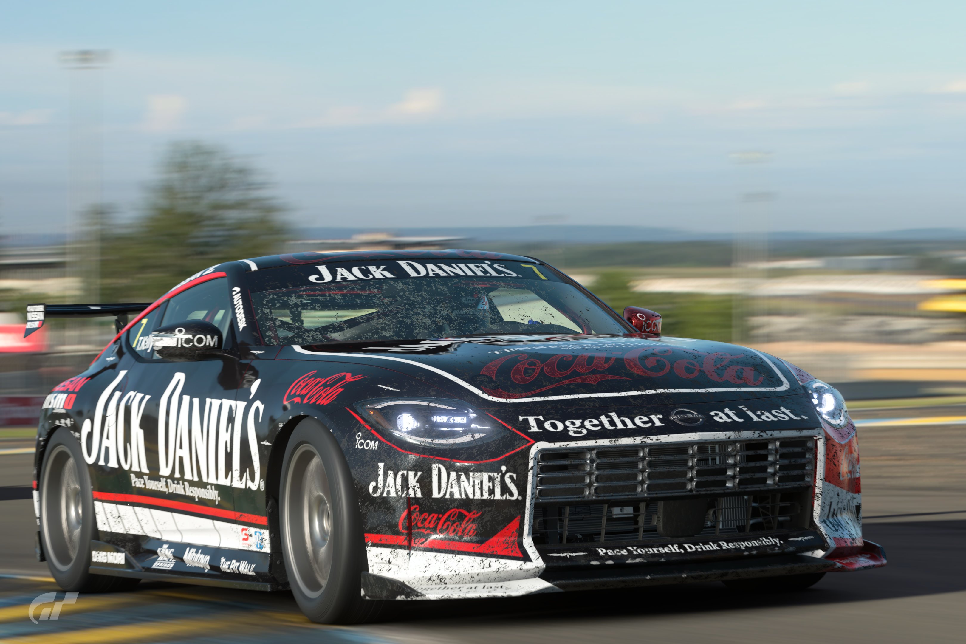
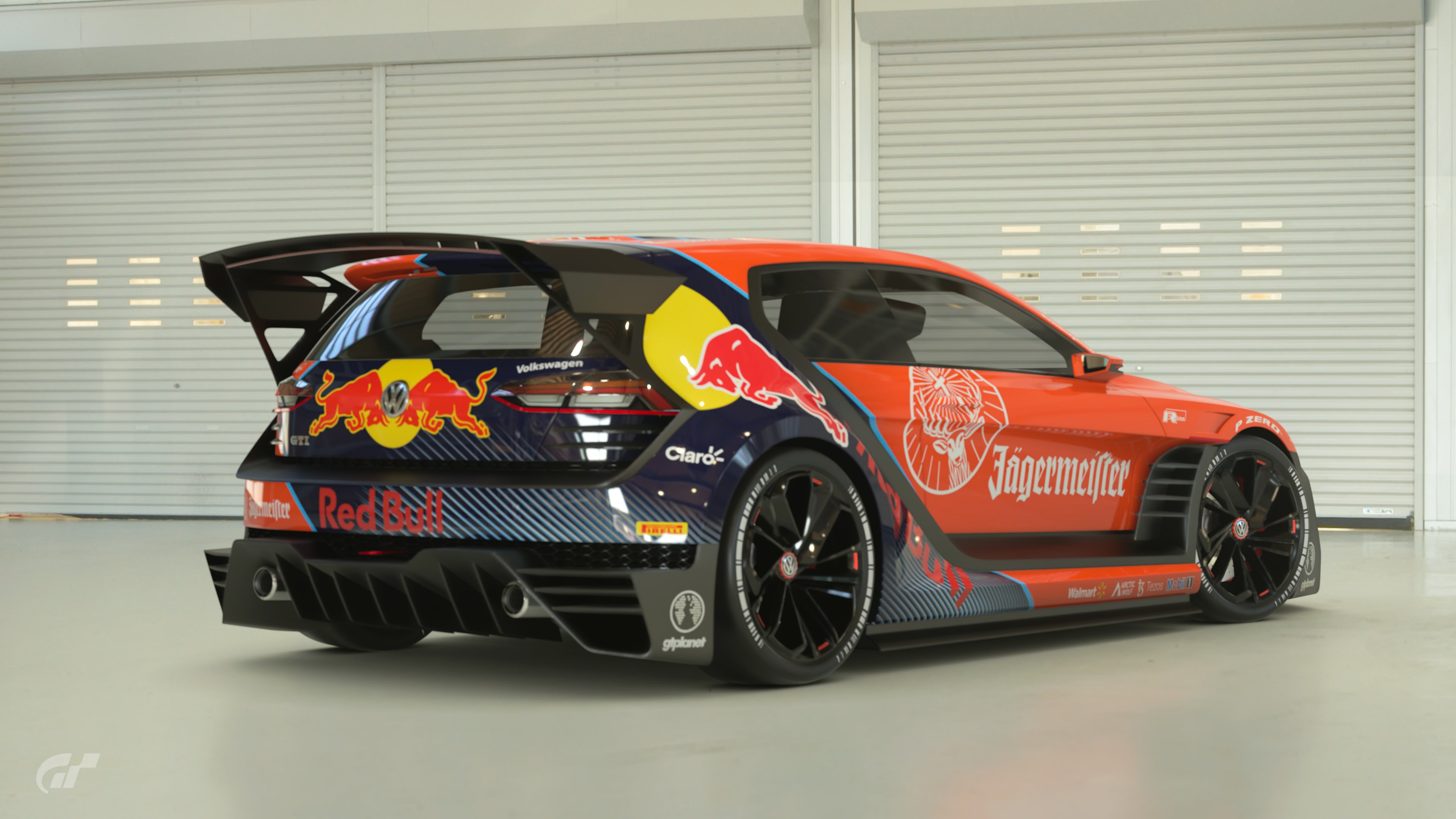
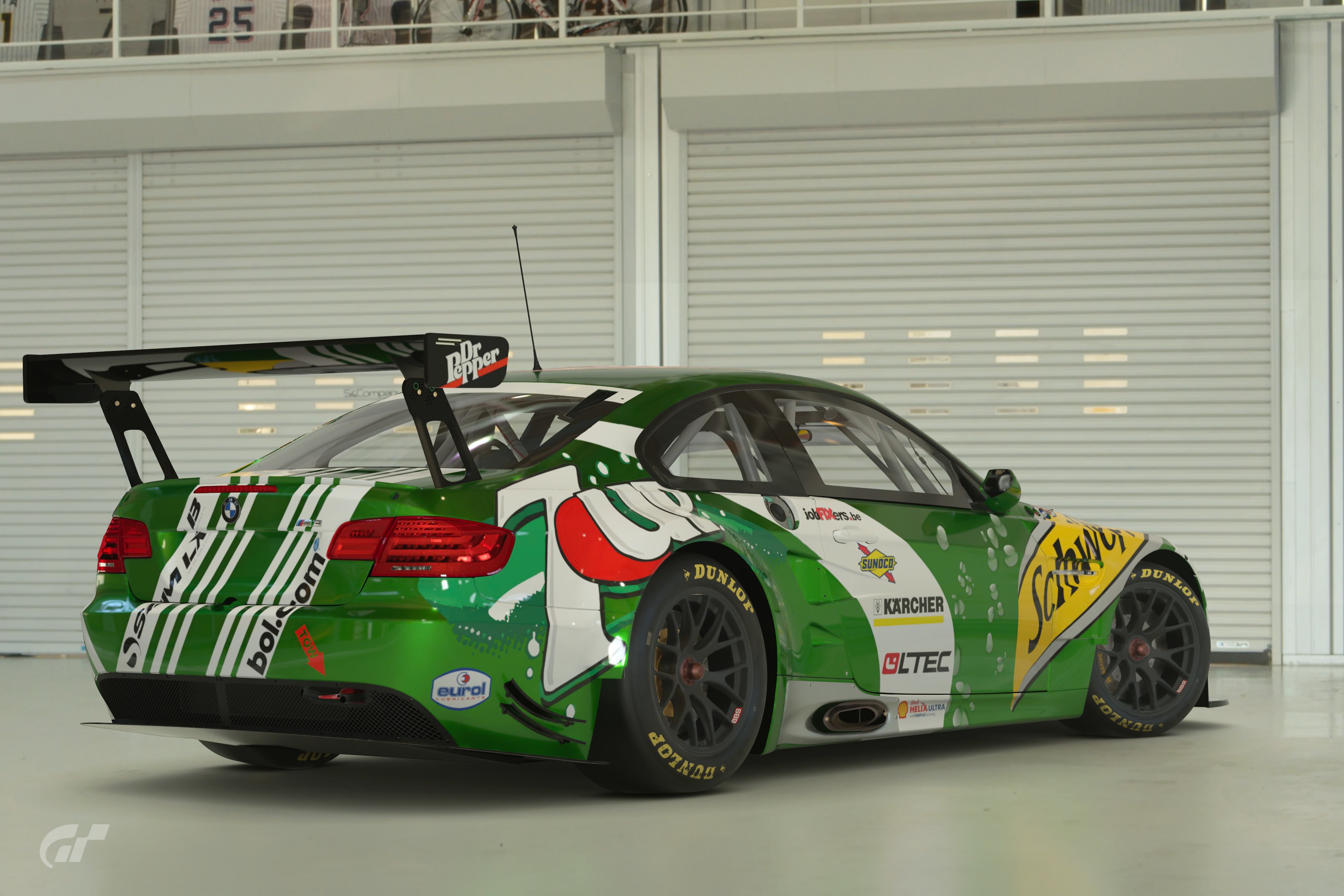
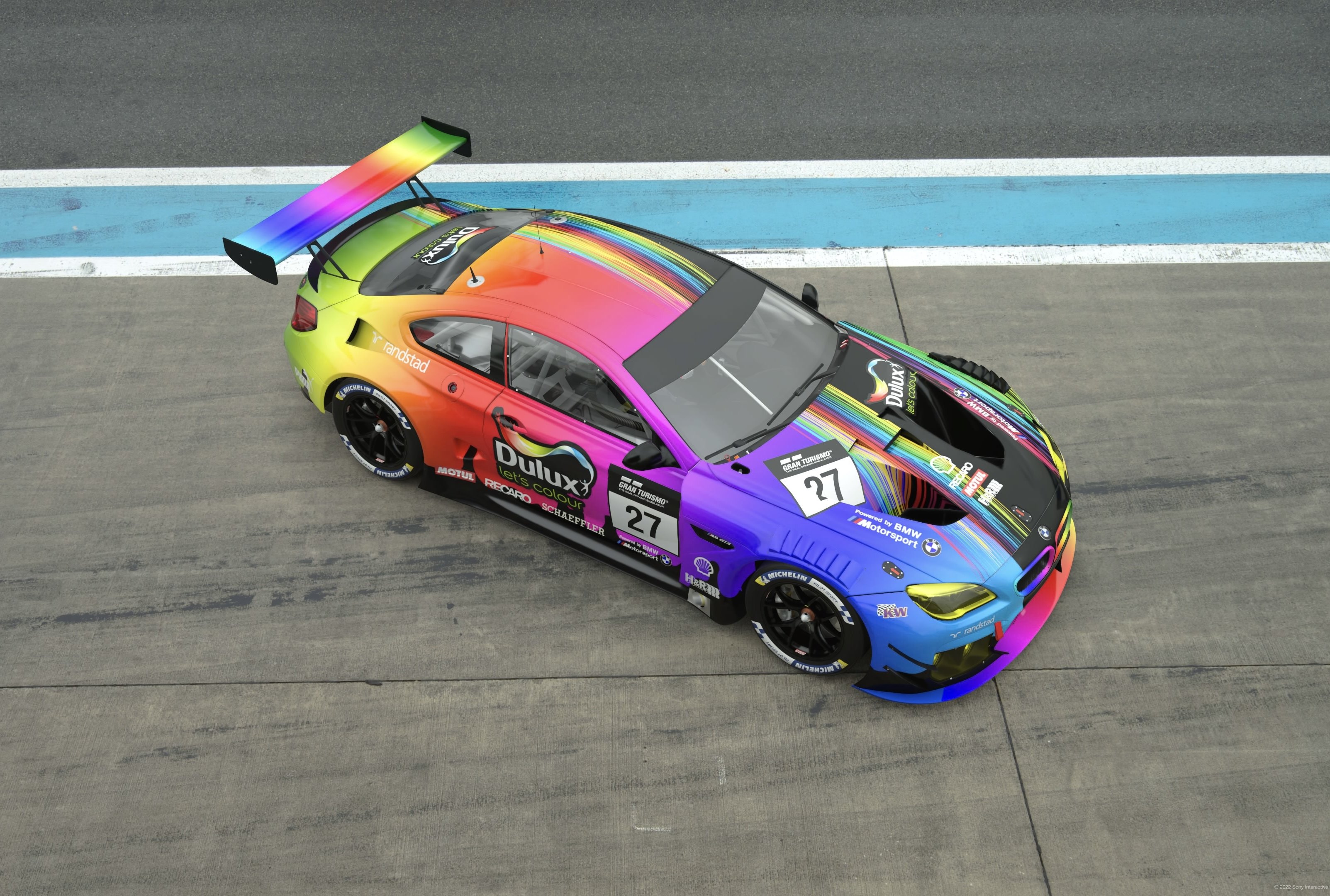
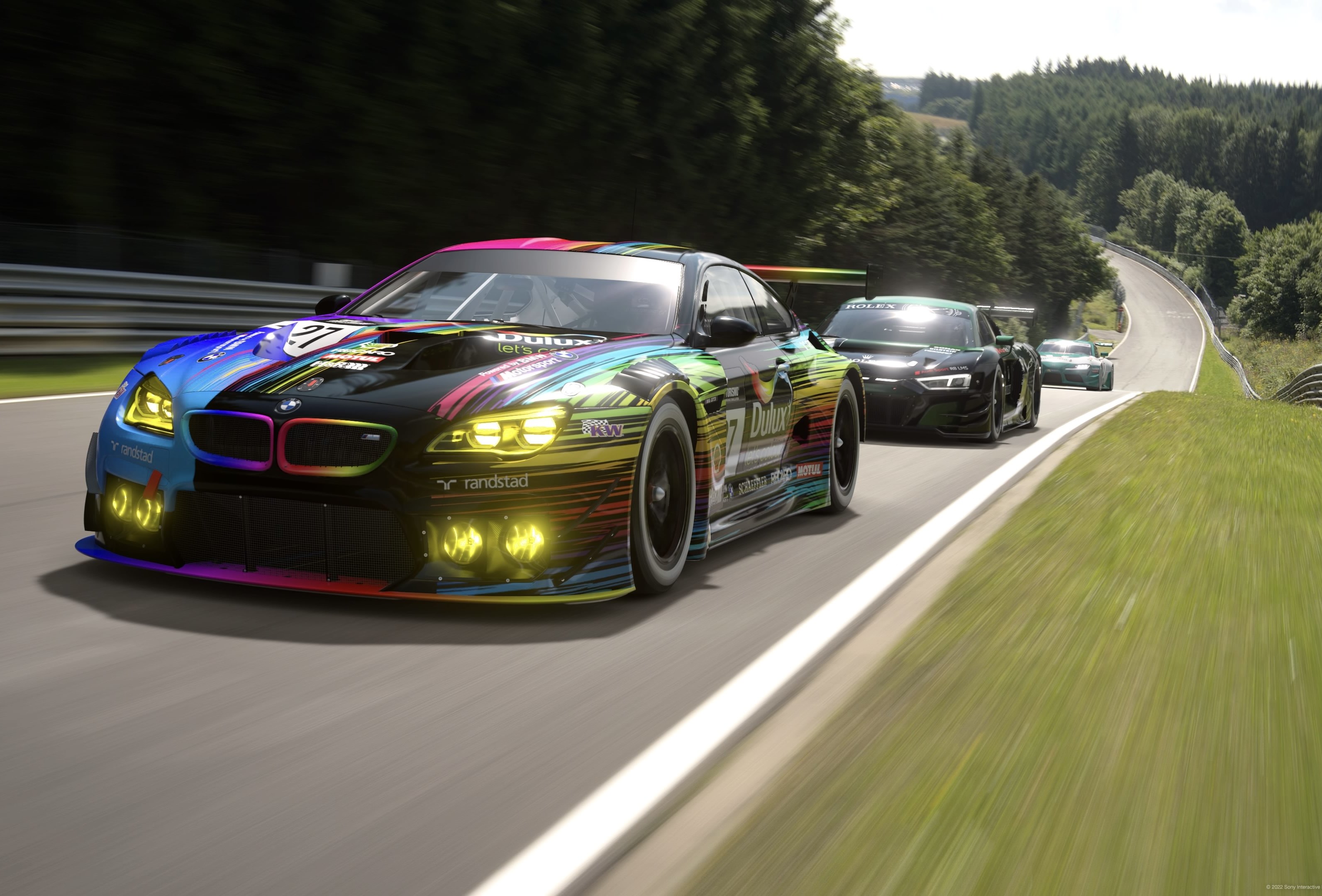
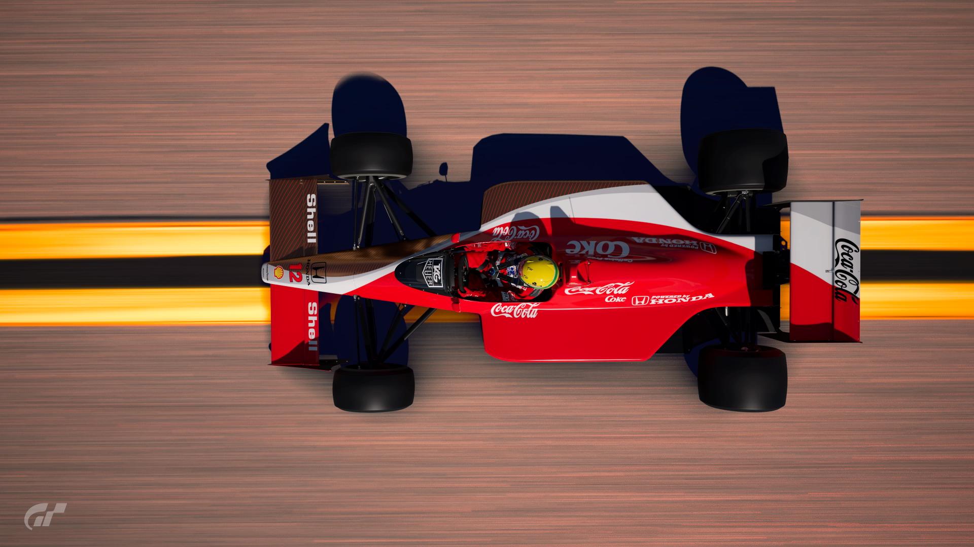
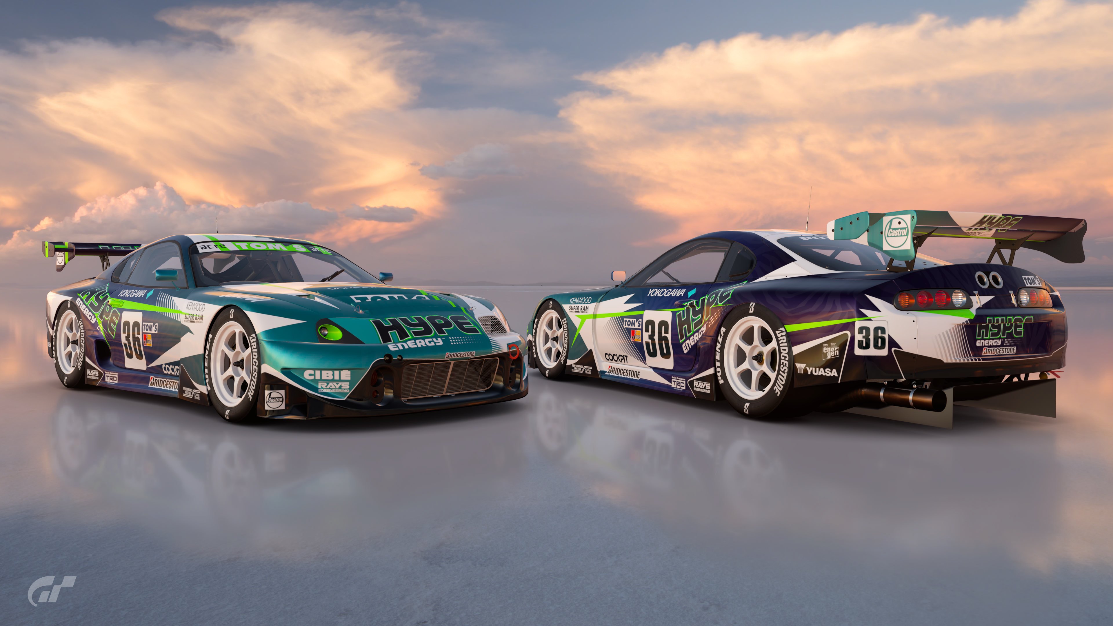
Poll Option #01 - PS5 Framerate
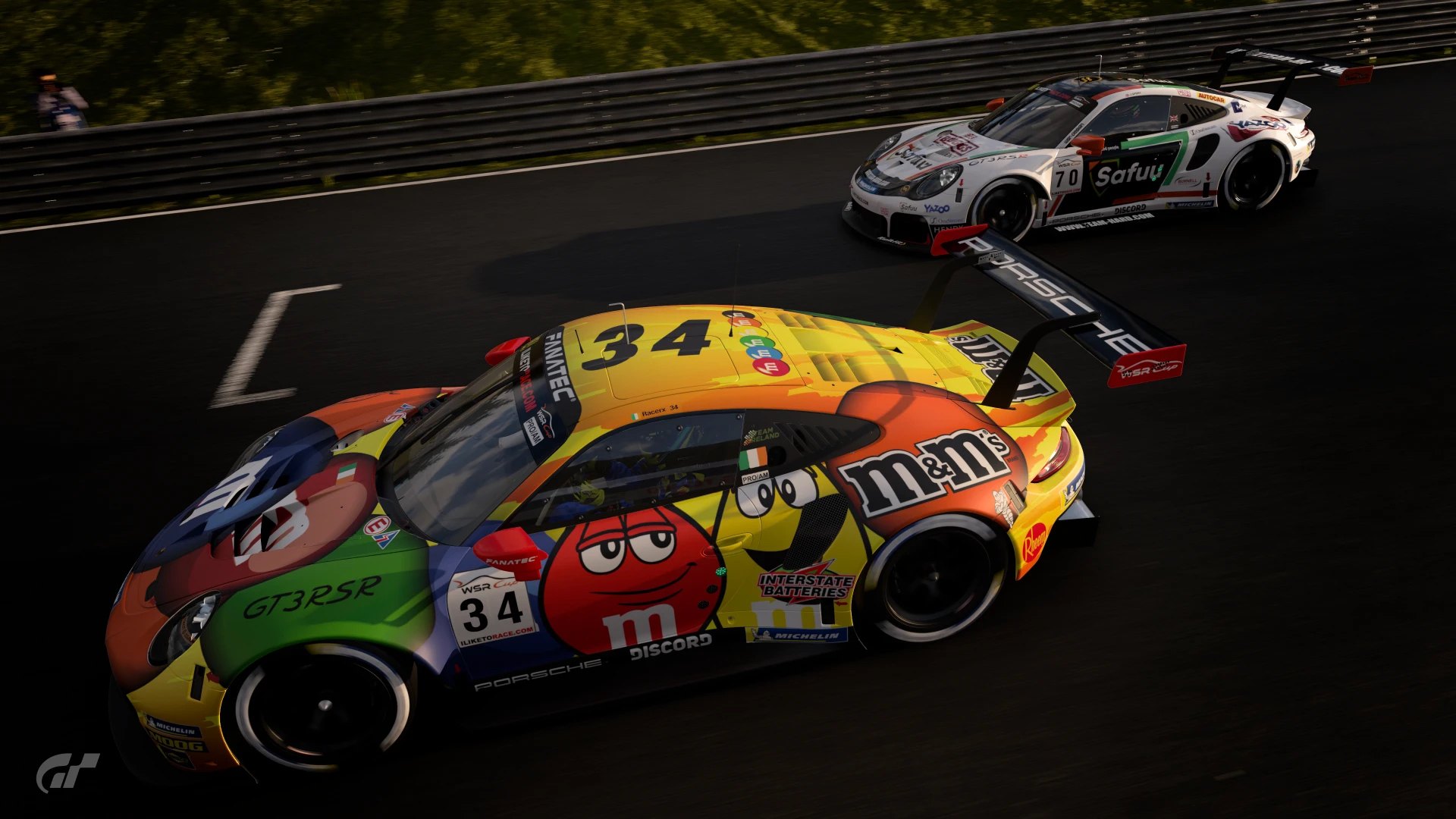

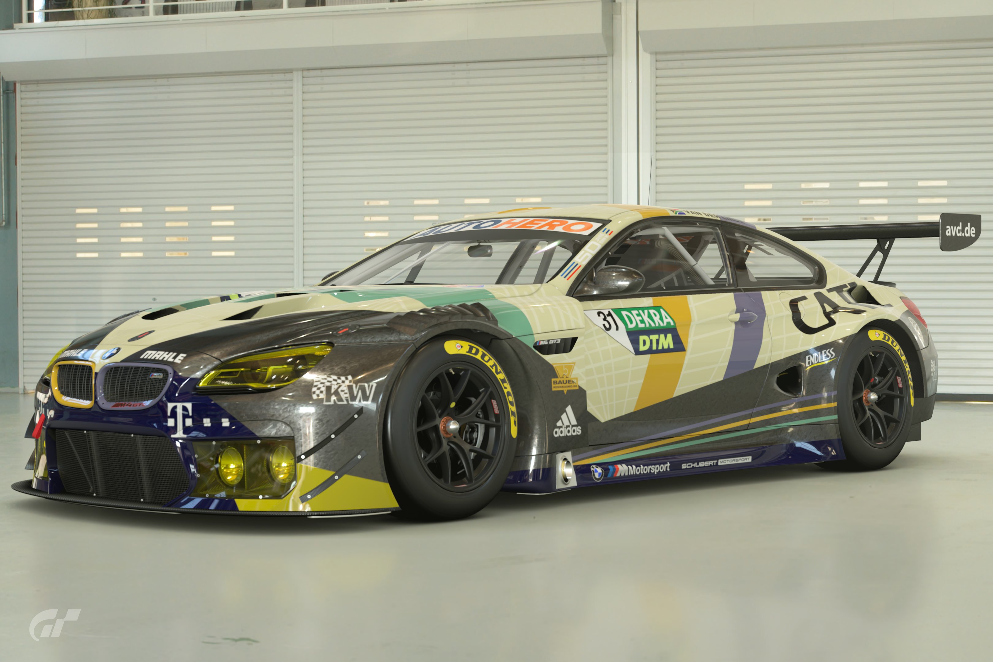
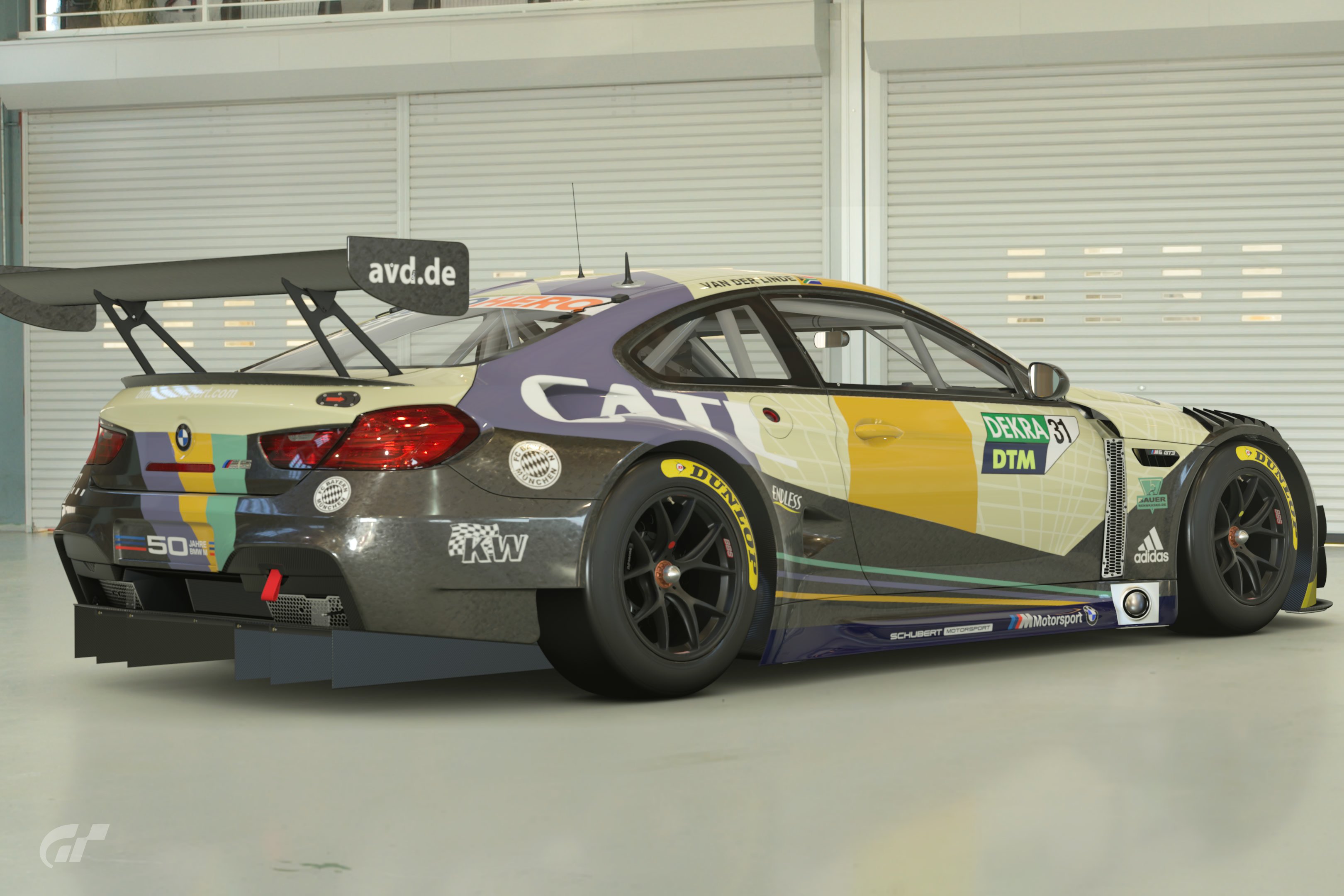
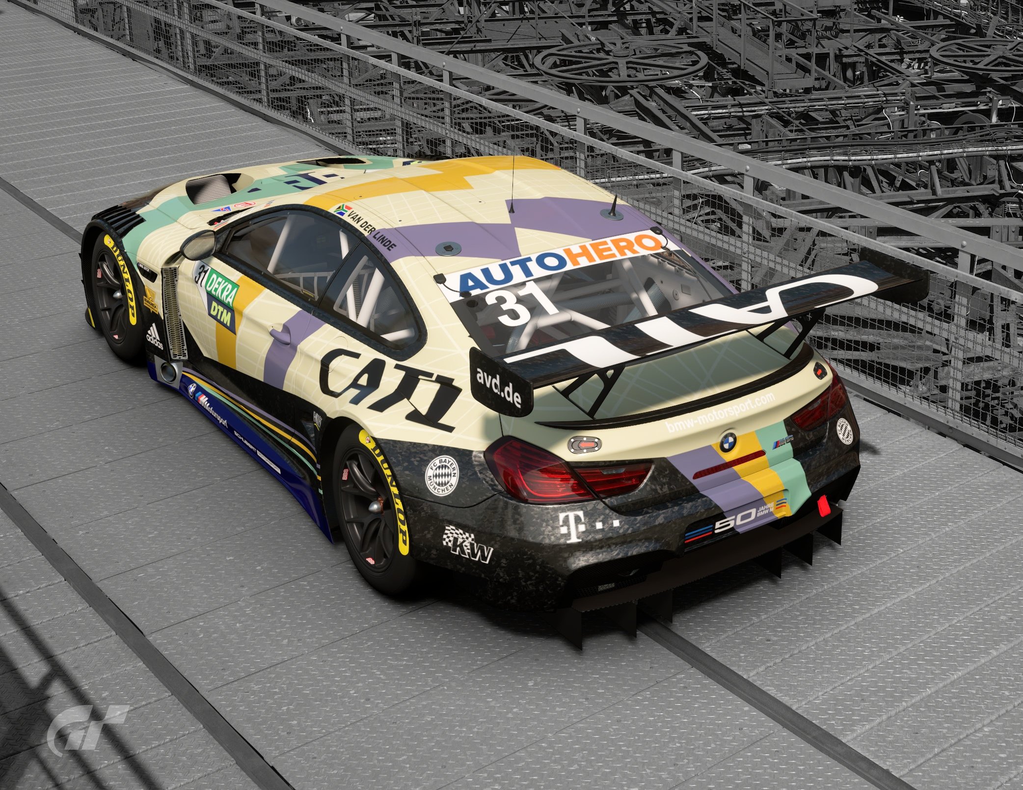
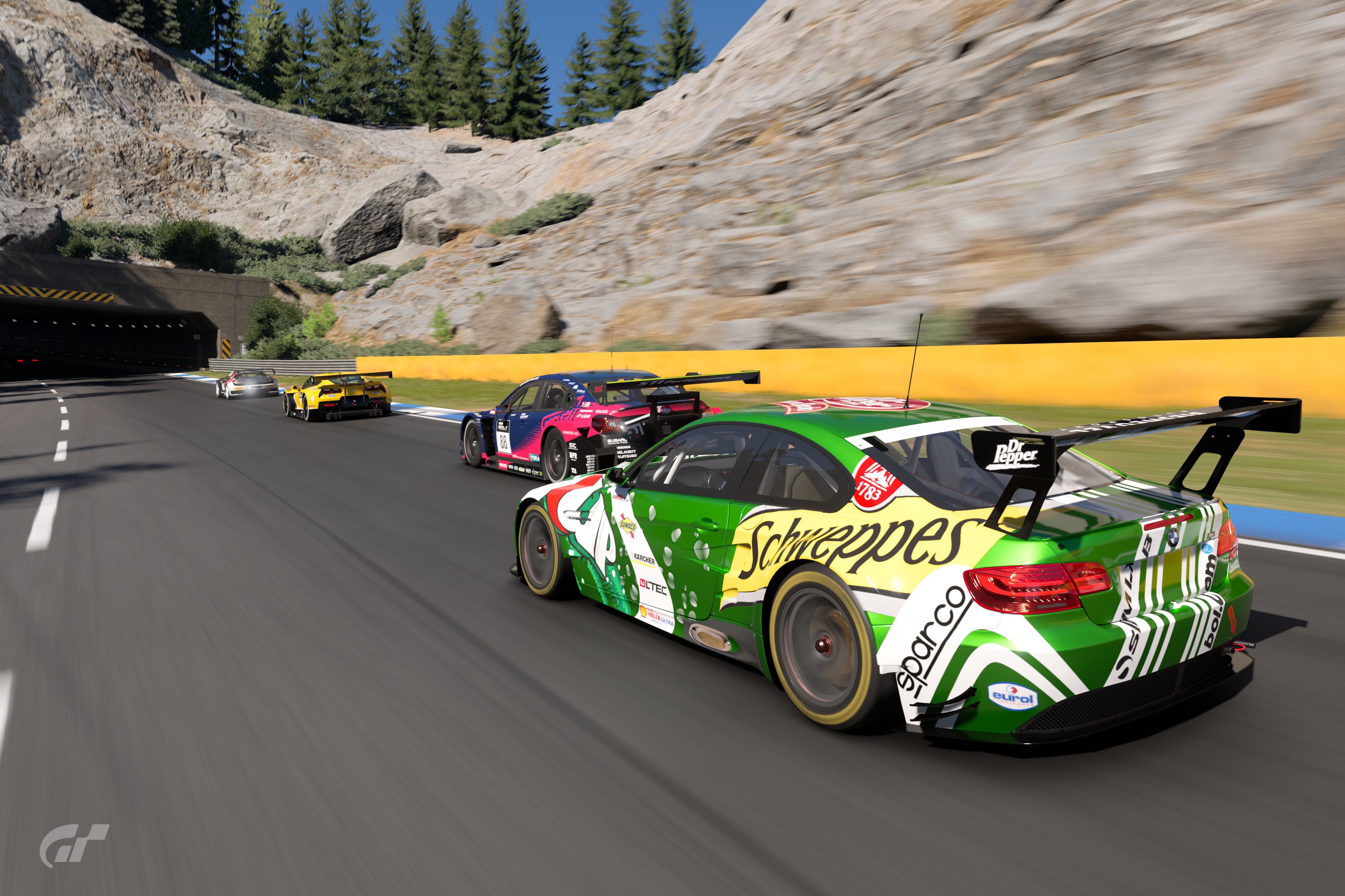
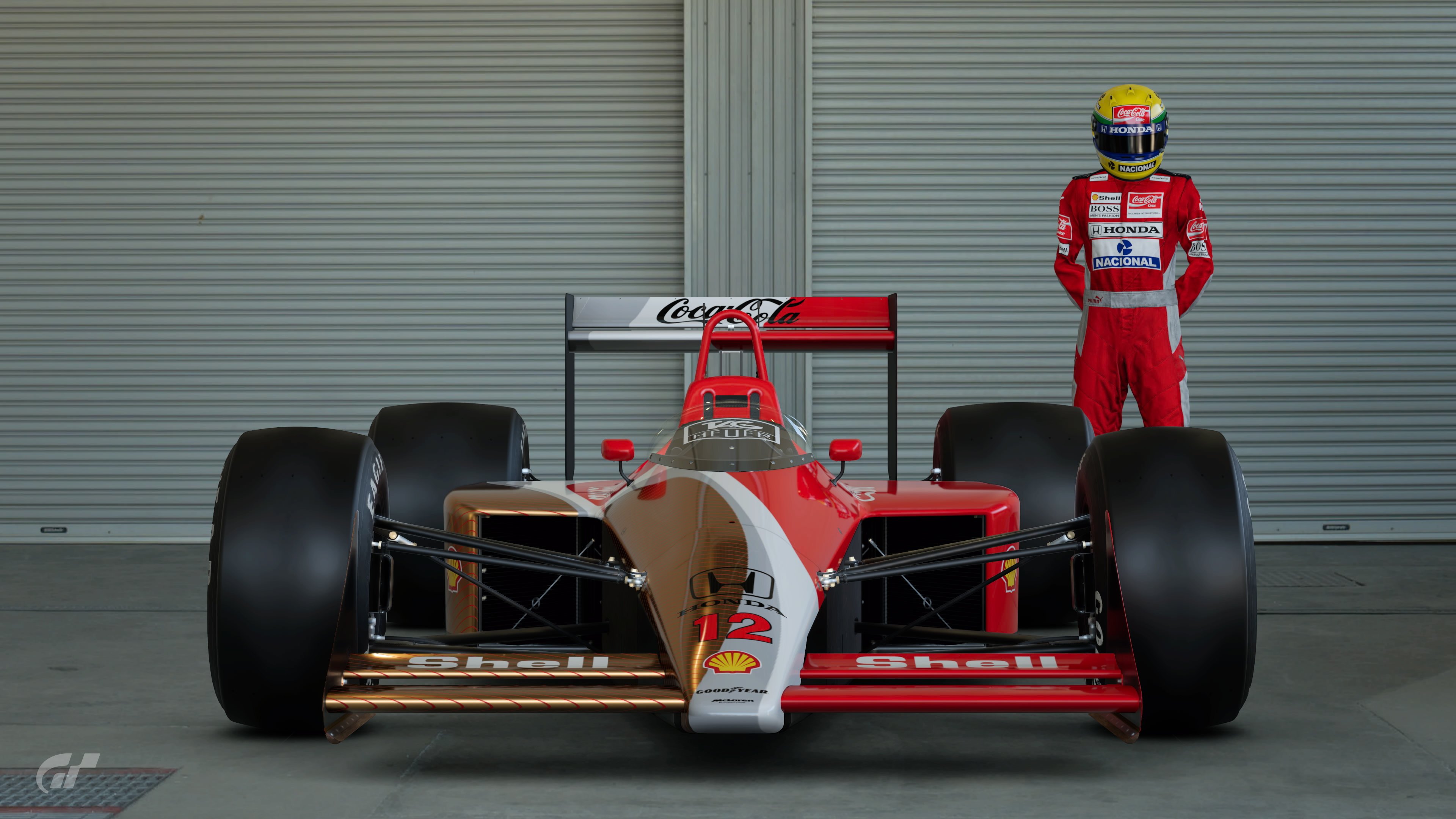
Poll Option #02 - PS5 Framerate
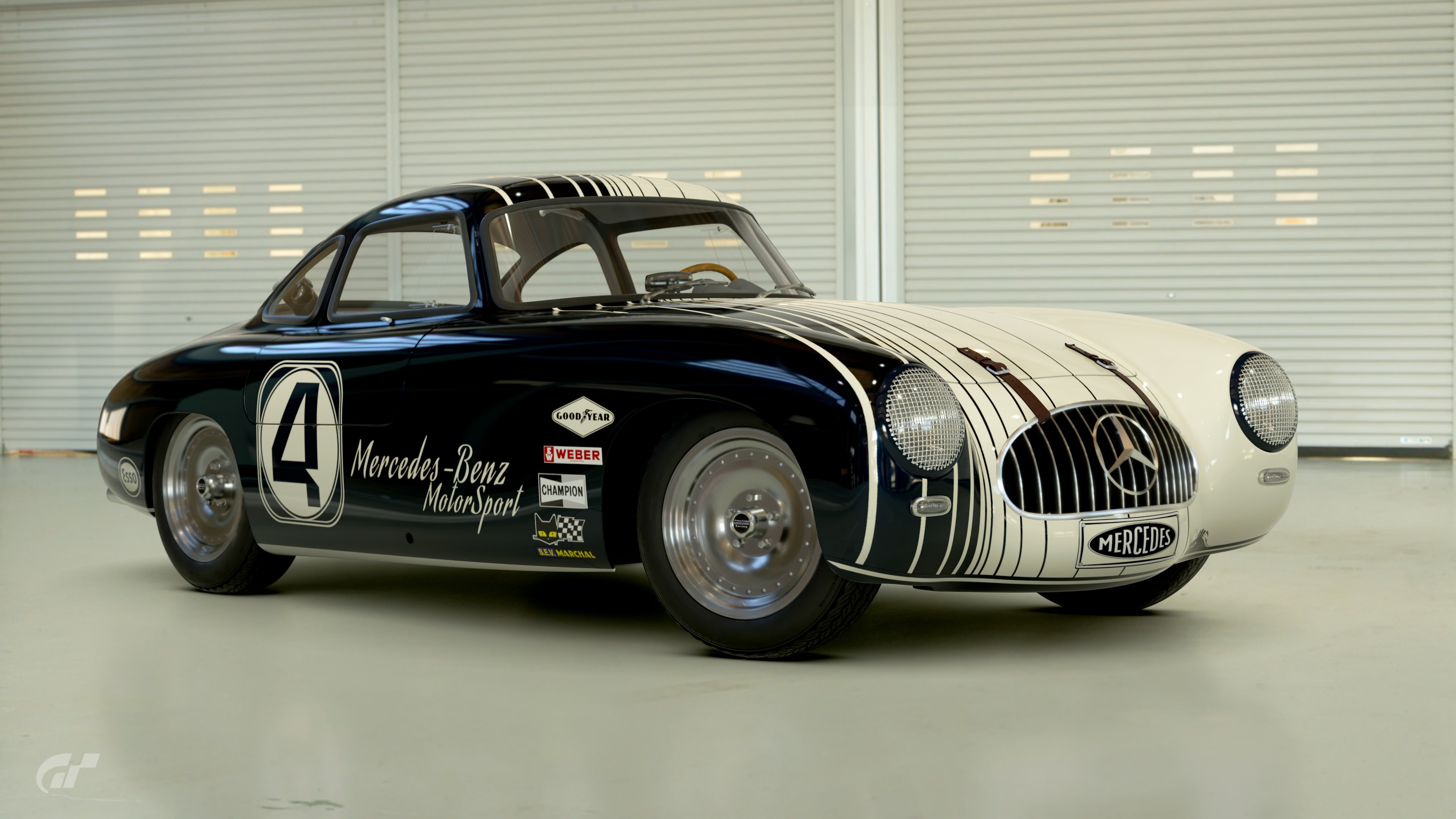
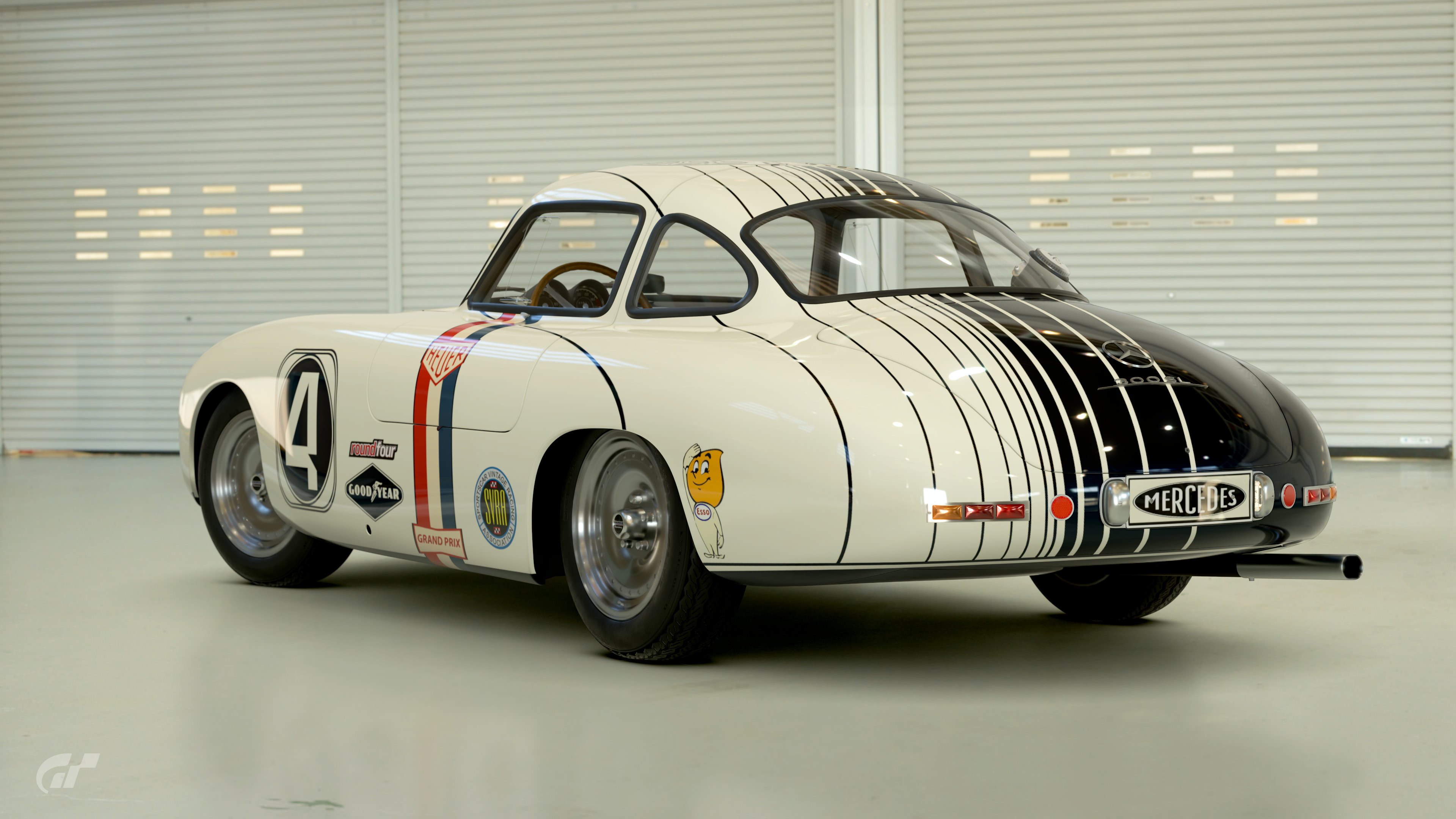
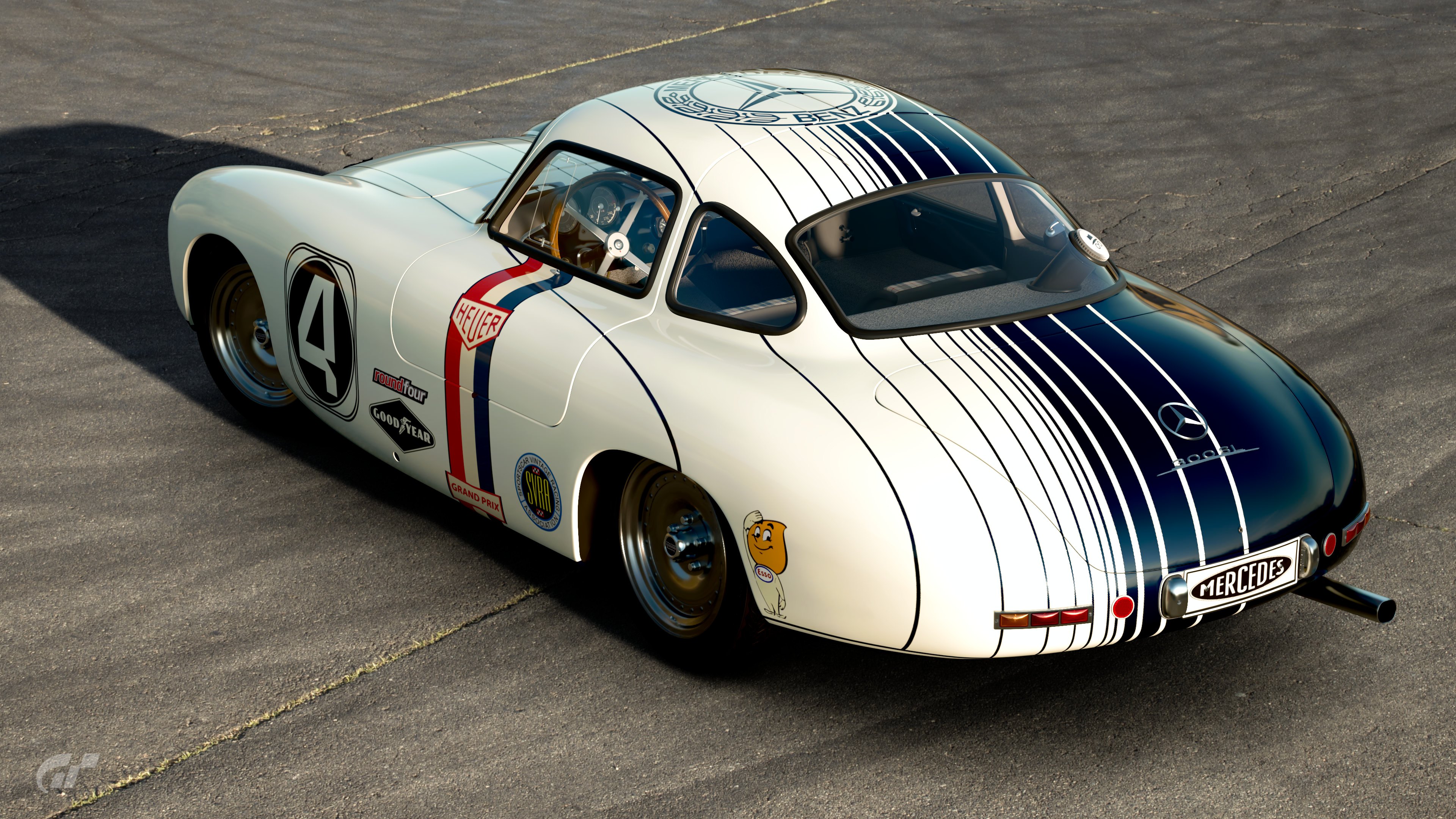
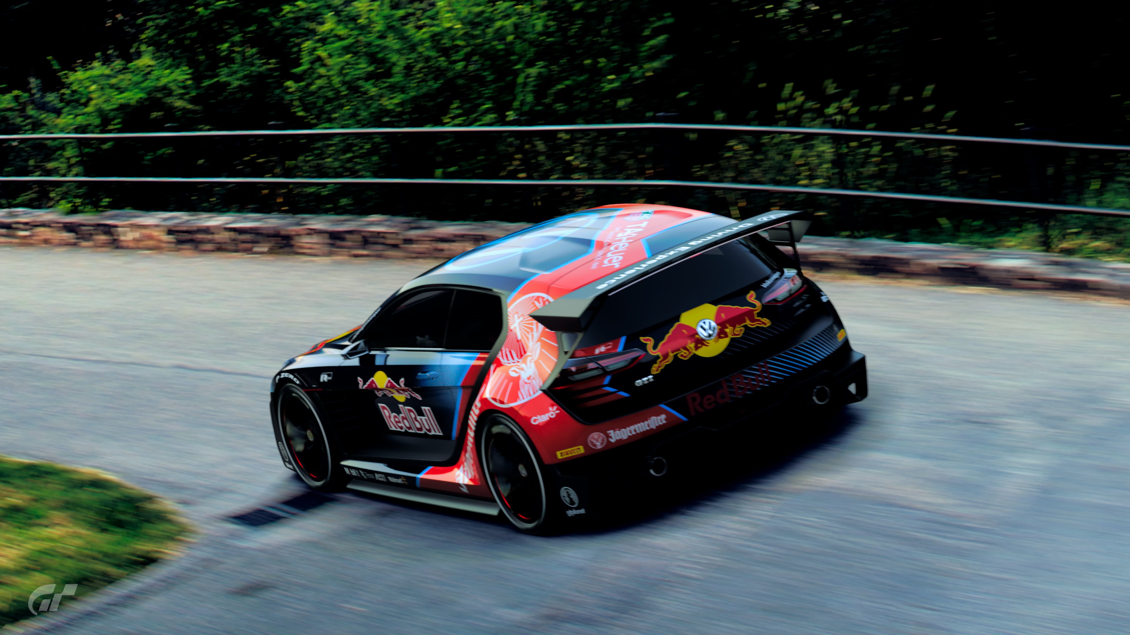
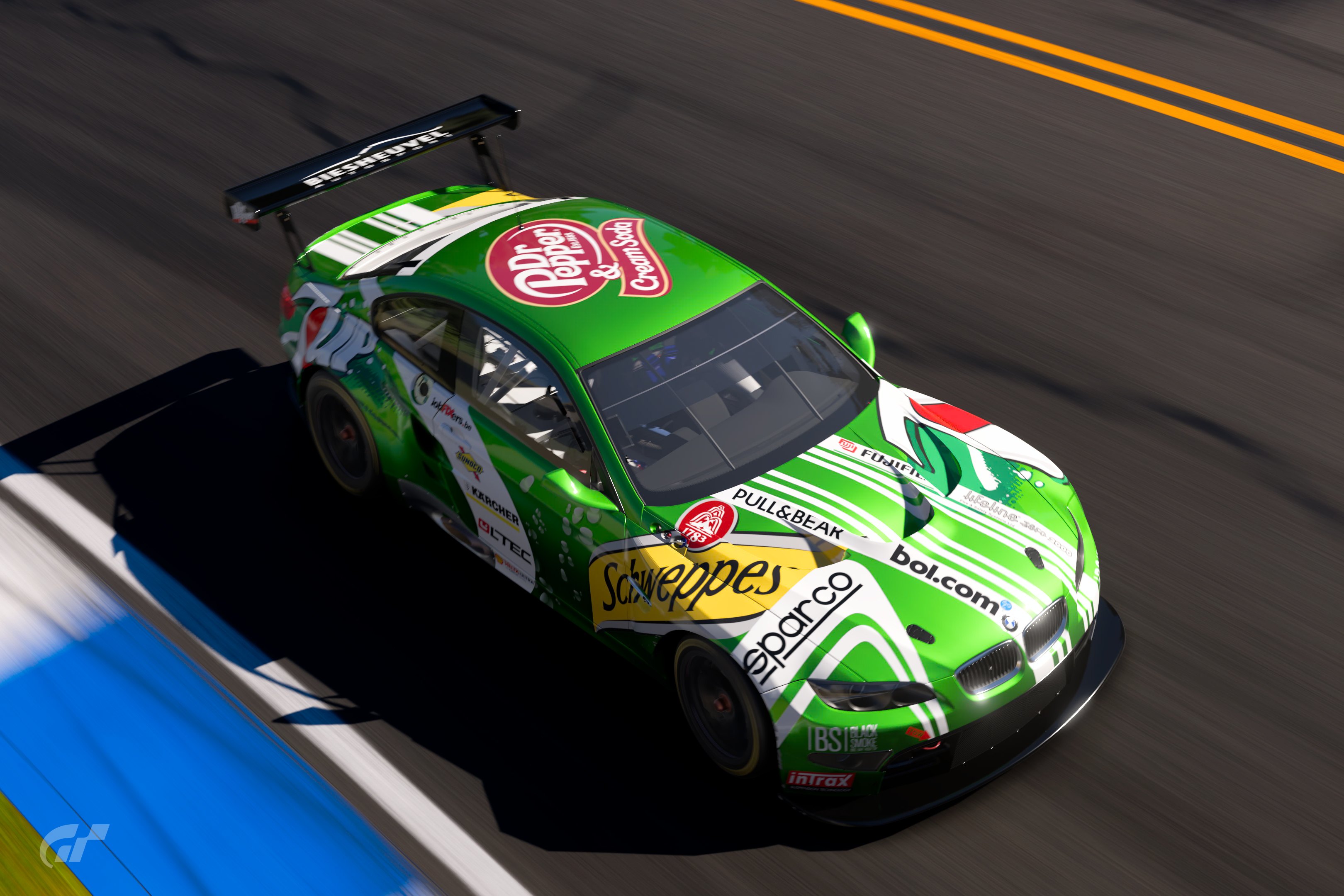
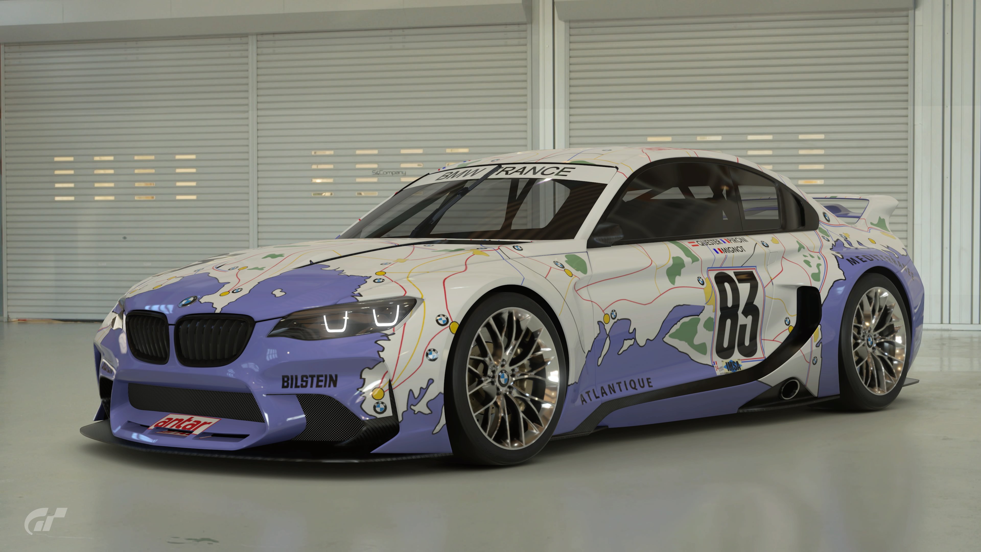
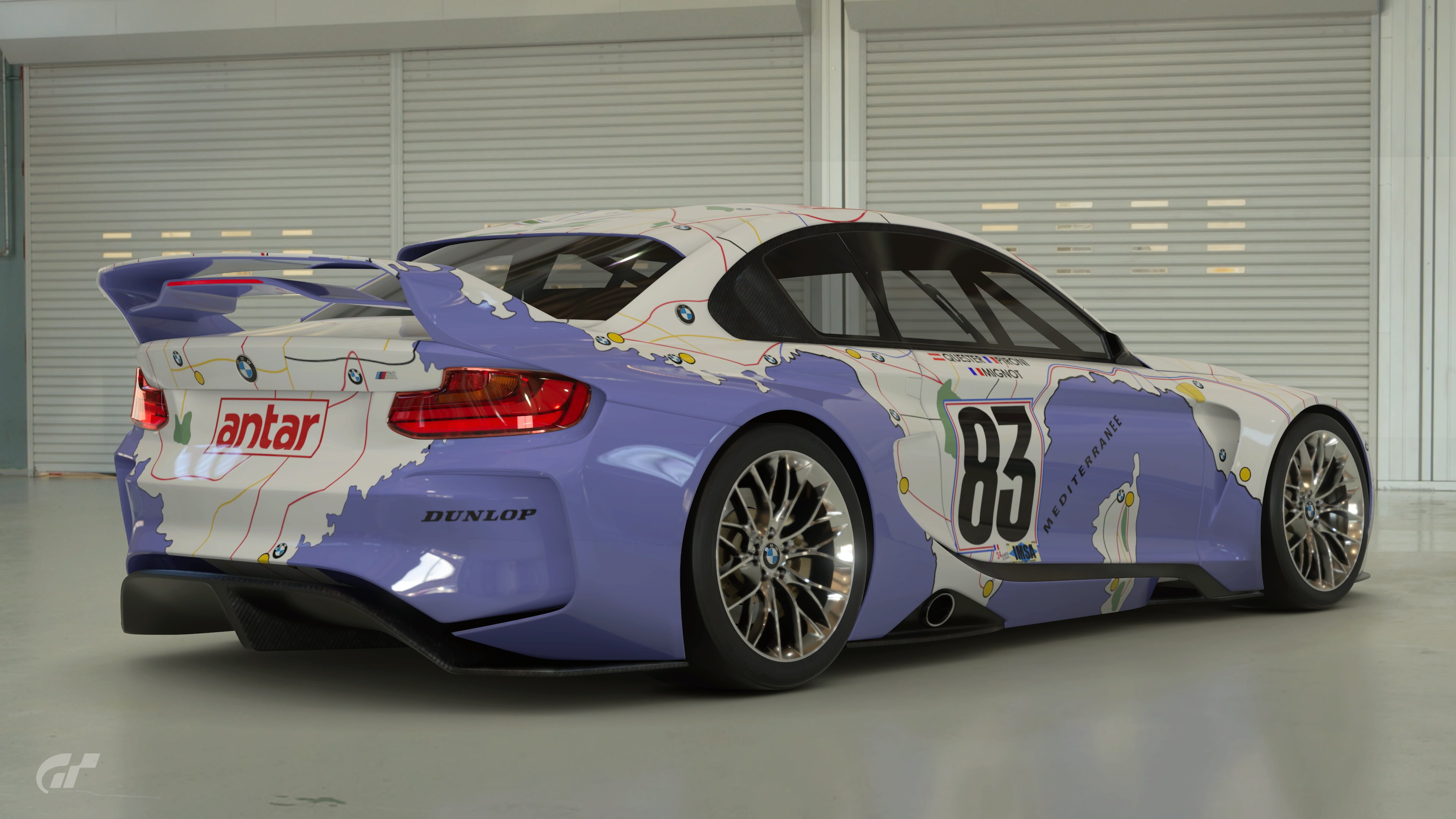
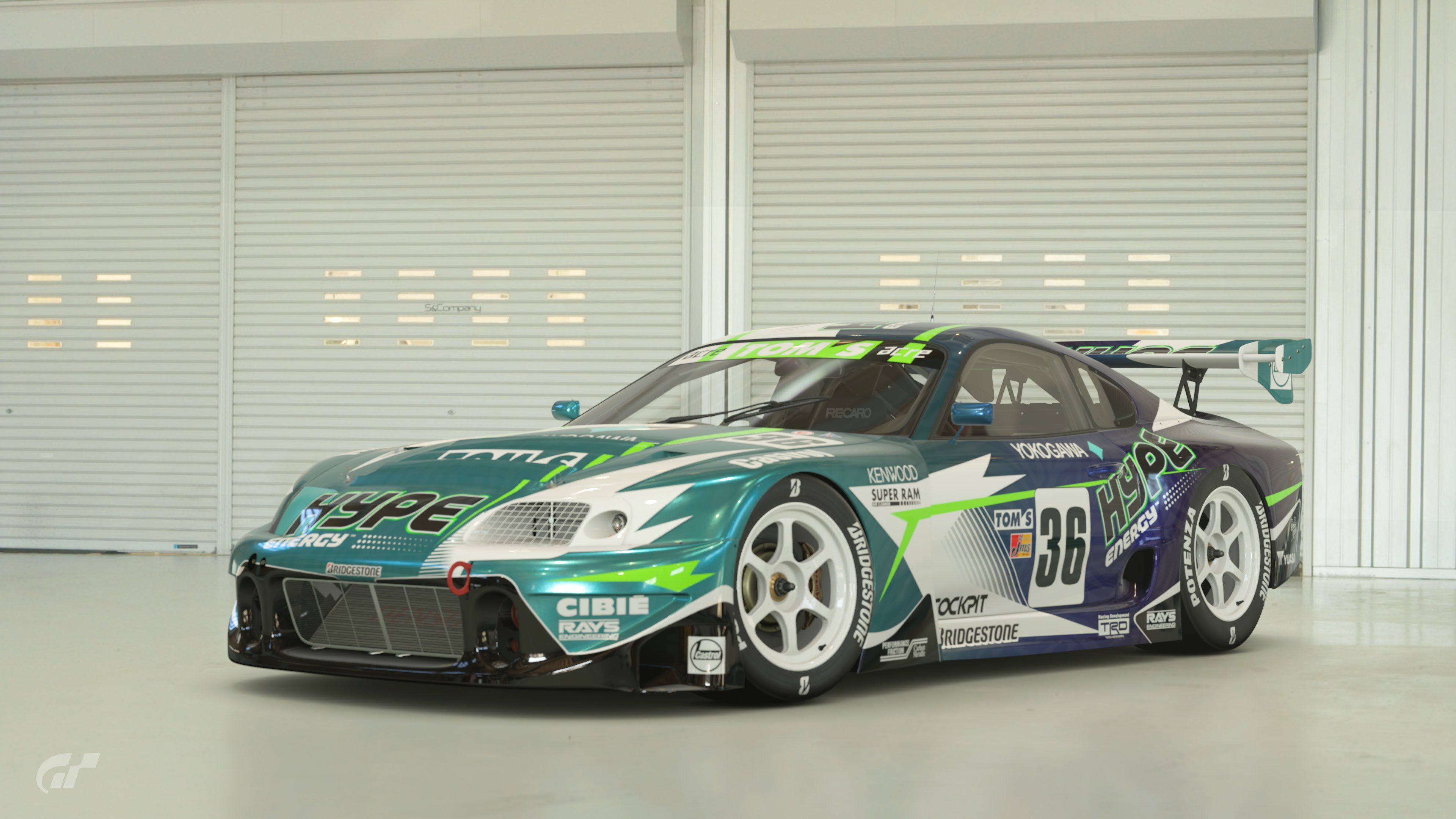
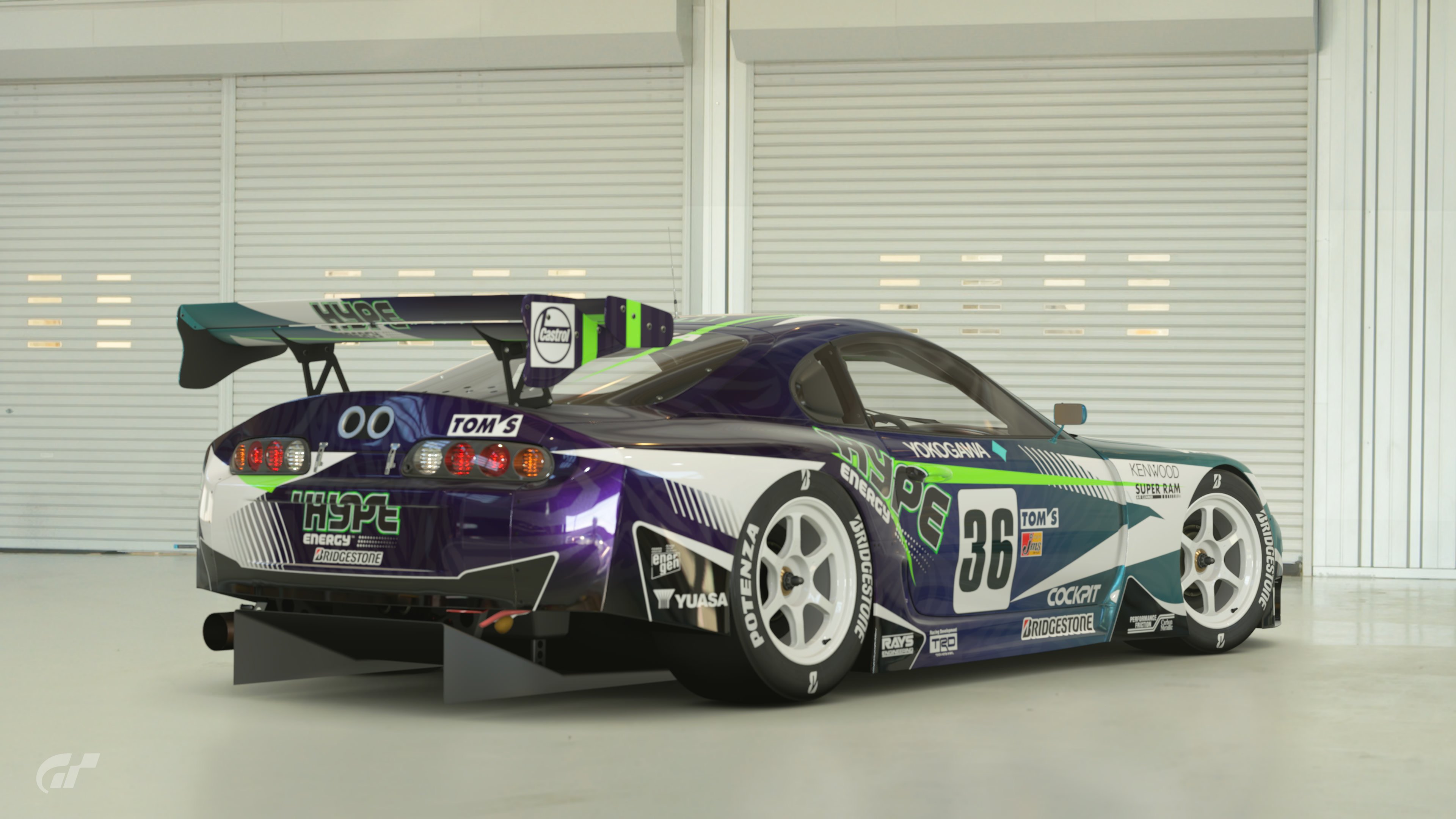
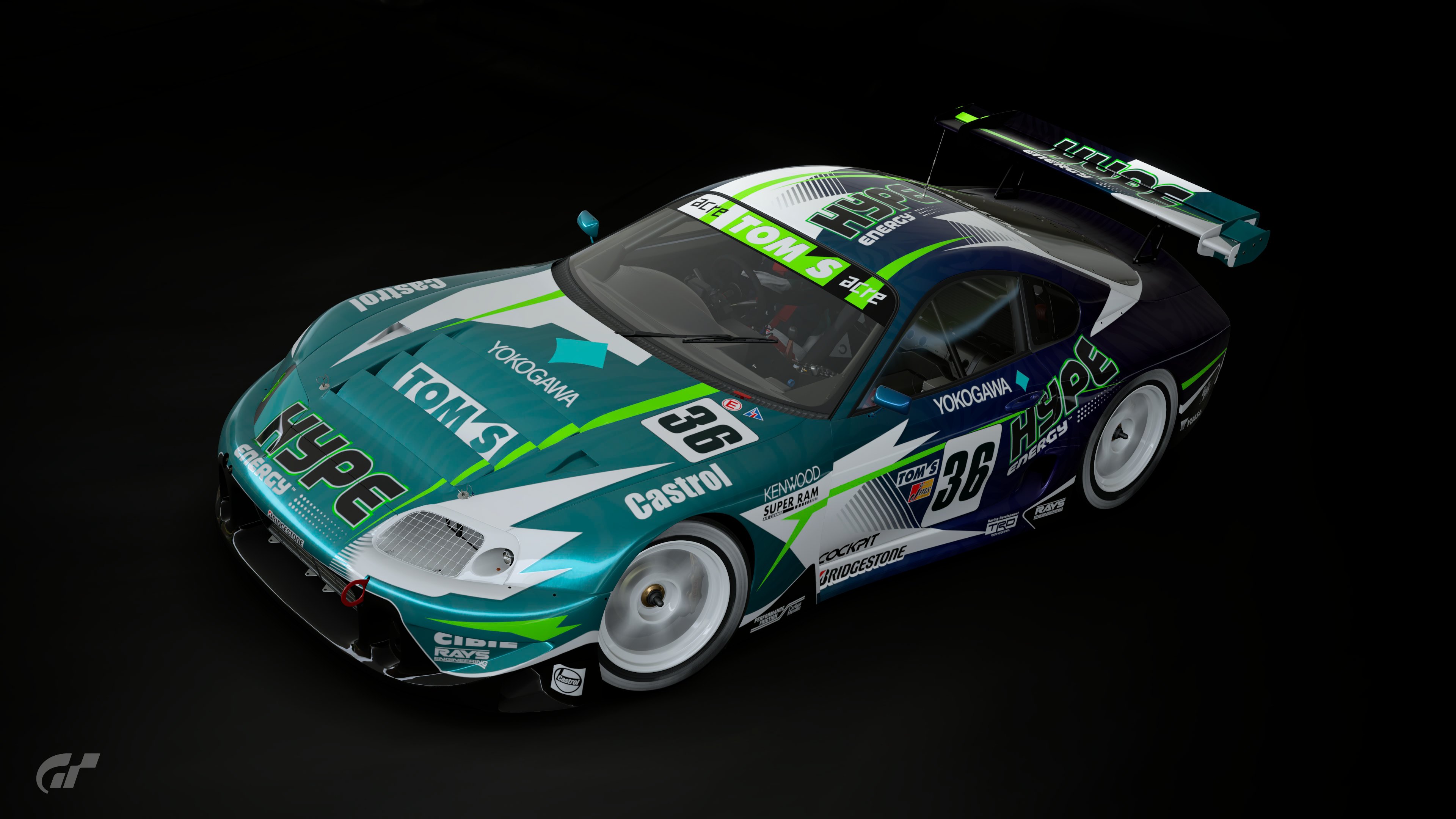
Poll Option #03 - Playstation
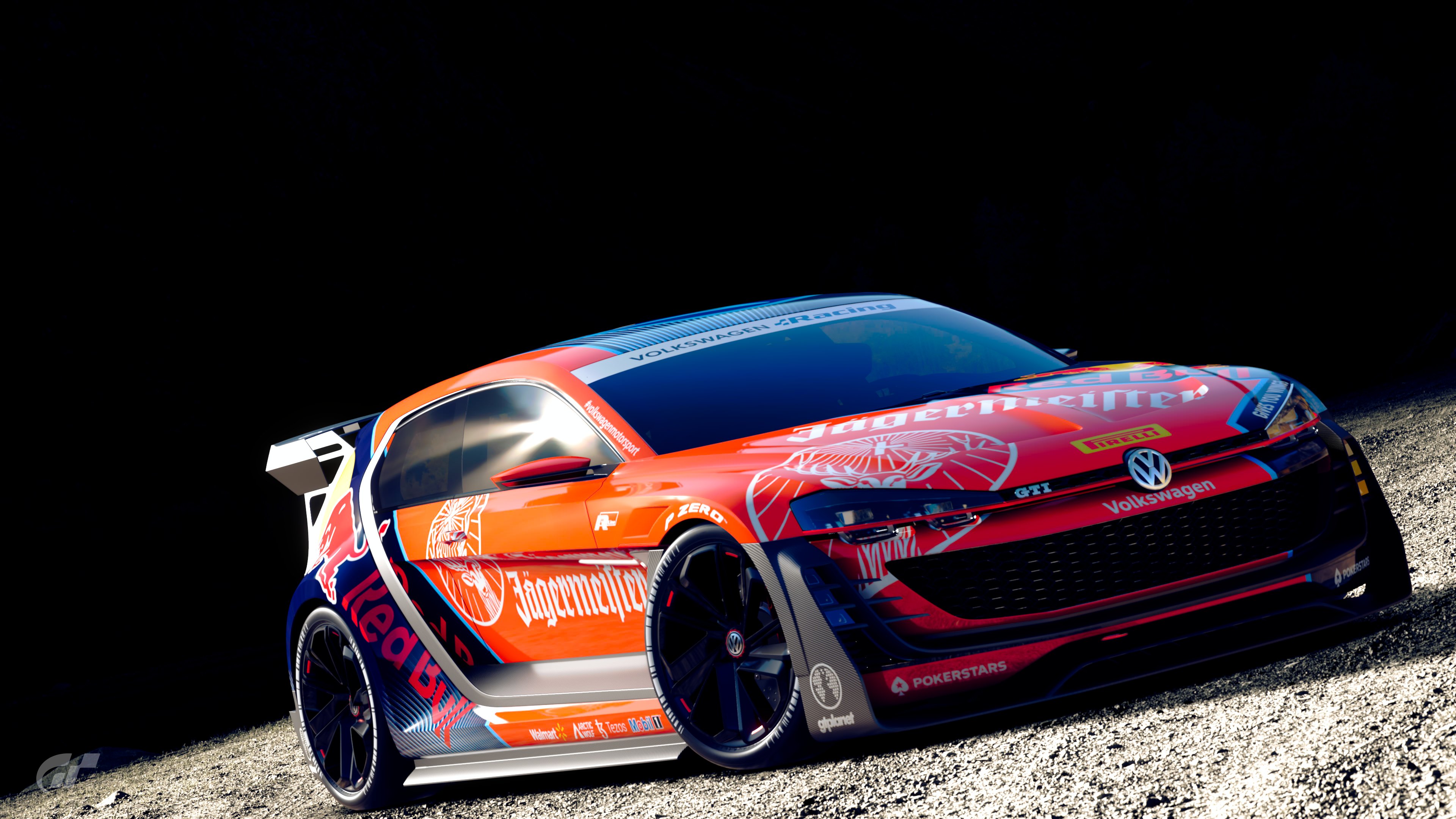
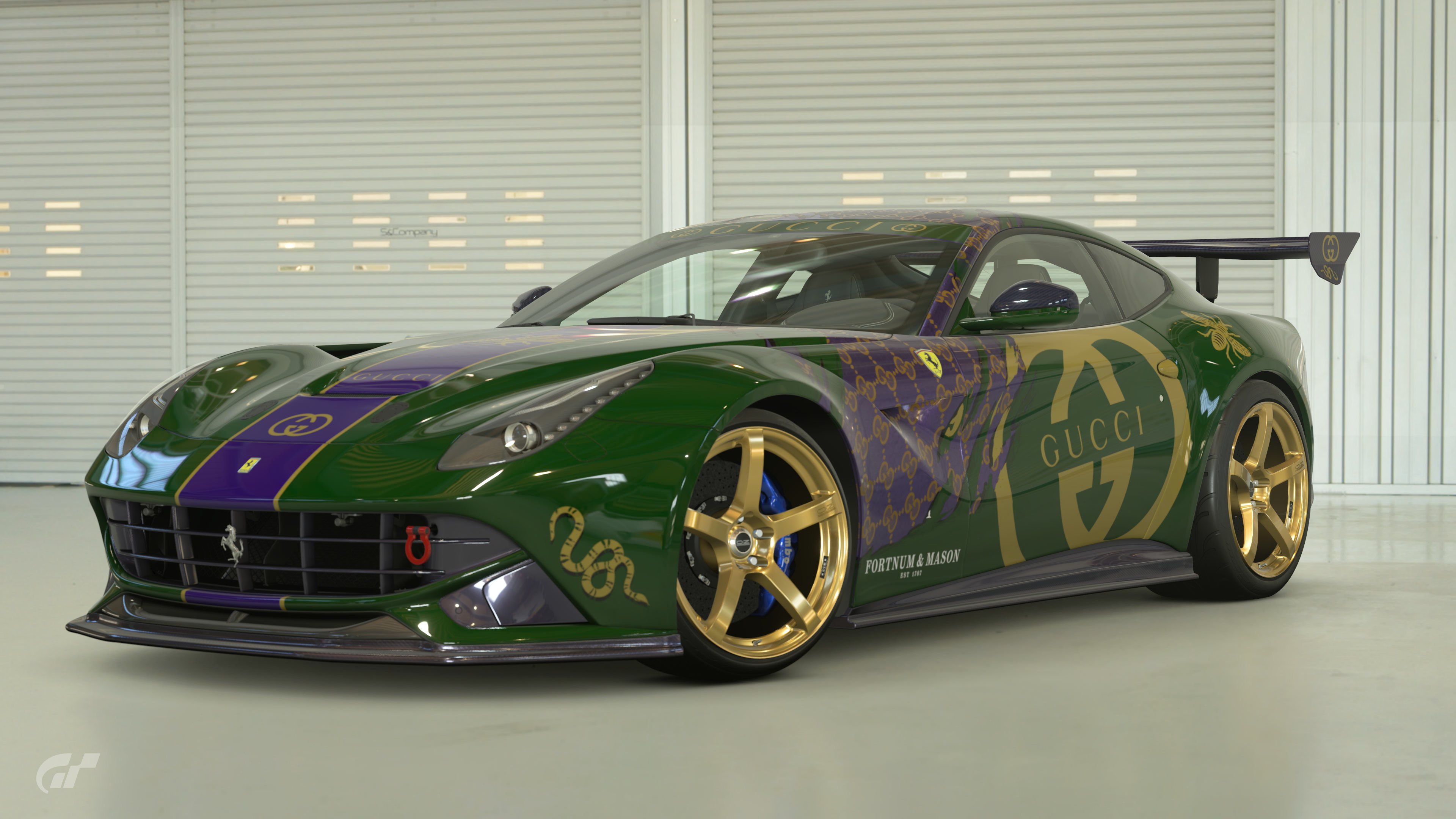
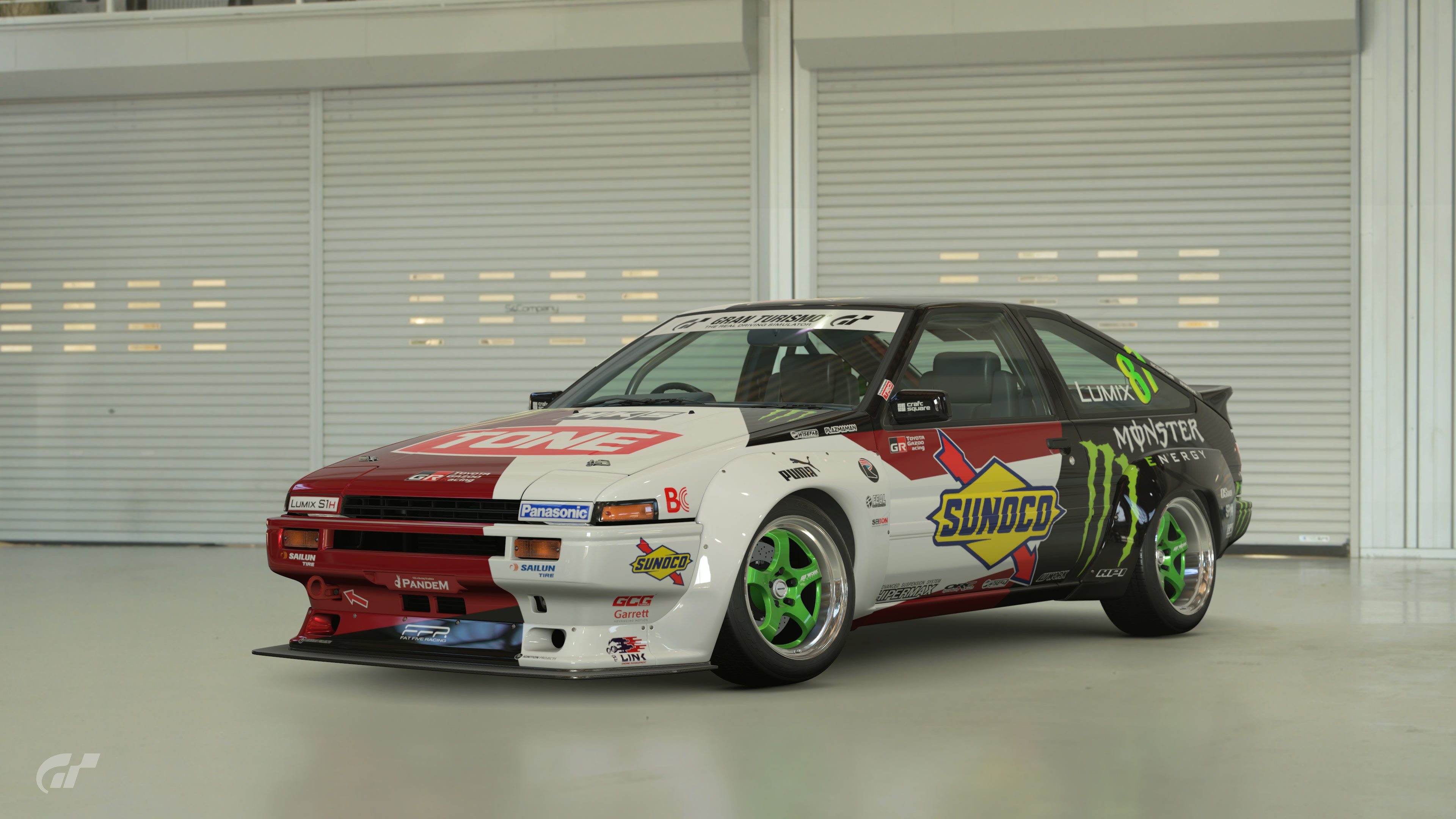
Poll Option #04 - PS4 Base
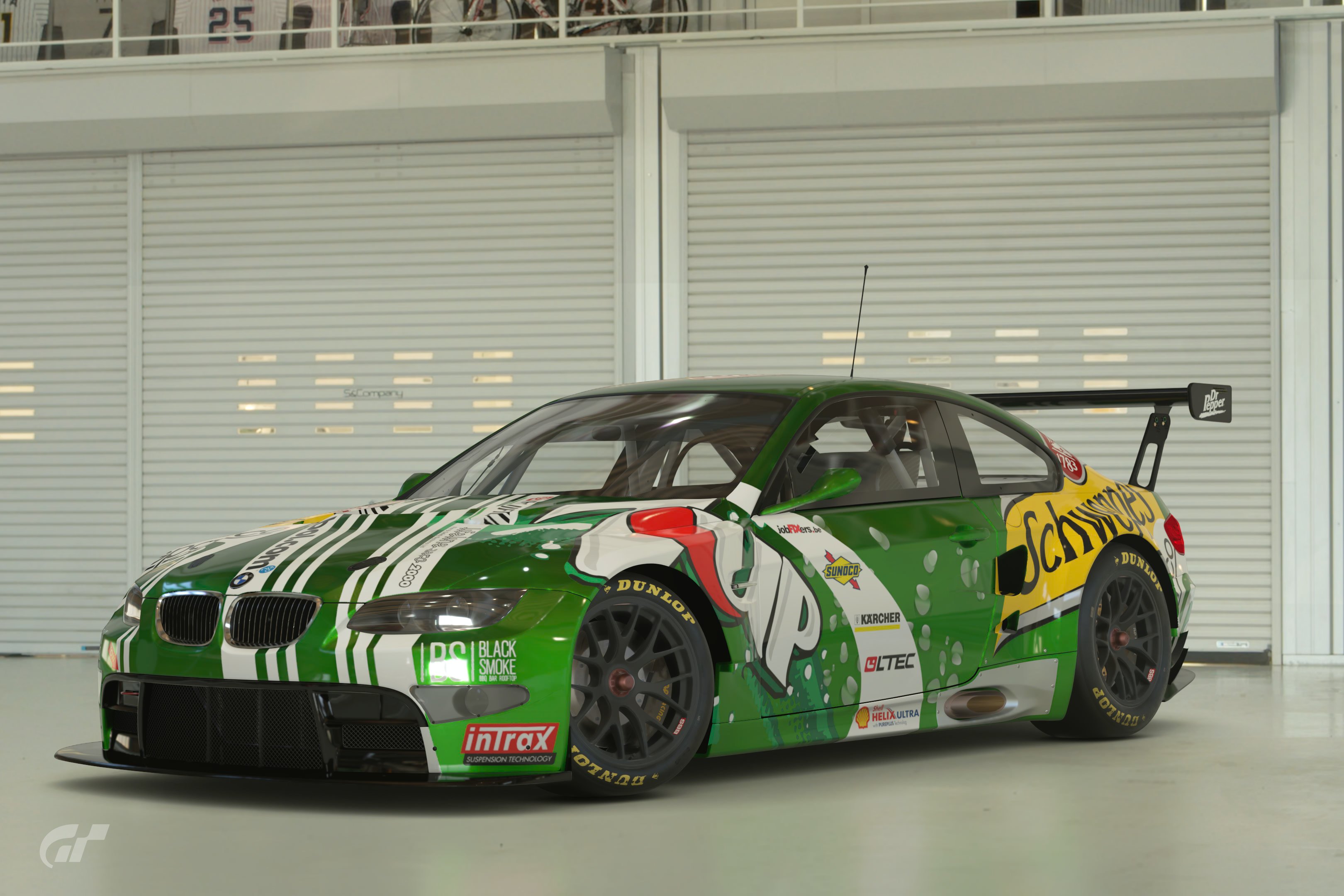
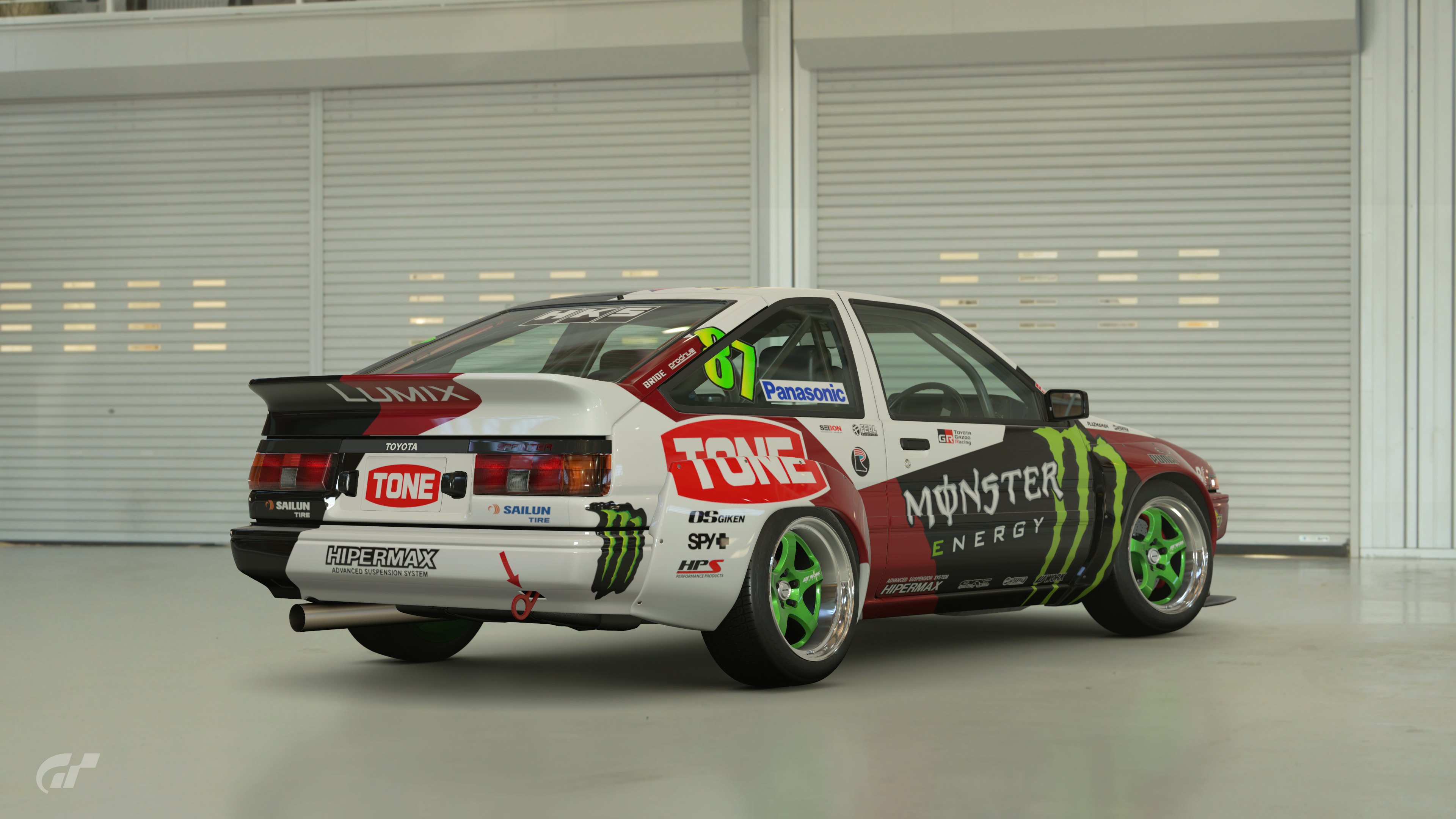
Poll Option #05 - PS4 Pro
Poll Option #06 - PS4 Pro
Poll Option #07 - PS5 Raytracing
Poll Option #08 - PS5 Raytracing
Poll Option #09 - PS4 Base

Poll Option #10 - PS5 Raytracing
Poll Option #11 - PS4 Base


Poll Option #12 - PS5 Raytracing
Poll Option #13 - PS5 Raytracing
Poll Option #14 - PS4 Base
Poll Option #15 - PS4 Base
Poll Option #16 - PS5 Raytracing
Poll Option #17 - PS5 Framerate
Poll Option #18 - PS4 Base


Poll Option #19 - PS4 Base


Poll Option #20 - PS5 Raytracing
Poll Option #21 - PS4 Base
Poll Option #22 - PS5 Raytracing
Good luck to everyone who entered


") . And who the hell am I to critique? But I can see from the last poll that some people enjoy these comments, and this time I had a particularly difficult choice between 2 entries, so I thought I'd give it a go.
. And who the hell am I to critique? But I can see from the last poll that some people enjoy these comments, and this time I had a particularly difficult choice between 2 entries, so I thought I'd give it a go.