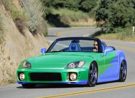
Psc: S2k!

  • Thread starter Thread starter Ryan2
  • 29 comments
  • 991 views
Mine:
 

Attachments

  • s2k copy.jpg
    s2k copy.jpg
    33.3 KB · Views: 146
i can't enter this one as of right now, but i'll have my entry by the 25th... ;)
 
just reinstalled Photoshop, had to give it a try... quite hard when your hard drive's almost empty :rolleyes:
 
Originally posted by PunkRock
just reinstalled Photoshop, had to give it a try... quite hard when your hard drive's almost empty :rolleyes:

everything bout that is cool except for the blue band across the top of the windshield, just doesnt fit
 
i know... but it came with the top, and i can't remove it without making it look dumb! :lol: the front wheel's taller than the rear one, too...
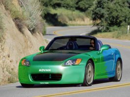
 
i didnt notice that bout the wheels, its just that strip is kinda blurry looking and the rest of the car looks really sharp
still nice though
 
Yeah, PR (hey what a rhyme!) the banner really kills it, but its a pretty good damn effort!! Not that nothing is wrong with it..
 
update!
 
Whats the deal with using a pic that already has been chopped?

EDIT: The original pic did not load when I posted this! :lol:
 
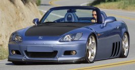
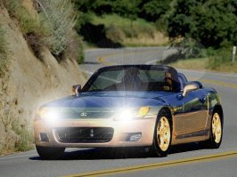
the blueish S2000 hasn't been 'chopped, it's an official image from Honda... they might have added some highlights by themselves, but i'm pretty sure that's a normal picture.
 
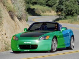
Not my best but at least it looks good. And PR, I just HAD to use the wheels. They were just like what I was looking for. If they were in silver in would've been even better. But oh well...
 

Attachments

  • s2000.jpg
    s2000.jpg
    43.4 KB · Views: 81
Like this?
 

Attachments

  • s2000.jpg
    s2000.jpg
    43.1 KB · Views: 74
Possibly more to come.
 

Attachments

  • s2000flat copy.jpg
    s2000flat copy.jpg
    71.8 KB · Views: 69
holy mother****ing god! :eek:

looks like i'm gonna have to update, just to stay competitive! ;)
 
Great Job Stevie, yours look so realistic! :thumbsup:
 
Exactly TVR...wow, I didn't know this would get so competitive, I might have to medieval on every body...heh heh heh....(grins maliciously)
 
Here is mine so far.... tell me what you think I need to do to help improve it.
 

Attachments

  • s20004.2.jpg
    s20004.2.jpg
    70.5 KB · Views: 55
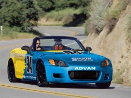
Not bad...sharpen up that left side and add a few logos (Toyo, Advan, Spoon, etc.) and it'll look really good.
 
I don't know what made the left side look like that. I'll try to fix it up. I really don't like logos like that...so this one is going to be clean.
 
Do do do... I prefer before but I worked for a bit on this so I'm posting it anyways
s2000xcopy.jpg
 
Nice! :thumbsup:
 
this is my first shop,i dont think its that bad but compared to the others mine sux :lol:
 

Attachments

  • firstshop.jpg
    firstshop.jpg
    48.5 KB · Views: 32
Originally posted by StevieMo
Do do do... I prefer before but I worked for a bit on this so I'm posting it anyways
s2000xcopy.jpg

OMG, :)
you are awesome Stevie
thats beyong cool :cool:
 
Back