Rate the photo above.

  • Thread starter Thread starter vass0131
  • 49 comments
  • 3,229 views
8/10,the color looks a little dull.

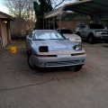
IMG_68782183037852.jpeg
 
Syracuse - Night_2.jpg
@bikerbob951 8/10, It looks so mean, but I think the car is to dark for that picture. Rate this away!
 
Last edited:
@Dylan R 6/10 Its a bit busy and the angle doesn't really work for me, if you straightened it up a bit and focussed on the car a bit more rather than the background it would be a lot nicer. The paint job and stance of the car look nice
MX5Matterhorn Rotenboden.jpg
 
@DolHaus thanks for the ideas, new to this. 7/10, I like the sense of movement, but nothing is really grabbing my attention. Think this is better?
Syracuse - Night_1.jpg
 
@DolHaus thanks for the ideas, new to this. 7/10, I like the sense of movement, but nothing is really grabbing my attention. Think this is better?View attachment 120633
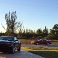
much better, maybe swap the cars around to give more contrast (dark car in the light, bright car in the dark)
 
Car photos tend to look better if the frame is not too tight on the front, especially if there is motion, or implied motion in the shot.

If the entire car is visible, I suggest you ensure that there is more space where the car is about to travel, and less inclusion of space where it has been.

If the car is cropped by the frame, and it looks like an accident in the eyes of the viewer, then the photo will lose points. If the intersection of the car with the frame looks quite deliberate and "feels good", then the cropping is fine.

Finally, look out for:-

Distracting elements which take the eye away from the intended subject
Unfortunate intersections between your subject and the background
Generally too-tight cropping, however, it's good to get in close
Use the rule of thirds if it fits the situation
Discard the rule of thirds if you're going for symmetry

And all rules should be broken to see what happens. The result may be good!
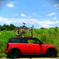
 
@Polarfox

9.5/10 Love it! I love the color, and I'm not sure how you did the lighting, but it's excellent. My only critique, and it's probably just personal taste, but I think a bit different cropping or positioning could be found for a more flattering angle of the car.

Unedited, click for full res.


City of Arts and Sciences - Night_1
by 951 Imaging, on Flickr
 
@bikerbob951 7/10. I like the way you put it side by side with the normal car, but I think it would better if the white Scirocco isn't cropped.


GT1.jpg
 
8/10
I'm not much of a critic, but I really like the feeling of speed in your photo, combined with the clarity of focus on the center car and the smoke from the lead car; it lends a real sense of excitement and danger involved with these extreme machines.

Trial Mountain Circuit_9.jpg
 
@PHO3NIX_F1RE
6/10
The high contrast causes a lack of details on the car, and to me it seems a but blurry on places it shoudn't be.
Also the composition isnt of the best work either.

 
@ Polarfox 10/10

Great sense of speed, plus... Fire is always a Plus

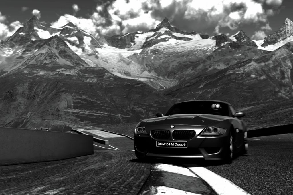
MatterhornRotenboden.jpg
 
Matterhorn Dristelen _3.jpg
7/10
I like the Ansel Adams B/W look, but you might think of using a pan mode 2 to get a feeling of speed.
 
@Safoo
9/10
I like it, but I think it would be perfect if the shot shifted to the right more. I feel that there isn't enough car in the photo.
image.jpg
 
7/10
I like the striking colours in the surroundings, and the fact that the white car seems less well eh... white.

Fuji Speedway GT_1 by Chrisuu, on Flickr​

 
9/10, I love the angle and the subject matter
 
7/10, This picture is really good, great sense of speed, not a bad angle the only issue that I personally found with this image is the cross processing filter although at first the filters seem great the colours become strange and distorted. Apart from this it's great.
Goodwood Hillclimb_30.jpg
 
Back