
If it weren't for the watermarks I'd say a few of those could be real. Keep it up 👍
What photoshop are you using?


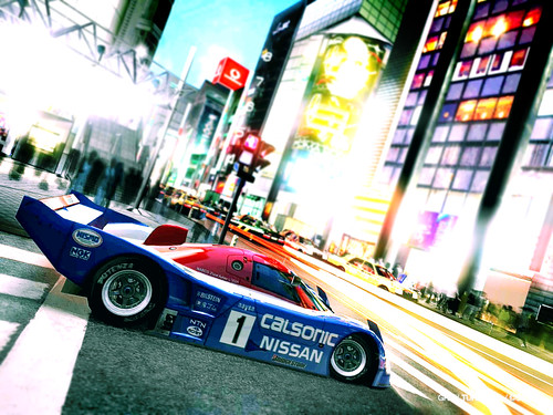
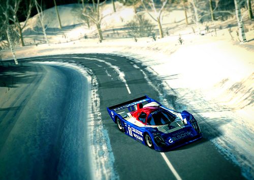
Awesome quality shots you have here. The angles and the vividness of these pics are marvelous. Some of the shots IMO the blur is exagerated but i dont realy mind it. And you may want to crop the watermark or use the clone stamp tool to remove it, it is a bit distracting especially when it's blurred, but other than that I love 'em all. 👍👍


Some of these are really great.
My tip to you is to not exaggerate the craquelure. It is a great addition, nonetheless, when added softly. Just do it in a new layer and then change the opacity. Youll see some texture improvement, while not being so strong.
I know this will sound silly but what exactly is craquelure?, I know a few of the things in photoshop... but not by name... but I really take any help I can get, and this sounds to be very helpfull...
Its what I thought you had used in Photoshop to get that sharp effect, present in (i.e.) this picture: http://img29.imageshack.us/img29/5300/img0045copyv.jpg


")
I have tried to do this, in some of the pictures I'm currently working on... ... I still need to work on that. I know its simple, but for me ... simple can at times be difficultI like the first and last shots best. Have you tried removing the watermark?
I love the presentation, it gives really a professional look to it. Also the pictures itself seem to be great, I love the composition and the angles they are in. Sadly, the link to the full-size doesn't seem to work, or this is the full size?
")
