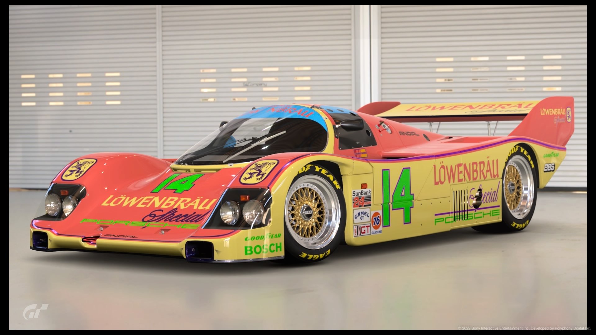
This version of the Lowenbrau livery reminds me of the AG2R cycle team colours but I ended up here by a set of choices/changes rather than starting off trying for that. This LEC had fun written all over it with the theme, but it also reminded me of another LEC, where I tried to make a Prada livery based on a Zoolander-style pronouncement by their head honcho, about how they were making ugly beautiful: “Ugly is attractive, ugly is exciting. Maybe because it is newer,” she said. “The investigation of ugliness is, to me, more interesting than the bourgeois idea of beauty. And why? Because ugly is human.”

I’ve seen little evidence of this in practice, but at the time I tried (and failed) to imagine a livery that Prada would design if they actually followed this brief rather than the rather chic restraint they’re associated with. Let’s try again.
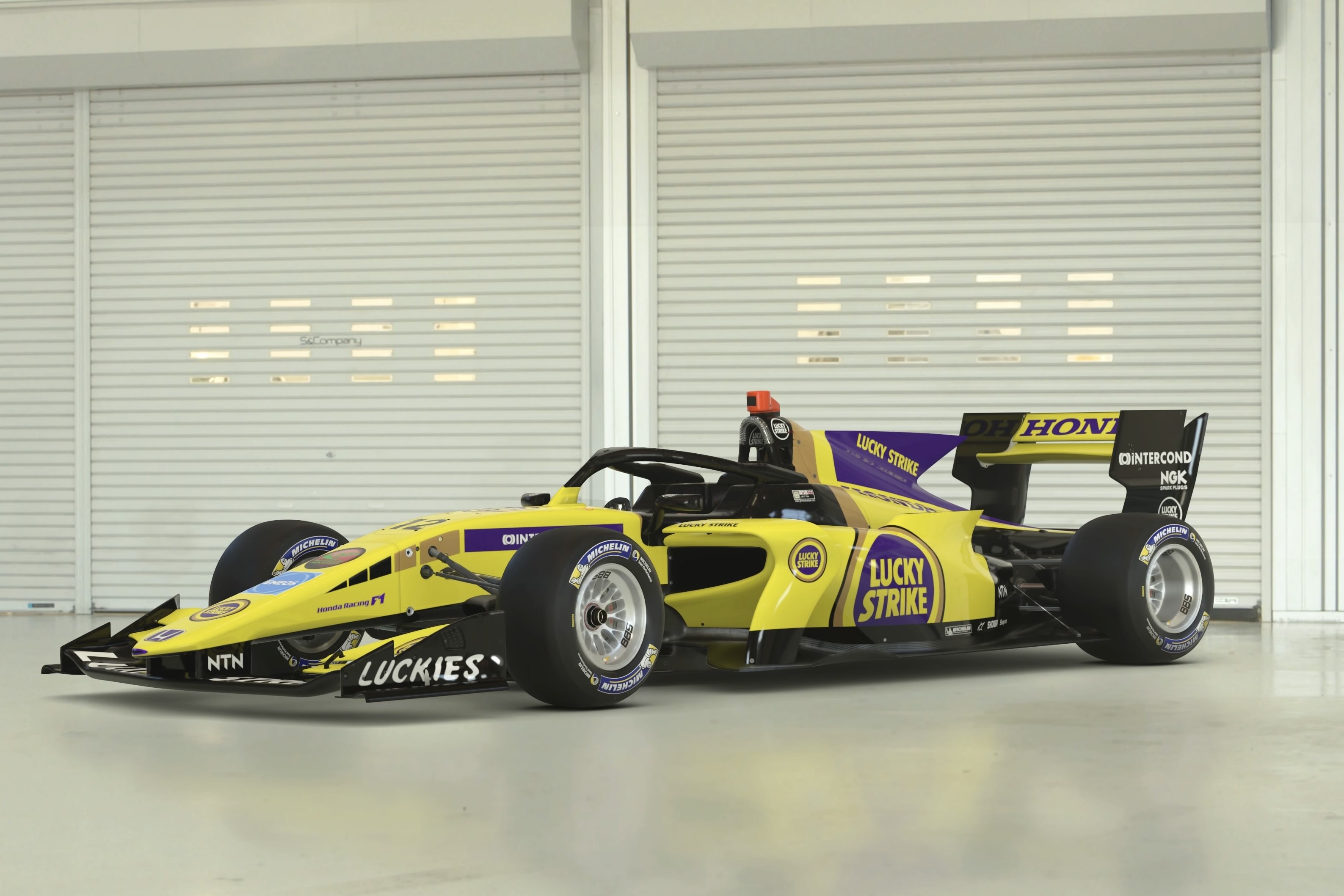
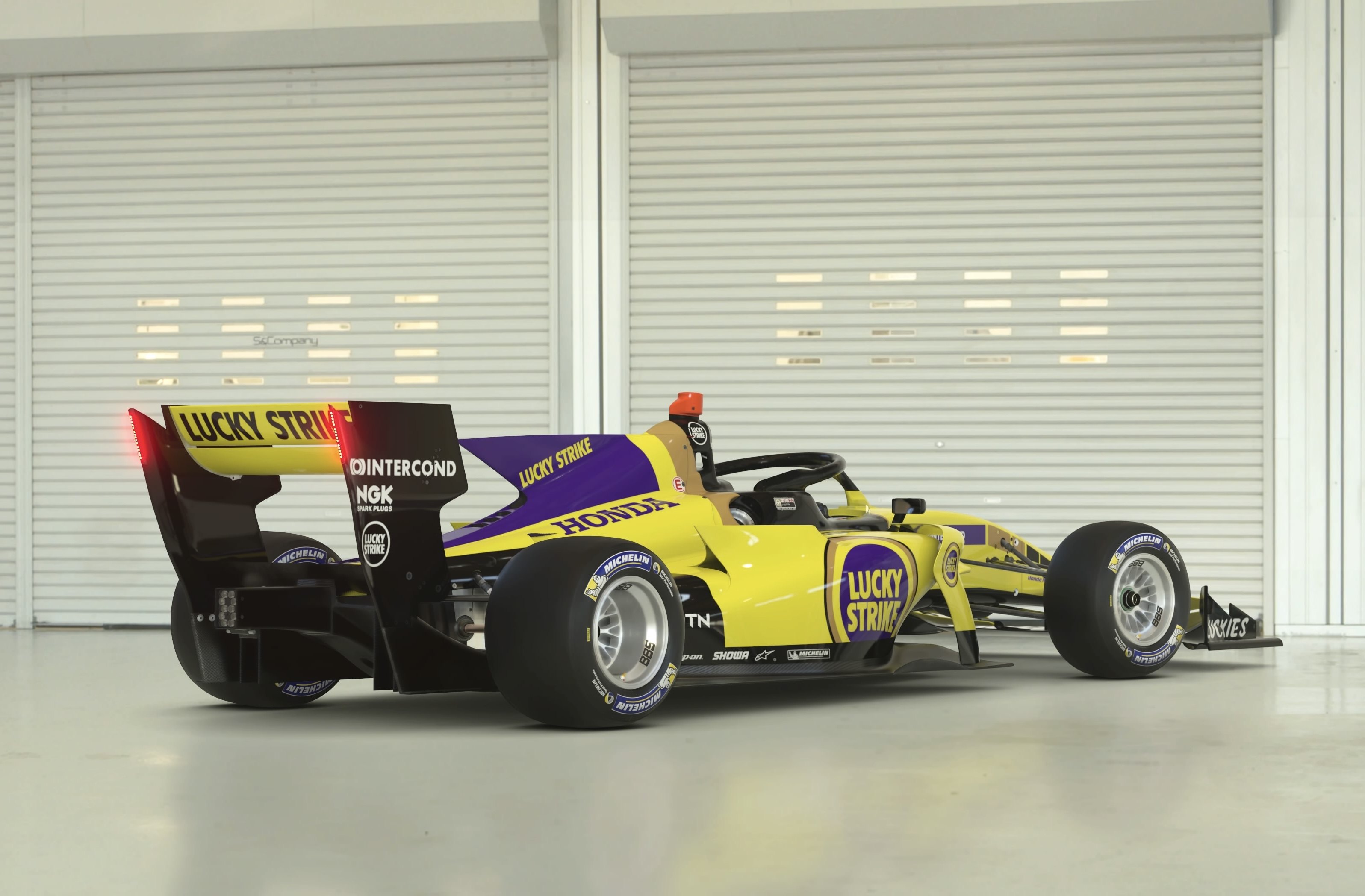
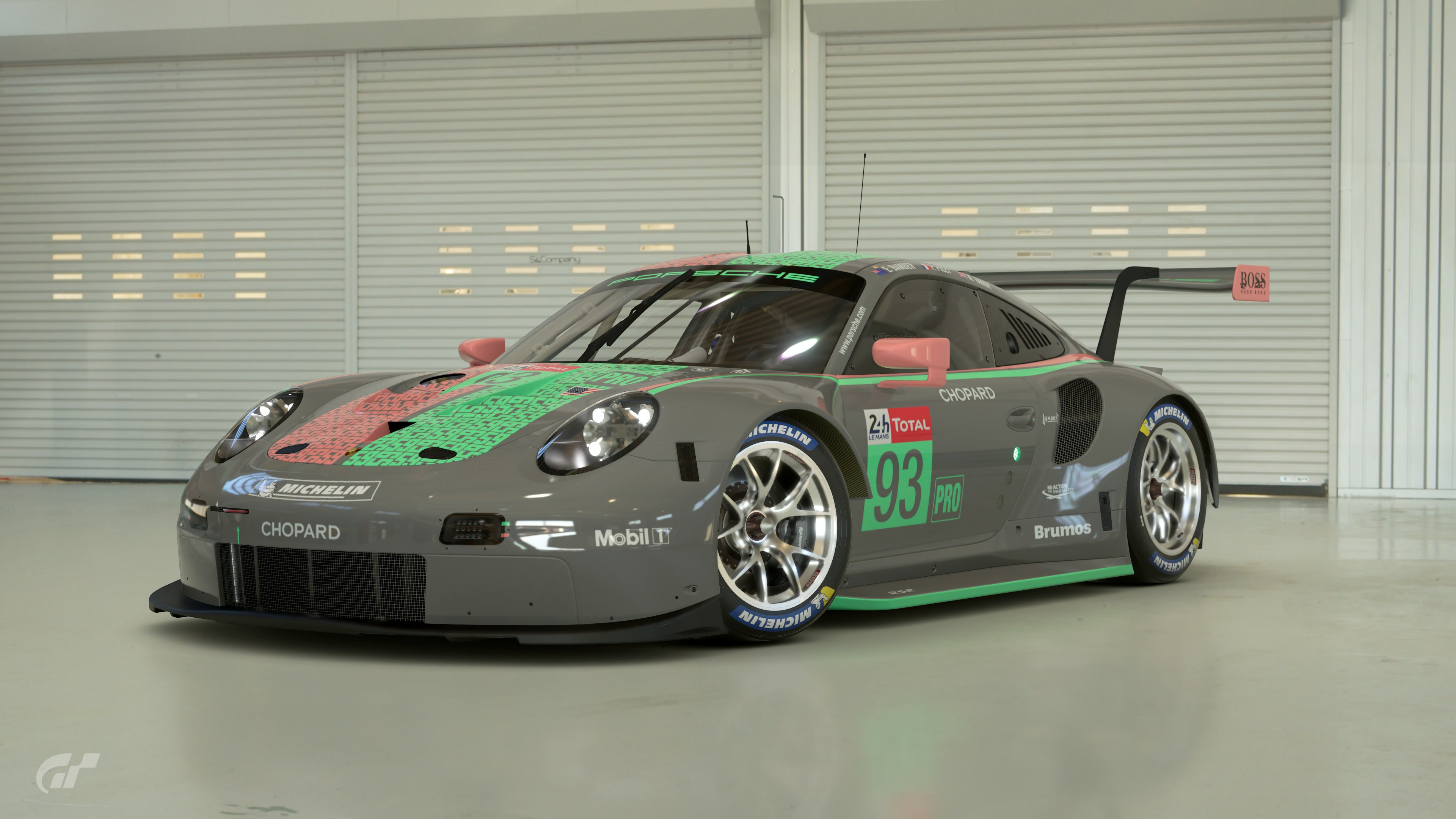
First attempts at this LEC were less than encouraging:
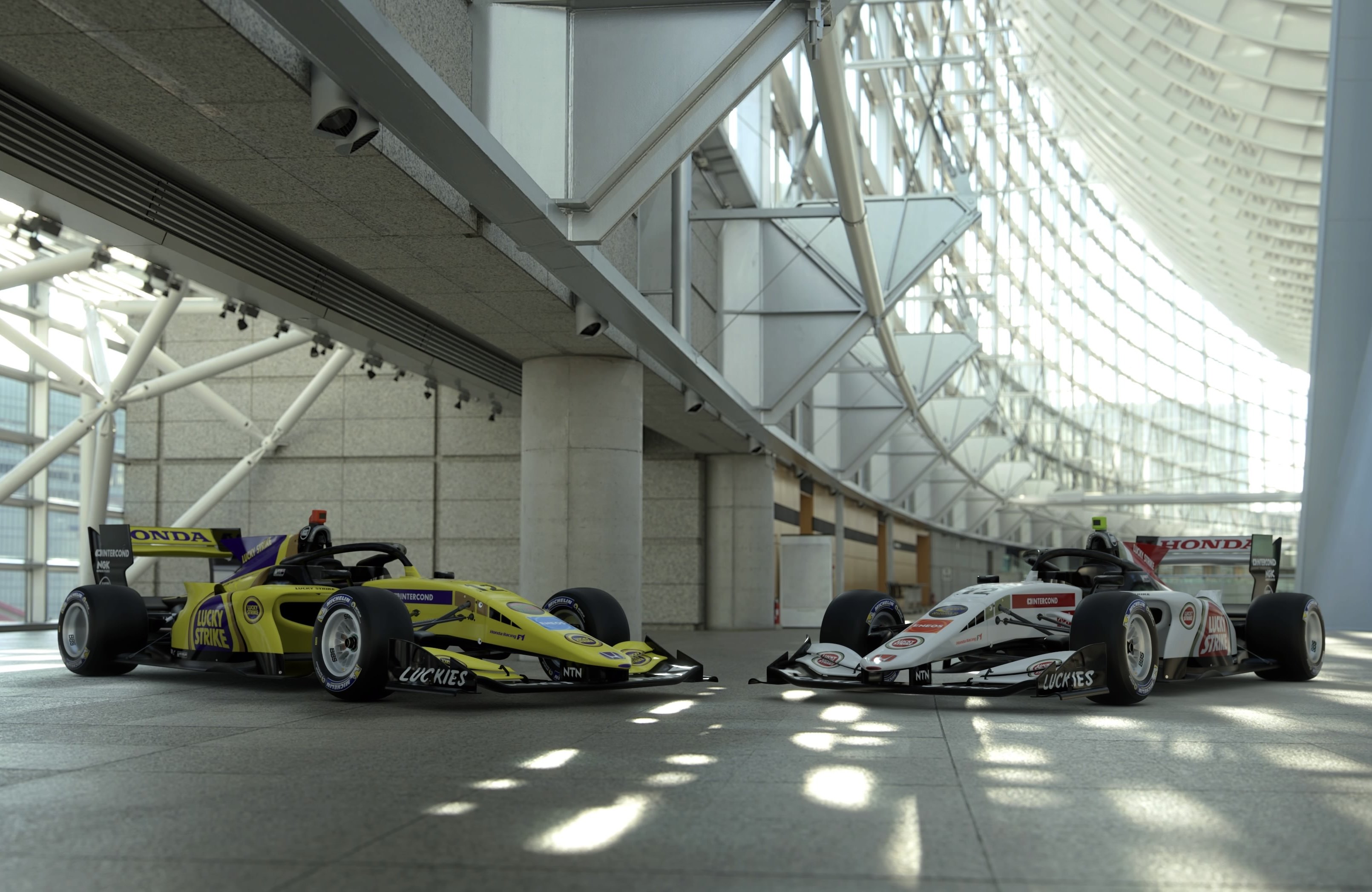
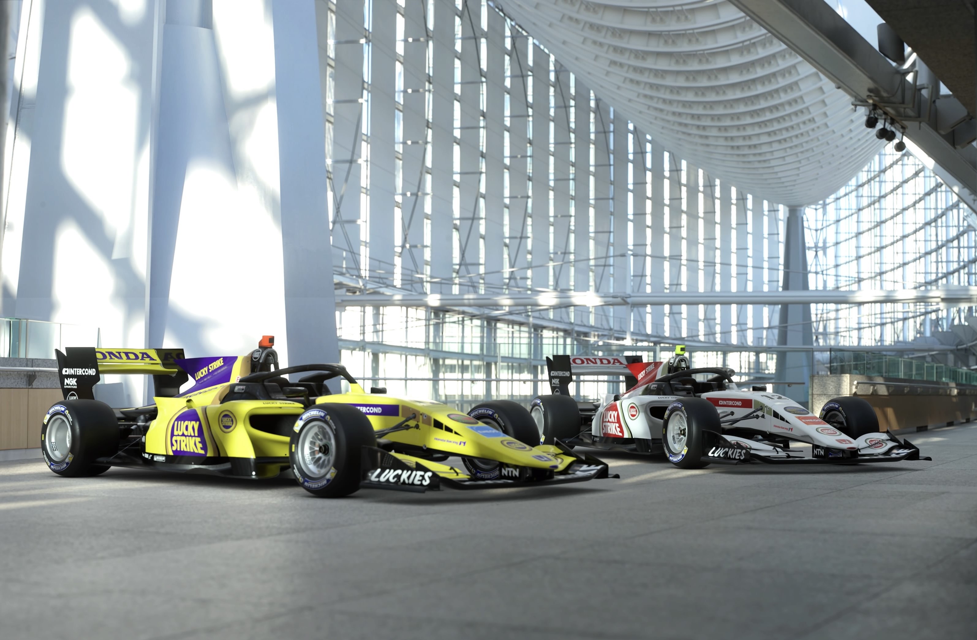
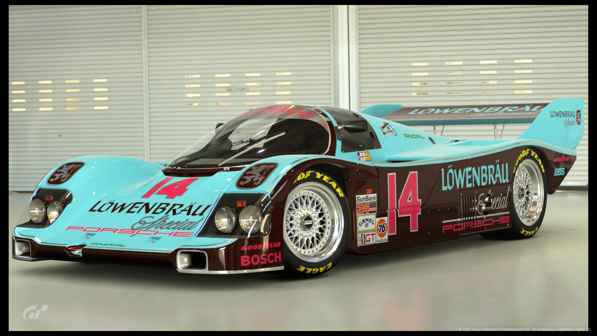
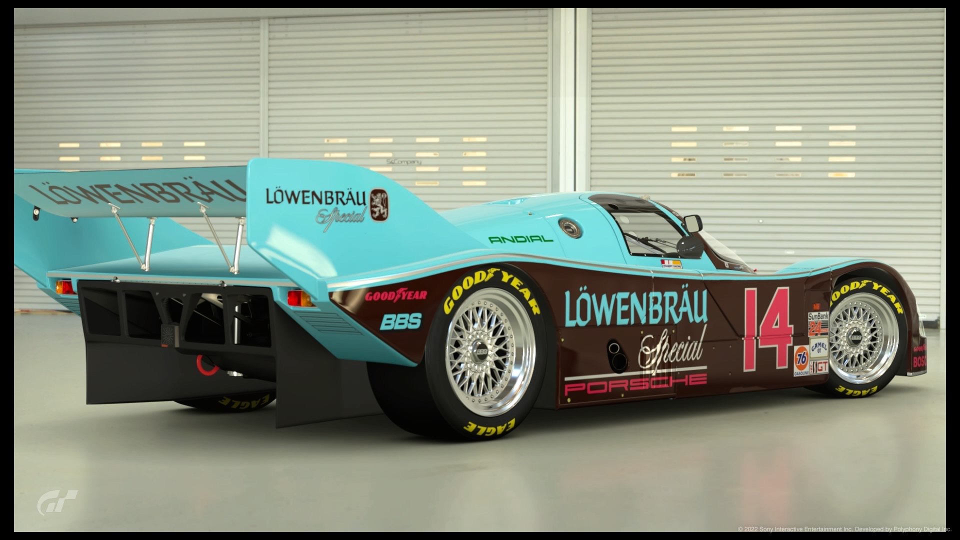
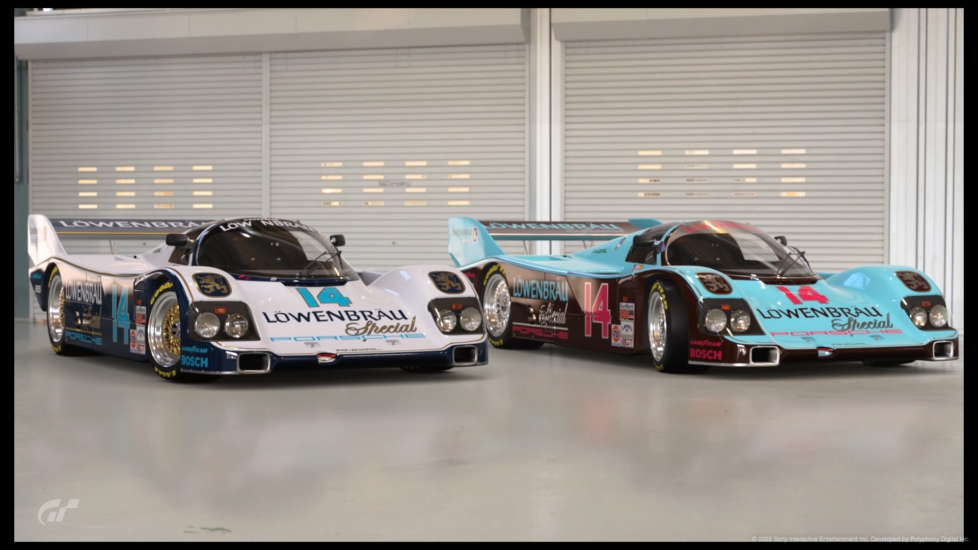
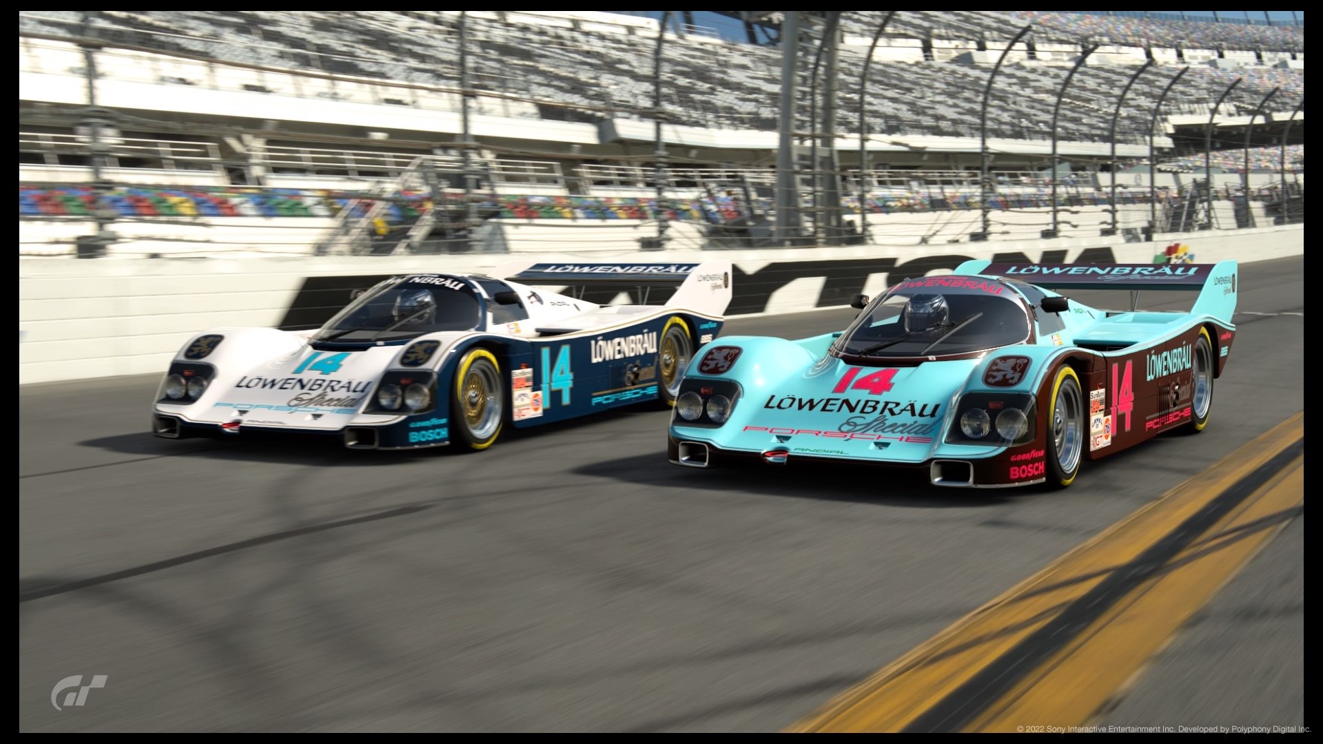
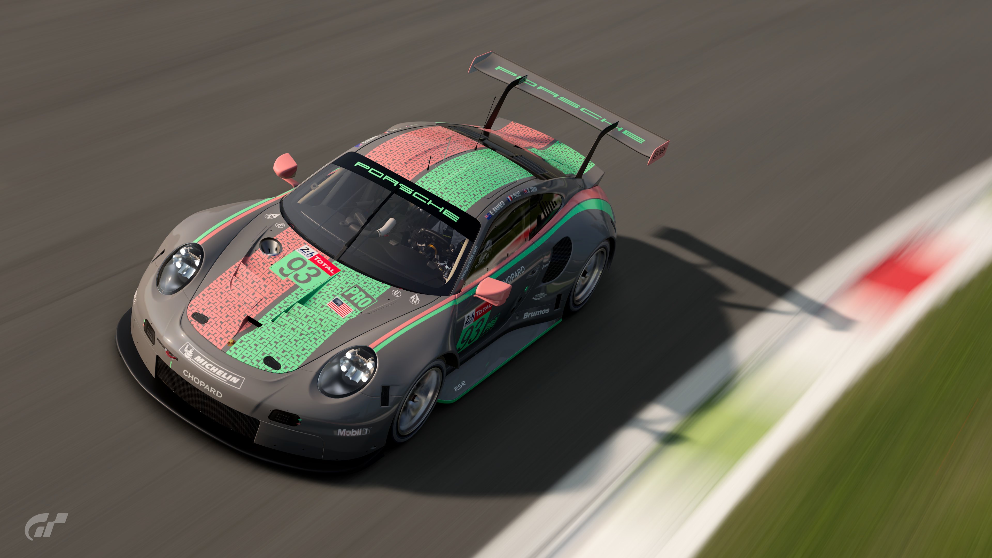
The choices then became how do I improve this? Purple went silver, because it had to be distinct from the other colours and shine. I really wanted blue but couldn’t get a metallic blue shiny enough, another challenge to come back to.
The primary colours had to contrast more, went burgundy/chocolate on the sides to move it to the red end of the spectrum, so the other main colour had to be light and I chose blue, numbers and sponsors another shade of red. Overall the tonal balance is close to the original, which makes it less interesting but more recognisable.
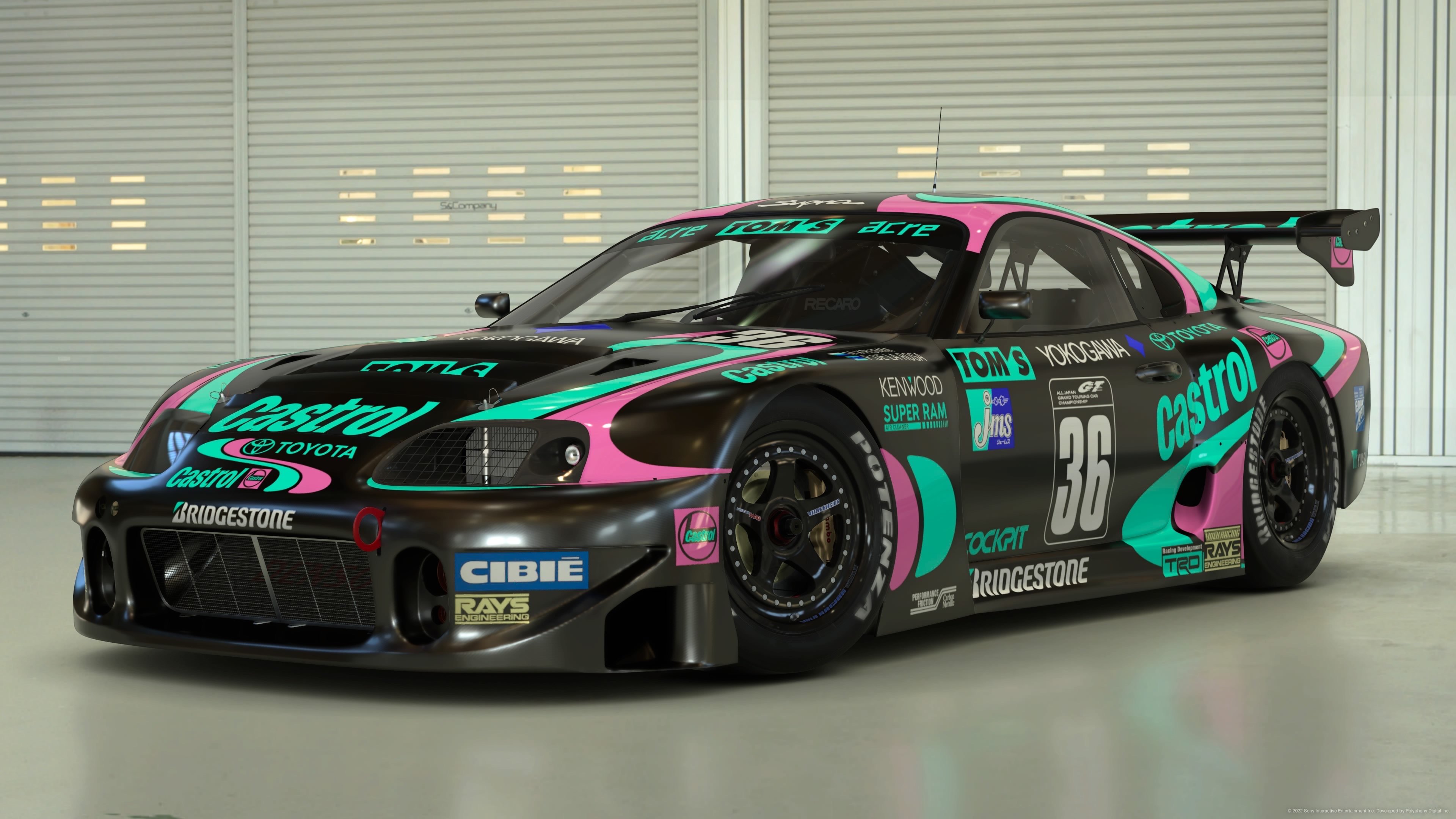
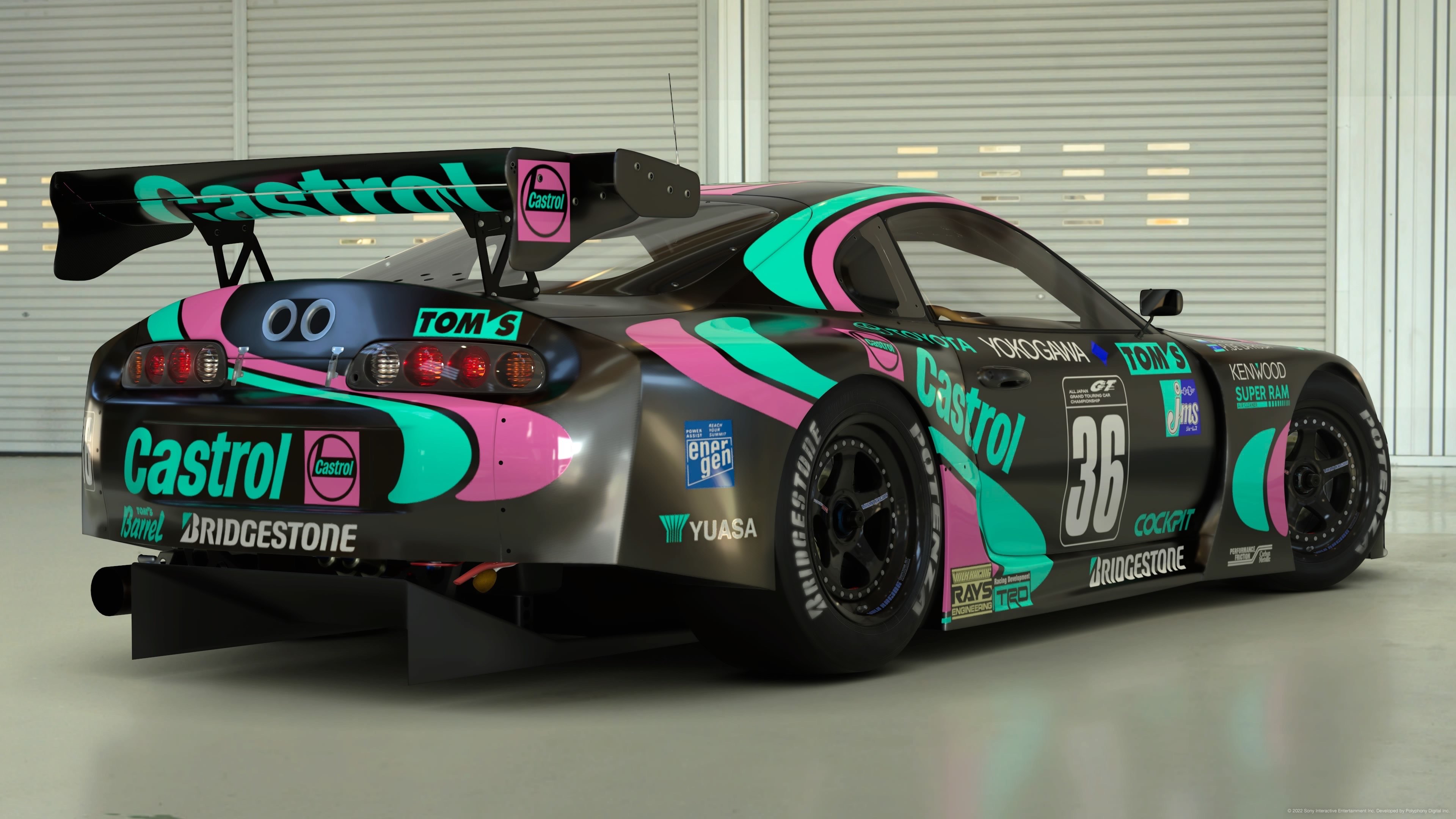
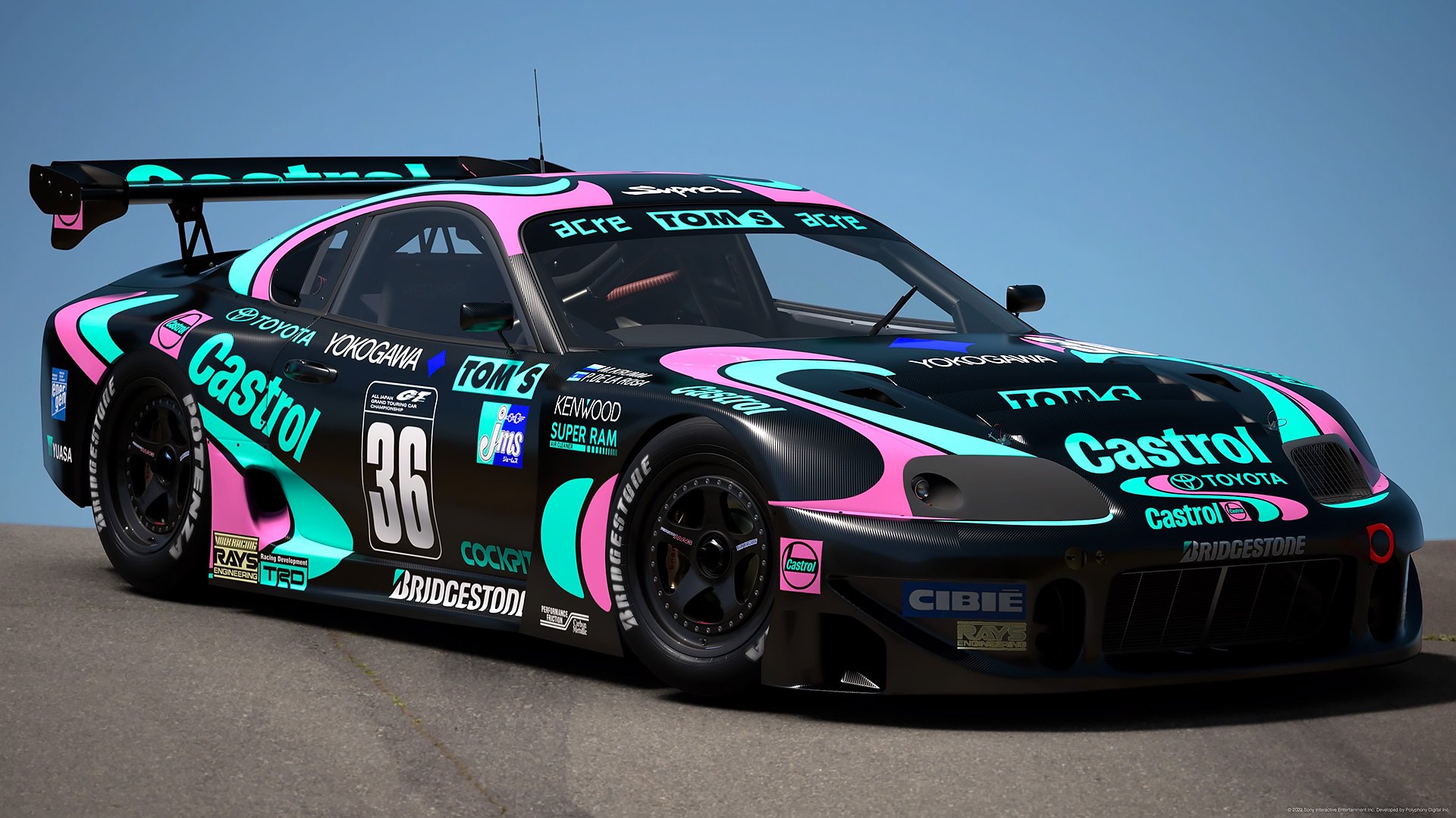
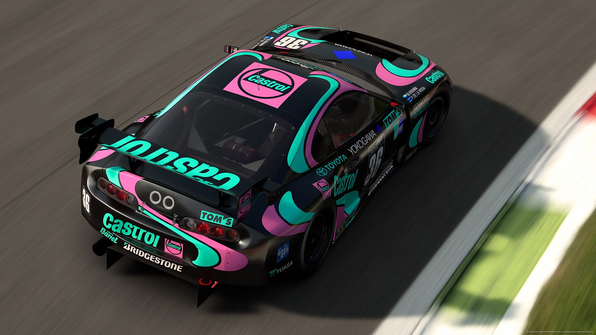
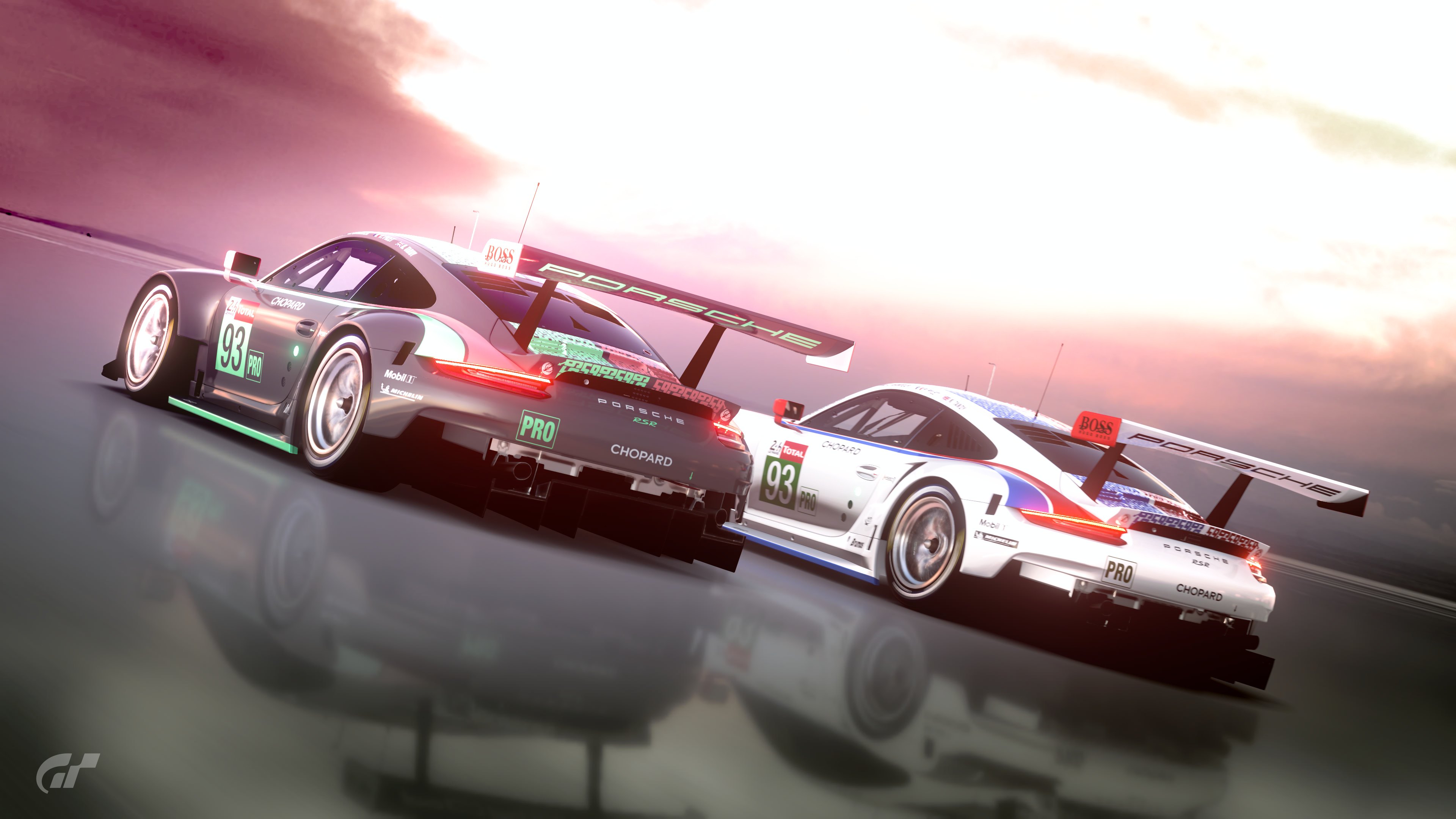
So, crime or misdemeanour? You be the judge
")

")