The "Rate My Photo" thread! **Read the OP Before You Post**

  • Thread starter MSD Drifter
  • 2,388 comments
  • 164,752 views
122
MSD_Drifter
O9K Seaking
This thread is for all the GT5 photographers out there who want feedback/ratings for their photos. Hopefully this thread will be a constructive one.


Here are a few simple rules to follow:

Bold=Very Important

**If you don't rate the pictures before your post, Your photos are mostly not gonna be rated**

5 Photos maximum per post ONLY!!

Please re-size your photos to a reasonable size (about 800 pixels wide)

* If you're posting photos, please specify what you want to be critiqued. Composition? Overall image? Lighting?


o The aim of this thread is to help you, but we need to know what you want feedback on!


* If you're posting after someone requesting comments, please rate their photos in your post.


o Please try to keep comments constructive and true to the requests of the photographer. If they asked for something specific, try to answer their questions if you can :) This should have everyone covered, so there isn't a build-up of people asking for comments and not getting a reply


Here's a quick check list of what makes up good constructive criticism.

1. Appropriate rating.

2. What you like about the photo.

3. What you don't like about the photo and why.

4. What you suggest changing and why.

The why part is the most important part. If you don't explain your suggestions to the person asking for criticism, they might not understand what you mean. By giving a brief explanation, it enables people to apply this newfound knowledge to other photos :)


Here's an example.

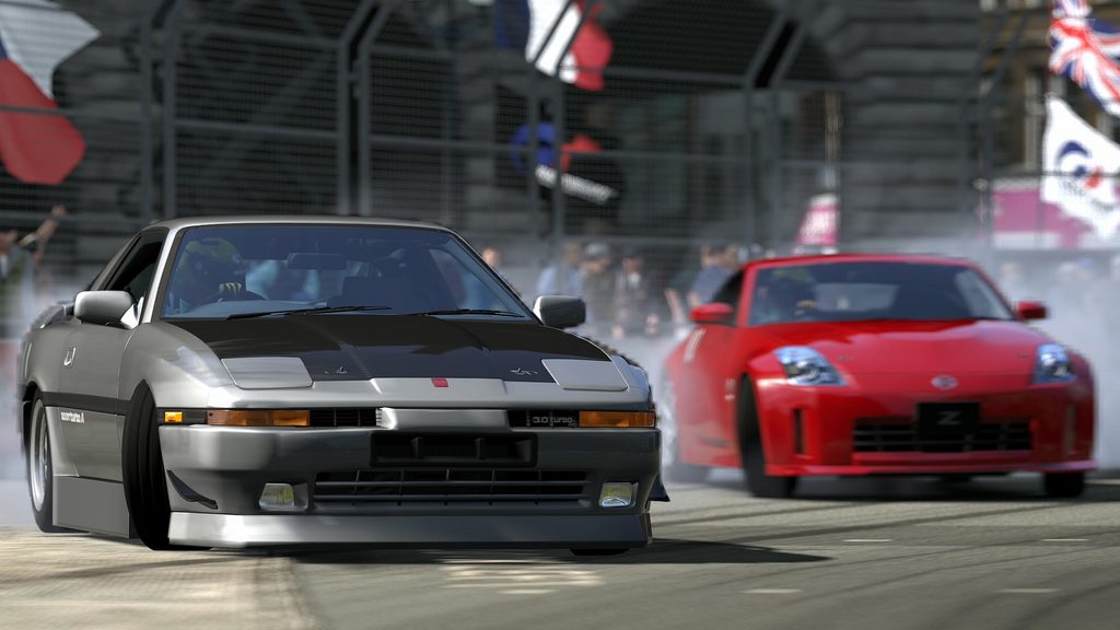
Photo is by GTP user Chocobos:
5225426788_6352940bf7_b.jpg


7/10
I gave this shot 7/10 because the focal point is good, the shutter speed is good, but I think the shot could of been taken form a better angle, where the Supra and the 350Z are about the same distance from the camera, and making the shot more exciting.


Another thing about rating pictures, rate the picture not the car or the track in the picture.
 
Last edited:
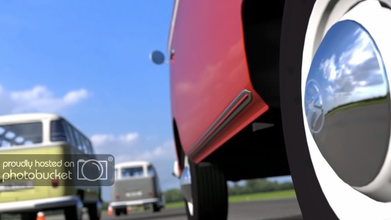
8/10 I like the concept and the positioning, but I think I would've focused more on the body(of the orange bus) than the hub or used the second panning mode.

Still a good pic though.

I have to say i'm not too sure on the different panning modes. I haven't played with them much.
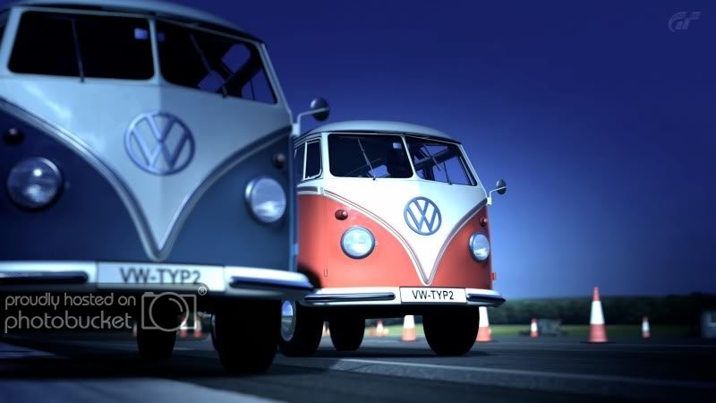
However, same race, different angle:
TheTopGearTestTrack_1.jpg

I prefer the first one to be honest...
 
I have to say i'm not too sure on the different panning modes. I haven't played with them much.
However, same race, different angle:
TheTopGearTestTrack_1.jpg

I prefer the first one to be honest...

edit: didnt see the above post. I think the cool filter is misplaced on the Kombi buses. I might have cut off about half the blue bus and brought the red bus into the scene more. Sort of looking past it at the red bus.

Much like you did in the first picture - looking past the chrome hubcap to the scene.

*****

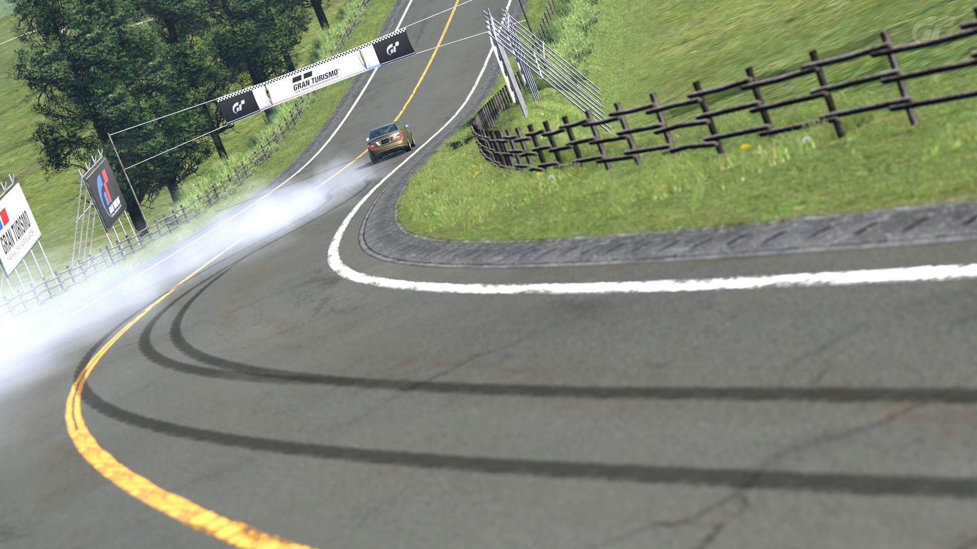
I'll toss one in the mix. Trying to "tell a story" with 1 image. We see who did what where - we just never get to see them do it. A little different but why not :)

mtasotarmac21.jpg
 
Last edited:
I have to say i'm not too sure on the different panning modes. I haven't played with them much.
However, same race, different angle:
TheTopGearTestTrack_1.jpg

I prefer the first one to be honest...

I give it a 7. I like it but I can't see the bus in focus because there's another one in front of it! I'd either focus on the one at the left or take it from a different angle.

Here's mine:

5270145638_4428d20599_b.jpg
 
Last edited:
I have to say i'm not too sure on the different panning modes. I haven't played with them much.
However, same race, different angle:

Dude, play around with them, they're awesome! Mode two is perfect when you want a clear/focused shot of something moving while maintaining the motion blur on the background.(I hope that made sense.)
 
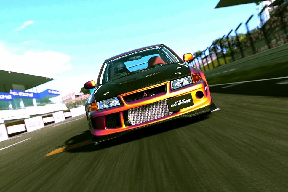
I'll rate you 7.5, exciting shot but a little over exposed and slight loss in clarity.

It's a great shot though full of excitement!

I'd have to argue this... only because if he were to bring the f-stop down any, the car itself would become lost.. darker colours would be crushed. (You might lose detail in the carbon fiber) If this is all to accommodate the white barriers and clouds in the background, then why do you think they're out of the focal range? I think the shot is great! Good focal point, the lighting/exposure is appropriate and the dutch tilt on it also adds character. Yes, the white's may be hot, but we're not looking at it on a waveform monitor. :sly:

I'd bump this to at least at 8 - 8.5.
 
I hope my constructive criticisms below are taken in the spirit in which they are offered! :cheers:

I guess ill crank this joint up :)

2hn3wo8.jpg

If I were grading this, I'd put it a solid B. I like the sense of motion; the feeling that the car is jumping out of the screen towards me; the intense orange of the car, and the angled horizon line. What detracts from it is the over-exposed nature of the shot - especially toward the left side. The human eye is drawn towards what is brightest and sharpest in a photo - and the bright white of the clouds and stands on that side of the photo draw the viewer away from the subject. The color of the sky is a bit much, too. I'd crop the image much tighter - here's my quick take on it.


I had a bit of a Samba Spree lately, but here's my first attempt
TheTopGearTestTrack.jpg

I'd have to put this one at about a B-. I love the simple colors and the very unique angle - the reflection of the sky in the hubcap is great!. However, it appears that your focus point was just in front of the rear wheel, leaving that hubcap soft and out-of-focus. As a result, the viewer isn't certain what the actual focus/subject of the image is. I'd have used a smaller aperture (which, oddly enough, means a larger aperture number) to get more depth of field.

I have to say i'm not too sure on the different panning modes. I haven't played with them much.
However, same race, different angle:
TheTopGearTestTrack_1.jpg

I prefer the first one to be honest...

Another B-, maybe C+. You used depth-of-field and the cool filter to bring the viewers' attention to the subject; the only problem is the subject is rather uninteresting from this particular angle - and, as Dravonic said, the subject of the photo is mostly obscured. Also, the eye tends to be drawn towards the cones - particularly the one halfway between the subject bus and the right edge of the frame. Recomposing the shot from a different angle - or maybe just a different crop - would help a bit.

I'll toss one in the mix. Trying to "tell a story" with 1 image. We see who did what where - we just never get to see them do it. A little different but why not :)

mtasotarmac21.jpg

Interesting idea, but still around a B-, I think. It's not technically flawed (the subject is in focus, you used DoF nicely), and I like the concept - it's difficult to 'tell a story' in this medium. However, the subject is so very distant from the camera. I think I would have used a longer focal length to compress the distance a bit. I can't retroactively do that, but I can crop it tighter (and do a quick contrast adjustment). This doesn't help too much - I think the answer really would have been a longer focal length.


Here's mine:

5270145638_4428d20599_b.jpg

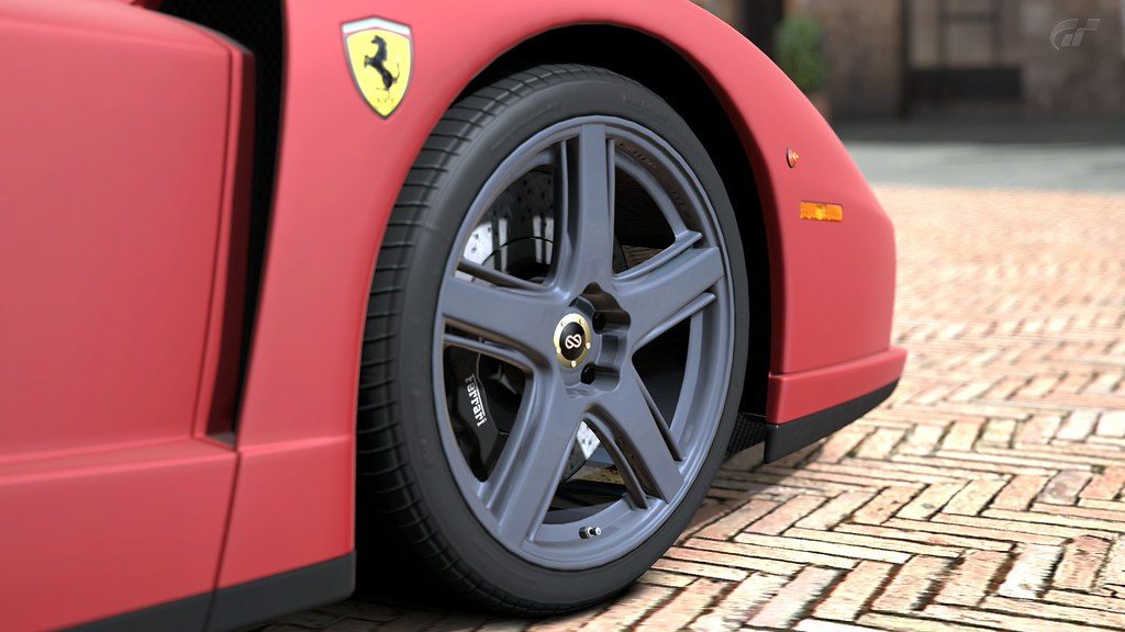
We've seen a lot of detail shots on the forums, and this doesn't really separate itself from the others. B-, I'd say. It's technically acceptable; focus is good, you used a shallow DoF nicely, and exposure is good. But the paint on the car looks extraordinarily flat, which tells me you probably didn't find the best photo travel location to take this shot. Also, the wheel is just straight - there's a reason you can turn the wheels in Photo Travel mode, and it's to create a sense of energy/dynamism. Sadly, that energy is missing here. Try shooting this at Kyoto at night, on the cobbles; turn the wheel so more of it faces the viewer. :)
 
Last edited:
I hope my constructive criticisms below are taken in the spirit in which they are offered! :cheers:


Interesting idea, but still around a B-, I think. It's not technically flawed (the subject is in focus, you used DoF nicely), and I like the concept - it's difficult to 'tell a story' in this medium. However, the subject is so very distant from the camera. I think I would have used a longer focal length to compress the distance a bit. I can't retroactively do that, but I can crop it tighter (and do a quick contrast adjustment). This doesn't help too much - I think the answer really would have been a longer focal length.


Thanks - criticisms taken as valued. I fell for the old "try get too much in" - I was thinking about a tighter view and longer focal lenght, but ended up trying to get too much of the tyre mark in - I was trying to use the S curveof the tyre mark to draw the viewer to the smoke whisps - but realised it left the car a distant spec. I just didnt want to lose the "motion" of the smoke.

Here is a "During the deed" version, but just not as dramatic as the first one though.

mtasotarmac19.jpg
 
Thanks - criticisms taken as valued. I fell for the old "try get too much in" - I was thinking about a tighter view and longer focal lenght, but ended up trying to get too much of the tyre mark in - I was trying to use the S curveof the tyre mark to draw the viewer to the smoke whisps - but realised it left the car a distant spec. I just didnt want to lose the "motion" of the smoke.

Here is a "During the deed" version, but just not as dramatic as the first one though.

Yeah, I like using S-lines, too - natural way to pull viewers in. I actually disagree with your assessment of the 'during the deed' version - it's more dramatic than the first shot. The car is still somewhat sideways, it's clearer to the viewer that the car is the subject, and you're tight enough to the subject that there's some background blur, lending a sense of motion. By the way, I like the dutch angle you used in both shots.
 
First shot at criticism, dont be too hard

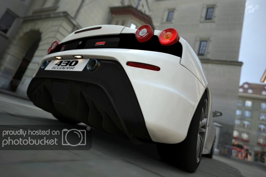
(White Ferrari 430 Scuderia - photo removed from quote to save space.)

Similar to the other detail shot (Dravonic's Ferrari, above), I'd give this a B. It's a technically-sound image - good focus, reasonable use of DoF, and a decent exposure - and, getting as low as you did, you used a very interesting perspective (we can even see the license plate lights!). Even with all that, there's still a 'flat' quality to the light in this image. I think it's just a result of where the light is coming from on this one - turning the car (and the camera) so that more light is playing on the back of the beautiful Ferrari might make the image 'pop' a little more.

Hope that wasn't too hard! :nervous:
 
here is my first.... all comments will be taken as constructive criticism so fire away :)

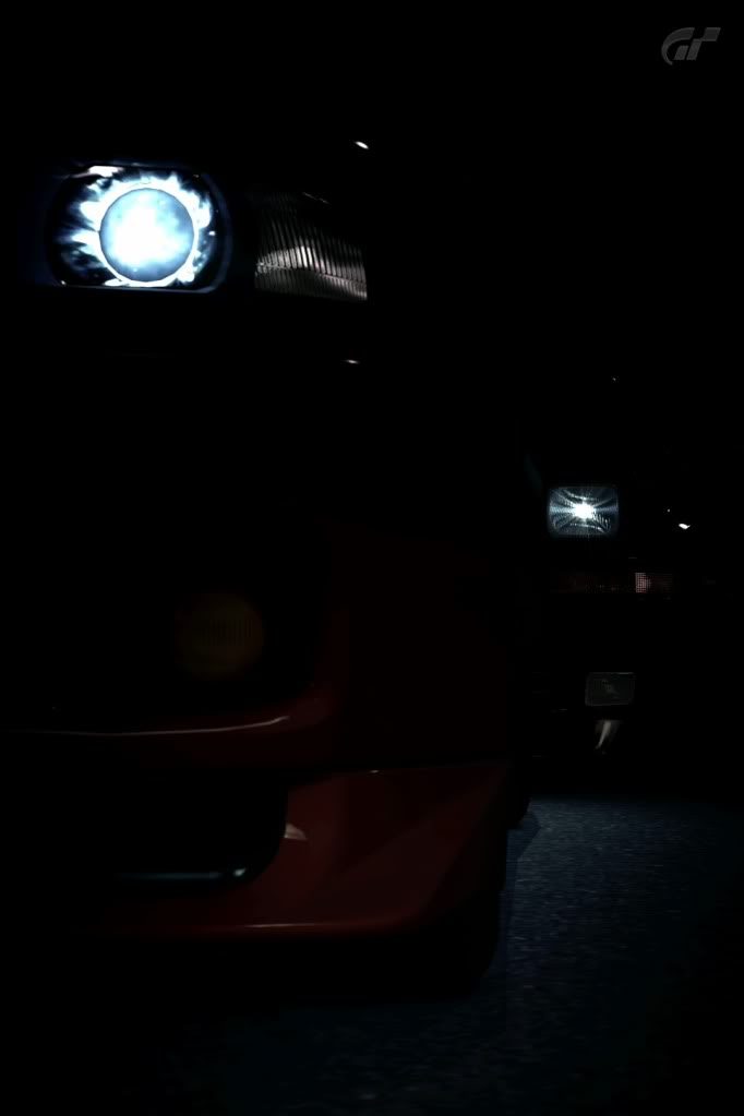
This is an interesting abstract; I got a better feeling for context (not to mention what the cars actually are) by looking in your gallery. I'm not really sure how I'd grade this image, but I can tell you what I like: the subtle shape, and hint of color, in the front of the leading car; the use of very dark shadow to create a sense of mystery; the creative use of a vertical framing (which we don't see enough of in my opinion). What I don't like: this is just personal taste, but it's almost too dark. As a pure abstract, that works great - if that's what you're going for. I think this image would work well as part of a series - but on it's own, it struggles a bit.
 
Last edited:
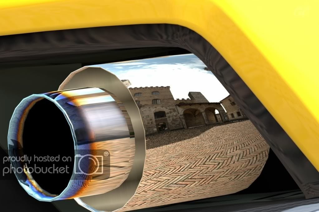
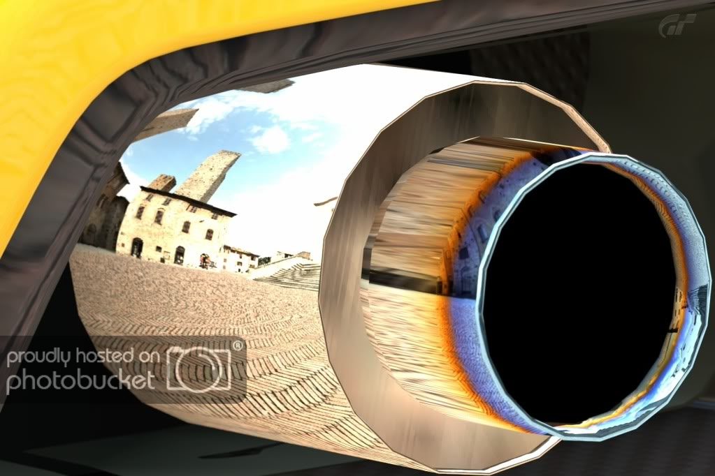
Here are my detail shots:

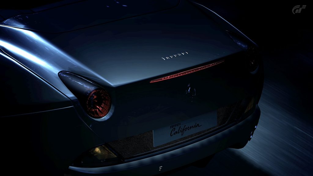
These are tough to rate because once you get this close to a subject in-game, it becomes clear that it's not real. What's good? The careful composition of the reflected architecture and the brilliant yellow framing the images (great use of color!). What's not so good? The second shot is overexposed and both shots are cropped so tightly that the bottom edge of the exhaust is cut off (or nearly cut off). While those are fair criticisms, my biggest problem with these is something that you, as the photographer, can't do much about - the fact that, at this range, you can actually see the polygons that make up the thought-it-was-a-circle exhaust. That fact just sorta takes me out of the image and reminds me that it's just a game - but, like I said, that's not your fault!
 
Need some feedback on this:

5272920000_36c0ce69ba_b.jpg


and this:

5272296421_9f2b6caff6_b.jpg


All done on Photoshop CS5.

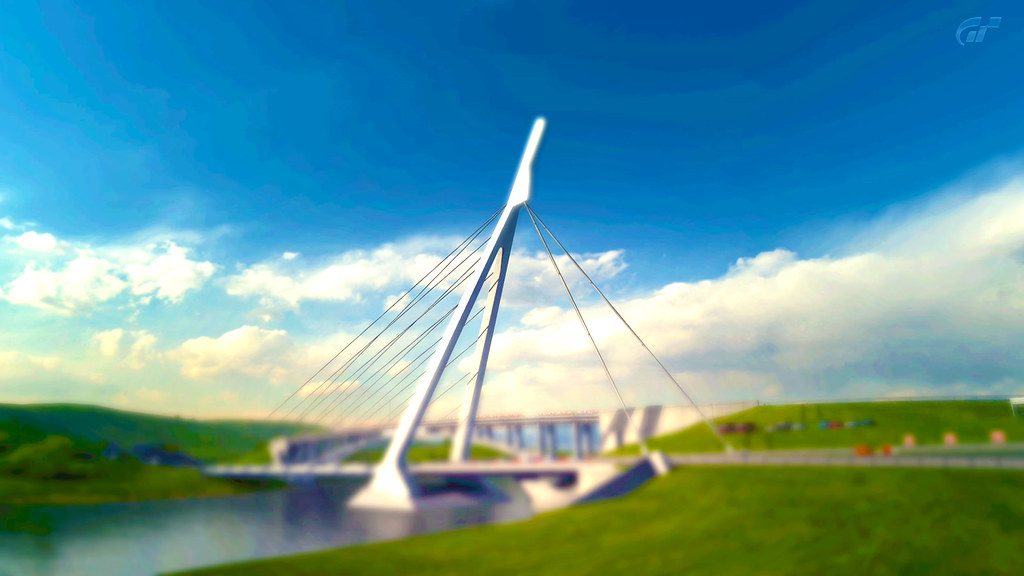
The 1st shot, is an interesting use of the miniature filter, but I like the colors. 7.5/10

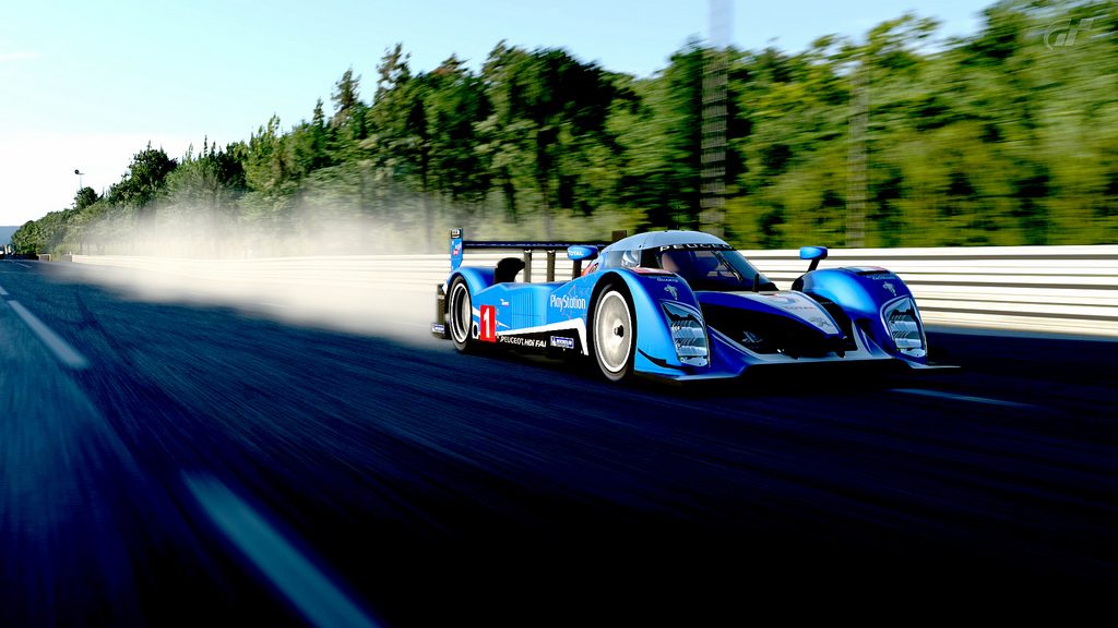
The 2nd kind of feels like the car is leaving the shot, maybe a slightly tighter crop ( although i know you want to show the car's trail.) But it has a good feel to it and sense of speed. 8/10

Here's my first critique(able) shot. Be rough! haha

Eiger Nordwand K Trail by carlton750's GT5 shots, on Flickr

Thanks. Glad you liked them. 👍

Yours isn't photoshopped like my one right?
 
:drool:

Absolutely love it. 9/10. I'd just make it a little bit brighter and point the camera a little bit more to the left.

Here's mine:

mp412c.png

7/10
To me it doesn't look right. I had to turn my head to appreciate it. I would perhaps reverse the direction of the car.
 
Back