- 77

- Philippines
Welcome to my gallery!
So, I've finally figured this thing out.
Most, if not all, of the photos I'll be posting here are edited; some will be more so than the others. if I feel that a particular shot is already a good one as it is, then very minimal editing will be put into it - perhaps adjusting the clarity or vibrance. I think the stock GT6 photo mode pics, although great in their realism, are still, at the end of the day, too dull, sooo....
Me and my Corel Paintshop Pro X6 have become real close friends of late ") . But I'm still learning alot of things, and I am hoping, moving forward, to vastly improve the quality of my edits, and to become at par with some of the very best in this magnificent forum.
. But I'm still learning alot of things, and I am hoping, moving forward, to vastly improve the quality of my edits, and to become at par with some of the very best in this magnificent forum.
. But I'm still learning alot of things, and I am hoping, moving forward, to vastly improve the quality of my edits, and to become at par with some of the very best in this magnificent forum.
Feel free to leave your comments, praises and/or criticisms. Now, on to the show, and enjoy!


Last edited:


")


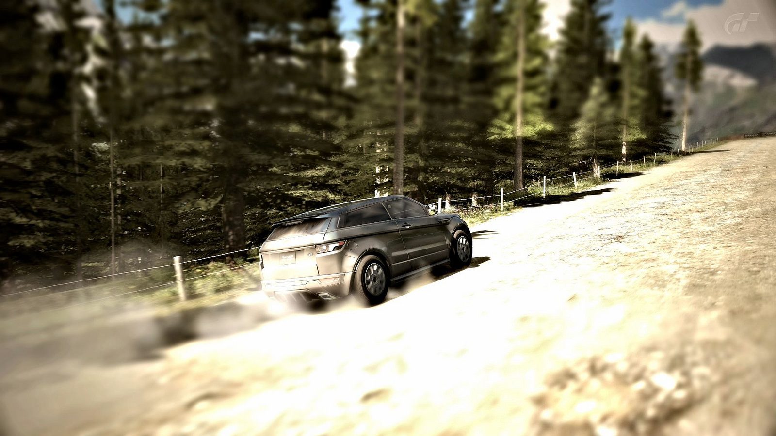
 Winning ways is sideways!
 Centered distraction
 Afterburners?
 Camper