Welcome to GTP16: Dark Mode, Emojis, Reactions, Bookmarks, and So Much More...

  • Thread starter Jordan
  • 356 comments
  • 18,942 views
Secondly the dark mode is pretty nice but it's a bit hard to notice the difference between unread and read topics.
Looking at the difference side-by-side, the un-bolded Dark Mode text seems to be a pixel or two thicker than the un-bolded Light Mode text while bold is pretty much the same in either mode. It's less of a problem on mobile but it does require more than a passing glance.


Edit: I'm also running into an error whenever I try to change my avatar.
 
Last edited:
Did mobile mode use to have the sub forums drop down link as desktop does?

My brain is telling me it did, but it has been known to lie...
 
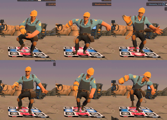
My Reaction to darkmode.
tf2 GIF
 
Getting myself used to the new changes and liking the majority of them so far. There is one query regarding the post editor which I'm surprised has not been addressed yet, and that is the omission of some useful features from the previous version including the media gallery embed (the one with the camera icon) and the ability to insert bullet points/numbered lists without codes. I used the former frequently to insert uploaded images of my custom GT Sport liveries for threads and competitions, so is there an alternative method I can use without having to search for the specific 'Embed Gallery' BB code?
 
Last edited:
@Jordan something I've just noticed is that there's no button for making bullet-point lists in a comment (neither ordered or unordered).

Not a massive deal but wanted to point it out :)

(also, bonus points for implementing CTRL+Enter as the Save command 👍🏻)
 
Last edited:
Still getting used to the setup, but so far I'm enjoying it. The mobile version is very good, and has (for me, me at least) has become much more big-finger friendly, which is nice. Dark mode is a very welcome addition as well.

If I do have any major complaint so far, it would be the loss of the old smilies, particularly the "censored" smiliey, which I made quite frequent use of. While I do welcome the new emojis, the old smileys I felt did a good job of communicating feelings, plus I never saw those particular ones on any other site, so they did make GTP a bit more unique imo. If it's possible/not a major coding PITA, it'd be nice to have both the old smilies and the emojis.

Otherwise, well done on what seems to be a major overhaul @Jordan! Hope it didn't cost you too much sleep. ☺️
 
It's a matter time before @Famine writes so much in indigo and the the dark mode becomes harder to see. 🤣
He should try Magenta
But that would be hard to see in light mode.

Shame Jordan didn't my a hybrid code for famine that switches between indigo for light mode and magenta for dark mode.
 
He should try Magenta
But that would be hard to see in light mode.

Shame Jordan didn't my a hybrid code for famine that switches between indigo for light mode and magenta for dark mode.
He did - it's not magenta, but the indigo brightens up a few points in dark mode.
 
Liking the redesign so far (especially the new post editor), though I personally prefered having my watched threads on a separate page from the main forum view while logged in. Having the Subscribed Threads and Latest Posts sections as collapsible would be nice, though I don't know how much additional configuration that would take.
 
Looks great, Jordan!

What I've noticed so far:

The button to sort by likes in the suggestions forum doesn't seem to work, though manually using the filter to sort by "first post reaction score" does seem to do the trick.

The transparency of my avatar doesn't work as it did before, with it now set against a white background. Or on my profile page, with a gray gradient behind it. This could be intentional, but I did like my circular avatar being circular.
 
All looks great so far, Thank you Jordan for your hard work. 😃👍
 
The Poo is a load of crap...

More seriously, personally I think its potentially open to abuse or misinterpretation when used.

In terms of "bugs" ...
digital art cockroach GIF by Colin Raff


the "Show more" button on "Subscribed Threads" definitely isn't working right as it just takes you to a screen showing the first Subscribed Thread.

"Show more" actually shows less currently 😂

I second the post above suggesting an option to collapse the Subscribed Threads and Latest Posts list. It already feels "user unfriendly" having to scroll down each time I visit this page to get to the forum list.

Minor tweaks though, nothing "game breaking". And I think posts will be more "creative" going forward with all the new functionality 👍

:gtpflag:
 
I open up GT Planet and to my great surprise it is in dark mode to match my phone's setting. I haven't looked at the all oth new features yet but I am loving dark mode. Great job Jordan and to everyone who helped with the update
 
This is going to take some getting used to, much like any major upgrade, but I really like this! Well done, boss. 😁
 
Last edited:
This is going to take some getting used to, much like any major upgrade, but I really like this! Well done, boss. 😁
You've potentially spoiled the winner of the race.

I agree though, I am getting acclimated quite quickly with the new layout.
 
I dig this new look of GTPlanet! All of the newer changes speaks to the evolution of this awesome site and the awesome people who keep this site awesome. Me likey.
 
Right on, the biggest update to GTP to date, I'm guessing? So many new things to dive into. Thanks for the hard work! Now you should sell the framework of your hard work to other message boards ;)

Wait, I'm not on the celebrity list?!?!

Just Kidding No GIF by MJ5


Jerome
 
Wow, that's one behemoth of an update. I'm loving Dark Mode already 😉 Emoji support is a very welcome addition too but I have mixed feelings about the laughing reaction (those familiar with facebook will know why). More often than not it's used in a toxic manner and this definitely applies to the poo reaction as well. Eh, we'll see where this is going very soon.
 

Latest Posts

Back