Williams FW37 launch

prisonermonkeys

Be Fearless
Premium
Messages
33,151
Peru
Hammerhead Garage
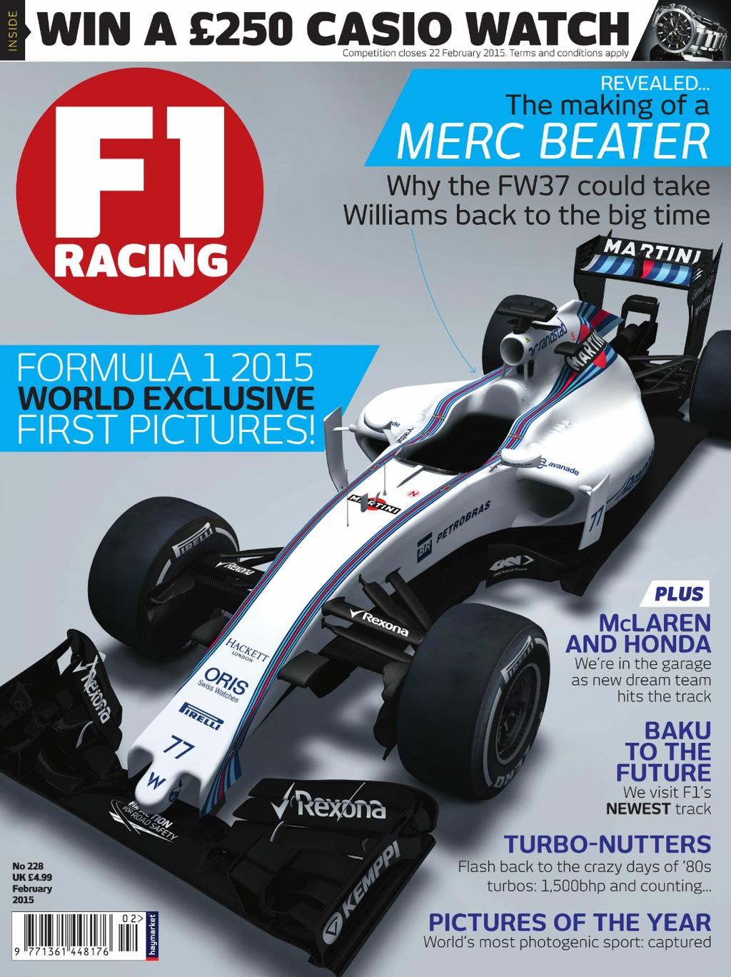
This images has already been posted a few times in the forum, but in keeping with tradition, we usually have a dedicated thread for each car launch. So here it is - Williams have been the first to break cover, with the FW37 gracing the cover of F1 Racing:
williams-fw37-2015-1.jpg
 
Is the Senna tribute the same place as last year.
 
From what we can see so far, I think it looks pretty good.
Good to see what looks like a new sponsor for them too (Rexona). I think they deserve a bit more sponsor cash after thier strong showing last year. I guess we just have to hope they can at least maintain the momentum they gained last year.
 
I really want to believe the hype on that cover, last week I bet €10 each way on Bottas at 28/1 on the only site that pays out for a top 3 finish.
 
To be honest, I'm more interested in the story on Baku than the FW37. The car is pretty much what we were all expecting - an FW36 with a W05 nose. The only surprise is the stub at the front of the car.
 
I thunk you'll find the size of the stripes is proportionate to the amount of money paid by Martini. If it were up to me, I'd make the engine cover red and blue stripes over the sidepods, with the rest of the car being white.
 
Why are they saying this car looks good?, it looks hideous with that small penis on the front :lol:

Also not enough going on on the livery, the Martini stripes need to be much wider and more pronounced.
Williams excelled itself in 2014, with Bottas outpointing Alonso. Once a car starts outperforming, it suddenly looks better!
 
Williams excelled itself in 2014, with Bottas outpointing Alonso. Once a car starts outperforming, it suddenly looks better!

I'm talking purely about looks and looks alone. Even last years car didn't look that great IMO regardless of performance.
 
I thunk you'll find the size of the stripes is proportionate to the amount of money paid by Martini. If it were up to me, I'd make the engine cover red and blue stripes over the sidepods, with the rest of the car being white.

I would have the stripes run full width up the top of the nose and then split down the side pods fanning out with the engine cover and top of the sides white.
 
At least it looks better than last yea—no it doesn't.

At least it looks better than the F14—that's debatable.

At least it still has the awesome Martini livery.

Always a bright side! :dopey: For some reason I quite like the car, a lot more than last year's car in fact. And that's including the stubbed toe on the front.


 
Bigger side pod (slightly) and more front wing elements with smaller pylons...
 
What are those little things near the sidepods?
 
Debatable? The F14 looked like an elephant had sat on its nose and nobody noticed it.

True, however, it didn't have a weird nosecone protruding outward. :lol:
 
Those vertical fins? Teams have been using those for years.
No the things on the vertical fins, they're really tiny connector pieces, I've never noticed them on another car before.
 
No the things on the vertical fins, they're really tiny connector pieces, I've never noticed them on another car before.
They have been used in some form or another ever since the fins were first introduced. They just add a bit of stability to the upright.
 
The Williams looks like it has a giant zit hanging off the front of the nose. :yuck: Other than that, pretty much business as usual everywhere else and awesome Martini livery.
 
New image, showing the FW37 in side profile:

FW37_11.jpg


Definite Mercedes influence in the nose (most teams are expected to follow this trend), plus higher-profile branding for Rexona.
 
So it's had a circumcision....

Still, the livery helps it a lot in my opinion..
 
Compare to FW36 is side profile:

f1-abu-dhabi-gp-2014-valtteri-bottas-williams-fw36.jpg


To be honest, I prefer the longer nose when viewed in profile.
 
They finally have a sponsor on their side pods.

Last time they had that was 2010.
 
It's ugly and isn't going to win any races.
 
Back