Worst Liveries Of All Time

  • Thread starter Thread starter Liquid
  • 1,118 comments
  • 232,401 views
B32I0218-lg.jpg


97-16.jpg


Sometimes a color change make a beautiful livery look wrong, the Aston Martin from this years Daytona 24 is a example of that.
 
Are those... LED numbers? If so, what does it represent compared to the painted number?
 
Are those... LED numbers? If so, what does it represent compared to the painted number?
Class position I believe. I love that livery anyhow.
 
The fellow on top is in 97th position in class then. Ouch.
 
The fellow on top is in 97th position in class then. Ouch.
One side shows the race number, and like the bottom one, the other is showing the class position.
 
Ah, I see. It was confusing me that in the top picture, it was 97 and 97...
 
Wouldn't be the greatest run ever :lol:
 
I actually loled at that. :lol:

Taste is subjective, but I think this is the wrong thread.
 
Generally I don't usually mind the liveries with teeth (probably due my slight bias for Aircraft noseart of same), but this...kinda hangs between worse and best. Its worse because of how big it is, but its best because of how cartoony it is.
 
10414631_769141379774080_3620094637252655460_n.jpg

This ugly car just rolled over about 10 min ago. Thanks Cole Whitt, you ridded us of the eyesore.
 
I actually like it, I don't see whats wrong with it.
 
So it looks a like rolling piece of candy cane. Would you prefer the Vomit comet?

I'd prefer a car with an appealing paint scheme.
 
And looking like a piece of candy isn't appealing? Not what I'd expect from Pinkie Pie Autosport :p
 
Subjective. I actually liked the 18.
 
I like the 18 as well, but my favorite color is green.. so...
 
Jeff Gordon's first livery was horrid.

image.jpg


And it wasn't ever sponsored by skittles.
 
@JMoney689 I call liveries like that "corporate liveries", because of a sponsor influencing the design of the livery.

DuPont's logo had those colors at the time, and they paid a lot of money to have their logo all over the car, hence the livery.
 
hsv
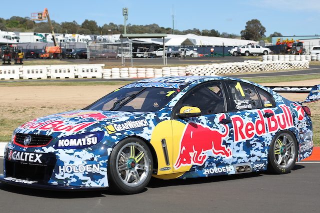
Camo doesn't work on race cars, and the colours are terrible.
:grumpy:
Ryan+Newman+2011+NASCAR+Daytona+Speedweek+klUbKgE5EArl.jpg

That looks good ^

As for a bad scheme...
hi-res-185322530-dale-earnhardt-jr-driver-of-the-mountain-dew-xbox-one_crop_north.jpg

It looks like their logo they ordered was too large so they just slapped it on the side of the car. Euhg.
 
:grumpy:
Ryan+Newman+2011+NASCAR+Daytona+Speedweek+klUbKgE5EArl.jpg

That looks good ^

As for a bad scheme...
hi-res-185322530-dale-earnhardt-jr-driver-of-the-mountain-dew-xbox-one_crop_north.jpg

It looks like their logo they ordered was too large so they just slapped it on the side of the car. Euhg.
Those two actually look really good in my opinion.
 
Back