Worst Liveries Of All Time

  • Thread starter Thread starter Liquid
  • 1,118 comments
  • 232,396 views
Wasn't that the Forza based livery contest winner?
 
All teeth liveries are awesome. I like the gold tooth touch.
 
Most of them are lurid horrid energy drink plastered designs.

1013433_480963625320331_348160550_n1.jpeg


Rockstar-GRC-Beetle-at-Chicago-Auto-Show-2014.jpg.jpg


This is barely acceptable...

Liam_Doran_Citroen_DS3_Rallycross_Supercar-003.jpg

I don't exactly see whats wrong with them (unless you just hate energy drinks period). I don't even understand how Doran's car is "Barely Acceptible" when its the classic Matt Finish with the Green Monster logo (like most cars I've seen sponsored by them).

Also, pretty sure only six cars having energy drink liveries doesn't constitute "most" of the field in GRC.
 
Last edited:
wec-silverstone-2015-51-af-corse-ferrari-f458-italia-gianmaria-bruni-and-toni-vilander-and.jpg
 
The Aston grew on me, granted it's still my least favorite art car.
 
The Aston art car looks horrific in photos and in real life.
 
Radio Le Mans mentioned a 3D film crew were shooting at this year's 24hrs, and it was suggested that that might be the reason for the Aston livery.

It still looks awful though.
 
The Aston doesn't look as bad as it did when they unveiled it to me, but it still looks more like a WW1 warship camouflage than art.
 
The Aston doesn't look as bad as it did when they unveiled it to me, but it still looks more like a WW1 warship camouflage than art.
Dazzle camouflage looks better than that Aston.

 
Dazzle camouflage looks better than that Aston.
True, but it's still somewhat valid comparison, as the livery makes it much harder to see how nice the shape of the car itself is.
 
The Aston looks like a red/blue 3D image which doesn't quite work.
 
hsv
The FK Massimo R32 was horror on wheels.

img_7

Honestly, how do you find these obscure monstrosities?
 
DK
Honestly, how do you find these obscure monstrosities?
I'm just a bit of a historic Japanese motorsport nerd... historic motorsport and obscure race series in general, really.
 
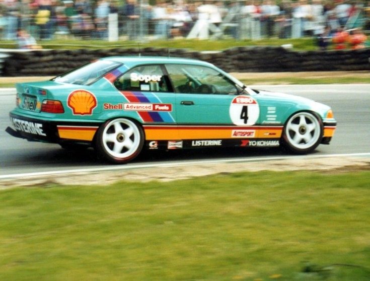
btcc92.jpg


Let's be real. Paisley wallpaper would look better wrapped around this than its current scheme.

 
Change the aqua to red and the livery isn't an eyesore.
 
mortimer-tate-458-livery-rockingham.jpg
 
02.jpg


Usually Mad Croc liveries have always been pretty bad on non-rally/rallycross cars, but this Viper is one of the worst I've seen.
 
Probably not the worst, but for me this Peugeot livery always will be ugly.
peugeot_406-btcc-1996-99_r8.jpg


Oh wow, this is just bad.
MGST03427.JPG

4284704288_1969d8276f.jpg
 
I always thought the BTCC Ultron livery was one of the best Peugoet liveries.
 

I don't exactly see what the problem is here. Its three colors that work together, it goes with the Sponsor and its not exactly slapped together as far as I can tell.
 
Why....?!

image.jpg
 
Not really so much a livery as it was a decal change to the front end and back end. 50th anniversary for the 57 Chevy if I recall, but it does look a tad off when I go back and look at it now.
 
Not really so much a livery as it was a decal change to the front end and back end. 50th anniversary for the 57 Chevy if I recall, but it does look a tad off when I go back and look at it now.
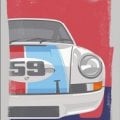
True, I know what you mean. And I think it's the '57 Chevy. But, the decals just don't fit well on a Monte Carlo body. It just doesn't work.
 
Back