- 212
- gtsomething
Update List:
The update title tag will stay up for roughly 24 hrs after every update
v1.0: It's done! キタ━━━━━━(゚∀゚") ━━━━━━!!!!!
━━━━━━!!!!!
v1.1: Reorganized structure and layout + fixed errors in example images and spelling.
v1.2: Added the Editing section
v1.21: Added HDR section
v1.3: Added Focal Length section... ...finally
v1.31: Minor changes in certain sections.
v2.0: Added Composition and Realism sections
v2.01: Changed the original description for rule of thirds + touch up for aperture
v2.1: Edited text overall. Added 2 new images. Updated HDR examples. Fixed dead video link.
Last Updated: October 16th, 2011
Tiny Table of Content
Through the Camera - Basics:
1.0 The Magical GT5 Camera
2.0 Shutter Speed
3.0 Aperture
4.0 Focal Lengths
5.0 EV and AE Lock
6.0 Robotic Arm Panning!
7.0 Miniature Filter
8.0 Focusing!
9.0 Lighting
Behind the Camera - Advanced:
10.0 Composition
11.0 Good Image vs Realistic Image
12.0 Editing - Yes or No?
---12.1 Vignetting
---12.2 High Dynamic Range
X.0 Who am I to talk?
Through the Camera - Basics:
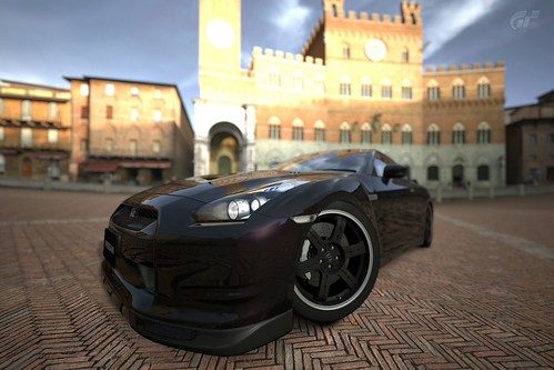
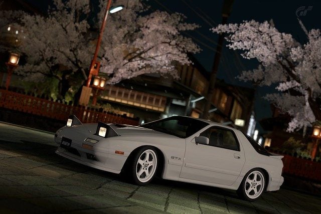
1.0 The Magical GT5 Camera
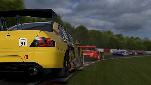
According to Flickr, the camera used in GT5 is called the "Polyphony Digital Inc. Gran Turismo 5". Clearly, this camera is epic, it is a DSLR in the form of a boomerang controller and has a digital screen display thats as big as your TV! It features a shutter speed range of 1 second to 1/8000th seconds, and an aperture range of f/1.0 to f/45 (which is physically unpossible!). What really makes the GT5 camera special is that it has robotic arms that can do panning for you in 3 modes, and it can bend the physics of light to always give you a visible picture even with impossible settings.
2.0 The Shutter Speed
In real life, the shutter speed controls how long the internal sensor is 'open' for, this can cause blur and show visible hand-shaking when it is too low, however, if it were high, it would freeze images in time better, but at the same time, the sensor would capture less light, which is vital to a good image. In the game however, shutter speed simply controls the look of movement in the image, and has no effect what so ever on the exposure (brightness) of the image.
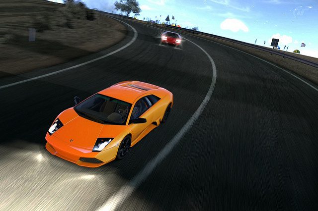
So why is it important? Well, when you first enter photo mode, it has a default shutter speed of 1/250 if you do not change it. In real life, most people would use a shutter speed of 1/100 - 1/500 for race cars, since not many people can pan a race car nicely at lower speeds, but it's definitely far from impossible. So a default speed of 1/250 isn't bad, however, since our GT5 camera has robotic hands that allow it to be the worlds best tripod and unbeatable panning, we can have slower shutter speeds and still get an amazing image.
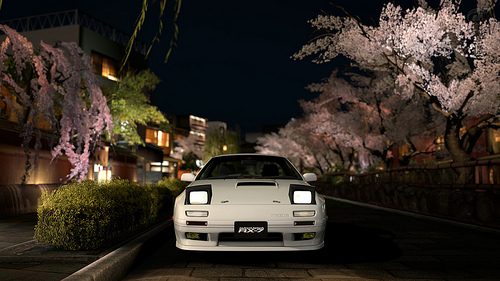
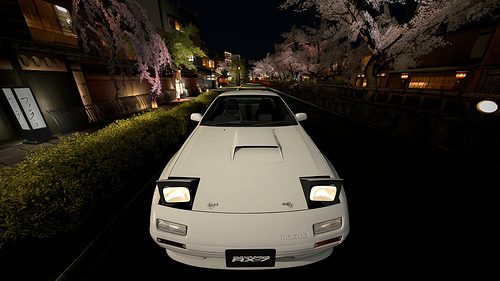
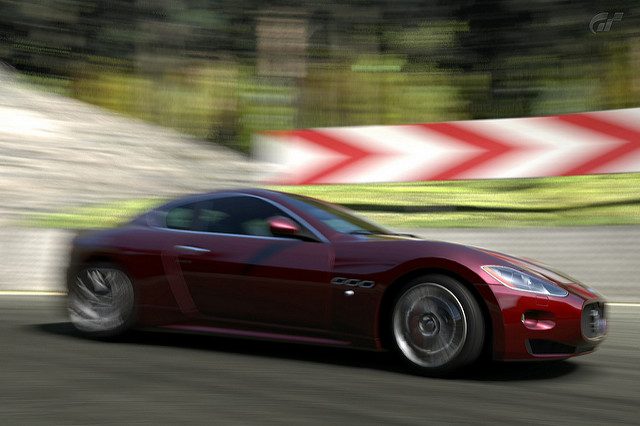
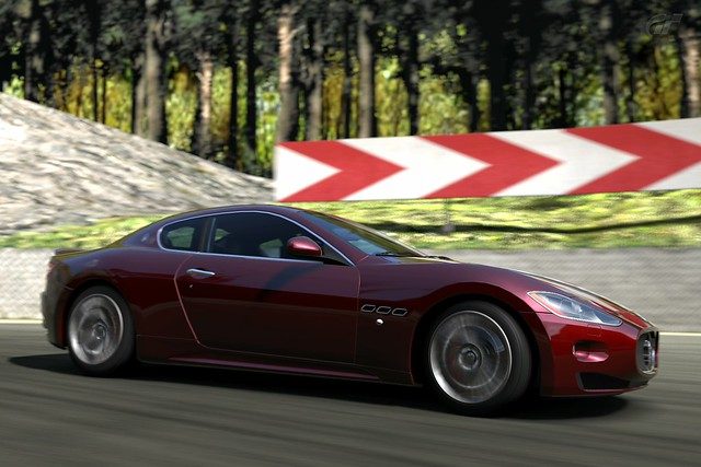
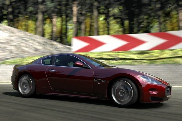
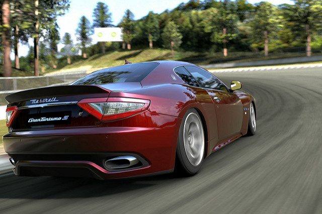
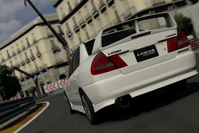
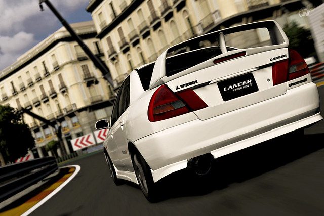
As noted earlier, shutter speed will determine how movement looks in our images, which is important when it comes to racing photos, since you want the car to look like it's moving... Lets have a look at some examples below.
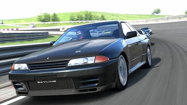
1/60 Shutter Speed
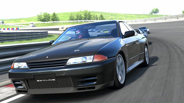
1/250 Shutter Speed
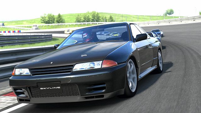
1/640 Shutter Speed
You can see that 1/60 second shutter speed produces the most "movement-like" image (Look at the wheels and the racing curbs). As you bump down the shutter speed (Yes, down, bigger numbers means a shorter time), the image will slowly begin to lose this "movement" look. If you go with any faster of a shutter speed, the car will begin to look frozen, like it's not moving at all. You can already do that in photo travel mode! When you're on a track, you'll want the car to look like it's moving, and moving fast!
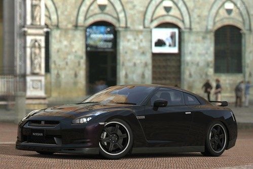
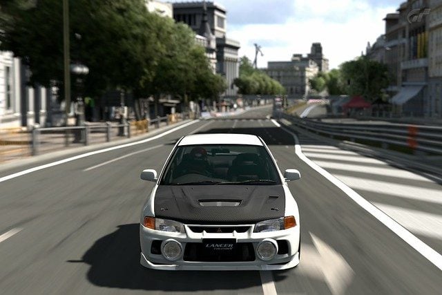
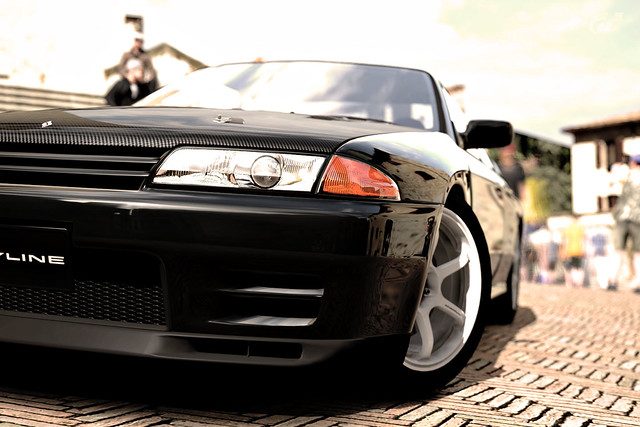
3.0 Aperture
Ever wonder what that silly f/# is next to your shutter speed? Well it's more important than you may think. It controls what is known as "depth of field" in the real world and in our Gran Turismo world. If you don't know what depth of field is, and you don't want to look it up, I'll give you the simple version of it. It controls the amount of "blur" that the out-of-focus areas have, in real life, it controls a lot more than that, but that's all that matters in GT5. The higher the f/stop number is, the more crisp and clear everything in the image will be (in GT5 land anyways), the lower the number, the more "blur" you will get in unfocused areas. Unfortunately, the GT5 camera doesn't produce a very good "blur", buuuuut, no camera is perfect.
Now you may think "Oh, sharper images! I want sharp images! *set aperture to f/45*". NO! YOU DON'T DO THAT. Unless you want both your car and the building which is a mile away to be clear; again, NO! Unless you want the person to pay equal or more attention to the building than the car itself.
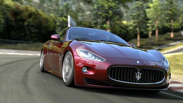
You'll want to stay between f/1.4 and f/11 at the least/most, personally I stick between f/2.8 and f/5.6. Of course, knowing which f/stop to use depends on the orientation of your car to the camera. For example, below are 3 images taken from the front.

f/4.0
f/2.8
f/1.0
Personally, I like the f/4.0 the most. It produces a decent amount of blur, and just barely blurs the rear end of the car, this is nice because it will focus the viewers attention on the front, without losing too much of the car to blur. You may notice that f/2.8 blurs the mid-section of the car more than f/4.0, beginning to get how it works? Depth of field...depth... ...distance...yes? The depth of the focus? The distance away from the focal point that's in focus? Clicking? Good. Then f/1.0, that's too extreme, it looks like the car is in a creepy dream where I'm all of a sudden about to get run over. You can't see anything except for the front! The rest of the image makes no sense.
I said earlier that the aperture setting you should use is based on how the car is orientated towards you, the camera, I know how this works in my head, but I'm going to suck at explaining it, so heres another example from the side.

f/4.0
f/2.0
f/1.4
Compare the blur around the rear end of the car between the different f/stops. The blurring isn't as heavy as the first set of examples, that's because the rear of the car isn't as far away to the camera as it was in the first example! The amount of blur any "subject" will have is based on it's distance from the point of focus. Understandy?
4.0 Focal Lengths
Ok, focal lengths! Originally I was going to talk about this, but the samples turned out badly, and I "left it until later", and uh... that was a bad idea because *stares at calender*. ...Hmmm. Theres the lesson of the day kids, DON'T DELAY THINGS. If you want to ask her out, YOU ASK HER O- ...back on topic.
So what is focal length? In physics, it's... it's...what it is. In photography, it refers t - in basic English - the zoom. The focal length of the GT5 robotic armed camera ranges from 14mm-500mm. Without having any understanding the numbers, you should know that 14mm means very wide, and 500mm is very...zoom... or "telephoto"-ee. Now, in photography, anywhere under... I'd say 18mm? Is considered to be " super wide angle", anything under 24 is "wide angle", then anything above that and under about 100mm would be "standard." Anything above that and under 400mm or so would be considered telephoto, above that and beyond would be super-telephoto.
Now you may or may not have seen "fisheye" effects before, and "fisheye lenses" in the real world are in the "super wide-angle" category, but of course there are non-fisheye Wide-angle lenses, and those are... mad expensive. Unfortunately! ...GT5 offers us one lens, the 14mm-500mm lens (which cannot exist in real life), and anything under... about 24mm will have a fisheye effect (this is called barrel distortion irl) to it, and there is nothing you can do about it. NOTHING. As cool as this is, there are times where I know I want a non-fisheye effect and still want a wide-angle photo, *nudge nudge wink wink@PD*
Why you ask? Because their fisheye effect is pretty extreme at 14mm, of course the fisheyeness gets more mild as you zoom in more, but it's still annoying! Let me show you what I mean...
This photo was taken at ...50mm (or 50.9mm according to flickr, weird lol) and f/2.0.
Now I walked up really close, put the lens to 14mm, and did the "wide angle fisheye shot."
NOW I KNOW WHAT CHUR THINKIN! It looks cool right? Different? Neat? Unique? And it is! But uh... at the same time, you have to admit, the photo is kinda ugly. But you know, not all fisheye photos have to be ugly, it's just slightly difficult to make them not look ugly.
Personally, I kind of like this photo. Just... just puttin that out there, I don't feel the need to adjust it, but for the sake of this guide... I did a fisheye of the front.
The vertical angle is a bit different, but that's cause... I kind of needed it. But this produces an obvious fisheye effect, without ruining the integrity of the car. Right..? Right? SAY YES.
But you see what I mean? Now, the telephoto end, meaning, zooming in from really far away, produces a different effect. Naturally, it produces an effect that makes the object in focus look smaller, this helps with the miniature effect. Hard to say much else on this, so I'll just show you.
Here is that same picture again... that's just... just up there *points up*, which is, again, at 50mm.
Now I stepped back as far as I could, and zoomed in, to approx. 142mm, there is a lot less background because it's zoomed in from afar, and even less barrel distortion (distortion at 50mm? That's messed...). You see how this works now? Yes? Ok!
So someone asked about the "blur" you get from aperture at different focal lengths, and it's true but not true at the same time , they're different at different focal lengths. Orobourus explained this in a much more technical way on the top of page 4. Essentially, you can get more of a blur for each stop or "click" in aperture when you're further away and zooming in.
Let me give you an example... ...again I'm going to use the GT-R images, they really handled a lot of examples this time around lol.
So once again, 50mm at f/2.0. Take note of the blur.
Now this is at 142mm at f/2.0. The blur looks like it's much more intensive.
In order to achieve this kind of blur in at the 50mm range, I had to stop it down to f/1.0 on the 50mm range.
Like that...
You should also take note of the the blur on the car. In the standard focal range, a lower aperture will blur the car as well, in the more telephoto focal length, the car isn't really blurred. I know how this works in my head, but it's one of those things that I cannot put into words. that's why the examples are there above me! uh...Yes? We good? Alright *fistbump*.
5.0 EV and AE Lock
EV stands for Exposure Value, in GT5's camera, it pretty much means exposure compensation; or in even simpler english, brightness. You make it higher, and the image will be brighter overall, lower, and, well, you get the idea.
It seems that not many people know what AE Lock does. Thanks to GT5s magic inside their camera, the image will be properly exposed at any setting on any level. But it does base its exposure on what has the most focus. If you point the camera at the sky with AE Lock off, you'll notice it's AHHH FREAKING BRIGHT, but it will then slowly adjust itself to show the sky at just the right brightness. If you point the camera back down, it will adjust once again. That adjusting is the point of AE Lock, if you point at the sky, turn on AE Lock, and then bring the camera back down. The exposure/brightness will not automatically adjust. This gives you some more freedom in using light with the GT5 camera.
This image is too dark, the car is in the shadows, we can either crank up the EV, or we could use the AE Lock feature! Like I did below.
 What I did was I zoomed in & focused in on the darker area of the car so that the camera would automatically adjust it's exposure to make it somewhat more visible, then I simply clicked AE Lock on and repositioned the camera.
Of course this ends up over-exposing other parts of the image. The sky has turned pure white now! GAHHH, it's bright. Really, this is up to the user to keep the image or not, personally, I wouldn't; we'll talk more about this later in section 9.0.
6.0 Robotic Arm Panning!
If you don't know what panning means, it refers to following a moving subject when taking a photo. With a shutter speed of 1/60, your cameras robotic arms can take a perfectly panned image of your car.
That is, if you use the correct panning mode...
Panning mode 1 seems to be like the camera and photographer is standing in one position, and rotates in that one position as the car goes by, giving a blurry/spinning looking image. This is the most realistic looking panning when a car is by you, or around you in a corner, but in GT5, I personally hate how it looks, and I hate how it's default.
Panning mode 3 is like having the robotic arms attach to your car, and follow it where ever it goes without moving, therefore you can see your whole car!
Panning mode 2 is somewhat in the middle of modes 1 & 3, that's the best that I can describe it. Let the images below give you a better idea of just what I mean.
Panning Mode 1
Panning Mode 2
Panning Mode 3
I think Panning Mode 1 really ruins the image, but it's up to you! Based off of what you're looking for.
7.0 Miniature Filter
I'm only going to be talking about this filter, since I don't use the other filters that much. I don't use this miniature filter much either, but I can't help but notice that a lot of people either don't know how to use it, or don't know what it really does. Miniature, in photography terms, refers to what is known as a "tilt-shift" effect, it creates a very specific kind of blur that will makes things look miniature! ...Derp.
However, a lot of people are using it as a form of...general blur and maybe 1/10 of these actually turn out nicely. I decided to finally try and get some actual tilt-shift photos, they turned out... well not the best, but they're...ok


If you really want to use it just for the blur, then I guuuuuueeeess that's fine too, but like I said earlier, only about 1/10 photos using the tilt shift filter in a non-tilt shift way look nice, that means not pointlessly blurring out half the car; this is just showing you how tilt-shift was originally used. Tilt-shift in real life images can be really cool, here are 2 video examples of tilt-shift videos, just to give you a better idea of what it is.
Drifting Video
Concert Video <--- Very cool
8.0 Focusing!
Yay! Now you know all the basics that you need to know about actually using your epic robotic armed Polyphony GT5 camera, now it's time to actually use it!
I'm finding that a lot of people don't seem to know how to focus their images, or they simply don't care. At the most basic basic basic level of focusing, you want to focus the part of the car that is closest to you (unless the closest part of the car to you is about to fall off the edge of the frame), the part of the car that will grab the most attention from the viewer. If you're taking an image from the behind the car, you'll want the focus to be more towards the rear of the car, not the front, or else you end up with a giant blur in front of your face and that's not attractive. Get it? Here are some examples of poor focusing
Bad... This is a case of nice road, and Oh! I didn't notice the car there. An effect like focusing away from the car can work out nicely sometimes, but most of the time, ...no.
Theeere we go!
I've seen images like these, and I can't really help but wonder why. I mean, that's a great road/alley way that's in focus, but there's this stupid car in my way!
Oh hey! I see a car! It's a Mazda!

I'm actually driving the Murcielago, I'm taking a bad line, and I'm not in front. So I didn't focus on myself, I focused on the car in front of me because they're closer to the camera, and therefore they dominate the space in the frame. Had I been a loser and focused on myself, there would be beautiful blurry red Countach just ruining the entire image.
This section might be expanded in the future.
9.0 Lighting
Lighting is the most important, most vital, most most most- ...thing of photography, in game or in real life. GT5s sun seems to move around a lot, like he's playing a joke on you or something, but we have to deal with it. The best example of complicated lighting is the orientation of the sun to the car. Taking a picture of the dark side of a car is like taking a picture of the dark side of the moon, YOU DON'T SEE ANYTHING! The viewers attention isn't directed at the car anymore, cause they can't see it! I'm going to have to use a repeat example here.
You saw earlier in section 3.0 about exposures on how you can make a dark image look lighter, but it would mean making the entire image lighter, including the already well-light areas.
Another great thing about GT5's robotic armed camera is that you can place the camera anywhere you want! Even right in front of the car, where you're most likely to get killed. So if you don't like the dark image above, just simply walk around to the side of the car that is lit, and you can still get a great photo of that epic new car of yours.
And another angle!
So not all is lost if your image turns out dark! You simple have to find the part of the car that is actually lit. No big deal right? ...Right! Now if you're thinking "pfft, that's in a race, in photo mode it would look much better!" Well, maybe...
This is a poorly lit image.
Now I turned the car about 90 degrees, and I didn't move my camera at all...
AND BAM! SUDDEN AMAZEMENT. Now you may notice the first image is darker overall, that's because I forgot to turn AE Lock off. ...My bad. But you get the idea right? RIGHT?! Light, use the light. Photographers say that a clear, sunny day is horrible for photography because of the harsh shadows that are created, I disagree. Also, most people here don't care, and we don't have an option to make a photo mode location cloudy. The only time you don't want a well lit image, is when, well, when you don't want...a well lit image, like night time racing, or a stalker sitting in his Prius, parked in the shadow.
Behind the Camera - Advanced
10.0 Composition -
Composition is the most important things of photography, it's what makes a photo stand out from the rest. So for those who don't know what composition is, it is... hmmm, how to explain this... in plain english, it's where the things sit in your photo, and how they sit. It's where your subject is in contrast to where other objects/elements are, of course you don't always have control of every element in your photo, but this is GT5, and we have 99% control of everything, which is freaking awesome, but it's up to you, the photographer, to know... not where to place them, but where you place your camera so that the objects and elements end up the way you want them to.
Essentially, your composition is 50% or more of what makes your photo interesting or not. You would be amazed at what some very simple, very basic composition will do for you. If you've read the basics of this guide (which I hope you have) then you may or may not have thought to yourself "Hmm, I would do this instead" or looked at my examples and said "I would change this here." That's good! That's the beginning of your compositional... mindset... thinking...ness. Your composition is your creativity, it's your power, freedom, and ability to make the picture yours, make it unique. Lets start with one of the most basic things in image (image applies to more than just photography, hint hint) composition.
10.1 Rule of Thirds
It's called the "Rule of Thirds", why is it called that? Well, essentially you split the image into 1/3rd's both horizontal and vertically, giving you 2 lines in each direction, 9 boxes kind of like tic-tac-toe, and 4 points where the lines intersect. These lines and intersect points are reference points on where to focus/put your subject. The most basic use of the rule of 3rds is to have your subject either on one of the lines, or on one of the intersecting points. The most advanced use of the rule of 3rds is to have a contributing element at every intersecting point of the image. Now if that seemed confusing, just...just keep reading.
I'm hoping you can see the red lines, I know they're a bit faint, but uh, it's the best I could do for now lol.
I see so many photos like this. Where a person points the camera direction at the car, and takes the picture, default settings and all. So see how the car is dead center? Like... dead center. It's pretty freaking boring. Now you see those lines? You want to use those lines as a reference for your subject. Lets try moving the car...
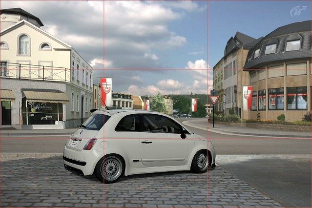
There, now it's along the bottom line. Is that better? Yeah I think so, I also dropped the shutter speed to get some fluid movement in the background (look at the flags). But when you're using the rule of 3rds, you want to to emphasize the subject on the point where the line intersects. AKA the 4 points where you can see a +.
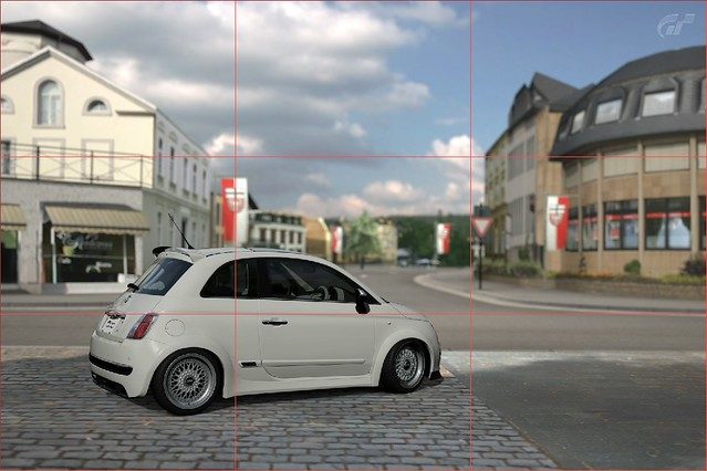
That's what I mean. I also dropped down the aperture a bit, and we have a much improved image from the first example, yes?
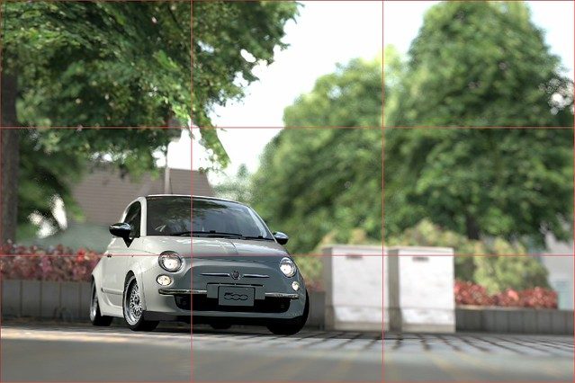
The basic explaination is that essentially, you want your subject to ride along the lines that make up that middle box. So you don't want to be too center on vertical and horizontal axises, or completely center, and you don't want to be completely on the edge. That's the rule of thirds, but since I sucked at explaining it, heres another example.
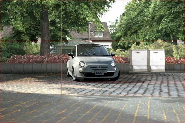
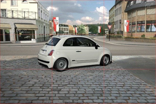
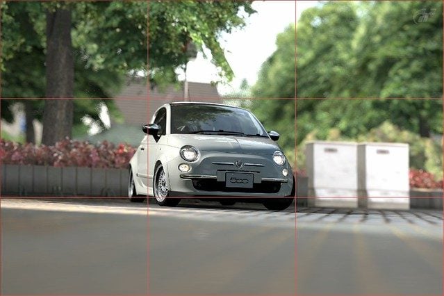
This image couldn't be any more center, it's so centered that, that, it's centered. - What does it look like? It looks like you were walking around Germany, saw a Fiat 500, and you j...j... can't say that word on here in your pants, so you quickly whipped your camera phone and took this picture. Ultimately, it looks boring doesn't it?
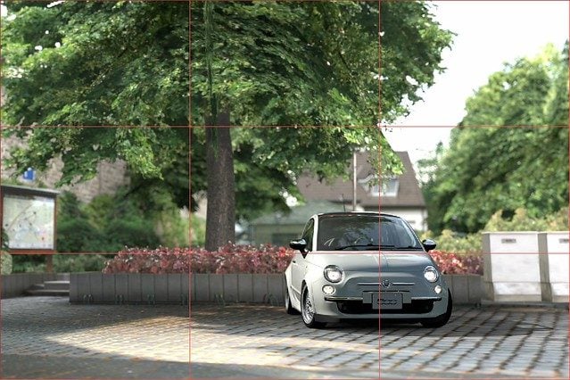
Also dropped the aperture to blur the background more, and get rid of some of that boring plain grey walkway at the bottom, and to bring more focus to the car. Does this not look better? You cannot say that this doesn't look better.
10.2 Don't get caught Standing!
What do I mean by this? I mean, you have to give a unique point of view. Don't use default camera settings, especially the default camera height. Anyone can walk by a car, whip out a phone/camera, and take a picture of a car. Anyone can walk by a car and save a mental image of it, just as it is at that very moment, anyone can see the car the way you see it by standing upright. So get low, get high (not that kind of high, drugs are bad), get sideways, get tilted! That's what this section is all about. Since the last example isn't far away, look back to it, and take note of the height perspective. It looks like it would be about standing level for a.. I dno, 5 foot 5 inches tall person. Right? Lets maybe get low or something...
There! Now the camera is lower, and the overall image looks more interesting, because you're giving a unique perspective that isn't seen in everyday life by everyday people. But you may still notice that there are red lines there... just to show another example of rule of thirds - it's dead center. Notice that when you drop the camera low, and have the subject centered, you get a horrible amount of bland... boring.. plain...ground! Lets apply ze rule of zirds!
Is that not better? Now we have an uncenetered, unique perspective a car, it no longer looks plain, boring, and bland.
Placing the camera higher up gives a unique perspective that you can't get from simply standing around and photographing the race, even if you're actually standing in the middle of the road.
Or get tilted!
Personally, I think this image looks fine, not every image needs an angle, remember that.
But! Adding a tilt to the camera does make it look a bit more interesting doesn't it? Unique, different. Right? See what I'm gettin at?
10.3 Centering
Wait, wait, waaaaaaaaaaiittt... What? Yes, exactly. You just read me talk about the rule of thirds, and how you should avoid placing your subject in the center. Well, the thing about the "rule of thirds", is that it involves the word "rule", and rules are meant to be broken! Remember what I said about composition being your power and freedom to be creative and unique? In order to do so, you must break rules, and go against normality, otherwise, how else would it be creative? The rule of thirds of course, should not be ignored, it is the basic guideline to composition in all kinds of imagery, but it can be broken if it is see fit. Centering your subject is one way to do it, but centering is challenging. I'm sure you noticed just how ugly, bland, and boring my examples were. ...Mind you, not much effort was put into those, but still, my point remains. So centering a subject requires... illusion, you need to make it seem like it's not centered by using the elements around the center. Let me show you what I mean.
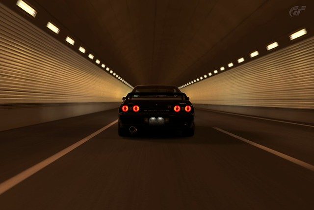
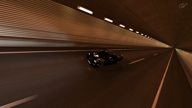
This is a completely centered image. It's not the best, but it looks better than the examples I used in rule of 3rds, why? Because of the elements in it, this example is in the tunnel on SSR7 (which seems to be the main place I'll be using for examples here). So what do I mean? I mean, look at it, everything is pointing towards the car, it's like the car is pulling in both the sidewalls, like some suction hole, that's neat.
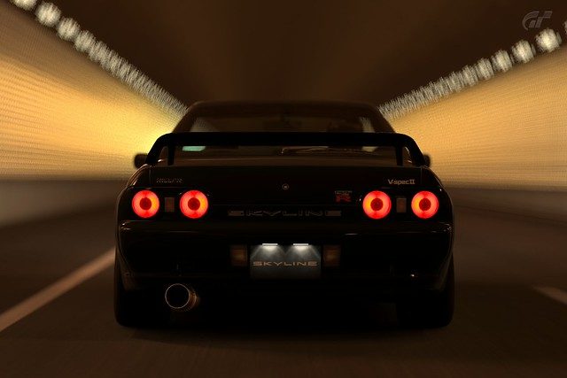
One easy way to center images and get away with it, is to get up close close and personal with it, occupy the frame so that it's not really centered. But again, the elements around the car in this image, the blurred lines of speed, give the feel of speed and thrill that makes the audience forget that it's even centered at all.
But these of course, are just examples, for the next example, I'm going to use one of the photos from my gallery =D.
What do I mean by illusion exactly? This is what I mean.
Does the car look centered to you? Does it look centered to me? No. But it is... so what creates this illusion? It's the angle, the tilt, the height, the everything. Look to the right of the center, you see the long, long...long tunnel, showing, where the car has been, where it came from. Then look to the left of the center of the image, you see maybe, 5m worth of road. Therefore your mind is tricked to think that the car is extremely close to you (I say close to you because you're facing it), the car feels like it's leaning to the left of the image, but it isn't.

Here's another illusive example. This is also kind of neat, it's the first picture I ever took in GT5, I was absolutely stunned at what GT5's camera could do. Anyway, back on topic..
Does it look centered? No, I don't think so. But is it? Fairly, yes, it's slightly below center, but for the most part, it's centered. But again, it looks like the car is leaning far to the left of the image, why? Because there is little to no road, no substance there, but there are cars trailing on the right, and you can clearly see where the road leads to, giving you the illusion that it's a long road. That is the illusion, make the centered image look as if it's not centered at all. Cool isn't it?
*I know Composition has a lot more to it than this, future plans to add more to it are still unclear*
11.0 Good Image vs Realistic Image
Now, if you haven't noticed already, the most popular thread in this GT5 Photography forum is the "Realistic Photo Thread", unfortunately, I'm part of the group of people who find that 80% of the images aren't in the slightest bit realistic. It's either because people are so anxious to show off their work that they don't care, ooooorrrr, it's because people think that "Hey this picture looks awesome" and automatically put it into their "realistic box". I'm sorry folks, but there is a difference between a good image and a realistic image, there was this image in the realistic photo thread, that featured a white 350z with white rims, I actually stopped, continued scrolling, then went back up to look at it again, because it looked so real. It looked like it was just an unedited track-meet image, kind of dull and lacking fake vivid colours. (I've now re-found that image and have permission to use it)

Image by hot-wok
But no one had commented on it or anything, why? Because it the image next to it, that didn't look real, looked a lot better. Realistic photos may not always look good, and good images, rarely look realistic. A fantastic image, looks good, and realistic. Get it? Let's get started.
I was going to split this part into sections, but I'm finding that difficult to do at the moment, so I'll talk about them both as a whole. Starting with a good image, what's a good image? It has nice blur, good sense of speed (if that's what you're going for), the subject is properly focused, and the photographer is properly displaying what he wants to, by that, I mean when a person looks at the image, they should see what the photographer sees in his head. A good image has good composition, it makes the audience stop and stare for a moment as they look through a barrage of images, it makes them wonder - it makes them think. I'm going to show you an example of what I think is a good image.
That's a good image, in fact I think I have this in my gallery. It has good detail, a good amount of blur, a decent sense of speed, the focus is where it should be, the lighting is targeted at the focus, multiple cars are involved, you can feel it's a tight race.
But does it look real? Not really, a lot of things in it still look very Gran Turismo like, it looks like..a graphic, more than real life, the surface of the car looks too smooth. The trees look like gran turismo, the... just, you can easily tell, that it's not real!
So that leaves the question, what makes an image look real? Well, if it's one thing I've noticed about GT5, it's that the color (or lack of color and light if you're a nerd) black is not black enough. Allow me to demonstrate.
This was my first Photo Travel Mode image, ok well not the very first one, but my first photo travel "session", once again, I was completely stunned by the vast capabilities that our GT5 camera allowed us to have. Does it look real? eeeehhhh... Kinda. But like I said, the black in GT5 is not black enough. So after some editing...
Emphasized on the black, and gave it a yellow filter, it looks more real, yes?
One very important thing to keep in mind when you want to achieve "realness" is to eliminate the things that don't look real. Fortunately, PD spends more time on creating the car models than the building and object models, but that can make GT5 photography realism difficult. Certain buildings however, can look fantastic in GT5 photos and actually add to realism.
The buildings in this look great, they actually look like they could be real, the car looks great, it has a wonderful amount of detail. ...The chairs, the chairs murder the picture. They're not smooth at all, they're bumpy... and have rough edges, the colour is dull, and...brown! It ruins the whole image!
Now, for me anyways, the 2 essential things to making an image look real, is 'The Black', and 'The Detail'. But this little bit of course, is all from my personal perspective, different people might have different views on what makes a GT5 image look real. So you know about 'The Black', about how the black lines and colours in GT5 aren't black enough, now 'The Detail'. That's fairly obvious, annnddd for once, it's not as simple as it sounds! It's about 5 IQ more complex!
In order to have a GT5 image look real, it has to have incredible detail. I said incredible detail, not an incredible amount of detail. 'In order to obtain detail, you must get rid of detail', thought of that line myself. *Feels smart*. Anyway, what I mean is, in order to make detail stand out, you have to make other detail less noticeable, less obvious, or gone all together. This is why you must understand and know how to use the aperture! So that you can blur the background, getting rid of any detail, good or bad, in there, bringing the focus to the car, and showing off the detail of the car. Look at the last example, the buildings in the background have a slight blur, so people don't even notice the detail in it. Another problem with GT5 models, is the people, they're all blocky and worse than Sims, so you want the slowest possible shutter speed, like... 1 second shutter speed (that's 1/1 on the dial...), so in the example above, the people are caught moving, they look blurred and ghostly, so you can't see their blocky detail.
This is another photo from my gallery, and it's also used as an example up thar *points up*, except this one is edited. With proper aperture usage, the background is blurred, their detail is nulled out, the detail of the back of the car is also nulled out, therefore it emphasizes the detail at the front of the car.
*This section is still to be continued*
12.0 Editing - Yes or No?
So you might be wondering, hmmm, should I edit my photos? What are the benefits of editing your photos? Would it make it look more real? Would they look better? Actually, that last question is quite debatable. Sometimes a photo could use some touching up, and it would benefit it quite well overall. Other times, when a photo doesn't need editing, but you "touch it up" anyways, it could actually make the image look worse.
Don't let that discourage you though, if you're considering editing your images, you should give it a shot first, before you make your final decision on liking it or not. Here are just some examples of what editing can do for you...
The original image is... ..."meh". For a white car, it's darker than it should be, and all the colours seem to blend together, so it lacks the attention seeking factor. So with some minor editing...
There we go! That's a bit better. The colors stand out more, therefore the car itself stands out more, and the car is slightly sharper than in the unedited one. Buuuuuuuut... in my personal opinion, it's still a "meh" looking picture.
That's one thing you have to keep in mind when you consider editing a photo or not. Will it help? One of the first things you should know when you first learn how to edit images is that editing can only do so much. If the original image isn't good, then after editing, it still won't be good. The only way to take a bad image and make it into a good one is to get plastic surgery, AKA - take a new picture.
One of the bad things (unfortunately) about GT5, is the jagged shadows, smoke, and rain. We've all heard it. It is quite sad when you see an epic drift or a beautiful rain shot being ruined by bad pixelation on your car. Editing can help!
Apart from colour editing, making the image sharper, and adding a vignette (the dark corners), I smoothed out the jagged edges (I didn't do a very good job though). Had I taken more time to smooth out the edges, it could be almost unnoticeable.
12.1 Vignetting
Vignetting - Now you may have noticed I just used this word in the last example. Vignetting (pronounced vinyetting) refers to the faded dark edges on the image. Real life cameras will produce this naturally, due to physics of... glass... and stuff, but it's far less noticeable on the more expensive cameras and lenses. The GT5 Camera also produces vignette, if you wish to get rid of it, then you need to crank up the aperture. It's just the way things work, in the real world and in GT5, but it's far more effective and noticeable in GT5. The camera filters also have vignetting, very obvious vignetting for that matter. The vignette in the last image was a much more heavier vignette than I would normally use, but still less vignetting than the GT5 filters. Personally, I don't like too much vignetting, it covers too much of the image, but this opinion varies heavily from person to person, and image to image. It's also why I don't like using the GT5 filters, because the vignetting is too strong.
But vignetting can be a good thing, by darkening the corners of an image, it can bring the viewers attention towards certain areas, in the case of GT5 filters, and most vignettes, the center of the image. But since I don't like the heavy GT5 vignetting, I do it myself in editing, so I can get it juuuuuust right.
Theres the original image...
This is after the colour, sharpness, brightness, and contrast has been adjusted. But I'm finding that the green patch of grass in the bottom right is slightly distracting, as is the car I'm about to PWN, and the top right corner now that I look at it once more. So I added a very light vignette.
There we go! Now the distracting green corners are darker, and they no longer grab your attention away from the cars. (A tad more brightness was also added)
12.2 High Dynamic Range
High Dynamic Range (HDR) images refers to an image that has a very high, and dynamic range. ...DURRRR. HDR's have a wide range of colours and brightness levels. Now you may not understand what that means, and that's normal, cause it took me a while to fully understand the meaning of HDR, therefore, I suck at explaining it. Look at it this way, lets think back to section 8.0, where I talked about lighting. Shooting into the dark is a bad idea, cause you can't see the car, remember now? The (obvious) reason why you can't see the car because the background is so bright, that it's colors and light in a theoretical way, overshadow the car. So what if you want both the bright background and the car to be visible? (Remember, using AE Lock made the background overexposed) You turn it into an HDR! Which will even out the exposure all across the image by applying both dark and light to all areas of the image. Ok, I suck at explaining this, and even if I didn't suck at it, it's easier to understand with images, so here we go.
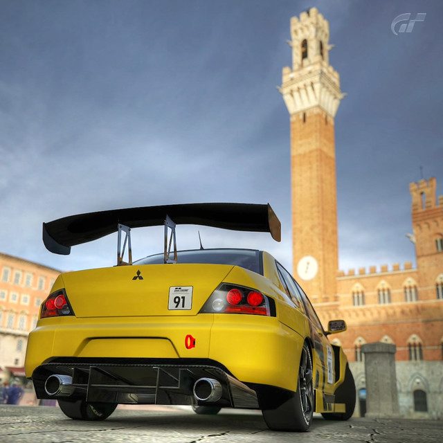
For my example, I decided to use this clock tower, which for some reason, so many people want to capture into their image. Now, in all honesty, the ones I've seen have been less than impressive. Most of the time, the ar is underexposed, it's too dark, or the tower is overexposed, it's too bright. ...Or there was one image where the car looked severely warped, that..that's just weird. So below we have the original image with an EV of 0.0, AKA default.
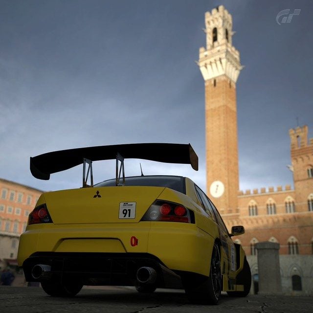
In this case, yeah the car is underexposed, but unlike a lot of other images I've seen, at least you notice the car before the freaking clock tower!
Now in order to do an HDR, you need multiple instances (images) of that one photo, all with varying exposure levels, to capture all the various ranges of colour and brightness for us to mesh them together. So the first image, on top...
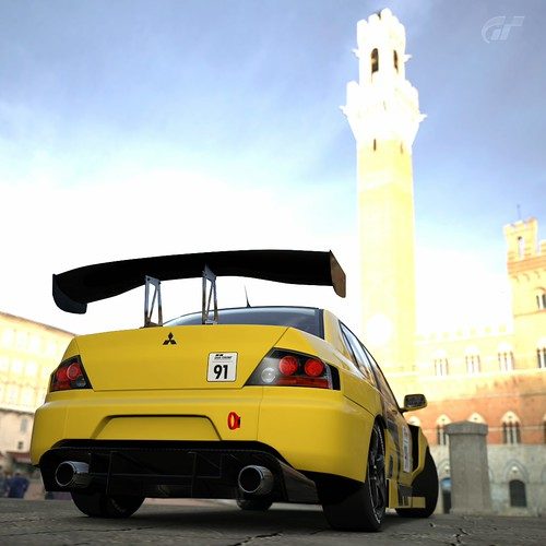

Top: Exposure value of +2.0 Bottom: Exposure Value of -2.0
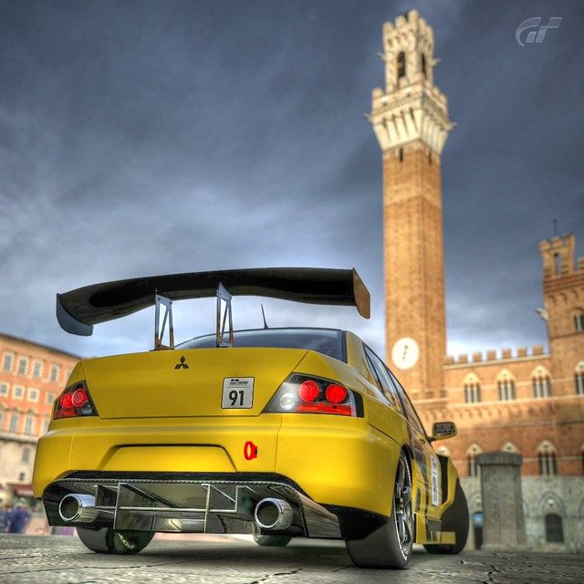
As you may notice, the +2.0 EV makes the car very clear, and the clock tower blindly bright. While the -2.0 EV makes the car almost fall into the dark abyss, and the clock tower is just slightly too dark. I also have pictures of +1.0 EV and -1.0 EV, but that's not shown here to save room. For a better effect, you should take more images, for example, an image for every 0.5 EV instead of every 1.0 EV. Now by using certain editing programs like photoshop or gimp, or image stacking programs like ImageStacker or Photomatix, we can average out the colours from all our instances of this one photo. What we end up with is this...
You may notice the colours are very saturated, and very vibrant. Remember, HDRs have a very wide range of colours and brightness levels. This makes it look kind of unreal, which some people like for an "artistic" effect and they would emphasize these vibrant colours even further using techniques such as tone mapping, while others, just simply want to balance the exposure of their images.
That's a good example of a poorly tone mapped image.
The image I made is in between unreal and balancing exposure, therefore, it looks like crap. That, and I suck at making HDRs in the first place. But the important thing is, the car is nicely visible, and the clock tower isn't too bright. If you've attempted this, then you probably know the basics of editing, and then could properly adjust the vibrancy, saturation, tones, and color to your liking. You could even tweak the clock tower exposure a little bit more as well.
Unfortunately, this guide will not teach you how to edit. It's just to inform you about editing, if you want to learn about it. Find an editing program like photoshop or gimp (Don't ask me how you're going to get it, because the obvious answer is the legal one), do some googling and learn.
*This section still has a lot that can be expanded on, but I'm not sure if I'll go into that or not*
X.0 Who am I to talk?
I AM THE GREAT GTSOMETHING! I AM I! ..In all seriousness though, I do photography strictly as a hobby (for now), 100% self taught and specialize in Food Photography...strangely enough. Below is mah GT5 Photo Gallery, and my Flickr if you're interested! Thanks for looking!
My Gallery
Flickr
2013 Edit: I've gone and shot real cars now, and a lot more... and you can check some of that our by clicking here
-----------------------------------
P.S. If you spot any errors, please let me know! There could be many mistakes that I've missed!
The update title tag will stay up for roughly 24 hrs after every update
v1.0: It's done! キタ━━━━━━(゚∀゚
━━━━━━!!!!! v1.1: Reorganized structure and layout + fixed errors in example images and spelling.
v1.2: Added the Editing section
v1.21: Added HDR section
v1.3: Added Focal Length section... ...finally
v1.31: Minor changes in certain sections.
v2.0: Added Composition and Realism sections
v2.01: Changed the original description for rule of thirds + touch up for aperture
v2.1: Edited text overall. Added 2 new images. Updated HDR examples. Fixed dead video link.
Last Updated: October 16th, 2011
Tiny Table of Content
Through the Camera - Basics:
1.0 The Magical GT5 Camera
2.0 Shutter Speed
3.0 Aperture
4.0 Focal Lengths
5.0 EV and AE Lock
6.0 Robotic Arm Panning!
7.0 Miniature Filter
8.0 Focusing!
9.0 Lighting
Behind the Camera - Advanced:
10.0 Composition
11.0 Good Image vs Realistic Image
12.0 Editing - Yes or No?
---12.1 Vignetting
---12.2 High Dynamic Range
X.0 Who am I to talk?
Through the Camera - Basics:
1.0 The Magical GT5 Camera
According to Flickr, the camera used in GT5 is called the "Polyphony Digital Inc. Gran Turismo 5". Clearly, this camera is epic, it is a DSLR in the form of a boomerang controller and has a digital screen display thats as big as your TV! It features a shutter speed range of 1 second to 1/8000th seconds, and an aperture range of f/1.0 to f/45 (which is physically unpossible!). What really makes the GT5 camera special is that it has robotic arms that can do panning for you in 3 modes, and it can bend the physics of light to always give you a visible picture even with impossible settings.
2.0 The Shutter Speed
In real life, the shutter speed controls how long the internal sensor is 'open' for, this can cause blur and show visible hand-shaking when it is too low, however, if it were high, it would freeze images in time better, but at the same time, the sensor would capture less light, which is vital to a good image. In the game however, shutter speed simply controls the look of movement in the image, and has no effect what so ever on the exposure (brightness) of the image.
So why is it important? Well, when you first enter photo mode, it has a default shutter speed of 1/250 if you do not change it. In real life, most people would use a shutter speed of 1/100 - 1/500 for race cars, since not many people can pan a race car nicely at lower speeds, but it's definitely far from impossible. So a default speed of 1/250 isn't bad, however, since our GT5 camera has robotic hands that allow it to be the worlds best tripod and unbeatable panning, we can have slower shutter speeds and still get an amazing image.
As noted earlier, shutter speed will determine how movement looks in our images, which is important when it comes to racing photos, since you want the car to look like it's moving... Lets have a look at some examples below.
1/60 Shutter Speed
1/250 Shutter Speed
1/640 Shutter Speed
You can see that 1/60 second shutter speed produces the most "movement-like" image (Look at the wheels and the racing curbs). As you bump down the shutter speed (Yes, down, bigger numbers means a shorter time), the image will slowly begin to lose this "movement" look. If you go with any faster of a shutter speed, the car will begin to look frozen, like it's not moving at all. You can already do that in photo travel mode! When you're on a track, you'll want the car to look like it's moving, and moving fast!
3.0 Aperture
Ever wonder what that silly f/# is next to your shutter speed? Well it's more important than you may think. It controls what is known as "depth of field" in the real world and in our Gran Turismo world. If you don't know what depth of field is, and you don't want to look it up, I'll give you the simple version of it. It controls the amount of "blur" that the out-of-focus areas have, in real life, it controls a lot more than that, but that's all that matters in GT5. The higher the f/stop number is, the more crisp and clear everything in the image will be (in GT5 land anyways), the lower the number, the more "blur" you will get in unfocused areas. Unfortunately, the GT5 camera doesn't produce a very good "blur", buuuuut, no camera is perfect.
Now you may think "Oh, sharper images! I want sharp images! *set aperture to f/45*". NO! YOU DON'T DO THAT. Unless you want both your car and the building which is a mile away to be clear; again, NO! Unless you want the person to pay equal or more attention to the building than the car itself.
You'll want to stay between f/1.4 and f/11 at the least/most, personally I stick between f/2.8 and f/5.6. Of course, knowing which f/stop to use depends on the orientation of your car to the camera. For example, below are 3 images taken from the front.
f/4.0
f/2.8
f/1.0
Personally, I like the f/4.0 the most. It produces a decent amount of blur, and just barely blurs the rear end of the car, this is nice because it will focus the viewers attention on the front, without losing too much of the car to blur. You may notice that f/2.8 blurs the mid-section of the car more than f/4.0, beginning to get how it works? Depth of field...depth... ...distance...yes? The depth of the focus? The distance away from the focal point that's in focus? Clicking? Good. Then f/1.0, that's too extreme, it looks like the car is in a creepy dream where I'm all of a sudden about to get run over. You can't see anything except for the front! The rest of the image makes no sense.
I said earlier that the aperture setting you should use is based on how the car is orientated towards you, the camera, I know how this works in my head, but I'm going to suck at explaining it, so heres another example from the side.
f/4.0
f/2.0
f/1.4
4.0 Focal Lengths
Ok, focal lengths! Originally I was going to talk about this, but the samples turned out badly, and I "left it until later", and uh... that was a bad idea because *stares at calender*. ...Hmmm. Theres the lesson of the day kids, DON'T DELAY THINGS. If you want to ask her out, YOU ASK HER O- ...back on topic.
So what is focal length? In physics, it's... it's...what it is. In photography, it refers t - in basic English - the zoom. The focal length of the GT5 robotic armed camera ranges from 14mm-500mm. Without having any understanding the numbers, you should know that 14mm means very wide, and 500mm is very...zoom... or "telephoto"-ee. Now, in photography, anywhere under... I'd say 18mm? Is considered to be " super wide angle", anything under 24 is "wide angle", then anything above that and under about 100mm would be "standard." Anything above that and under 400mm or so would be considered telephoto, above that and beyond would be super-telephoto.
Now you may or may not have seen "fisheye" effects before, and "fisheye lenses" in the real world are in the "super wide-angle" category, but of course there are non-fisheye Wide-angle lenses, and those are... mad expensive. Unfortunately! ...GT5 offers us one lens, the 14mm-500mm lens (which cannot exist in real life), and anything under... about 24mm will have a fisheye effect (this is called barrel distortion irl) to it, and there is nothing you can do about it. NOTHING. As cool as this is, there are times where I know I want a non-fisheye effect and still want a wide-angle photo, *nudge nudge wink wink@PD*
Why you ask? Because their fisheye effect is pretty extreme at 14mm, of course the fisheyeness gets more mild as you zoom in more, but it's still annoying! Let me show you what I mean...
This photo was taken at ...50mm (or 50.9mm according to flickr, weird lol) and f/2.0.
Now I walked up really close, put the lens to 14mm, and did the "wide angle fisheye shot."
NOW I KNOW WHAT CHUR THINKIN! It looks cool right? Different? Neat? Unique? And it is! But uh... at the same time, you have to admit, the photo is kinda ugly. But you know, not all fisheye photos have to be ugly, it's just slightly difficult to make them not look ugly.
Personally, I kind of like this photo. Just... just puttin that out there, I don't feel the need to adjust it, but for the sake of this guide... I did a fisheye of the front.
The vertical angle is a bit different, but that's cause... I kind of needed it. But this produces an obvious fisheye effect, without ruining the integrity of the car. Right..? Right? SAY YES.
But you see what I mean? Now, the telephoto end, meaning, zooming in from really far away, produces a different effect. Naturally, it produces an effect that makes the object in focus look smaller, this helps with the miniature effect. Hard to say much else on this, so I'll just show you.
Here is that same picture again... that's just... just up there *points up*, which is, again, at 50mm.
Now I stepped back as far as I could, and zoomed in, to approx. 142mm, there is a lot less background because it's zoomed in from afar, and even less barrel distortion (distortion at 50mm? That's messed...). You see how this works now? Yes? Ok!
So someone asked about the "blur" you get from aperture at different focal lengths, and it's true but not true at the same time , they're different at different focal lengths. Orobourus explained this in a much more technical way on the top of page 4. Essentially, you can get more of a blur for each stop or "click" in aperture when you're further away and zooming in.
Let me give you an example... ...again I'm going to use the GT-R images, they really handled a lot of examples this time around lol.
So once again, 50mm at f/2.0. Take note of the blur.
Now this is at 142mm at f/2.0. The blur looks like it's much more intensive.
In order to achieve this kind of blur in at the 50mm range, I had to stop it down to f/1.0 on the 50mm range.
Like that...
You should also take note of the the blur on the car. In the standard focal range, a lower aperture will blur the car as well, in the more telephoto focal length, the car isn't really blurred. I know how this works in my head, but it's one of those things that I cannot put into words. that's why the examples are there above me! uh...Yes? We good? Alright *fistbump*.
5.0 EV and AE Lock
EV stands for Exposure Value, in GT5's camera, it pretty much means exposure compensation; or in even simpler english, brightness. You make it higher, and the image will be brighter overall, lower, and, well, you get the idea.
It seems that not many people know what AE Lock does. Thanks to GT5s magic inside their camera, the image will be properly exposed at any setting on any level. But it does base its exposure on what has the most focus. If you point the camera at the sky with AE Lock off, you'll notice it's AHHH FREAKING BRIGHT, but it will then slowly adjust itself to show the sky at just the right brightness. If you point the camera back down, it will adjust once again. That adjusting is the point of AE Lock, if you point at the sky, turn on AE Lock, and then bring the camera back down. The exposure/brightness will not automatically adjust. This gives you some more freedom in using light with the GT5 camera.
This image is too dark, the car is in the shadows, we can either crank up the EV, or we could use the AE Lock feature! Like I did below.
Of course this ends up over-exposing other parts of the image. The sky has turned pure white now! GAHHH, it's bright. Really, this is up to the user to keep the image or not, personally, I wouldn't; we'll talk more about this later in section 9.0.
6.0 Robotic Arm Panning!
If you don't know what panning means, it refers to following a moving subject when taking a photo. With a shutter speed of 1/60, your cameras robotic arms can take a perfectly panned image of your car.
That is, if you use the correct panning mode...
Panning mode 1 seems to be like the camera and photographer is standing in one position, and rotates in that one position as the car goes by, giving a blurry/spinning looking image. This is the most realistic looking panning when a car is by you, or around you in a corner, but in GT5, I personally hate how it looks, and I hate how it's default.
Panning mode 3 is like having the robotic arms attach to your car, and follow it where ever it goes without moving, therefore you can see your whole car!
Panning mode 2 is somewhat in the middle of modes 1 & 3, that's the best that I can describe it. Let the images below give you a better idea of just what I mean.
Panning Mode 1
Panning Mode 2
Panning Mode 3
I think Panning Mode 1 really ruins the image, but it's up to you! Based off of what you're looking for.
7.0 Miniature Filter
I'm only going to be talking about this filter, since I don't use the other filters that much. I don't use this miniature filter much either, but I can't help but notice that a lot of people either don't know how to use it, or don't know what it really does. Miniature, in photography terms, refers to what is known as a "tilt-shift" effect, it creates a very specific kind of blur that will makes things look miniature! ...Derp.
However, a lot of people are using it as a form of...general blur and maybe 1/10 of these actually turn out nicely. I decided to finally try and get some actual tilt-shift photos, they turned out... well not the best, but they're...ok
If you really want to use it just for the blur, then I guuuuuueeeess that's fine too, but like I said earlier, only about 1/10 photos using the tilt shift filter in a non-tilt shift way look nice, that means not pointlessly blurring out half the car; this is just showing you how tilt-shift was originally used. Tilt-shift in real life images can be really cool, here are 2 video examples of tilt-shift videos, just to give you a better idea of what it is.
Drifting Video
Concert Video <--- Very cool
8.0 Focusing!
Yay! Now you know all the basics that you need to know about actually using your epic robotic armed Polyphony GT5 camera, now it's time to actually use it!
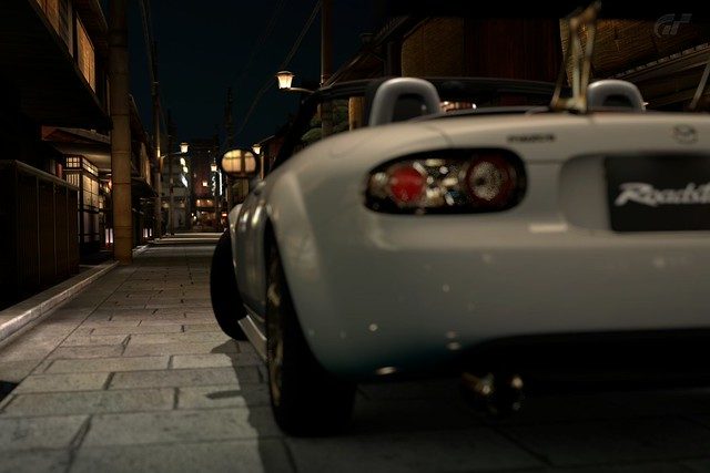
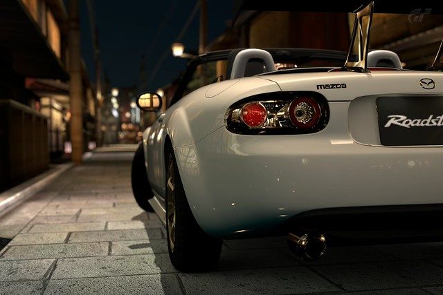
I'm finding that a lot of people don't seem to know how to focus their images, or they simply don't care. At the most basic basic basic level of focusing, you want to focus the part of the car that is closest to you (unless the closest part of the car to you is about to fall off the edge of the frame), the part of the car that will grab the most attention from the viewer. If you're taking an image from the behind the car, you'll want the focus to be more towards the rear of the car, not the front, or else you end up with a giant blur in front of your face and that's not attractive. Get it? Here are some examples of poor focusing
Bad... This is a case of nice road, and Oh! I didn't notice the car there. An effect like focusing away from the car can work out nicely sometimes, but most of the time, ...no.
Theeere we go!
I've seen images like these, and I can't really help but wonder why. I mean, that's a great road/alley way that's in focus, but there's this stupid car in my way!
Oh hey! I see a car! It's a Mazda!
I'm actually driving the Murcielago, I'm taking a bad line, and I'm not in front. So I didn't focus on myself, I focused on the car in front of me because they're closer to the camera, and therefore they dominate the space in the frame. Had I been a loser and focused on myself, there would be beautiful blurry red Countach just ruining the entire image.
This section might be expanded in the future.
9.0 Lighting
Lighting is the most important, most vital, most most most- ...thing of photography, in game or in real life. GT5s sun seems to move around a lot, like he's playing a joke on you or something, but we have to deal with it. The best example of complicated lighting is the orientation of the sun to the car. Taking a picture of the dark side of a car is like taking a picture of the dark side of the moon, YOU DON'T SEE ANYTHING! The viewers attention isn't directed at the car anymore, cause they can't see it! I'm going to have to use a repeat example here.
You saw earlier in section 3.0 about exposures on how you can make a dark image look lighter, but it would mean making the entire image lighter, including the already well-light areas.
Another great thing about GT5's robotic armed camera is that you can place the camera anywhere you want! Even right in front of the car, where you're most likely to get killed. So if you don't like the dark image above, just simply walk around to the side of the car that is lit, and you can still get a great photo of that epic new car of yours.
And another angle!
So not all is lost if your image turns out dark! You simple have to find the part of the car that is actually lit. No big deal right? ...Right! Now if you're thinking "pfft, that's in a race, in photo mode it would look much better!" Well, maybe...
This is a poorly lit image.
Now I turned the car about 90 degrees, and I didn't move my camera at all...
AND BAM! SUDDEN AMAZEMENT. Now you may notice the first image is darker overall, that's because I forgot to turn AE Lock off. ...My bad. But you get the idea right? RIGHT?! Light, use the light. Photographers say that a clear, sunny day is horrible for photography because of the harsh shadows that are created, I disagree. Also, most people here don't care, and we don't have an option to make a photo mode location cloudy. The only time you don't want a well lit image, is when, well, when you don't want...a well lit image, like night time racing, or a stalker sitting in his Prius, parked in the shadow.
Behind the Camera - Advanced
10.0 Composition -
Composition is the most important things of photography, it's what makes a photo stand out from the rest. So for those who don't know what composition is, it is... hmmm, how to explain this... in plain english, it's where the things sit in your photo, and how they sit. It's where your subject is in contrast to where other objects/elements are, of course you don't always have control of every element in your photo, but this is GT5, and we have 99% control of everything, which is freaking awesome, but it's up to you, the photographer, to know... not where to place them, but where you place your camera so that the objects and elements end up the way you want them to.
Essentially, your composition is 50% or more of what makes your photo interesting or not. You would be amazed at what some very simple, very basic composition will do for you. If you've read the basics of this guide (which I hope you have) then you may or may not have thought to yourself "Hmm, I would do this instead" or looked at my examples and said "I would change this here." That's good! That's the beginning of your compositional... mindset... thinking...ness. Your composition is your creativity, it's your power, freedom, and ability to make the picture yours, make it unique. Lets start with one of the most basic things in image (image applies to more than just photography, hint hint) composition.
10.1 Rule of Thirds
It's called the "Rule of Thirds", why is it called that? Well, essentially you split the image into 1/3rd's both horizontal and vertically, giving you 2 lines in each direction, 9 boxes kind of like tic-tac-toe, and 4 points where the lines intersect. These lines and intersect points are reference points on where to focus/put your subject. The most basic use of the rule of 3rds is to have your subject either on one of the lines, or on one of the intersecting points. The most advanced use of the rule of 3rds is to have a contributing element at every intersecting point of the image. Now if that seemed confusing, just...just keep reading.
I'm hoping you can see the red lines, I know they're a bit faint, but uh, it's the best I could do for now lol.
I see so many photos like this. Where a person points the camera direction at the car, and takes the picture, default settings and all. So see how the car is dead center? Like... dead center. It's pretty freaking boring. Now you see those lines? You want to use those lines as a reference for your subject. Lets try moving the car...
There, now it's along the bottom line. Is that better? Yeah I think so, I also dropped the shutter speed to get some fluid movement in the background (look at the flags). But when you're using the rule of 3rds, you want to to emphasize the subject on the point where the line intersects. AKA the 4 points where you can see a +.
That's what I mean. I also dropped down the aperture a bit, and we have a much improved image from the first example, yes?
The basic explaination is that essentially, you want your subject to ride along the lines that make up that middle box. So you don't want to be too center on vertical and horizontal axises, or completely center, and you don't want to be completely on the edge. That's the rule of thirds, but since I sucked at explaining it, heres another example.
This image couldn't be any more center, it's so centered that, that, it's centered.
- What does it look like? It looks like you were walking around Germany, saw a Fiat 500, and you j...j... can't say that word on here in your pants, so you quickly whipped your camera phone and took this picture. Ultimately, it looks boring doesn't it?
Also dropped the aperture to blur the background more, and get rid of some of that boring plain grey walkway at the bottom, and to bring more focus to the car. Does this not look better? You cannot say that this doesn't look better.
10.2 Don't get caught Standing!
What do I mean by this? I mean, you have to give a unique point of view. Don't use default camera settings, especially the default camera height. Anyone can walk by a car, whip out a phone/camera, and take a picture of a car. Anyone can walk by a car and save a mental image of it, just as it is at that very moment, anyone can see the car the way you see it by standing upright. So get low, get high (not that kind of high, drugs are bad), get sideways, get tilted! That's what this section is all about. Since the last example isn't far away, look back to it, and take note of the height perspective. It looks like it would be about standing level for a.. I dno, 5 foot 5 inches tall person. Right? Lets maybe get low or something...
There! Now the camera is lower, and the overall image looks more interesting, because you're giving a unique perspective that isn't seen in everyday life by everyday people. But you may still notice that there are red lines there... just to show another example of rule of thirds - it's dead center. Notice that when you drop the camera low, and have the subject centered, you get a horrible amount of bland... boring.. plain...ground! Lets apply ze rule of zirds!
Is that not better? Now we have an uncenetered, unique perspective a car, it no longer looks plain, boring, and bland.
Placing the camera higher up gives a unique perspective that you can't get from simply standing around and photographing the race, even if you're actually standing in the middle of the road.
Or get tilted!
Personally, I think this image looks fine, not every image needs an angle, remember that.
But! Adding a tilt to the camera does make it look a bit more interesting doesn't it? Unique, different. Right? See what I'm gettin at?
10.3 Centering
Wait, wait, waaaaaaaaaaiittt... What? Yes, exactly. You just read me talk about the rule of thirds, and how you should avoid placing your subject in the center. Well, the thing about the "rule of thirds", is that it involves the word "rule", and rules are meant to be broken! Remember what I said about composition being your power and freedom to be creative and unique? In order to do so, you must break rules, and go against normality, otherwise, how else would it be creative? The rule of thirds of course, should not be ignored, it is the basic guideline to composition in all kinds of imagery, but it can be broken if it is see fit. Centering your subject is one way to do it, but centering is challenging. I'm sure you noticed just how ugly, bland, and boring my examples were. ...Mind you, not much effort was put into those, but still, my point remains. So centering a subject requires... illusion, you need to make it seem like it's not centered by using the elements around the center. Let me show you what I mean.
This is a completely centered image. It's not the best, but it looks better than the examples I used in rule of 3rds, why? Because of the elements in it, this example is in the tunnel on SSR7 (which seems to be the main place I'll be using for examples here). So what do I mean? I mean, look at it, everything is pointing towards the car, it's like the car is pulling in both the sidewalls, like some suction hole, that's neat.
One easy way to center images and get away with it, is to get up close close and personal with it, occupy the frame so that it's not really centered. But again, the elements around the car in this image, the blurred lines of speed, give the feel of speed and thrill that makes the audience forget that it's even centered at all.
But these of course, are just examples, for the next example, I'm going to use one of the photos from my gallery =D.
What do I mean by illusion exactly? This is what I mean.
Does the car look centered to you? Does it look centered to me? No. But it is... so what creates this illusion? It's the angle, the tilt, the height, the everything. Look to the right of the center, you see the long, long...long tunnel, showing, where the car has been, where it came from. Then look to the left of the center of the image, you see maybe, 5m worth of road. Therefore your mind is tricked to think that the car is extremely close to you (I say close to you because you're facing it), the car feels like it's leaning to the left of the image, but it isn't.
Here's another illusive example. This is also kind of neat, it's the first picture I ever took in GT5, I was absolutely stunned at what GT5's camera could do. Anyway, back on topic..
Does it look centered? No, I don't think so. But is it? Fairly, yes, it's slightly below center, but for the most part, it's centered. But again, it looks like the car is leaning far to the left of the image, why? Because there is little to no road, no substance there, but there are cars trailing on the right, and you can clearly see where the road leads to, giving you the illusion that it's a long road. That is the illusion, make the centered image look as if it's not centered at all. Cool isn't it?
*I know Composition has a lot more to it than this, future plans to add more to it are still unclear*
11.0 Good Image vs Realistic Image
Now, if you haven't noticed already, the most popular thread in this GT5 Photography forum is the "Realistic Photo Thread", unfortunately, I'm part of the group of people who find that 80% of the images aren't in the slightest bit realistic. It's either because people are so anxious to show off their work that they don't care, ooooorrrr, it's because people think that "Hey this picture looks awesome" and automatically put it into their "realistic box". I'm sorry folks, but there is a difference between a good image and a realistic image, there was this image in the realistic photo thread, that featured a white 350z with white rims, I actually stopped, continued scrolling, then went back up to look at it again, because it looked so real. It looked like it was just an unedited track-meet image, kind of dull and lacking fake vivid colours. (I've now re-found that image and have permission to use it)
Image by hot-wok
But no one had commented on it or anything, why? Because it the image next to it, that didn't look real, looked a lot better. Realistic photos may not always look good, and good images, rarely look realistic. A fantastic image, looks good, and realistic. Get it? Let's get started.
I was going to split this part into sections, but I'm finding that difficult to do at the moment, so I'll talk about them both as a whole. Starting with a good image, what's a good image? It has nice blur, good sense of speed (if that's what you're going for), the subject is properly focused, and the photographer is properly displaying what he wants to, by that, I mean when a person looks at the image, they should see what the photographer sees in his head. A good image has good composition, it makes the audience stop and stare for a moment as they look through a barrage of images, it makes them wonder - it makes them think. I'm going to show you an example of what I think is a good image.
That's a good image, in fact I think I have this in my gallery. It has good detail, a good amount of blur, a decent sense of speed, the focus is where it should be, the lighting is targeted at the focus, multiple cars are involved, you can feel it's a tight race.
But does it look real? Not really, a lot of things in it still look very Gran Turismo like, it looks like..a graphic, more than real life, the surface of the car looks too smooth. The trees look like gran turismo, the... just, you can easily tell, that it's not real!
So that leaves the question, what makes an image look real? Well, if it's one thing I've noticed about GT5, it's that the color (or lack of color and light if you're a nerd) black is not black enough. Allow me to demonstrate.
This was my first Photo Travel Mode image, ok well not the very first one, but my first photo travel "session", once again, I was completely stunned by the vast capabilities that our GT5 camera allowed us to have. Does it look real? eeeehhhh... Kinda. But like I said, the black in GT5 is not black enough. So after some editing...
Emphasized on the black, and gave it a yellow filter, it looks more real, yes?
One very important thing to keep in mind when you want to achieve "realness" is to eliminate the things that don't look real. Fortunately, PD spends more time on creating the car models than the building and object models, but that can make GT5 photography realism difficult. Certain buildings however, can look fantastic in GT5 photos and actually add to realism.
The buildings in this look great, they actually look like they could be real, the car looks great, it has a wonderful amount of detail. ...The chairs, the chairs murder the picture. They're not smooth at all, they're bumpy... and have rough edges, the colour is dull, and...brown! It ruins the whole image!
Now, for me anyways, the 2 essential things to making an image look real, is 'The Black', and 'The Detail'. But this little bit of course, is all from my personal perspective, different people might have different views on what makes a GT5 image look real. So you know about 'The Black', about how the black lines and colours in GT5 aren't black enough, now 'The Detail'. That's fairly obvious, annnddd for once, it's not as simple as it sounds! It's about 5 IQ more complex!
In order to have a GT5 image look real, it has to have incredible detail. I said incredible detail, not an incredible amount of detail. 'In order to obtain detail, you must get rid of detail', thought of that line myself
. *Feels smart*. Anyway, what I mean is, in order to make detail stand out, you have to make other detail less noticeable, less obvious, or gone all together. This is why you must understand and know how to use the aperture! So that you can blur the background, getting rid of any detail, good or bad, in there, bringing the focus to the car, and showing off the detail of the car. Look at the last example, the buildings in the background have a slight blur, so people don't even notice the detail in it. Another problem with GT5 models, is the people, they're all blocky and worse than Sims, so you want the slowest possible shutter speed, like... 1 second shutter speed (that's 1/1 on the dial...), so in the example above, the people are caught moving, they look blurred and ghostly, so you can't see their blocky detail.
This is another photo from my gallery, and it's also used as an example up thar *points up*, except this one is edited. With proper aperture usage, the background is blurred, their detail is nulled out, the detail of the back of the car is also nulled out, therefore it emphasizes the detail at the front of the car.
*This section is still to be continued*
12.0 Editing - Yes or No?
So you might be wondering, hmmm, should I edit my photos? What are the benefits of editing your photos? Would it make it look more real? Would they look better? Actually, that last question is quite debatable. Sometimes a photo could use some touching up, and it would benefit it quite well overall. Other times, when a photo doesn't need editing, but you "touch it up" anyways, it could actually make the image look worse.
Don't let that discourage you though, if you're considering editing your images, you should give it a shot first, before you make your final decision on liking it or not. Here are just some examples of what editing can do for you...
The original image is... ..."meh". For a white car, it's darker than it should be, and all the colours seem to blend together, so it lacks the attention seeking factor. So with some minor editing...
There we go! That's a bit better. The colors stand out more, therefore the car itself stands out more, and the car is slightly sharper than in the unedited one. Buuuuuuuut... in my personal opinion, it's still a "meh" looking picture.
That's one thing you have to keep in mind when you consider editing a photo or not. Will it help? One of the first things you should know when you first learn how to edit images is that editing can only do so much. If the original image isn't good, then after editing, it still won't be good. The only way to take a bad image and make it into a good one is to get plastic surgery, AKA - take a new picture.
One of the bad things (unfortunately) about GT5, is the jagged shadows, smoke, and rain. We've all heard it. It is quite sad when you see an epic drift or a beautiful rain shot being ruined by bad pixelation on your car. Editing can help!
Apart from colour editing, making the image sharper, and adding a vignette (the dark corners), I smoothed out the jagged edges (I didn't do a very good job though). Had I taken more time to smooth out the edges, it could be almost unnoticeable.
12.1 Vignetting
Vignetting - Now you may have noticed I just used this word in the last example. Vignetting (pronounced vinyetting) refers to the faded dark edges on the image. Real life cameras will produce this naturally, due to physics of... glass... and stuff, but it's far less noticeable on the more expensive cameras and lenses. The GT5 Camera also produces vignette, if you wish to get rid of it, then you need to crank up the aperture. It's just the way things work, in the real world and in GT5, but it's far more effective and noticeable in GT5. The camera filters also have vignetting, very obvious vignetting for that matter. The vignette in the last image was a much more heavier vignette than I would normally use, but still less vignetting than the GT5 filters. Personally, I don't like too much vignetting, it covers too much of the image, but this opinion varies heavily from person to person, and image to image. It's also why I don't like using the GT5 filters, because the vignetting is too strong.
But vignetting can be a good thing, by darkening the corners of an image, it can bring the viewers attention towards certain areas, in the case of GT5 filters, and most vignettes, the center of the image. But since I don't like the heavy GT5 vignetting, I do it myself in editing, so I can get it juuuuuust right.
Theres the original image...
This is after the colour, sharpness, brightness, and contrast has been adjusted. But I'm finding that the green patch of grass in the bottom right is slightly distracting, as is the car I'm about to PWN, and the top right corner now that I look at it once more. So I added a very light vignette.
There we go! Now the distracting green corners are darker, and they no longer grab your attention away from the cars. (A tad more brightness was also added)
12.2 High Dynamic Range
High Dynamic Range (HDR) images refers to an image that has a very high, and dynamic range. ...DURRRR. HDR's have a wide range of colours and brightness levels. Now you may not understand what that means, and that's normal, cause it took me a while to fully understand the meaning of HDR, therefore, I suck at explaining it. Look at it this way, lets think back to section 8.0, where I talked about lighting. Shooting into the dark is a bad idea, cause you can't see the car, remember now? The (obvious) reason why you can't see the car because the background is so bright, that it's colors and light in a theoretical way, overshadow the car. So what if you want both the bright background and the car to be visible? (Remember, using AE Lock made the background overexposed) You turn it into an HDR! Which will even out the exposure all across the image by applying both dark and light to all areas of the image. Ok, I suck at explaining this, and even if I didn't suck at it, it's easier to understand with images, so here we go.
For my example, I decided to use this clock tower, which for some reason, so many people want to capture into their image. Now, in all honesty, the ones I've seen have been less than impressive. Most of the time, the ar is underexposed, it's too dark, or the tower is overexposed, it's too bright. ...Or there was one image where the car looked severely warped, that..that's just weird. So below we have the original image with an EV of 0.0, AKA default.
In this case, yeah the car is underexposed, but unlike a lot of other images I've seen, at least you notice the car before the freaking clock tower!
Now in order to do an HDR, you need multiple instances (images) of that one photo, all with varying exposure levels, to capture all the various ranges of colour and brightness for us to mesh them together. So the first image, on top...
Top: Exposure value of +2.0 Bottom: Exposure Value of -2.0
As you may notice, the +2.0 EV makes the car very clear, and the clock tower blindly bright. While the -2.0 EV makes the car almost fall into the dark abyss, and the clock tower is just slightly too dark. I also have pictures of +1.0 EV and -1.0 EV, but that's not shown here to save room. For a better effect, you should take more images, for example, an image for every 0.5 EV instead of every 1.0 EV. Now by using certain editing programs like photoshop or gimp, or image stacking programs like ImageStacker or Photomatix, we can average out the colours from all our instances of this one photo. What we end up with is this...
You may notice the colours are very saturated, and very vibrant. Remember, HDRs have a very wide range of colours and brightness levels. This makes it look kind of unreal, which some people like for an "artistic" effect and they would emphasize these vibrant colours even further using techniques such as tone mapping, while others, just simply want to balance the exposure of their images.
That's a good example of a poorly tone mapped image.
The image I made is in between unreal and balancing exposure, therefore, it looks like crap. That, and I suck at making HDRs in the first place. But the important thing is, the car is nicely visible, and the clock tower isn't too bright. If you've attempted this, then you probably know the basics of editing, and then could properly adjust the vibrancy, saturation, tones, and color to your liking. You could even tweak the clock tower exposure a little bit more as well.
Unfortunately, this guide will not teach you how to edit. It's just to inform you about editing, if you want to learn about it. Find an editing program like photoshop or gimp (Don't ask me how you're going to get it, because the obvious answer is the legal one), do some googling and learn.
*This section still has a lot that can be expanded on, but I'm not sure if I'll go into that or not*
X.0 Who am I to talk?
I AM THE GREAT GTSOMETHING! I AM I! ..In all seriousness though, I do photography strictly as a hobby (for now), 100% self taught and specialize in Food Photography...strangely enough. Below is mah GT5 Photo Gallery, and my Flickr if you're interested! Thanks for looking!
My Gallery
Flickr
2013 Edit: I've gone and shot real cars now, and a lot more... and you can check some of that our by clicking here
-----------------------------------
P.S. If you spot any errors, please let me know! There could be many mistakes that I've missed!
Last edited:
")


