Boozyblokes Place Update 3-8-11 Old wet car 2.0 competition entry and reject

  • Thread starter boozybloke
  • 205 comments
  • 17,694 views
Not bad at all, It's a nice colour for the GT. I like shots 3 & 5, 5 particularly is my kind of style, very nice.
 
huuuge gallery!:drool:

I definitely need my time to watch them all, but so far, they are great! Very well made sir!
But bigger previews would be nice (just my opinion)
 
Bonus pic
This was a shot taken to enter the new vs old photocomp, I didn't think it was good enough, so I thought I'd do something interesting with it


I realised that I've been a bit remiss on answering the comments you guys have taken the time to leave, so firstly;

Sems, GPR TVR and SVX- glad you liked them guys, it means a lot that you guys keep coming back to see my stuff

krakozyabr- yeah, that's a good idea in retrospect, I'll remember that for next time, thanks.

bmxmitch- Danke mein Freund, ich schätze Ihre Kommentare. That's as far as my German stretches, but as for the previews; I am still playing around with to see what looks best, so watch this space!

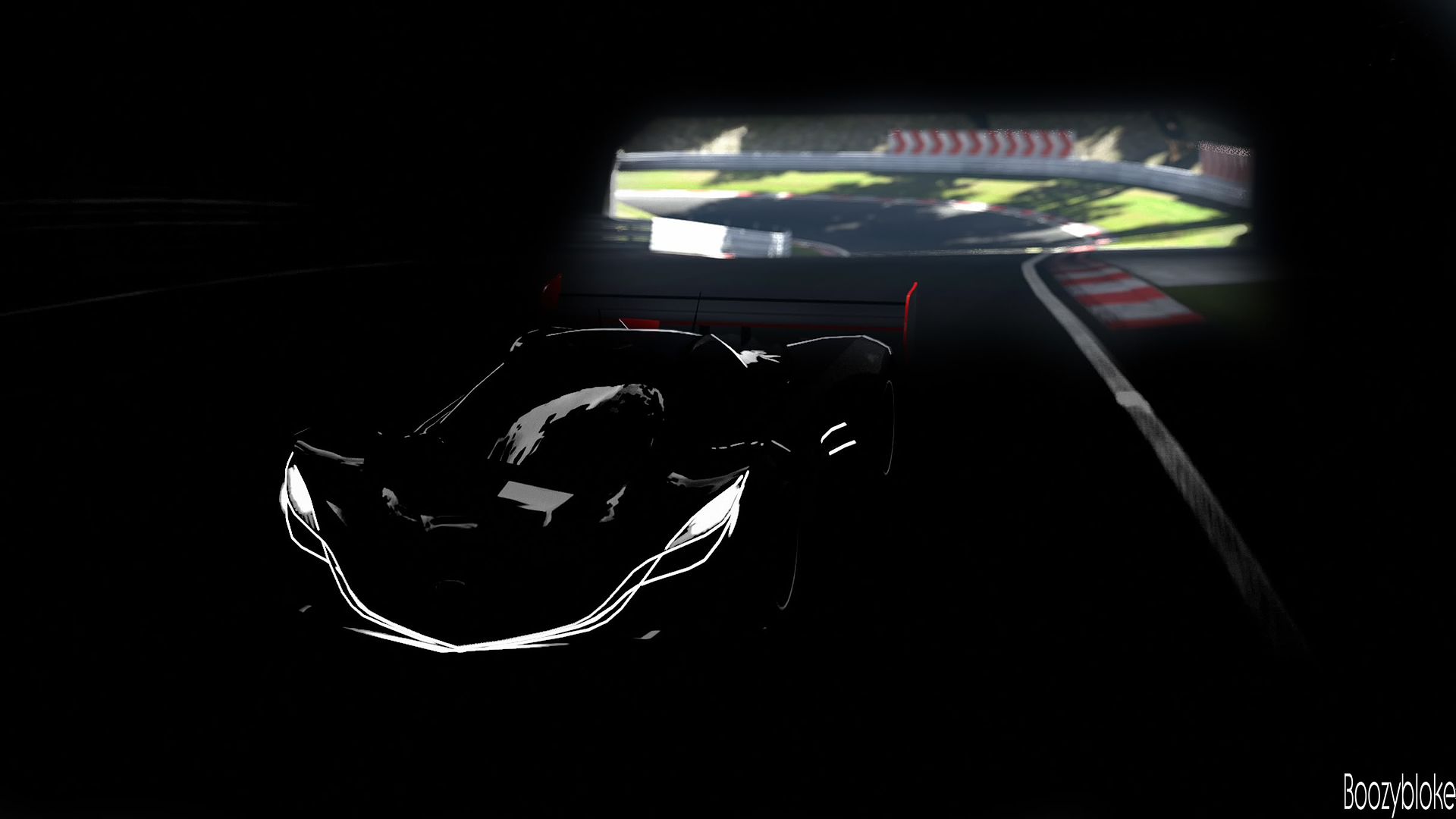
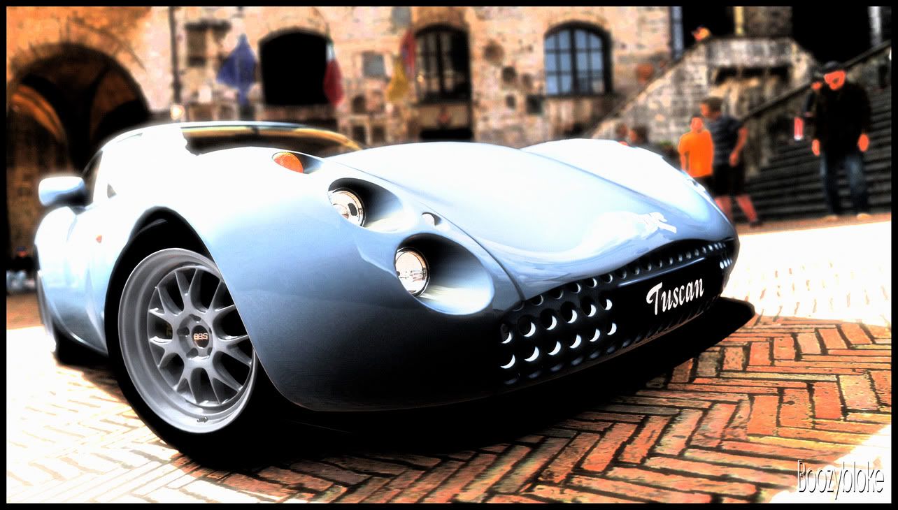
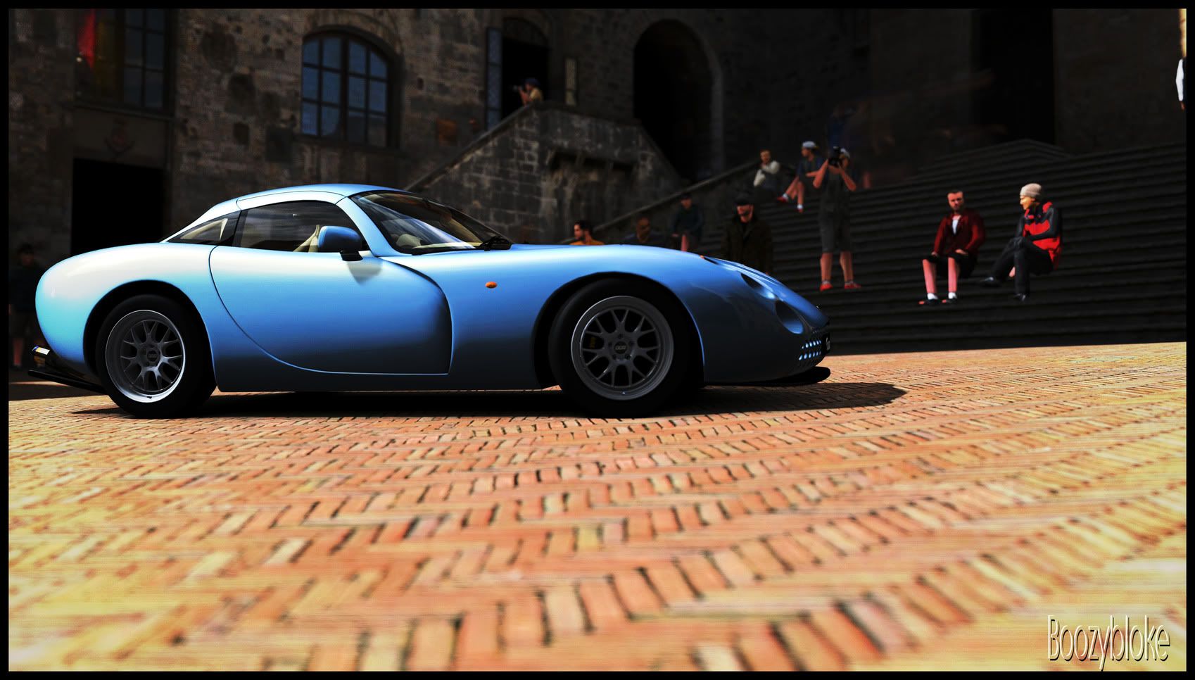
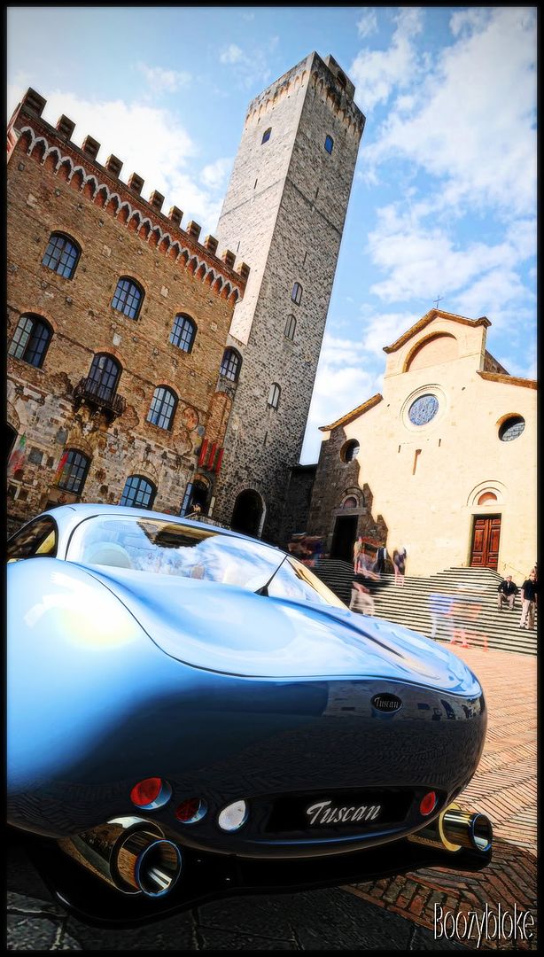
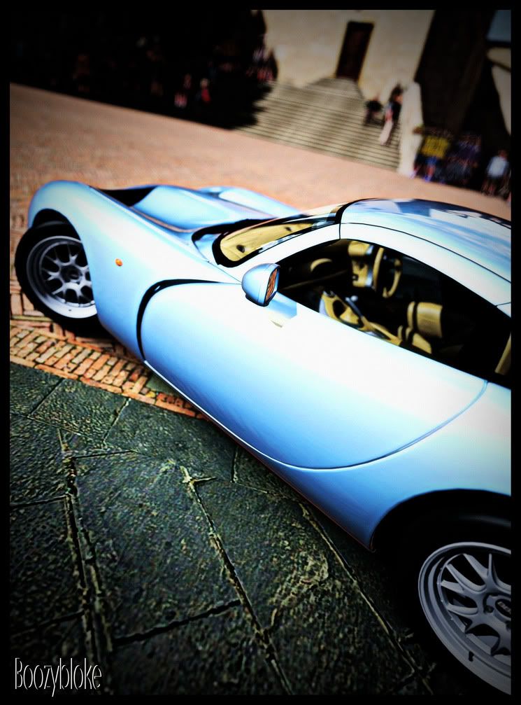
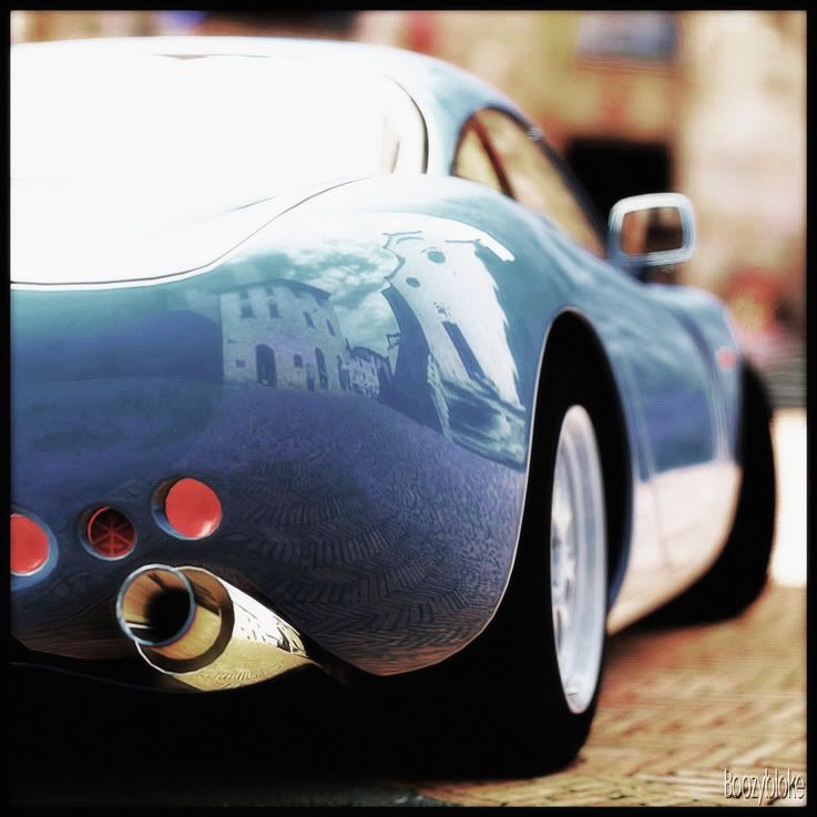
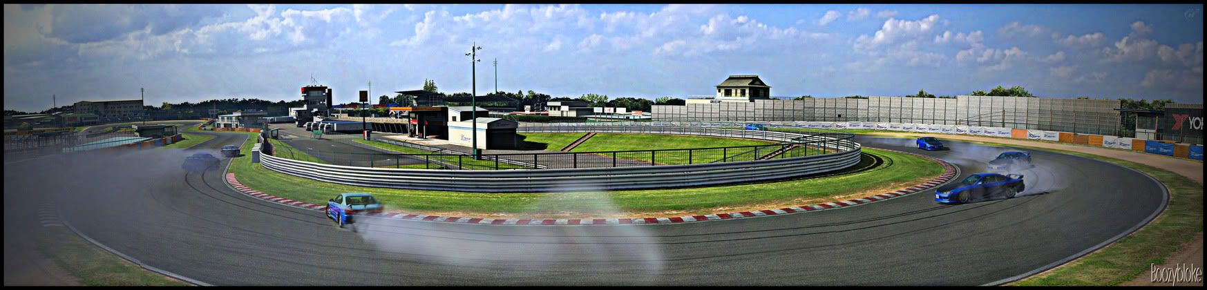
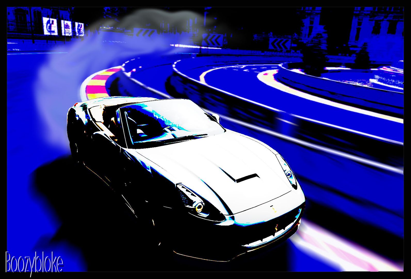
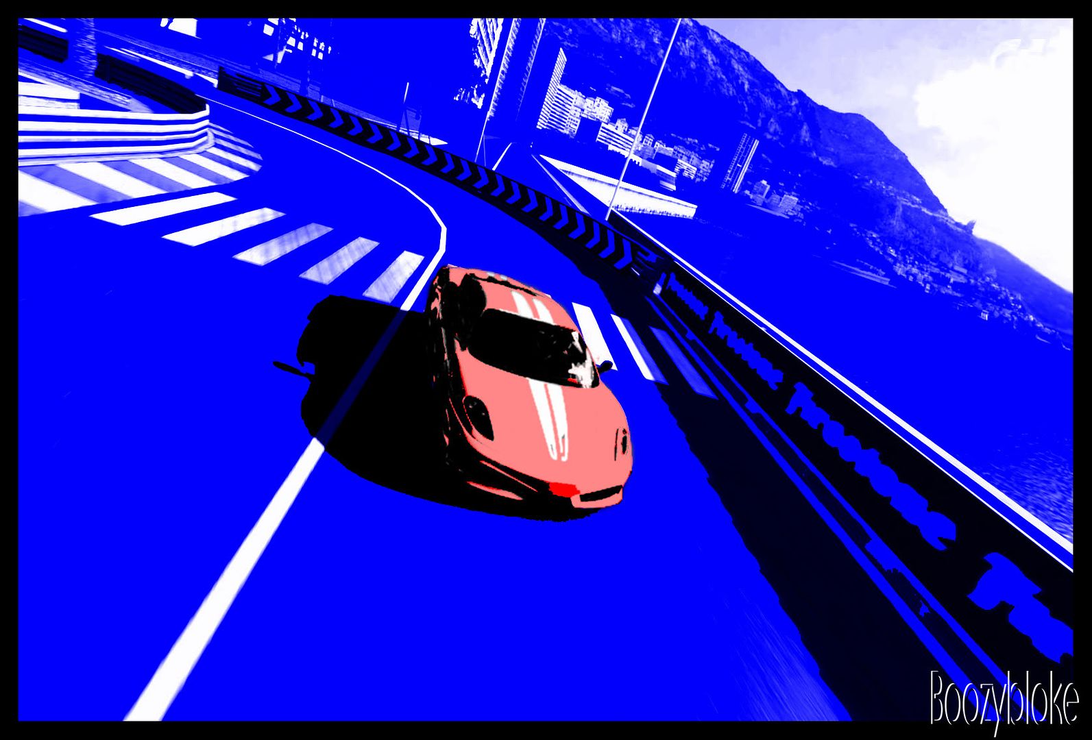
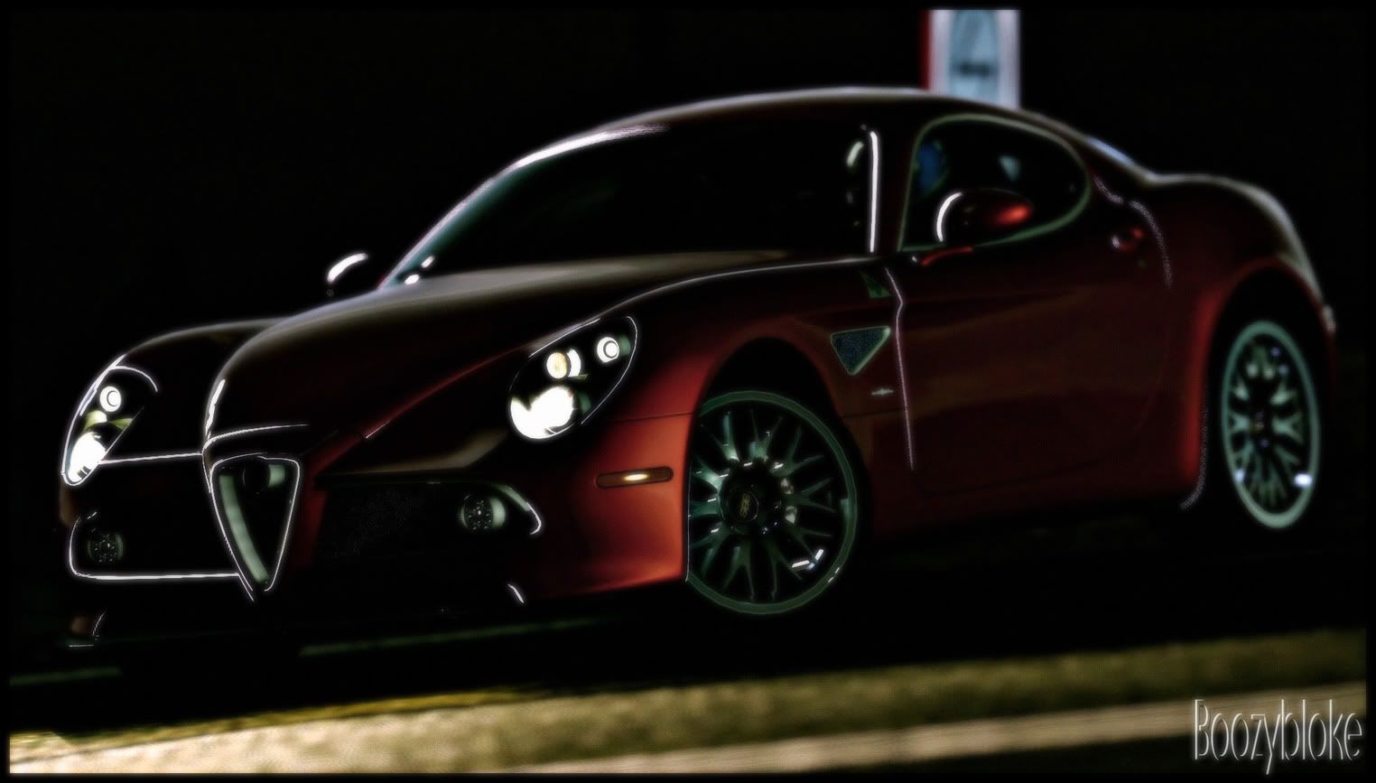
Right, now on with the update, these are the rejects, and entries to the week 13 photo comp and 2.0 comp

2.0 comp entry


rejects


Photocomp entry
Actually, this is the edited version of my entry, to see the actual entry head over to the competition thread


rejects (all unedited)


Anyway, I always like to read your comments, so feel free to let me know if you like them/hate them, and that I should have used a different entry
 
That Furai shoots is amazing. 👍
More so to the Photocomp. rejected.
It's really hard to take some shoot during night + wet surface.
You've make use of it brilliantly! :drool:
 
The Furai shot is not bad, quite interesting.

I quite lke shot 3 of the reject lot of the TVR.
 
Thanks guys. Glad you like the Furai shot- I took one in black and white, one in colour and they didn't look right, so I tried combining them and kind of liked the result.
 
I feel the third reject, from the PMC 2.0 contest is a lot better. Compared to your entry, which made the poll.
 
You would of done well with any of those shots, they are fantastic. I like all of them, especially the 350z shots, I like the detail in them.
 
TVR- Thanks, it's always difficult trying to select a photo to go into the comps. as you know yourself I'm sure. One of the things I consider, especially with it being a competition, is whether there are similar shots already submitted. I really liked that shot as well, and I nearly did enter it, but as I looked through the thread, that bit of the background had already been used heavily and I wanted to use a shot that stood out a bit.

SVX & grrlpurple- thanks, glad you like them. It's a shame that we can't enter sets of photos... Hmmm, possible idea for a competition...?
 
Anatomy of a drift
This is a shot I wanted to try, a mix of panorama and composites. I know it's not perfect by any stretch, but it was more about the idea than the execution. One day I will be able to put together a half-decent panorama... *shakes fist at the sky*


Make sure you full size it!
 
Thanks guys, it's not perfect but I'm pleased that you got the feel of the idea. I'll probably try doing another at some point when my skills have improved some more
 
Thanks! And thanks for voting for me too :)
I had the idea a while ago, I used it on one of the Mercedes/Mclaren SL pictures, but I thought I'd sit on it till the right theme to use it in came up. I thought it might have done better for me actually.. still, there's time enough yet... :rolleyes:
 
I haven't been on for a while, what with one thing or another, and I haven't really played GT5 much, but here's a few popart pictures that I've been working on now and again to keep my hand in


leave a comment if you like​
 
Out of the 3 I like the last one best. It would make a great avatar if you cropped the car. I really like the Anatomy Of A Drift on the last page, never saw it until now. I like the concept and execution 👍
 
Alfa Romeo 8C at Toscana
Just a couple of shots that I had on my computer and had a little fiddle with, hope you like them


Feel free to comment

 
That first 8C shot is a bit blurry. The other two are very nice. I especially like the lone tree in the final picture.
 
Thanks for the comments everybody.

Sems- yep, I should trademark it maybe? ;)

Rossticles- it's supposed to be a 'soft focus' kind of effect on that first one, though I might have overdone the softness a little...

Grrlpurple- thanks, it's my favourite one.

Ceilingfan- go for it! I'd love to see what you come up with 👍
 

Latest Posts

Back