I love your latest entries, Nathan.
Picture #1 - This picture has an excellent composition, great lighting and shadowing and looks very realistic in general. What I like most about this one is the fact that you managed to get a very smooth background without losing any important details. The added noise emphasizes the texture of the road very well.
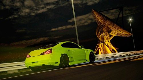
Picture #2 - I just love the extremely high contrast found in this picture. Your decision to accentuate the green and magenta tones (and with that create a complementary contrast) paid off, in my opinion. The lighting is excellent and furthers the sense of motion, which I regard as something essential, in this picture. The amount of noise is in line with the "night theme", too.
Picture #3 - What I like most about this picture are the smooth colour transitions (especially perceptible when looking closely at the cars and the sky), the subtle noise, the shadowing and the road and background blur. So... Pretty much everything about this photo is great.
Picture #4 - This right here is one of my favourite pictures from your gallery. The cold-warm contrast is the first thing I noticed. Shadows look very rich and the lighting underlines the overall contrast of the picture very well, too. On top of that, the depth of field lets the car stand out nicely.
Picture #5 - What can I say? This is one of the best C7 pictures I've seen thus far. Really like the composition, sense of motion, contrast and overall toning of this picture. The sky just looks incredible and immediately grabbed my attention.
Picture #6 - This is another personal favourite. You were able to get the different objects into the frame very well without sacrificing any compositional quality. I like the contrast created by the rather dark car and the illuminated background. What I also like is the fact that you placed the racing driver... well, where he is. This makes it easier for the contemplator to judge how far away the car is from that building - a great detail, which one may not be aware of at first glance, but I'm glad that you made this decision. One thing that I found distracting is the saturation of the (green) colours in that exterior rear view mirror - ever thought about desaturating them a bit? I think that the tones look realistic in general, but that one little detail...
Picture #7 - All the details showcased in this photo are simply mind-blowing. The lighting looks very natural and the incredibly smooth colour transitions of the sky really make this shot stand out from the rest. The composition is spot on, too. Have nothing to complain about.
Picture #8 - Among the best heavier edits, in my opinion. You were able to "combine" two cars in such an extraordinary fashion, that I've no words to describe how great this piece of art really is...
Picture #9 - And yet another stunning edit. The snow effect looks very natural and was executed very well. What tops it, though, is the lighting and the fact that you were able to create an indescribable atmosphere by adjusting the colour balance.
Picture #10 - I love it! This is another favourite. You ask why? It's simple: The extremely rich shadows and the pitch-black sky allow for a very high contrast compared to the well-illuminated cars. I like the way the contemplator's eye is forced towards the road in front of the cars thanks to the lights - great composition. The font you chose fits perfectly, as well. Oh, and nice, subtle signature.")

Picture #1 - This picture has an excellent composition, great lighting and shadowing and looks very realistic in general. What I like most about this one is the fact that you managed to get a very smooth background without losing any important details. The added noise emphasizes the texture of the road very well.
Picture #2 - I just love the extremely high contrast found in this picture. Your decision to accentuate the green and magenta tones (and with that create a complementary contrast) paid off, in my opinion. The lighting is excellent and furthers the sense of motion, which I regard as something essential, in this picture. The amount of noise is in line with the "night theme", too.
Picture #3 - What I like most about this picture are the smooth colour transitions (especially perceptible when looking closely at the cars and the sky), the subtle noise, the shadowing and the road and background blur. So... Pretty much everything about this photo is great.
Picture #4 - This right here is one of my favourite pictures from your gallery. The cold-warm contrast is the first thing I noticed. Shadows look very rich and the lighting underlines the overall contrast of the picture very well, too. On top of that, the depth of field lets the car stand out nicely.
Picture #5 - What can I say? This is one of the best C7 pictures I've seen thus far. Really like the composition, sense of motion, contrast and overall toning of this picture. The sky just looks incredible and immediately grabbed my attention.
Picture #6 - This is another personal favourite. You were able to get the different objects into the frame very well without sacrificing any compositional quality. I like the contrast created by the rather dark car and the illuminated background. What I also like is the fact that you placed the racing driver... well, where he is. This makes it easier for the contemplator to judge how far away the car is from that building - a great detail, which one may not be aware of at first glance, but I'm glad that you made this decision. One thing that I found distracting is the saturation of the (green) colours in that exterior rear view mirror - ever thought about desaturating them a bit? I think that the tones look realistic in general, but that one little detail...
Picture #7 - All the details showcased in this photo are simply mind-blowing. The lighting looks very natural and the incredibly smooth colour transitions of the sky really make this shot stand out from the rest. The composition is spot on, too. Have nothing to complain about.
Picture #8 - Among the best heavier edits, in my opinion. You were able to "combine" two cars in such an extraordinary fashion, that I've no words to describe how great this piece of art really is...
Picture #9 - And yet another stunning edit. The snow effect looks very natural and was executed very well. What tops it, though, is the lighting and the fact that you were able to create an indescribable atmosphere by adjusting the colour balance.
Picture #10 - I love it! This is another favourite. You ask why? It's simple: The extremely rich shadows and the pitch-black sky allow for a very high contrast compared to the well-illuminated cars. I like the way the contemplator's eye is forced towards the road in front of the cars thanks to the lights - great composition. The font you chose fits perfectly, as well. Oh, and nice, subtle signature.
Last edited:
 .
.")


 👍. Well, all of them are fantastic really
  .
.


 !
!
 In any case, I like it - it's original and green, which is probably one of the most under-appreciated colors in the spectrum for cars. Perhaps you may recall my green Lambo set from a while back? That's what I'm talking about.


