2014+ Lexus IS | RC General Discussion: RC-F Revealed

  • Thread starter CodeRedR51
  • 193 comments
  • 18,866 views

CodeRedR51

Premium
55,260
United States
United States
http://www.autoblog.com/2013/01/09/next-gen-lexus-is-design-revealed-to-be-swoopiest-yet/

00-2014-lexus-is-live-opt.jpg


I don't like it. And am definitely NOT a fan of that new grill treatment Lexus is giving all of its cars. :yuck:

And someone put some lowering springs on that thing, stat.
 
Looks like I thought it would. Front sticks out a little much for my liking. Interior isn't surprising, but I love the LFA-inspired cluster. Can't wait to drive it.
 
I don't like how the car looks (the grill and the checkmark headlights :yuck:), but the interior is quite acceptable
 
I'm not really surprised it doesn't look as good as the current gen. Because I don't think you can make a saloon that is more beautiful and elegant than the current gen IS.
 
I really like it. Apart from the odd white bits splitting the headlights in two. Would look fine, but for the lower edge of the upper part of the headlight is oddly wavy. Would be better as a straight edge.

I quite like Lexus's current 'Spindle' grille design though. Gives the cars a bit of personality, and I suspect it'll soon look less shocking too, just as Audi's "beard" grille from the early 00s eventually did.
 
Audi's shield grill eventually started working great because Audi started designing their cars around it, but even before they did the worst you could say was that it didn't work as well as the previous double-decker grill design.


Lexus seems to be slapping it on the cars with no regard to the rest of the design (like Chevrolet was when they lifted the Audi design for all of their 2005-ish cars), and it's getting annoying how overstyled cars are getting nowadays anyway. I'm thinking 10 years from now people will look back on this silliness with the same distaste people looked at fins with in the 1960s.
 
This style worked much better for the GS, I think. This new IS is too small of a platform to gracefully support all the styling gimmicks of the larger vehicles, and it ends up looking somewhat overwrought rather than aggressive (although it has some swagger, for sure!) And what's up with the rear tail lights drooping down so much? THAT is the single worst part of the design to me - they need to be more squared off.

But overall it's not a bad-looking vehicle, and it should have all the traditional Lexus strengths.
 
Lexus seems to be slapping it on the cars with no regard to the rest of the design

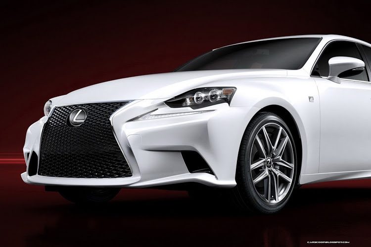
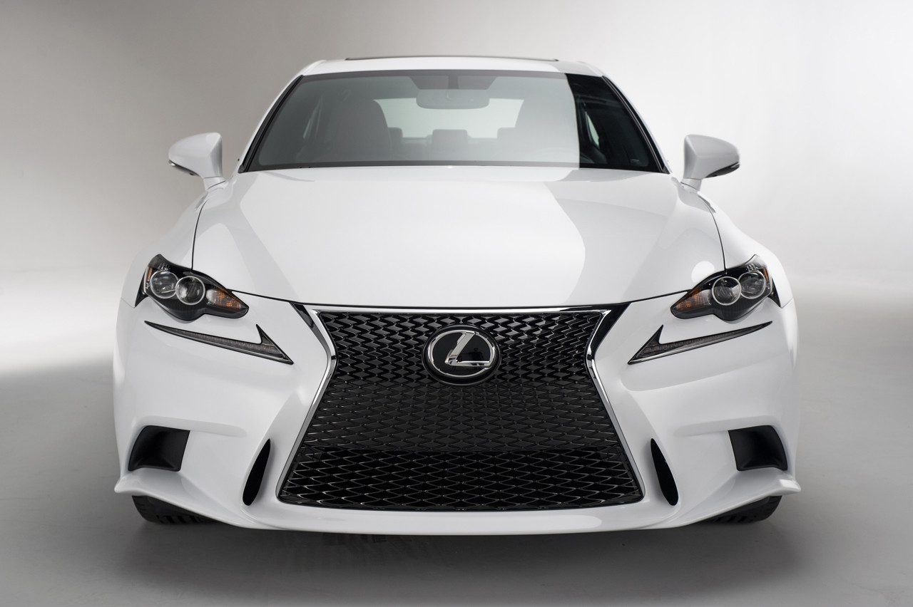
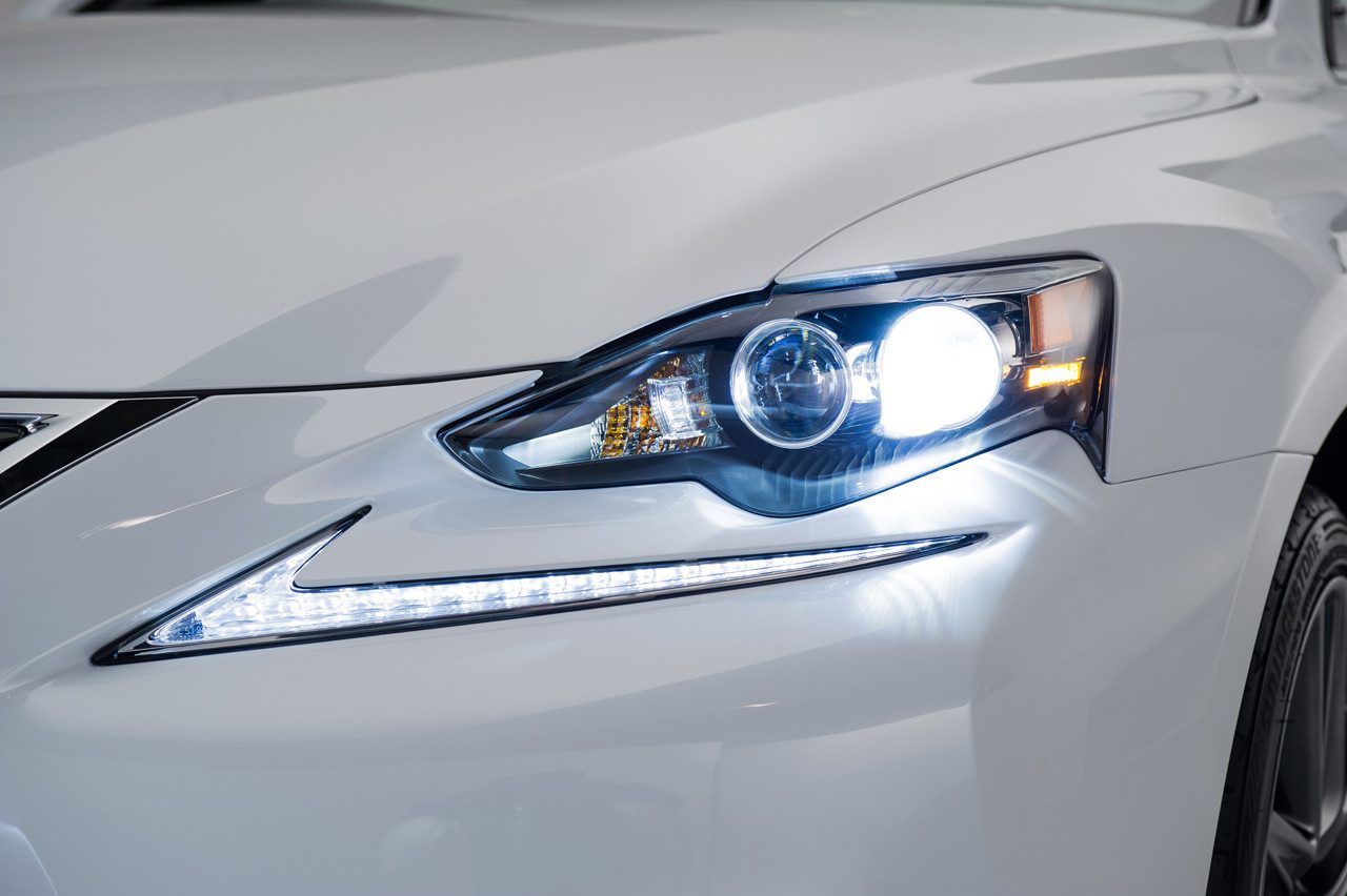
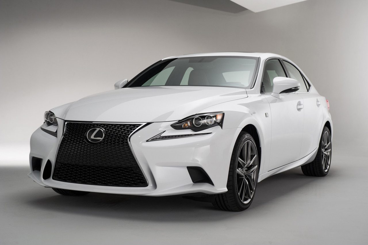
I dunno, I think it works. The upper edge of the grille, before the line changes directions, echoes the edges of the headlights. The lower edge is reflected in the smaller vents to each edge of the front bumper. And overall, Lexus cars have been getting more angular and origami-like recently anyway. I don't think something less bold - say, the interim grille style on the CT 200h - would work with a design otherwise filled with sharp folds.

There is one other thing, and that's the fact that the grille looks less dramatic when there's a license plate stuck right in the middle of it, which is the case in many countries. Not visible in the images above obviously, but it does take the edge off it a little out on the road.

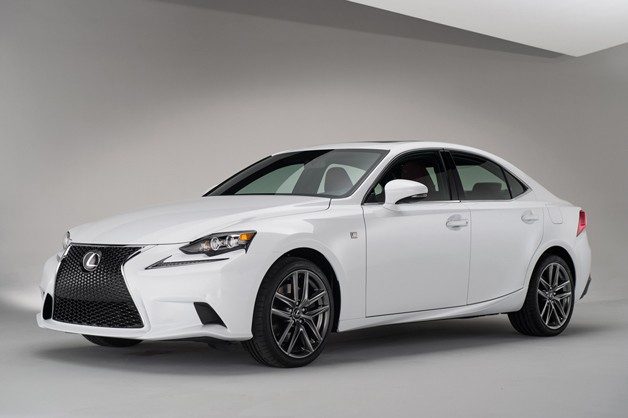
The other thing is that I quite like Lexus's design confidence. It's dramatic but I wouldn't go as far as calling it over-designed. Several other cars on sale at the moment have a sort of uneasy mix of sharp edges, curves, scalloped sides, odd details etc (I'm looking at you, 1-Series) - to me, the IS is at least consistent across the whole car (those odd headlights aside).

I quite like the rear lamps too, AMCNUT! It's a very concept car-style touch. Looks like the lights are peeling out of the bodywork between the metalwork and the rear bumper. I'm a big fan of the GS, but the IS has all of a sudden made the GS look a bit half-hearted.

But Lexus's current design language sits a lot more easily with me than many at the moment. It's like the car has been searching for a design identity since 1989 and they've finally found it in the last few years.

Maybe I'm just odd.
 
At the very least, it is an interesting vehicle. A hobbled-up mess of new style and performance directions for Lexus. I mean, from the looks of things, it would seem like the F-Sport would drive quite well, and the LF-A inspired interior is... Interesting. But it seems like such a strange mess of switchgear, digital interfaces, and that awkward analog clock.

Still, it seems a fair bit more interesting than the new 3-er. I'd imagine that, based on the GS and LS, it should be as entertaining to drive as the ATS.
 
I quite like the rear lamps too, AMCNUT! It's a very concept car-style touch. Looks like the lights are peeling out of the bodywork between the metalwork and the rear bumper. I'm a big fan of the GS, but the IS has all of a sudden made the GS look a bit half-hearted.

I can appreciate adventurous design, but those tails look less like they're peeling out than they do just... bleeding. Like a girl who cried too much with makeup on and now it's run down her cheek. That's what the tails remind me of! :lol:

I suppose the easiest solution would be to just buy a red car so I don't notice...
 
The concept looked much better. The grill for instance, didn't come down and lean out like a giant slide at the bottom.

Maybe the possible coupe will look better.
 
Ahh, my eyes! It's hideous! I would never, ever buy one. I don't care if it's better to drive than the LFA, it's too ugly.
 
The side profile and interior look nice but the headlights / front and tail lights looks ugly.

2014-Lexus-IS-14%25255B2%25255D.jpg

2014-Lexus-IS-10%25255B2%25255D.jpg
 
Looks tasty. Definitely more spice than the last model.

Though I can see why the other members don't like it as much as I do (Then again we are a tough crew to please).:lol:
 
It's just too busy. The front is a mess, the rear just doesn't work at all. And the side has no continuity. Overall, it just doesn't work for me.
 
I really like it. The only thing I would change is the 'DRL' strip below the main lights, if they were smaller or looked less like the Nike logo I think the front end would look a little neater. I love that grille though, it's a brave move but at least it lets the car stand out from the crowd a bit.
 
Excepting perhaps the Nike'd DRLs, the wavy pattern on the lower line of the headlights and the triangular hofmeister-kink-simulating thingy on the rear door. I think it looks properly beautiful.

It's undeniably eastern but not overdone, it has a somewhat muscular stance and manages to hide it's enormous wheelbase very well. And the predator grill really fits this car. Very nice.
 
This car has the most disgusting headlight design I've seen in my life. It's not an issue of poor design, like old sealed-beam rectangles, these headlights are actually ugly in an organic way, like a hairless cat or a prostitute's moneymaker. They're just ****ing terrible.

Now, if this globular mass was encased inside a single unit they would be great. I see that they attempted some line continuity with the Nike slash seeming to be connected to the main light unit, even up close...

agzM8.jpg


4bA8x.jpg


...but they failed because that illusion only works when looking straight at the shapes. When you turn the car at an angle you can see the main light unit bulging like a cancerous brow, an unsightly tumor bursting from an otherwise smooth and futuristic shape.

F6ZZl.jpg


YUmlf.png


Ruins the entire car which, besides this massive fault, is better than the last in every way. What the hell were they thinking?
 
I liked the spindle grill on the F-Sport models from Lexus at first, but I'm beginning to hate it. It's just too big for the car and much too dominant over what would otherwise be a nice design with interesting cues not seen on many other cars. I'm certain non F-Sport models will look a million times better, though I hate those weird blobs in the headlights; it reminds me of the headlights from an Acura RSX. Awkward blobby things that just do not flow with the rest the car. The separate LED strips are neat, but the headlights themselves are much too small.

8041720006_large.jpg

2014-Lexus-IS-15.jpg


The interior looks very nice, though the inconsistent color of the lights on the center stack drives me nuts. Red, green, blue, yellow, it all just looks unsettled. It'll be interesting to see how this compares to the ATS.
 
Congratulations, Lexus. You've spent twenty years and billions of dollars on making the public aware that an ES and an IS and an LS and a GS are totally different cars, and that they shouldn't dare be confused with any mere Toyota product.

And then, you proceed to make them all look very much alike, while making them ugly. I'd hate to be a Lexus salesman, although I suppose I can console myself that a few of them that I know are now getting what they deserve...
 
I like almost every part of the car, except for how the headlights are separated. Anyone have the time to see what the car would look like if the headlights were one piece (photoshop)?

Edit 2:

isedit.png


(I tried)
 
Last edited:
I like almost every part of the car, except for how the headlights are separated. Anyone have the time to see what the car would look like if the headlights were one piece (photoshop)?

No need, just imagine this year's GS and a 2013 IS. With all the inspiration of the ES.
 
This is definitely a love it or hate it design, no in-between.

I'll show this to my brother, who owns a 2011 model, and see if he stays Lexus or moves elsewhere.

This car will look slightly better with a ride height drop and slightly fatter tires, but I guess that's for an F-sport package down the line.
 
I like almost every part of the car, except for how the headlights are separated. Anyone have the time to see what the car would look like if the headlights were one piece (photoshop)?

Edit 2:

isedit.png


(I tried)

That's much much better. Somehow joining the lights up has made the grill appear smaller and better.

I think the fitting of a licence plate will improve the look of the grill, or even splitting the grill in two with a black bar (there is one there behind the grill already). The side profile and wheels look good though :drool:
 
I think the fitting of a licence plate will improve the look of the grill, or even splitting the grill in two with a black bar (there is one there behind the grill already). The side profile and wheels look good though :drool:
isedit.png
 
Last edited:
Back