- 361

- Baytown, TX
- CommanderBond
I don't have time to go through all 54 pages, but here's my personal favorite...

I do actually like the Marlboro McLaren design because it's simple and unclutteted but you raise an excellent point that has been overlooked before - successful cars usually have more memorable liveries.It's only the associations it has that make people think it's actually a good livery.
I like those liveriesI do actually like the Marlboro McLaren design because it's simple and unclutteted but you raise an excellent point that has been overlooked before - successful cars usually have more memorable liveries.
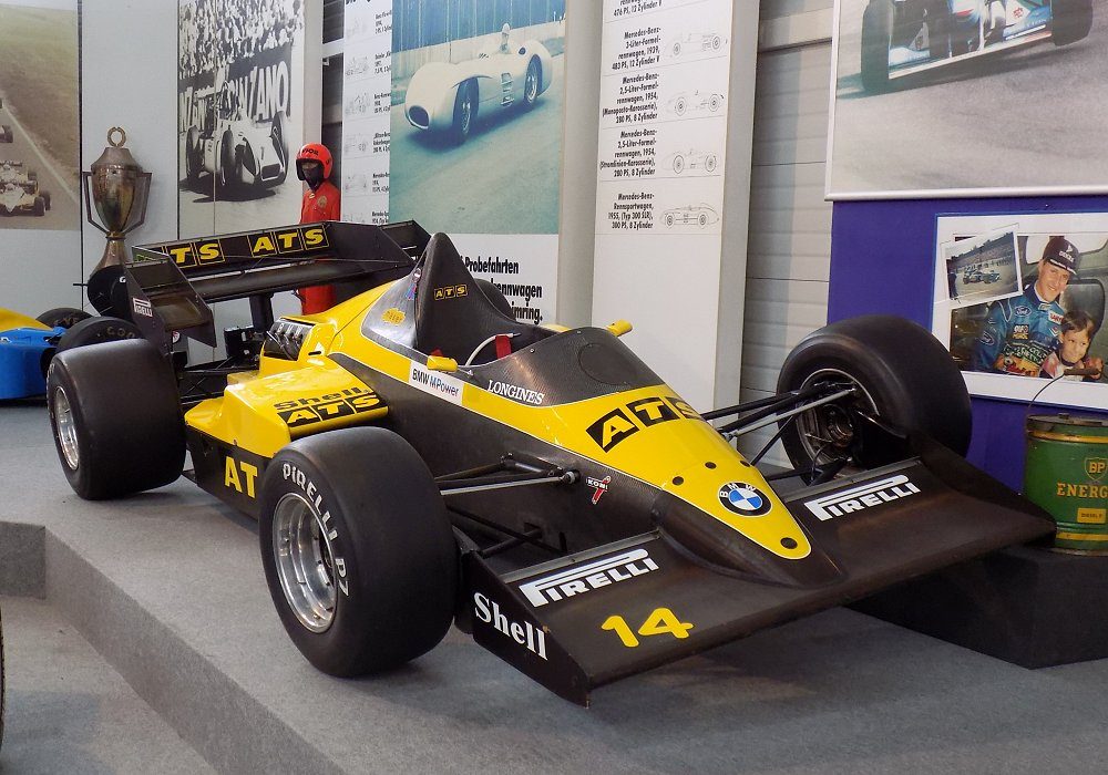
If the ATS D7 had won 15/16 races, it would doubtlessly be lauded as a stunning car.
If Thomas Erdõs won the 2001 BTCC, his Lexus would be remembered as a sleek looker.
View attachment 1382717
It's much rarer that you get Esso Ultron Peugeot 406s or Jaguar R1s, uncompetitive cars definitely remembered as good looking. It's even rarer still that winners are remembered for being ugly.


It's clean and classic, however I think it's imagery is idolised for the performance of the car rather than the livery delivery.For me, nothing beats this one.

Marlboro is the most overrated design of all time.It's clean and classic, however I think it's imagery is idolised for the performance of the car rather than the livery delivery.
I think it looks a bit too plain and simple, looks a little bit "homebrand" (generic supermarket) product.
Some of the first races I remember watching was these cars just driving off into the distance, as much as Murray was sensationalising them I thought those two cars were boring at the time - I was fairly young so I had much to learn.
I've got to disagree with this. The Marlboro livery existed well before the cars that ran it became so dominent. It was a very early sponsorship livery when the whole concept of sponsorship was pretty new. As such, liveries were simple, but the way the Marlboro inverted V (which in itself is a classic design) was applied to the single-seater shapes of the time just works so well. It's clean and simple but totally 'Marlboro'. It's shown above on the ('88) MP4/4, but as a design on an F1 car it dates back to the very early 70's.Marlboro is the most overrated design of all time.
It’s the bare minimum of design effort. Painting a red stripe on a white car (or a white stripe on a red car in the case of Ferrari/Toyota).
The success of the teams using Marlboro liveries and the “smoking is cool” attitude in society that was prevalent when they were being used carry the entire design. Otherwise it’s incredibly basic and boring.
It would be interesting to see a 1980's McLaren in an older Marlboro paint scheme.. I think it might look better with more of a two tone red over white.I've got to disagree with this. The Marlboro livery existed well before the cars that ran it became so dominent. It was a very early sponsorship livery when the whole concept of sponsorship was pretty new. As such, liveries were simple, but the way the Marlboro inverted V (which in itself is a classic design) was applied to the single-seater shapes of the time just works so well. It's clean and simple but totally 'Marlboro'. It's shown above on the ('88) MP4/4, but as a design on an F1 car it dates back to the very early 70's.