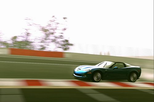
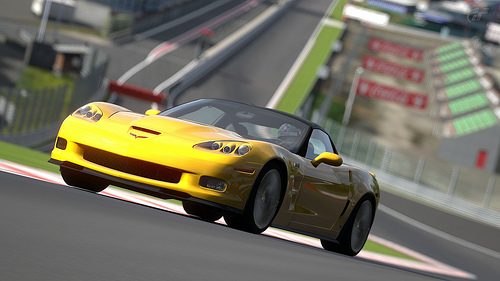
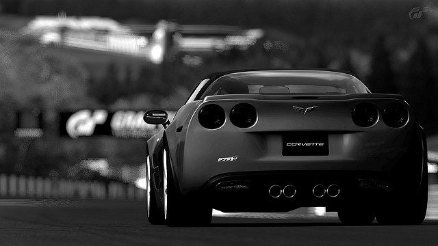
It's not so much the composition as Musical Artist indicated, as much as it was the overexposure on this one. You could have moved the camera over to the right about 25 meters with the perspective on the driver's side rear-end in the lower right quadrant of the frame, and that would have given you more road to draw the eye away, giving a better sense of depth. It may even have helped with exposure, because the sun would not have been glaring into the lens. The Rule of Thirds is a good heuristic, but still discretionary, as long as there is a purpose behind the composition. Rigid adherence to such rules should not outweigh artistic license. In this case, I felt the bleached out sky dominated the shot, notwithstanding the composition. Spa is a very difficult track to get a good
unedited shot on because of the position of the light source (the sun). I can see that you had to amp the exposure up in order to bring out the detail of this side of the Vette, but it was done at the expense of the totality of the shot. On the flip-side, your shot has great sense of motion and the spray from the tyres is nice. I also liked how you placed the rumble strip along the path of the car, which accentuates the lines of the car and the sense of speed.
Please don't tell me that i failed because of the contrast on this one:
Can anyone give me an opinion or advice? Thanks
I won't tell you that.
")
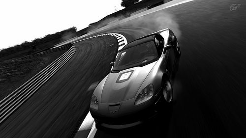
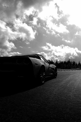
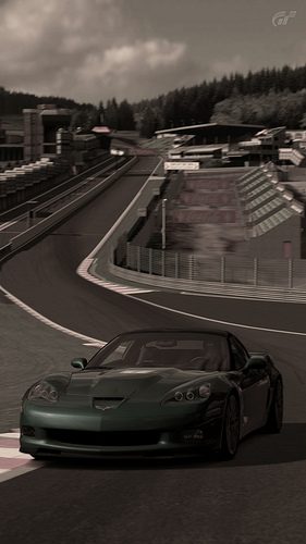
In fact, this one made it into the top 25. With this great angle and curve of the road, though, I would have liked this shot to adhere a little more strictly to the rule of thirds. If you had placed the Vette in the lower right quadrant and tilted the camera up or down and to the right a little, while looking down a little more on the subject car, it may have made the picture more interesting. It would have brought out the curve of the road more and the shot may have been more compelling. Additionally, I felt the photo was a little too sharp, as indicated by the telling marks along the seams along the hood. With the black and white shots, smooth gradient progression along the blacks and grays is necessary for a great shot. The hood in this shot has some issues with this, as the grays break up a little bit (quasi color banding/posterization). Nevertheless, I really liked the sense of motion from left to lower right and the lighting on the top of the car is great.
Some feedback please Primus?
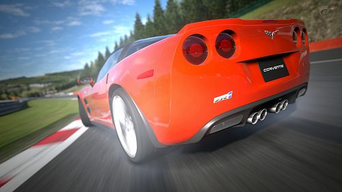
Nice shot my friend. I liked the color and depth of field. The Vette sure does have big hips doesn't she?
In this photo, the fish-eye view and close-up of the rear seemed to dominate the shot more than the great depth of the road. I liked the sense of motion as well, but it looks like you were going for two different focal points, which tended to cause confusion instead of harmony in the shot. If you're going for the great aperture/DOF, it may have been better to back up the shot a little and go for a slightly smaller aft end. If the Vette was the primary perspective, then I would have liked the car a little more in the upper right-hand quadrant with the camera up a little, tilted to the right a little and panned down a little. It's hard to describe and easier to show. In other words, I would have tilted the camera differently and backed the camera up a little to decrease the fish-eye, provide a similar but more harmonic focus on the car, while keeping the long road and great depth of field. Sorry I can't explain it better.

feedback?
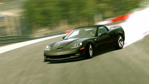
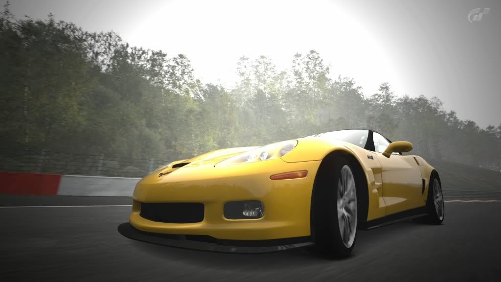
Beautiful shot GT-johan - this one made it into the top 20. The composition is nice, the tones are decent, the aperture is good... right about now you are thinking, yeah, so why didn't it make the poll? There were some issues with the greys in the rear with banding, which were more significantly manifest when the picture was enlarged, but even that probably wasn't the biggest issue. In the end, I think it was that there were quite a few desaturated photos in this competition, and although the picture was technically sound, it did not stand out stylistically. Maybe it was a case of knowing your medium, so to speak. We have one of the greatest racing tracks in the world with one of the greatest sports cars in the world. I didn't get the sense that either the track or the power of the Vette was being displayed, even though the car and the blurred out track were nice individually. A photo should tell a story, but this one just needed a little more character I think. This isn't to say that the photo has to show the power of the Vette or the grandeur of Spa's glorious bends and straights, it's just that if these attributes are left out, the remainder must stand out even more.
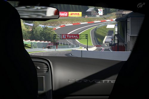
Say Primus, your thoughts on this interior shot...
...would this exterior image have gained a more favourable judgement?

Well, you definitely went outside of the box and took a chance on this one my friend. I liked the idea. Much like the critique I gave above for GT_johan, though, I think your photo missed the point of the car/track pairing. I didn't get a good sense of story in this shot. I see the nice curves in Eau Rouge, but the inside of the ZR1 isn't interesting, even in the real deal. This perspective merely amplified the poor rendering of the interior. Perhaps a different aperture would have helped fade out the end of the road a little. I wouldn't have gone as far as 1.0, but maybe a 1.4 or 2.0, depending on how far back behind the Vette your camera was. Nice try though!
Your other shot was also decent, but the tree trunks and house in the distance were poorly rendered by PD, which obviously decreased the realism of the shot.
feedback please
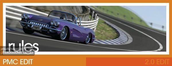
 CCCL Week 47
 by
f1_stig, on Flickr
I really expected to see more of Eau Rouge in this competition. It is legendary. In this shot, I like how you utilized a vertical composition, but felt that the color was a little desaturated and you may have fared better with a different shutter speed. Had you used a 1/60, for example, the wheels would have been spinning and there would have been a greater sense of motion in the road. Also, with a long perspective like this, you may have benefited from a different/wider aperture, such as 1, 1.4, 2.0, etc. This would have isolated the front of the Vette more while blurring the back ground to your taste in order to provide a more interesting shot. The lighting in this shot is also a little dim. Lastly, you clipped part of the road out of the left side of the shot, which is a little distracting. It was a nice try, and I think you were on the right track. Just a few adjustments and the picture would have a lot of potential.