Fonts that you love and hate: Typographical discussion.

  • Thread starter Pupik
  • 276 comments
  • 38,057 views

Pupik

dig the bolts in my neck
Staff Emeritus
19,423
United States
HSV
These fonts are used for illustration purposes only, and not because I actually like to use them or see them.

1. MS Comic Sans

attachment.php


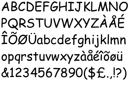
Please, Microsoft...even if you can't fix all the bugs, at least stop packaging this font with Windows. There's even a crusade against it.
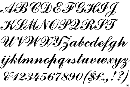
2. Monotype Corsiva

attachment.php


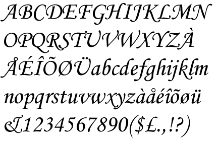
This isn't so bad (but there's at least 1000 better fonts) but it's always used in ALL CAPS and looks terribly unbalanced. Fancy without style is lame.
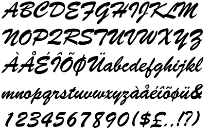
3. Mistral

attachment.php


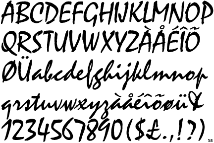
It's a wind, and thus, this overused font blows. Once the rap group N.W.A. sent this font into oblivion for their album's title (language warning), and it has had no visual impact since. It does not appear to be applied with a brush, once you've used it for same letter twice.

4. Impact

attachment.php


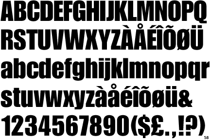
It's that loud person in a room that never knows when to shut up and allow others to speak, which is understandable since it laughs at its own jokes.

5. Times New Roman

attachment.php


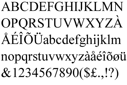
It's not even that terrible a font, especially since ClearType and anti-aliasing was finally accepted as a de facto standard by the start of the millenium. But the next letter, business proposal, or FW: FW: FW: FW: e-mail I see with that font is going right into the trash can. Please do not italicize it, either. It looks wors-er-est.
 

Attachments

  • ComicSansMS.gif
    ComicSansMS.gif
    13.9 KB · Views: 595
  • Corsiva.gif
    Corsiva.gif
    14.9 KB · Views: 595
  • Impact.gif
    Impact.gif
    14 KB · Views: 589
  • Mistral.gif
    Mistral.gif
    17.4 KB · Views: 590
  • TimesNewRoman.gif
    TimesNewRoman.gif
    13.3 KB · Views: 589
Last edited:
How about the 3 fonts that are nothing but signs/symbols? Why do they need 3 fonts for that? Who can even read the 1?!
 
True the alignment is nice, of course whenever I use it I think of the days of typing on an old Apple with Windows '95...
 
Blackoack STD, and of course Comic Sans.
Both deserved to be shot at.
 
Papyrus. And, obviously, Times New Roman, Impact and Comic Sans MS.

BASE02

It's not big and it's not clever (anymore)

That does annoy me. It seems like every trying-to-be-EXTREME-but-not-so-much company is using that to seem cool these days. Whatever happened to originality, people?


(Yeah, I'm a big font nerd...)
 
Helvetica

Blasphemy. I can't think of any other typeface that's so neutral yet can convey different feels based on its weight. :P

The main culprits are already outlined, what frustrates me more is the sudden over-use of certain fonts such as Rockwell and Avant Garde Gothic and its alternate characters.
 
Dont click the link in post 1 about banning comic sans, Norton reported I had a high strength attack blocked from that site.
 
Last edited:
Reventón;3215545
How about the 3 fonts that are nothing but signs/symbols? Why do they need 3 fonts for that? Who can even read the 1?!

yeah, those ones are just weird
who would actually ever even think of typing in barcodes
 
Commercial Script
CommercialScript.gif


Brush Script
BrushScript.gif


Years of making boat licenses, door decals and windshield banners for people has jaded me more than I can convey.
 
’

I hate wingding's
 
Sage appearing in 3... 2... 1...
:lol:

I actually “hate” very few fonts themselves – typeface designers are often very talented people and have thought carefully about their work. It’s almost always the misuse of fonts that I hate. However, it’s very very very easy for me to choose my #1 most-hated font of all time ever forever ever:

attachment.php


Arial.

A perfect case study in why I don’t like Microshaft and certain other cancers of typography. Back when Windows 3 was being developed, MS needed to choose a sans serif font to bundle with its OS. Apple chose Helvetica, arguably the most important font of the 20th century, and for good reason – it’s utilitarian, can be used just about anywhere, and doesn’t draw attention to itself, yet it’s balanced and quite a gorgeous font. MS was too cheap to pay the license fee for Helvetica, so instead they paid for Arial, which is a total ripoff of Helvetica (actually, it’s a ripoff of Monotype Grotesque and then stretched to fit Helvetica’s dimensions, but for all intents and purposes it’s a ripoff of Helvetica). It would be bad enough if it were a ripoff, but to avoid legal problems Arial has a few tweaks to some of the letters that makes it worse than Helvetica. So it’s a shameless ripoff without the grandeur of being a true ripoff. Horrible horrible piece of contemptible trash.

This shows you how much they copied Helvetica:

attachment.php


Red is Arial, black is Helvetica.

And of the differences that they did make, the change in “R” really steams me:

attachment.php


On the left is Helvetica’s “R” – it’s my favorite letter in that typeface. It continues the geometric 1960’s theme of Helvetica, but adds in a bit of early 20th-century flair in the leg. On the right is Arial. Okay, who the 🤬 decided to break Helvetica’s leg and put it in a cast? That’s already bad enough. But then they take it a step further by narrowing the stroke as it meets the bowl, which as far as I can tell only serves to make the leg look even more brittle. Stupid letter drives me insane. You people have to understand that I could write pages and pages and pages on everything wrong with Arial. The fact that it’s ubiquitous only makes it worse.
 

Attachments

  • a-h.png
    a-h.png
    13.7 KB · Views: 472
  • rr.png
    rr.png
    1.5 KB · Views: 417
  • arial.png
    arial.png
    11 KB · Views: 419
Last edited:

Latest Posts

Back