Fonts that you love and hate: Typographical discussion.

  • Thread starter Pupik
  • 276 comments
  • 38,059 views
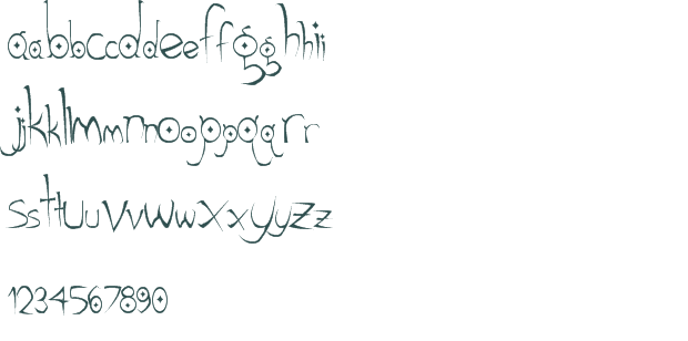
I have a strange love for Gothic Hijinx. I use it a lot on artistic "magicy" stuff
Gothic_Hijinx_font_preview_12685_2.png

Its asterisk looks like a shuriken, I always found that quite cool.

And from times where MtG still had atmospheric card frames:
GoudyMedieval.png
 
^ and you didn't see the Top Gear episode dedicated to it? ;)

My typography prof met Mr. Parker; he had nothing but good things to say about him. Those who've made typography their singular profession are just scary in the amount of knowledge they have - it really is all about the small details. It's always sad when a master of any craft passes on. :(
 
So did you guys know Hoefler & Frere-Jones split up?

http://nymag.com/news/features/jonathan-hoefler-tobias-frere-jones-2014-6/

Years ago, FJ sold his portfolio to Hoefler's company for ten bucks, assuming they would be partners. But, basically, Hoefler always brushed the topic of partnership under the rug. A few months ago they had a confrontation, and Hoefler insists that FJ was always just an employee. In other words, Hoefler is a wormy scumbag that tried to screw the guy that put them on the map out of half the equity in the company. Multi-millions.

How freaking greedy do you have to be to pull something like that? Hoefler has no cojones. He ruined a great thing.

They've settled out of court now, but my god I'll never use another H&co font. They all suck anyway. FJ's fonts were the only good ones.
 
TB
...save them millions.

...To spend on every screen play handed to them lol.

I’m a big fan of the Blade Runner font and used it for the logo of a short lived magazine project I worked on.
 
Back