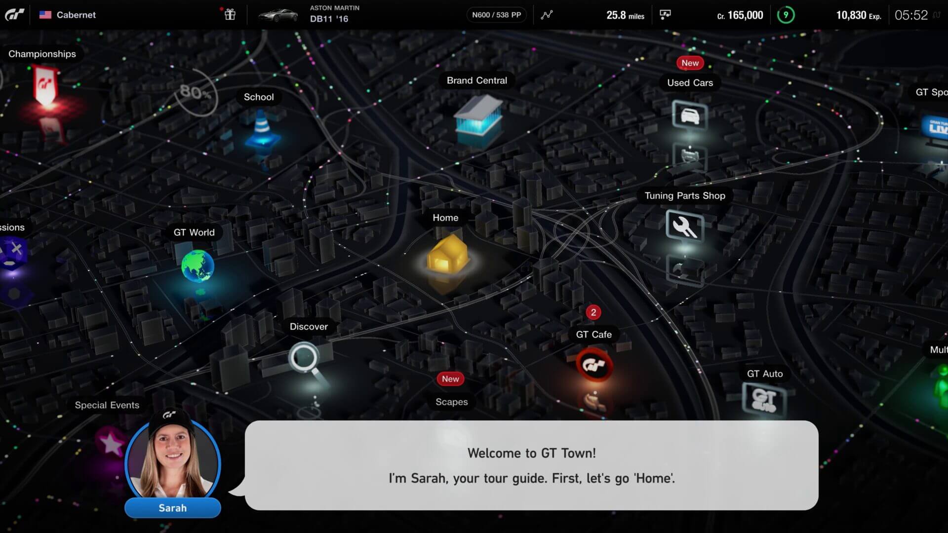
Perfect? It's a UX mess. Tell me, if I go to tuning part shop and press down, which icon will I land on? What about up from discover?I really like GT Town, the new home screen
Nostalgia, modern .... I like little circles that represent cars. Whoever created it deserves a medal for me. It's perfect !
You are using an out of date browser. It may not display this or other websites correctly.
You should upgrade or use an alternative browser.
You should upgrade or use an alternative browser.
Gran Turismo 7: Latest news and discussion thread
- Thread starter sems4arsenal
- 39,384 comments
- 4,110,281 views
- 2,877

- southport
Perfect? It's a UX mess. Tell me, if I go to tuning part shop and press down, which icon will I land on? What about up from discover?
You`ll be using the analogue stick, like a mouse?
- 4,500

- Australia
You`ll be using the analogue stick, like a mouse?
Which takes five times longer than using the D-pad...that adds up when you do it hundreds (if not thousands) of times. There is literally no value added in increasing the time it takes to navigate a menu
A lot of people forget that GT4 was the real menu simulator. The novelty if the menu feeling like an adventure wears off very quickly. It was abhorrent.
Last edited:
You`ll be using the analogue stick, like a mouse?
Except it's not though, is it? PD have always had a mouse like interface despite their game not using a mouse. Did you play GT4? You constantly landed on the wrong icon despite thinking you've pushed the right direction. You push down and left from School. Do you land on GT World or whatever that icon is cut off on the left? Depends what angle you pushed to the left I guess.
If you hold it too long, oops, you've gone all the way to the icons at the bottom.
It would work with a mouse, where you can freely move and click on each icon. It doesn't work when you're using a controller to push a mouse icon around bouncing from one icon to the other.
- 141

- Hungary
I think it will be like in GT Sport. With the arrows you can rush through the menu in the classic way but with the analog stick it actually works like a mouse.Except it's not though, is it? PD have always had a mouse like interface despite their game not using a mouse. Did you play GT4? You constantly landed on the wrong icon despite thinking you've pushed the right direction. You push down and left from School. Do you land on GT World or whatever that icon is cut off on the left? Depends what angle you pushed to the left I guess.
If you hold it too long, oops, you've gone all the way to the icons at the bottom.
It would work with a mouse, where you can freely move and click on each icon. It doesn't work when you're using a controller to push a mouse icon around bouncing from one icon to the other.
- 13,738
- Adelaide
- Neomone
You`ll be using the analogue stick, like a mouse?
You'll be using the analogue stick, like an analogue stick. A mouse is completely different, and if you're actually zooming a little mouse cursor around with the analogue stick then that's just bad design. There's a reason ThinkPad style nubbins never really took off outside the ThinkPad; there's a small group of people who think that they're wonderful and everyone else finds them frustrating.
If the touchpad on the DualSense was a bit bigger maybe you could use it like a laptop touchpad, except that would require moving your hand from the normal controller grip and therefore would still be bad design. Having an interface designed around a mouse when you're using a controller, even an analogue one, is not optimal. An interface designed specifically for the control hardware that comes packaged with the system is optimal. There is some room for style over functionality, but not much when you consider how long people actually spend in the menus in games like Gran Turismo.
A menu should be clear, intuitive and usable first and foremost. That main shot can't even fit all the top level options on the screen at once because of how much space it's dedicated to shiny cubes and coloured lights, meaning that until you memorise exactly where everything is you'll be scrolling side to side looking for stuff.
I absolutely agree that it looks lovely, but as a user it's making my job of getting to the part of the game I want that much harder. I know that "git gud" is pretty much gaming culture du jour, but I'm not sure that fighting the menus is engaging gameplay in the same way that Ornstein and Smough are.
- 1,206

- South Africa
I don't get the complaints about the GT4 style menu... the game needs to have the immersion, the menu adds to it's sense of flesh, like it did back in GT4. Nostalgia is important for the game, because GT Sports menu is the most un-gran Turismo thing about it.
Some say its a UX disaster, some say it will take so long to navigate.
At the end of the day.. you will have ZERO-0.2 sec of a delay between actually clicking a button and entering a menu, it will be no big deal at all. (PS5 SSD)
GT4 had issues with the speed of menus loading more than the awesome City map screen. I think Kaz only allowed this style of menu because it's negligible in light of the PS5 SSD and load times.
- 96

- Gilbert, AZ
- JHinSD
- JHinAZ
UI is both usability and likability. If all I cared about was getting from one place to another in the least amount of time possible, GT1 menus would be fine. But what is there to "like"? If the interface is more pleasant but it means I have to precisely maneuver a cursor with a controller knob over a screen that scrolls, or click an arrow up/up/over/over/down to get where I want to go, I'm more frustrated about the idiocy of the design than I am about the extra time.
EDIT: this is where voice-activated menus, or for that matter, customizable menus come in.
EDIT: this is where voice-activated menus, or for that matter, customizable menus come in.
Last edited:
- 3,611
- PNW
- happycorey
How does a menu like that add to immersion??
Because you're involved in the experience. It's the character of the game we can learned to love. You're not just cycling through a menu, you're looking for your destination.
"It needs to have confusing UI design to keep with tradition."
Sorry the majority of us aren't easily confused.
Because you're involved in the experience. It's the character of the game we can learned to love. You're not just cycling through a menu, you're looking for your destination.
Sorry the majority of us aren't easily confused.
You ARE just cycling through a menu though. I don't see how the fact it vaguely looks like a top down map makes you feel immersed in anyhthing.
Look I enjoyed GT4 at the time but game design and graphic design in general has moved on.
- 3,611
- PNW
- happycorey
Look I enjoyed GT4 at the time but game design and graphic design in general has moved on.
And GTS was the answer? I would hate to see that in a new game, or even GT5/6 layout. GT4/7 at least feel like they aren't stale
- 5,549
- Edison NJ
- jdmking13
- Lucid killer 58
Still I would take GTS over PC and AC everyday! I actuality have no problem with GTS but GT7 looks way better to me, I can’t wait to navigate the city!And GTS was the answer? I would hate to see that in a new game, or even GT5/6 layout. GT4/7 at least feel like they aren't stale
- 13,738
- Adelaide
- Neomone
At the end of the day.. you will have ZERO-0.2 sec of a delay between actually clicking a button and entering a menu, it will be no big deal at all. (PS5 SSD)
GT4 had issues with the speed of menus loading more than the awesome City map screen. I think Kaz only allowed this style of menu because it's negligible in light of the PS5 SSD and load times.
You're missing the point. It's not the delay in clicking a button that makes it bad design. It's the unnecessary time spent finding what you're looking for and getting the cursor to it. You can have an internet link that loads instantly, but if you have to scroll through 4 pages of cat gifs to get to it every time you're not going to consider that a good UI experience even if you really like cats.
Because you're involved in the experience. It's the character of the game we can learned to love. You're not just cycling through a menu, you're looking for your destination.
Which would be fine, and it is good for a game and it's menus to have some unique character. But that character shouldn't impede usability. I'd go so far as to suggest that it's completely possible to make a city map styled menu like this that is far more intuitive and usable, probably to the point that it would be equivalent to any other modern UI for practical purposes.
For starters, have all the available options on a single screen so that people who are unfamiliar or who haven't memorised the placement of every item aren't scrolling from side to side hunting for stuff.
Maybe some groupings of similar or related items, either by having them physically close or by using the background city to delineate them.
Clear placement such that using the Dpad is both possible and has predictable outcomes.
Some shortcuts, probably as combinations of shoulder and face buttons so that advanced users can quickly get what they want without even having to navigate the menu.
I'm sure there's heaps more than this, I'm no UI professional or anything.
It's not super hard and it doesn't have to take away the character of what they're trying to do. It just takes a little thought about minimising the work that people have to put in to navigate the menu. Which should be only a good thing, the menu is something that is supposed to help you on your way to play the game. If it's impeding you from getting to where you want to go, it's not doing it's job.
- 744

- United Kingdom
- TheGaming_Galaxy
Plural

- 96
- Gilbert, AZ
- JHinSD
- JHinAZ
Back in GT2 and 3 (I think), you could either play the "arcade" version, which was just like it sounds; choose an arcade car and race against arcade cars, or Simulator, which was events, licenses, achievements...everything you do now normally. If I recall, in GT2, Arcade and Simulator were on separate CDs, so you couldn't just switch from one to the other on a menu. You had to pop out the arcade disc, put it in a place where it would never be found again, then pop the simulator disc in and play.
- 744
- United Kingdom
- TheGaming_Galaxy
Can anyone remind me what is this Simulation Mode and from which GT game is.
It refers to the general career mode of all, but it was called Simulation Mode in 3.
- 96
- Gilbert, AZ
- JHinSD
- JHinAZ
Can anyone remind me what is this Simulation Mode and from which GT game is.
Also, in Europe I think it was called Gran Turismo mode.
- 1,211
- Melbourne
- Nicky-Boy_7
Both here and in youtube clips I've heard peeps say that they're concerned about the upkeep / labour involved in creating samples that reflect engine and exhaust tweaks, speculating that there may be inevitable shortfalls in this area.
Unless I dreamed it, didn't PD say a few years ago that it had created a synthesis / modelling engine for engine sounds? If indeed this was the case, matching appropriate engine / exhaust sounds to user-implemented upgrades would be a no-brainer; the appropriate variables in the synthesis algorithm would simply be updated every time you made a part/s change. Done.
Unless I dreamed it, didn't PD say a few years ago that it had created a synthesis / modelling engine for engine sounds? If indeed this was the case, matching appropriate engine / exhaust sounds to user-implemented upgrades would be a no-brainer; the appropriate variables in the synthesis algorithm would simply be updated every time you made a part/s change. Done.
- 1,442
- Texas
- JoshsoJB
Speaking of synthesis, can't these procedural generation techniques that PD themselves developed be used to replace the low detail off track objects and flat glass textures that everyone's complaining about? Or maybe it's already being used and just not as substantial as it seems? The idea of being able to fill up environments with just the setup of some parameters is very intriguing and definitely something PD should be taking advantage of for their beauty-focused game. It seems to be very advanced so I'm leaning towards it just not being used yet.
- 1,211
- Melbourne
- Nicky-Boy_7
Yeah, that's like a random-generator thingy if I'm not mistaken, where you'd set boundaries and values would be generated "therewithin".
Whatever it is, I'd like to agree and hope that such things as "mini-golf greens" are removed altogether.
Whatever it is, I'd like to agree and hope that such things as "mini-golf greens" are removed altogether.
Rob192005
Premium
- 12,818
- Backstreets of Paisley
- Robabza2
It was,I just started it again about 10 days ago.Also, in Europe I think it was called Gran Turismo mode.
")
- 858

- Longueuil
Speaking of synthesis, can't these procedural generation techniques that PD themselves developed be used to replace the low detail off track objects and flat glass textures that everyone's complaining about? Or maybe it's already being used and just not as substantial as it seems? The idea of being able to fill up environments with just the setup of some parameters is very intriguing and definitely something PD should be taking advantage of for their beauty-focused game. It seems to be very advanced so I'm leaning towards it just not being used yet.
Ilja Jusupov uses procedurally generated grass with his Assetto Corsa Shaders Patch. Shouldn’t be too difficult to implement if they wanted to.
")
- 818
- California
- Lux_Klonoa
- Lux Klonoa
Source? I only recall him saying that they were working on Deep Forest in 2017, not Trial Mountain...The photos in post above makes me scratch the head. Some takes in Trial Moutain in GT7 trailer has really bad textures. Maybe they are using an early version?
I remember KY saing they had a funcional Trial Mountain runnig in GTS's engine...